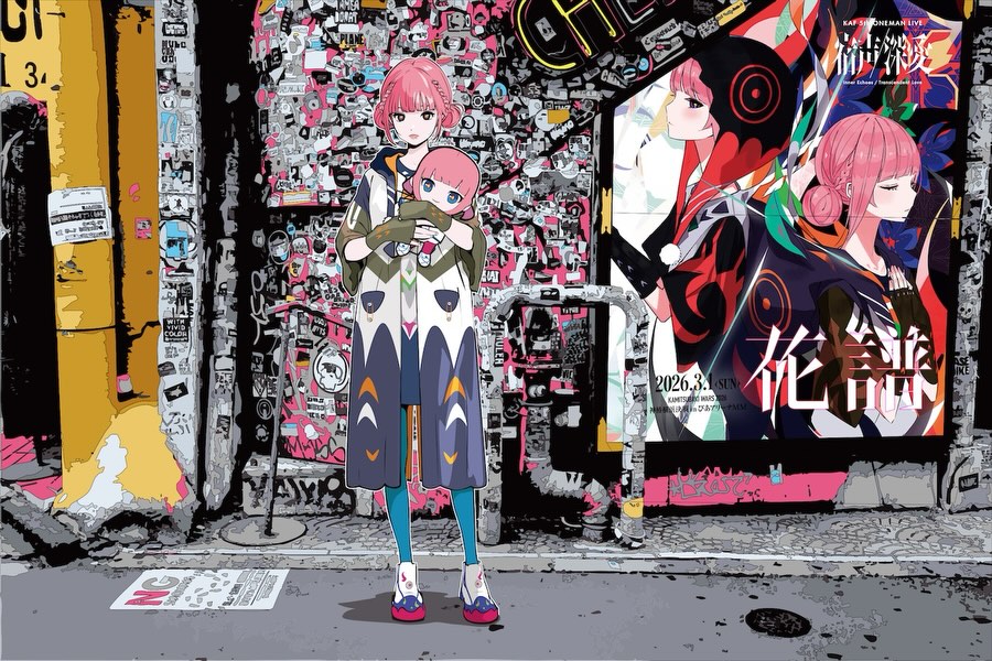
The Kafu Backside Works Poster: How virtual_kaf Built This AI Art
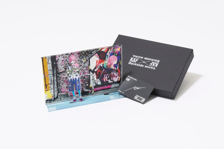
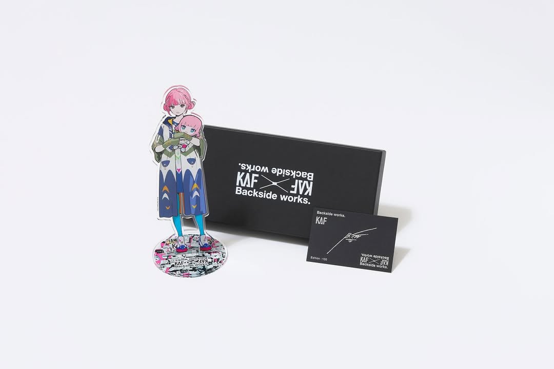
This image is doing two jobs at once. It is a character illustration, and it is also an ad system built into the scene. The trick is the “poster inside the world”: the billboard on the right turns the whole frame into a promotional artifact without feeling like a plain product shot.
Why it travels
The first hook is density. The sticker-collage wall is overwhelmingly detailed, so viewers linger just to scan it. That extra dwell time is not an aesthetic bonus; it is distribution fuel. The second hook is contrast: a clean, centered character silhouette against a chaotic background. Your eye locks onto the girl, then explores the wall.
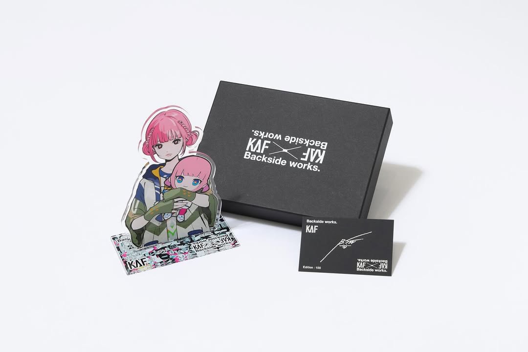
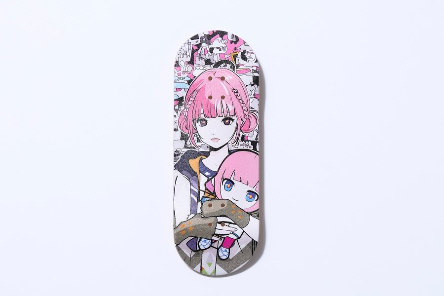
The third hook is meta-packaging. The billboard creates a clear “campaign anchor” (headline characters + date line), while the foreground character carries a plush/chibi doll that reads like merch. Even if someone cannot read the text, they understand: this is an announcement, a world, and a brand.
| Signal |
Evidence (from this image) |
Mechanism |
Replication Action |
| High dwell-time surface |
Wall packed with layered stickers, tags, micro-details |
Scanning behavior increases time-on-post |
Design one “detail field” area per image (stickers, shelves, notes, collage) |
| Clean hero silhouette |
Centered full-body character with simple readable pose |
Instant readability creates a scroll-stop |
Lock one centered subject; keep pose calm and recognizable |
| In-world campaign anchor |
Billboard poster on the right with headline + date |
Feels like a real announcement, not a random illustration |
Add a “poster within scene” panel with consistent placement and typography |
| Merch cue |
Plush/chibi doll held as a secondary focal object |
Object implies collectible value and productization |
Place one product-shaped prop in the character’s hands (plush, badge, book) |
Use cases and transfers
Best-fit scenarios
- Limited poster drops: keep the billboard panel; swap the headline/date each release.
- Collab announcements: keep the street wall; place collaborator visual language inside the sticker field.
- Tour/live goods promos: keep character + prop; use the billboard for the venue/date system.
- Creator world-building series: keep the same street corner; change only the poster and one prop per episode.
- Fan community posts: keep the dense background; hide easter eggs to encourage comments and shares.
Not ideal
- Minimalist luxury where empty space is the brand signature.
- Educational explainers that need clear, readable instructional text across the whole image.
- Fast meme formats where the joke is the only payload.
Transfers (3 remix recipes)
- Keep: centered character + chaotic detail wall. Change: the prop. Template: "{character} holding {prop}, dense sticker wall background, poster-quality anime illustration".
- Keep: street corner layout. Change: the billboard content. Template: "wide street wall scene with an in-world billboard showing {headline} and {date}".
- Keep: palette logic (pink accents over monochrome). Change: the left panel color. Template: "monochrome collage wall with hot pink accents, {left panel color} weathered poster strip".
Aesthetic read: chaos controlled by layout
The image feels intentional because it separates roles. The wall is “noise” (texture and discovery). The character is “signal” (identity and silhouette). The billboard is “context” (campaign). When you assign roles like that, you can increase detail without losing clarity.
Notice how the character’s colors are limited and clean: pink hair and teal legs are the only loud accents. That lets the background be busy while the subject stays readable. The result is a frame that works both as a story image and as a functional announcement.
| Observed |
Recreate |
Why it matters |
| Sticker wall micro-detail field |
Allocate 50–60% of the image to dense collage texture |
Encourages scanning and saves |
| Centered hero with calm pose |
Use a straight-on stance; avoid dynamic limbs that break readability |
Works at thumbnail size |
| Poster panel embedded in scene |
Place a framed billboard on the right with consistent typography zones |
Turns art into an announcement system |
| Two accent colors only |
Pick hair color + one wardrobe accent; keep everything else neutral |
Prevents visual overload |
Prompt technique breakdown
| Prompt chunk |
What it controls |
Swap ideas (EN, 2–3 options) |
| character + prop |
Primary identity and “product cue” |
holding a plush; holding a poster tube; holding a badge pack |
| background density |
Dwell time and discovery |
sticker wall; bulletin board; collage of flyers and tags |
| layout anchors |
Clarity inside chaos |
right-side billboard; left poster strip; ground paper scatter |
| palette rules |
Whether the frame feels readable or noisy |
monochrome + hot pink; monochrome + neon green; warm panel + teal accent |
| linework + rendering |
Poster-quality finish |
crisp anime lines; graphic flat shading; high-detail collage texture |
Remix steps (fast convergence)
Baseline Lock: (1) wide composition with centered character, (2) dense sticker wall, (3) right-side billboard panel.
One-change rule: change only 1–2 knobs per run. Example sequence:
- Run 1: Get the layout right (character center, billboard right, left warm panel).
- Run 2: Increase background density until it feels “overfull,” then pull back 10%.
- Run 3: Lock palette (neutral wall + hot pink accents + one teal accent).
- Run 4: Swap only the billboard content (headline/date) for the next drop.
If you are promoting merch or events, this is a scalable template: the world stays constant, the poster changes, the prop changes. That is how you turn art into a release machine.