made the trip up to @sf_artweek and it did not disappoint ✨ whenever i’m searching for creative fuel, i always come back to art 💙 so many conversations about process, intention, and making the work… definitely leaving with a few new ideas brewing 😉🎶
made the trip up to @sf_artweek and it did not disappoint ✨ whenever i’m searching for creative fuel, i always come back to art 💙 so many conversations about process, intention, and making the work… definitely leaving with a few new ideas brewing 😉🎶
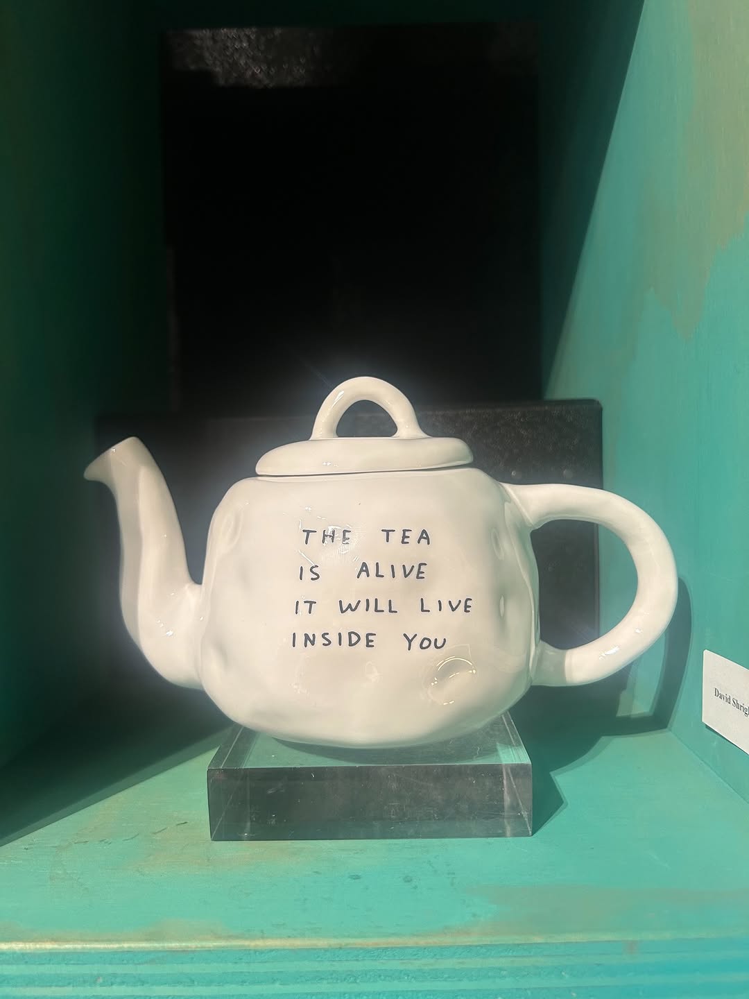
This image performs through conceptual tension: a familiar object (a teapot) carrying unsettling text in a museum-like display. The frame is simple, but the message is provocative. That friction between domestic comfort and strange language is what drives saves and reposts.
For creators, this is a strong blueprint for object-led storytelling. You do not need a person in frame when the object itself has narrative charge.
The visual hook is immediate because viewers recognize the object before they decode the text. Once they read the phrase, the meaning shifts from ordinary to uncanny. This two-step read process increases dwell time and comment debate.
| Signal | Evidence (from this image) | Mechanism | Replication Action |
|---|---|---|---|
| Familiar-object disruption | Classic teapot form paired with unusual statement text | Expectation break drives attention and interpretation | Use everyday objects with one conceptual text twist |
| Exhibit framing | Acrylic plinth + enclosed colored display niche | Museum context raises perceived cultural value | Present object in curated display environment, not casual tabletop |
| Minimal composition | Single centered subject with sparse background | Low visual noise pushes focus to idea | Keep one hero object and eliminate secondary distractions |
Not ideal: direct e-commerce catalog images, practical tea product reviews, or tutorial content that needs literal clarity.
{everyday object} + {unexpected text line} + {gallery niche} + {minimal composition}.{domestic object} + {handwritten statement} + {single-color display room} + {clean negative space}.{familiar tech object} + {human-feeling text} + {museum-style pedestal} + {cool ambient light}.The image uses controlled isolation. The teapot is centered and large enough to read text clearly, while the turquoise enclosure acts as a tonal frame that separates object from the outside world. Minor glare and imperfect perspective are useful, not problematic; they signal this is a real exhibit encounter rather than a studio render. The handwritten typography contrasts with ceramic mass, introducing vulnerability and tension. This is a clear example of concept-first visual design where composition exists to serve meaning.
| Observed | Recreate |
|---|---|
| Single-object dominance | Keep one artifact centered with generous breathing room |
| Readable text integrated on surface | Ensure message is legible at first glance on object body |
| Colored niche as contextual frame | Use one enclosure color to create gallery-like isolation |
| Slight real-world imperfections | Allow mild reflections/perspective skew to preserve authenticity |
| Prompt chunk | What it controls | Swap ideas (EN, 2-3 options) |
|---|---|---|
| Object archetype | Baseline familiarity | teapot; mug; lamp |
| Text tone | Interpretive depth and audience response | uncanny warning; poetic line; ironic humor statement |
| Display context | Perceived cultural value | aqua exhibit niche; white cube plinth room; dark museum alcove |
| Surface realism | Tactility and credibility | handmade ceramic dents; glossy porcelain; aged matte glaze |
| Lighting behavior | Mood and legibility | soft museum glare; flat diffused light; directional spotlight |
Baseline lock: (1) single centered object, (2) strong message text on surface, (3) curated display environment.
One-change rule: change one conceptual variable each version.
This method helps creators produce coherent concept-art series with measurable audience response differences.