made the trip up to @sf_artweek and it did not disappoint ✨ whenever i’m searching for creative fuel, i always come back to art 💙 so many conversations about process, intention, and making the work… definitely leaving with a few new ideas brewing 😉🎶
made the trip up to @sf_artweek and it did not disappoint ✨ whenever i’m searching for creative fuel, i always come back to art 💙 so many conversations about process, intention, and making the work… definitely leaving with a few new ideas brewing 😉🎶
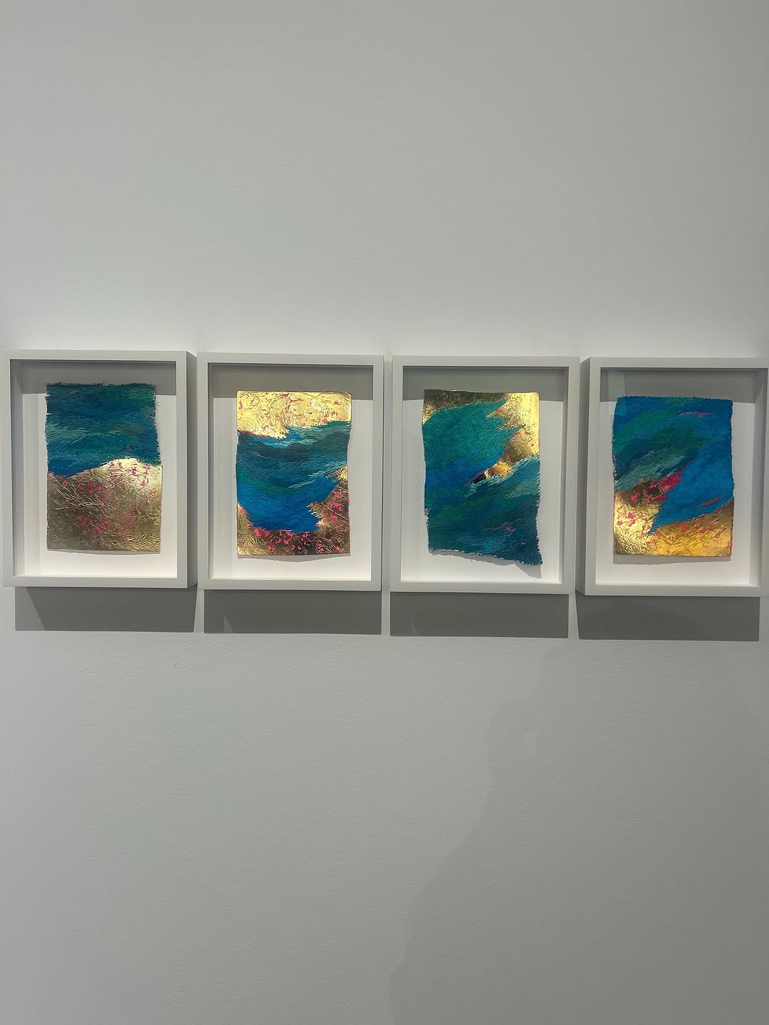
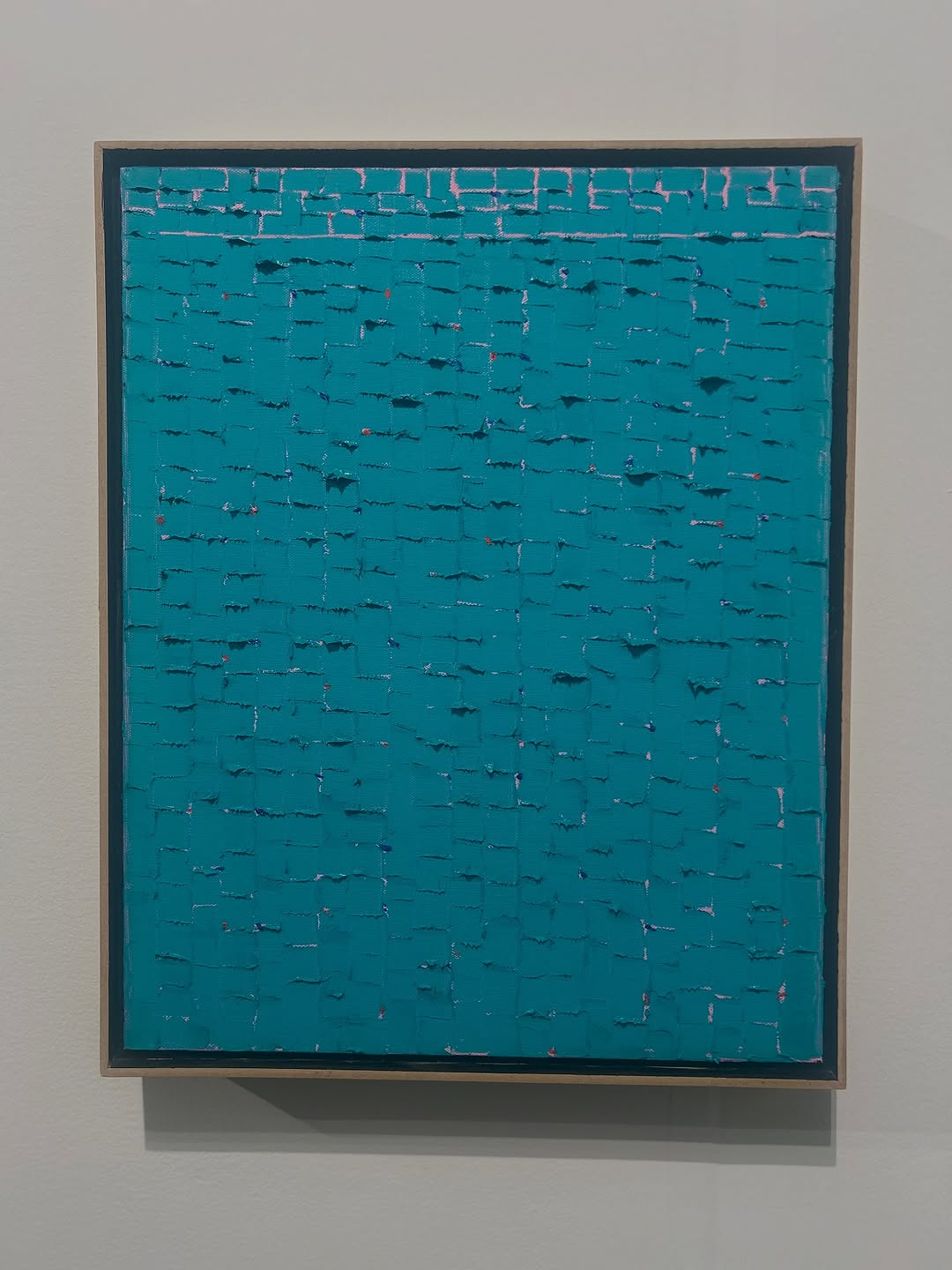
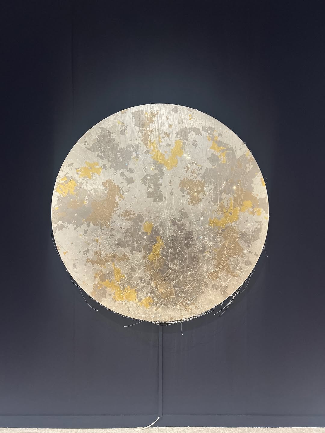
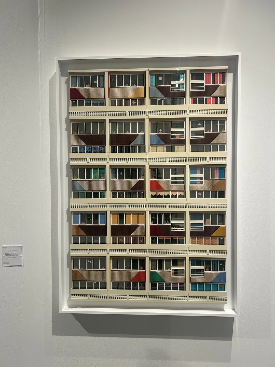
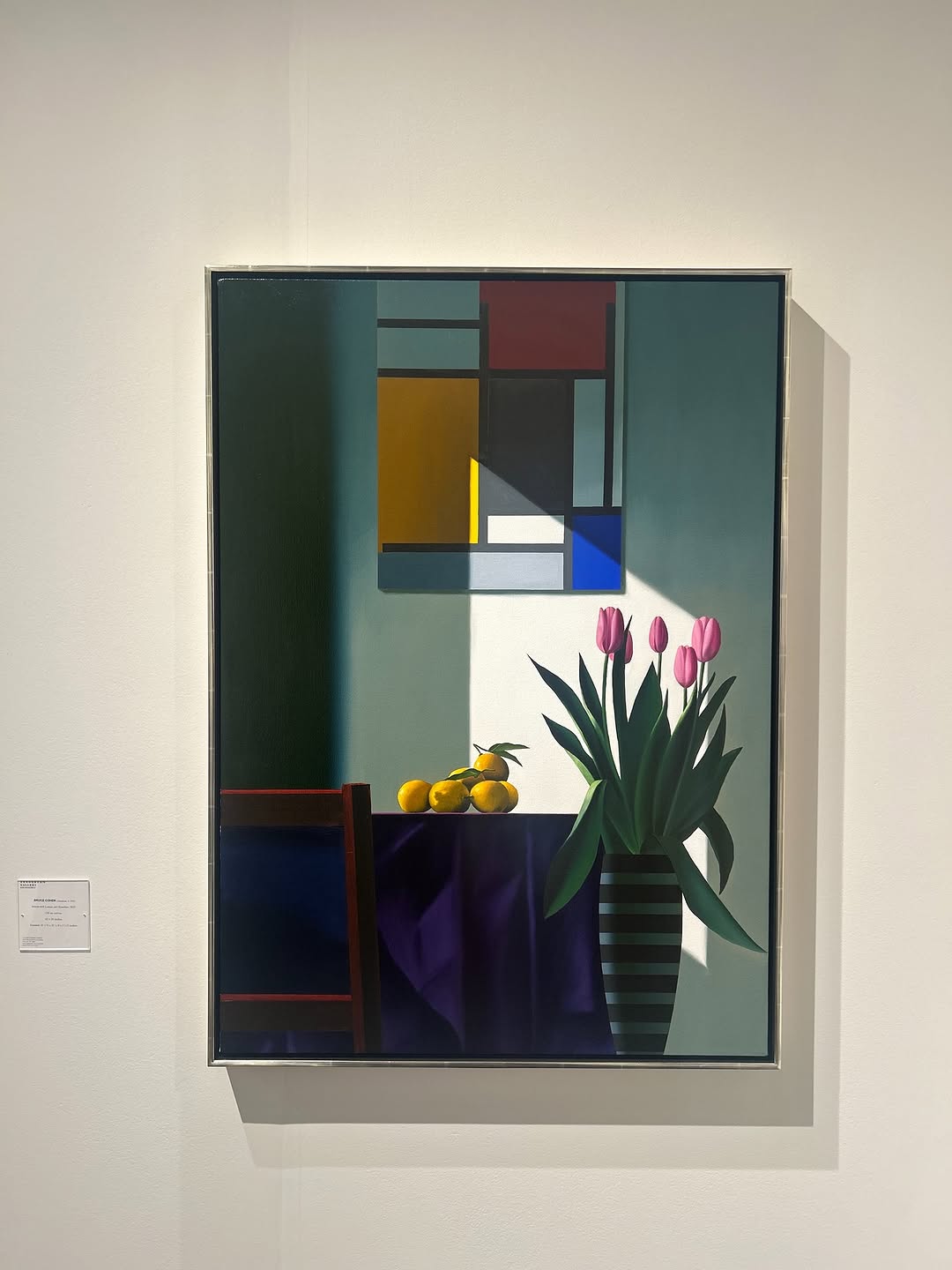
This image works through serial rhythm. Instead of one hero piece, we get a family of four related works. That repetition creates structure, while subtle differences reward closer viewing. It is a strong strategy for creators who want calm, collectible visual storytelling.
For social growth, series often outperform singles because they imply continuity. Audiences read a row like this as part of an ongoing body of work, which increases follow intent.
The post is minimal but deliberate. White wall, consistent framing, controlled palette, and repeated format all signal curation quality. This visual discipline builds trust in artistic intent.
| Signal | Evidence (from this image) | Mechanism | Replication Action |
|---|---|---|---|
| Series structure | Four related pieces in one row | Suggests depth and continuity | Publish work in grouped sets, not isolated one-offs |
| Palette cohesion | Blue + gold appears across all frames | Creates brand-like visual memory | Lock 2-3 core colors across a mini collection |
| Controlled variation | Each panel differs slightly | Keeps attention during scan | Repeat format, vary internal composition by 20-30% |
| Negative-space confidence | Large blank wall area around row | Signals premium curation | Leave breathing room instead of filling frame with objects |
Not ideal for personality-led storytelling, event crowd moments, or campaigns that need immediate textual explanation.
The visual strength here is tempo. The eye moves left to right through similar structures, noticing tiny shifts in texture and balance. Metallic gold catches light differently in each frame, adding subtle motion to an otherwise static display. This is a highly effective style when your goal is sophistication rather than immediacy.
| Prompt chunk | What it controls | Swap ideas (EN, 2-3 options) |
|---|---|---|
| Series-count block | Rhythm and narrative continuity | “four framed pieces”, “three-part triptych”, “five-panel sequence” |
| Palette block | Cohesion | “teal + gold”, “charcoal + copper”, “ivory + indigo” |
| Spacing block | Curation quality | “equal frame spacing”, “tight salon-style spacing”, “wide breathing-room spacing” |
| Wall-context block | Visual hierarchy | “plain white gallery wall”, “soft gray museum wall”, “clean architectural backdrop” |
| Texture block | Material richness | “metallic leaf reflections”, “matte impasto brushwork”, “mixed-media surface depth” |
Baseline lock: frame count, equal spacing, and core palette.
This process helps creators publish series content that feels intentional and collectible.