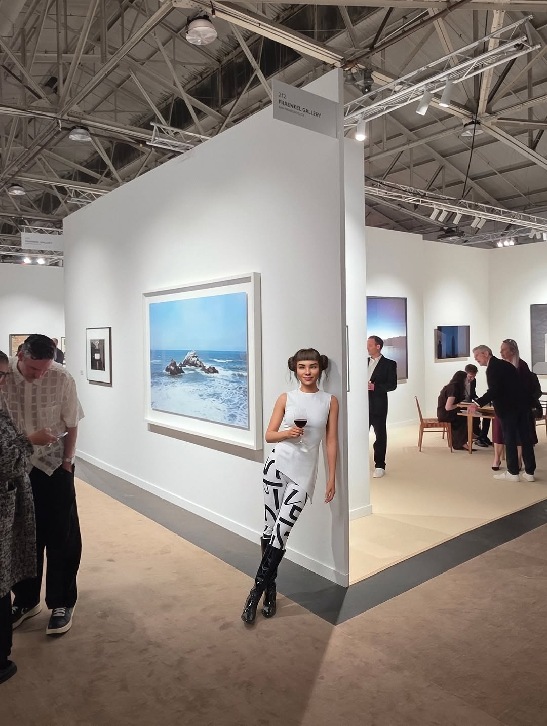
made the trip up to @sf_artweek and it did not disappoint ✨ whenever i’m searching for creative fuel, i always come back to art 💙 so many conversations about process, intention, and making the work… definitely leaving with a few new ideas brewing 😉🎶
made the trip up to @sf_artweek and it did not disappoint ✨ whenever i’m searching for creative fuel, i always come back to art 💙 so many conversations about process, intention, and making the work… definitely leaving with a few new ideas brewing 😉🎶
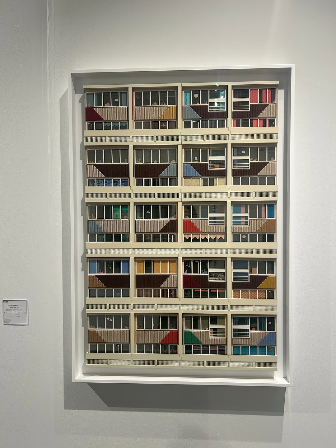
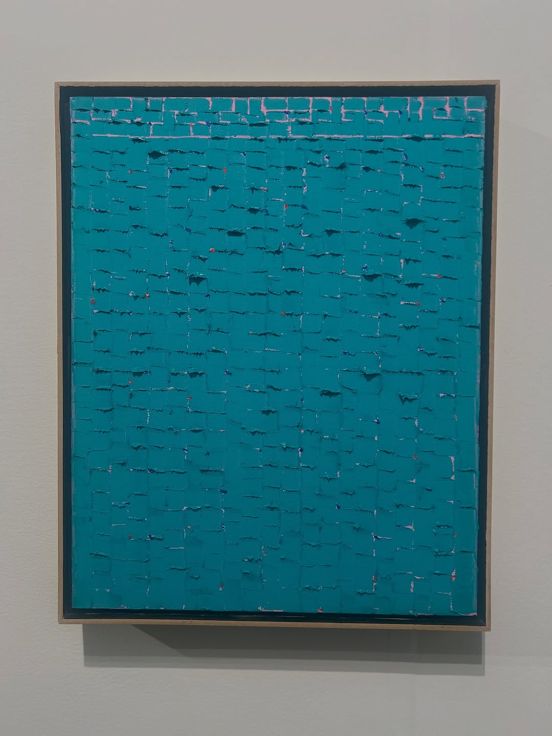
This image is quiet, but it is not weak. Its power comes from repetition and control. A single framed piece dominates the wall, and the artwork itself is a grid of architectural modules with subtle color shifts. The eye keeps scanning because the pattern is stable but never identical.
For creators, this is a useful format when your goal is “save-worthy calm.” Not every post must scream. Some posts win by visual order and texture intelligence.
The frame has strong curation cues: clean wall, one artwork, museum label. That context increases perceived quality and invites thoughtful engagement, especially from design, architecture, and art audiences.
| Signal | Evidence (from this image) | Mechanism | Replication Action |
|---|---|---|---|
| Single-object focus | Only one framed piece centered on wall | Reduces cognitive noise | Use one hero object per frame when showcasing craft detail |
| Repetition with variation | Many similar window modules with subtle color differences | Encourages prolonged scanning | Design repeating structures where 15-25% of units vary |
| Institutional context | Visible wall placard and gallery lighting | Adds credibility and cultural value | Include one context marker (label, caption card, exhibition tag) |
| Negative space framing | Large white wall margins around artwork | Signals premium curation | Leave breathing room instead of edge-to-edge composition |
Not ideal for personality-led storytelling, fast meme loops, or product ads requiring immediate human presence.
The aesthetic strength here is structural rhythm. Horizontal and vertical lines create a calm lattice, while diagonal inserts prevent monotony. The white frame recess adds depth without distraction. Because lighting is even and neutral, viewers can read material and color honestly. This is a high-value style for creators who want authority and restraint in their feed.
| Prompt chunk | What it controls | Swap ideas (EN, 2-3 options) |
|---|---|---|
| Gallery context block | Perceived curation quality | “white cube wall”, “museum exhibition wall”, “minimal art-space interior” |
| Object focus block | Visual hierarchy | “single framed artwork”, “one centered wall piece”, “solo exhibit object” |
| Pattern block | Dwell-time behavior | “repetitive window grid”, “modular geometric facade”, “serial architectural panels” |
| Color discipline block | Mood control | “muted neutral palette + small accents”, “earth tones with cool inserts”, “desaturated base with selective color tiles” |
| Lighting block | Documentation realism | “soft even gallery light”, “neutral exhibition illumination”, “low-contrast museum lighting” |
Baseline lock: single-object composition, grid structure, and soft neutral lighting.
This gives you a reusable template for calm, credibility-driven posts.