made the trip up to @sf_artweek and it did not disappoint ✨ whenever i’m searching for creative fuel, i always come back to art 💙 so many conversations about process, intention, and making the work… definitely leaving with a few new ideas brewing 😉🎶
made the trip up to @sf_artweek and it did not disappoint ✨ whenever i’m searching for creative fuel, i always come back to art 💙 so many conversations about process, intention, and making the work… definitely leaving with a few new ideas brewing 😉🎶
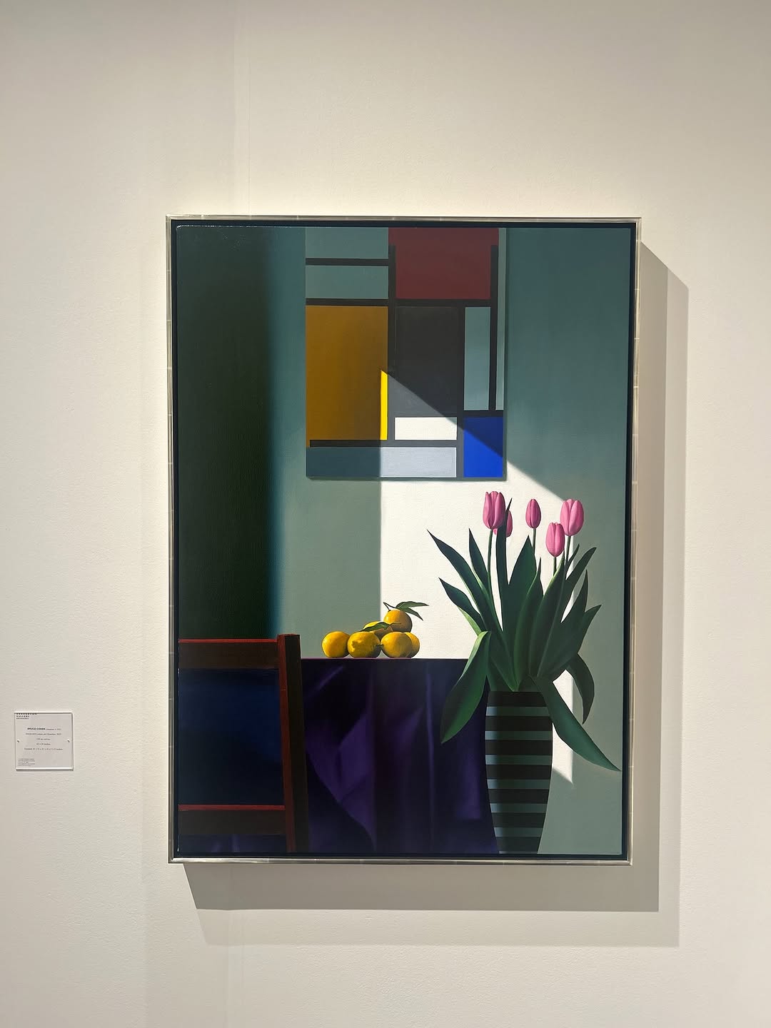
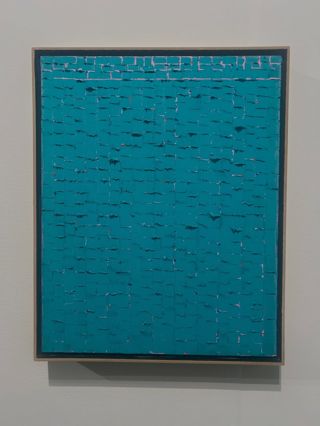
At first glance this is “just” a framed painting on a white wall. But it carries three things that perform extremely well on social: a clean stage, a readable idea, and a built-in lesson. The work inside the frame is all crisp geometry and a single dramatic diagonal shadow, balanced by a human, tender detail: pink tulips in a vase. That mix of structure and softness is the kind of contrast that makes people stop and look.
Transfer 1: Still Life, Different Anchor
Keep: geometric blocks, diagonal shadow, minimal palette.
Change: the organic anchor (flowers) and the tabletop prop.
Slot template (EN): {geometric_panels} + {diagonal_shadow} + {tablecloth_color} + {organic_anchor} + {small_props}
Transfer 2: Same System, New Location
Keep: centered framed subject, wall label cue, neutral lighting.
Change: gallery wall to studio wall or cafe wall while preserving negative space.
Slot template (EN): {framed_artwork} on {clean_wall} with {label_plaque}, shot in {neutral_spotlight}
Transfer 3: Diagonal Light Study Series
Keep: one strong diagonal light wedge as the signature.
Change: palette and subject each post to create a collectible series.
Slot template (EN): {subject} under {single_diagonal_shadow} in {two_to_three_color_palette}
The strongest aesthetic decision is restraint. The wall is blank, the frame is thin, and the composition is centered. That restraint makes the internal painting feel more intense. Inside the artwork, the eye moves through a clear hierarchy: the diagonal light wedge first, then the tulips, then the lemons, then the quiet geometry above. It is a lesson in making one big shape do the emotional work, while smaller shapes add story.
Color is disciplined: muted greens and grays as the field, then small hits of saturated pink and yellow. This is why the image feels premium instead of chaotic. If you want to recreate it, think in layers: one neutral field, one dark anchor (the tablecloth), and two accent colors that never fight each other.
| Observed | Recreate Knob | Why It Matters |
|---|---|---|
| Centered frame with large negative-space wall | Place subject center; keep 35–50% clean wall | Instant readability on mobile |
| Single diagonal shadow wedge across the scene | Add one dominant diagonal light shape | Creates drama without adding clutter |
| Two accent colors (pink flowers, yellow fruit) | Limit accents to two colors | Feels curated and controlled |
| Dark anchor mass at the bottom (tablecloth) | Lock one dark region in the lower third | Grounds the composition |
| Institutional cue (label plaque) | Include one “gallery cue” element | Adds credibility and context |
| Prompt chunk | What it controls | Swap ideas (EN, 2–3 options) |
|---|---|---|
| Gallery documentation framing | Trust, realism, and negative space | "museum wall", "white cube gallery", "minimal exhibition space" |
| Single framed artwork + label plaque | Institutional cue and story context | "wall label", "placard", "small caption plaque" |
| Artwork content: geometric still life | Internal subject identity | "vase of tulips", "bowl of fruit", "chair and table" |
| Lighting shape: diagonal shadow wedge | Drama and focal hierarchy | "sharp diagonal sunlight", "angled spotlight", "single hard-edged shadow" |
| Color palette discipline | Premium feel vs chaos | "muted teal field", "two-accent palette", "dark anchor + warm accents" |
| Lens and perspective | Documentary believability | "28mm smartphone", "35mm documentary", "straight-on wall shot" |
This is a series-friendly format. Build a repeatable system rather than chasing random aesthetics.
Change only one major knob per run: either the organic anchor (flowers), or the palette accents, or the geometry arrangement. Keep the rest fixed.