made the trip up to @sf_artweek and it did not disappoint ✨ whenever i’m searching for creative fuel, i always come back to art 💙 so many conversations about process, intention, and making the work… definitely leaving with a few new ideas brewing 😉🎶
made the trip up to @sf_artweek and it did not disappoint ✨ whenever i’m searching for creative fuel, i always come back to art 💙 so many conversations about process, intention, and making the work… definitely leaving with a few new ideas brewing 😉🎶
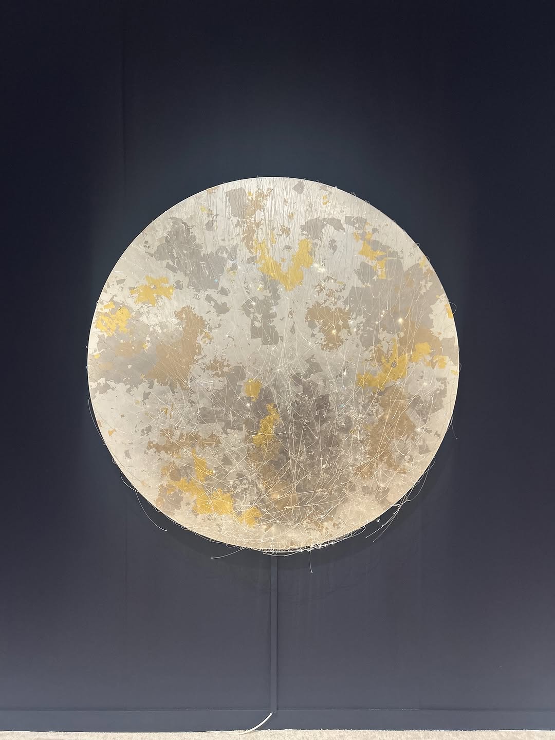
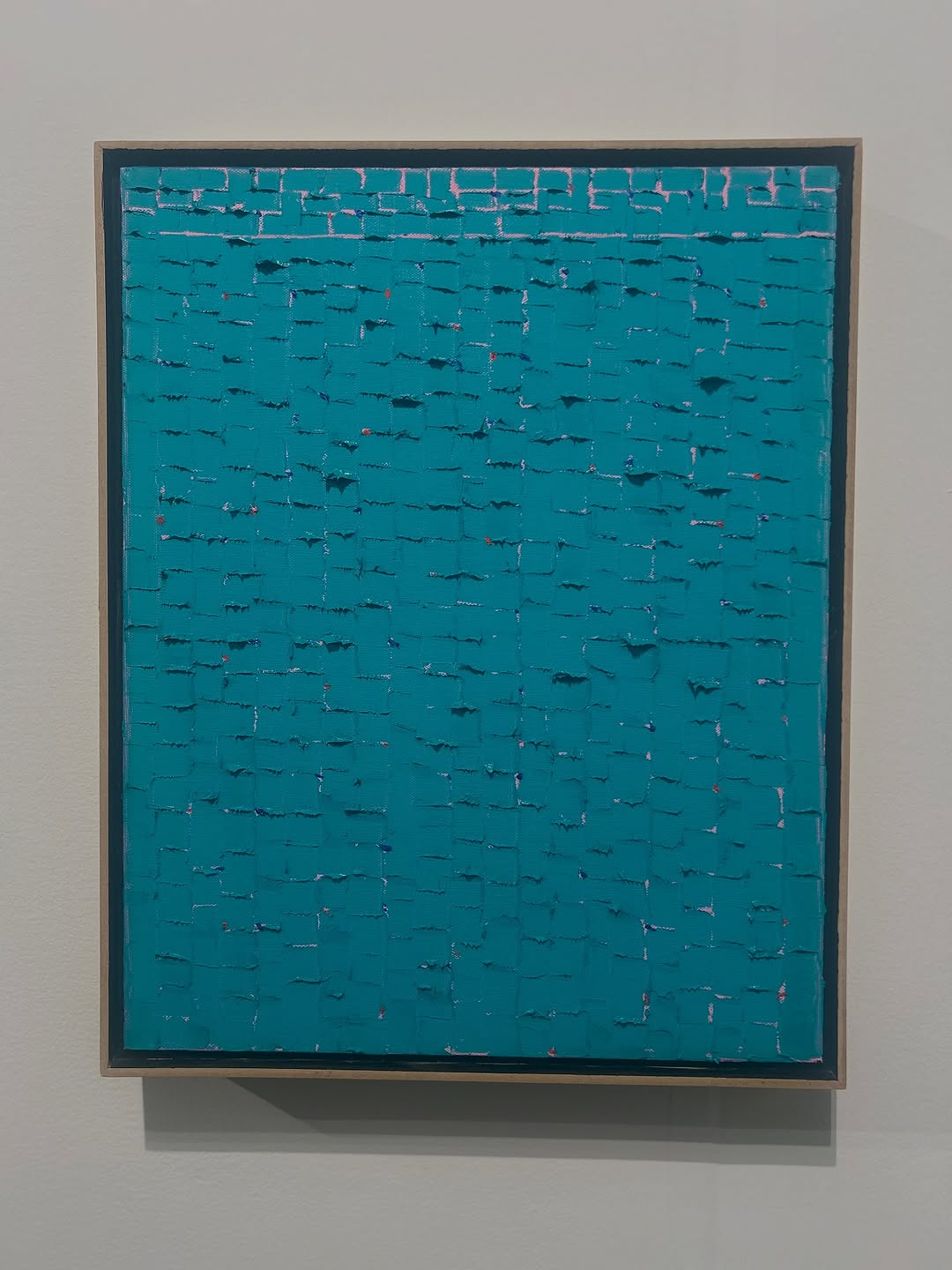
This image looks minimal, but it carries strong content potential for creators. One glowing circular artwork on a dark wall creates immediate visual clarity. There is no subject clutter, no busy environment, and no competing objects. That makes it ideal for feed behavior where users decide in a second whether to stop. The frame reads as calm, intentional, and premium.
What makes this post strategically useful is the caption context: the creator links the image to creative process, intention, and idea generation after visiting an art week event. This moves the post from "pretty object" to "creative fuel narrative." For small creators, this is the key transfer: connect visual stillness to a practical creative takeaway. People engage more when the image is paired with a process mindset rather than pure admiration.
Keep: single centered object, dark clean background, subtle internal glow.
Change: swap circular artwork for textured square panel and adapt caption to composition lessons.
Slot template (EN): "{single-artwork} on {clean-dark-wall}, learned {process-insight}."
Keep: minimal scene entropy and micro-texture emphasis.
Change: replace art object with crafted product prototype while preserving contemplative tone.
Slot template (EN): "{hero-object}, {negative-space}, {what-it-taught-me-about-making}."
Keep: central symmetry and restrained palette.
Change: shift background hue and one accent color to match your brand identity.
Slot template (EN): "{shape-anchor} + {muted-palette} + {creator-reflection-line}."
The image is anchored by geometric certainty: the circle is centered and isolated, giving the frame visual authority. Negative space works as a framing device rather than empty area, making the object feel deliberate and museum-like. Lighting is controlled and soft, with internal glow that separates the artwork from the wall without blowing out detail. This creates a contemplative, almost lunar atmosphere.
Texture is the second aesthetic engine. The surface combines cloudy marbling, hairline fibers, and muted gold notes, so the image unfolds gradually. From distance it reads as one shape; from close inspection it becomes a material study. That dual readability is highly reusable for creator content because it supports both quick feed impact and deeper save-worthy value.
| Observed | Recreate evidence |
|---|---|
| Strict central symmetry | Place hero object dead-center with balanced margins. |
| Dark low-noise backdrop | Use plain deep wall tone and remove all side objects. |
| Internal soft glow | Light from within or emulate backlit diffusion around edges. |
| Layered neutral texture with subtle gold accents | Combine off-white, gray, and restrained warm highlights. |
| Prompt chunk | What it controls | Swap ideas (EN, 2-3 options) |
|---|---|---|
| "single luminous circular artwork centered on dark wall" | Subject count and geometric hierarchy | "one glowing disc sculpture" | "single moon-like wall piece" | "solitary circular installation" |
| "plain navy-charcoal gallery background" | Scene cleanliness and premium tone | "deep matte slate wall" | "minimal black gallery wall" | "dark neutral exhibition backdrop" |
| "off-white and gray marbled texture with muted gold accents" | Material identity and color restraint | "chalky mineral textures" | "paper-fiber layering" | "stone-like cloudy surface" |
| "soft internal glow, low ambient light" | Mood and tonal separation | "gentle halo backlight" | "diffused warm-neutral glow" | "subtle luminous edge bloom" |
| "strict symmetrical vertical framing" | Compositional discipline | "centered museum shot" | "balanced minimal portrait orientation" | "high-negative-space alignment" |
Baseline Lock: lock central composition, lock one-object scene, lock soft low-key lighting.
One-change rule: change only 1-2 knobs per iteration, usually texture palette or glow intensity.