made the trip up to @sf_artweek and it did not disappoint ✨ whenever i’m searching for creative fuel, i always come back to art 💙 so many conversations about process, intention, and making the work… definitely leaving with a few new ideas brewing 😉🎶
made the trip up to @sf_artweek and it did not disappoint ✨ whenever i’m searching for creative fuel, i always come back to art 💙 so many conversations about process, intention, and making the work… definitely leaving with a few new ideas brewing 😉🎶
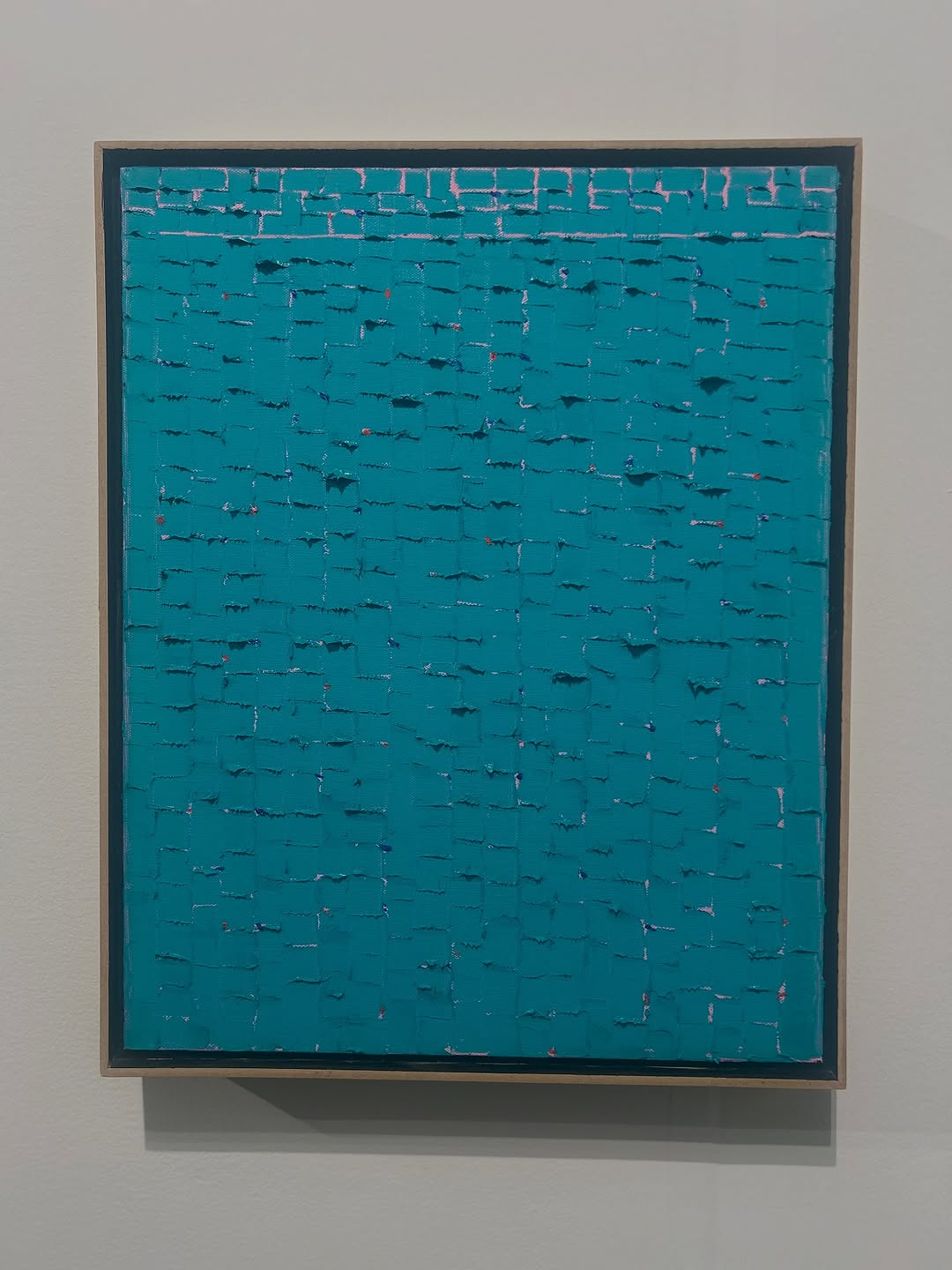
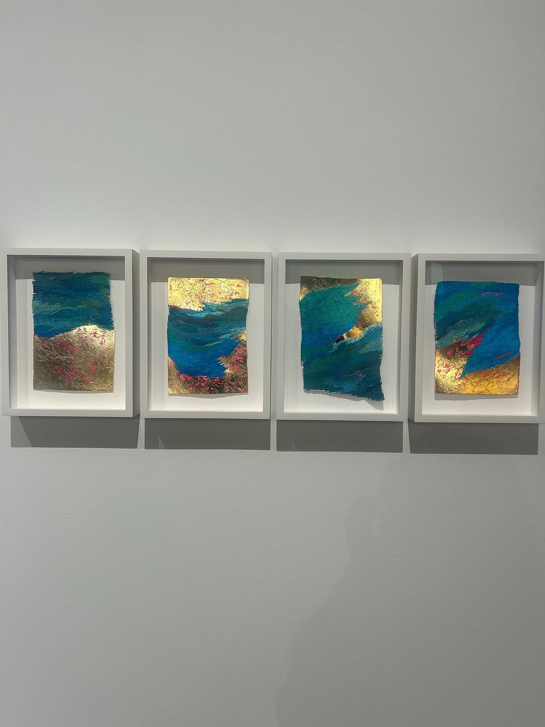
This image documents a monochrome abstract painting where meaning is carried by surface rather than imagery. There are no figurative elements; the visual interest comes from repeated block-like paint gestures and subtle tonal shifts inside one color field.
The piece invites close looking. What seems flat at distance becomes materially complex when texture catches light.
Material emphasis: Thick paint relief creates tactile depth.
Color restraint: Single-hue focus produces meditative intensity.
Rhythmic structure: Repeating marks build visual tempo without literal narrative.
Gallery framing: Clean wall presentation supports formal reading.
Create a square gallery documentation photo of a framed monochrome abstract painting in teal-blue tones. The painting surface should feature dense, textured impasto marks arranged in horizontal brick-like rhythm. Keep composition centered on a white wall with soft gallery light revealing texture relief. Maintain neutral framing and true color fidelity with no people or label clutter.
| Element | Instruction | Purpose |
| Color field | Single teal/cyan family with tonal nuance | Creates minimalist chromatic discipline |
| Texture system | Impasto blocks and ridges | Adds tactile visual interest |
| Presentation | Centered framed canvas on white wall | Supports museum-style documentation |
| Lighting | Soft directional gallery light | Reveals relief without glare |
| Camera approach | Straight-on, low distortion | Preserves artwork geometry |
| Exclusions | No labels/people/background clutter | Keeps focus on artwork only |
Gallery archive: Catalog image for exhibition records.
Artist portfolio: Document texture and color strategy.
Curatorial communication: Visual for writing on monochrome abstraction.
Art-market listing: Neutral presentation for sales platforms.
Minimal: "Teal field, layered time."
Curatorial: "Monochrome as structure, texture as language."
Reflective: "One color, many surfaces."
Prioritize accurate color reproduction and texture legibility. Avoid heavy contrast that crushes subtle tonal transitions. Keep wall neutrals clean and remove visual noise around frame edges. Slight perspective correction ensures professional documentation quality.
Variant A - Detail Macro: Close-up crop showing impasto ridges and knife marks.
Variant B - Side Light: Stronger raking light to exaggerate texture depth.
Variant C - Triptych Context: Include adjacent works for exhibition narrative.
Variant D - Neutral Gray Wall: Alternative display context for color comparison.
The image succeeds by respecting the painting as an object, not just a picture. In monochrome abstraction, faithful capture of material surface is essential, and this frame centers that requirement.