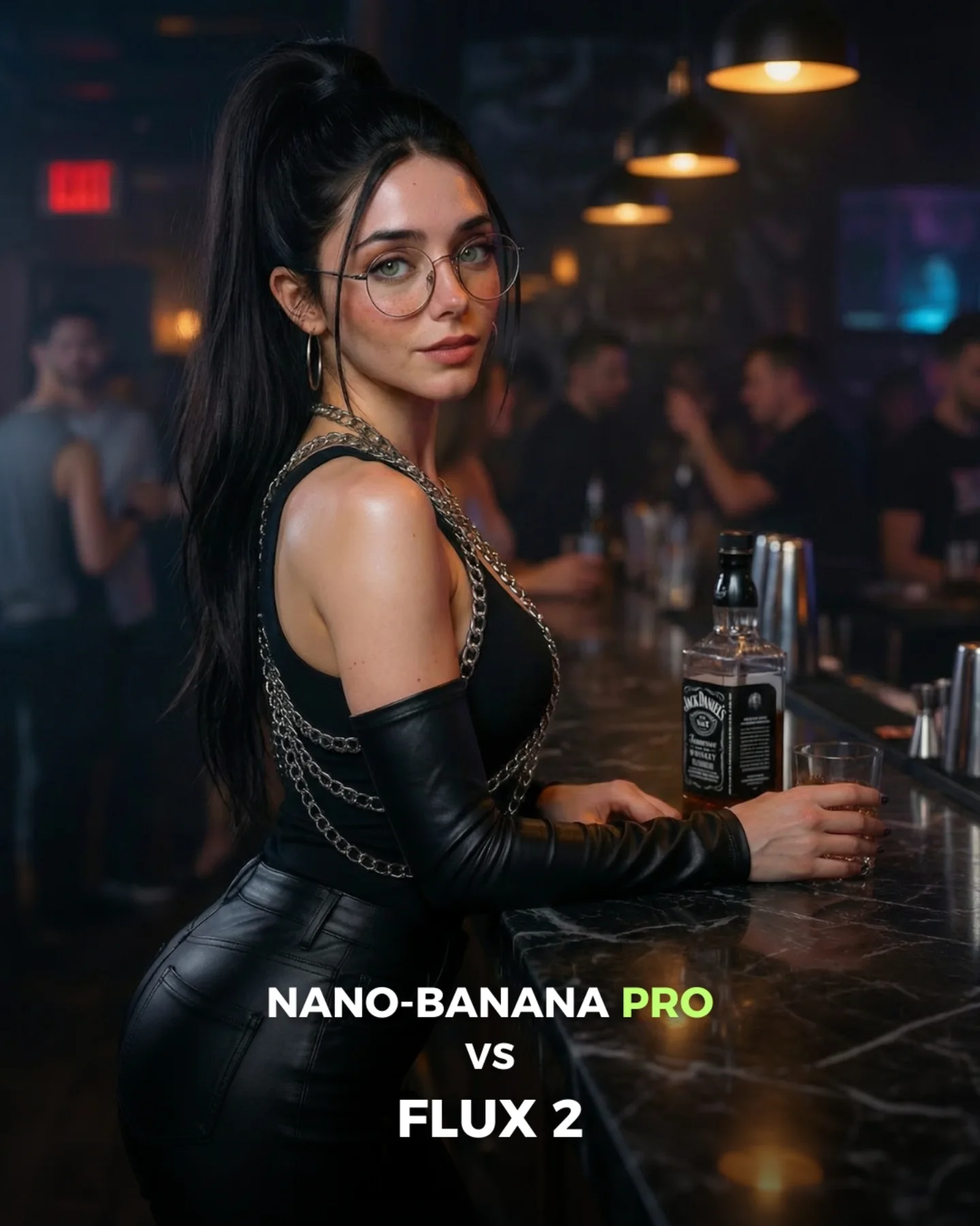
FLUX 2 vs. Nano Banana PRO 💥
Cada vez que aparece un nuevo generador de imágenes, me encanta ponerlo a prueba frente al mejor del momento y ver qué tan lejos puede llegar 🙊
Si te da curiosidad probarlo, lo tienes disponible directamente en @freepik 💕
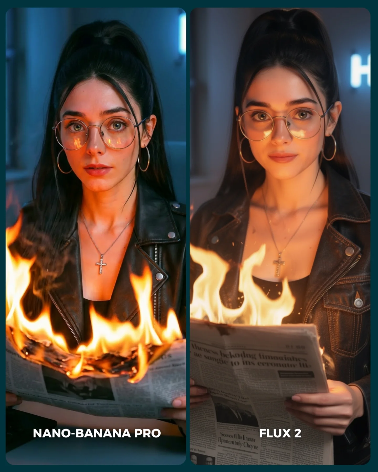
Why soy_aria_cruz's FLUX 2 vs Nano Banana PRO Burning Newspaper Portrait Comparison Went Viral — and the Formula Behind It
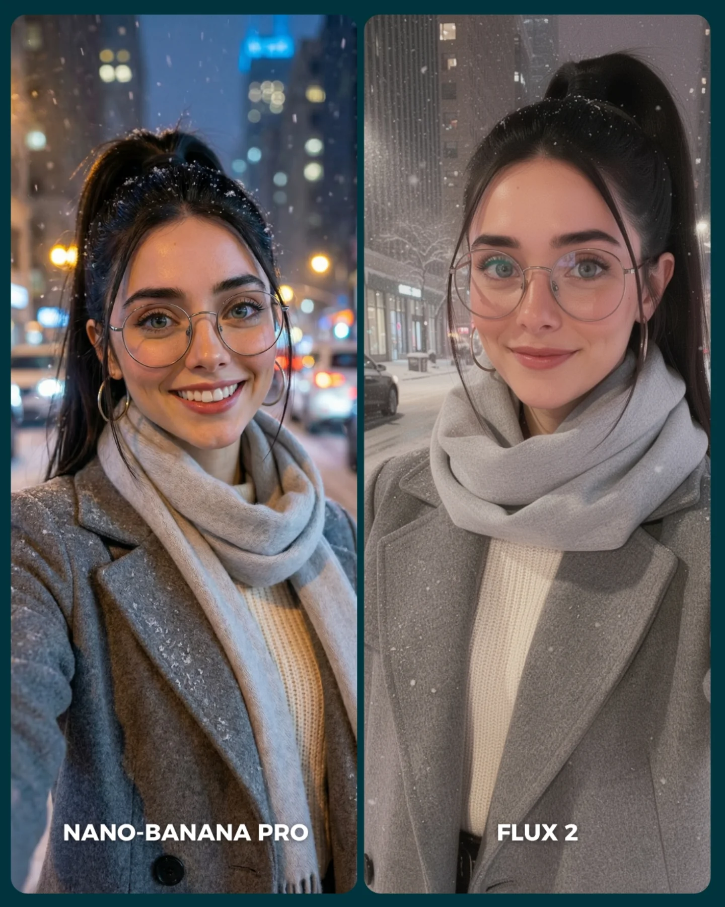
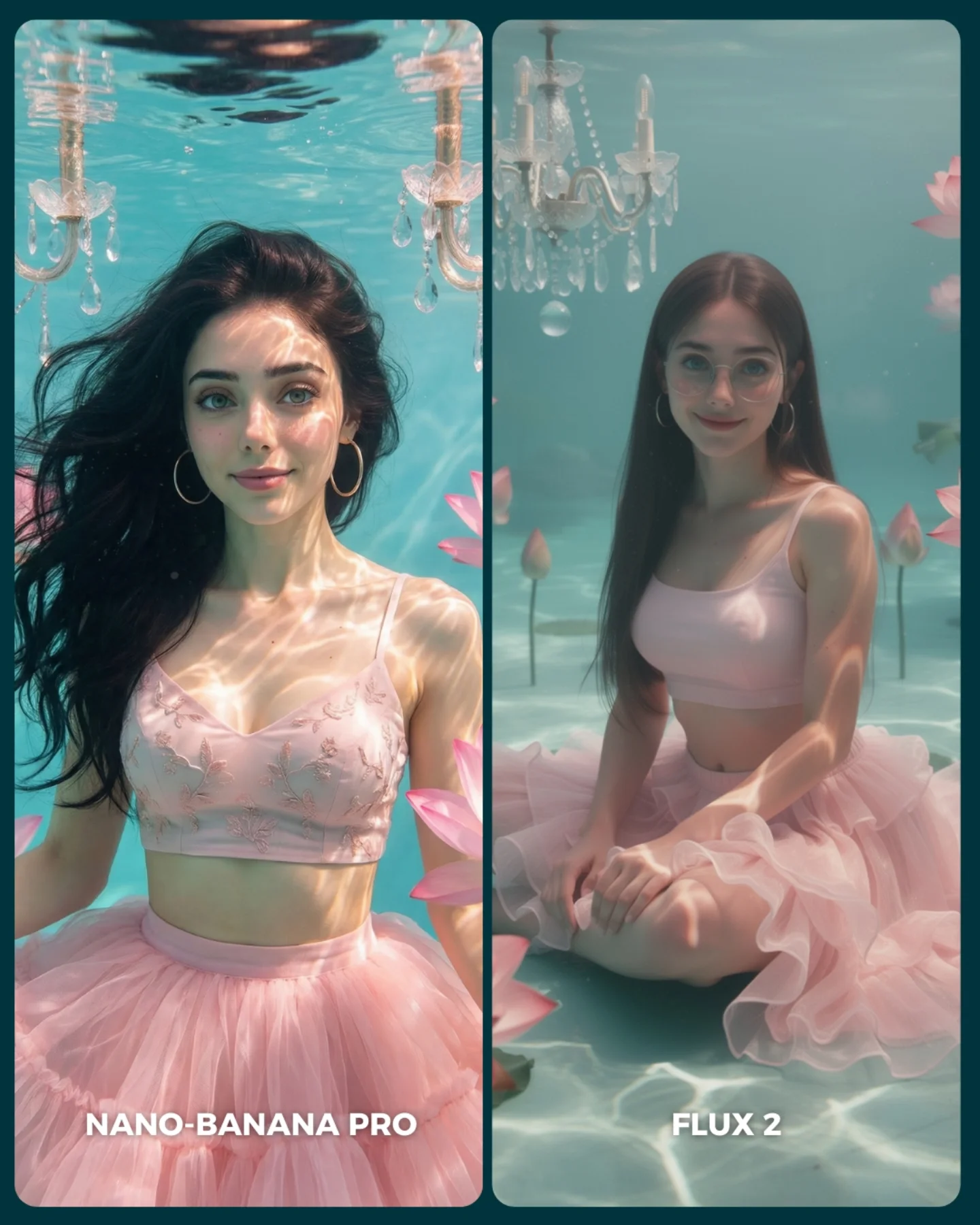
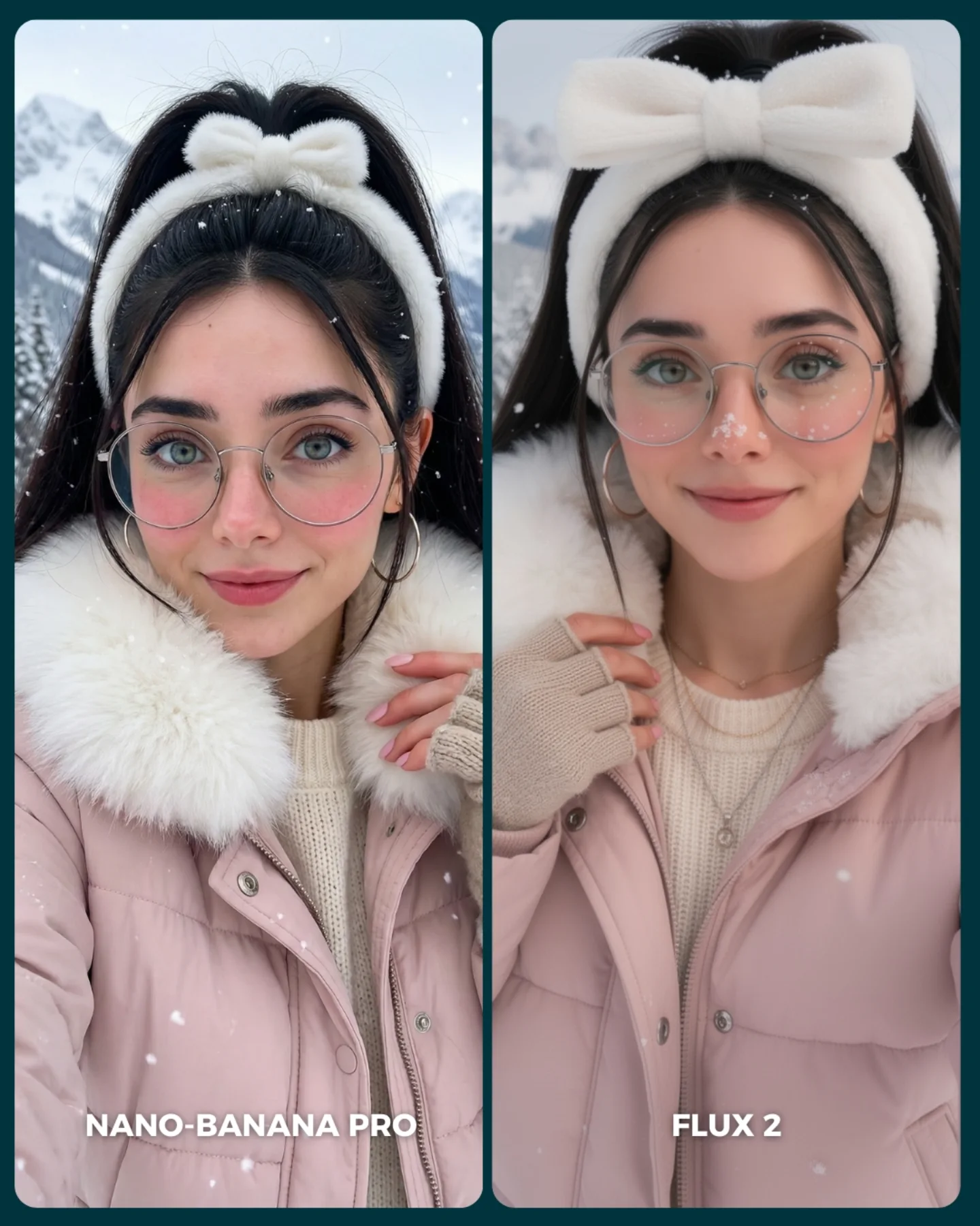
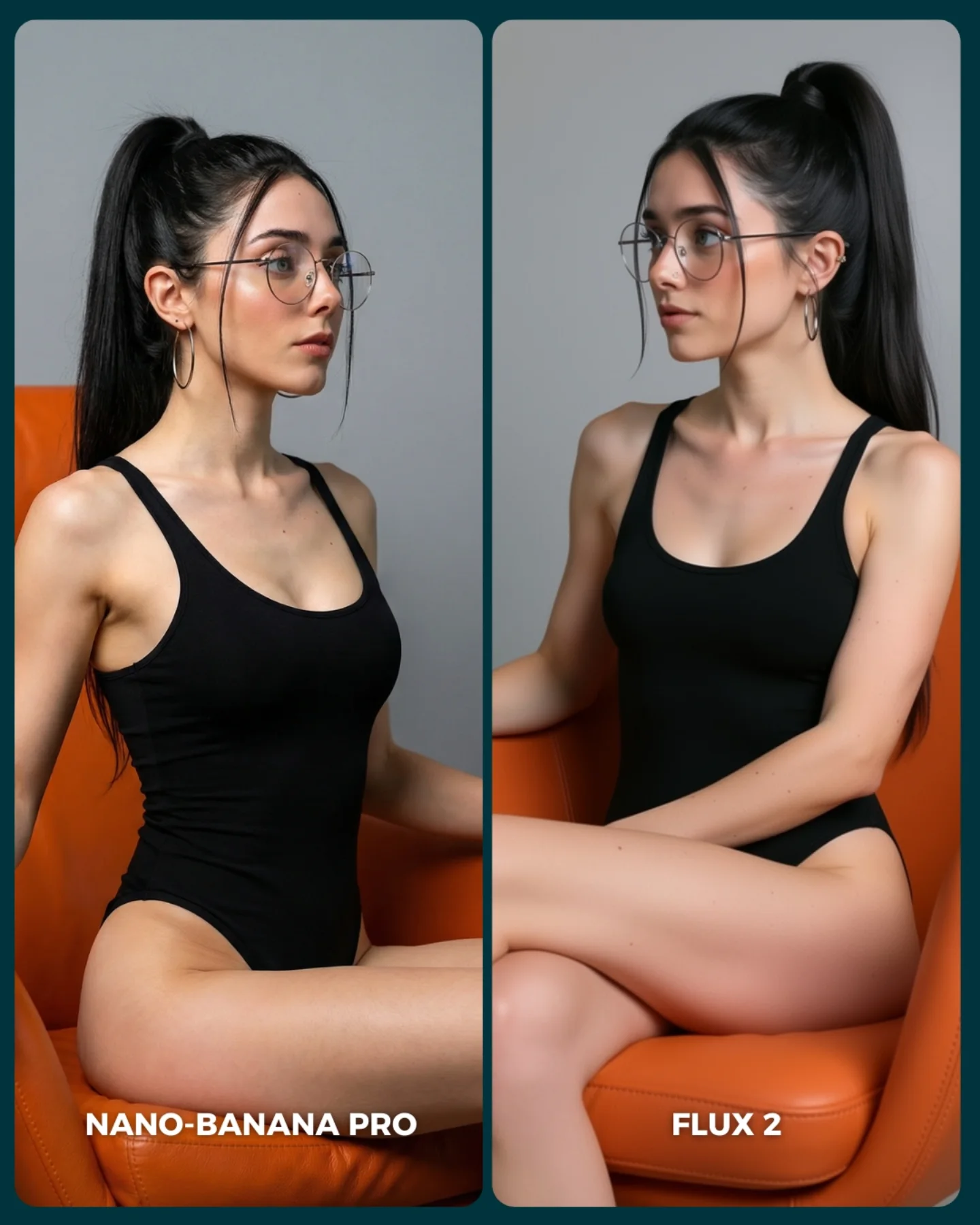
This image is a strong example of how benchmark content should look on social. It does not ask the viewer to imagine what changed between tools. It shows one scene, one subject, one prop setup, and two outputs side by side. That clarity is the entire point. Good comparison content is not only about the image quality of each model. It is about reducing interpretation friction so the audience can form an opinion quickly.
The burning newspaper concept is also smarter than it first appears. Fire is one of the fastest ways to expose differences in realism, lighting control, edge handling, and material rendering. At the same time, the portrait is simple enough that the viewer can still focus on the face. That makes the post feel dramatic without becoming messy.
Why this comparison format performs well
The strongest mechanism here is controlled sameness. Both panels use the same woman, the same leather jacket, the same glasses, the same flaming newspaper, and the same framing. When almost everything is held constant, even small differences become legible. That makes the audience feel qualified to judge, which is exactly what drives comments on comparison posts.
There is also a strong visual hook in the firelight. Flames add immediate motion and danger cues, but the composition keeps them in the lower foreground so they do not overwhelm the face. That balance matters. If the scene were calmer, the comparison might feel too technical. If it were more chaotic, the benchmark would become harder to read. This concept lands in the useful middle.
Signal
Evidence (from this image)
Mechanism
Replication Action
High benchmark clarity
Same pose and same setup across two labeled panels
Viewers can compare outputs quickly without guessing what changed
Keep subject, pose, props, and crop fixed when making tool-versus-tool posts
Dramatic but readable prop
Burning newspaper adds firelight and material complexity
Reveals model differences in texture, light behavior, and control
Choose one visually demanding prop that stresses realism without hiding the face
Strong feed hook
Flames, leather jacket, and serious eye contact make the scene stop-worthy
The post feels cinematic enough to earn attention before the comparison logic kicks in
Use one bold visual element, then simplify everything else around it
Where this style is most useful
This format is ideal for AI comparison creators, tool reviewers, prompt educators, and social accounts that want to prove model differences visually instead of explaining them in long threads. It is especially good for Instagram and short-form feeds, where the split-screen structure immediately signals “pick a side.”
It is less useful for evergreen aesthetic pages. Model-vs-model content tends to perform as conversation and proof, not timeless visual mood. If your goal is long-term beauty content, the comparison framework may date the image faster than a standalone hero shot would.
Best fit: AI benchmark creators. Why fit: the image makes evaluation simple and visible. What to change: test different materials and light conditions while keeping the same split-screen discipline.
Best fit: prompt educators. Why fit: fire, metal, skin, and paper all expose model behavior clearly. What to change: annotate which details to watch when comparing outputs.
Best fit: social discussion pages. Why fit: the audience can instantly vote on which side looks better. What to change: choose scenarios with obvious realism stress points.
Not ideal: timeless portrait galleries. Reason: the tool labels and comparison logic anchor the image to a specific moment.
Not ideal: minimal visual brands. Reason: the flames and split-screen structure are intentionally loud.
Transfer recipes
Keep: two-panel matched setup, one demanding foreground prop, and bottom labels. Change: fire to rain-soaked glass, reflective metal, or smoke. Slot template: "{same subject} with {stress-test prop} in a two-model comparison format"
Keep: one face-centered portrait and one dramatic material challenge. Change: the wardrobe and color palette. Slot template: "{portrait type} under {lighting challenge} comparing {model A} and {model B}"
Keep: clean background and fixed crop. Change: the realism test from newspaper flames to fabric translucency or wet surfaces. Slot template: "{locked composition} featuring {material challenge} for side-by-side model evaluation"
What the image gets right aesthetically
The image is visually effective because it limits complexity. The face remains central, the background stays blurred, and the only real drama comes from the fire. That hierarchy is what keeps the post usable as a benchmark. When creators compare models, they often introduce too many variables at once and end up proving nothing. This setup is much cleaner.
The leather jacket and cross necklace also help because they add controlled texture variation. You get skin, glass, metal, leather, paper, and flame all in one frame. That is a high-information image without being crowded. For prompt design, that is a sweet spot worth copying.
Observed
Why it matters for recreation
Two matched portrait panels with identical framing
Lets the audience focus on quality differences instead of scene differences
Burning newspaper in the lower foreground
Adds a strong realism stress test without blocking the face
Leather jacket, glasses, and cross necklace
Provide multiple texture types for model comparison
Cool background with warm firelight
Creates a clear contrast that reveals lighting behavior
Minimal clutter behind the subject
Keeps the benchmark easy to scan at feed speed
Prompt chunks worth locking first
If you want to build this kind of comparison well, start with the fixed composition and the stress-test prop. Do not begin with vague “cinematic woman with fire” phrasing. The value of the image comes from control, not from atmosphere alone.
Prompt chunk
What it controls
Swap ideas (EN, 2–3 options)
two equal side-by-side comparison panels
Benchmark structure and readability
split-screen test, dual-column model comparison, left-right output benchmark
same woman in glasses and black leather jacket
Subject consistency across models
same male subject, same fashion portrait, same beauty setup
burning newspaper in foreground
Material and lighting stress test
wet magazine, reflective foil, shattered glass with light spill
warm firelight plus cool ambient room tone
Color contrast and realism challenge
candlelight plus window blue, neon plus flash, sunset plus phone light
minimal blurred background
Reduces noise and keeps focus on model differences
soft studio corner, dark living room blur, subtle hallway backdrop
clear bottom model labels
Instant feed comprehension
MODEL A vs MODEL B, BEFORE vs AFTER, TOOL X vs TOOL Y
An iteration path that makes the comparison stronger
Lock these three things first: the same subject identity, the same crop, and the same prop challenge. Those are non-negotiable. After that, refine the fire behavior, hand anatomy, and label design one pass at a time.
Run 1: stabilize the matched split-screen layout and the subject’s facial identity.
Run 2: improve the burning newspaper realism and keep flames below the face line.
Run 3: refine leather, glasses reflections, and the warm-cool light balance.
Run 4: swap the realism challenge while preserving the same comparison structure.
If the image feels dramatic but not useful, the issue is usually too much variation between panels. If it feels clear but boring, the issue is usually that the stress-test prop is not visually demanding enough. The strongest benchmark sits between those two extremes.