FLUX 2 vs. Nano Banana PRO 💥
Cada vez que aparece un nuevo generador de imágenes, me encanta ponerlo a prueba frente al mejor del momento y ver qué tan lejos puede llegar 🙊
Si te da curiosidad probarlo, lo tienes disponible directamente en @freepik 💕
How to Create a Black Latex Bar Comparison AI Image
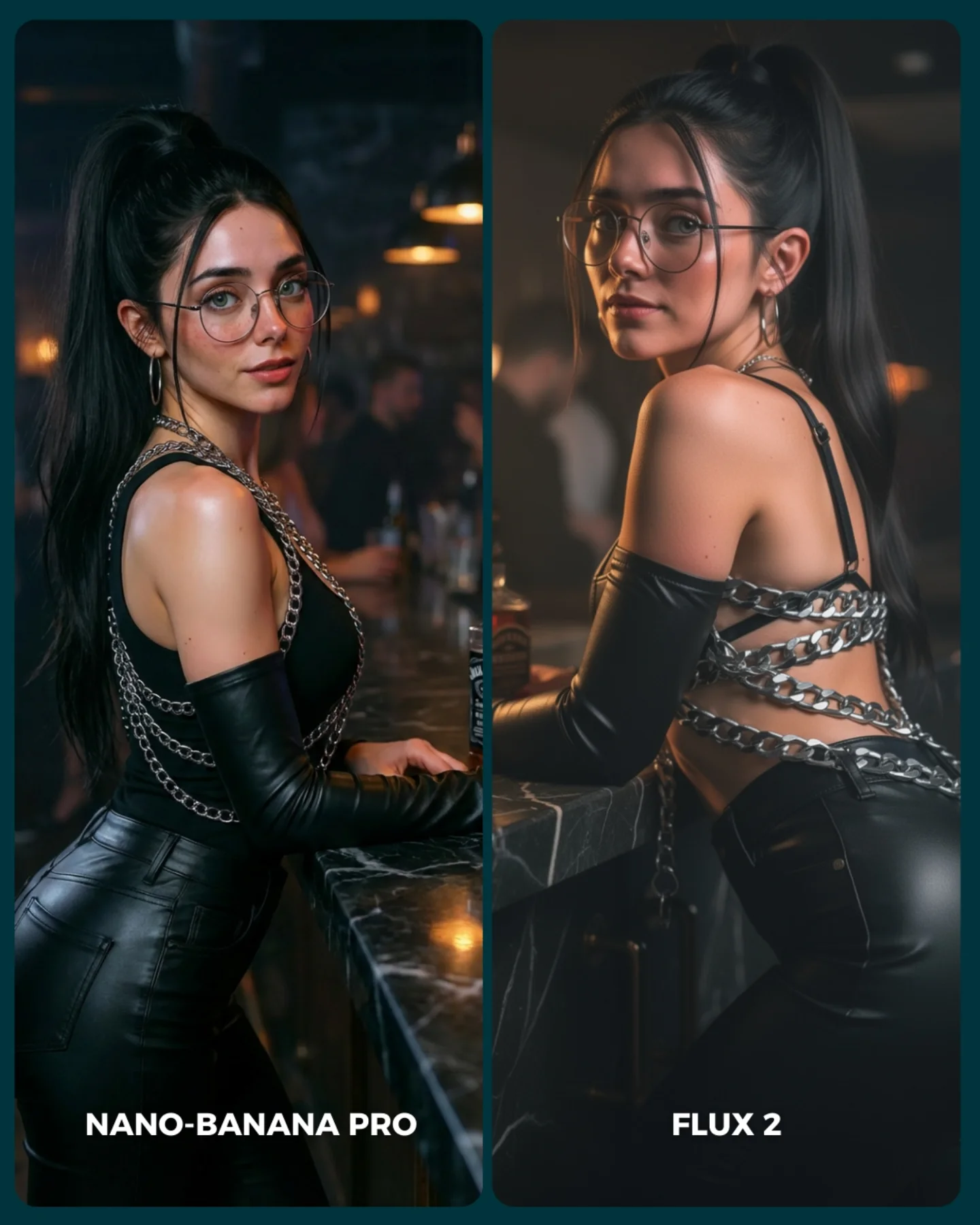
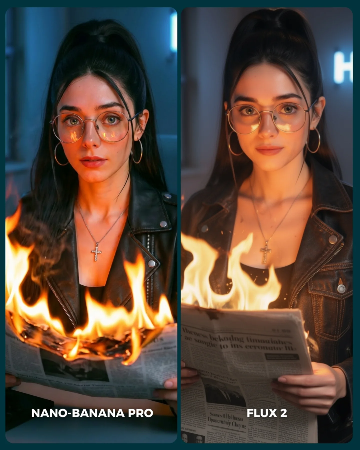
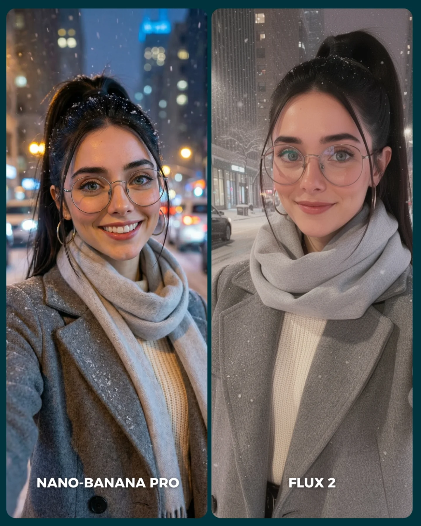
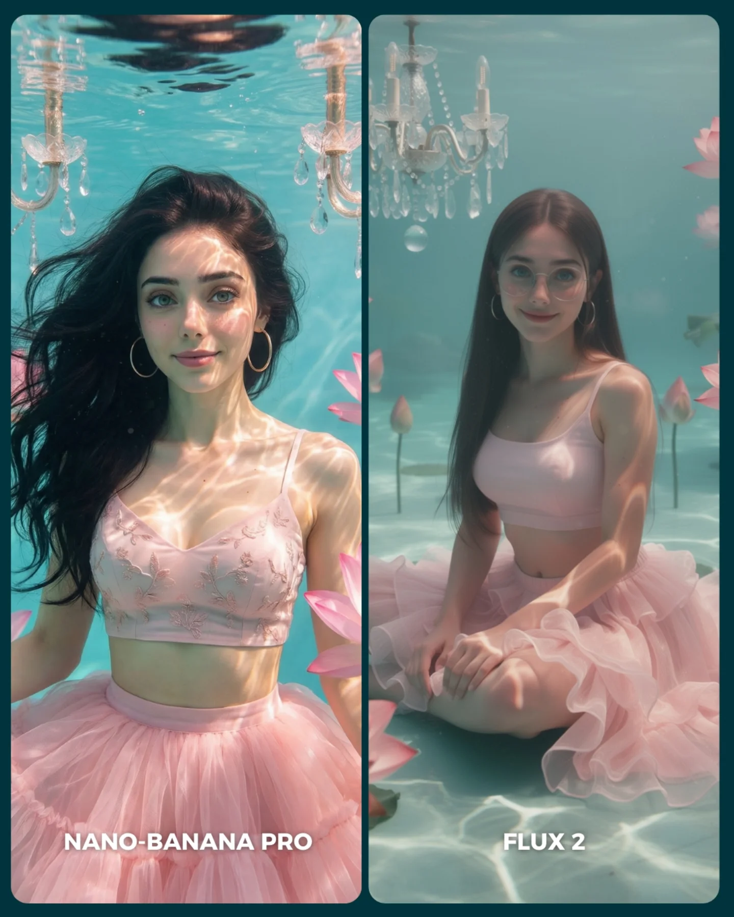
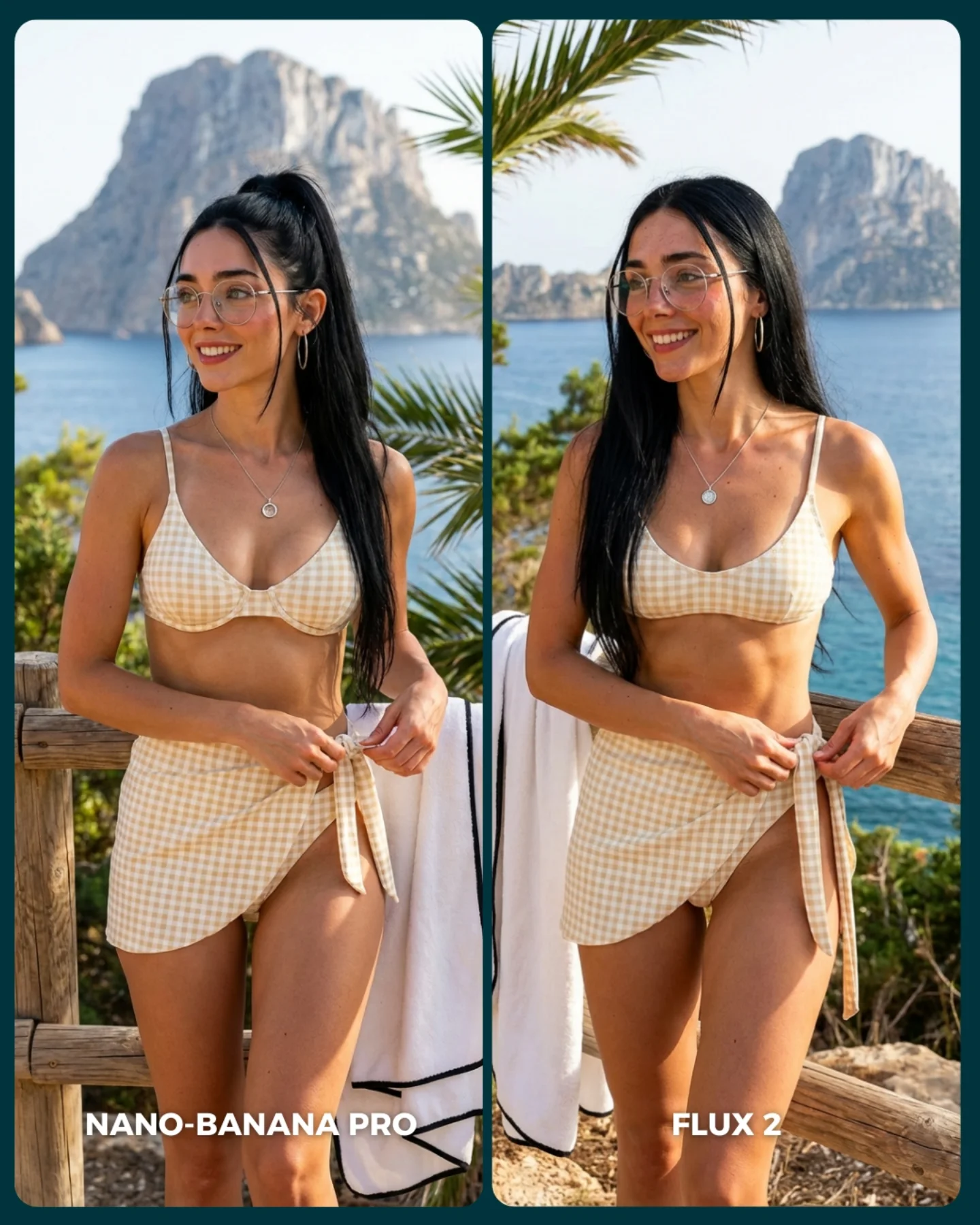
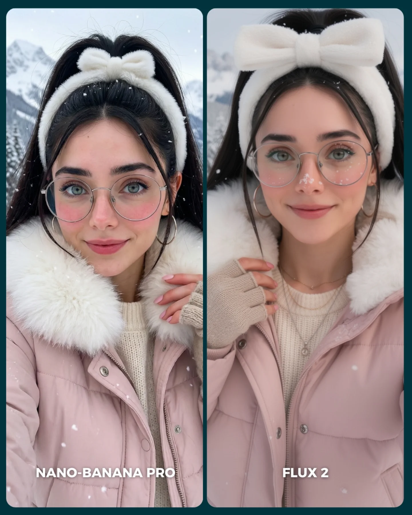
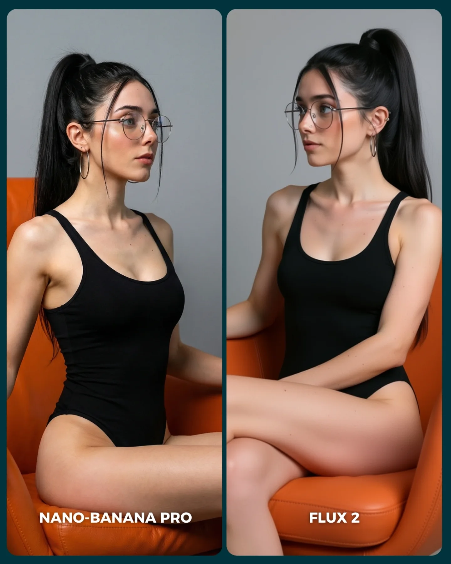
The first thing this image gets right is control. Even though it is a side-by-side comparison post, it does not feel like a technical test sheet. It still reads as a fashion image. The same woman appears in both frames with nearly identical styling, the same bar setting, the same mood, and the same dark glamour palette. That consistency is what makes the comparison useful. Your eye is not distracted by random scene changes. It can focus on rendering differences, pose nuance, and material handling.
There is also a strong lesson here for creators who post AI image tests on social platforms. Most comparison posts die because they look like lab experiments. This one performs better because it borrows from nightlife editorial language: marble bar, amber bokeh, black faux leather, silver chains, over-the-shoulder eye contact, and a clean split layout. The content says “comparison,” but the styling says “desirable image.” That tension is what gives it scroll-stopping power.
What Actually Creates The Hook
The hook is not just the model-vs-model premise. It is the fact that both outputs are visually legible at phone size. The silhouette is clean, the background is soft, and the outfit has enough specular detail to read instantly. The composition also keeps both panels emotionally alive: one side gives a more frontal, conversational glance, while the other side turns into a more dramatic back-and-shoulder pose. That small directional change is enough to make viewers compare, which is exactly what the post wants them to do.
Another reason it travels is that the styling is familiar but still aspirational. The image sits in a zone creators understand well: beauty portrait, nightlife mood, fashion attitude, easy-to-read contrast. It is not so experimental that viewers have to decode it. That makes it a good format for testing tools publicly because the audience can judge output quality fast.
Signal
Evidence (from this image)
Mechanism
Replication Action
Controlled A/B framing
Two nearly matched portrait panels show the same woman, wardrobe, and bar setup
Consistency removes noise and makes visual differences easier to notice
Lock subject, wardrobe, and environment first; only vary angle or renderer between versions
Material readability
Glossy gloves, black fitted fabric, and silver chains catch light immediately
Reflective surfaces create instant phone-screen contrast and premium texture cues
Use one high-shine material and one metallic accent rather than stacking too many textures
Nightlife intimacy
Blurred warm lamps, dark bar, and close body framing create a lounge atmosphere
Moody environments feel more cinematic and help glamour portraits look expensive
Keep the background soft, dim, and warm; avoid busy signage or high-detail shelves
Pose contrast without chaos
One panel faces more frontally, the other emphasizes the back and shoulder line
Small pose shifts encourage comparison while preserving stylistic cohesion
Test one pose variable at a time: shoulder turn, chin angle, or hand placement
How The Aesthetic Is Built
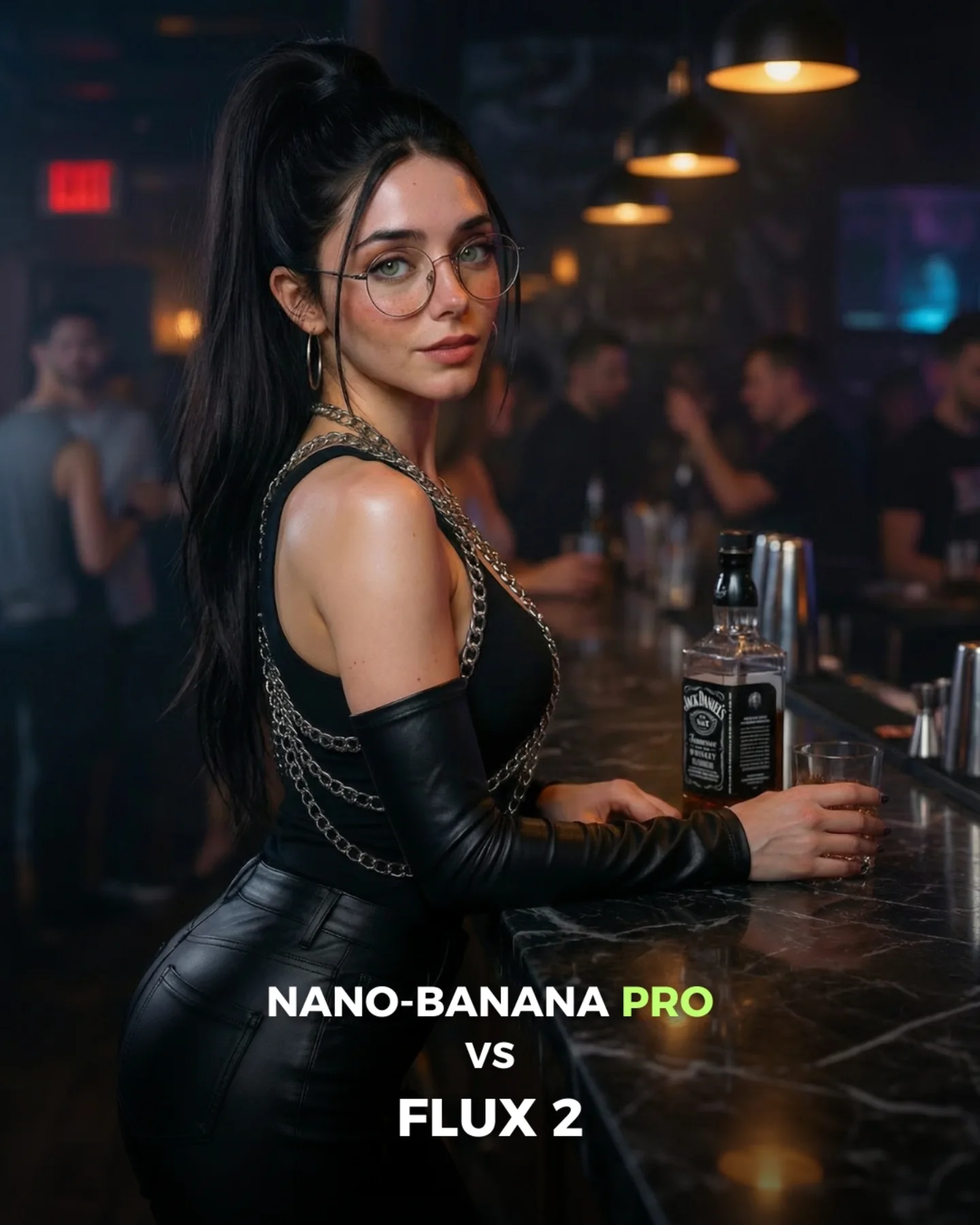
The image leans on a narrow but effective palette: black, silver, skin tone, and warm amber. That is enough. When creators add extra colors to this kind of concept, the comparison usually gets cheaper, not richer. Here, the whole frame feels disciplined because the light is allowed to do the decorative work. Warm bulbs in the background provide atmosphere, while the subject remains cool, clean, and sharply separated from the room.
The second important choice is how the bar counter is used. It is not just a prop. It acts like a stabilizing line running through both frames, which keeps the comparison grounded. Then the styling does the rest: high ponytail for shape, round glasses for identity, chain details for visual rhythm, and open-back construction for silhouette contrast. None of those choices are random. They are all promptable features that survive compression well.
Observed
Why it matters for recreation
Warm practical bokeh behind a dark subject
Builds depth fast without stealing attention from the face and outfit
Rounded split panels with a clean divider
Makes the comparison format feel intentional and easy to parse
Glossy black materials with metallic chain accents
Creates strong contrast and a premium nightlife-fashion signal
Face visible in both panels despite pose change
Keeps identity continuity, which is essential for any generator comparison
Countertop leading line across lower frame
Anchors the body pose and gives the image a believable location
Best Fits, Weak Fits, And Transfers
Best for generator comparison posts because the styling is stable enough to reveal quality differences clearly.
Best for AI glamour tutorials because the image contains useful prompt knobs: material, light temperature, lens feel, and pose geometry.
Best for social teasers around new model releases because the layout naturally invites comments and side-picking.
Best for brand-adjacent nightlife fashion concepts when you want mood without requiring a full environment build.
This format is less ideal for storytelling scenes, comedy content, or product-centric ads. It depends on a tight image language and on the audience enjoying comparison as the core interaction. If your concept needs narrative progression, a split glamour board will feel static.
Transfer Recipes
Keep: split comparison layout, warm bar bokeh, glossy material response. Change: swap nightclub styling for red satin dress or tailored blazer. Slot template: "{venue} portrait comparison, same woman, {wardrobe}, warm practical bokeh, two pose variants"
Keep: same-subject consistency and minimal palette. Change: move from bar counter to vanity mirror, hotel desk, or rooftop railing. Slot template: "{location anchor}, identical subject styling, left panel {pose A}, right panel {pose B}, moody cinematic light"
Keep: one reflective hero material plus one metallic accent. Change: convert nightlife glamour into sci-fi clubwear, biker fashion, or futuristic latex styling. Slot template: "{style genre} comparison portrait, glossy material, metallic accents, soft amber background lights"
Prompt Blocks That Matter Most
Prompt chunk
What it controls
Swap ideas (EN, 2-3 options)
Identity anchor
Keeps the same woman readable across both panels
high ponytail with round glasses; sleek bun with cat-eye glasses; loose waves with no eyewear
Hero material
Determines whether the image reads premium, soft, edgy, or cheap
Stops the background from drifting into generic blur
dark marble bar; hotel cocktail lounge; dim jazz club counter
Pose delta
Creates comparison energy without breaking continuity
front three-quarter vs over-shoulder; seated vs leaning; direct gaze vs side glance
Light temperature
Sets the emotional mood of the image
warm amber bokeh; cool blue edge light; mixed tungsten and soft neutral key
Layout rule
Keeps the visual test readable as a comparison asset
two rounded panels; diptych with thin divider; magazine-style split spread
Execution Playbook For Remixing It
Baseline lock the following three things first: same-subject identity across both panels, the moody amber nightlife lighting, and the split-panel composition. Those are the non-negotiables. If you lose any one of them, the image stops feeling like a premium comparison and turns into two unrelated portraits.
After that, use a one-change rule. Run a sequence like this:
Get the left and right panel composition stable with matching subject identity.
Refine the wardrobe material until the glossy blacks and chain highlights read cleanly at small size.
Adjust only the pose delta between the two panels, such as shoulder turn or chin direction.
Test mood refinements last by changing bokeh warmth, haze level, or countertop reflectivity.
This workflow is especially useful when testing generators against each other. If you change too many variables at once, you are no longer comparing render quality. You are comparing prompt instability.