FLUX 2 vs. Nano Banana PRO 💥
Cada vez que aparece un nuevo generador de imágenes, me encanta ponerlo a prueba frente al mejor del momento y ver qué tan lejos puede llegar 🙊
Si te da curiosidad probarlo, lo tienes disponible directamente en @freepik 💕
Why soy_aria_cruz's FLUX 2 vs Nano Banana PRO Bedroom Selfie Comparison Went Viral — and the Formula Behind It
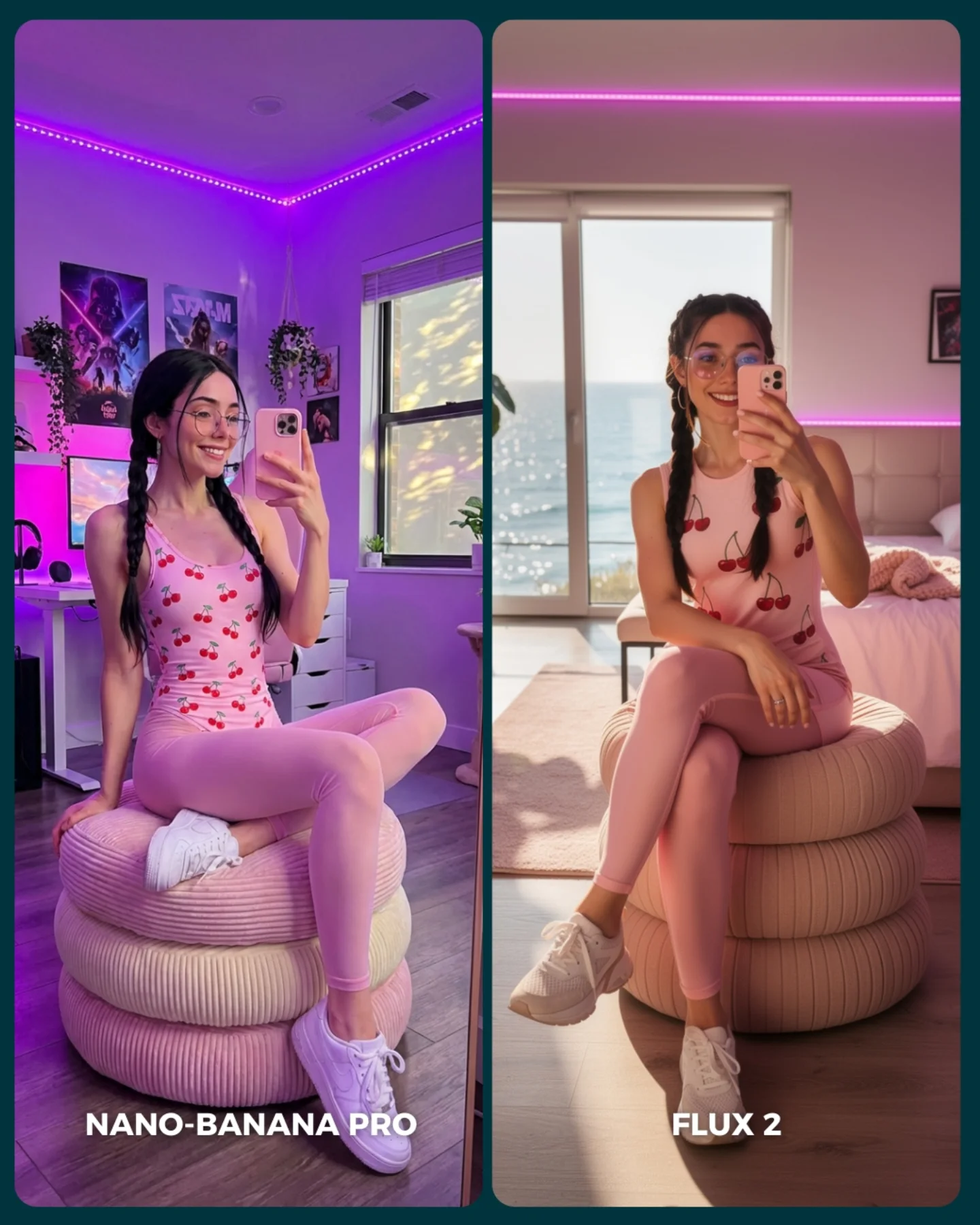
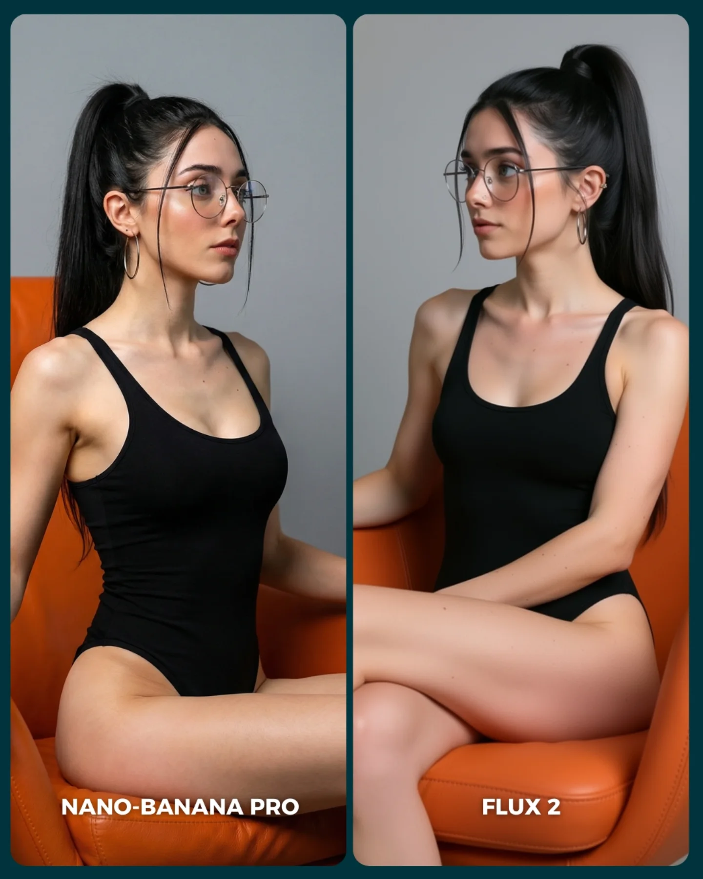
This comparison is useful because it does more than ask which face looks better. It tests whether a model can hold the same identity and pose while moving across two different interior-lighting worlds. That is a better stress test than many direct comparisons, because real creator content often depends on the same subject surviving different room setups without losing coherence.
For creators, that is the main lesson here. If you only compare models under one flat lighting condition, you learn very little about how they behave in the environments people actually post. This image is smarter. It keeps the subject, styling, and pose stable, but asks the models to solve two different room moods: saturated LED-nightlife bedroom energy on one side and bright daylight lifestyle softness on the other.
The seated ottoman pose is also doing a lot of hidden work. It gives the body a simple, repeatable geometry that still exposes plenty of risk points: leg overlap, hand placement, sneaker shape, fabric stretch, and braids. That makes the comparison far more useful than a simple headshot or standing pose would have been.
Signal
Evidence (from this image)
Mechanism
Replication Action
Controlled identity test
Same braids, same glasses, same pink outfit, same ottoman pose in both panels
Stable subject design makes differences attributable to the generator, not to prompt drift
Lock the face, hairstyle, outfit, and body geometry before testing model differences
Lighting-world comparison
Left panel uses purple LED room light; right panel uses daylight bedroom light
Different room moods reveal how well a model preserves identity across environments
Compare the same prompt idea under one artificial-light room and one natural-light room
Lifestyle realism stress
Ottoman shape, sneakers, room decor, bed, desk, window, and city view all remain readable
Ordinary creator-room objects are where many models quietly fail consistency
Use familiar interior props that expose subtle rendering weaknesses instead of purely decorative sets
Where this format transfers best
This kind of image works especially well for AI model benchmarks, creator-room prompt tutorials, consistency tests across lighting conditions, and audience-vote carousel covers. It is also helpful for SEO pages because it teaches viewers how to design a fair comparison. It is less suitable for single-image mood posts, because the whole point is controlled evaluation rather than immersive storytelling.
Best fit: model benchmark posts. Why it fits: viewers can compare identity, room logic, and fabric handling at a glance. What to change: keep the subject constant and vary only the generator or one environmental variable.
Best fit: prompt education pages. Why it fits: the image demonstrates a clean way to isolate lighting-world differences. What to change: explain which details should be judged, such as braids, hands, ottoman shape, and room consistency.
Best fit: audience-vote covers. Why it fits: the split layout is instantly understandable and highly interactive. What to change: keep labels large enough to read on mobile.
Not ideal: story-first carousels. Reason: the comparison structure interrupts narrative flow on purpose.
Not ideal: fashion-only editorials. Reason: the key question here is model behavior, not wardrobe styling alone.
Three transfer recipes are especially useful. Keep the same sitter, same furniture, and same pose. Change only the model, or one room-light variable if you are testing environmental stability. Template one: {same subject} in {same seated pose} inside {room mood A} vs {room mood B}. Template two: {identity consistency benchmark} using {matching styling} under {different interior light logic}. Template three: {creator-room comparison cover} designed for {binary audience evaluation}.
What the image teaches aesthetically
Aesthetically, the image works because the subject styling is intentionally simple and sweet. Braids, a pink outfit, and a soft ottoman are enough to create a consistent visual identity, but not so much that the room signals get drowned out. That balance is exactly what you want in a comparison image. The subject has enough detail to stress the model, while the environment still matters.
The two rooms are also well chosen because they contrast clearly without feeling unrelated. Both are believable spaces for a creator selfie, but one leans into artificial atmosphere and the other into daylight softness. That gives the viewer a fair visual decision rather than a gimmick.
Observed
Why it matters
Same seated pose and body angle across both panels
Keeps the test fair and lowers interpretation noise
Braids, glasses, and pink outfit repeated
Create strong identity anchors for evaluating consistency
Left LED-lit room versus right daylight bedroom
Show how different lighting worlds stress the same subject differently
Ribbed ottoman and sneakers visible in both panels
Add object-consistency checks beyond the face alone
Prompt technique breakdown
Prompt chunk
What it controls
Swap ideas (EN)
same woman, same braids, same pose
Comparison fairness and identity continuity
same standing pose, same bed-edge pose, same mirror pose
pink creator-room outfit
Soft lifestyle identity and fabric consistency
blue lounge set, black athleisure set, white pajama look
LED bedroom versus daylight bedroom
Environmental mood comparison
sunset room versus rainy window light, studio flash versus lamp light
Lock three things first: the subject identity anchors, the ottoman pose, and the split layout. Then change one variable at a time. A strong sequence is:
Start with the current version: same woman, same styling, two room moods, two model outputs.
Keep the models fixed and test a second pose that stresses hands or legs differently.
Keep the pose fixed and change only the interior-lighting conditions.
Only after that, add more room complexity such as mirrors, posters, or plants.
This order matters because the image is useful only as long as the test remains controlled. Once too many variables move, the comparison stops teaching anything.