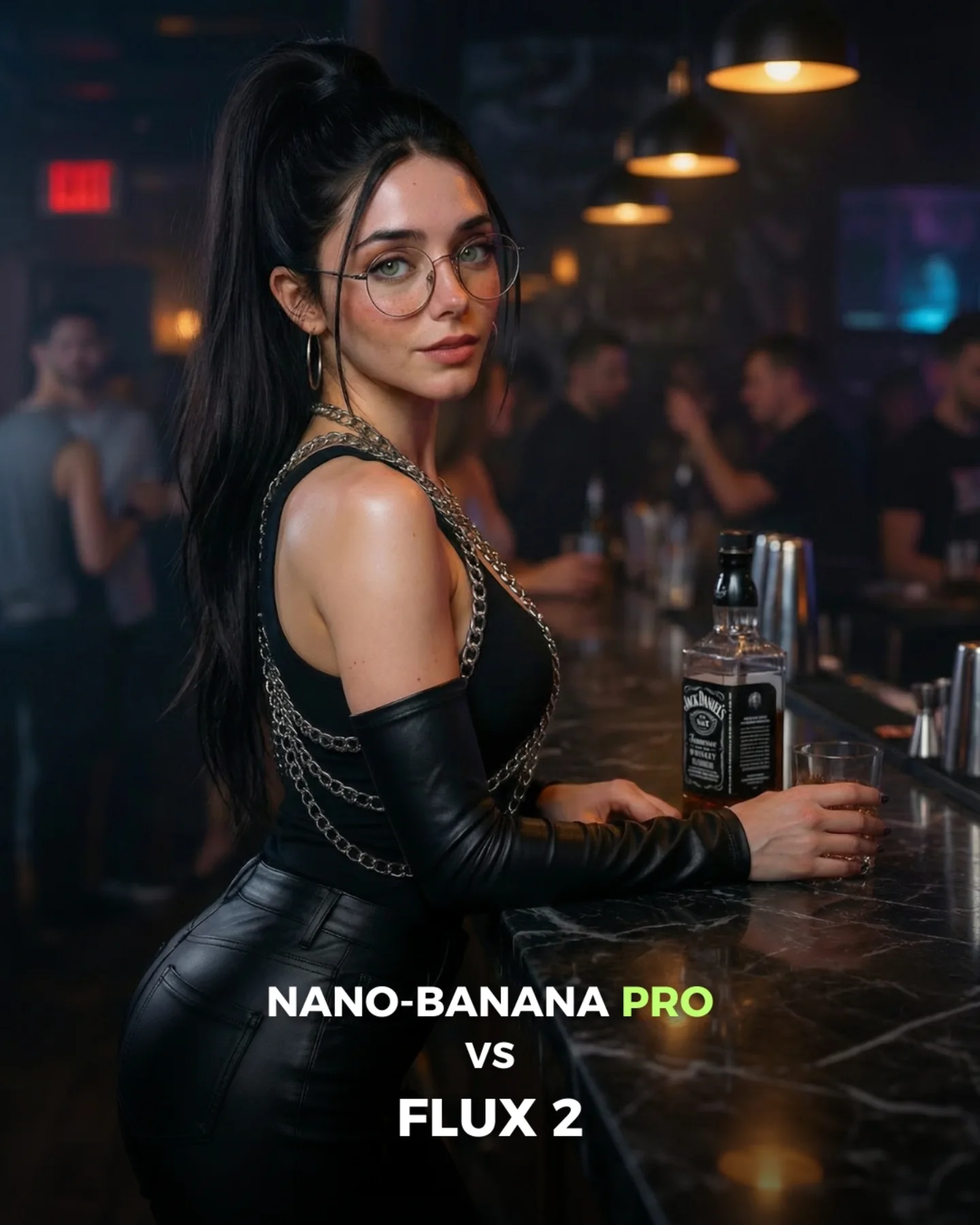
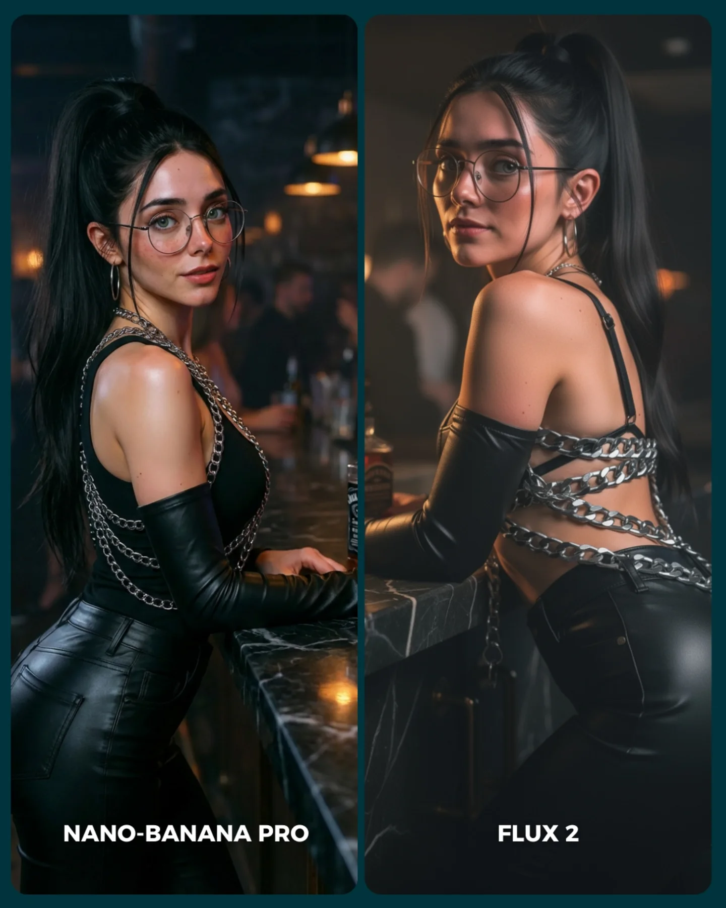
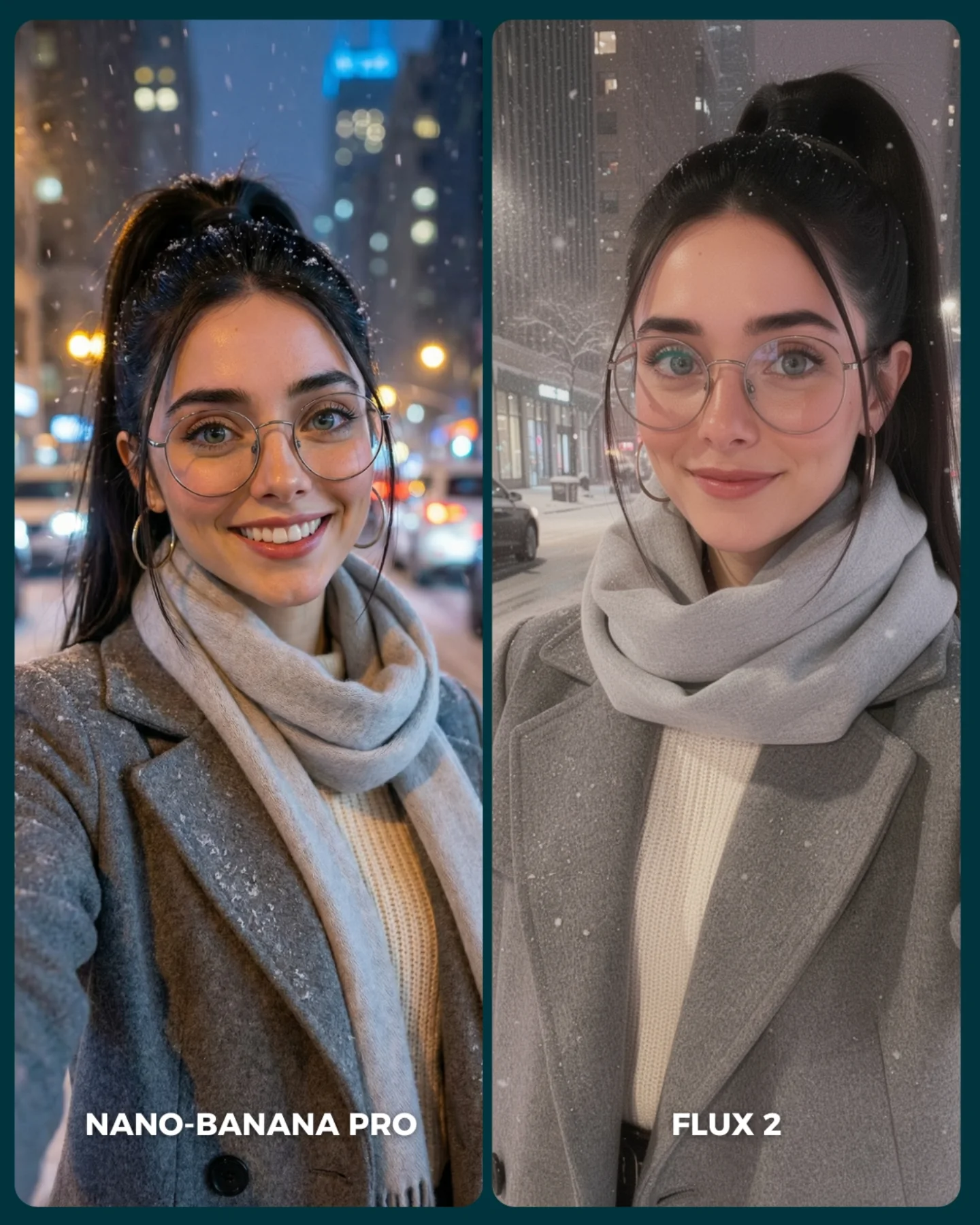
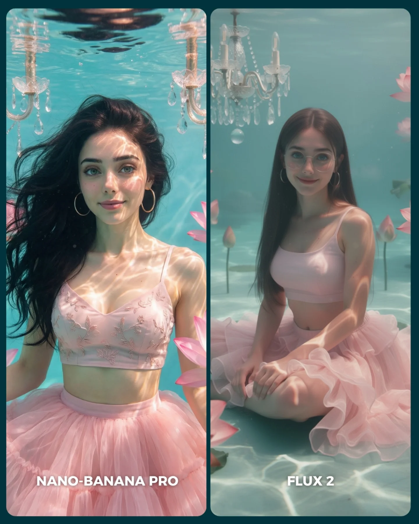
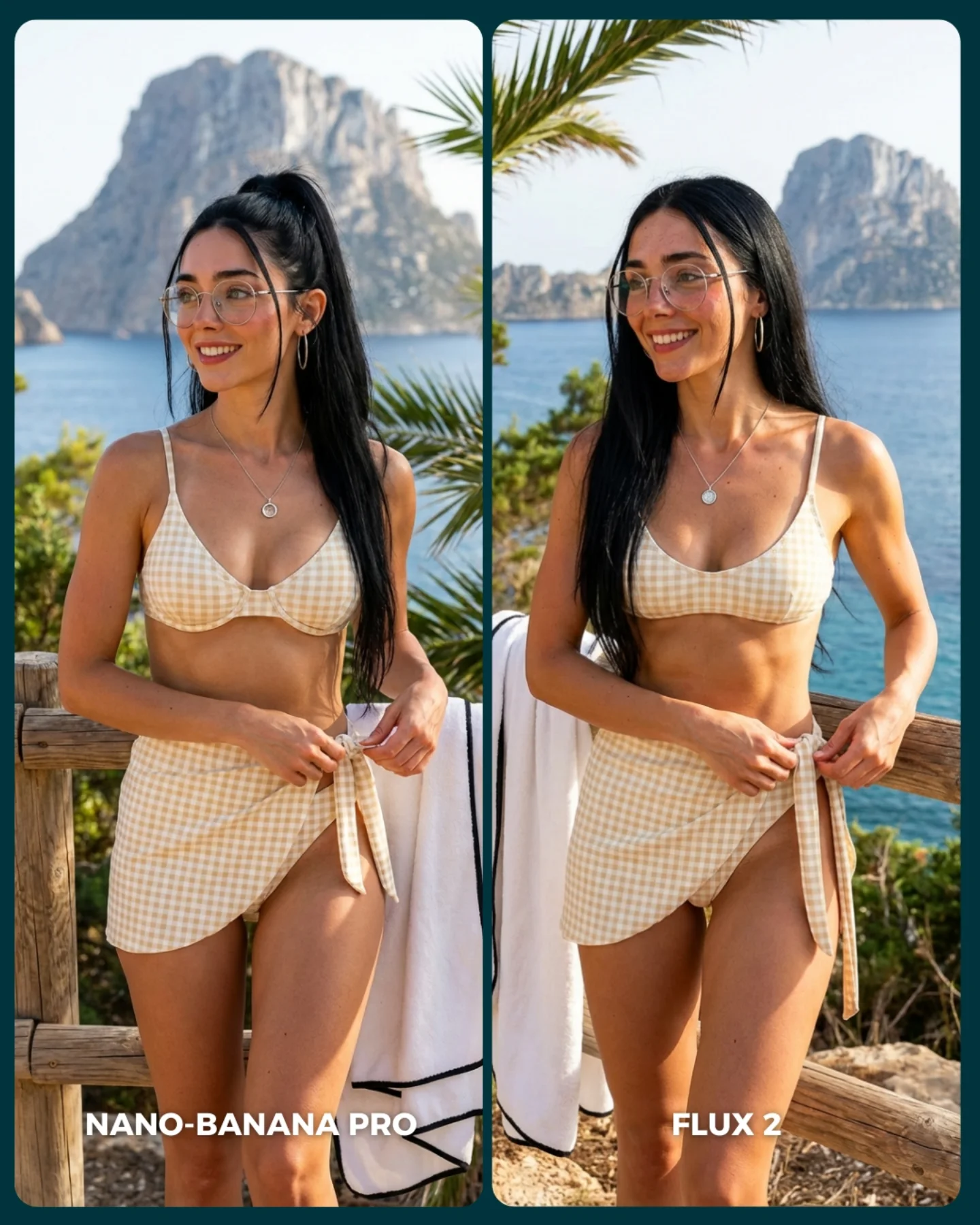
FLUX 2 vs. Nano Banana PRO 💥
Cada vez que aparece un nuevo generador de imágenes, me encanta ponerlo a prueba frente al mejor del momento y ver qué tan lejos puede llegar 🙊
Si te da curiosidad probarlo, lo tienes disponible directamente en @freepik 💕
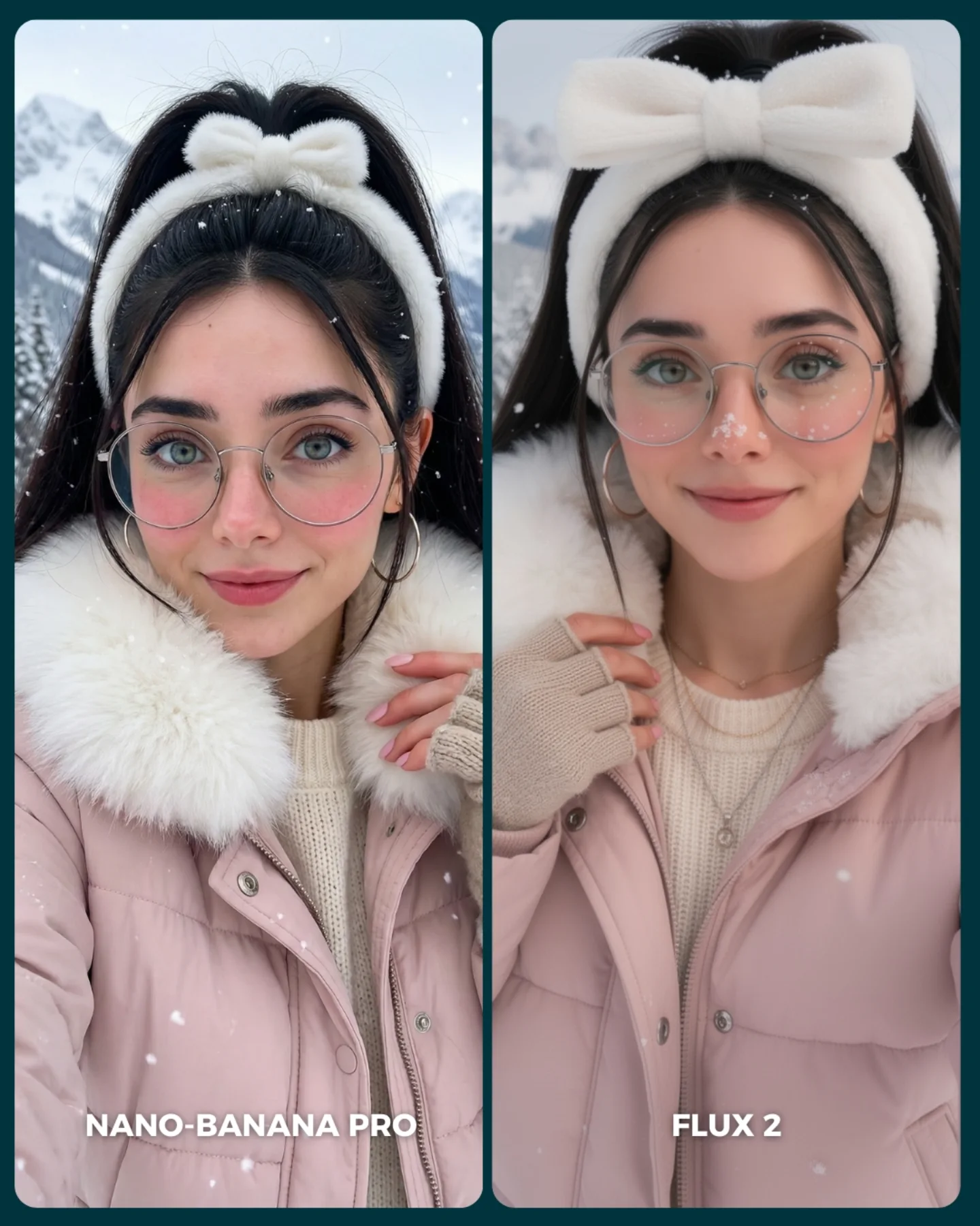
Why soy_aria_cruz's FLUX 2 vs Nano Banana PRO Red Fuzzy Hoodie Portrait Went Viral — and the Formula Behind It
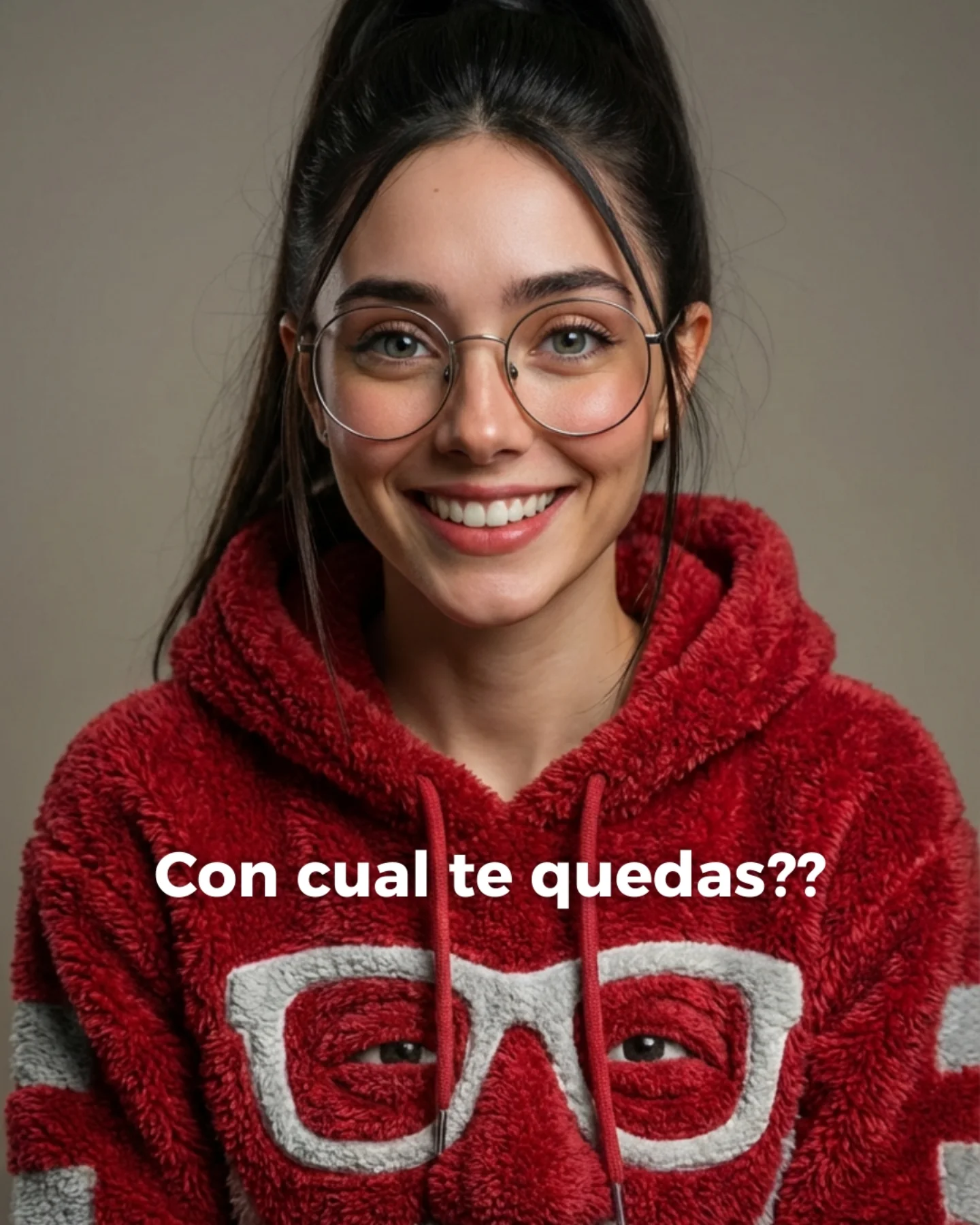
This image is a good reminder that comparison content does not always need spectacle. There is no sci-fi set, no dramatic action pose, no cinematic environment. It is just a centered smiling portrait, a plush red hoodie, a neutral background, and one very readable identity anchor: round glasses with a matching glasses motif on the garment. That simplicity is exactly why it works. When creators compare image models, a clean portrait like this reveals face rendering, textile handling, and eye contact much more honestly than a noisy scene ever could.
The other thing it gets right is emotional accessibility. A lot of AI test images feel cold because they are optimized only for detail. This one feels warm. The smile is open, the light is soft, the background is calm, and the hoodie adds tactile comfort. That makes the image easier to stop on and easier to judge. Viewers do not need to decode the concept before reacting. They understand it instantly, which is useful for any public comparison post built for comments and quick opinions.
Where The Strength Really Comes From
The strongest part of the image is not complexity. It is clarity. The subject is centered, the palette is limited, and the whole frame is organized around recognizability. The face is clean and front-facing, the eyes are visible through the glasses, and the clothing texture is strong enough to read even on a small screen. That means the viewer can spend attention on quality, not on orientation.
This also explains why this kind of image is effective for model-vs-model posts. Portraits expose weakness quickly. If a generator mishandles symmetry, eyewear, teeth, skin texture, fleece detail, or eye sharpness, the audience notices immediately. So even though the frame looks simple, it is actually a high-pressure test. For creators, that is valuable. You can compare tools without burying the comparison under unnecessary scene design.
Signal
Evidence (from this image)
Mechanism
Replication Action
Immediate face readability
The portrait is straight-on, centered, smiling, and evenly lit
Front-facing clarity gives viewers an instant emotional read and makes quality differences obvious
Lock eye-level camera, direct gaze, and a symmetrical crop before changing any styling variables
Texture contrast
The red fuzzy hoodie carries strong tactile detail against a smooth background
One dominant texture makes the render feel richer without introducing chaos
Choose one hero fabric and make sure lighting is soft enough to reveal its surface clearly
Identity anchors
Round glasses, high ponytail, and the white glasses motif on the hoodie all repeat the same visual idea
Repeated cues make the subject memorable and easy to compare across generator outputs
Use 2-3 consistent identity markers and keep them fixed across every test image
Low-noise comparison frame
Plain studio background and minimal palette remove distractions
A clean frame helps audiences judge rendering quality faster and comment more decisively
Reduce the background to one neutral tone whenever the real goal is quality comparison
What Makes The Aesthetic Feel Friendly
The image has a distinctly soft visual rhythm. Rounded glasses, rounded cheeks, a plush hood, gentle light, and a simple centered crop all point in the same direction. Nothing is aggressive. That matters because softness often performs better than sharp drama in creator-facing audiences, especially when the account is blending AI education with approachable personality content.
The color choice does a lot of work too. The strong red hoodie adds enough saturation to make the image pop in-feed, while the neutral background prevents that red from turning loud. Then the white glasses motif on the chest gives the lower frame a graphic element that echoes the real glasses on the face. It is a neat design loop. The image feels coherent because the outfit participates in the identity story, not just the styling.
Observed
Why it matters for recreation
Centered eye-level framing
Builds trust and makes the portrait feel conversational instead of posed from a distance
Soft neutral-warm studio light
Preserves skin tone and fleece detail while keeping the mood inviting
Single bold garment color against muted background
Creates strong feed visibility without needing a complicated environment
Round eyewear repeated by the hoodie graphic
Turns a simple accessory into a memorable visual signature
Minimal background information
Lets viewers compare generator quality through the face and fabric, not scene noise
Best Uses, Bad Uses, And Transfers
Best for model comparison posts because the portrait is stripped down enough to reveal rendering differences honestly.
Best for creator-brand headshots where you want AI polish but still need warmth and relatability.
Best for prompt tutorials focused on facial realism, eyewear, and textured casual clothing.
Best for seasonal or casual campaign variations where changing one garment color can refresh the whole frame.
This setup is less ideal for luxury editorial, narrative storytelling, or product-heavy content. It is strongest when the face is the event and the clothing texture is the main supporting signal. If you need environment, action, or narrative tension, this portrait language will feel too static.
Transfer Recipes
Keep: centered portrait composition, soft beauty light, one textured garment. Change: swap fleece hoodie for knit sweater, varsity jacket, or pastel cardigan. Slot template: "{subject} centered studio portrait, direct smile, {textured garment}, plain neutral backdrop"
Keep: glasses as identity anchor and minimal background noise. Change: shift mood from cozy to smart-casual, tech-founder, or academic portrait. Slot template: "{expression} portrait with round glasses, {hairstyle}, {wardrobe}, soft even light"
Keep: friendly front-facing eye contact and restrained palette. Change: replace color strategy with forest green, cream, or cobalt blue for a new campaign family. Slot template: "{color garment} close portrait, direct gaze, clean background, tactile fabric detail"
Prompt Technique Breakdown
Prompt chunk
What it controls
Swap ideas (EN, 2-3 options)
Face orientation
Determines whether the portrait feels intimate, editorial, or distant
straight-on direct gaze; three-quarter smile; slight downward chin with eye contact
Identity marker
Keeps the subject memorable across multiple renders or model tests
round glasses; freckles; signature fringe bangs
Hero fabric
Creates tactile interest without needing extra props
bold red against neutral; monochrome cream palette; pastel blue with soft gray backdrop
How To Remix It Without Breaking The Format
Start by locking three things: the symmetrical eye-level crop, the direct smile, and the soft studio lighting. Those are the structural reasons the image feels clear and trustworthy. If one of those drifts, the portrait becomes less useful as a comparison asset.
Then apply a one-change rule across iterations:
First nail the face: eyes, glasses, smile, and high ponytail must all be consistent.
Next refine the hoodie fabric so the fleece texture reads naturally without looking synthetic.
Then test color swaps or garment swaps one at a time.
Finally adjust small polish variables like background warmth or catchlight intensity.
That sequence keeps the portrait stable while still giving you room to explore style. For creators comparing generators, it also makes your results more interpretable. You want people discussing quality, not guessing which variables changed.