Why soy_aria_cruz's FLUX 2 vs Nano Banana PRO Studio Chair Portrait Comparison Went Viral — and the Formula Behind It
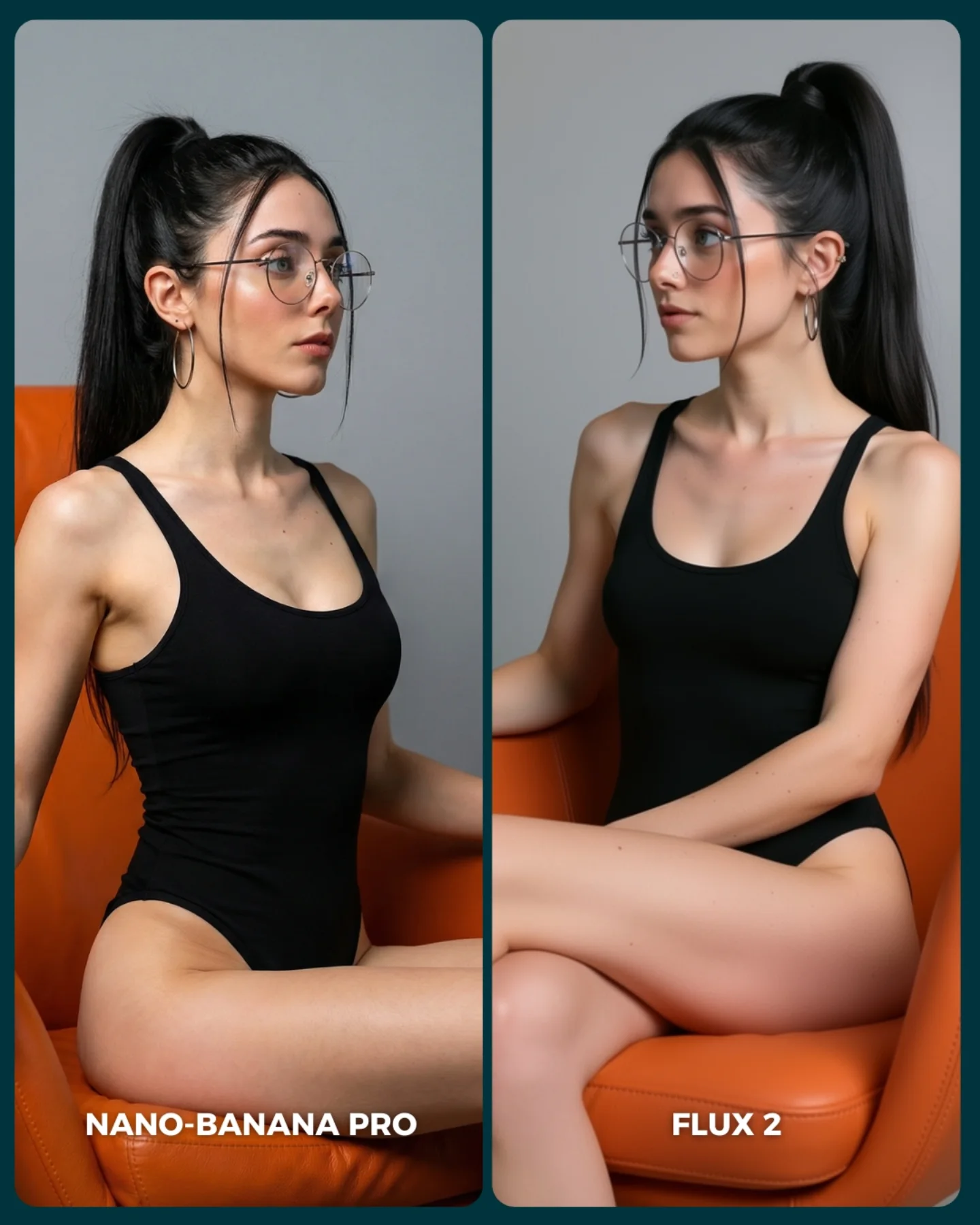
This image works because it strips the benchmark down to the essentials. There is no dramatic prop, no cinematic lighting trick, and no complex background trying to win attention for the models. Instead, the comparison focuses on what really matters in a clean portrait test: anatomy, facial consistency, fabric behavior, posture, chair geometry, and subtle material rendering. That simplicity is what makes the post valuable.
For creators, this is an important reminder that not every benchmark should rely on spectacle. Sometimes the strongest comparison is the one that removes excuses. When the scene is this controlled, viewers can judge fine differences more confidently. That makes the post more useful as evidence and more likely to spark concrete discussion instead of vague hype.
Why this comparison format feels credible
The strongest mechanism here is reduction. By keeping the gray background plain, the outfit minimal, and the chair bold but simple, the post narrows the viewer’s attention to a few critical questions: Which model handles seated anatomy better? Which one keeps the face more stable? Which one renders the chair and fabric more convincingly? Those are productive questions, and the image makes them easy to ask.
The second strength is that the scene is visually clean enough to survive in a feed. The orange chair provides immediate contrast, so the post still catches the eye. But unlike a fire scene or a fantasy comparison, the attention hook does not interfere with evaluation. That balance between scroll-stopping color and benchmark clarity is exactly what makes this kind of image useful.
| Signal | Evidence (from this image) | Mechanism | Replication Action |
|---|
| Controlled testing environment | Plain gray backdrop, same chair, same styling, and nearly identical subject framing | Reduces noise so viewers can compare rendering quality directly | Use a stripped-back set whenever the goal is to test anatomy and realism |
| Strong color anchor | The orange chair creates clear visual structure without adding clutter | Keeps the image noticeable in a feed while preserving test clarity | Choose one bold furniture or prop color and keep everything else neutral |
| Pose-based difficulty | Seated body angles, crossed legs, and arm placement expose model weaknesses | Posture reveals errors more effectively than static standing beauty shots | Use seated or leaning poses when benchmarking anatomy consistency |
Where this style is most effective
This format is ideal for AI tool reviewers, prompt educators, creator pages that compare outputs seriously, and anyone building a reusable library of benchmark scenes. It is especially useful when you want to test body proportions, seat interaction, or identity consistency across multiple models.
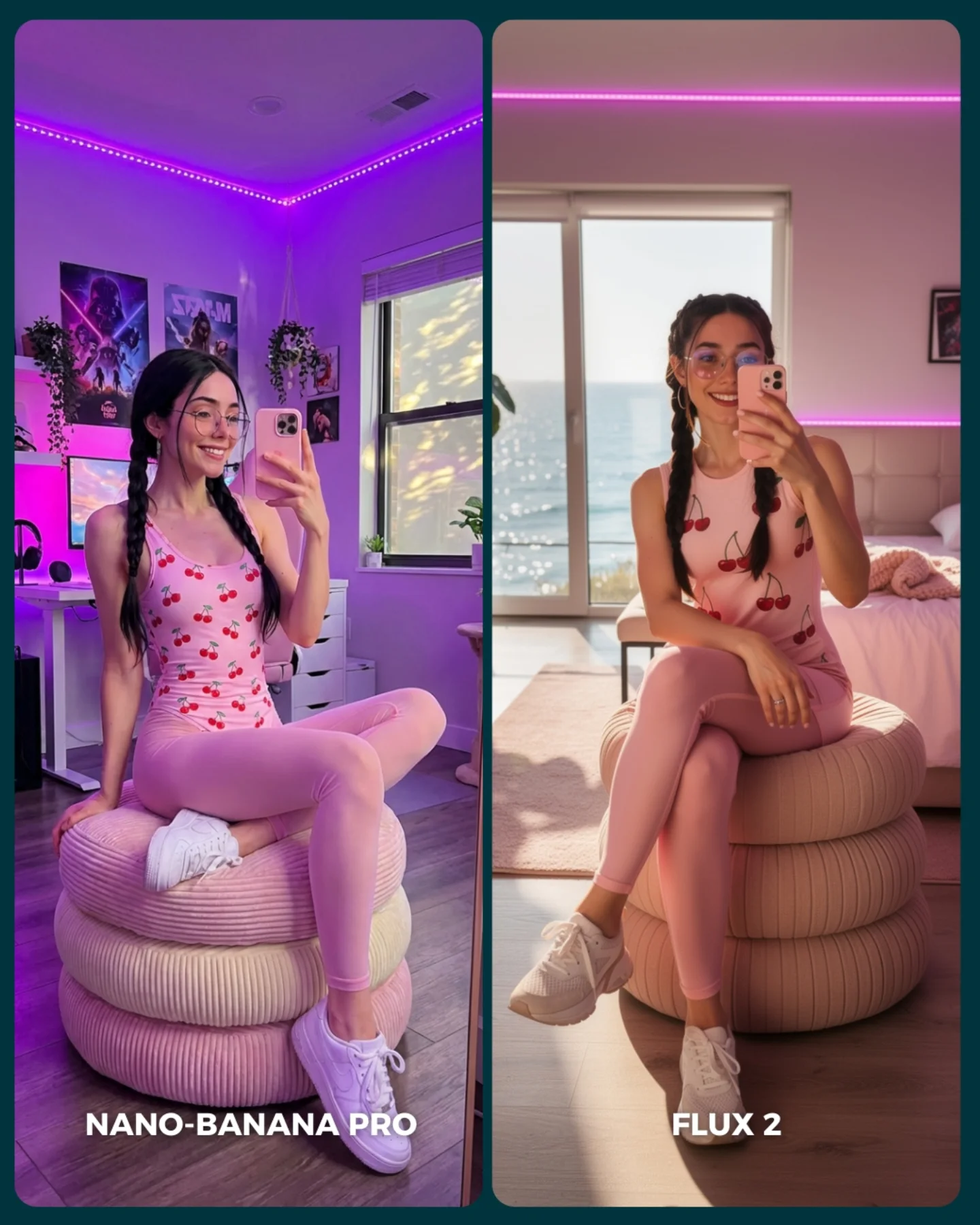
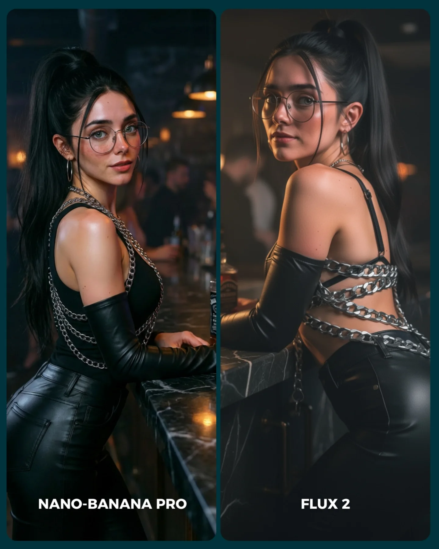
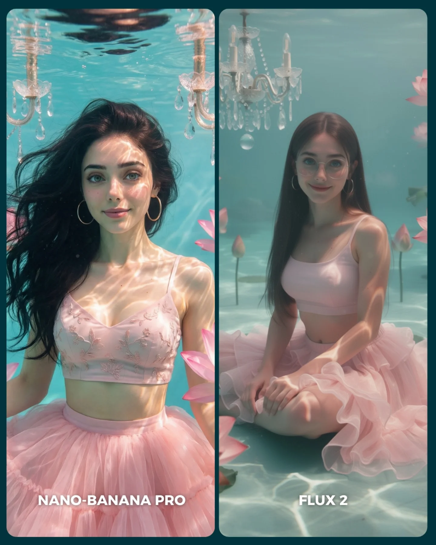
It is less useful for pages chasing broad emotional virality. The image is informative first, dramatic second. That is a strength if your audience values comparison. It is a weakness if your audience mostly wants spectacle or fantasy mood.
- Best fit: benchmark creators. Why fit: the scene is controlled enough to support meaningful side-by-side judgment. What to change: vary pose complexity while keeping the set fixed.
- Best fit: prompt tutorial accounts. Why fit: the image teaches how clean environments reveal rendering differences. What to change: explain which body landmarks to inspect in each run.
- Best fit: commercial-style realism testers. Why fit: the studio setup reflects the kind of controlled imagery brands often need. What to change: swap chair shape, fabric type, or crop style.
- Not ideal: fantasy remix pages. Reason: the image intentionally avoids narrative and spectacle.
- Not ideal: fashion-first editorial feeds. Reason: the styling is too restrained to function as expressive fashion content.
Transfer recipes
- Keep: split-screen layout, same outfit, and same chair. Change: the pose type from profile sit to reclined or leaned-forward sit. Slot template: "{same subject} seated in {single bold chair color} for {model A} vs {model B}"
- Keep: clean backdrop and one furniture anchor. Change: the garment from bodysuit to knit dress or jacket-trouser set. Slot template: "{minimal studio benchmark} testing {garment behavior} across models"
- Keep: fixed composition and bottom labels. Change: the realism challenge to hand placement, crossed legs, or asymmetric pose. Slot template: "{controlled portrait test} focused on {specific anatomy challenge}"
What the image gets right aesthetically
The best aesthetic decision here is restraint. The scene uses only a few visual ingredients: black clothing, orange chair, gray backdrop, clean skin, and soft light. That economy creates clarity. It also makes any rendering inconsistency more obvious, which is exactly what a benchmark should do.
The chair color is especially effective because it gives the frame identity without becoming a prop gimmick. It also helps viewers track edge quality, material realism, and contact points between body and furniture. That is a good prompt-design lesson: the best benchmark props are often structurally useful, not merely decorative.
| Observed | Why it matters for recreation |
|---|
| Two nearly identical seated portrait panels | Make comparison feel fair and readable |
| Orange chair against gray backdrop | Provides one strong contrast layer without clutter |
| Simple black bodysuit | Reveals anatomy and posture clearly |
| Soft neutral studio light | Shows texture and form without dramatic distractions |
| Glasses, hoops, and high ponytail preserved in both panels | Help evaluate subject consistency across models |
Prompt chunks worth locking first
If you want this type of benchmark to work, begin with the controlled environment, not the subject styling. The scene earns its value from sameness. Once the environment is fixed, the pose and anatomy become the real test.
| Prompt chunk | What it controls | Swap ideas (EN, 2–3 options) |
|---|
| two equal vertical comparison panels | Benchmark structure and visual fairness | dual-column portrait test, side-by-side model output, split benchmark layout |
| same woman with glasses, hoops, and high ponytail | Identity consistency | same male subject, same short-hair portrait, same beauty profile |
| simple black bodysuit in orange lounge chair | Pose clarity and material interaction | knit dress on sofa, blazer on stool, swimsuit on molded chair |
| plain gray seamless studio background | Noise reduction and evaluation clarity | beige backdrop, off-white cyc wall, muted blue seamless |
| soft neutral studio lighting | Texture visibility and realism control | top-softbox fill, front beauty dish, diffused window-like studio light |
| bold bottom model labels | Instant feed readability | MODEL A vs MODEL B, PRO vs BASE, TEST 1 vs TEST 2 |
An iteration path that keeps the benchmark useful
Lock these three things first: the split-screen structure, the chair and background, and the subject identity. Those are the control variables. After that, use the pose as the challenge variable and refine only one or two changes per run.
- Run 1: stabilize subject identity, glasses, and chair geometry across both panels.
- Run 2: refine seated posture, leg crossing, and arm placement.
- Run 3: tune bodysuit fabric tension, skin texture, and soft-light realism.
- Run 4: swap the pose challenge while preserving the same set and styling controls.
If the post feels too plain, the answer is not more clutter. The answer is usually a better challenge variable, such as a more complex seated pose or a trickier furniture interaction. The cleaner the stage, the more meaningful those differences become.