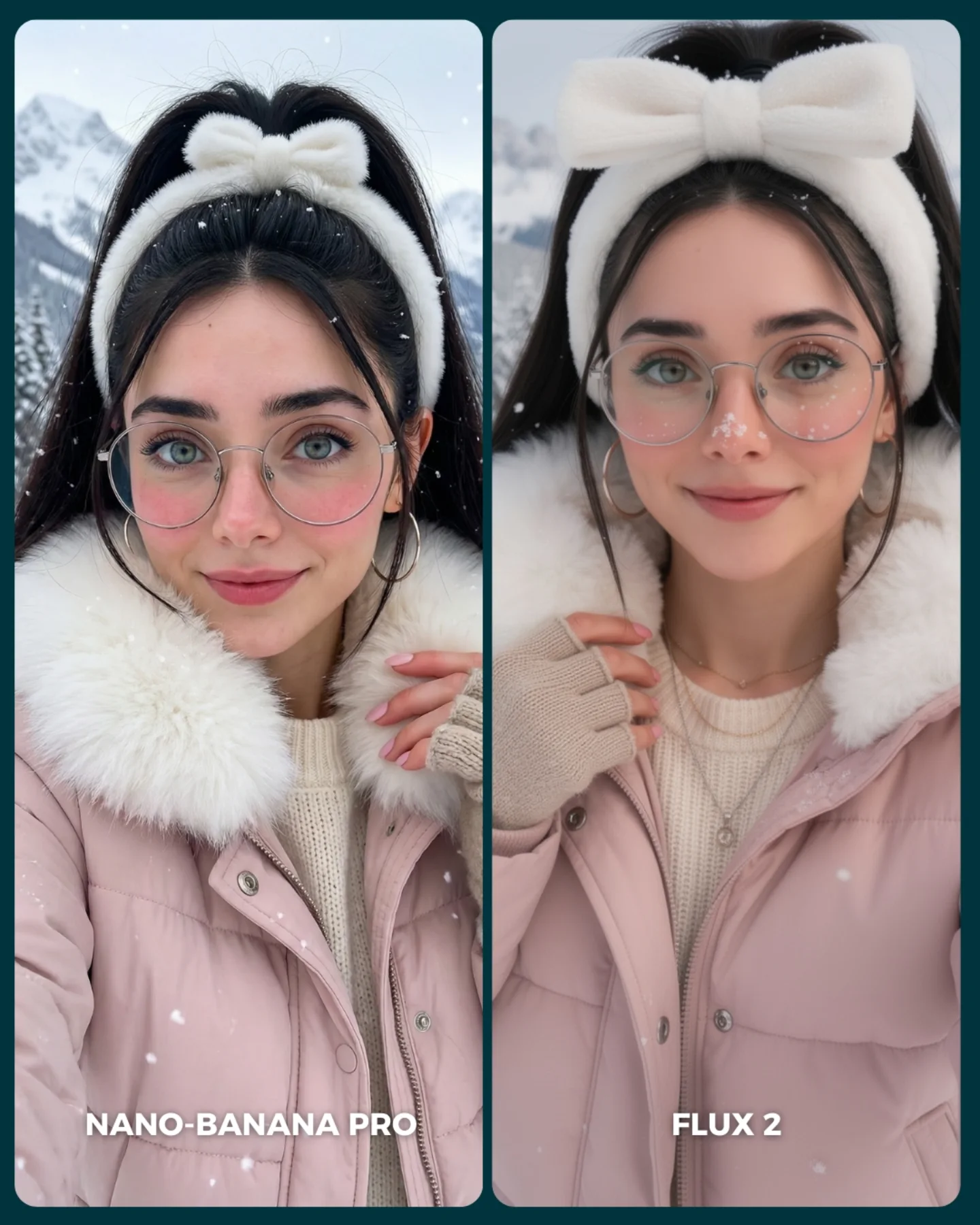
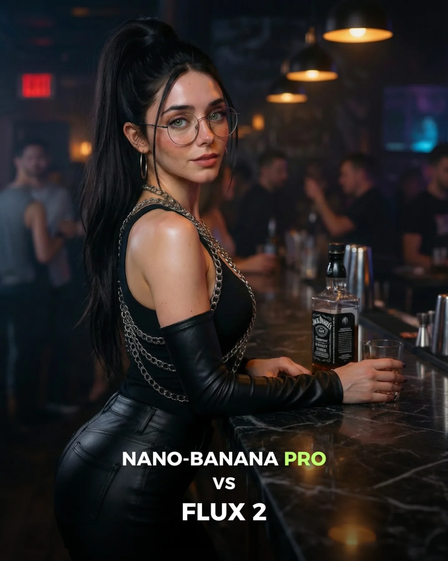
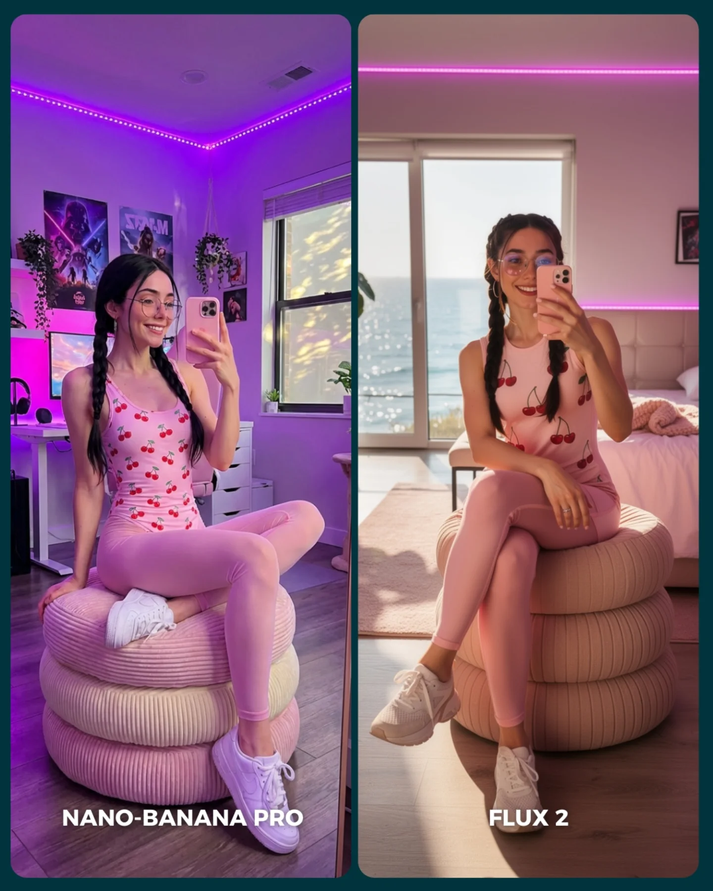
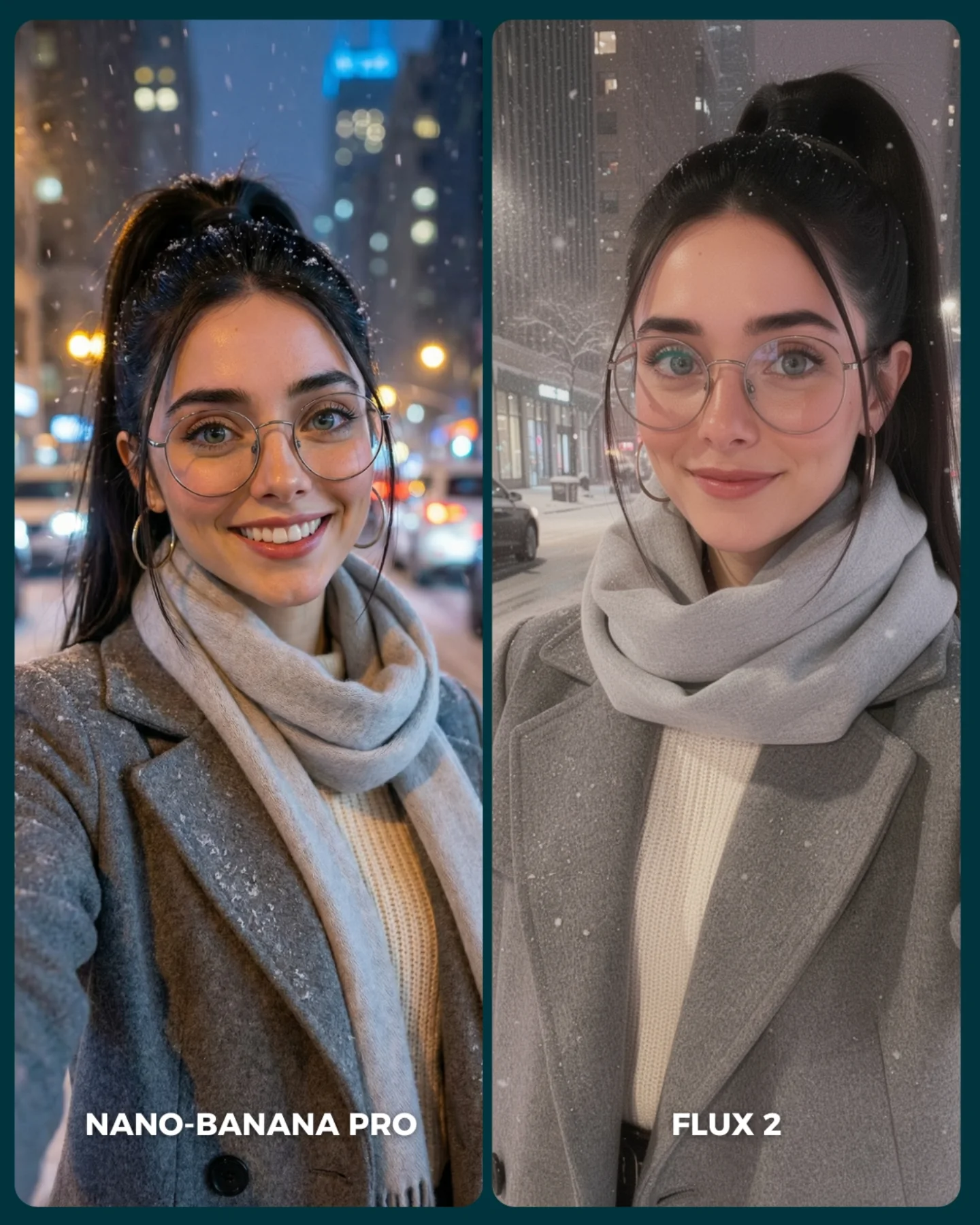
How soy_aria_cruz Made This Winter Pink Puffer Comparison Image — and How to Recreate It
This image is not trying to be a single great portrait. It is trying to be a useful comparison. That difference matters. The side-by-side layout turns one winter styling idea into a benchmark. Instead of asking the viewer to admire only mood and beauty, it asks them to inspect texture, skin handling, fur softness, glasses geometry, and expression quality across two outputs.
For creators, this is a strong reminder that comparison covers can perform well when the source setup is simple but detail-rich. Here, the styling is intentionally controlled: same person, same pink puffer, same white fur collar, same plush bow headband, same snowy background logic. That consistency creates a fair visual test. If the styling varied too much, the comparison would feel noisy and less trustworthy.
The winter concept is also a smart choice because it exposes many common generator weaknesses at once. Snowflakes can look fake, fur can melt into plastic texture, glasses can distort, and pale cold-weather lighting can flatten the face if the model is not careful. In other words, the image is attractive, but it is also technically revealing.
Why This Format Works on Social
The first reason this works is clarity of purpose. The layout tells the audience immediately what to do: compare left against right. That kind of built-in interaction is powerful. People spend longer on content when the image itself invites judgment or choice, even before they read the caption.
The second reason is that the styling is emotionally friendly. Pink outerwear, soft fur, snowflakes, and a bow headband create a cozy winter fantasy that broad audiences understand instantly. That softness helps the technical comparison feel approachable rather than nerdy. The post becomes both cute and analytical.
The third reason is control. Because the two panels share nearly identical subject matter, small differences in realism become more visible. That makes the image feel more honest. In AI content, trust rises when viewers feel they are seeing a real apples-to-apples test instead of a vague side-by-side made from two different prompts.
| Signal | Evidence (from this image) | Mechanism | Replication Action |
|---|
| Instant comparison cue | Two nearly matching winter portraits with generator labels underneath | The audience knows exactly how to engage without reading instructions | Use mirrored or near-mirrored styling when building benchmark covers |
| Soft emotional packaging | Pink puffer, plush bow, faux fur, and snowfall create a comforting winter mood | Friendly styling broadens appeal beyond purely technical audiences | Wrap comparison content in a visually warm theme instead of a dry diagnostic layout |
| Texture stress test | Fur, knitwear, glasses, skin, and snow all appear together | Complex but familiar materials make output quality easier to judge | Choose scenes that expose common rendering weaknesses in a natural way |
| Fairness through consistency | Same subject identity and same wardrobe logic appear in both panels | High consistency increases audience trust in the comparison | Lock styling and framing first, then compare only the model outputs |
Where This Style Fits Best
This format is perfect for generator-versus-generator posts, A/B thumbnail tests, prompt benchmark carousels, seasonal realism challenges, and educational content about output quality. It is especially useful when you want the audience to inspect subtle differences instead of simply reacting to spectacle.
- Best fit: model comparison posts. The layout is already designed for direct evaluation.
- Best fit: seasonal realism benchmarks. Winter materials expose weaknesses without requiring extreme scene complexity.
- Best fit: creator education. Viewers can learn what to inspect in high-quality portrait outputs.
- Best fit: soft-aesthetic feeds. The cozy palette keeps technical content aligned with a lifestyle look.
- Best fit: carousel cover slides. The split composition reads clearly even before the swipe.
It is less suitable for narrative storytelling, single-image emotional portraits, or pages that want a raw documentary tone. The strength of this visual is structured comparison, not immersion.
Transfer Recipes
- Autumn knit comparison. Keep: dual-panel benchmark layout and same-subject consistency. Change: palette, background, wardrobe textures. Slot template:
two-panel generator comparison, same woman in {seasonal outfit}, matching pose, soft background, labeled left and right outputs - Rainy street comparison. Keep: fair mirrored styling and text labels. Change: environment stress points such as wet hair, reflections, and neon blur. Slot template:
split-screen realism test, same subject and outfit, {weather cue}, generator labels beneath each panel - Beauty close-up comparison. Keep: benchmarking layout and same identity. Change: crop tightness, accessory detail, makeup intensity. Slot template:
side-by-side portrait comparison, same subject, same accessories, clean benchmarking design, subtle differences between outputs
The Aesthetic Read
The image is built on softness. Soft fur, soft snowfall, soft pink jacket, soft winter light, and soft expression. That consistency is doing a lot of work. When every element supports the same emotional temperature, the comparison feels elegant instead of clinical. This is a useful tactic for creators who want educational content to blend into a beauty or lifestyle feed.
The headband bow is also more important than it looks. It gives the portrait a thumbnail-level identity. Without it, the panels would still be pretty, but less memorable. Distinct silhouette accessories are especially valuable in split-screen comparisons because they help the viewer anchor both sides quickly.
The dark teal border and divider are another smart choice. They separate the two outputs without making the design feel aggressive. This is a good reminder that layout framing matters. Comparison covers do not need heavy arrows and giant labels everywhere if the overall structure is already legible.
| Observed | Why it matters | How to recreate it |
|---|
| Near-matching subject styling in both panels | Creates a fair comparison and improves trust | Lock identity, outfit, and framing before generating variants |
| Plush white bow headband | Adds instant personality and thumbnail recognition | Use one strong accessory that survives small-screen viewing |
| Pink puffer plus white fur collar | Provides cozy winter appeal and material richness | Choose seasonal wardrobe with two or three tactile surfaces |
| Minimal snowy mountain background | Keeps focus on portrait details while still feeling seasonal | Use a simple environment that supports, not competes with, the subject |
| Bottom generator labels | Makes the comparison explicit without cluttering the face area | Place labels low in the frame so evaluation stays face-first |
Prompt Technique Breakdown
To build this kind of cover well, treat it as two tasks: one stable portrait system and one comparison layout system. Many creators get the portrait right but forget that the layout is what makes the post useful. Without the split panels, labels, and visual consistency, the image loses its comparison logic.
| Prompt chunk | What it controls | Swap ideas (EN, 2-3 options) |
|---|
| Identity lock | Consistency between the two outputs | same woman in both panels; matched facial identity; stable subject across comparison |
| Seasonal styling | Emotional tone and material complexity | pink puffer and faux fur; winter knit and scarf; plush cold-weather accessories |
| Accessory silhouette | Recognition and charm | large bow headband; fluffy earmuffs; plush winter headband |
| Environment simplicity | Focus and season cue | snowy mountain blur; pale winter landscape; soft snowfall backdrop |
| Comparison layout | Usability as a benchmark cover | split-screen portrait cards; side-by-side labeled outputs; generator comparison design |
| Quality stress points | What viewers can inspect | fur softness; glasses geometry; skin realism; snow particle believability |
The biggest drift risk is losing the same-person consistency. If the left and right panels start to look like two different women, the benchmark weakens immediately. Protect identity first, then refine style differences second.
A Practical Iteration Sequence
Lock three things first: same subject identity, winter wardrobe, and split-screen layout. Once those are stable, refine micro-details like fur density, snowflake realism, or the slight softness difference between outputs. If you start changing expression, crop, and outfit all at once, the comparison becomes less trustworthy.
Use a one-change rule. If the panels feel too different, tighten identity and pose. If they feel too identical and boring, allow one small variation in smile or hand placement. If the winter vibe is weak, strengthen snow and fur before touching anything else. Small controlled changes keep the comparison honest and readable.
- Run 1: Solve the mirrored dual-panel layout with consistent subject identity.
- Run 2: Add pink puffer, bow headband, glasses, and faux-fur collar.
- Run 3: Introduce snowy mountain background and gentle snow particles.
- Run 4: Tune the subtle quality difference between panels and add the lower labels.
If the output becomes too cute and loses comparison clarity, strengthen the dark divider and labels. If it becomes too technical and cold, soften the palette and facial expression. The image works best when benchmarking is wrapped inside a warm seasonal aesthetic.