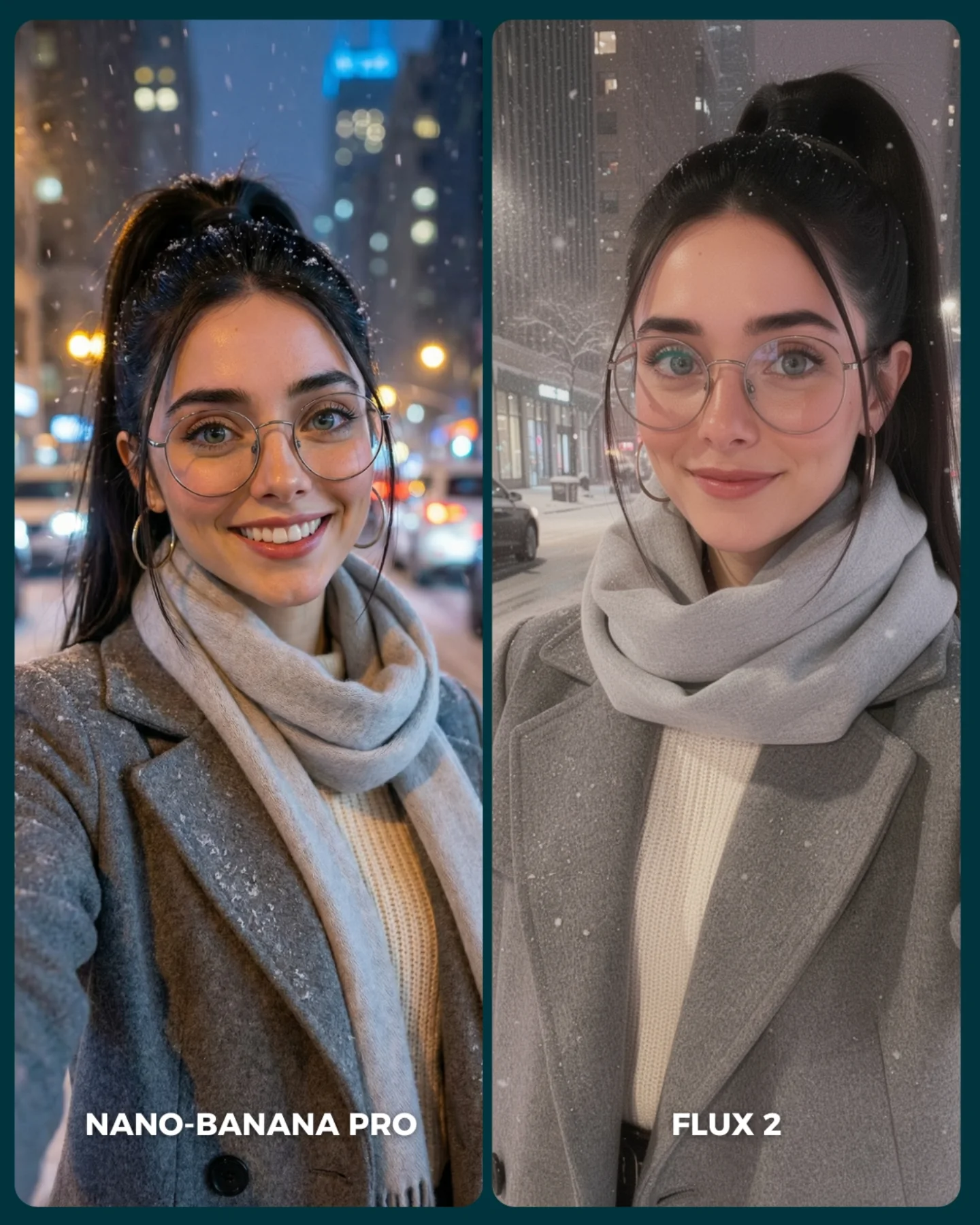
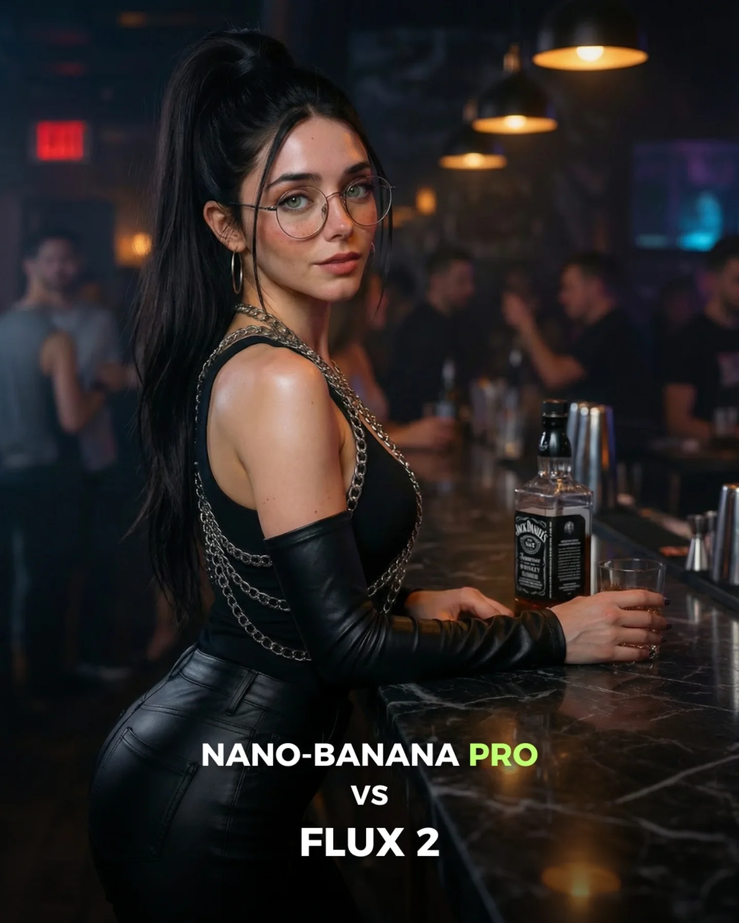
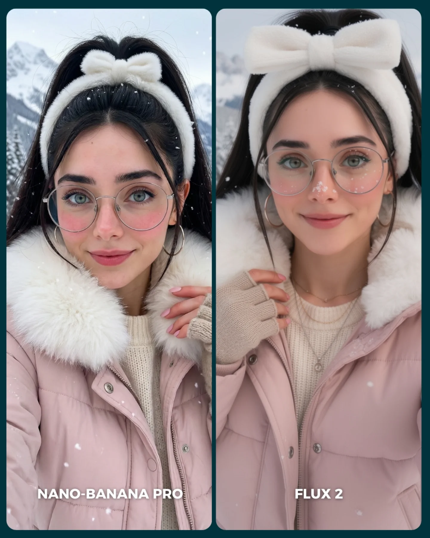
How soy_aria_cruz Made This Snowy City Portrait Comparison Image — and How to Recreate It
This image works because it compares models under conditions that look simple at first glance but are actually full of failure points. Snow, glasses, low-light skin, scarf layering, and cold-night city backgrounds all introduce subtle rendering stress. That makes the comparison useful. It is not only about style preference. It is about whether a model can keep warmth, texture, and realism intact in a difficult but relatable setting.
The best choice here is the matched wardrobe. Gray coat, scarf, cream knit, and similar facial framing remove unnecessary variables, so the viewer can focus on how each system handles atmosphere and detail. For creators, that is exactly what a good comparison should do: keep the prompt stable and let the rendering differences reveal themselves.
Why This Winter Comparison Format Feels Convincing
The strongest thing about the image is control. Both panels share the same logic, which makes small differences meaningful. Snow density, coat texture, eye clarity, skin softness, and background bokeh can all be compared without wondering whether the prompt itself changed too much. That gives the post credibility.
Another reason it works is that winter portraits are emotionally legible. People know what snow, wool, and cold air should look like. That familiarity makes flaws easier to notice. For creators, this is why weather-based comparisons are so useful. They test realism in a way that viewers can intuitively judge without needing technical vocabulary.
| Signal | Evidence (from this image) | Mechanism | Replication Action |
|---|
| Controlled prompt conditions | Both portraits share the same coat, scarf, glasses, hair, and crop | Consistency lets viewers compare rendering quality instead of design choices | Keep subject, wardrobe, and framing nearly identical in model tests |
| Weather realism stress test | Falling snow interacts with hair, coat, and background lights | Snow reveals weaknesses in fine detail handling and atmospheric coherence | Use environmental particles when you want a harder realism benchmark |
| Accessory difficulty | Large glasses sit across the face in both panels | Eyewear is a reliable test of facial geometry, reflections, and proportion | Include glasses or other face-adjacent accessories in comparison portraits |
| Tonal divergence is easy to read | One side feels warmer and more nightlife-bokeh driven while the other is calmer and cleaner | Subtle style differences become visible when layout and wardrobe stay fixed | Allow a small mood difference, but keep structure locked for honest evaluation |
Where This Comparison Style Fits Best
- AI model benchmark posts: ideal when the goal is to compare realism under common but difficult lifestyle conditions.
- Prompt-engineering tutorials: useful because viewers can study exactly what changed and what stayed stable.
- Creator trust-building content: strong because visible comparison logic makes recommendations feel more evidence-based.
- Winter portrait prompt libraries: good reference for handling coats, scarves, skin, snowfall, and low-light city backgrounds.
This setup is less ideal for narrative storytelling, broad inspiration collages, or heavily stylized concept art comparisons. The strength here comes from disciplined repetition and small visible differences. If you vary too much, the benchmark value collapses.
Transfer recipe one: Keep the side-by-side structure and matched wardrobe. Change the weather from snowfall to rain, fog, or backlit dust while preserving the same portrait crop. Slot template: {shared portrait prompt} {environmental stressor} {matched styling} {model labels}.
Transfer recipe two: Keep the winter outfit and city-night setting. Change one face-adjacent challenge such as glasses, earrings, scarf texture, or wet hair while preserving everything else. Slot template: {same scene} {one difficult detail} {two-model split} {evaluation layout}.
Transfer recipe three: Keep the clean label system and rounded panel design. Change the city type, color temperature, or snow density while maintaining the same subject styling. Slot template: {winter city portrait} {controlled clothing} {model comparison panels} {lighting variation}.
What This Image Tests Aesthetically
The comparison is useful because it does not only test realism. It tests taste under realism constraints. Good winter portrait generation requires more than correct anatomy. The scarf must feel soft, the coat must hold shape, the snow must sit naturally, and the face must remain alive under cool conditions. That balance is what viewers actually respond to in the wild.
The different background interpretations also matter. One panel leans into glow and color, the other into calmer clean realism. For creators, this is a valuable takeaway: when two models are both competent, the real difference often shifts from correctness to mood control. A good benchmark helps you see that early.
| Observed | Recreate |
|---|
| Snow interacts with hair and coat without obscuring the face | Use weather that touches the subject visibly but does not overpower the portrait |
| Gray coat and scarf create a stable neutral test wardrobe | Choose clothes that reveal texture and layering without introducing wild color shifts |
| Bottom labels clarify which model is which | Label panels directly on-image so viewers can compare fast and discuss clearly |
| Two slightly different mood interpretations stay within the same prompt logic | Keep the structure fixed if you want style divergence to be informative rather than confusing |
Prompt Technique Breakdown
| Prompt chunk | What it controls | Swap ideas (EN, 2–3 options) |
|---|
| two side-by-side winter city portrait panels of the same woman | Core benchmark layout and comparability | rainy-night split test; fog portrait comparison; neon-glow side-by-side benchmark |
| gray coat, pale scarf, cream sweater, glasses, ponytail | Wardrobe consistency and accessory challenge | beige coat and knit beanie; black coat and turtleneck; white puffer and scarf |
| falling snow on a night city street | Environmental stress and atmospheric realism | light snow flurries; dense snowfall; sleet and wet snow mix |
| left warmer with more bokeh, right calmer and cleaner | Mood comparison across models | one cooler and sharper; one softer and glowier; one higher contrast and one muted |
| bottom labels naming each model | Evaluation clarity and social usability | top labels; corner badges; blind test without labels |
| rounded panel borders and dark divider | Graphic cleanliness and app-friendly layout | square comparison cards; white divider; full-bleed split layout |
How to Iterate Without Breaking the Benchmark
Lock three things first: the side-by-side layout, the stable winter wardrobe, and the weather challenge. Those are the load-bearing parts. If any of them shifts too much, the image stops being a clean comparison.
- Start with the exact formula: two portrait panels, identical gray outerwear, glasses, ponytail, snowfall, and bottom labels.
- Change only one rendering challenge, such as stronger snow, darker street, or more reflective glasses, while preserving all structural variables.
- Change only the mood split between the models, keeping one warmer and one cleaner without altering the wardrobe or crop.
- Change only the label strategy if you want a blind-test version, but keep every other variable aligned.
The repeatable takeaway is simple: AI comparison graphics become most useful when they test believable lifestyle complexity under tightly controlled framing.