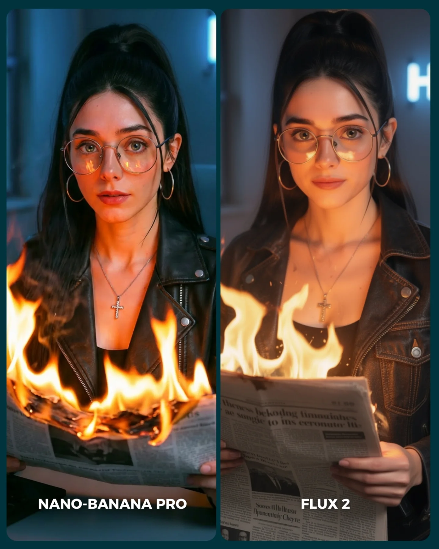
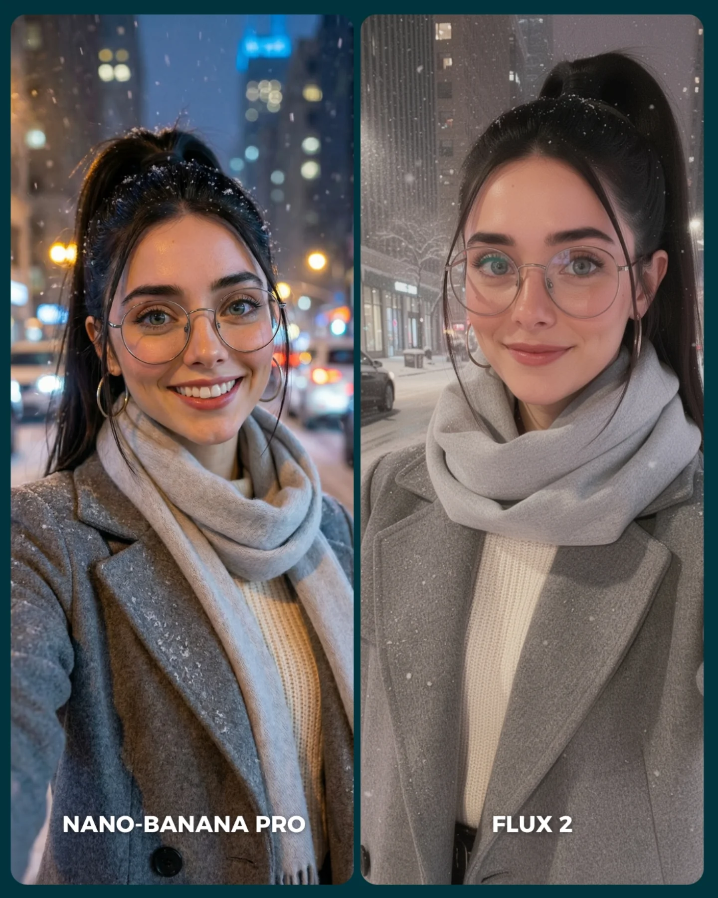
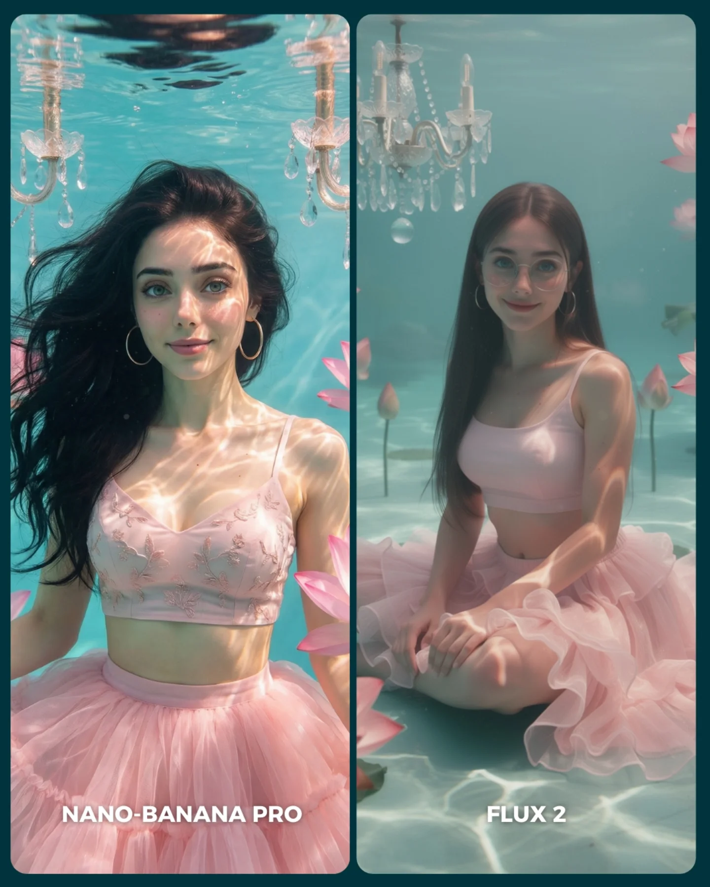
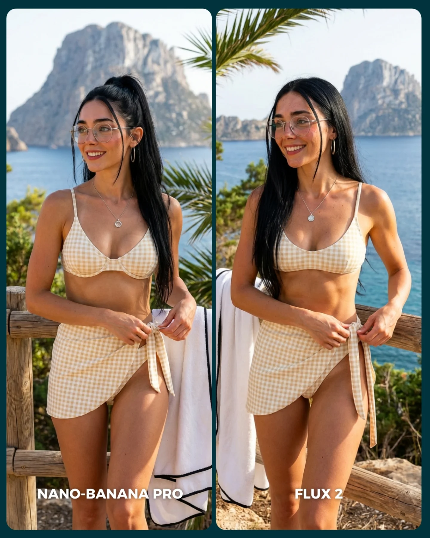
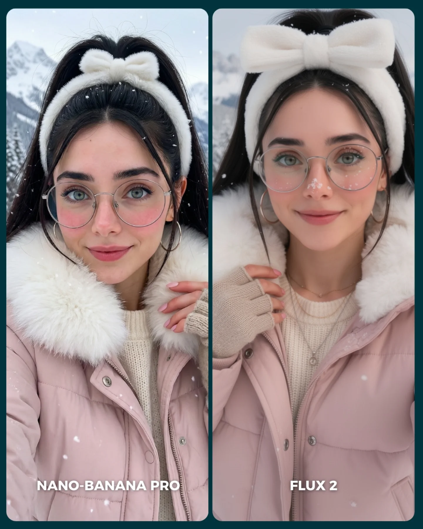
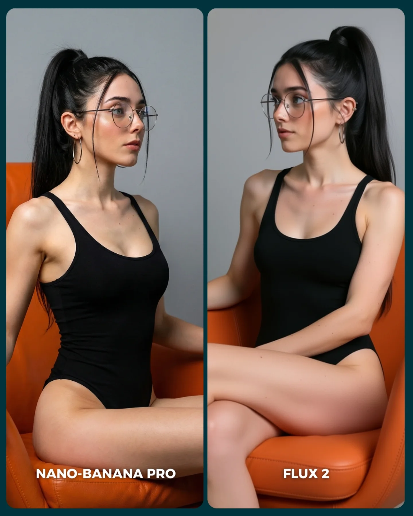
FLUX 2 vs. Nano Banana PRO 💥
Cada vez que aparece un nuevo generador de imágenes, me encanta ponerlo a prueba frente al mejor del momento y ver qué tan lejos puede llegar 🙊
Si te da curiosidad probarlo, lo tienes disponible directamente en @freepik 💕
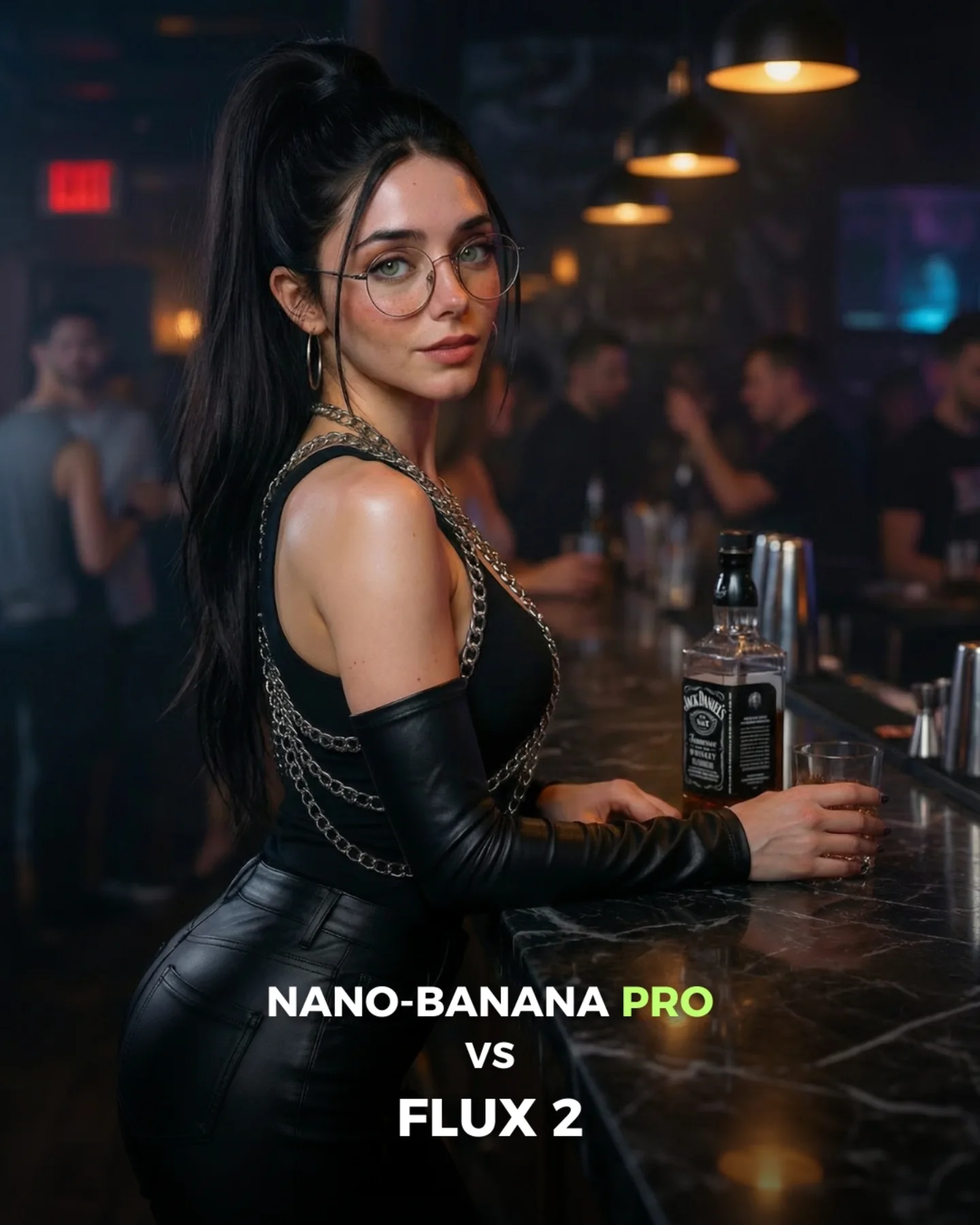
How soy_aria_cruz Made This Bar Counter Black Outfit Portrait Image — and How to Recreate It
This image works because it sits in a profitable middle zone between fashion and social proof. It is polished enough to feel aspirational, but still readable as a scene someone could imagine entering. The outfit does a lot of the work, but the bar environment is what turns the portrait into a mood. Warm pendant lights, blurred crowd energy, and a dark marble counter make the frame feel like nightlife content instead of generic studio glamour.
For creators, the most useful lesson here is restraint. The picture does not rely on a loud pose, heavy props, or exaggerated facial expression. It relies on silhouette, texture, and atmosphere. The chains across the shoulders, the glossy black pants, and the whiskey bottle on the bar each contribute just enough signal to make the image memorable without overcrowding it.
The comparison framing in the caption also matters. Since the post is about one image generator versus another, the image has to feel like a strong test case. This portrait does that well because it includes a challenging mix of reflective surfaces, skin tones, hair detail, shallow depth, and moody interior lighting. In other words, it is not only attractive; it is diagnostically useful.
Why This Type of Image Travels
The first mechanism is material contrast. Smooth skin, glossy black fabric, hard metal chain, reflective marble, and glass all appear in one frame. That gives viewers a lot to inspect. Social images often hold attention longer when there are several material types interacting under one lighting scheme. It feels rich even when the composition remains simple.
The second mechanism is controlled confidence. The subject is not smiling broadly, and she is not doing an exaggerated editorial pose either. The expression stays calm and self-possessed. That kind of understated confidence performs well because it keeps the image broad enough for mainstream audiences while still feeling elevated.
The third mechanism is environmental credibility. A lot of AI nightlife images feel fake because the room is too empty or the lights are too theatrical. This bar scene solves that by keeping background people blurred but present. You can feel a place without needing to read individual faces. That is often the sweet spot for realistic social storytelling.
Signal
Evidence (from this image)
Mechanism
Replication Action
Material richness
Metal chains, glossy pants, marble bar, bottle glass, skin highlights
Multiple textures make the image feel premium and worth inspecting
Combine at least four material types under one coherent lighting setup
Understated attitude
Soft over-the-shoulder gaze with minimal expression
Calm confidence broadens appeal more than exaggerated seduction
Prompt for composed eye contact instead of extreme facial performance
Believable nightlife context
Blurred patrons and pendant lamps create background life without clutter
Environmental credibility improves realism and shareability
Stage a lived-in bar scene with soft human blur rather than empty luxury minimalism
Comparison-post readiness
Clean lower text space and visually challenging textures
The image works as both a result and a test case
Leave layout room for short comparison text when building cover images
Where This Aesthetic Fits Best
This style is especially strong for generator comparison covers, nightlife-inspired creator branding, AI portrait benchmarks, beauty-adjacent social posts, and “realism test” content where you want the audience to notice rendering quality. It is also useful for accounts that want to look premium without using obviously expensive locations or props.
Best fit: image-generator comparison posts. The mix of reflective surfaces and moody lighting gives viewers something meaningful to compare.
Best fit: nightlife portrait moodboards. The scene feels stylish without needing loud club energy.
Best fit: creator-led realism showcases. Subtle skin detail and hair realism become part of the value proposition.
Best fit: social cover images. The composition naturally leaves room for bold text overlays.
Best fit: fashion-adjacent creator pages. The outfit communicates style, but the bar keeps it grounded.
It is less useful for playful family content, hyper-cinematic storytelling, or minimal clean-brand campaigns. This image depends on nightlife texture and adult social cues. If those cues are not aligned with the audience, the mood can feel misplaced.
Transfer Recipes
Hotel lounge version. Keep: material contrast, over-the-shoulder pose, warm practical lighting. Change: bottle type, seating, wood tones. Slot template: {luxury lounge interior}, {subject styling}, leaning at bar, warm pendant lights, blurred guests, premium social portrait
Jazz bar version. Keep: dark outfit, calm confidence, shallow depth. Change: color temperature, instrument hints, glassware. Slot template: {moody jazz bar}, black fitted outfit with {accent detail}, realistic portrait, amber practical lights, nightlife background blur
The strongest visual decision here is the side-turn pose. It gives the body a clean curve and lets the face return to the viewer without the image feeling confrontational. That is a smart move for social portraiture, where complete front-facing poses can feel flat and high-fashion exaggeration can feel distant.
The lighting strategy also deserves attention. The scene uses practical lamps as visible atmosphere, but it does not let those lamps become the only source. There is enough frontal softness on the face to keep the portrait readable. That balance between moody room tone and flattering face exposure is what makes the image usable as a high-performing social cover rather than just a dim bar snapshot.
The chain details are another subtle win. They add visual complexity near the upper body, which is important because the rest of the color palette is so dark. Without them, the outfit could collapse into a black mass. With them, the image gains rhythm and a premium cue without breaking the monochrome look.
Observed
Why it matters
How to recreate it
Three-quarter body angle with head turned back
Creates elegance and shape while preserving connection
Pose the torso away from camera and return only the face
Warm pendants plus soft face fill
Keeps the bar atmosphere without sacrificing readability
Use practical lights for mood and separate fill for the subject
Glossy black outfit with chain accents
Adds texture and premium detail to a dark palette
Introduce one reflective trim or accessory to break up black clothing
Blurred patrons behind the bar
Signals social life without stealing focus
Include background figures as soft shapes, not detailed characters
Whiskey bottle and tumbler near the hand
Adds narrative specificity to the bar setting
Use one drink cue to anchor the environment
Prompt Technique Breakdown
To make this image work, think in layers: pose, material, atmosphere, and layout. Most weak prompts over-describe the bar and under-describe the subject’s body angle or outfit finish. That leads to generic nightlife images. The distinctive part here is not “woman in a bar.” It is “woman with a specific silhouette and material story inside a believable bar.”
Prompt chunk
What it controls
Swap ideas (EN, 2-3 options)
Pose geometry
Shape, confidence, and viewer connection
over-the-shoulder bar pose; three-quarter turned portrait; leaning side profile with direct gaze
Outfit finish
Premium feel and texture variety
glossy black pants; chain-trim top; fitted nightlife outfit with metal details
whiskey bottle and tumbler; cocktail glass and bottle; bar tools near hand
Lighting logic
Mood versus readability balance
soft practical amber light; warm overhead lamps with face fill; intimate cinematic bar lighting
Cover layout
Social-media usability
text-safe lower center; comparison-cover composition; clean promo space
The most common failure point is over-darkening the frame. Creators often chase “moody bar” and end up losing the face, the chains, and the material differences. Guard the visibility of those elements first. Darkness should create atmosphere, not destroy information.
How to Iterate Without Breaking the Balance
Lock three things first: the body angle, the bar lighting scheme, and the outfit material story. Once those are stable, adjust the bottle, the background crowd, or the amount of chain detail. If you start by rewriting the whole environment every time, you will lose the clean hierarchy that makes this image work.
Use a one-change rule. If the image feels flat, strengthen material contrast. If it feels too sexualized, soften the outfit language and keep the pose unchanged. If it feels too empty, add blurred patrons instead of more props. Small targeted changes preserve the premium mood without turning the frame into clutter.
Run 1: Solve the pose and bar-counter geometry.
Run 2: Add the warm pendant atmosphere and soft facial fill.
Run 3: Refine glossy fabric, chain highlights, and marble reflections.
Run 4: Introduce background patrons and final text-safe layout without moving the subject.
If the image becomes too editorial, append a correction like social-media nightlife portrait, realistic bar setting, not a fashion campaign. If it becomes too casual, reinforce the chain accents and polished bar finish. The image wins because it feels elevated but still socially native.