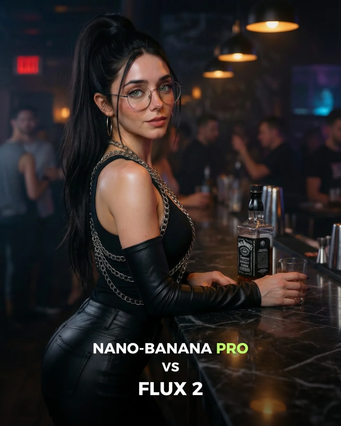
How to Create an Island Bikini Model Comparison AI Image
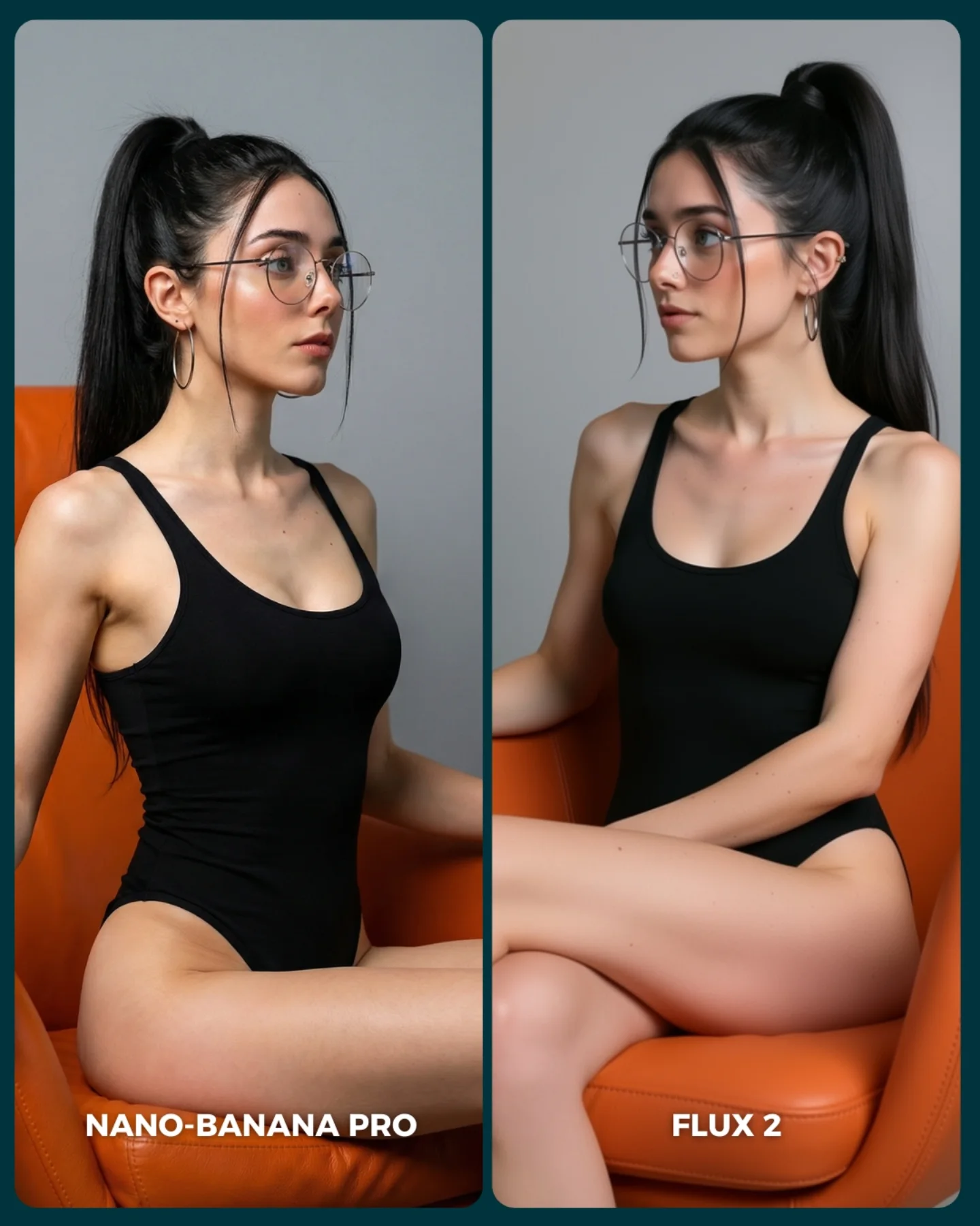
The image is effective because the setup looks simple while actually testing a lot of difficult things at once. The models have to render skin in direct sun, gingham fabric, coastal depth, hair over shoulders, transparent glasses, jewelry, and a believable holiday atmosphere. That makes it a strong comparison scene. It is visually pleasant enough to save, but technically rich enough to expose differences.
The split-screen format also feels fair. Same person, same outfit, same location, nearly the same pose. That control matters in A/B content. If too many scene variables change, the viewer stops comparing the models and starts comparing the image concepts. Here, the structure makes the argument legible fast.
The vacation setting is another smart choice because it sits in the sweet spot between realism and aspiration. People know what a beach-view portrait should feel like, so mistakes become noticeable. At the same time, the setting is attractive enough to keep the card from feeling dry or technical. That balance is why this kind of comparison content performs well.
Why this model comparison is easy to engage with
| Signal |
Evidence (from this image) |
Mechanism |
Replication Action |
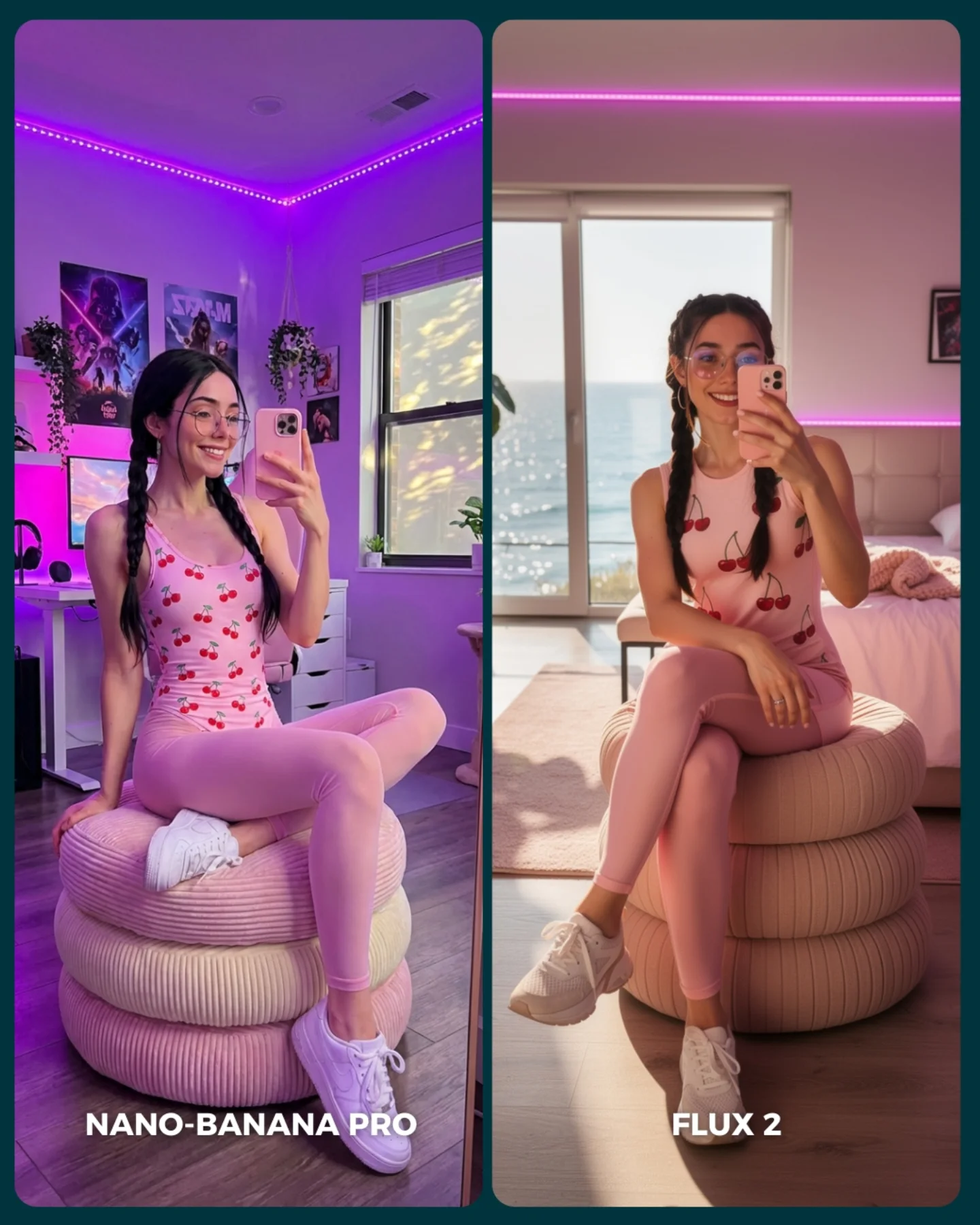
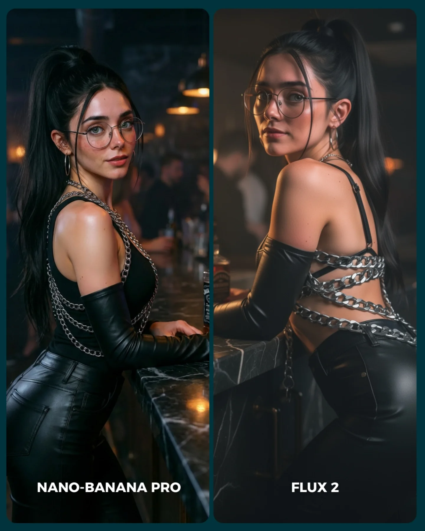
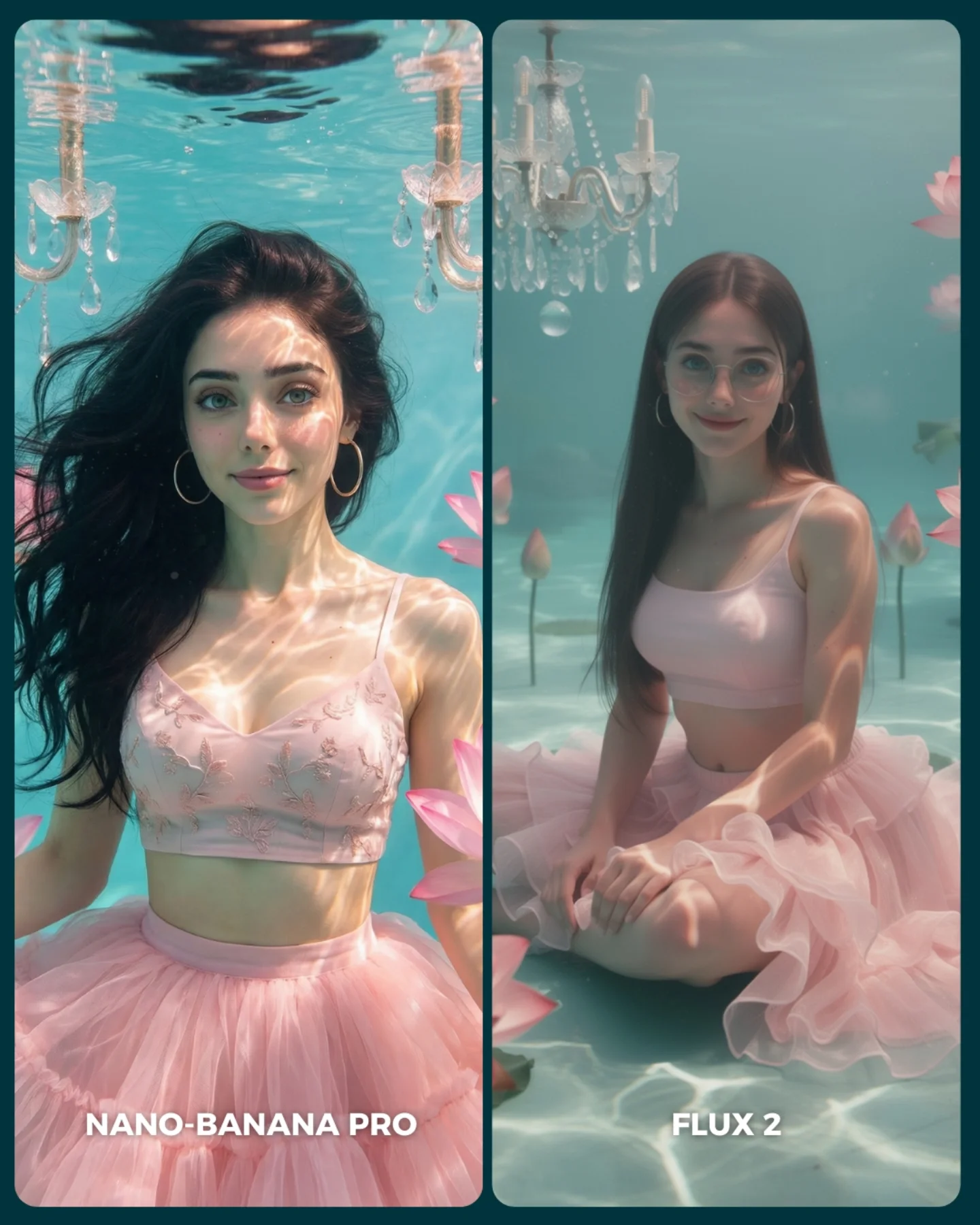
| Controlled scene matching |
Same woman, same outfit, same railing, same island backdrop in both panels |
Keeps the comparison about rendering behavior instead of prompt drift |
Lock subject identity, wardrobe, and environment before comparing models |
| High-information environment |
Sunlit skin, gingham fabric, sea depth, rocky island, foliage, towel, glasses |
Provides many small surfaces where model differences can show up |
Choose comparison scenes that include multiple texture and lighting challenges |
| Aspirational but familiar setting |
Mediterranean vacation lookout with blue water and summer styling |
Makes the card attractive while keeping viewer expectations grounded |
Use scenes people emotionally want but visually understand well |
| Clear label hierarchy |
`NANO-BANANA PRO` on the left, `FLUX 2` on the right |
Makes the result easy to discuss in comments without extra explanation |
Keep labels large, simple, and anchored consistently at the bottom |
Where this format fits best
- A/B engine testing: Best when you want the audience to compare model taste rather than obvious failure cases.
- Travel and lifestyle benchmarking: Strong because these scenes combine aspiration, realism, and many material cues.
- Prompt education posts: Useful when teaching that one prompt can produce different visual “personalities” across engines.
- Comment-bait comparison content: Great for posts designed to provoke preference debates instead of delivering a single winner.
This structure is less ideal for scenes with too much narrative complexity or too many moving parts. Comparison images are strongest when the concept is elegant and the technical surface variety does the heavy lifting.
Three transfer recipes
- Keep: same subject + same pose + same location. Change: render engine only. Slot template: “{same travel portrait prompt} rendered by {model A} vs {model B}”.
- Keep: sunny outdoor realism + patterned clothing + accessories. Change: backdrop type, color palette, body crop. Slot template: “{controlled vacation scene} used as a {texture-and-light comparison card}”.
- Keep: clean split-screen and bottom labels. Change: model names, setting, wardrobe style. Slot template: “{A/B portrait test} in {aspirational real-world location}”.
What the image is actually testing
The image is not only comparing beauty. It is comparing confidence under sunlight. Coastal daylight is unforgiving. If a model cannot handle glasses, skin, patterned fabric, and landscape depth at the same time, the scene starts to feel synthetic quickly. That is what makes this setup useful.
The outfit also matters more than it first appears. Gingham is a very good stress test because it exposes shape drift, fabric tension mistakes, and pattern inconsistency. The tied sarong adds another challenge by forcing each model to interpret knot logic and garment overlap in a believable way.
The rocky island in the distance then gives the image a location anchor strong enough to feel memorable but simple enough not to distract from the subject. This is why the whole frame stays readable: the background is attractive, but the evaluation still happens on the body, fabric, and facial detail.
| Observed |
Why it matters |
| Strong sun on shoulders, collarbones, and face |
Test how each model handles bright natural light and skin transitions |
| Gingham bikini and tied sarong |
Reveal pattern consistency and fabric realism differences |
| Glasses and jewelry preserved in both panels |
Provide stable micro-detail anchors for comparison |
| Rocky island and sea behind the railing |
Create strong place identity without stealing focus from the subject |
| Nearly mirrored standing pose in both panels |
Keeps the test legible and avoids idea-level drift |
Prompt technique breakdown
To recreate this well, write the prompt to preserve sameness first and difference second. The comparison should begin with control, then allow rendering taste to emerge naturally.
| Prompt chunk |
What it controls |
Swap ideas (EN, 2–3 options) |
| “same woman in both panels, matching identity and accessories” |
Fairness and subject continuity |
“same face lock”, “identical identity across outputs”, “preserve same woman in both renders” |
| “beige gingham bikini top with matching tied sarong” |
Pattern and garment realism test |
“patterned resort set”, “checked beach wrap look”, “summer gingham coordination” |
| “coastal viewpoint with wooden railing, white towel, blue sea, rocky island” |
Location identity and scene richness |
“Mediterranean lookout”, “Ibiza cliffside viewpoint”, “summer seaside terrace rail” |
| “two vertical comparison panels with bottom labels” |
A/B test readability and social usability |
“split-screen benchmark card”, “side-by-side output comparison”, “portrait A/B layout” |
| “left softer, right slightly sharper or stiffer” |
Subtle rendering divergence between models |
“natural vs polished”, “softer vs crisper beauty bias”, “gentler vs more rigid finish” |
How I would iterate this image
Baseline lock first: the identity, the outfit, and the location. Those are the three anchors. Once those are stable, the comparison labels and slight rendering drift become meaningful.
- Run 1: lock the same woman, same hair, same glasses, same jewelry in both panels.
- Run 2: fix the same gingham outfit, same hand placement, and same railing-plus-towel composition.
- Run 3: reinforce the same sea and rocky-island background with matching sunlight direction.
- Run 4: fine-tune the left-right rendering taste difference and add or polish the bottom labels.
Use the one-change rule. If the identity drifts, do not touch the labels yet. If the identity is stable but the place feels inconsistent, fix the environment before tweaking panel style. Comparison content only works when the audience trusts the control.