How soy_aria_cruz Built This ChatGPT vs Nano Banana Portrait Comparison
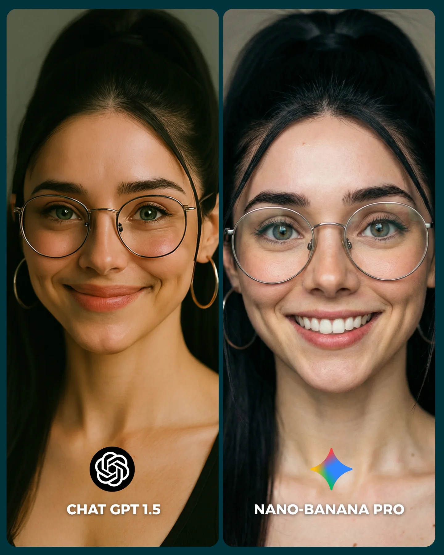
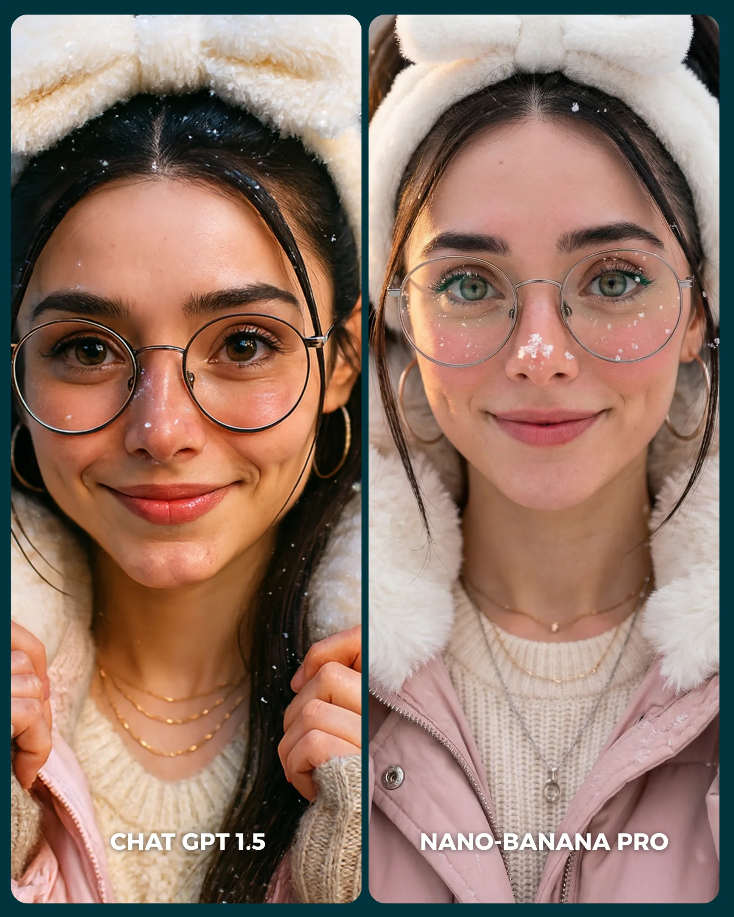
The image is effective because it is not trying to explain the models with technical language. It forces the viewer to compare faces directly. Same identity, same framing, same glasses, same hair structure, almost the same lighting. Once those variables are locked, every small rendering difference becomes legible. That is the right structure for social comparison content because the audience can judge quickly without reading a thread.
The strongest move here is consistency. Both panels are close enough that the viewer does not have to wonder whether the models were given different ideas. The comparison feels fair at a glance, even if the real experiment behind it is more complex. In creator content, perceived fairness often matters as much as actual methodology. If the layout looks controlled, people will engage with the result.
The second strong move is that the differences are visible but not cartoonishly exaggerated. The right panel looks cleaner, brighter, and more “beauty polished,” while the left reads slightly softer and more restrained. That kind of subtlety is good for comments because it invites debate instead of producing an obvious winner. Debate is a growth mechanic in itself.
Why this style of comparison gets engagement
| Signal |
Evidence (from this image) |
Mechanism |
Replication Action |
| Controlled variables |
Same subject identity, same crop, same accessories, same dark background |
Makes differences feel attributable to the model instead of the prompt |
Lock identity, framing, and wardrobe before running comparison outputs |
| Subtle but readable differences |
Left is softer and more restrained; right is brighter and more polished with a bigger smile |
Invites interpretation and comment-driven debate instead of instant consensus |
Choose prompts where models diverge in texture or taste, not only in obvious errors |
| Fast-scrolling layout |
Two vertical panels, bottom logos, bold labels |
Lets the viewer parse the whole experiment in under a second |
Use a simple A/B card format with no extra clutter or explanatory overlays |
| Face-first subject choice |
Close-up portrait with glasses, teeth, skin, and eye details visible |
Portraits expose model taste differences very efficiently |
Use portrait prompts when you want fine-grained aesthetic comparison |
Where this format fits best
- Model comparison posts: Best for creator accounts that teach through visual A/B tests instead of long tutorials. Keep the layout clean and the variables fixed.
- Prompt education content: Useful when you want to show that the same prompt can produce different aesthetic biases depending on the engine.
- Audience poll formats: Strong when comments and preference arguments are part of the content strategy. Use labels that make the choice easy to articulate.
- Beauty-render benchmarking: Especially good for portraits because eyes, teeth, glasses, and skin reveal rendering tendencies quickly.
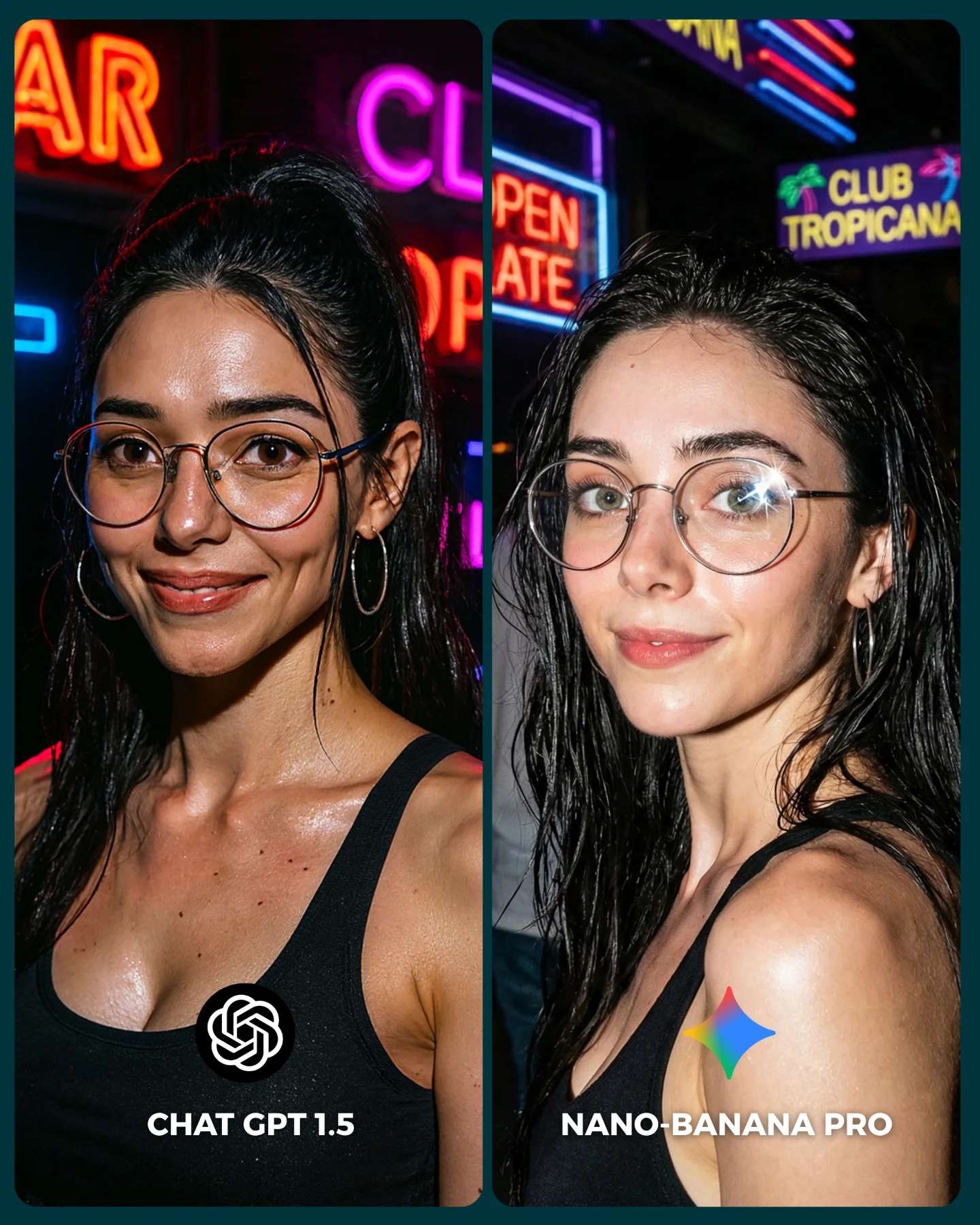
This structure is less ideal for complex scenes with many props, environmental storytelling, or dramatic action. The more variables inside the image, the harder it becomes to isolate what the model is doing differently. Comparison content is strongest when the test is clean.
Three transfer recipes
- Keep: same identity + same crop + same outfit. Change: model engine, facial expression intensity, background brightness. Slot template: “{same portrait prompt} rendered by {model A} vs {model B}”.
- Keep: side-by-side panel layout + logos + minimal background. Change: subject type, genre, comparison claim. Slot template: “{controlled A/B test} for {specific image style}”.
- Keep: face-focused subject with readable micro-details. Change: lens feel, age styling, makeup intensity. Slot template: “{portrait identity} compared across {two render systems} under {same lighting brief}”.
What the image is actually comparing
The most important thing here is not correctness. It is model taste. The left side feels slightly gentler, less sharpened, and more understated. The right side feels more optimized for instant beauty appeal: brighter smile, cleaner skin, a more commercial finish. That is a meaningful comparison because many creators are not choosing between “good” and “bad.” They are choosing between different visual attitudes.
The glasses are a particularly useful diagnostic detail. They test how each model handles thin metal rims, face symmetry through transparent objects, and eye readability behind reflections. Teeth and lips do similar work on the right side. Skin transition around the cheeks and nose does the same on the left. This is why portraits are such efficient benchmark subjects.
The logos and labels at the bottom also matter more than people think. They convert the image from a pretty collage into a decision card. Once the viewer can immediately say “left” or “right,” the post becomes socially usable. Usability is a large part of shareability.
| Observed |
Why it matters |
| Nearly identical face framing in both panels |
Reduces confusion and increases perceived fairness |
| Different smile intensity between left and right |
Reveals aesthetic bias without changing the entire identity |
| Glasses and hoop earrings preserved across both sides |
Provide stable detail anchors for visual comparison |
| Minimal dark background |
Keeps attention on facial rendering quality instead of scene design |
| Bottom logos plus model names |
Turn the image into a quick poll-ready comparison card |
Prompt technique breakdown
If you want to make comparison content like this useful, write the prompt to minimize drift first and maximize diagnostic detail second. The goal is not novelty. The goal is controlled divergence.
| Prompt chunk |
What it controls |
Swap ideas (EN, 2–3 options) |
| “same woman in both panels, identical identity and accessories” |
Comparison fairness and controlled subject continuity |
“same person, same face”, “identical identity lock”, “preserve facial match across outputs” |
| “close-up portrait with glasses, hoop earrings, black top” |
Micro-detail test points and visual anchors |
“beauty portrait with glasses”, “head-and-shoulders close-up”, “face benchmark framing” |
| “two side-by-side comparison panels with model labels and logos” |
Social-card usability and instant readability |
“A/B card layout”, “split comparison portrait”, “benchmark graphic format” |
| “left softer and more natural, right cleaner and more polished” |
The intended difference in aesthetic bias |
“subtle natural vs glossy commercial”, “soft realism vs crisp beauty pass”, “gentle vs sharpened portrait feel” |
| “minimal dark teal studio background” |
Attention control and variable reduction |
“muted beauty backdrop”, “dark studio blur”, “plain portrait background” |
How I would iterate this comparison
Baseline lock first: the exact identity, the crop, and the accessories. If those are not stable, the comparison is weak before it starts. Once that base is locked, you can inspect how each model treats skin, smile design, and micro-contrast.
- Run 1: force identity consistency with the same hair, glasses, earrings, and neckline across both outputs.
- Run 2: lock the same head-and-shoulders crop and dark background in both panels.
- Run 3: tune the left output toward softer naturalism and the right toward cleaner polished beauty rendering.
- Run 4: add logos and labels only after the portrait match is already strong.
Use the one-change rule. If the identity drifts, do not adjust the smile yet. Fix the identity first. If the faces match but the comparison still feels weak, then push only the finish difference: softer on one side, glossier on the other. Good comparison content is built through control, not chaos.