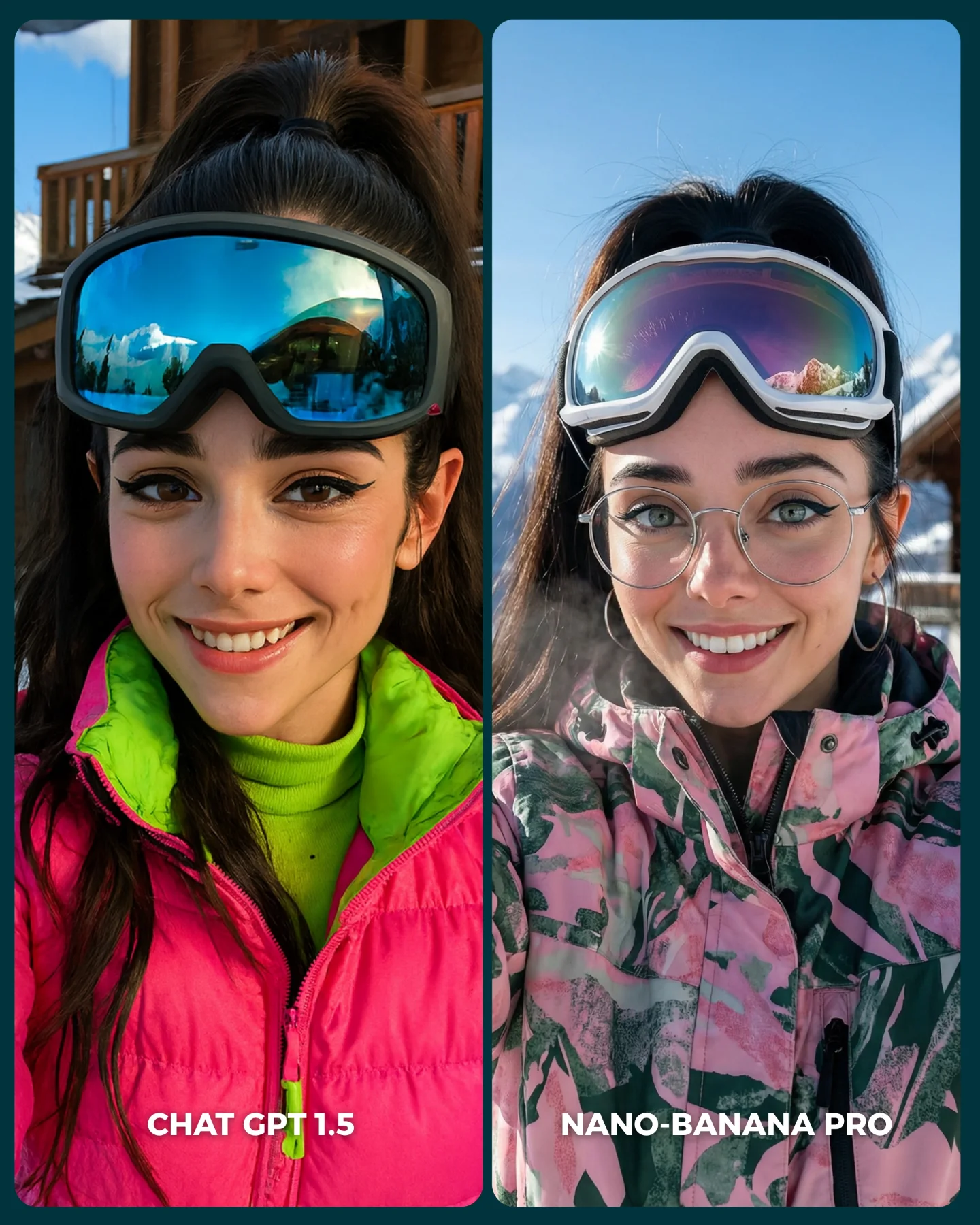
Nuevo ChatGPT 1.5 vs. Nano Banana Pro 😳
Recién salió el nuevo generador de imágenes de ChatGPT y dicen que supera a Nano Banana Pro... 👀 Como hay que verlo para creerlo, aquí os dejo unas imágenes para que comparéis 💕
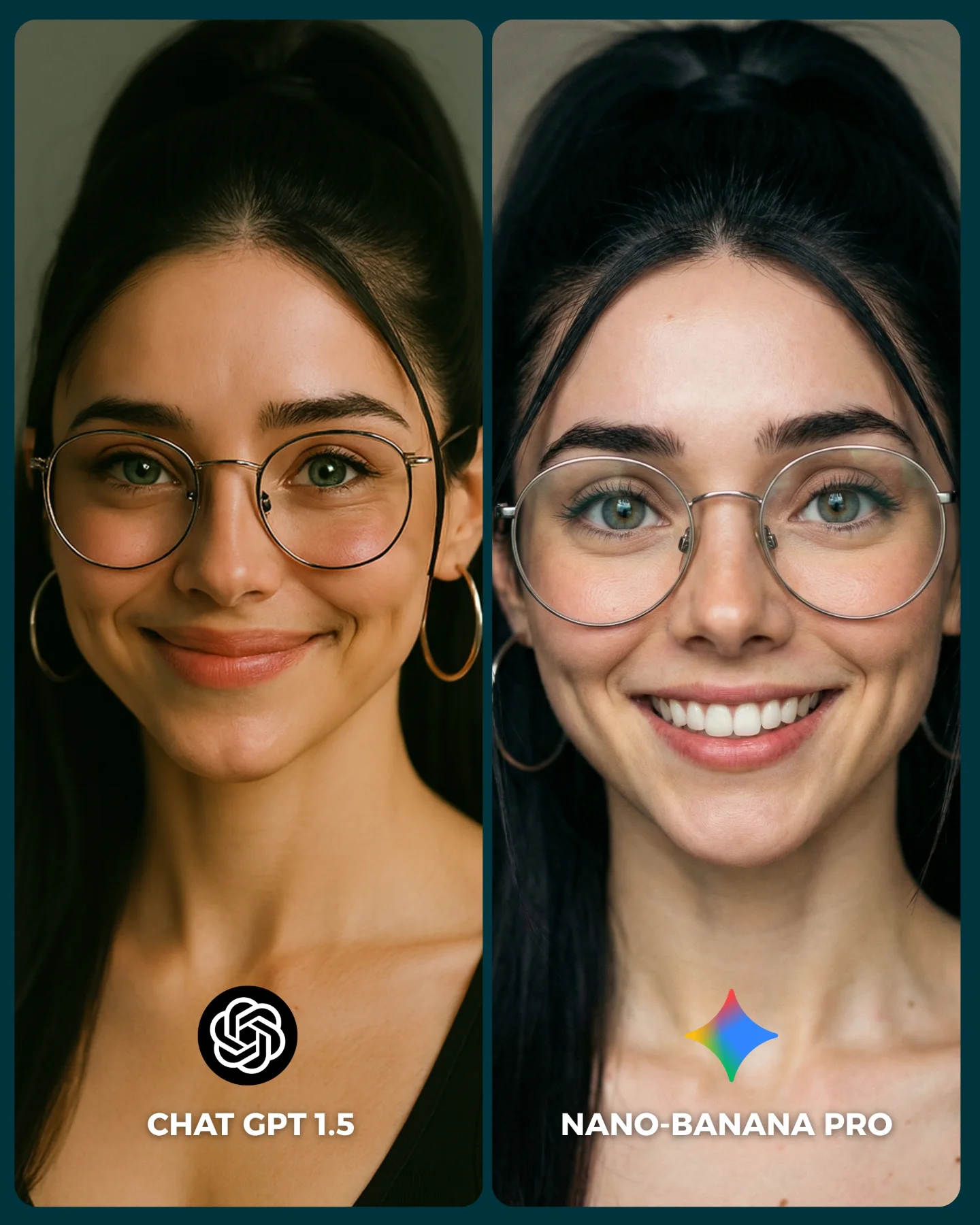
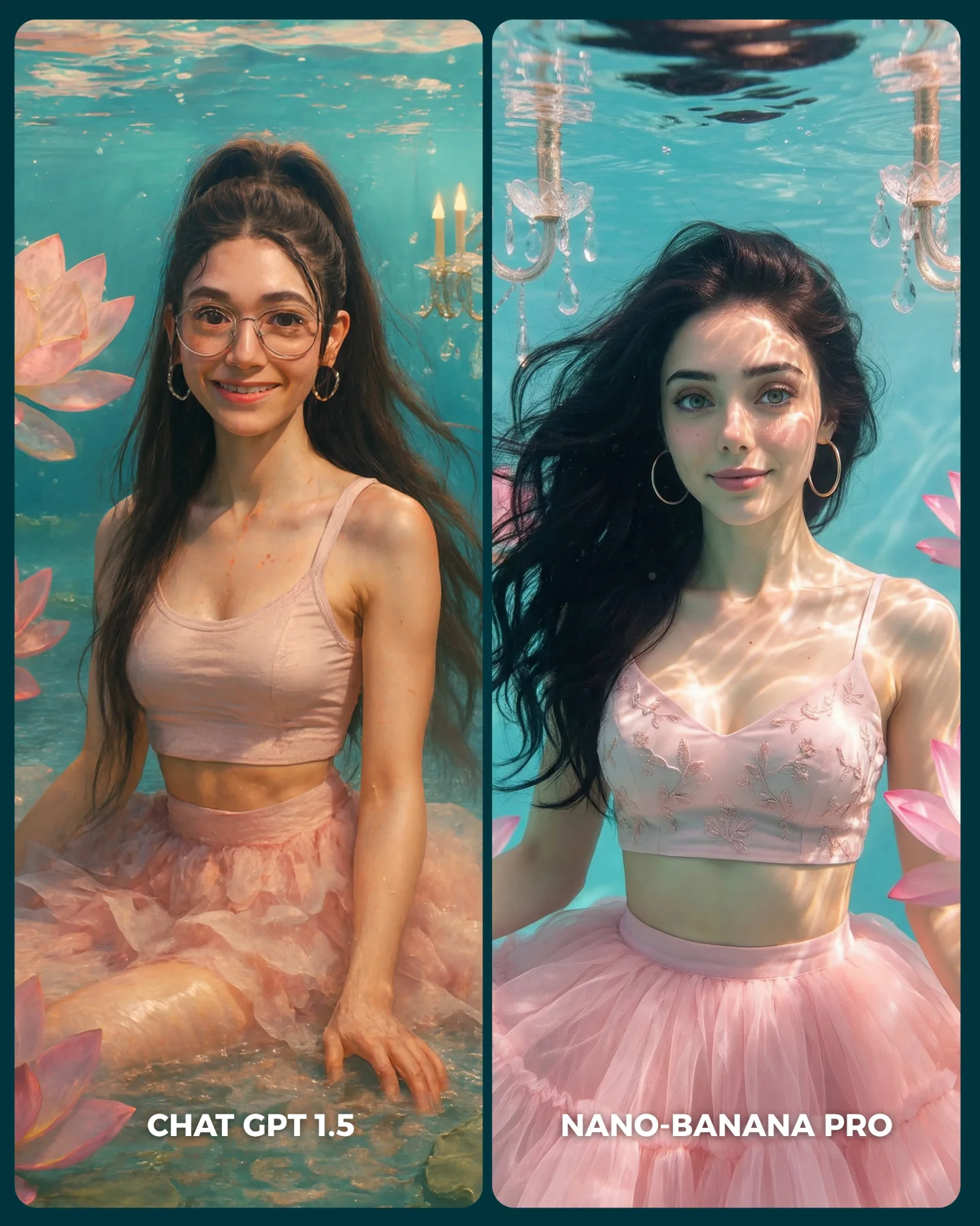
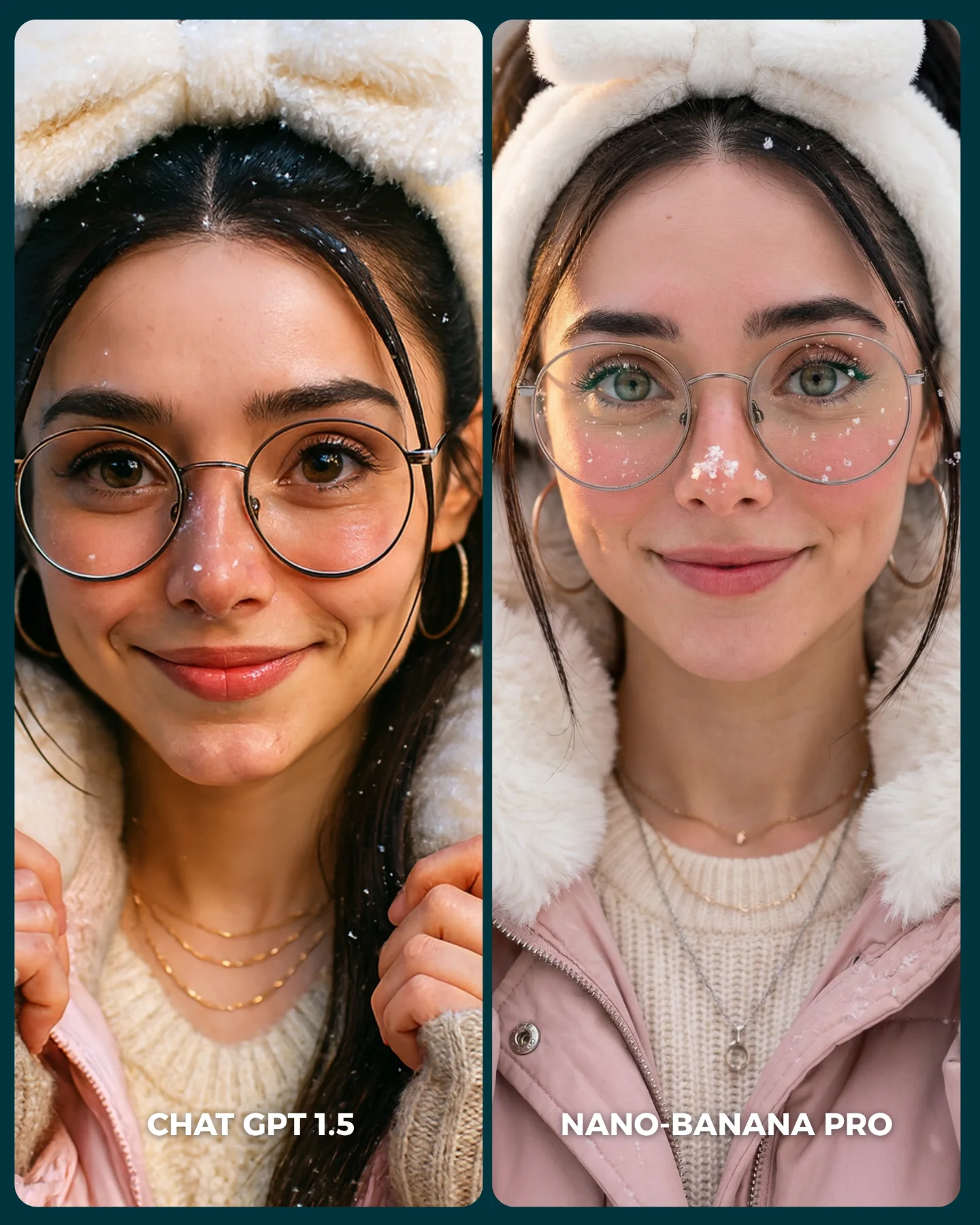
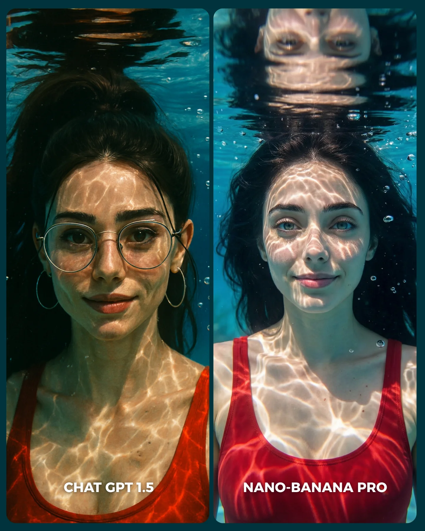
No sé si soy yo... pero no me convence en absoluto GPT 1.5 😅
Igualmente dime tú, que te parece y con cual te quedarías??
Y comenta "ARIA" y te paso los prompts que usé para todas estas imágenes 💌
How soy_aria_cruz Made This ChatGPT vs Nano Banana Party Comparison Image — and How to Recreate It
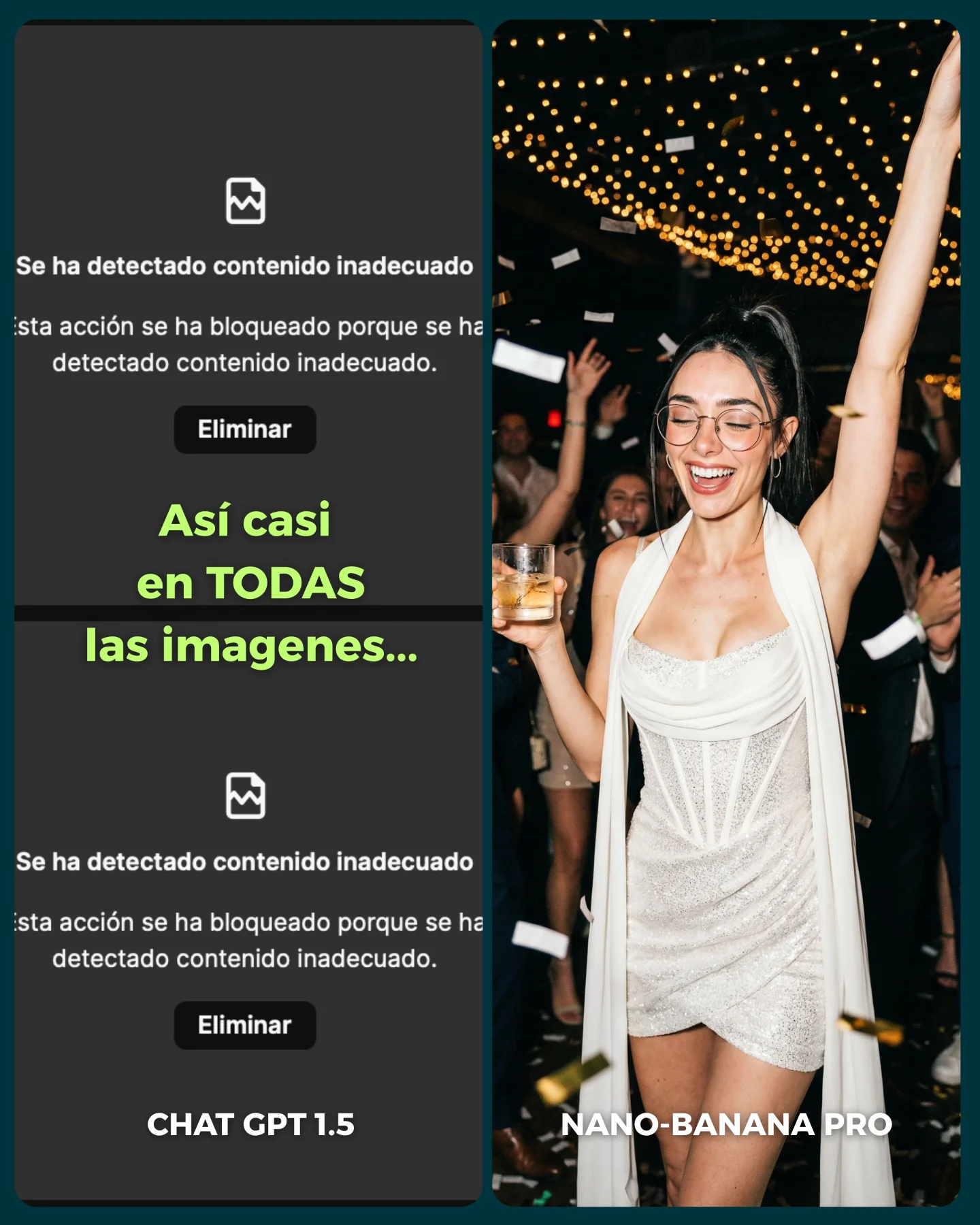
This image is not winning because the right-hand party photo is beautiful on its own. It wins because the creator turned a product comparison into a social proof story that people can understand in half a second. The left side shows rejection, friction, and frustration. The right side shows payoff, style, and usable output. That contrast is brutally efficient in a crowded feed.
For small creators, this is a useful reminder that viral prompt content does not always need to start from a perfect image. Sometimes the stronger hook is the gap between tools. Viewers stop because the post frames a decision for them: which system actually gives me something I can publish? That is much easier to react to than a generic “look at this AI image” upload.
What makes the comparison format so effective
The post uses asymmetry well. The left panel is ugly on purpose: dark interface, blocked-result text, no emotional reward. The right panel is everything the viewer wanted instead: human energy, confetti, a readable face, fashion, nightlife, and movement. When one side feels dead and the other feels publishable, the audience immediately understands the creator's claim without needing a long explanation.
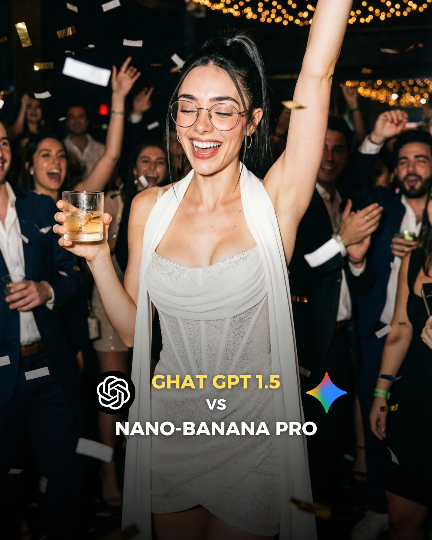
There is also a smart emotional layer under the tool comparison. The right image is not a sterile benchmark render. It looks like a real social post someone could use that night. That matters because creators judge AI tools less by abstract quality and more by whether the output feels ready for Instagram, reels covers, or lifestyle branding. This image passes that test quickly.
Signal
Evidence (from this image)
Mechanism
Replication Action
Instant contrast
Left side is a moderation error screen, right side is a polished party photo
Viewers understand the comparison before reading the caption
Use split-screen posts where one side visualizes friction and the other visualizes payoff
Publishable aspiration
The right image looks like influencer nightlife content, not a lab test
People imagine using the output themselves, which drives saves and comments
Benchmark tools on scenarios your audience already wants to post
Readable social framing
Large labels and obvious platform-style layout make the argument simple
Low interpretation cost increases feed retention
Design comparison creatives so the thesis is visible without opening the caption
Where this template fits best
This approach is strongest for AI creators who review tools, sell prompt packs, or build trust by documenting workflow friction. It also works well for creator educators on Instagram, TikTok covers, and X threads, because comparison visuals naturally invite opinion. People love to declare a winner when the evidence feels visible.
It is less useful for accounts that want timeless aesthetic galleries, because the left panel is intentionally ugly and heavily tied to a moment in tool discourse. If your page depends on evergreen beauty, use a softer before-and-after variation instead of a moderation-failure comparison.
Best fit: AI tool reviewers. Why fit: the image converts an abstract product opinion into a visible result gap. What to change: test the same prompt across two models with the same aspect ratio.
Best fit: prompt educators. Why fit: you can prove prompt portability and model sensitivity in one frame. What to change: annotate only the key variable that changed.
Best fit: creator marketing accounts. Why fit: split-screen conflict triggers comments fast. What to change: choose a scenario your audience actively wants for posting.
Not ideal: minimalist aesthetic brands. Reason: the left-side error screen adds noise and breaks a premium gallery mood.
Not ideal: accounts targeting search-only evergreen traffic. Reason: tool-vs-tool posts date faster than style breakdowns.
Transfer recipes
Keep: split-screen friction versus payoff, clear labels, one high-value output image. Change: party scene to fashion editorial, moderation screen to low-quality competitor result. Slot template: "{bad output screen} vs {publishable hero image} in {content niche}"
Keep: one ugly side and one aspirational side, readable typography, social feed pacing. Change: image tools to video tools, blocked result to awkward frame grab, winner panel to cinematic reel still. Slot template: "{failed generation state} vs {finished creator-ready asset} for {platform}"
Keep: visual winner-takes-all framing, same creator identity, strong emotional contrast. Change: nightlife photo to travel, food, or beauty content. Slot template: "{tool A issue} vs {tool B usable result} with {scene type}"
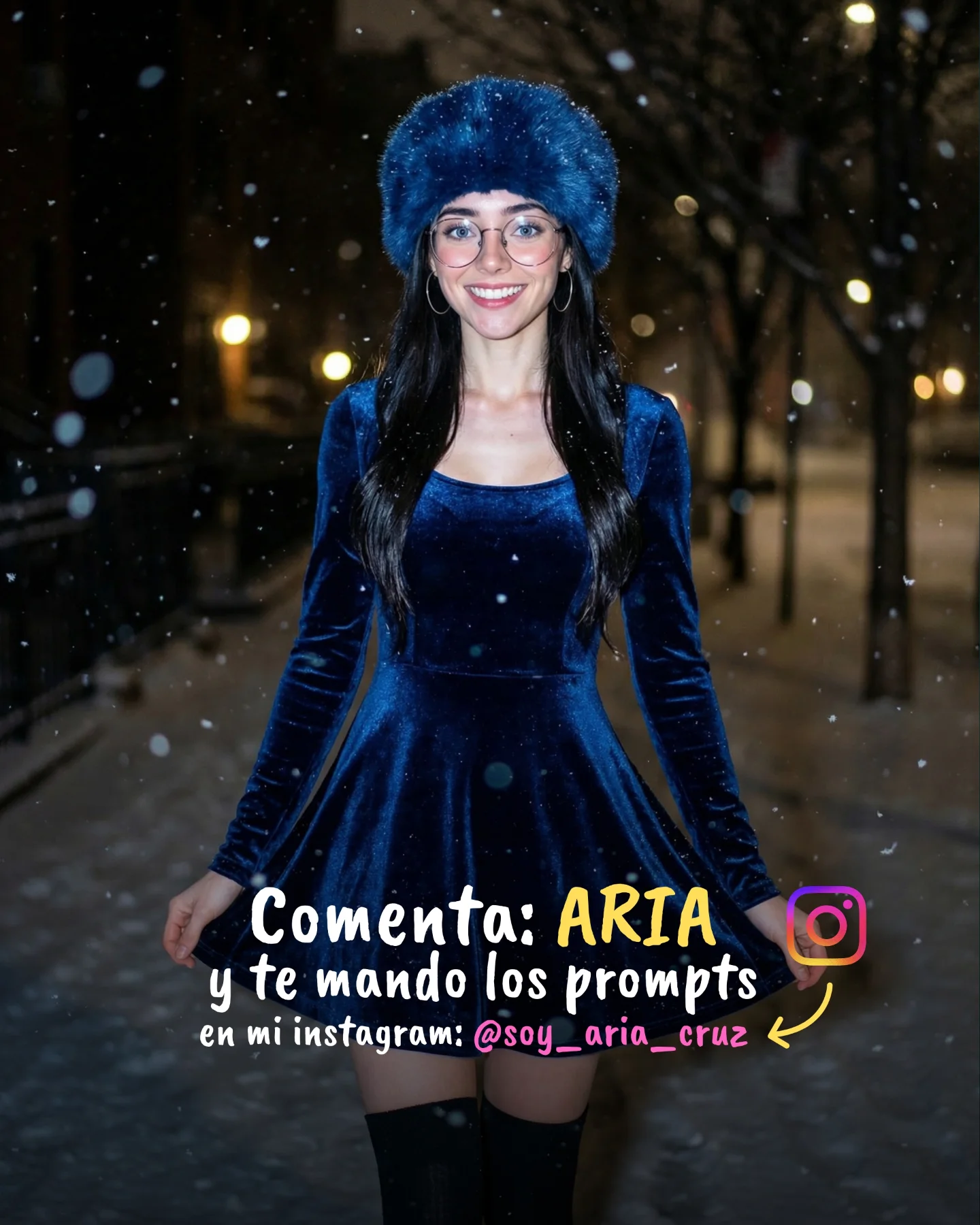
The aesthetic lesson inside the winning panel
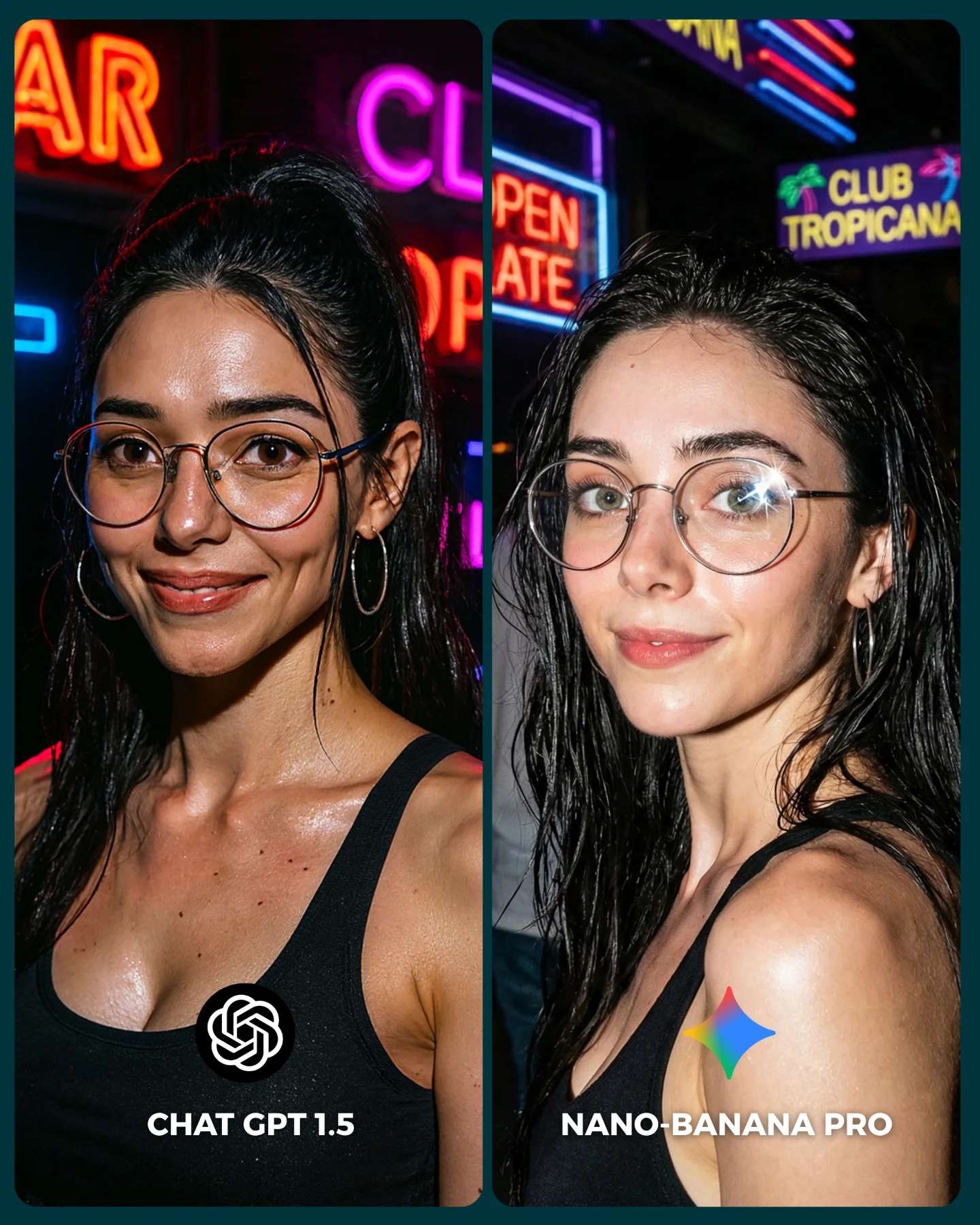
The right-hand image works because it is socially legible. One raised arm, one drink, one bright smile, one sparkling dress, and one ceiling full of lights are enough to communicate “party moment” instantly. Nothing is overcomplicated. Even the background crowd is blurred just enough to suggest status and movement without competing with the subject.
The flash look is important too. Instead of soft cinematic lighting, the image leans into nightlife realism: direct highlights, dark room, reflective dress texture, visible confetti, and warm ceiling lights. That makes it feel more like a phone-camera moment from a real event. For creators, this is a useful prompt lesson: sometimes “more believable” comes from embracing a culturally familiar camera style rather than chasing luxury editorial lighting.
Observed
Why it matters for recreation
Direct flash on subject with dark ambient surroundings
Creates instant nightlife credibility and high subject separation
Clean split between ugly UI panel and aspirational photo panel
Strengthens the narrative argument of the post
Prompt blocks worth reusing
The safest way to recreate this style is to treat the design as two separate systems: interface panel and social-photo panel. If you blur them together in one prompt, the result usually gets messy. Build the split-screen architecture first, then refine the winner image until it looks post-ready.
Prompt chunk
What it controls
Swap ideas (EN, 2–3 options)
two vertical side-by-side panels
Comparison layout and reading order
split-screen benchmark, dual-column contrast post, side-by-side creator test
dark moderation error screen with readable warning text
Lock these three things first: the split-screen layout, the ugly-versus-aspirational contrast, and the direct flash party camera feel. After that, do not change more than two variables per run.
Run 1: stabilize layout and text hierarchy so the comparison is readable at thumbnail size.
Run 2: improve the right-side pose, face, glasses, and hand-with-drink anatomy.
Run 3: tune atmosphere with denser string lights, better confetti placement, and stronger dress texture.
Run 4: remix the right-side scene into another niche while preserving the same contrast logic.
If the post stops working, check whether both sides still feel meaningfully different. This format depends on visible stakes. The wider the gap between frustration and payoff, the stronger the share impulse tends to be.