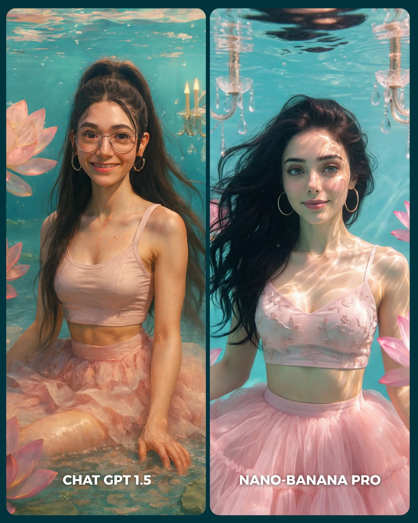
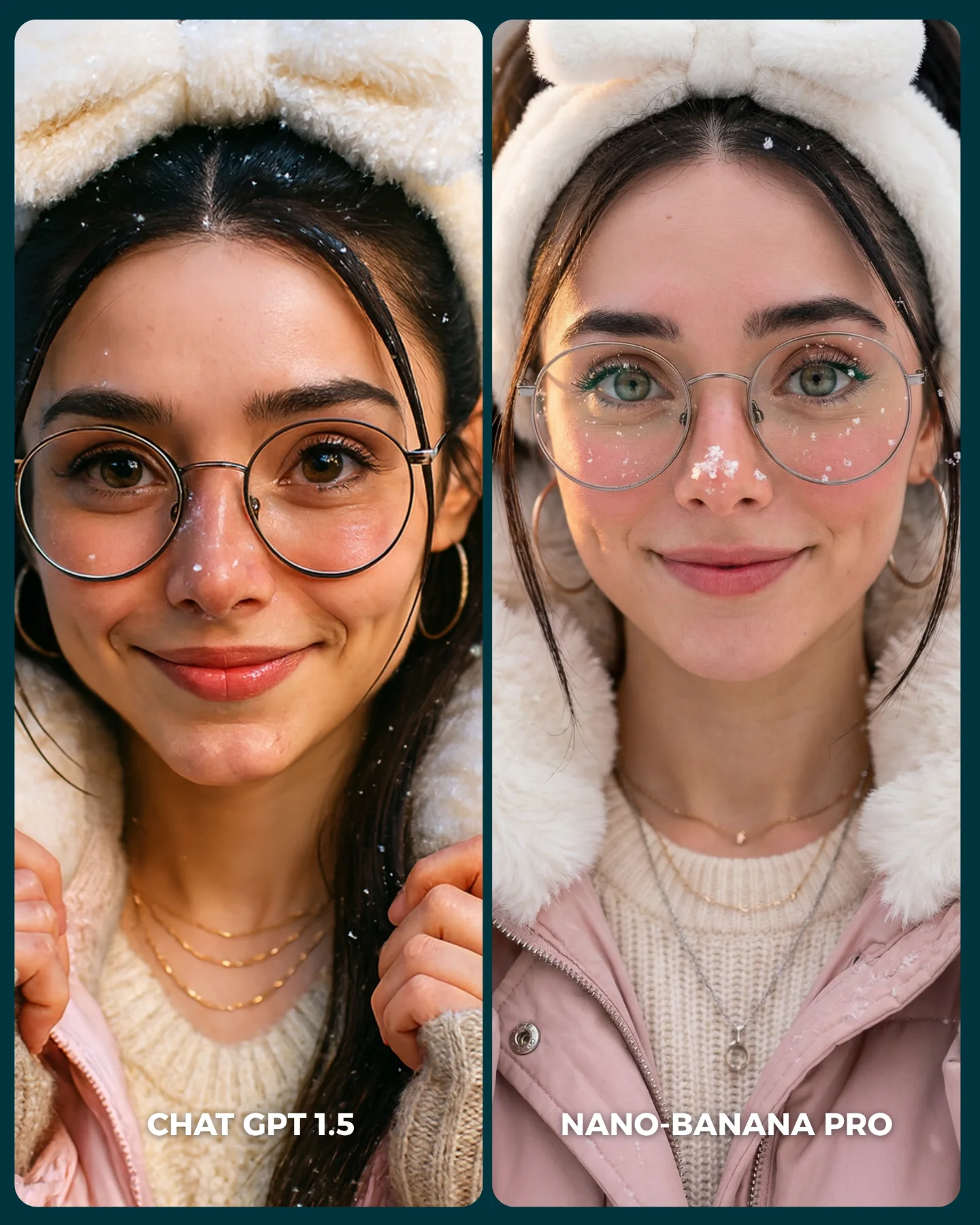
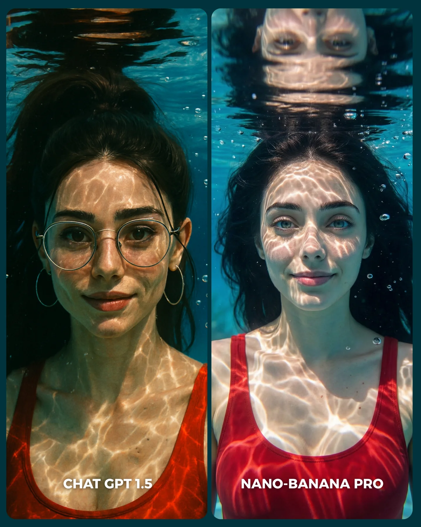
Nuevo ChatGPT 1.5 vs. Nano Banana Pro 😳
Recién salió el nuevo generador de imágenes de ChatGPT y dicen que supera a Nano Banana Pro... 👀 Como hay que verlo para creerlo, aquí os dejo unas imágenes para que comparéis 💕
No sé si soy yo... pero no me convence en absoluto GPT 1.5 😅
Igualmente dime tú, que te parece y con cual te quedarías??
Y comenta "ARIA" y te paso los prompts que usé para todas estas imágenes 💌
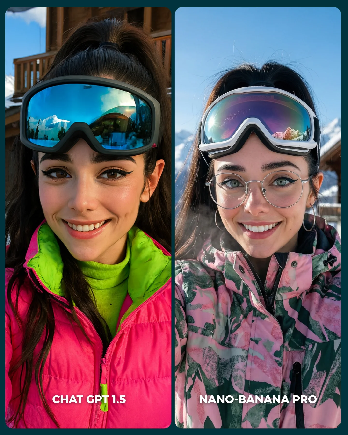
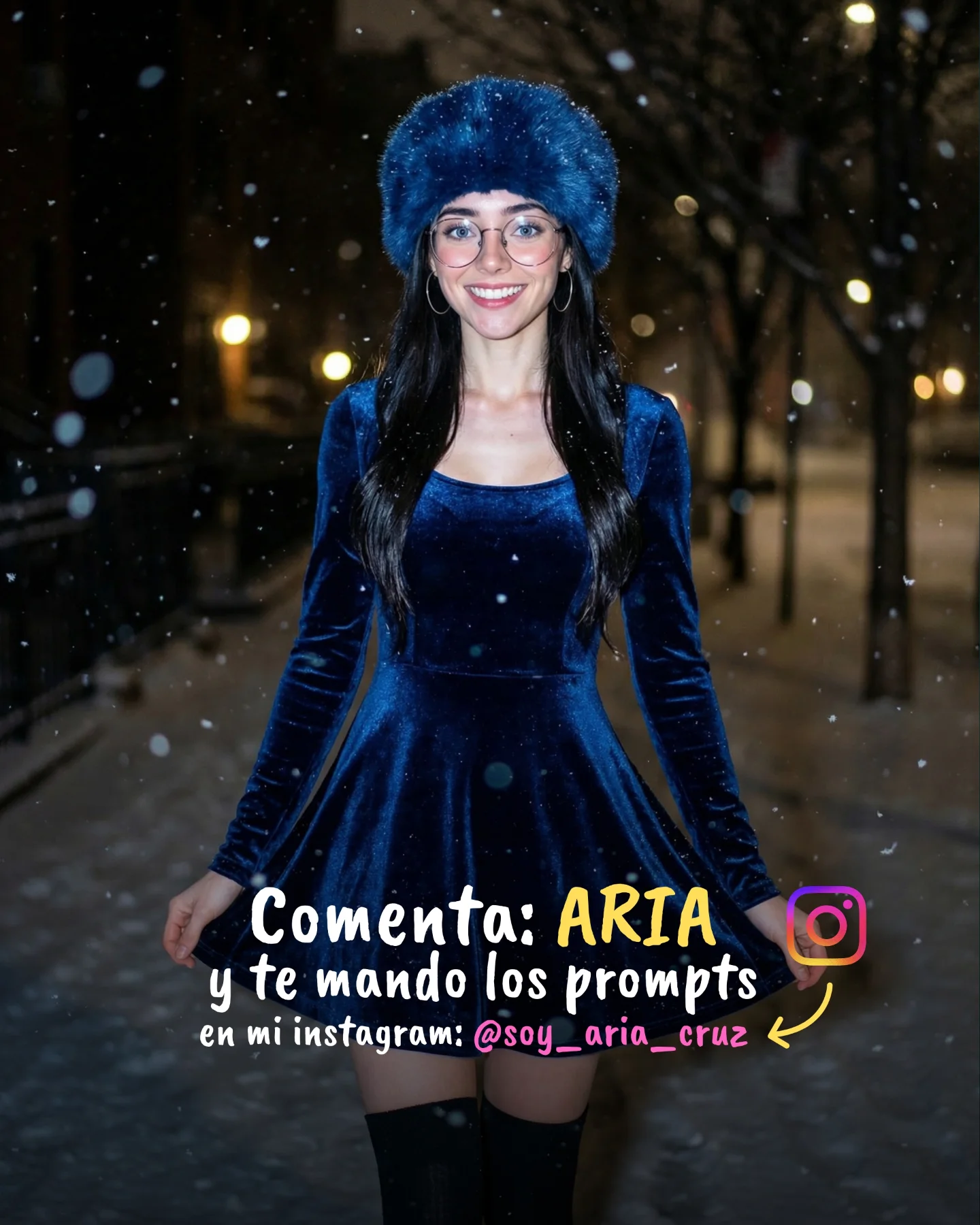
Why soy_aria_cruz's ChatGPT 1.5 vs Nano Banana Pro Ski Selfie Comparison Went Viral — and the Formula Behind It
This image is effective because it does not ask the viewer to trust an abstract opinion. It shows the difference directly. The same woman, the same snowy setting, and the same general selfie framing appear in two adjacent panels, but the aesthetic choices diverge in a way that is immediately readable. On one side the result is hotter, glossier, and more stylized. On the other side it feels more grounded, more tactile, and more like a believable cold-weather moment. That direct visual contrast makes the image highly shareable.
For creators, this matters because comparison content performs best when the variables are controlled. Here the face, location, and broad concept remain stable, while the styling logic changes. That gives the audience something concrete to judge. It is not only a pretty winter portrait. It is a demonstration image, and demonstration images often pull stronger attention because they promise an answer to a question: which one feels better, and why?
The Viral Hook Is Side-By-Side Readability
The biggest reason the image stops the scroll is that the verdict can begin in under a second. The eye compares the two faces, then the jackets, then the goggles, then the overall color feel. The split-screen structure turns aesthetic judgment into a quick interactive game. Even people who do not know anything about prompting or image models can still participate because the comparison is visual, not technical.
This is a strong pattern for prompt pages and SEO content. When you make style differences visible rather than theoretical, your content becomes easier to engage with and easier to remember. The left panel reads as more synthetic and fashion-amplified through neon color and reflective gloss. The right panel reads as more plausible because the glasses, breath mist, and jacket texture pull the scene closer to physical reality.
Signal
Evidence (from this image)
Mechanism
Replication Action
Immediate comparison clarity
Two aligned portraits of the same subject appear side by side under the same winter theme
Viewers can spot differences instantly without reading instructions
Keep the framing and subject constant when comparing visual styles
Stylized vs believable tension
Left side uses neon pink and mirrored goggles, while the right side feels softer and more grounded
The viewer is invited to choose between impact and realism
Design comparisons around one meaningful tradeoff, not many unrelated changes
Cold-environment credibility
Snowy mountain cues, goggles, winter jackets, and visible breath anchor the setting
Real-world details make the judgment feel fair and specific
Add one or two physical cold-weather signals so winter scenes feel tactile
Color-led audience participation
One side is punchy and editorial; the other side is gentler and more natural
Bold contrast encourages comments and preferences
When making a comparison image, exaggerate one axis enough that the choice feels discussable
Why The Left And Right Feel So Different
The left panel is optimized for impact. The hot pink outerwear and neon-lime base layer do a lot of the work before the viewer even studies the face. The mirrored goggles add another layer of synthetic perfection because the reflections look glossy and controlled. It is the kind of image that feels made to impress fast.
The right panel is optimized for trust. The white goggles pushed up, the visible glasses, the softer jacket pattern, and the hint of cold breath all help the portrait feel more physically present. Nothing in the scene is dull, but the image is less eager to dazzle. That is why many viewers may find it more convincing. It feels closer to a real ski-trip selfie rather than an amplified fashion render.
Best-Fit Uses And Transfer Recipes
Model or prompt comparison posts: strong fit because the split layout makes evaluation frictionless; change by locking subject identity and varying only one aesthetic dimension.
SEO pages about image realism: strong fit because the image demonstrates “stylized vs natural” in a single glance; change by substituting another environment like beach, city, or studio.
Creator education content: strong fit because the audience can learn from visible differences instead of technical jargon; change by adding short captions outside the source image, not inside it.
Winter-fashion prompt packs: strong fit because both panels are attractive enough to be useful even beyond the comparison; change by testing alternate colorways and eyewear behavior.
This structure is less ideal for emotional storytelling, cinematic sequences, or product pages where one unified mood matters more than comparative analysis. It is built for judgment and discussion.
Keep: same face, same environment, same selfie distance. Change: saturation or realism level. Slot template: "{subject} in {setting} rendered as {style A} vs {style B}".
Keep: winter gear and mountain context. Change: one item such as goggles, jacket material, or skin texture handling. Slot template: "{winter scene} with {shared identity} and {controlled style difference}".
Keep: side-by-side structure and one discussion-worthy contrast. Change: genre from ski resort to city nightlife, beach editorial, or cozy interior. Slot template: "{single concept} compared through {aesthetic axis} in two aligned portraits".
The Aesthetic Read Is About Controlled Contrast
The reason the comparison feels useful rather than chaotic is that the contrast is controlled. Both images still belong to the same visual family: winter, mountains, selfie, smiling woman, goggles, bright daylight. Only after that family resemblance is established do the differences become meaningful. That is the correct order. If too many base conditions changed, the comparison would stop feeling fair.
The composition supports that fairness. Both portraits are close, frontal, and smile-driven. This means the viewer can focus on material handling, color behavior, and realism cues instead of trying to decode two unrelated photographs. For prompt engineering and visual analysis, this is exactly the kind of structure that yields useful judgment.
Observed
Recreate implication
Both panels keep the same subject identity and similar selfie distance
Maintain identity and framing when you want the audience to evaluate style differences cleanly.
Left panel pushes neon color and goggle gloss more aggressively
Use saturation and material shine when you want a result to feel more synthetic or fashion-driven.
Right panel includes glasses and visible breath
Add small physical-world cues when aiming for realism and environmental credibility.
Snowy resort context appears behind or inside reflections rather than as a giant scenic backdrop
Environmental hints are often enough when the subject remains the focal point.
Source labels exist at the bottom but are not part of the underlying portrait concept
Remove comparison labels from the generated image itself if the goal is a clean reusable visual asset.
Prompt Technique Breakdown
To recreate this image well, the split structure and the contrast axis must be explicit from the beginning. If you only prompt for “two winter portraits,” the result will drift into two unrelated images. The stronger approach is to define one shared subject and one clear divergence: stylized neon ski look versus natural mountain-ski realism.
Prompt chunk
What it controls
Swap ideas (EN, 2-3 options)
same young woman in two aligned side-by-side ski-resort selfie panels
remove all source labels and branding text from the final image
Cleanup and reusability
no comparison caption; clean split image only; no social text overlays
Execution Playbook For Remixing
Lock three things first: shared identity, ski-resort location, and side-by-side composition. Those are the image bones. Then use the one-change rule. Change one or two variables per run so the audience can still tell what the comparison is testing.
A useful four-step sequence is this. First, generate the exact neon-vs-natural ski comparison. Second, keep everything fixed and alter only the left panel's saturation intensity. Third, keep the left panel fixed and change the right panel's realism cues, such as fogged breath or fabric texture. Fourth, keep the realism axis fixed and move the same comparison structure into a different environment like a beach or urban street. That way the comparison remains readable while the prompt family grows.