Why soy_aria_cruz's ChatGPT 1.5 vs Nano Banana Pro Red Carpet Comparison Went Viral — and the Formula Behind It
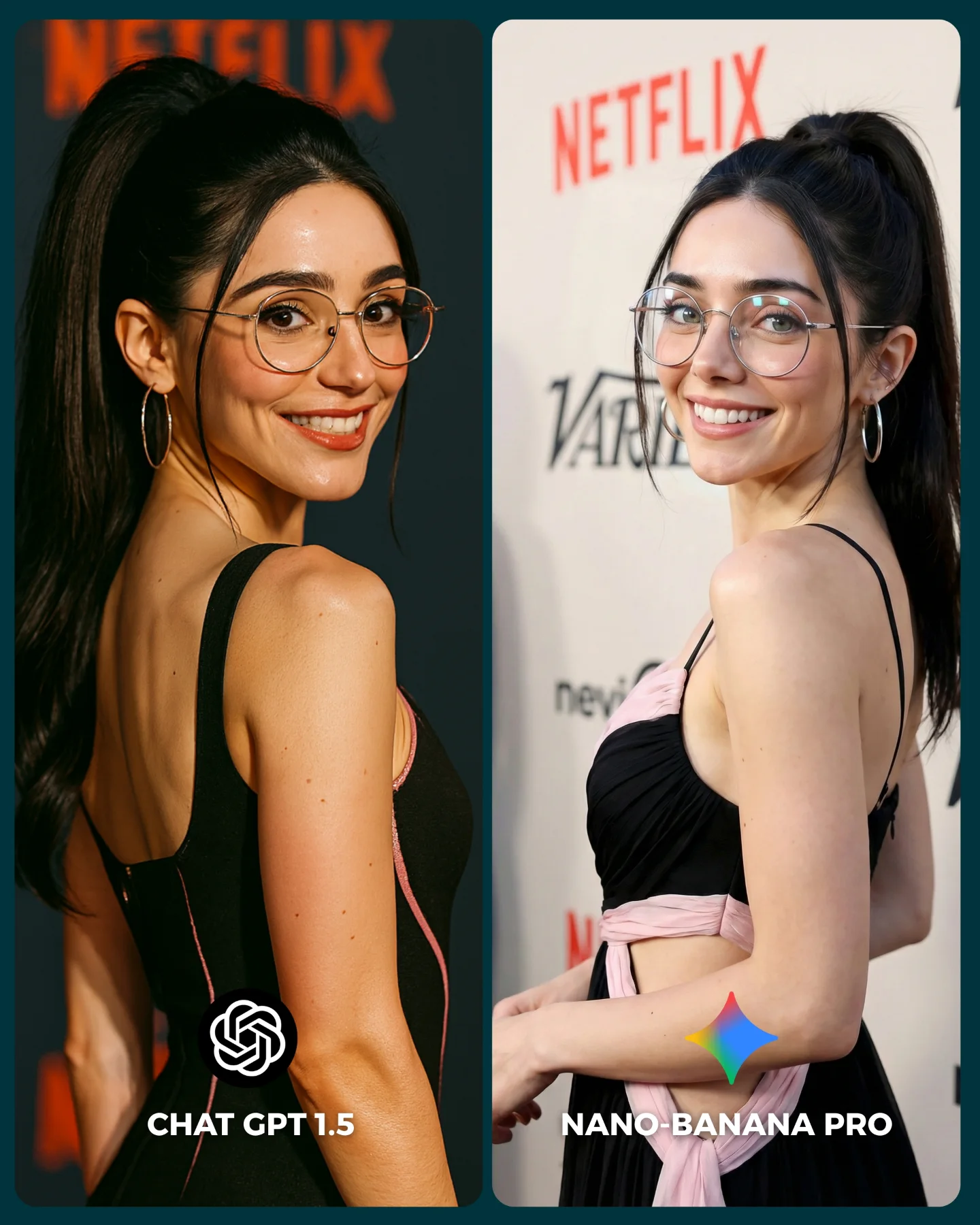
This comparison is effective because it does not chase spectacle. It keeps the subject, pose, framing, and event context almost constant, then lets the differences show up in the details that actually matter: skin rendering, dress structure, shoulder and arm treatment, glasses consistency, and the realism of the red-carpet background. That is what makes the comparison useful instead of noisy.
For creators, this is the core lesson behind a good image-model test. If you change too many variables at once, the result becomes entertainment but not evidence. Here, the format is much more disciplined. It asks a simple question: when the brief stays almost identical, which model handles identity and event-photography texture better?
The over-the-shoulder red-carpet pose is a smart choice for testing because it stresses several things at once. It tests face consistency, hairline and ponytail structure, ear and earring placement, shoulder anatomy, back contour, dress fabric logic, and event-wall integration. That makes it a high-signal pose without becoming chaotic.
| Signal | Evidence (from this image) | Mechanism | Replication Action |
|---|
| Controlled test design | Same woman, near-identical pose, same event-photo genre across both panels | Holding the frame steady makes differences attributable to the model, not to prompt drift | Lock identity, camera angle, and pose before comparing models |
| High-signal pose selection | Over-the-shoulder smile exposes face, shoulder, back line, dress fit, and accessories | One pose can test many rendering weaknesses at once | Use poses that naturally stress anatomy, fabric, and accessory consistency together |
| Readable output packaging | Clear two-panel layout with bottom labels for each model | Presentation clarity improves comments, saves, and comparison discussion | Always label outputs inside the image when asking an audience to vote or compare |
Where this format transfers best
This kind of image works especially well for model-vs-model benchmark posts, prompt education pages, creator tool comparisons, and carousels built around “which one is better?” audience interaction. It is also ideal for social platforms because the split layout is instantly understandable. It is less suitable for broad inspirational galleries, because the entire point is comparative scrutiny rather than immersive storytelling.
- Best fit: AI model benchmark posts. Why it fits: viewers instantly understand the test setup. What to change: preserve pose and framing, vary only the generator.
- Best fit: prompt education pages. Why it fits: the image shows what a good control test looks like. What to change: add one paragraph explaining which details should be judged.
- Best fit: audience-vote carousels. Why it fits: clean binary choices drive comments and saves. What to change: keep labels short and legible at mobile size.
- Not ideal: cinematic story sequences. Reason: the split layout interrupts emotional immersion.
- Not ideal: mood-board posts. Reason: the frame is built for comparison, not atmosphere-first viewing.
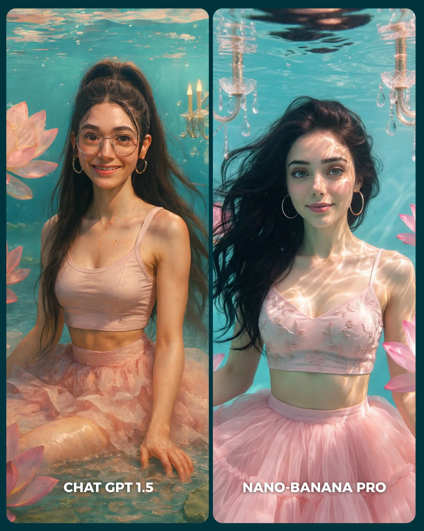
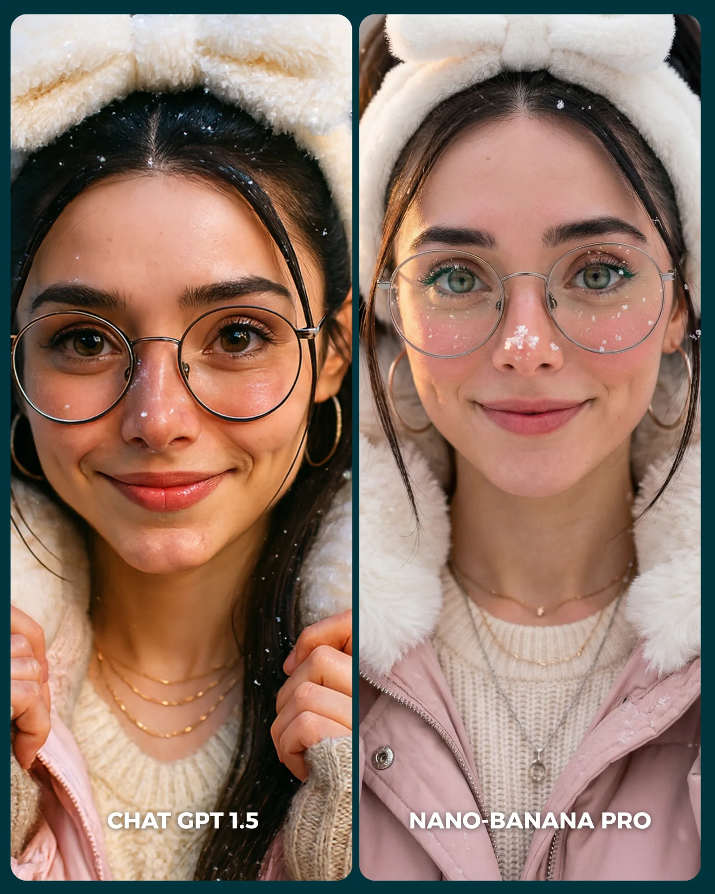
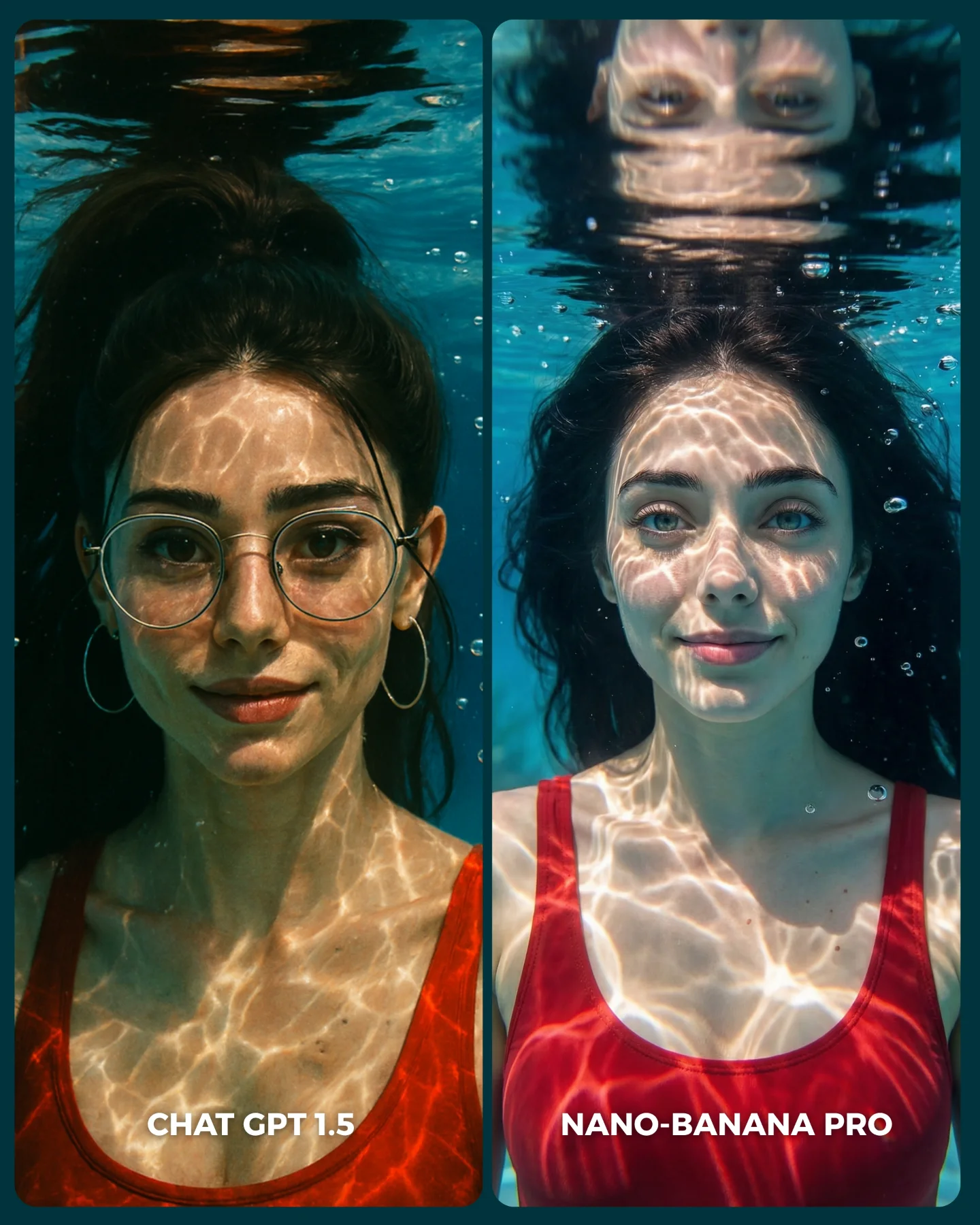
Three transfer recipes work especially well. Keep the same person, same pose, and same scene type. Change only the model, or one prompt knob if you are isolating another variable. Template one: {same subject} in {same pose} with {same event setting} rendered by {model A} vs {model B}. Template two: {two-panel comparison} testing {identity consistency} and {fabric realism} under {identical framing}. Template three: {creator benchmark image} designed for {binary audience vote}.
What the image teaches aesthetically
Aesthetically, the comparison works because the subject choice is elegant but not overly complicated. The black dress, glasses, ponytail, and event wall together create enough detail to expose weaknesses without overwhelming the frame. That balance matters. If the look were simpler, the comparison would be too forgiving. If it were more complex, the audience would not know what to judge.
The left and right tonal differences also help the comparison read fast. One side is moodier and richer, the other brighter and flatter. Even before close inspection, the viewer feels a difference. That is useful on social media, where a comparison image has only a second or two to communicate its premise.
| Observed | Why it matters |
|---|
| Same face orientation and smile in both panels | Keeps the benchmark fair and lowers interpretation noise |
| Event-wall text and logo cues behind both subjects | Test how each model handles background realism under portrait conditions |
| Glasses, earrings, ponytail, and shoulder line all visible | Expose identity-consistency strengths and weaknesses quickly |
| Two short labels embedded at the bottom | Make the image self-explanatory without needing caption context first |
Prompt technique breakdown
| Prompt chunk | What it controls | Swap ideas (EN) |
|---|
| same woman in nearly identical pose | Fairness of the comparison | same seated pose, same mirror selfie, same walking street shot |
| red-carpet event backdrop | Context and texture complexity | fashion week wall, film premiere carpet, branded convention wall |
| glasses, ponytail, hoop earrings | Identity anchors and accessory consistency | statement necklace, bangs, tied-back bun |
| dress fit and shoulder/back visibility | Fabric realism and anatomy stress test | satin gown, blazer dress, off-shoulder eveningwear |
| two-panel labeled layout | Distribution clarity and instant audience understanding | top-bottom split, slider cover, three-model comparison grid |
How to iterate without ruining the benchmark
Lock three things first: the subject identity anchors, the camera angle, and the event-photo pose. Then change only one comparison variable at a time. A strong sequence is:
- Start with the current version: same woman, same pose, same red-carpet context, different model outputs.
- Keep the models the same and test a second pose that stresses a different body area.
- Keep the pose fixed and change only wardrobe complexity, such as adding satin folds or layered jewelry.
- Only after that, test a different environment like street flash or indoor studio.
This order matters because the image wins through control. Once the comparison stops being controlled, it stops being useful.