Nuevo ChatGPT 1.5 vs. Nano Banana Pro 😳
Recién salió el nuevo generador de imágenes de ChatGPT y dicen que supera a Nano Banana Pro... 👀 Como hay que verlo para creerlo, aquí os dejo unas imágenes para que comparéis 💕
No sé si soy yo... pero no me convence en absoluto GPT 1.5 😅
Igualmente dime tú, que te parece y con cual te quedarías??
Y comenta "ARIA" y te paso los prompts que usé para todas estas imágenes 💌
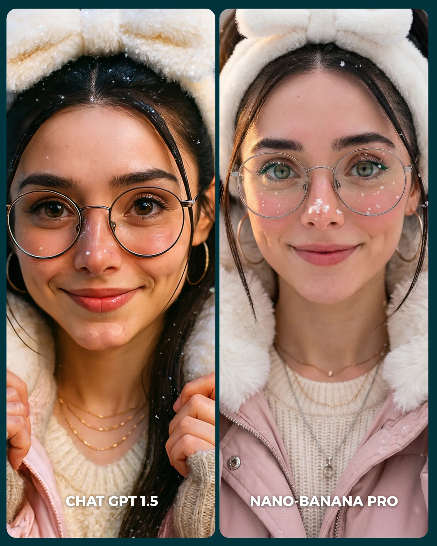
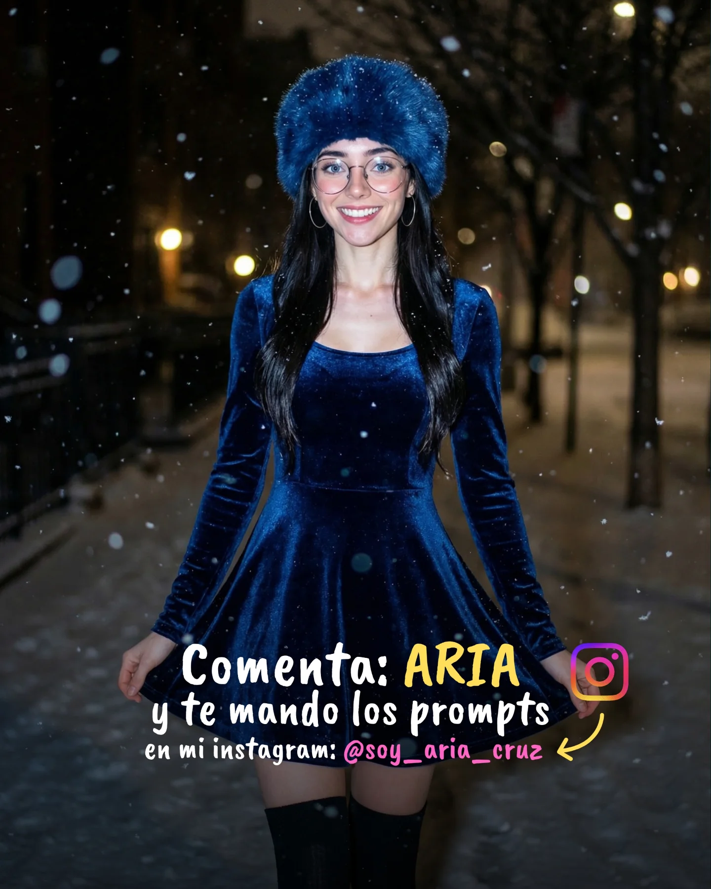
How soy_aria_cruz Made This Winter AI Portrait Comparison AI
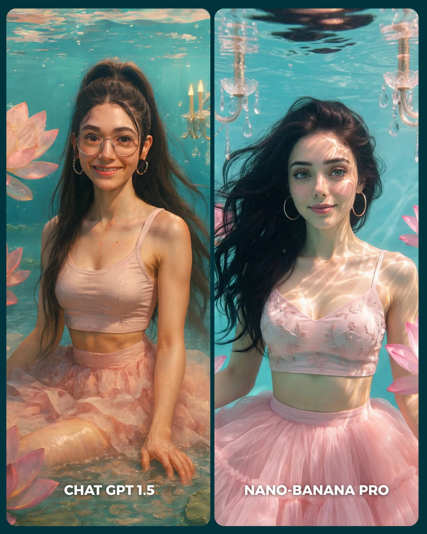
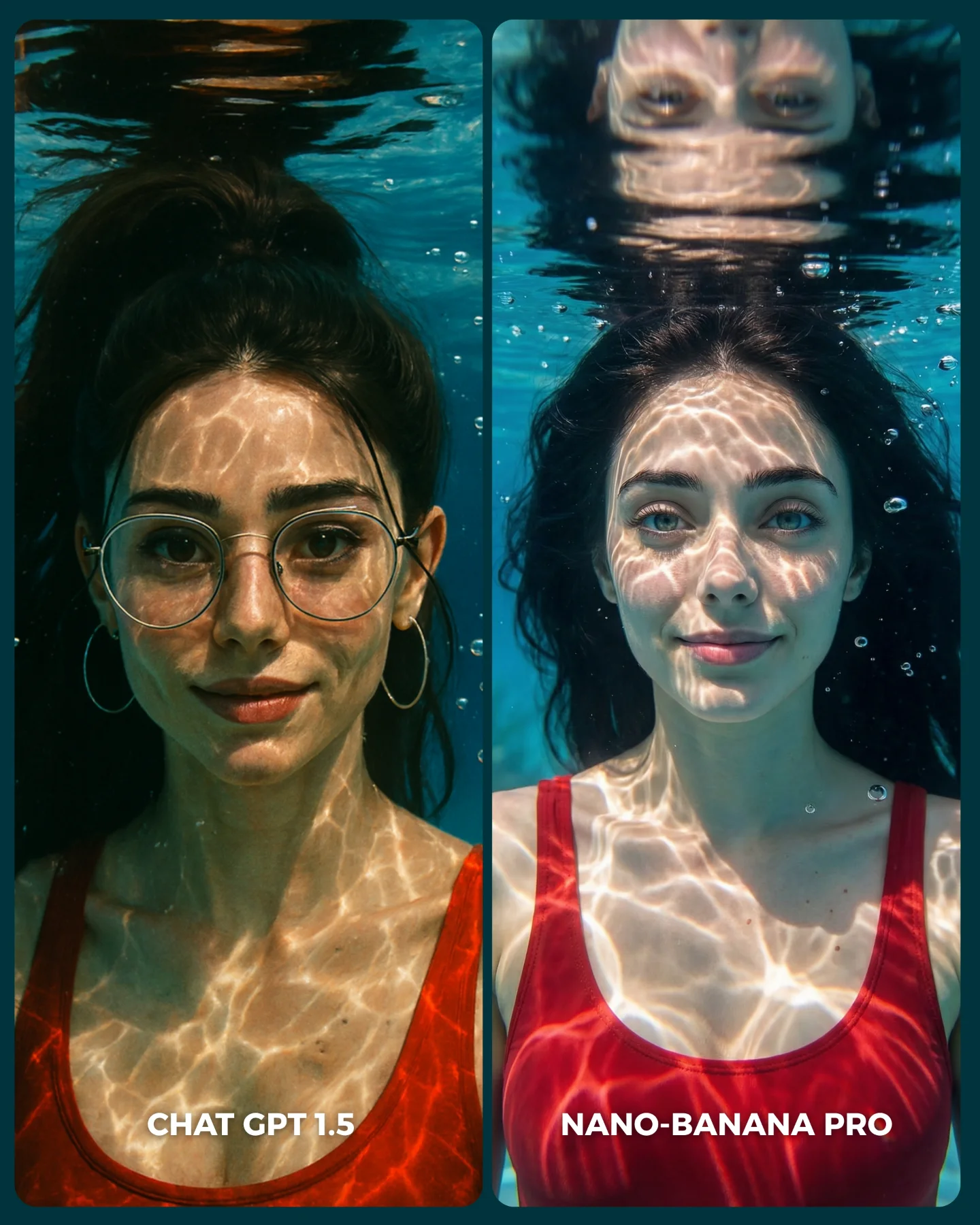
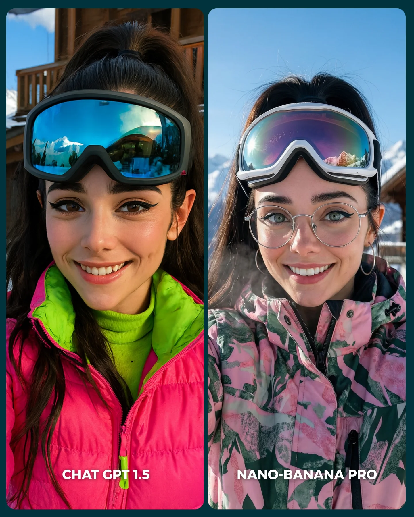
This image works because it turns an abstract tool debate into a visual decision anyone can read quickly. Instead of explaining model differences in technical language, it uses one stable winter-beauty prompt and places two outputs side by side. That makes the comparison immediate. Viewers do not need to understand the engines deeply to notice texture handling, skin feel, hood softness, or overall polish.
The choice of subject is smart too. A close winter portrait is sensitive to small differences in rendering quality. Glasses, delicate jewelry, knit texture, fur softness, and subtle facial color all reveal model behavior quickly. For creators, that is the real lesson: good comparison content starts with a prompt that exposes differences clearly without changing the underlying idea.
Why this comparison format performs well
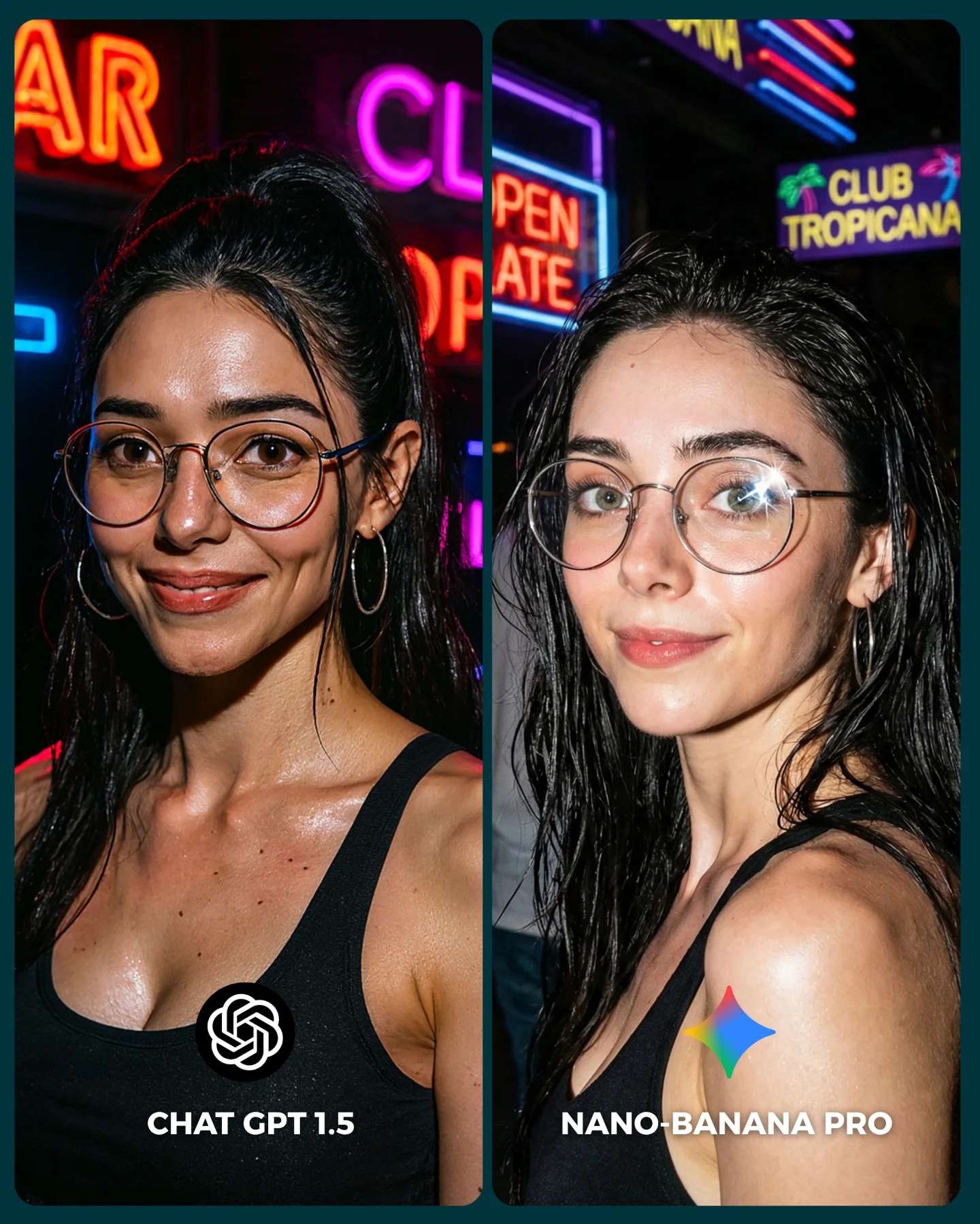
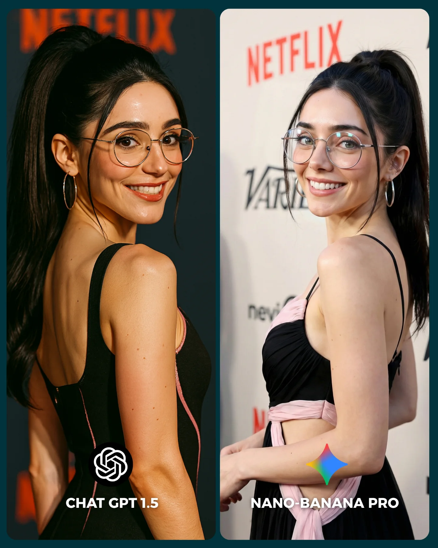
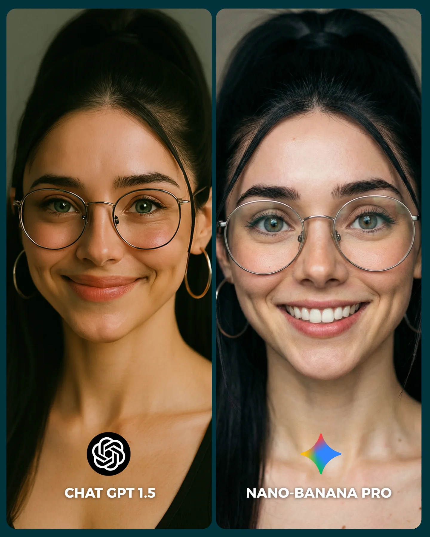
The biggest strength is controlled sameness. The same face, same styling, same framing, and same calm expression are repeated across both panels. That removes a lot of noise from the comparison. Viewers can focus on what changed because almost nothing else did. In AI-content terms, that is excellent comparison design.
The second strength is that the image remains aesthetically pleasing even while being analytical. It still feels like beauty content: soft winter palette, plush hood, gentle expression, clean composition. That matters because people are more likely to engage with a technical comparison when it also functions as attractive lifestyle imagery.
Signal
Evidence (from this image)
Mechanism
Replication Action
Stable subject control
Same woman, same outfit, same pose in both panels
Removes distraction and makes output differences easy to spot
Lock identity, wardrobe, and framing before comparing models
Multiple material types expose rendering quality quickly
Use prompts that include skin, fabric, fur, metal, and transparency in one shot
Low-friction readability
Simple labels at the bottom of each panel
Viewers understand the comparison without reading a long caption first
Keep the panel names baked into the image when the comparison itself is the content
Beauty-led framing
Clean close-up portrait composition in both panels
Makes technical content more shareable and less intimidating
Package model tests inside aesthetically strong portrait formats
Aesthetic read: what makes the comparison fair and attractive
The strongest visual decision is the simplicity of the background. A softer backdrop means the viewer’s attention stays on face detail and winter materials. That is important because model comparisons often become visually noisy when the prompt asks too much from the environment. Here, the scene stays controlled, which makes the subtle differences matter more.
The second strong decision is the winter styling itself. Plush ear hood, pale pink outerwear, and cream knit layers create a gentle emotional frame that people already like. That emotional appeal makes the comparison more watchable. For prompt creators, this is useful: if you want people to care about a technical test, wrap the test in a visually appealing subject.
Observed
Why it matters for the look
How to recreate it
Two equal close-up portrait panels
Keeps the comparison fair and instantly legible
Use matching crop, eye line, and composition on both sides
Soft winter materials
Expose model handling of fur, knit, and skin gently but clearly
Choose tactile wardrobe elements with visible texture contrast
Minimal background
Prevents environmental noise from masking quality differences
Keep the scene clean and let the portrait do the work
Simple bottom labels
Add immediate orientation without clutter
Use short tool names with clear hierarchy and contrast
Delicate accessories
Test detail rendering without overwhelming the frame
Add one or two small metal or transparent accessories like glasses and necklaces
Best-fit uses and where it transfers
AI model comparison posts: this format works especially well because it makes the argument visual instead of theoretical.
Prompt education content: it is useful for teaching which details tend to reveal model quality fastest.
Creator-brand benchmarking posts: the image allows the creator to compare tools while still preserving a consistent aesthetic identity.
Series around style tests: the same structure can be repeated across beauty portraits, fashion photos, product shots, or cinematic scenes.
This approach is weaker if the two panels differ too much in pose or outfit, because the audience then cannot tell whether the tool changed or the prompt changed. It also loses impact when the labels or visual hierarchy are unclear.
Three transfer recipes
Keep: one subject, one outfit, one crop, and two labeled panels. Change: the material challenge depending on what quality you want to test, such as metal jewelry, water droplets, or curls. Slot template:{same portrait prompt} {left model label} {right model label} {texture-rich styling}
Keep: clean split layout and low-noise background. Change: the prompt theme from winter beauty to streetwear, bridal, product, or cinematic portrait while preserving the comparison logic. Slot template:{controlled subject} {two-model comparison card} {consistent framing} {one high-information styling choice}
Keep: simple labels and visually pleasant test subject. Change: the audience angle by emphasizing realism, aesthetic taste, or prompt reliability depending on the creator’s goal. Slot template:{same person twice} {tool names visible} {specific quality test} {shareable visual design}
Prompt technique breakdown
To recreate this style reliably, separate the prompt into comparison structure, identity lock, texture choices, and label placement. If those layers are too vague, the output often stops functioning as a fair comparison and becomes two unrelated images.
Prompt chunk
What it controls
Swap ideas (EN, 2–3 options)
two equal side-by-side panels with model labels
Comparison structure and readability
AI comparison card; left-right benchmark layout; split portrait test image
same woman with glasses and winter hood in both panels
Identity stability
consistent face lock; repeated subject identity; same pose same styling
left more raw, right more refined; minor style divergence; visible output-quality gap
Remix steps that keep the comparison useful
Lock three things first: subject identity, framing, and outfit. Those are the backbone of the comparison. After that, change only the model name or the rendering interpretation. If too many image variables move at once, the post stops teaching anything.
Baseline run: keep the same winter portrait prompt and same subject lock across both panels.
Texture run: refine fur, knit, glasses, and jewelry until the prompt exposes useful detail differences.
Design run: adjust only the label placement, border spacing, and panel balance for easier scanning.
Evaluation run: decide which differences matter to your audience and reflect those in the caption, not by changing the image structure.
If the result becomes too similar, choose a prompt with more material complexity. If it becomes too inconsistent, simplify the prompt and strengthen identity lock. The best comparison image is not the one with the most drama. It is the one that makes viewers feel they can judge the difference for themselves in a second.