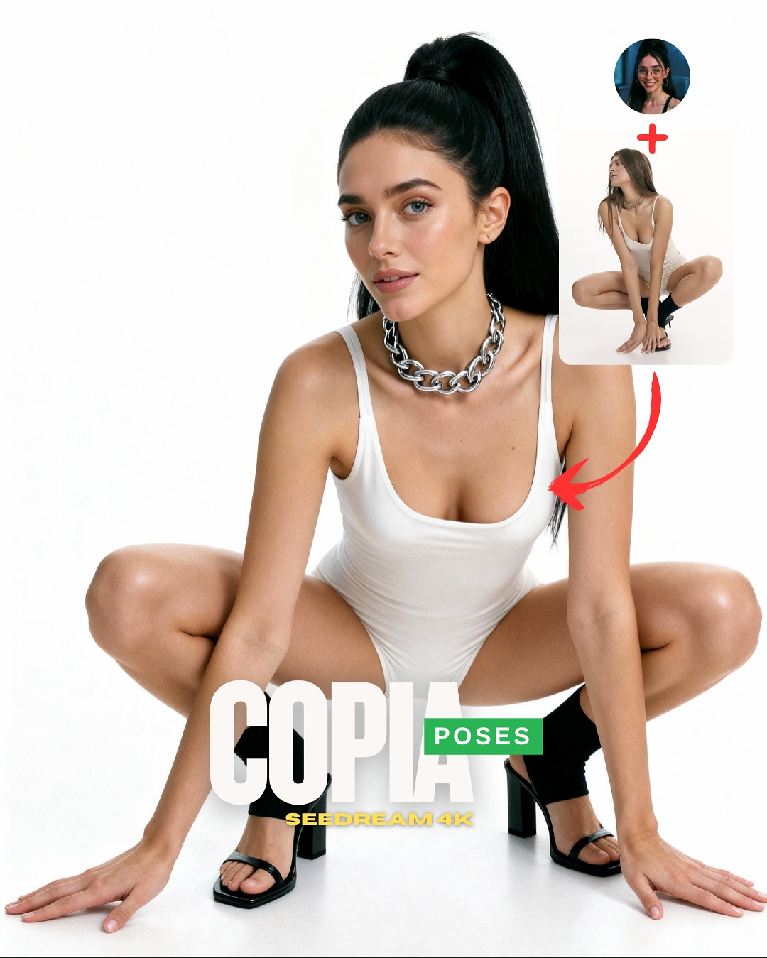
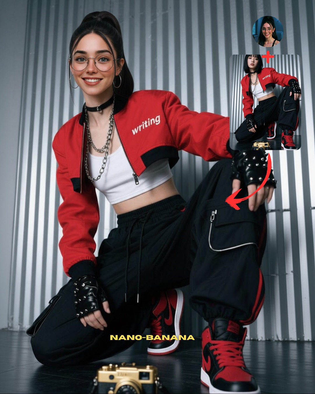
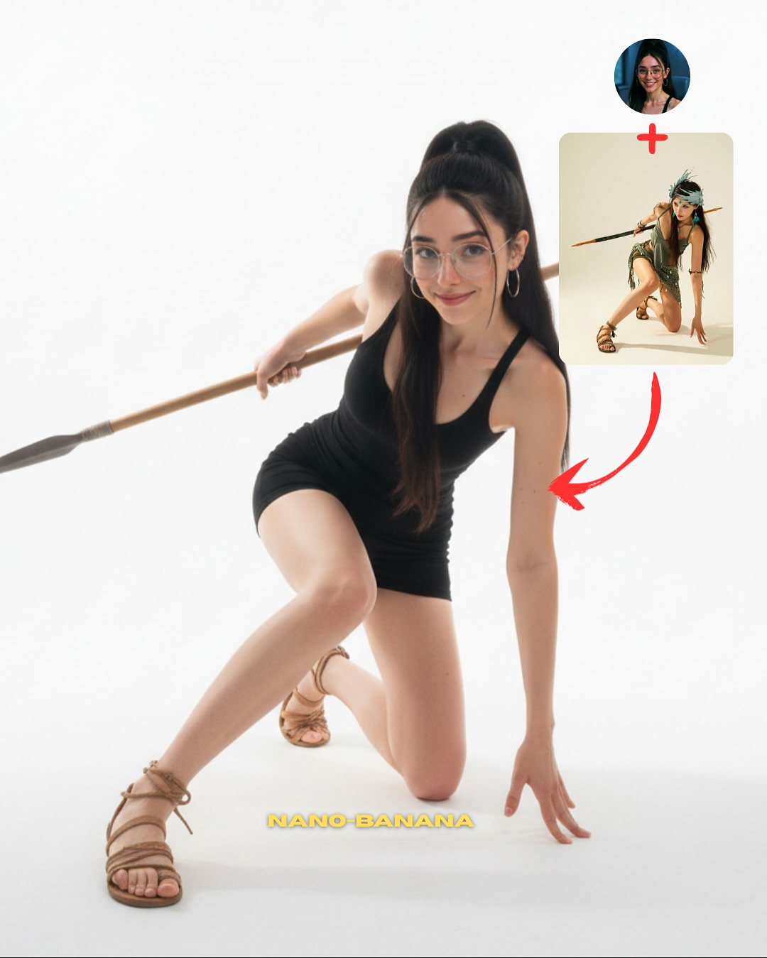
How soy_aria_cruz Made This Studio Squat Pose Image — and How to Recreate It
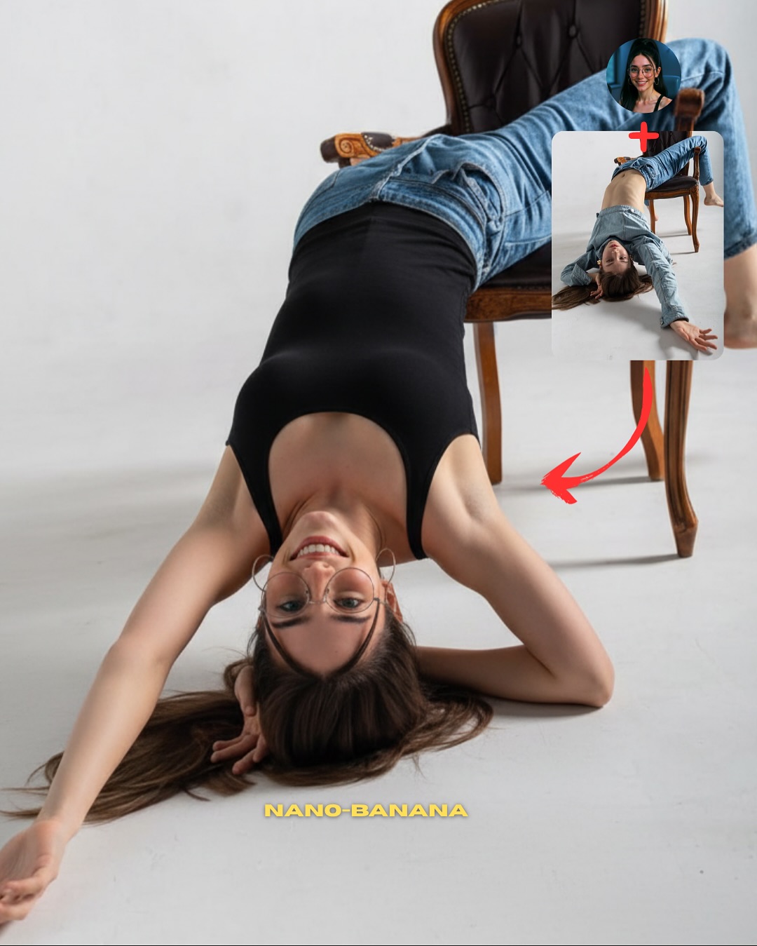
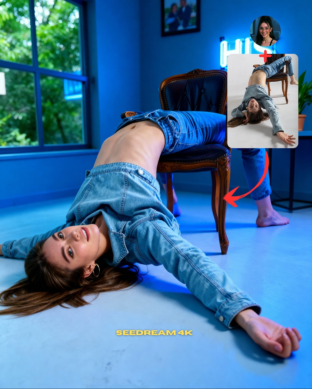
This image works because it understands that pose-tutorial content needs one thing above all: instant shape clarity. The white background removes every distraction, which means the viewer reads the squat geometry in less than a second. That is exactly what a “copy this pose” graphic should do. The body becomes the diagram, and the design elements simply frame that lesson.
The silver necklace and black heels are also doing more work than they seem to. They break up the all-white setup with a few sharp visual anchors, which helps the pose feel intentional and stylish rather than clinical. For creators, this is a useful lesson: even tutorial-style graphics need a little fashion tension if they want to remain visually desirable.
Why This Pose CTA Reads So Quickly
The strongest thing here is the clarity of the silhouette. The knees, elbows, hands, and torso all create a compact, symmetrical structure that stays legible even at small sizes. This is one of the reasons squat-based fashion poses perform well in social formats: they create a bold shape without requiring a complicated location.
Another reason it works is the explanatory overlay. The avatar, reference image, and red arrow immediately tell the viewer that this is not just inspiration but instruction. That distinction matters. Posts that combine style and teachability often outperform pure mood content because they give the audience something obvious to do next.
| Signal | Evidence (from this image) | Mechanism | Replication Action |
|---|
| Fast body geometry | The deep squat creates a memorable symmetrical shape against a blank background | Strong silhouette makes the pose easy to understand and copy quickly | Use compact high-contrast body positions if your post is teaching pose replication |
| Low-noise environment | The white seamless background removes any competing visual information | Visual silence makes the human form and overlays do all the work | Strip the setting down when the pose itself is the core product |
| Instructional packaging | Avatar, inset, arrow, and headline tell the viewer what the post is for | Clear social packaging lowers friction and increases conversion speed | Show source/reference logic directly if the goal is copying or learning |
| Minimal but sharp styling | White bodysuit is punctuated by a silver chain and black heels | A few contrast points keep the graphic stylish without undermining the clean format | Add one metal accent and one dark footwear cue if the background is fully neutral |
Where This Visual Formula Fits Best
- Pose-tutorial content: ideal when the body position itself is the main value of the post.
- Carousel or reel cover graphics: strong because the silhouette remains obvious at thumbnail size.
- Prompt-growth posts: useful for creators teaching how to recreate a particular studio pose result.
- Minimal fashion CTA images: effective when the goal is conversion with a clean premium look.
This setup is less ideal for narrative fashion stories, emotional portraiture, or lifestyle-rich brand content. The strength here comes from reduction. If you add environment, story, or too many accessories, the pose lesson gets diluted.
Transfer recipe one: Keep the white seamless background, one strong body shape, and the inset-arrow CTA system. Change the pose family while preserving the same instructional layout. Slot template: {hero pose} {blank studio} {reference inset} {big CTA headline}.
Transfer recipe two: Keep the bodysuit and heels logic. Change the styling accent from silver necklace to sunglasses, gloves, or bold earrings while preserving the same central squat geometry. Slot template: {clean studio pose} {one contrast accessory} {mobile-first layout} {copy-this-pose energy}.
Transfer recipe three: Keep the silhouette-first structure and conversion packaging. Change the emotional tone from calm confidence to playful attitude or stronger editorial edge while preserving the same white-background clarity. Slot template: {clear body shape} {minimal set} {overlay system} {creator growth goal}.
What Makes the Graphic Feel Premium Instead of Generic
The image feels premium because it uses emptiness intentionally. White space is not just background here. It is a design tool that makes the pose, the inset, and the CTA text feel deliberate. The subject is not lost in the emptiness because the silhouette is strong enough to justify it.
The chain necklace and heels also help the image avoid looking like a basic e-commerce pose reference. They add a little luxury friction. For creators, that is a practical takeaway: instructional graphics work best when they teach something useful while still looking like something people would want to save for aesthetic reasons.
| Observed | Recreate |
|---|
| Centered squat shape dominates a white frame | Use a pose with immediate graphic impact if the set itself is intentionally empty |
| Inset and arrow explain the source visually | Make the transformation pathway visible instead of relying on caption context alone |
| Small contrast accessories keep the image stylish | Add one or two sharp styling accents if the wardrobe and set are otherwise minimal |
| Bottom headline sits where the body leaves room for it | Design pose and typography together so they support rather than compete |
Prompt Technique Breakdown
| Prompt chunk | What it controls | Swap ideas (EN, 2–3 options) |
|---|
| deep squat pose on a white seamless background | Core body geometry and layout clarity | kneeling pose; floor-seated twist; one-knee hero stance |
| white bodysuit, silver chain, black heels | Minimal styling with contrast anchors | black bodysuit on white set; beige bodysuit with metallic boots; white set with statement earrings |
| upper-right avatar, reference inset, and red arrow | Instructional social packaging | before-after card; carousel cue; template thumbnail system |
| large bottom text reading COPIA POSES | Headline hierarchy and CTA clarity | copy this pose; save this pose; recreate this shot |
| bright high-key studio lighting | Clean readability and premium minimalism | slightly softer studio light; harder contrast studio version; cooler white background tone |
| mobile-first tutorial design instead of editorial layout | Use case and conversion behavior | ad cover version; carousel slide opener; cleaner prompt-guide card |
How to Iterate Without Losing the Teaching Value
Lock three things first: the strong central pose, the blank white background, and the inset-plus-arrow explanatory system. Those are the load-bearing parts. If one weakens, the image becomes either a generic fashion shot or a confusing CTA.
- Start with the exact formula: white seamless studio, deep squat, white bodysuit, black heels, profile avatar, inset, arrow, and bold bottom CTA.
- Change only the pose family, preserving the same empty studio and conversion packaging.
- Change only the styling accents, keeping the silhouette and the graphic system unchanged.
- Change only the CTA language, moving from pose-copy to tutorial, prompt-copy, or inspiration-save while preserving the same visual hierarchy.
The repeatable takeaway is simple: pose CTA graphics convert best when the body shape is instantly readable and the layout explains itself in one glance.