How soy_aria_cruz Built This Upside Down Chair Pose Transfer AI
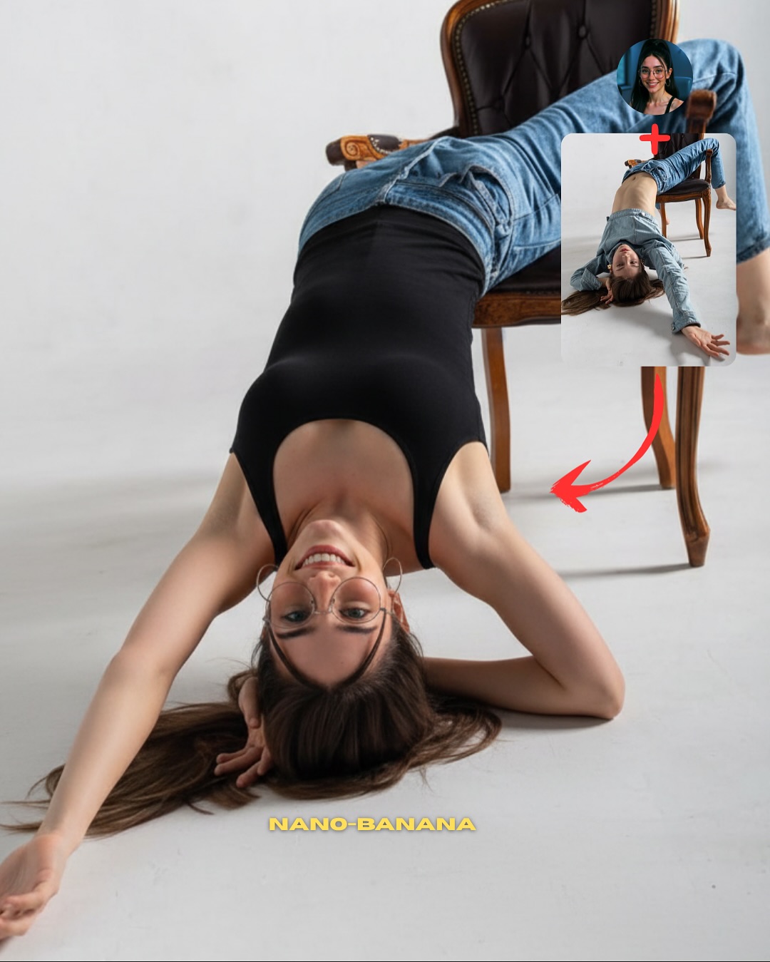
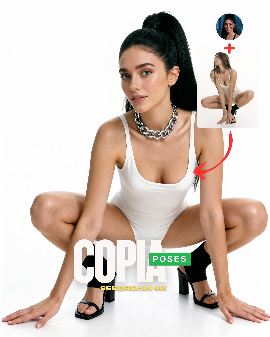
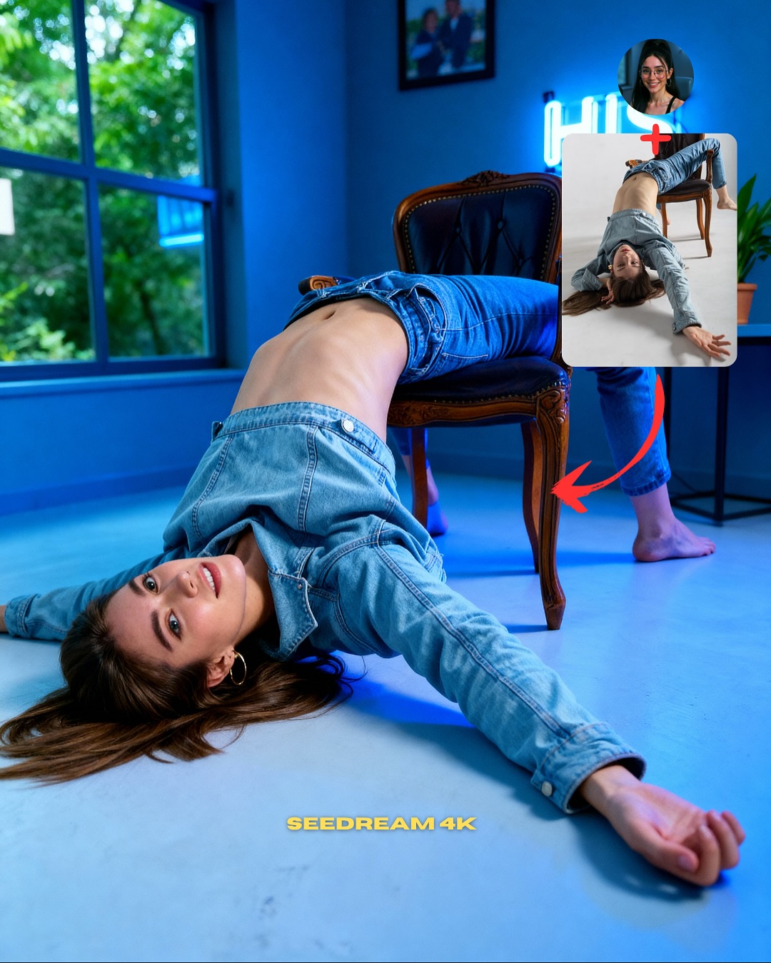
This image works because it chooses a pose that is visually unmistakable. An upside-down chair pose is not something the viewer reads as accidental. That matters for teaching. If you are trying to explain pose transfer, the best demonstration is a body position that would be hard to invent by chance but still clear enough to verify at a glance. This one does exactly that. The audience can instantly see that the final image inherited structure from the reference.
The layout also keeps the lesson honest. The small face reference and the separate pose reference make the process legible: one source controls identity, the other controls body arrangement. That is the real educational value here. Instead of pretending the image simply appeared fully formed, the cover shows the mechanics behind it. For creators building trust, that is a much better strategy than only posting the final output.
The clean white studio background is another smart decision. A complex set would make an unusual pose harder to parse. Here, the white floor and the single chair remove visual noise, so the viewer can judge whether the anatomy, furniture contact, and body arc all hold together. That is exactly what a good tutorial cover should do: simplify the scene so the technique becomes visible.
| Signal | Evidence (from this image) | Mechanism | Replication Action |
|---|
| Distinct pose geometry | Inverted body over one chair with legs draped above and arm extended across the floor | Memorable geometry makes transfer success easy to verify | Choose poses with a clear silhouette rather than generic standing stances |
| Visible source logic | Face reference, pose reference, and red arrow all stay in frame | Turns the image into a self-explaining workflow | Show identity source and pose source together whenever teaching transfer |
| Minimal set design | White seamless background and one chair only | Removes distractions and helps viewers inspect anatomy and object contact | Use the simplest possible background when the pose itself is the lesson |
Best-fit use cases
- Pose-transfer tutorials, because the body structure is strong enough to prove the method.
- Model capability tests, because furniture interaction exposes weak generations quickly.
- Carousel opener images, because the layout already contains the “how it works” hook.
- SEO teaching pages, because the frame gives both a visual result and an explanatory diagram.
Less ideal: mood-first editorials, travel content, or highly emotional narrative scenes. This structure is designed for demonstration and verification.
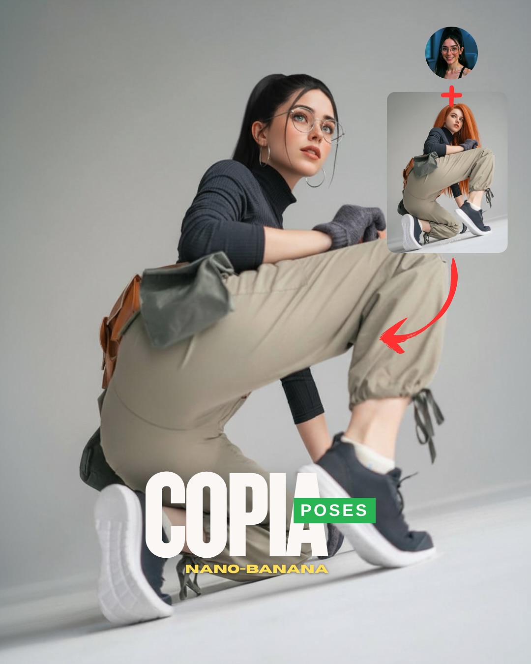
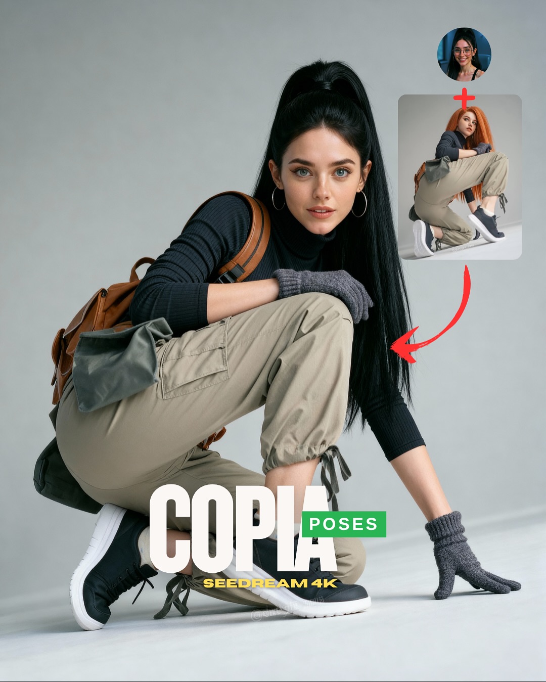
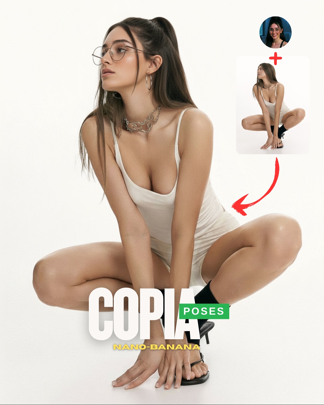
To adapt it, keep the single-object interaction, keep the source/reference corner, and keep the clear silhouette. Then change the furniture or support object. The same teaching logic works with stools, stairs, benches, yoga blocks, or low platforms. Slot template: {final result with clear object interaction} + {face source} + {pose source} + {simple annotation system}.
Aesthetic read
The reason this image still works aesthetically, despite being instructional, is that it is compositionally clean. The diagonal arm, curved torso, chair frame, and falling hair all create a readable path through the image. The background does almost nothing, which is exactly why the pose gets to do everything. For creators, this is a good lesson: if a pose is complex, the set should usually get quieter.
The outfit choice helps too. Black fitted fabric against a white floor gives the body line definition, while the blue jeans add just enough everyday texture to stop the image from feeling abstract. The leather chair contributes one more useful contrast: hard structure against a flexible body arc. That opposition makes the frame easier to read.
| Observed | Why it matters |
|---|
| Single vintage chair in a white studio | Creates a simple object anchor for the pose |
| Upside-down body arc with extended diagonal arm | Gives the tutorial a distinctive, testable silhouette |
| Top-right face and pose references | Explain the workflow without extra text |
| Black outfit against pale floor | Makes body lines easier to evaluate |
| Soft studio light with clean shadows | Helps viewers inspect pose accuracy and contact points |
Prompt technique breakdown
| Prompt chunk | What it controls | Swap ideas (EN, 2–3 options) |
|---|
| same face source plus separate upside-down pose reference | Core transfer workflow | identity source plus seated pose, same face plus stair pose, face lock plus yoga pose |
| inverted body draped over a tufted leather chair | Main silhouette and difficulty level | backbend over stool, sideways drape on bench, reclined twist on low platform |
| minimal white studio with one object only | Clarity of the instructional scene | light gray seamless, pale concrete studio, clean daylight loft corner |
| black fitted top and blue denim jeans | Readable body line with familiar everyday styling | neutral bodysuit and trousers, monochrome athleisure, simple knit and jeans |
| small reference boxes and red arrow annotation | Tutorial packaging and instant comprehension | numbered steps, split panels, dotted guide lines |
How to iterate without losing the core
Lock these three things first: the chair interaction, the clear inverted silhouette, and the simple tutorial layout. Those are the identity anchors. Then change only one or two variables per run.
- Baseline run: keep the same chair-based inversion and make sure anatomy and object contact feel stable.
- Second run: keep the layout but swap only the outfit, to check whether body readability survives different silhouettes.
- Third run: keep the pose logic and move from chair to stool or bench to test object-transfer difficulty.
- Fourth run: keep the workflow packaging and use the same structure for another complex pose category, such as floor stretches or dance shapes.
If the image starts failing, the first thing to correct is usually not the face. It is the contact logic between the body and the furniture. If the object interaction feels unstable, the whole tutorial loses credibility.