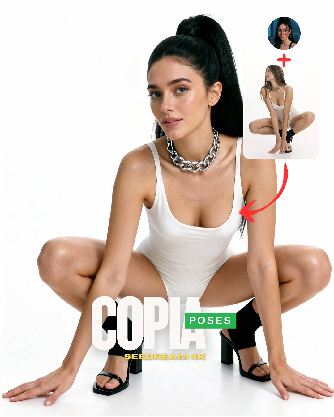
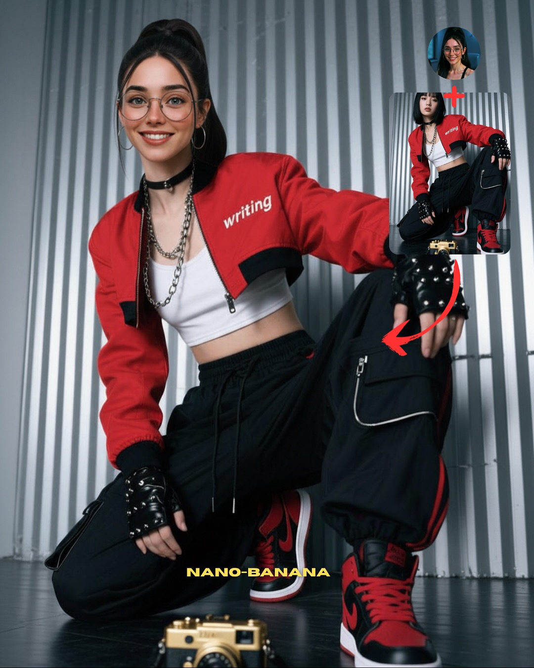
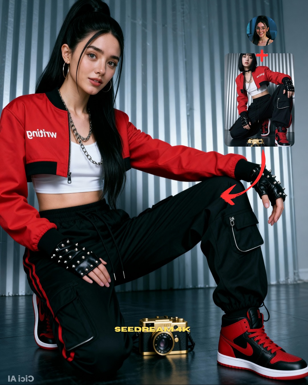
Transfiere Poses a tu Influencer IA 💕
Como sé que conseguir transferir la pose que buscas es complicado y requiere muchas pruebas fallidas (y créditos gastados para nada 😅), aquí te dejo varias imágenes con sus prompts para que puedas usarlas con tus propias imágenes 🙊
Cómo usarlo:
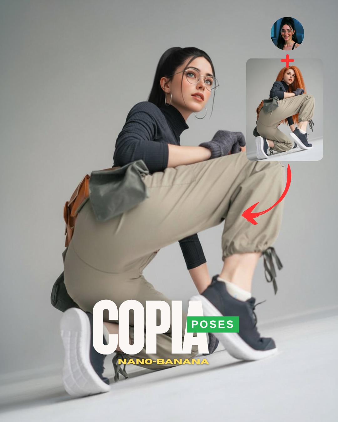
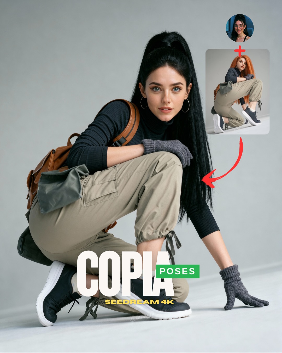
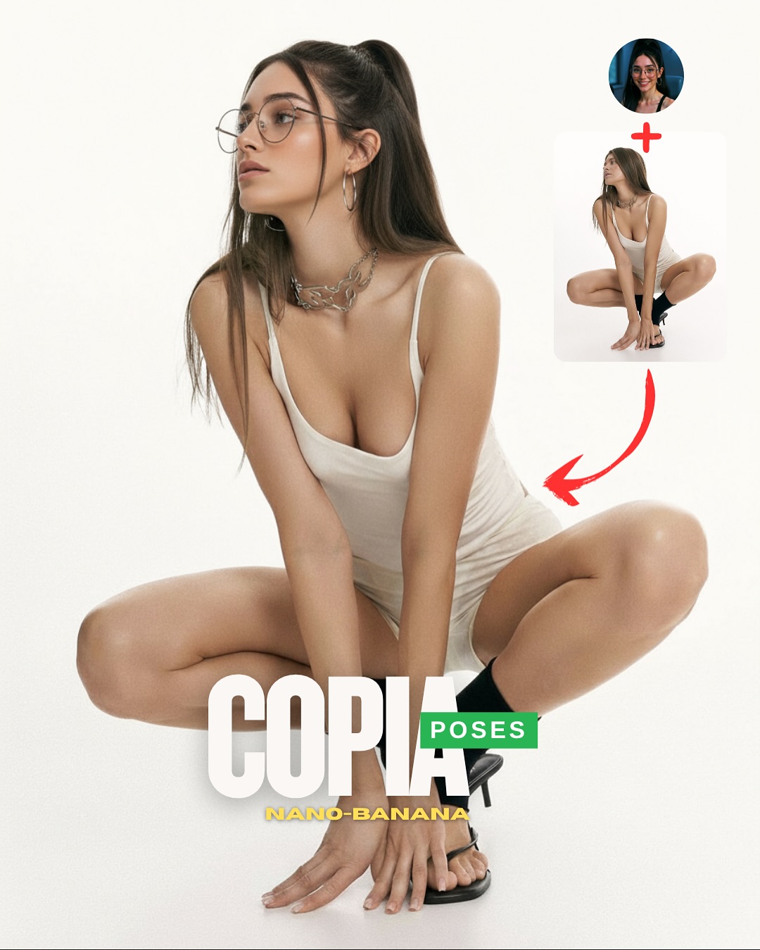
1️⃣ Imagen 1 = tu foto o la de tu influencer IA.
2️⃣ Imagen 2 = la pose que quieres recrear.
3️⃣ Genera en Nano-Banana o Seedream 4K y haz 4–8 intentos para elegir el mejor resultado.
Si quieres todos los Prompts comenta “ARIA” y te lo paso 💌
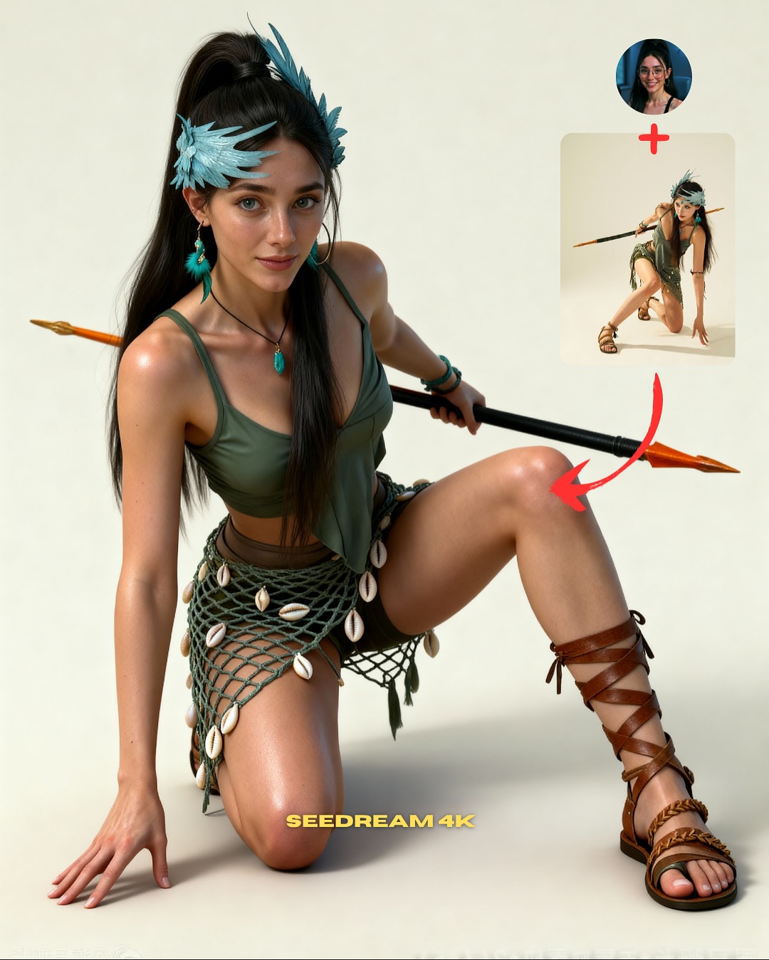
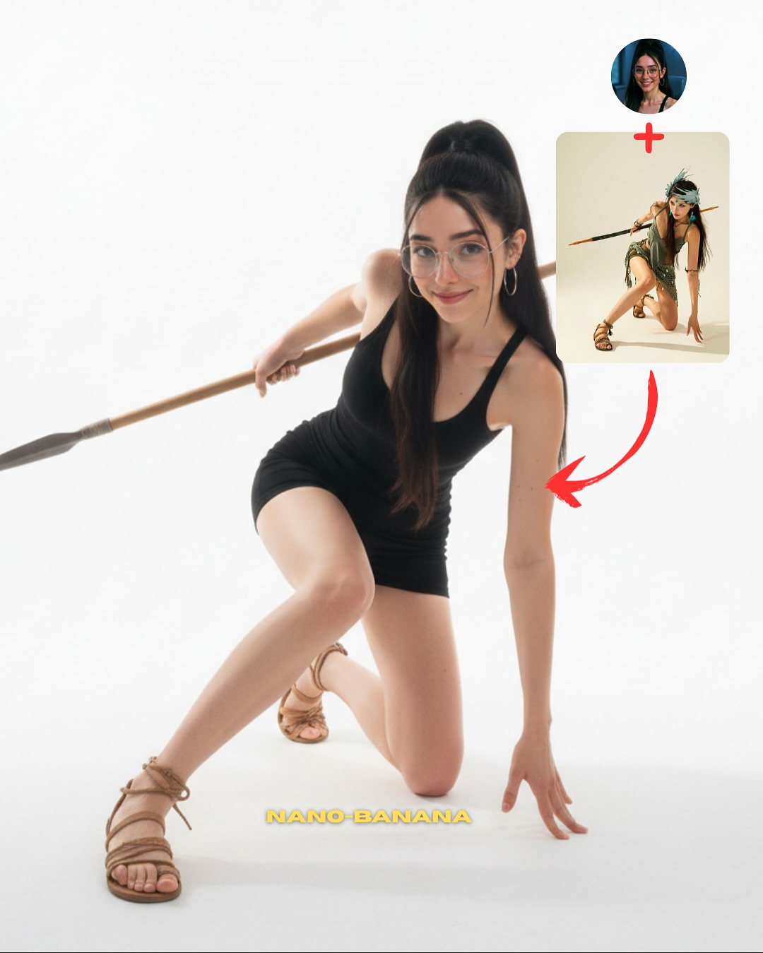
How soy_aria_cruz Made This Spear Warrior Pose Image — and How to Recreate It
This image succeeds because it turns a complicated pose problem into a clean visual lesson. The upper-right reference card shows the target pose, the red arrow explains the transfer logic, and the main image proves the result. That structure is what makes the post useful. Without the overlay, it would just be a stylish fantasy-studio portrait. With it, the image becomes a workflow demonstration.
For creators, the strongest lesson here is that pose-transfer content improves when the environment stays simple and the body shape stays readable. The plain studio background is not a limitation. It is the reason the viewer can judge whether the recreation actually worked. Every unnecessary location detail would make the anatomy harder to inspect.
The outfit choice is also strategic. The asymmetrical green costume, shell netting, and gladiator sandals add personality, but they still let the body line remain visible. That balance matters. If the clothing were too bulky, the pose would be hidden. If it were too minimal, the image would lose character. This styling gives the post both visual identity and structural clarity.
Why This Pose-Transfer Cover Performs
The first mechanism is immediate instructional clarity. The audience does not need to guess what the post is about. The reference image and arrow explain the premise instantly. That matters because educational social content performs better when the lesson is visually obvious before the caption begins.
The second mechanism is silhouette strength. The raised knee, grounded hand, turned torso, and long spear create a memorable body-and-prop shape that reads well at thumbnail size. Strong poses drive better attention because they turn anatomy into graphic composition.
The third mechanism is low-noise presentation. A lot of fantasy-inspired AI posts bury the body inside elaborate scenery. This one does the opposite. It keeps the backdrop blank and lets the pose carry the complexity. That is a much better choice for a benchmark or teaching post.
Signal
Evidence (from this image)
Mechanism
Replication Action
Visual tutorial cue
Reference card and red arrow clearly explain the source-to-result process
The post becomes useful before any caption text is read
Show the source pose inside the cover whenever teaching transfer workflows
Strong full-body geometry
One knee lifted, one hand grounded, spear stretched across frame
Distinct limb directions create a memorable and inspectable silhouette
Choose reference poses with clear angles and one long prop line
Character without clutter
Fantasy styling exists, but the background stays plain
The image feels specific without sacrificing readability
Add costume personality through accessories and texture instead of location noise
Benchmark fairness
Minimal backdrop exposes pose and anatomy quality directly
Clean setups make it easier for viewers to trust the result
Use seamless studio backgrounds when the goal is control rather than atmosphere
Where This Style Fits Best
This approach is ideal for pose-transfer tutorials, AI influencer workflow posts, studio benchmark covers, fantasy-character pose tests, and anatomy-control demonstrations. It is especially useful when you want followers to understand not only that the result looks good, but that the pose logic actually survived the generation.
Best fit: pose-transfer education. The overlay and plain background make the process easy to understand.
Best fit: fantasy styling tests. The costume adds flavor without compromising the technical lesson.
Best fit: creator workflow carousels. This kind of cover sets up a step-by-step explanation naturally.
Best fit: anatomy and prop control benchmarks. The spear adds an extra difficulty layer worth showcasing.
Best fit: social covers for prompt packs. The image is attractive enough to stop the scroll, then useful enough to convert attention.
It is less suited to cinematic storytelling, environmental worldbuilding, or luxury beauty positioning. Its power comes from controlled studio clarity, not atmosphere or narrative depth.
Transfer Recipes
Sword stance version. Keep: studio simplicity and overlay logic. Change: prop type, costume texture, knee angle. Slot template: pose-transfer tutorial cover, same subject in {character styling}, clean studio background, source-pose inset, long prop crossing the body
Archer crouch version. Keep: readable body geometry and minimal backdrop. Change: prop direction, arm position, accessory set. Slot template: studio pose benchmark, {fantasy archetype}, kneeling action pose, reference overlay in upper corner
Dance-floor warrior version. Keep: anatomy-first framing and transfer proof. Change: color palette, footwear, ornament style. Slot template: full-body pose transfer result, clean background, strong limb angles, costume detail, reference image plus arrow
The Aesthetic Read
The strongest design move here is the tension between softness and sharpness. The body pose is sharp and angular, but the background is soft and neutral. The costume textures are detailed, but the environment is quiet. That contrast helps the image feel sophisticated without confusing the eye.
The spear also matters more than it seems. It gives the frame a long horizontal counterline that stabilizes the crouch. Without it, the image would still work as a pose study, but it would feel less dynamic and less memorable. Props are often useful in pose-transfer posts when they reinforce, rather than fight, the body shape.
The teal headpiece and shell details are another smart choice. They add a fantasy read while staying lightweight enough not to bury the technical lesson. This is a good reminder that aesthetic flavor is most effective when it rides on top of clear structure instead of replacing it.
Observed
Why it matters
How to recreate it
Plain studio background
Keeps all attention on anatomy and prop control
Use seamless sets when pose accuracy is the main point
Spear crossing behind the body
Adds motion and anchors the composition horizontally
Pair dynamic poses with one long prop that clarifies direction
Raised knee and grounded hand
Create a strong asymmetrical silhouette
Choose poses with one bent support limb and one clear anchor point
Lightweight fantasy styling
Gives the image personality without hiding the form
Use accessories, netting, and jewelry instead of bulky armor
Upper-right reference overlay
Transforms the image from fashion shot into teaching asset
Always show the pose source when the workflow depends on transfer
Prompt Technique Breakdown
To recreate this image well, think in four systems: pose geometry, prop alignment, costume readability, and overlay logic. If any one of those systems collapses, the entire post weakens. A good fantasy portrait is not enough. The post becomes valuable only when the audience can see the pose transfer clearly.
Prompt chunk
What it controls
Swap ideas (EN, 2-3 options)
Pose geometry
Silhouette quality and teaching value
low kneeling crouch; one-knee-up pose; grounded hand with turned torso
Prop alignment
Motion line and complexity test
long spear behind body; staff crossing frame; pole weapon as horizontal counterline
Costume readability
Character identity without losing body clarity
olive fantasy two-piece; netted shell skirt; lightweight tribal styling
Studio control
Benchmark fairness and anatomy visibility
plain seamless backdrop; clean studio floor; minimal neutral set
Overlay logic
Explains the workflow visually
reference image inset; red curved arrow; creator profile plus source pose card
Identity anchors
Connects the result to the creator rather than a generic model
round glasses; high ponytail; teal head ornaments
The most common failure point is prop drift. Long weapons tend to warp, shorten, or intersect the body awkwardly in generated images. That is why the spear needs to be described explicitly in both placement and structure.
How to Iterate Without Wasting Runs
Lock three things first: the crouched pose, the spear alignment, and the plain studio background. Once those are stable, refine costume texture and the upper-right overlay. If you start by polishing styling before the anatomy and prop are correct, you will end up wasting iterations on attractive but unusable outputs.
Use a one-change rule. If the pose is wrong, fix only the body structure. If the pose works but the fantasy read is weak, adjust ornaments and shell details. If the teaching function is unclear, reintroduce the overlay more assertively. Controlled iteration is especially important for pose-transfer posts because readability is the whole value proposition.
Run 1: Solve the body geometry and stable crouch against a blank studio backdrop.
Run 2: Add the spear and lock its angle behind the body.
Run 3: Refine outfit textures, sandals, headpiece, and shell accents.
Run 4: Add the reference overlay, red arrow, and bottom generator label without disturbing the pose.
If the output becomes too much like fantasy key art, append a correction like pose-transfer tutorial cover, clean studio benchmark, realistic anatomy and prop alignment. If it becomes too plain, add back the ornaments and shell skirt, but keep the background empty. The image works because the lesson remains visible at all times.