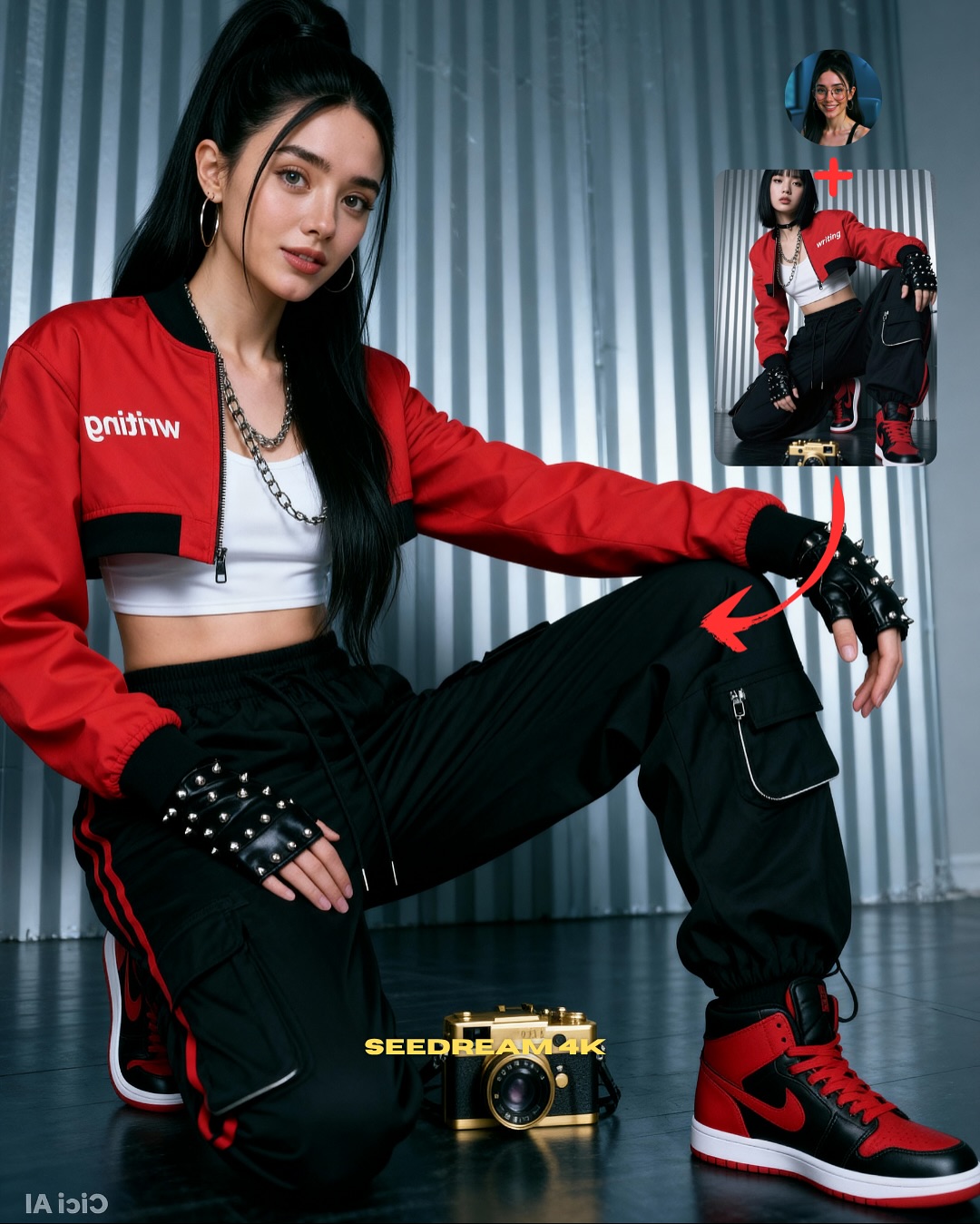
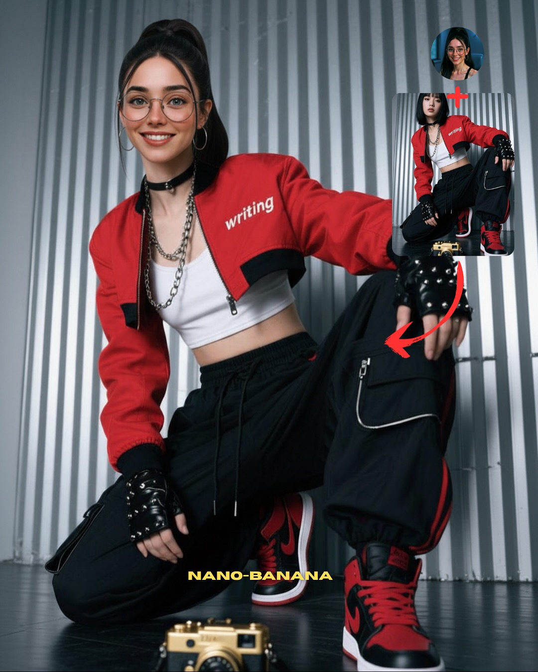
How soy_aria_cruz Built This Streetwear Kneeling Pose Transfer AI
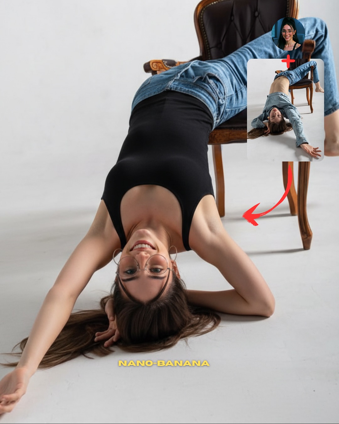
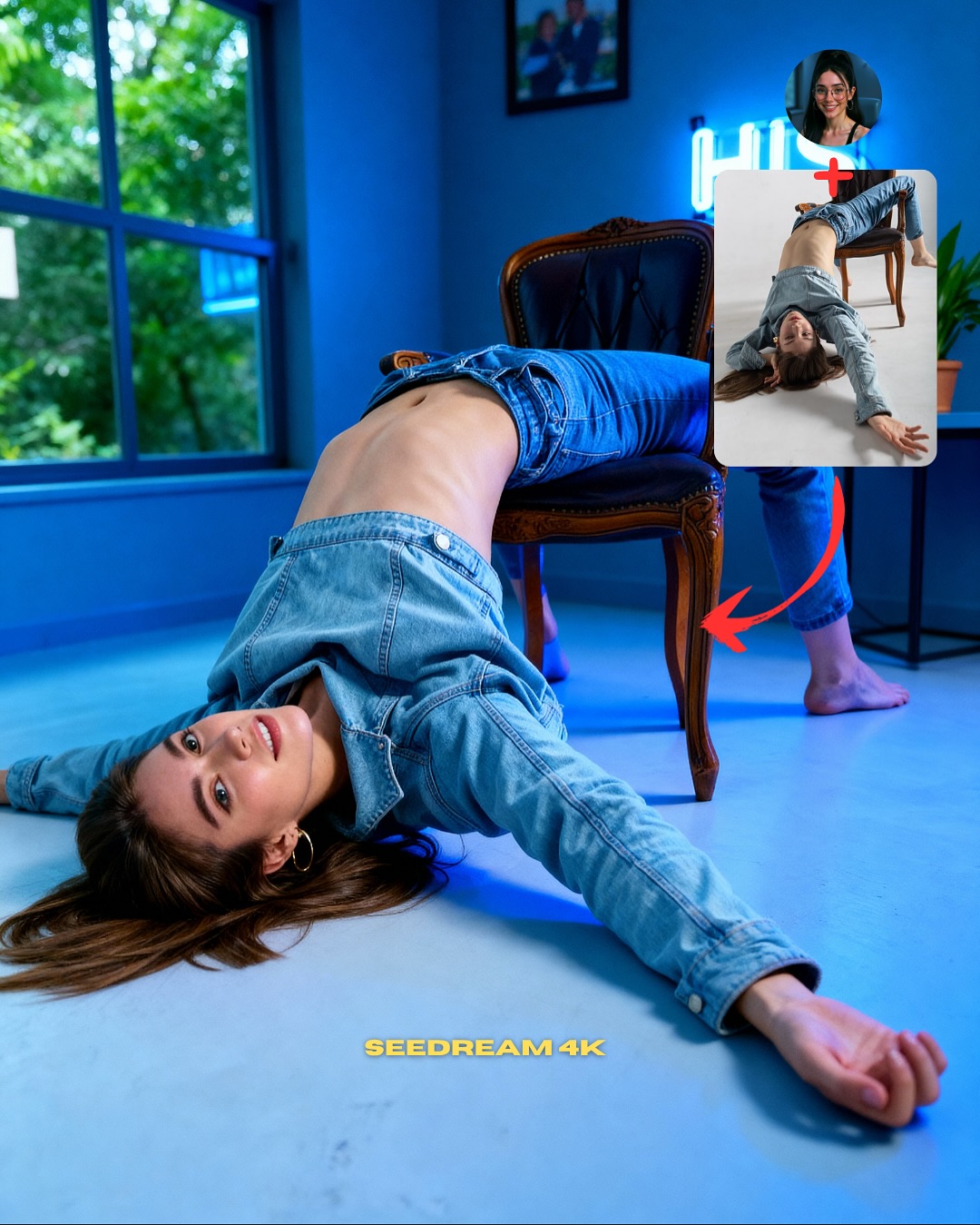
This image works because it does not just show a result. It shows the logic of the result. That is the difference between ordinary AI content and useful creator content. The main portrait is strong on its own, but the two insets in the upper corner turn the image into a mini workflow: identity source, pose source, final output. By the time someone finishes looking at the red arrows, they already understand the promise of the post.
That is why this format performs so well for education-led growth. It reduces explanation cost. Instead of making the audience imagine how pose transfer works, the layout visualizes the pipeline directly. This matters a lot in AI tutorial content, because most viewers are curious but impatient. If the first image does not prove the process quickly, they scroll. This one proves it fast.
The fashion styling also helps more than it seems. A kneeling streetwear pose with red-black contrast, cargo pants, chains, and sneakers gives the result image enough punch to feel worth learning from. If the final output were visually weak, the educational layout would not save it. So the cover succeeds by doing both jobs at once: it teaches and it sells the payoff.
| Signal | Evidence (from this image) | Mechanism | Replication Action |
|---|
| Visible workflow | Face reference, pose reference, arrows, and final image all appear in one frame | Explains the method before the viewer reads the caption | Always show source + transfer target + final output in the first tutorial image |
| Strong result styling | Red bomber, cargo pants, gloves, and sneakers create a high-contrast streetwear payoff | Makes the technique feel exciting and worth copying | Choose a final outfit and pose that feel visually rewarding, not merely correct |
| Clean hierarchy | Main subject dominates while references stay small but readable | Keeps the image instructional without becoming cluttered | Let the final image own most of the frame and relegate references to one corner |
Where this format fits best
- AI tutorial cover posts, because the viewer instantly understands what skill is being taught.
- Pose-transfer workflows, because body position is easier to explain visually than verbally.
- Carousel openers and SEO case pages, because one image can summarize the method and the result.
- Prompt giveaway funnels, because the layout naturally supports a “comment to get it” CTA.
Less ideal: mood-driven fashion editorials, cinematic story scenes, or posts where the process should stay hidden. This structure is for explanation, not mystery.
To adapt it, keep the main-result dominance, keep the small reference corner, and keep the arrow logic. Then change the task. The same layout can teach face consistency, wardrobe transfer, lighting transfer, or scene remixes. Slot template: {final result} + {identity source} + {reference input} + {direction arrows} + {clear payoff styling}.
Aesthetic read
The image succeeds aesthetically because it avoids the biggest risk of tutorial covers: looking like a cluttered diagram. The metallic wall background is simple, the palette is restricted to red, black, white, and silver, and the insets stay compact. That gives the frame enough visual discipline to still feel like content, not just instruction. This matters for creators because tutorial assets still need to be attractive enough to earn the click.
The pose itself is also a smart choice. It is clearly stylized, asymmetrical, and body-specific, which makes the transfer feel impressive. A standing front-facing pose would not demonstrate much. A more complicated acrobatic pose would risk breaking. This kneeling stance sits in the sweet spot: visually distinct but still reproducible.
| Observed | Why it matters |
|---|
| Main subject takes most of the frame | Keeps the result image aspirational and readable |
| Top-right inset references with red arrows | Turns the image into a self-explaining workflow |
| Red-black-white streetwear palette | Gives the tutorial a strong visual identity |
| Simple corrugated metallic background | Supports the fashion image without adding noise |
| Kneeling asymmetrical pose | Makes the transfer demonstration feel meaningful |
Prompt technique breakdown
| Prompt chunk | What it controls | Swap ideas (EN, 2–3 options) |
|---|
| same face source + separate pose reference + final merged result | Core transfer logic | identity lock + outfit reference, face source + lighting source, character source + action source |
| kneeling streetwear pose with one arm draped over raised leg | Pose distinctiveness and payoff | chair lean pose, wall-sit pose, crouched athlete pose |
| red bomber jacket, white crop top, black cargo pants, studded gloves, high-top sneakers | Fashion energy and readability | techwear black set, pastel idol outfit, denim-and-boots edit |
| small inset references in the upper corner with red arrows | Tutorial packaging | before/after boxes, numbered workflow labels, split-panel mini references |
| clean studio light on metallic wall | Visual clarity and graphic neatness | concrete backdrop, colored seamless paper, locker-room wall |
How to iterate without losing the core
Lock these three things first: the workflow hierarchy, the asymmetrical pose, and the strong result styling. Those are the identity anchors. Then change only one or two variables per run.
- Baseline run: keep the same instructional layout and get one clean pose-transfer result.
- Second run: keep the layout identical but change only the pose family to compare which body positions transfer best.
- Third run: keep the pose fixed but swap the wardrobe to test how styling affects perceived quality.
- Fourth run: keep the whole structure and port it into another tutorial category such as lighting transfer or face-consistency control.
If the image starts feeling messy, the first thing to simplify is usually not the main portrait. It is the annotation system. Tutorial covers win when the process is visible, but they fail when the graphic signals become noisier than the lesson itself.