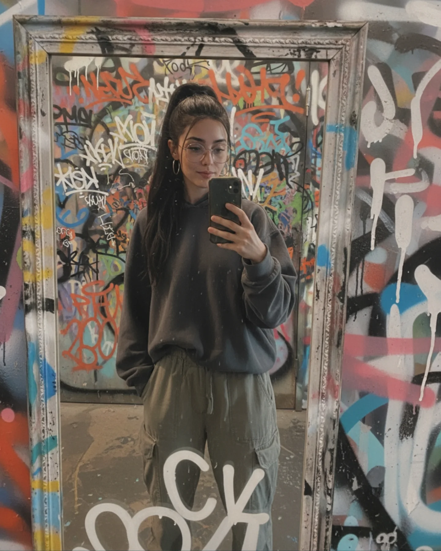
How soy_aria_cruz Created This Graffiti Bathroom Mirror Selfie AI
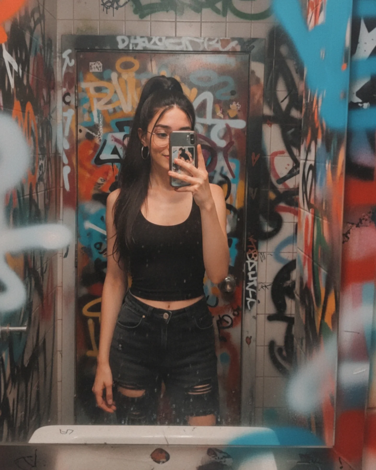
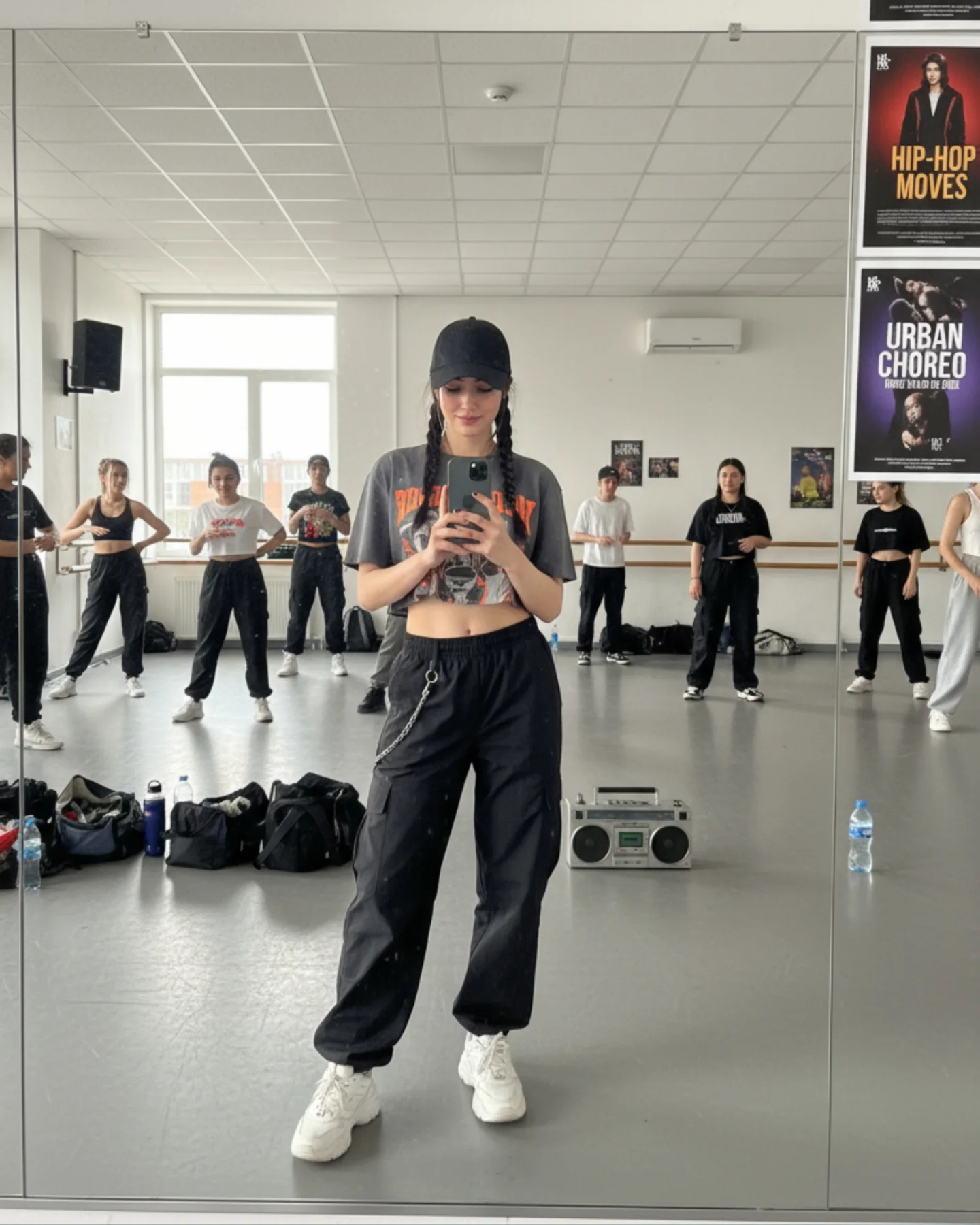
This image works because it turns a very ordinary format into something location-rich. Mirror selfies are common. What makes this one memorable is the room. The graffiti-covered walls, narrow tiled space, and slightly dirty mirror give the image social texture that a clean bedroom or polished restroom never could. It feels lived in, slightly chaotic, and real.
For creators, this is a useful reminder that “casual” does not have to mean empty. A simple black top and jeans can carry a photo if the environment has enough identity. Here, the outfit is minimal on purpose. That lets the walls do part of the storytelling while the subject still remains easy to read. The result is low-effort in styling, but high-value in atmosphere.
The phone covering part of the face is also doing important work. It makes the frame feel less performative. The audience is not being offered a perfect portrait. They are being shown a believable moment. That slight obstruction increases authenticity, which is often more valuable than a fully exposed face in this type of social-native content.
Why This Casual Selfie Holds Attention
The first reason is environmental specificity. Graffiti instantly creates an attitude. It suggests nightlife, a creative venue, or an off-duty city moment without needing any extra props. That kind of background shorthand helps a simple portrait feel more editorial than it really is.
The second reason is contrast between styling and setting. The subject is clean, simple, and minimally styled, while the room is loud and visually messy. That contrast makes the subject stand out. When both outfit and environment are busy, mirror selfies often collapse into clutter. This one avoids that.
The third reason is believable imperfection. The mirror haze, the phone in front of the face, and the narrow-space framing all support the sense that this was actually snapped in the moment. Audiences tend to trust and save casual images more when they still contain small flaws.
| Signal | Evidence (from this image) | Mechanism | Replication Action |
|---|
| Location personality | Graffiti-saturated walls and door give the room a strong identity | Distinct location texture helps a basic selfie feel more memorable | Use one environment with visual character instead of compensating with complicated styling |
| Minimal wardrobe contrast | Black crop top and black jeans stand out cleanly against the chaotic wall colors | Simple clothing helps the eye separate the subject from a busy setting | Keep outfits restrained when the environment already provides energy |
| Authentic obstruction | The phone covers part of the face in a believable mirror-selfie way | Imperfect framing makes the image feel socially native and less staged | Do not over-optimize mirror selfies for full-face beauty if authenticity is the goal |
| Gritty mirror realism | Smudges and haze on the mirror edge add texture and plausibility | Small flaws make the image feel captured rather than manufactured | Allow a little environmental imperfection instead of polishing everything away |
Where This Aesthetic Fits Best
This style is ideal for casual urban creator content, nightlife-adjacent feeds, “unstyled but cool” prompt examples, venue-bathroom selfies, and personality-first posts where the goal is relatability with edge. It works especially well when the account wants to feel current and grounded rather than glossy.
- Best fit: off-duty creator posts. The image feels personal and unstaged while still visually interesting.
- Best fit: urban moodboard content. Graffiti environments add enough attitude to make basics feel intentional.
- Best fit: casual prompt demos. The scene proves you can get value from simple wardrobe and strong setting.
- Best fit: nightlife venue content. It hints at a larger social world without needing a crowd.
- Best fit: social-first realism tests. Mirror logic, phone reflections, and messy surfaces all reveal model quality naturally.
It is less useful for luxury fashion, clean minimal brands, or highly romantic portrait feeds. The strength here is grit and familiarity, not polish or softness.
Transfer Recipes
- Club hallway version. Keep: mirror format, basic dark outfit, textured walls. Change: color accents, light temperature, mirror size. Slot template:
urban mirror selfie in {gritty location}, black basics, phone partially covering face, authentic venue texture - Sticker-covered backstage version. Keep: spontaneous framing and environment-led identity. Change: graffiti to posters, stickers, or tape marks. Slot template:
casual mirror selfie in a creative backstage room, simple outfit, lived-in walls, low-light realism - Indie-bar restroom version. Keep: narrow room and mirror imperfections. Change: palette, accessories, wall treatment. Slot template:
venue bathroom mirror selfie, clean subject styling, textured background, candid phone framing, social-native realism
The Aesthetic Read
The strongest visual decision is the restraint in the subject styling. Black top, black jeans, no loud accessories beyond glasses and hoops. That choice gives the environment permission to be the loud element. It is a useful strategy whenever the background already carries the personality.
The mirror haze is also more important than it first appears. Perfectly clean mirrors often make generated selfies feel synthetic. A little dust and smearing reintroduce friction, and friction is good for realism. In this image, those imperfections help the viewer believe in the setting.
The framing is another quiet strength. Because the space is narrow, the walls close in around the subject and create a tunnel effect. That makes the image feel immersive without needing depth-of-field tricks or cinematic lighting. The room itself does the composition work.
| Observed | Why it matters | How to recreate it |
|---|
| Simple all-black outfit | Keeps the subject readable inside a visually noisy room | Use low-complexity styling when the environment is the main visual hook |
| Graffiti walls on all sides | Create an instantly recognizable and attitude-heavy setting | Choose one immersive texture-rich location instead of a generic background |
| Phone covering part of the face | Supports authenticity and real mirror-selfie behavior | Allow the device to obscure some facial area rather than forcing a perfect reveal |
| Dirty mirror edges and sink lip | Add practical realism and confirm the location | Keep small location artifacts that tell the viewer what kind of room this is |
| Narrow vertical framing | Turns the room into a visual tunnel that centers the subject | Use tight architectural space as part of the composition, not as background filler |
Prompt Technique Breakdown
To recreate this image well, think in four layers: mirror geometry, room texture, styling restraint, and imperfection. Many weak attempts will get the graffiti but lose the realism of the mirror, or keep the mirror but clean the room into a generic bathroom. The image only works when all four elements stay active together.
| Prompt chunk | What it controls | Swap ideas (EN, 2-3 options) |
|---|
| Mirror geometry | Authenticity of the selfie format | full-body mirror selfie; phone covering part of face; sink edge visible below mirror |
| Room texture | Attitude and scene identity | graffiti-covered bathroom; tiled venue restroom; urban painted walls |
| Wardrobe restraint | Subject readability | black crop top and ripped jeans; simple dark streetwear; minimal fitted basics |
| Imperfection cues | Believability | mirror smudges; dusty glass; lived-in restroom texture |
| Identity anchors | Keeps the image tied to the creator | high ponytail; round glasses; hoop earrings |
| Lighting realism | Prevents the room from looking like a studio | warm dim indoor light; low-key venue restroom lighting; natural low-light selfie exposure |
The highest-risk drift point is cleanliness. Models often “improve” restroom images by making them too neat. That removes the core appeal. Keep the grime, smudges, and layered wall texture, because they are part of what makes the image feel true.
How to Iterate Without Losing the Casual Energy
Lock three things first: the narrow graffiti room, the mirror-selfie framing, and the simple black outfit. Once those are stable, refine phone placement, ponytail shape, or mirror haze. If you start by polishing the subject too much, the image will lose its offhand charm.
Use a one-change rule. If the room feels too generic, increase wall texture and tag density. If the image feels too messy, reduce graffiti saturation but keep the narrow-room feeling. If the selfie loses authenticity, let the phone cover more of the face again. Small changes preserve the candid tone while improving clarity.
- Run 1: Solve the mirror geometry and narrow room structure.
- Run 2: Add graffiti texture and smudged mirror surfaces.
- Run 3: Refine the black crop top, ripped jeans, and high ponytail silhouette.
- Run 4: Tune light warmth, phone placement, and final realism without cleaning the room too much.
If the output becomes too fashionable, append a correction like casual venue bathroom mirror selfie, spontaneous and realistic, not a fashion editorial. If it becomes too chaotic, simplify the color palette but keep the graffiti logic. The image wins because it feels like a moment, not a performance.