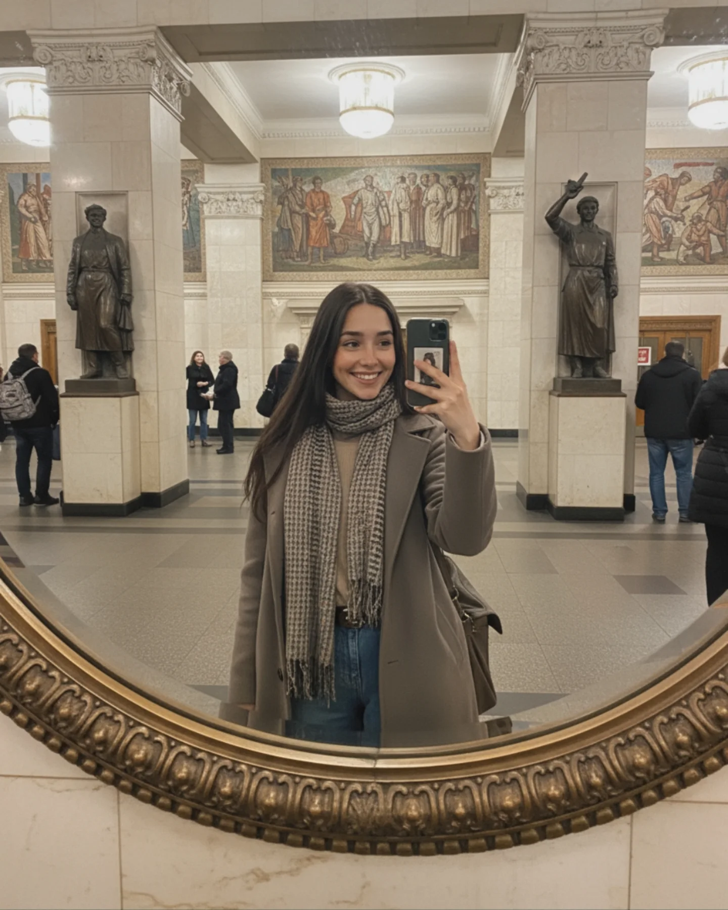
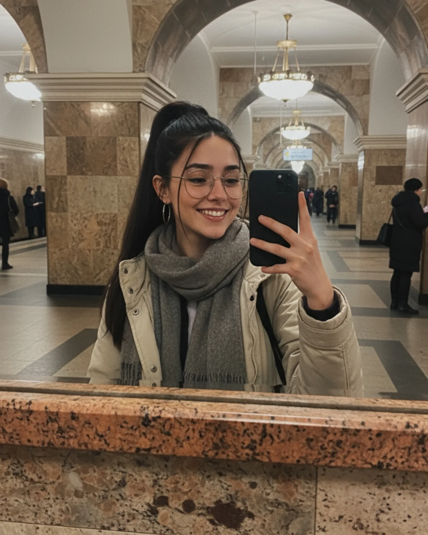
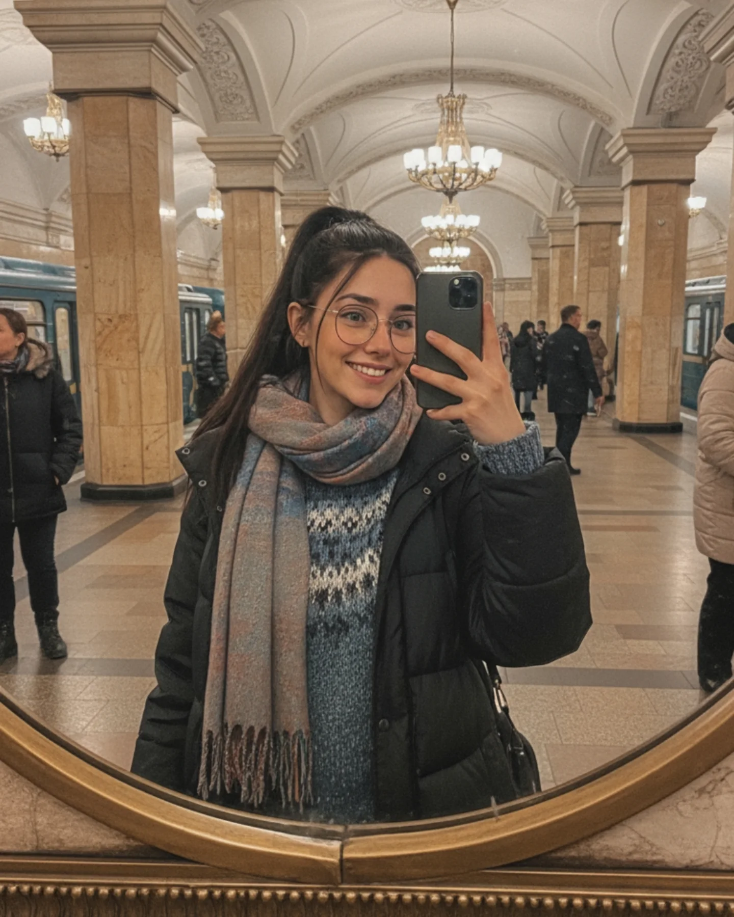
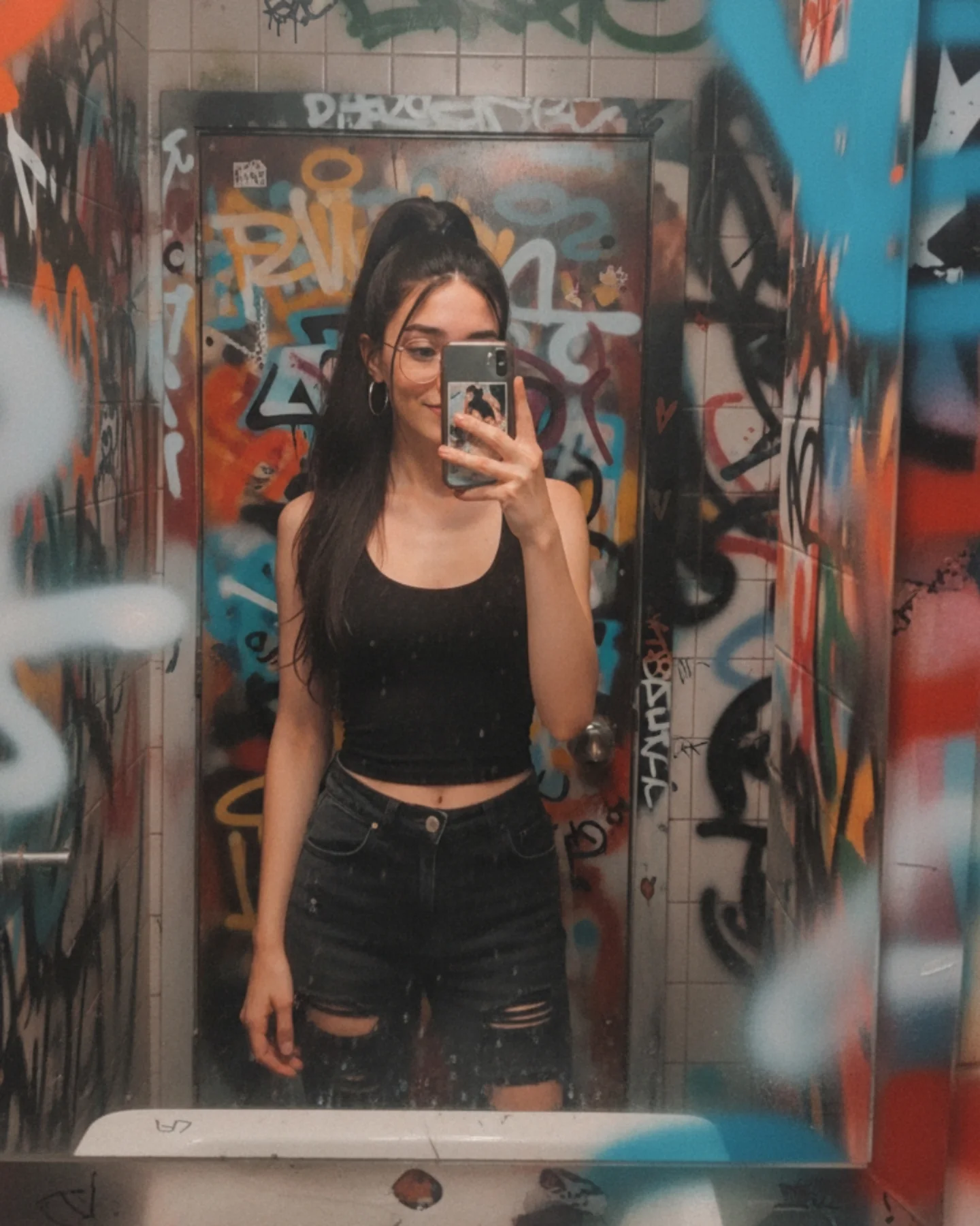
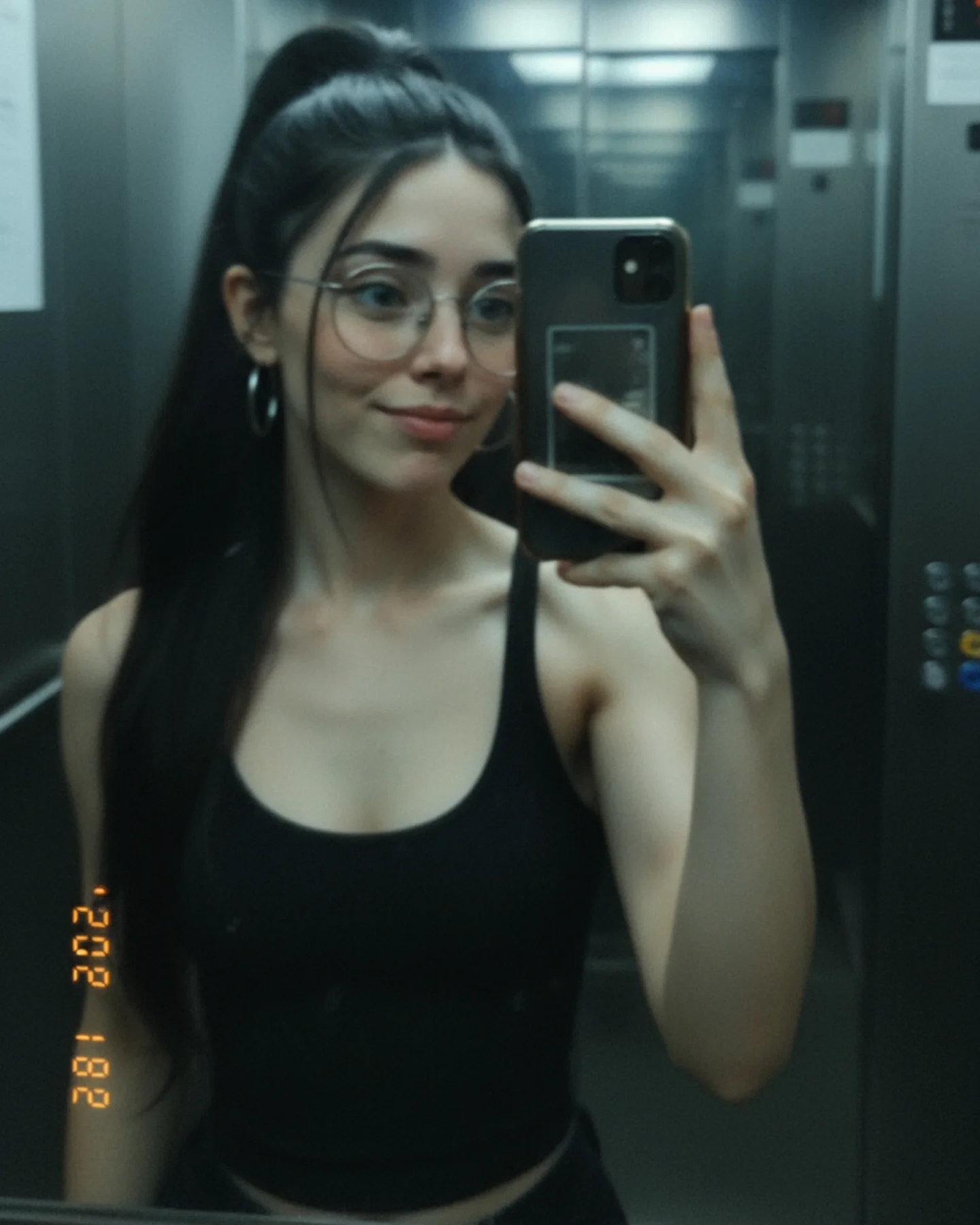
Hoy me apetecía algo más cercano 💕
No todo tienen que ser looks producidos o escenarios llamativos… a veces un simple selfie con el móvil transmite mucho más 🌸
En este carrusel verás varias de mis fotos, de esas que parecen improvisadas pero tienen su encanto 😌📱
Comenta "ARIA" y te paso el Prompt Base y todos los prompts que he usado para generar estas imágenes con Nano Banana 🍌
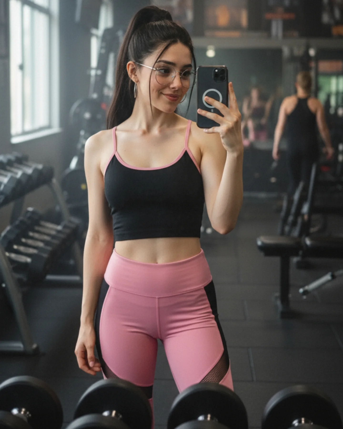
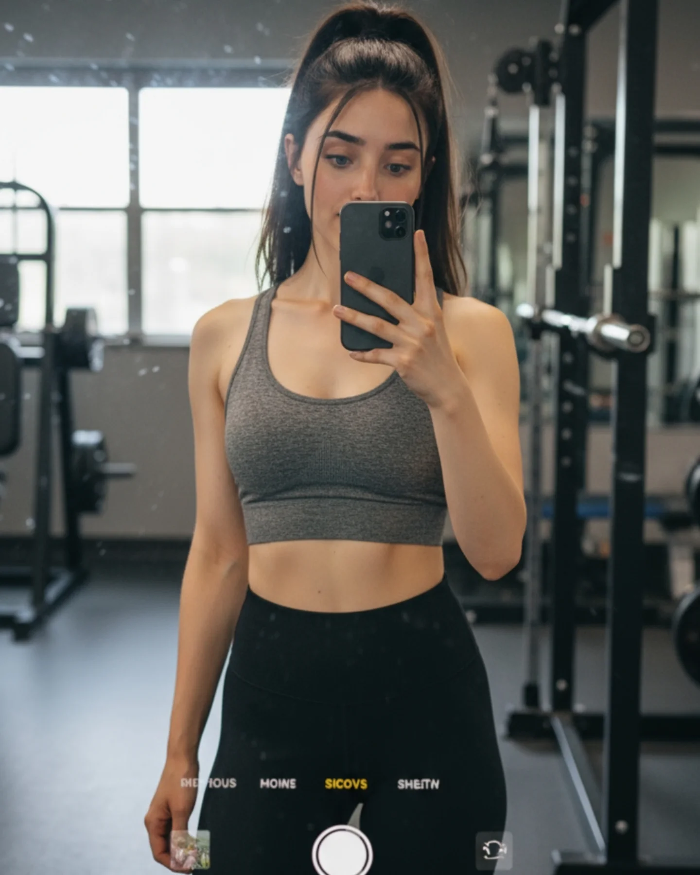
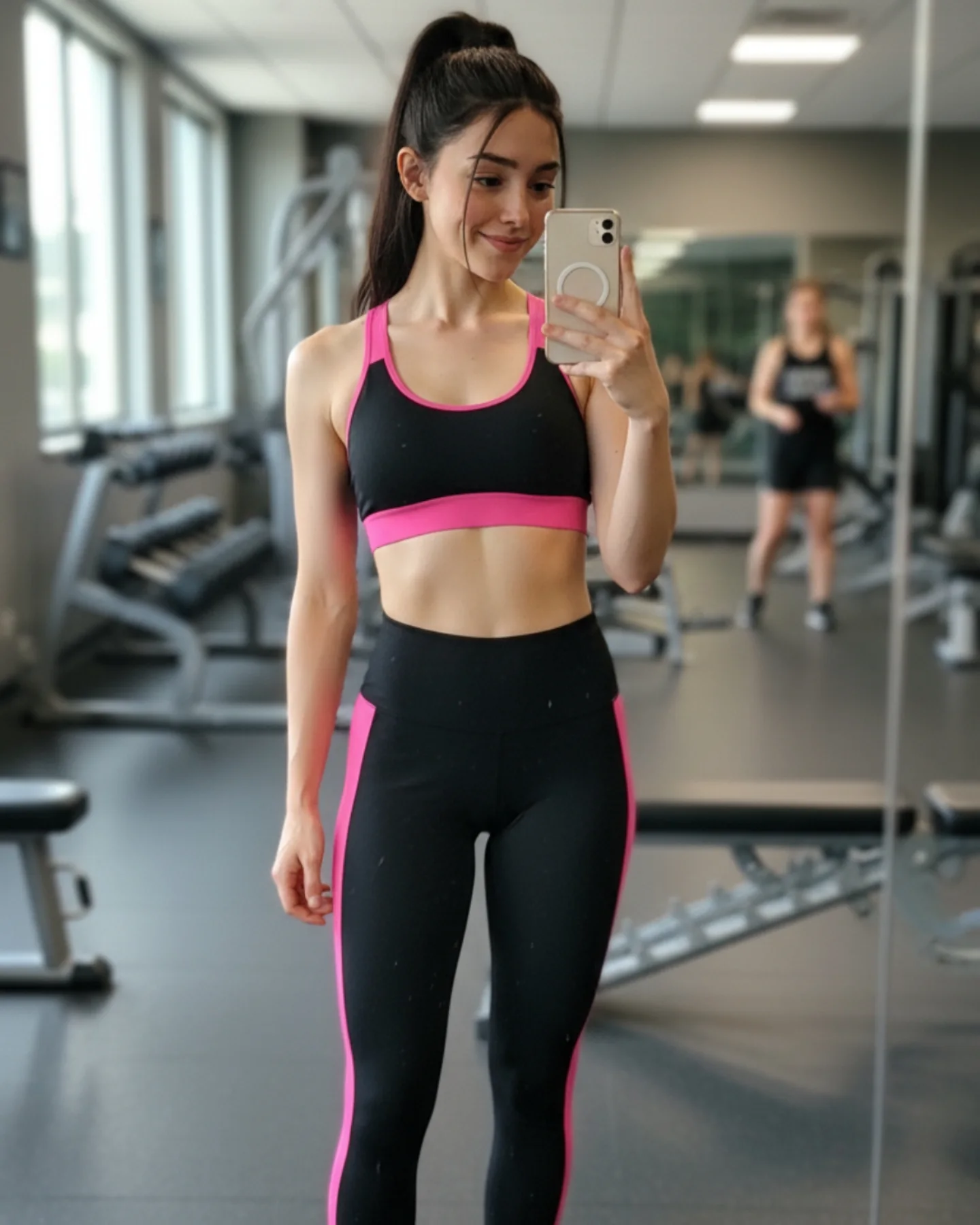
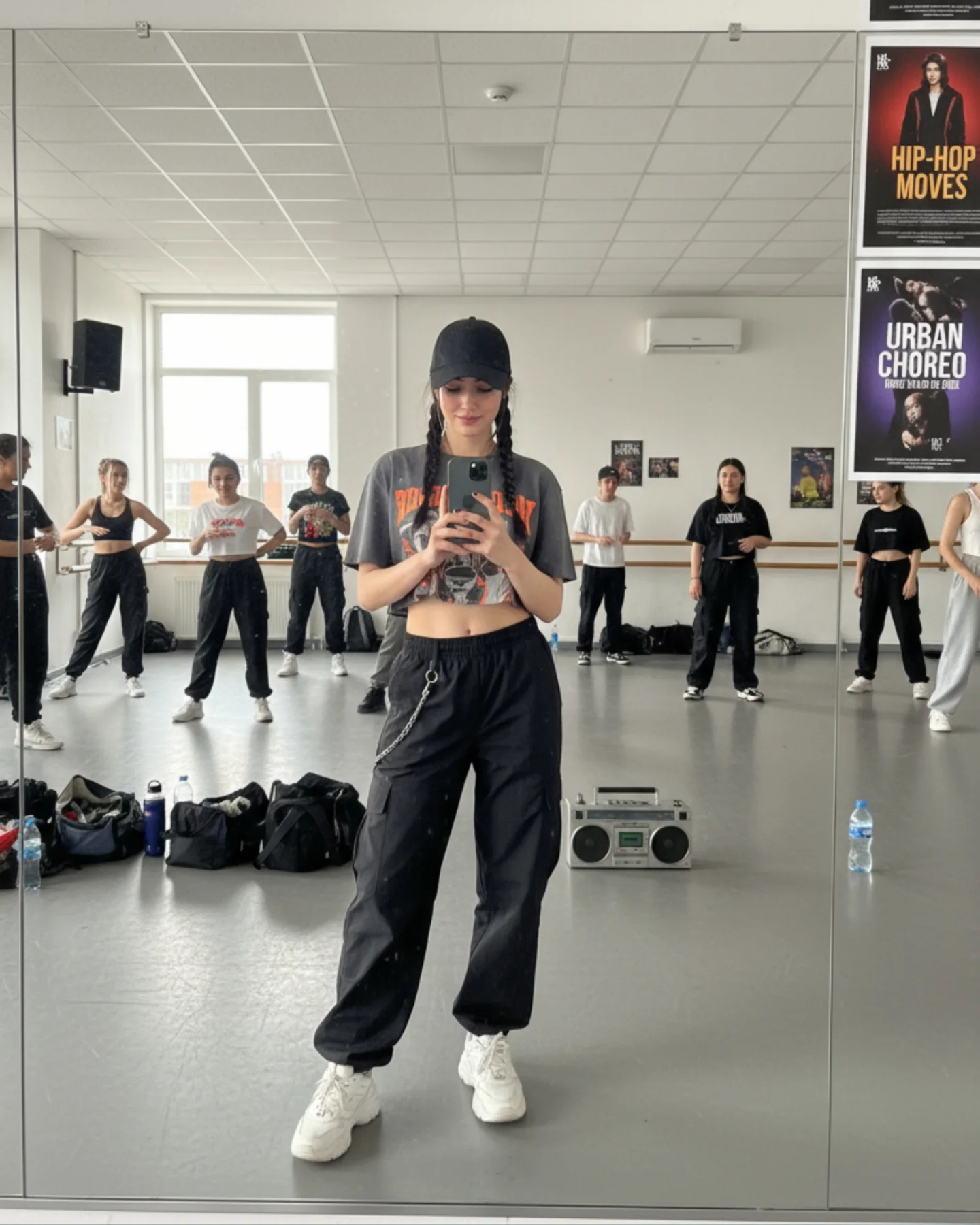
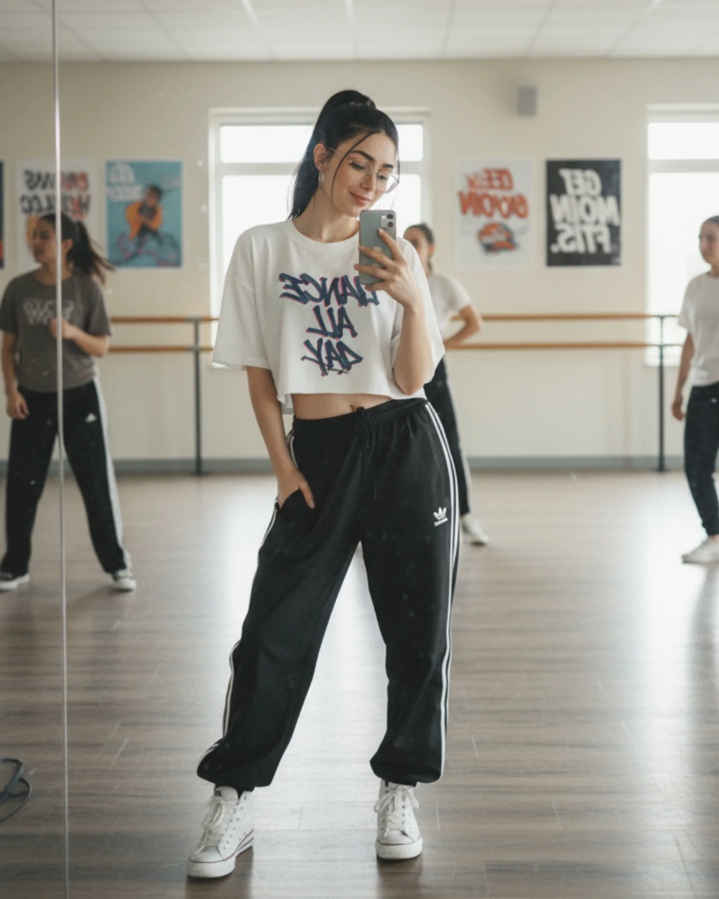
Why soy_aria_cruz's Pink Black Gym Mirror Selfie Went Viral — and the Formula Behind It
Fitness selfies often fail for one simple reason: they show effort, but not image control. This one works because it does both. The gym context is obvious, yet the frame still feels styled. The pink-and-black outfit gives the image a strong visual identity, the window light keeps the skin soft, and the mirror perspective makes the post feel native to social media instead of overproduced.
What really helps is the balance between atmosphere and readability. The gym is visible, but it is not chaotic. We get enough background detail to understand the setting, but the main subject stays clean and separated. For creators, this is a useful lesson. Fitness content performs better when the environment supports the body language rather than competing with it.
Why The Image Has Feed Power
The image creates an immediate category signal. Viewers know in under a second that this is activewear content inside a real workout space. That matters because clarity drives saves and shares. The outfit also does important work. Pink leggings against a darker gym interior create contrast, making the subject pop without needing aggressive editing. The glasses and ponytail add identity detail, which helps the image feel specific rather than like a generic fitness render.
The viewer understands the fitness context instantly
Include enough recognizable equipment to establish the gym without cluttering the frame
Strong subject separation
Pink leggings and soft face light against a darker room
Improves thumbnail readability
Use one brighter wardrobe color against a muted interior palette
Lifestyle authenticity
Visible phone and real gym background
Feels captured in the moment, not staged in a studio
Keep the mirror and phone visible if relatability matters more than formal polish
Identity detail
Glasses, high ponytail, hoop earrings
Makes the subject easier to remember
Lock one or two consistent personal markers across your content
Aesthetic Read: What Makes It Work
The aesthetic is built on contrast and restraint. The space is dark, slightly hazy, and functional, while the outfit is crisp and graphic. The left-side daylight prevents the image from becoming muddy and adds shape to the face and torso. The composition also benefits from depth. Dumbbells in the foreground, the subject in the middle, and a blurred gym-goer in the rear make the frame feel like a real place, not a flat backdrop.
This is also a good reminder that fitness content does not need exaggerated intensity to be effective. The subject is not flexing hard or doing a dramatic action pose. A relaxed mirror stance is enough because the location, outfit, and framing already tell the story.
Observed
Why It Matters
How To Recreate
Pink-black activewear against dark room tones
Creates immediate visual contrast
Choose one accent color and let the environment stay muted
Window light from the left
Keeps skin clean and adds form without harshness
Stand near side windows instead of relying only on overhead gym lights
Gym equipment framing the lower edge
Builds context without stealing focus
Let dumbbells or benches enter the foreground naturally
Background person softly blurred
Makes the space feel active and real
Keep one distant figure if you want realism, but blur them enough to avoid distraction
Where This Style Fits Best
Fitness creator check-ins: Ideal for progress updates or activewear posts because the environment is readable and believable.
Athleisure brand mood content: Strong for campaigns that want social-native realism instead of glossy studio perfection.
Prompt tutorials about mirror selfies: Useful because the visual locks are clear: outfit color, gym depth, phone, and window light.
Not ideal for hardcore training content: The energy is calm and aesthetic, not explosive or performance-driven.
Not ideal for minimal editorial branding: The gym detail is too central for a stripped-back luxury portrait.
Keep: dark room plus bright outfit contrast. Change: location to boxing gym, pilates studio, hotel gym, or training warehouse. Slot template: {training location} {accent color} {mirror crop} {lifestyle energy}
Prompt Technique Breakdown
Prompt chunk
What it controls
Swap ideas (EN, 2-3 options)
young woman taking a mirror selfie in a modern gym
dumbbells in foreground, benches and machines in background
Environmental depth and niche clarity
'free weights and squat rack', 'pilates reformers', 'boxing bags and benches'
round glasses, high ponytail, visible black smartphone
Identity and authenticity
'clear glasses', 'slick bun', 'white phone case'
Execution Playbook
Lock three things first: the outfit contrast, the gym environment, and the side-window light. Those are the anchors that make the image readable. Then iterate one change at a time. First version: establish the mirror composition and visible equipment. Second version: refine the leggings color and top trim. Third version: tune the face light so the expression stays soft. Fourth version: only then adjust background haze or the amount of visible activity behind the subject. That order keeps the image rooted in believable gym realism instead of drifting into generic activewear portrait territory.