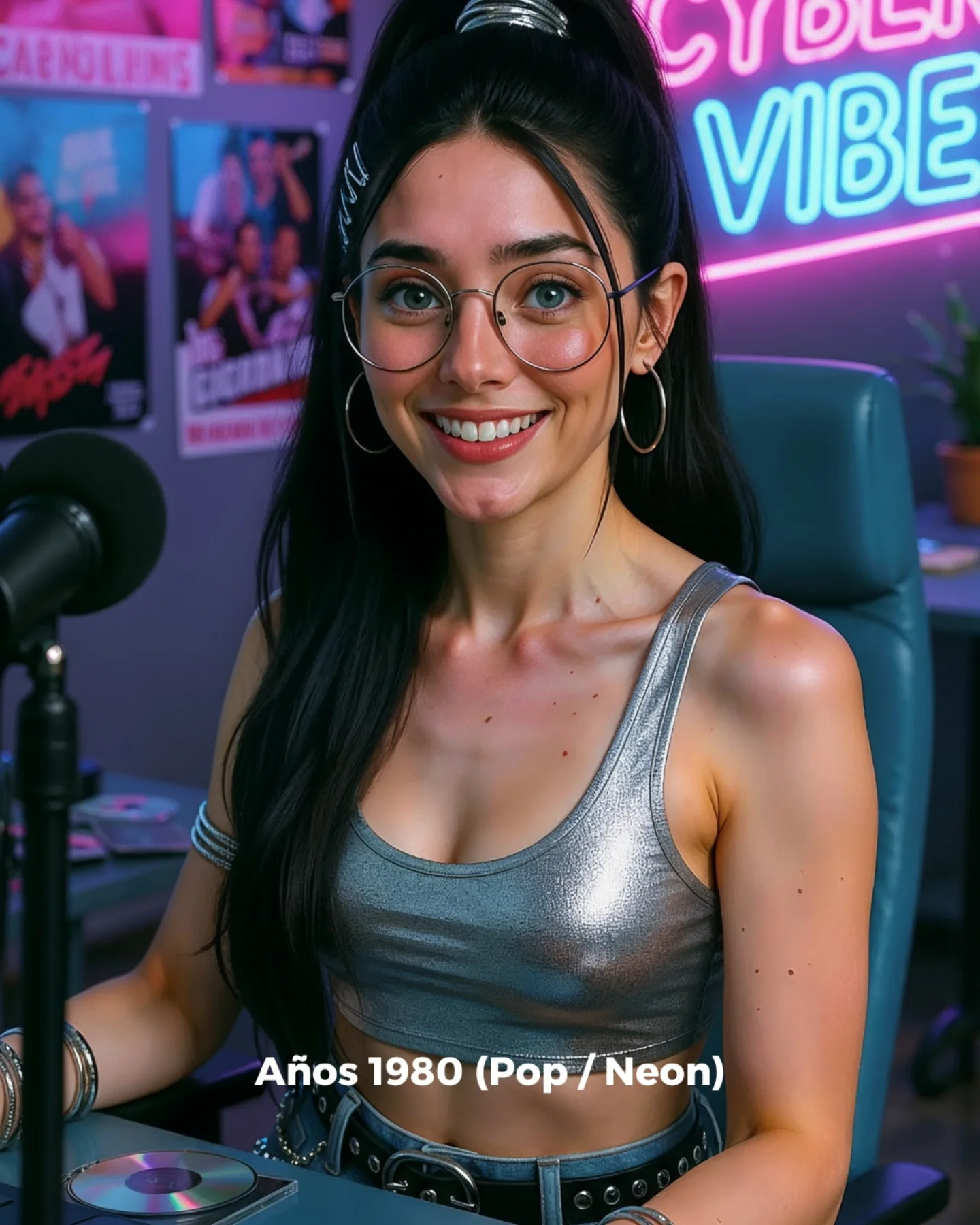
Why soy_aria_cruz's Retro 1980s Neon Pop Studio Portrait Went Viral — and the Formula Behind It
This image works because it translates “1980s pop” into a language that still feels contemporary. It does not rely on one cliché prop or an exaggerated costume. Instead, it layers several recognizable signals: metallic fabric, neon color contrast, studio microphone, posters, and glossy accessories. Together they create a retro-music atmosphere that is readable fast but still polished enough for modern creator content.
The strongest choice is the mix of warmth and spectacle. The subject keeps a direct friendly smile, which makes the image approachable, while the room around her adds color, energy, and cultural texture. That combination matters. If the portrait were too serious, it would risk looking like cosplay. If the room were too minimal, the era reference would become weak. Here, the image lands right in the middle: specific enough to feel themed, relaxed enough to feel shareable.
Another useful lesson is that retro aesthetics often work best when anchored to one everyday creator behavior. The microphone and seated studio setup quietly suggest recording, hosting, or performing. That gives the portrait a “reason” to exist beyond just looking nostalgic. It becomes a personality scene, not only an outfit scene.
| Signal | Evidence (from this image) | Mechanism | Replication Action |
|---|
| Era coding through materials | Reflective silver top and metallic accessories instantly evoke retro pop styling | Material cues trigger genre recognition faster than abstract adjectives | Use one high-signal retro material like metallic lamé, satin, or chrome accents |
| Music-culture context | Microphone, posters, disc, and neon-lit studio setting frame the subject as performer or host | Context objects turn nostalgia into narrative instead of surface styling | Add 2-3 era-relevant media props rather than overloading the wardrobe |
| Friendly social energy | Open smile and direct eye contact soften the stylization | Approachability broadens audience appeal and keeps the image comment-friendly | Lock expression warmth before increasing scene complexity |
Aesthetic Read
The image gets its punch from color temperature contrast. The face is lit softly enough to remain natural, while the room behind it leans into neon pinks and electric blues. That split is classic for pop-era revival content because it gives the portrait visual excitement without sacrificing facial readability. The metallic top then acts like a light catcher, repeating that glow on the body and tying the subject into the environment.
The posters and studio desk are also important because they prevent the neon from feeling generic. Without them, the background could become just “cool lights.” With them, it reads as a stylized music or media room. This is exactly the kind of detail that makes a themed prompt feel intentional instead of hollow.
| Observed | Recreate cue |
|---|
| Pink-blue neon glow behind neutral facial lighting | Use dual-color ambient background plus soft frontal key on skin |
| Metallic silver top catching highlights | Specify reflective fabric so the outfit participates in the lighting design |
| Microphone and posters as scene anchors | Include one performance tool and wall decor to suggest retro media culture |
| Tight portrait crop with seated studio posture | Frame mid-torso upward to balance face detail and room atmosphere |
Best Uses And Transfers
- Retro-themed creator portraits: ideal because the era cues are strong without being costume-heavy.
- Music-promo moodboards: strong fit for artists, podcast visuals, or pop-culture branding.
- Nostalgia content series: useful when building visual chapters around decades or cultural moods.
- Prompt tutorials on aesthetic fusion: a good fit because it clearly shows how props, color, and wardrobe collaborate.
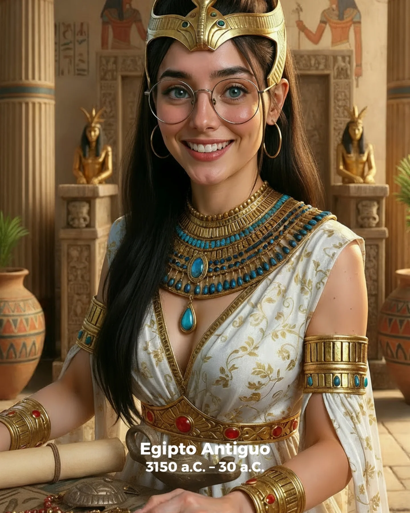
Not ideal for minimalist luxury branding, documentary realism, or historical reconstruction. This image is a stylized reinterpretation, not a strict replica of the decade.
Transfer recipe 1. Keep: neon dual-color glow, one reflective garment, one media prop. Change: decade or genre. Slot template: "{era} music-studio portrait, {reflective garment}, neon ambience, {prop}".
Transfer recipe 2. Keep: seated studio composition and friendly expression. Change: wall decor and color palette. Slot template: "{room decor} creator portrait, {palette}, microphone in foreground, bright smile".
Transfer recipe 3. Keep: pop-performance energy. Change: accessory language, from silver hoops to chunky plastic jewelry or vintage headphones. Slot template: "{retro style} portrait, {accessories}, glossy studio light, nostalgic media room".
Prompt Technique Breakdown
| Prompt chunk | What it controls | Swap ideas (EN, 2–3 options) |
|---|
| material cue | How quickly the era is recognized | metallic silver top, satin bomber, sequined mini dress |
| ambient color system | Whether the room reads retro, clubby, or modern streamer | pink-blue neon, purple-cyan glow, magenta-orange stage light |
| media prop | Narrative anchor for music or performance culture | microphone, cassette deck, CD stack |
| wall context | Authenticity of the themed room | concert posters, album art prints, vintage promo flyers |
| identity anchors | Continuity of the subject across theme changes | round glasses, hoop earrings, high ponytail |
| expression tone | Whether the final image feels fun, cool, or detached | bright smile, playful smirk, confident neutral gaze |
Execution Playbook
Baseline lock first: the metallic top, the microphone-plus-poster studio context, and the pink-blue neon ambience. Those three controls carry the retro-pop identity. Then change only one or two things at a time.
- Start with the base portrait: silver top, high ponytail, round glasses, microphone, posters, neon room.
- Change only the color palette next if you want to test another decade flavor while keeping the same prop setup.
- Then swap only the wardrobe material, leaving expression and room fixed.
- Only after the mood holds, experiment with tighter crop, bolder jewelry, or stronger poster styling.
If the image starts drifting into sci-fi or cyberpunk, reassert “retro pop studio” and “music-era nostalgia.” If text from signs or labels becomes too readable, reinforce “graphic glow only, no readable words.” Those corrections usually preserve the fun, era-coded, high-engagement feel that makes this portrait work.