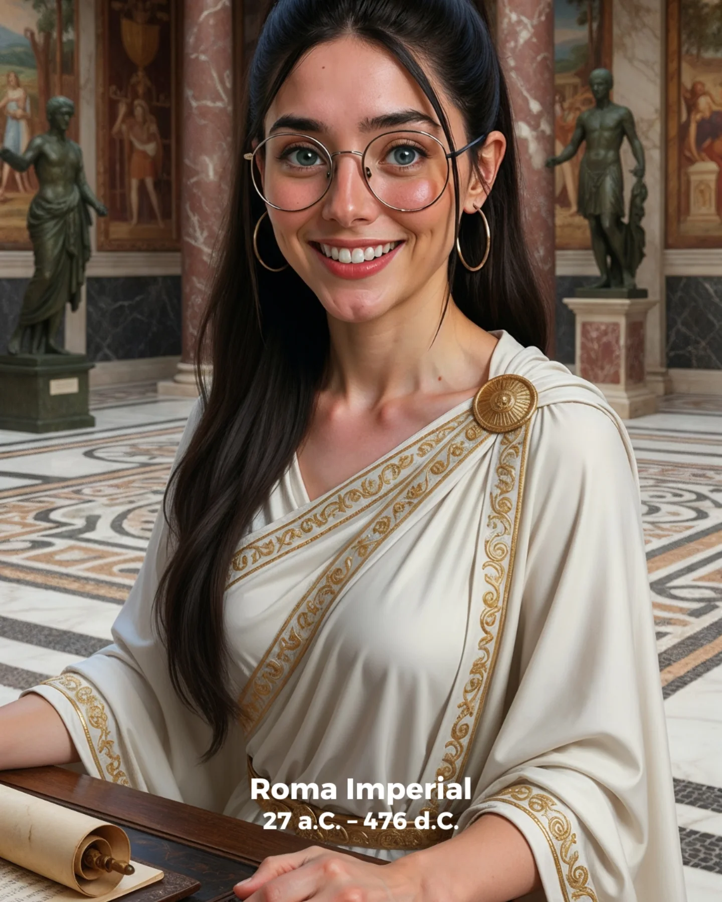
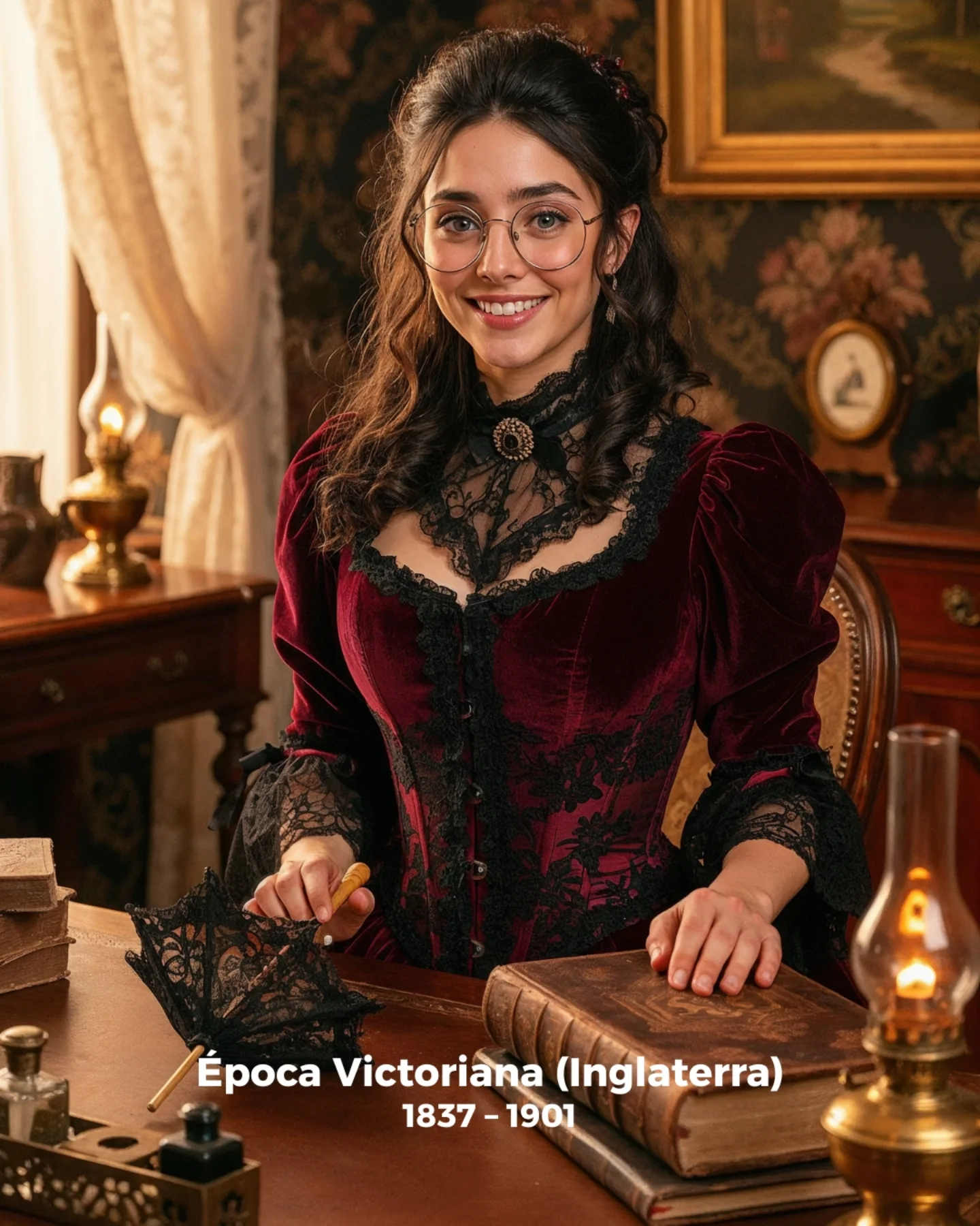
How soy_aria_cruz Made This Imperial Rome AI Portrait
Historical creator content often fails when it chooses accuracy without visual hierarchy or beauty without narrative context. This image works because it balances both. The Roman setting is immediately readable through columns, statues, marble, and scroll, but the portrait still feels welcoming and clear. That makes it suitable for educational content that needs to feel accessible rather than dusty or academic.
The strongest choice is restraint. The wardrobe is elegant without becoming costume-chaos. The environment is grand, but not overcrowded. The result is a cover that signals history fast while staying easy to read at thumbnail size. For creators making educational or explainer content, that is the exact sweet spot. You want atmosphere that supports the topic, not visual noise that buries it.
Why The Image Works As A Cover
The cover succeeds because it answers the viewer’s question before they even read the title. This is about Rome, it is about a specific historical mood, and it is framed around a human guide figure rather than a dry artifact. That human anchor matters. It transforms the subject from “history content” into “history presented through a relatable face,” which is much more clickable on social platforms.
| Signal | Evidence (from this image) | Mechanism | Replication Action |
|---|
| Immediate era recognition | Roman draped garment, scroll, columns, statues, marble setting | Viewers understand the topic without needing explanatory text | Choose 3-4 era-specific objects and make them clearly visible in the first frame |
| Human guide framing | Smiling central portrait rather than an empty hall | Makes historical content feel more inviting | Use a presenter-like subject when the goal is education, not only atmosphere |
| Controlled grandeur | Elegant hall remains readable but not overwhelming | Keeps the image premium while preserving clarity | Let the architecture support the portrait instead of dominating it |
| Prop-based narrative cue | Visible parchment scroll at the desk edge | Adds an instant “document / empire / record” story signal | Include one small narrative prop that reinforces the era |
Aesthetic Read: Why It Feels Polished
The portrait feels polished because the palette is coherent. Ivory fabric, gold trim, warm stone, dark bronze statues, and patterned marble all live in the same visual family. That is why the image feels rich without becoming loud. The gold detailing on the garment is especially important. It gives the wardrobe enough specificity to read as Roman-inspired rather than simply “white robe.”
The smile also changes the tone of the whole image. A stern expression would have pushed the portrait toward static costume imagery. The warm face makes it feel more like a cover for a digestible history explainer. That is usually a better match for short-form creator education, where clarity and friendliness outperform theatrical seriousness.
| Observed | Why It Matters | How To Recreate |
|---|
| Ivory draped garment with gold trim | Signals historical luxury without costume overload | Use one garment with era-specific trim instead of many accessories |
| Scroll on the table edge | Creates an instant narrative prop | Add one handheld or table prop tied to the historical setting |
| Columns and statues in soft focus | Builds context while preserving portrait readability | Keep architecture visible, but slightly secondary to the subject |
| Warm smile in a formal historical setting | Makes the cover approachable and clickable | Soften the subject expression when the background already feels grand |
Best Use Cases And Transfers
- History explainer covers: Ideal for empire timelines, ancient-culture summaries, and educational reels.
- AI historical portrait prompts: Useful for showing how to build era context without sacrificing readability.
- Cinematic learning thumbnails: Strong when you want historical atmosphere with modern creator polish.
- Not ideal for battle scenes: The image is too calm and presenter-oriented for war-heavy storytelling.
- Not ideal for strict museum documentation: The portrait is intentionally stylized for creator engagement.
Three transfer recipes
- Keep: presenter portrait, one historical garment, one narrative prop. Change: empire or civilization. Slot template: {civilization} {garment detail} {narrative prop} {architectural backdrop}
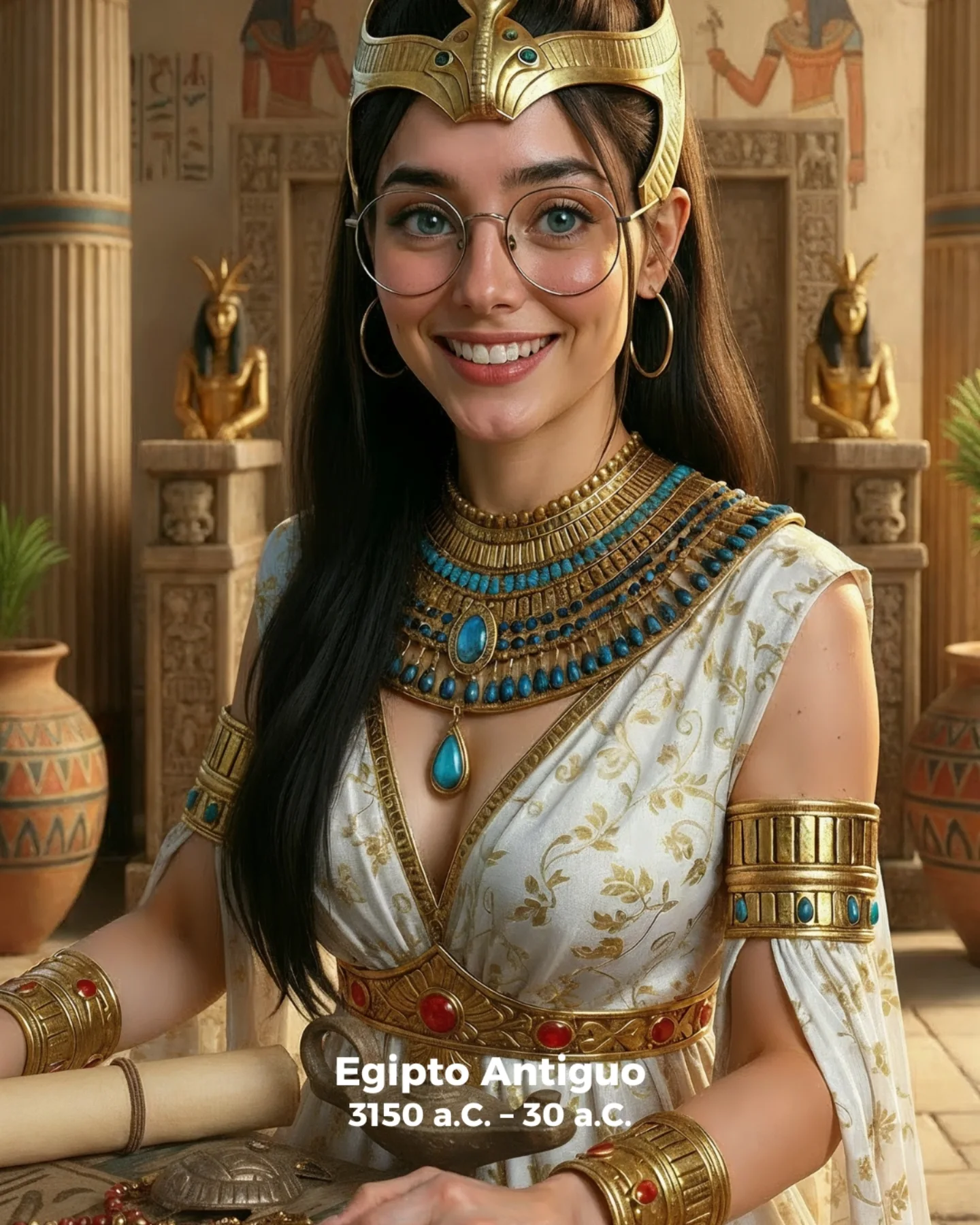
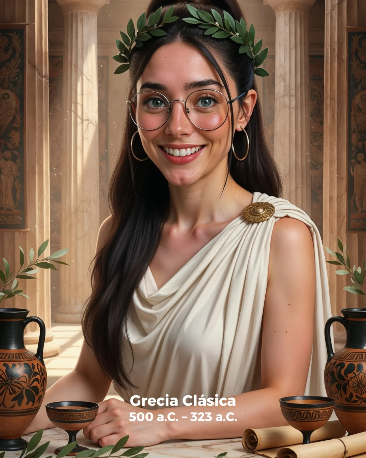
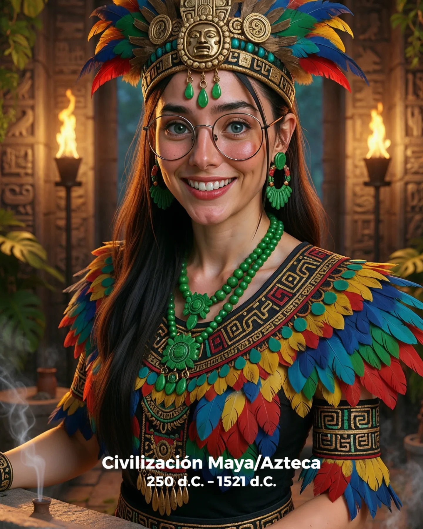
- Keep: warm smile and elegant architectural hall. Change: period from Rome to Greece, Byzantium, Renaissance, or Egypt. Slot template: {historical period} {trim motif} {room style} {cover mood}
- Keep: medium portrait crop and soft grand background. Change: subject role from scholar to noble, scribe, curator, or ruler-adjacent guide. Slot template: {historical role} {costume cue} {prop} {tone}
Prompt Technique Breakdown
| Prompt chunk | What it controls | Swap ideas (EN, 2-3 options) |
|---|
| young woman in an Imperial Rome-inspired portrait | Main historical identity | 'ancient Rome presenter portrait', 'Roman scholar cover', 'classical empire explainer image' |
| ivory draped garment with gold embroidered trim and shoulder brooch | Era-specific wardrobe clarity | 'cream toga with gold edging', 'white stola with laurel embroidery', 'beige ceremonial drape' |
| grand Roman hall with marble columns, statues, and patterned floor | Environmental credibility | 'classical atrium interior', 'senate-inspired hall', 'palatial fresco chamber' |
| rolled parchment scroll on the table edge | Narrative prop cue | 'wax tablet', 'bronze writing stylus', 'map scroll' |
| warm composed smile with direct eye contact | Creator-friendly accessibility | 'gentle scholarly smile', 'neutral noble expression', 'soft explanatory gaze' |
Execution Playbook
Lock three things first: the Roman garment, the classical hall, and the scroll prop. Those are the topic anchors. Then iterate one variable at a time. First version: establish the architectural setting and wardrobe trim. Second version: refine the portrait crop so the subject stays dominant. Third version: tune the expression between warm and formal. Fourth version: only then adjust the richness of the marble and statue background. That sequence keeps the cover readable and historical instead of drifting into overloaded costume fantasy.