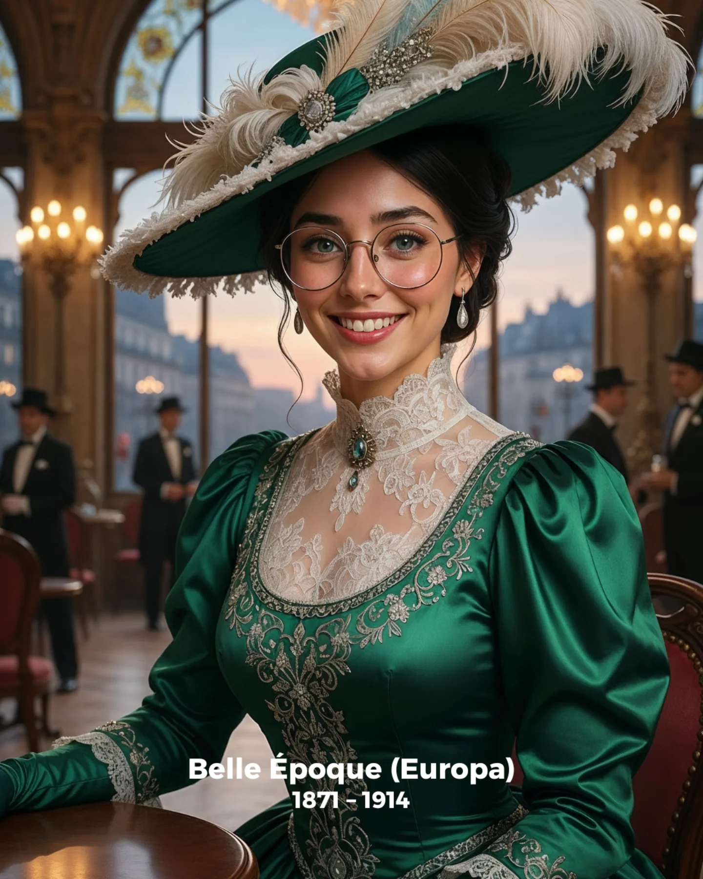
How soy_aria_cruz Made This Spanish Golden Age AI Portrait and How to Recreate It
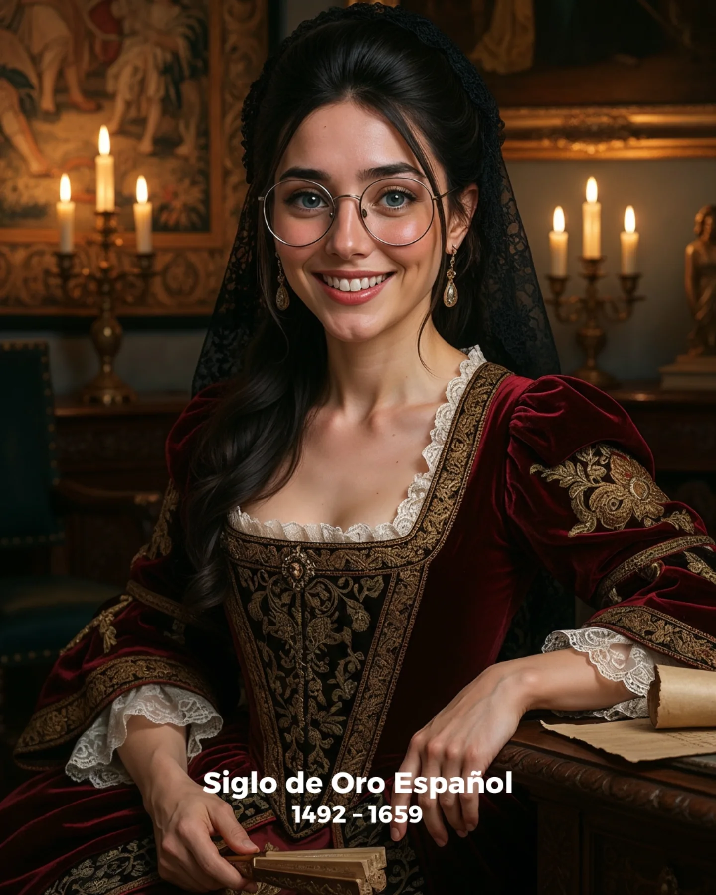
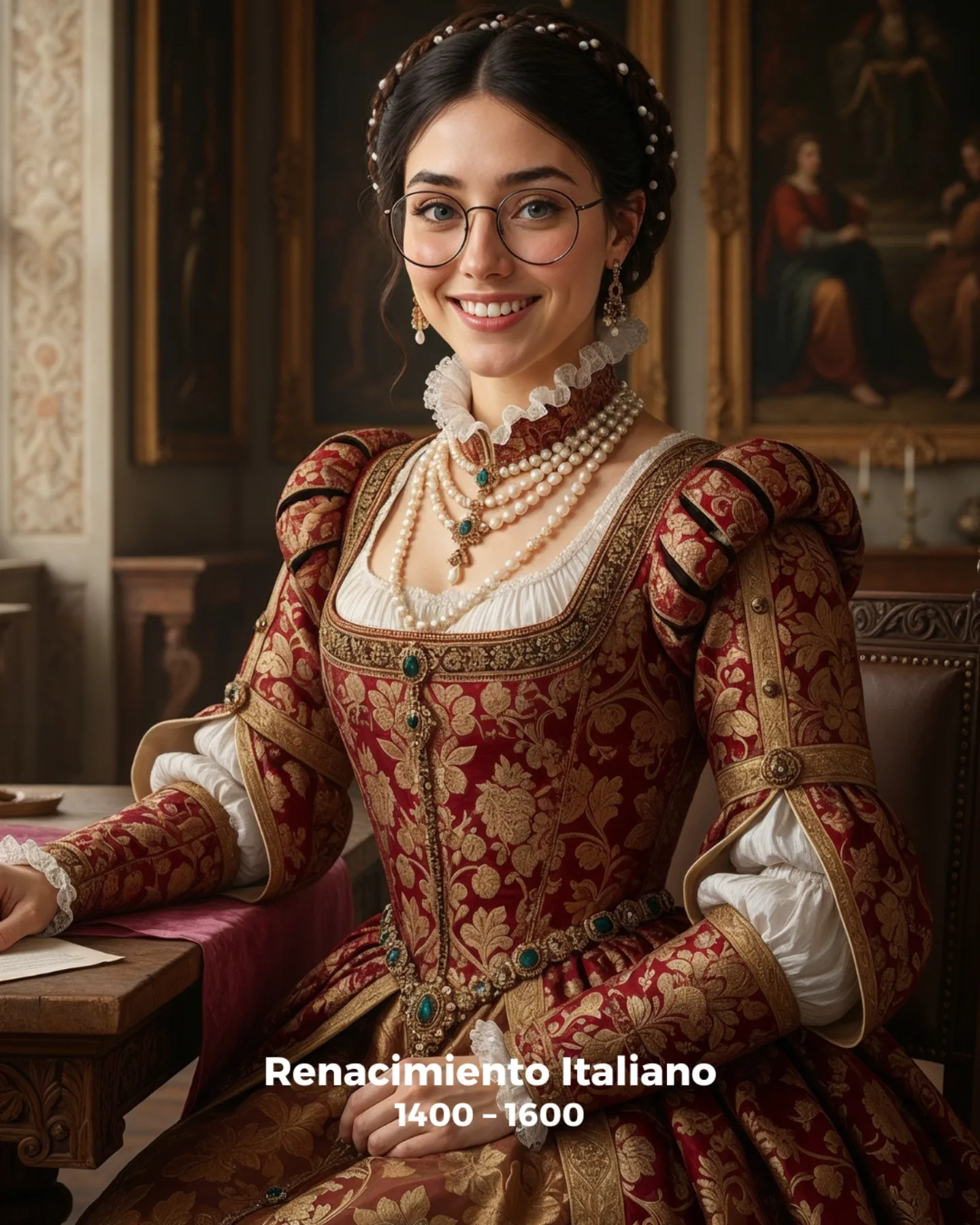
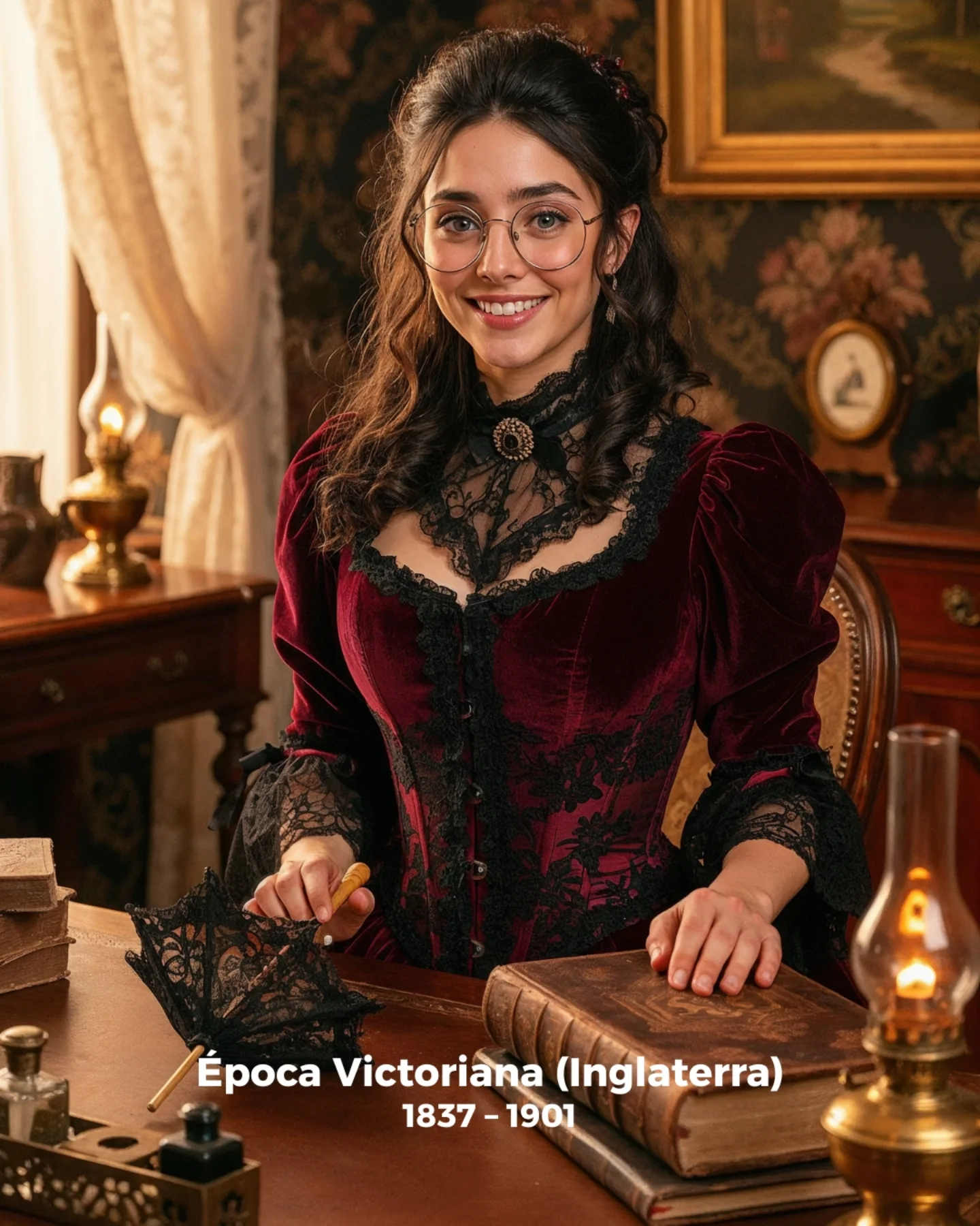
Historical covers often become unusable when they confuse richness with excess. This one works because it stays disciplined. The dress is ornate, the room is candlelit, and the setting clearly signals a European courtly era, but the image never turns chaotic. That control is what makes it strong for creator-facing educational content. It gives viewers atmosphere immediately while still letting the face remain the anchor.
The deeper reason it works is tonal consistency. The burgundy velvet, gold embroidery, black lace, warm candles, and dark wood all belong to the same emotional world. Nothing feels imported from the wrong genre. That is important for SEO-style history pages too. A good cover should tell the era before the title finishes loading, and this one does that cleanly.
Why The Cover Reads So Quickly
The image tells a complete story through only a few strong cues: aristocratic dress, candlelight, old master interiors, and a poised seated posture. The viewer does not need a lot of text to understand the time period. This matters because clickable educational covers usually rely on clarity before complexity. A strong cover image should establish the topic fast, then invite curiosity through texture and mood.
| Signal | Evidence (from this image) | Mechanism | Replication Action |
|---|
| Era-specific wardrobe | Burgundy velvet gown, lace trim, black veil, gold embroidery | Creates immediate historical recognition | Use one highly legible period garment rather than many mixed costume elements |
| Warm candle atmosphere | Candelabras glowing behind the subject | Signals old-world intimacy and prestige | Build the lighting concept around practical period sources like candles or firelight |
| Human accessibility | Direct smile and open face | Makes the historical topic feel less distant | Use a welcoming expression when the background already carries enough formality |
| Controlled room detail | Dark wood, framed art, and table edge remain readable but secondary | Adds historical depth without clutter | Let the environment support the portrait instead of dominating it |
Aesthetic Read: Why It Feels Convincing
The image feels convincing because every material behaves correctly. Velvet absorbs light, gold trim catches it, lace softens the neckline, and candle glow warms the surrounding wood. This is a useful reminder for prompt design: historical atmosphere is often more about material behavior than about quantity of props. A single believable gown can do more work than an entire room full of random antiques.
The black veil is especially effective. It adds silhouette and period specificity without distracting from the face. That is the kind of detail creators should study. A strong historical image usually needs one or two signature accents that define the era while keeping the portrait readable.
| Observed | Why It Matters | How To Recreate |
|---|
| Burgundy velvet and gold trim under warm light | Creates immediate luxury and period atmosphere | Pair rich fabric with warm practical lighting so the texture reads correctly |
| Black veil behind the hair | Adds silhouette clarity and historical identity | Use one dark draped accessory to shape the portrait without cluttering it |
| Table edge and hands visible | Makes the cover feel staged like a seated formal portrait | Include one furniture anchor so the subject feels placed in the room |
| Candles behind the subject | Establishes the old-world lighting logic fast | Let practical light sources appear in the frame instead of hiding them |
Best Use Cases And Transfers
- History explainer covers: Ideal for topics about Spain, early modern Europe, court life, and cultural eras.
- Historical portrait prompt tutorials: Strong for teaching how clothing, lighting, and interior cues define a period.
- Cinematic educational thumbnails: Useful when you want a cover that feels rich but still easy to read on mobile.
- Not ideal for battle or conquest narratives: The image is too refined and interior-focused for military drama.
- Not ideal for minimalist modern branding: The costume and room are intentionally era-specific.
Three transfer recipes
- Keep: one rich period garment, warm candlelight, seated portrait. Change: historical region or century. Slot template: {period} {signature gown detail} {practical light source} {interior style}
- Keep: warm human expression and old-world room depth. Change: role from noblewoman to scholar, patron, court singer, or writer. Slot template: {historical role} {wardrobe accent} {desk prop} {cover tone}
- Keep: medium portrait crop and elegant room. Change: color story from burgundy to emerald, black, ivory, or royal blue. Slot template: {fabric color} {trim motif} {background lighting} {historical mood}
Prompt Technique Breakdown
| Prompt chunk | What it controls | Swap ideas (EN, 2-3 options) |
|---|
| young woman in a Spanish Golden Age-inspired historical portrait | Main era identity | 'Spanish court portrait cover', 'Golden Age explainer image', 'early modern aristocratic portrait' |
| deep burgundy velvet gown with gold embroidery and black lace veil | Wardrobe specificity | 'emerald velvet gown', 'black brocade dress', 'ivory lace court gown' |
| warm candlelit interior with dark wood and framed art | Environmental logic and mood | 'candlelit salon', 'old master study room', 'noble chamber interior' |
| medium seated portrait with hands near the table edge | Formal portrait structure | 'standing historical portrait', 'three-quarter seated cover', 'desk-side noble pose' |
| warm composed smile with direct eye contact | Accessibility and creator-friendliness | 'serene noble expression', 'soft scholarly smile', 'neutral regal look' |
Execution Playbook
Lock three things first: the burgundy gown, the black veil, and the candlelit room. Those are the era anchors. Then iterate one variable at a time. First version: establish the garment silhouette and trim. Second version: refine the room lighting and candle placement. Third version: tune the crop so the table and hands remain visible. Fourth version: only then adjust expression or background art detail. That sequence keeps the image historical and legible instead of drifting into overdecorated costume fantasy.