Fake Facetime Edit Photo

Fake FaceTime photo edits work because the screen format makes a still image feel instantly more personal, awkward, or meme-ready. This page helps you find fake FaceTime photo ideas worth copying, the prompts that keep the call-screen joke readable, and the workflows that turn a static image into a stronger fake-call post. Pick one and start your own. Fake-call photo videos and creator-ready workflows, each paired with prompts and steps you can reuse. Last updated March 2026.

lilmiquela: Miquela New Song Meme
Miquela
[Creative Objective]
Create a meme-inspired social graphic styled like a smartphone incoming-call interface, used to announce or tease a music release. The design should be instantly readable and culturally familiar.

[Layout]
Square frame with black background. Top center contains large white headline text: "Miquela Drop A New Song". Middle area remains mostly empty/dark to mimic caller avatar zone. Lower area includes call options and two large circular buttons.

[UI Elements]
- Left side: muted "Remind Me" icon and label.
- Right side: "Message" icon and label.
- Bottom-left: red circular "Decline" phone button.
- Bottom-right: green circular "Accept" phone button.
Use recognizable call-screen visual language without overcomplicating details.

[Typography]
Bold sans-serif for headline; clean system-style sans-serif for labels. Ensure high contrast and mobile legibility.

[Color Direction]
High-contrast black-white base with standard call-action colors: red (decline) and green (accept).

[Mood]
Playful urgency and fan excitement, "you have to pick up this release" energy.

[Style]
Internet meme / fan culture announcement card. Minimal graphics, maximal clarity.

[Negative Prompt]
No busy background imagery, no extra decorative stickers, no complex gradients, no low-contrast text, no clutter that distracts from accept/decline decision.

[Output Specs]
1080x1080 meme-ready tile, clear text and button visibility.

[Refinement Deltas]
1) If headline feels cramped, reduce font size and increase top margin.
2) If buttons look off-brand, normalize red/green hues and icon thickness.
3) If labels are unreadable, increase label contrast and spacing.
4) If middle area feels awkwardly empty, add subtle dark circle placeholder.
5) If composition feels low-energy, enlarge button size by 8-10%.
6) If meme tone is weak, keep interface very close to familiar call-screen layout.
7) If text alignment drifts, recenter headline and button labels.
8) If colors clip on export, reduce saturation slightly on action buttons.
9) If readability on mobile is poor, simplify icon details.
10) If design looks too polished, preserve slight UI roughness for meme authenticity.
lilmiquela: Reaction Meme Screenshot AI Art
Miquela

[Subject] A desktop/computer screen showing a meme-like video frame in a media browser window. Main visible subject inside the screen content: shirtless adult male-presenting figure outdoors, wearing a black face covering mask over nose/mouth, leaning toward camera under bright sun. Meme caption text in large bold white letters across chest area reads: "My life is in shambles and he’s this level of unbothered lmao".

[Props/objects] Foreground object is monitor bezel filling most frame, with three colored circular UI dots (red/yellow/green) at top-left like a macOS window. On right edge, partial second panel/image and a small section of a person/hair visible, suggesting multi-panel editing or browsing interface. Background behind monitor includes pale wall and faint interface blocks.

[Environment] Indoor desk/workstation context, image captured as a photo of a screen rather than direct digital screenshot. Slight perspective skew and moire/softness from photographing display.

[Composition/Camera] Horizontal 16:10-ish frame. Monitor dominates center; content image framed by black window borders. Meme text centered in lower-middle of screen content. Partial UI cropping on sides gives candid behind-the-scenes vibe.

[Lighting] Mixed: strong warm sunlight inside the on-screen video content; neutral indoor ambient light on physical monitor edges. Contrast between bright beach-like scene and dark UI borders.

[Color palette] Warm skin and sky blues inside content, black UI frame, white meme typography, muted gray indoor surroundings.

[Style/Rendering] Meta-screen capture aesthetic (photo-of-monitor), internet meme culture visual language, casual and humorous social-post format.

[Detail constraints] Keep visible monitor frame and window UI dots; preserve masked shirtless man leaning forward in sunny outdoor scene; retain exact meme-style white text placement and tone; keep partial secondary panel on right edge.

Negative prompt: clean direct screenshot with no monitor bezel, extra people centered, different meme text, unreadable typography, neon cyberpunk colors, dark nightclub scene, heavy motion blur, watermarks, brand logos, cartoon style.

Suggested parameters: aspect ratio around 16:10 landscape, lens 35-50mm equivalent, slight off-axis perspective, medium depth (screen sharp, background soft), steps 24-32, CFG/style strength 5.5-6.5, sampler DPM++ 2M Karras, seed suggestion 27351940.

Delta prompt strategy (top drift points + corrective micro-prompts):
1) Monitor frame missing -> "photo of a physical monitor with black bezel".
2) UI dots absent -> "three red yellow green dots at top-left of window".
3) Subject clothing drifts -> "shirtless man with black face mask, leaning close".
4) Text changed -> "bold white meme caption exactly centered across torso area".
5) Setting loses sunlight -> "bright outdoor beach-like sunlight within the screen content".
6) Looks like pure screenshot -> "capture includes slight real-world perspective and screen-photo texture".
7) Right panel cropped out -> "partial secondary panel visible on right edge".
8) Tone too polished -> "candid internet meme screenshot aesthetic".
9) Colors too muted -> "warm skin tones and blue sky inside content frame".
10) Composition too wide -> "monitor fills most of frame with tight crop".
lilmiquela: Robo Bestie Call AI Art
Miquela
[Subject]
Primary subject is a macOS desktop screenshot with multiple overlapping windows.
Central focus: a FaceTime call window showing two participants side-by-side:
- Left participant: shirtless adult male, dark skin tone, wearing a black face mask, outdoor sunlit background.
- Right participant: feminine-presenting virtual human with short bangs and side buns, indoor setting, hand touching face, black satin-like pajama shirt.

[UI/Window inventory]
- Multiple image windows open in background featuring the same virtual character in different outfits/locations (desert road pose, etc.).
- Right side: map window (Los Angeles area) visible behind FaceTime window.
- Top system menu bar visible with app/menu labels and timestamp (Thursday evening context).
- Bottom macOS dock visible with various app icons (Finder, browser, Photoshop, Lightroom/Bridge-like icons, messaging, etc.).
- Additional floating utility windows partially visible (file/browser style overlays).

[Props/objects]
Digital interface elements only:
- FaceTime control bar icons inside call window.
- Browser/image viewer tabs and window chrome.
- Desktop wallpaper mostly obscured by layered windows.
No physical camera scene.

[Environment]
Screen-capture of creative workstation desktop during multitasking session (editing/reference browsing + video call).

[Composition/Camera]
Landscape 16:10-ish screenshot. FaceTime window centered and dominant, with collage of windows creating depth behind it. Visual hierarchy: call window first, background references second, dock/system UI third.

[Lighting]
Not photographic for outer scene (screen render). Inner video tiles have their own lighting:
- Left tile: strong sunlight.
- Right tile: soft indoor lamp light.

[Color palette]
Dominant: gray/black UI chrome, white window backgrounds.
Accents: skin tones, teal/blue map areas, colorful dock icons, warm indoor tones in right video tile.
Overall: busy digital workspace palette.

[Style/Rendering]
High-resolution computer screenshot realism, crisp UI text/buttons, authentic macOS aesthetic.

[Detail constraints]
Keep central FaceTime two-person call over layered creative windows and visible map panel. Preserve dock and top menu bar. Maintain desktop screenshot look; do not transform into a single photo scene.

Negative prompt:
single full-screen image only, no FaceTime window, no UI chrome, no dock, no menu bar, smartphone UI, Windows OS style, random anime overlays, blurred text, watermark, simplified empty desktop

Suggested parameters:
- Aspect ratio: 16:10 or similar desktop screenshot ratio (e.g., 1365x819)
- Generation type: UI screenshot recreation with text/icon fidelity
- Steps: 35-55
- CFG / guidance: 7.5-10.0
- Sampler: DPM++ 2M Karras
- Style/reference strength: 0.55-0.75
- Seed suggestion: 740581329

Delta prompt strategy (top 10 drift points + corrective micro-prompts):
1) Drift: FaceTime window missing.
   Fix: "center a large FaceTime call window with two participants"
2) Drift: desktop layers too clean.
   Fix: "add multiple overlapping image/reference windows behind the call"
3) Drift: map panel absent.
   Fix: "keep a visible Los Angeles map window on the right side"
4) Drift: dock/menu bar removed.
   Fix: "show full top macOS menu bar and bottom dock icons"
5) Drift: participant content wrong.
   Fix: "left call tile masked shirtless man outdoors, right tile virtual woman indoors"
6) Drift: OS style mismatch.
   Fix: "use authentic macOS window controls and interface styling"
7) Drift: resolution too soft.
   Fix: "crisp screenshot text/icons with readable UI edges"
8) Drift: central hierarchy weak.
   Fix: "make FaceTime window dominant over background windows"
9) Drift: no creative context.
   Fix: "include open reference images and editing-related apps in dock"
10) Drift: scene turned physical monitor photo.
    Fix: "flat direct screen-capture look, no camera glare or bezels"
lilmiquela: Life Size Selfie AI
Miquela

HIGH-GRANULARITY INVENTORY
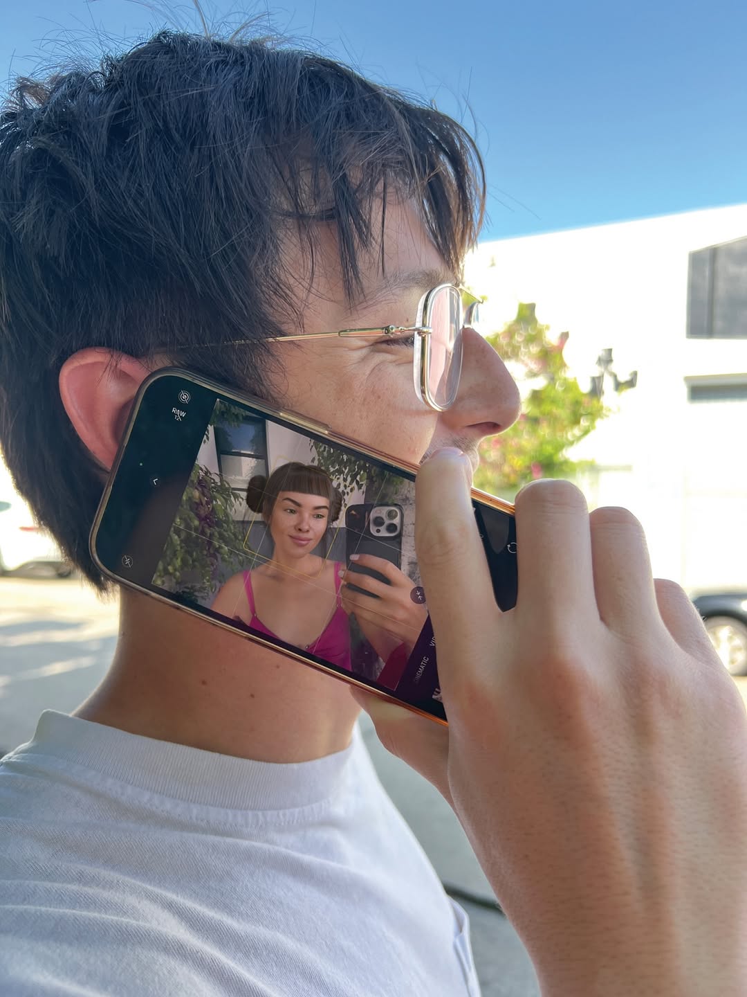
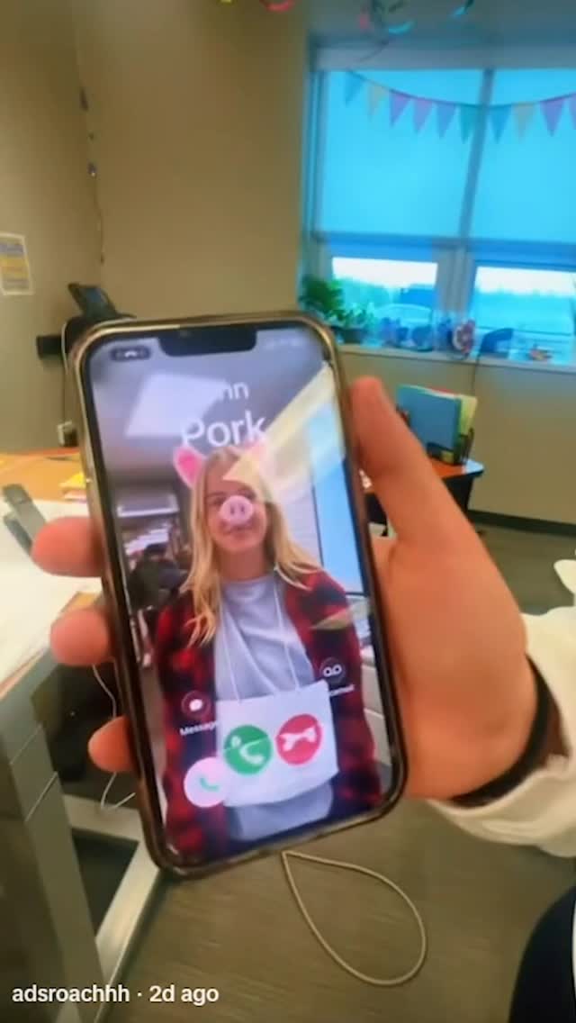
- Subject(s): 1 young adult man in the foreground (early 20s to early 30s), slim build, light skin tone, short messy dark-brown hair, thin metal-frame round glasses, relaxed smile, side profile facing right. Right hand is raised and holding a smartphone against his cheek as if taking a call. A second subject appears only inside the phone screen: 1 young woman (young adult), medium skin tone, dark blunt bangs with two mini side buns, neutral expression, wearing a bright pink strappy top, taking a mirror selfie with a phone.
- Clothing & materials: Foreground man wears a plain white crew-neck T-shirt (cotton jersey, matte texture, soft folds around shoulder/neck). Woman on screen wears a satin-like or smooth fabric pink top with thin straps.
- Props/objects: 1 black smartphone with metallic edge, held vertically but slightly tilted; screen is on and clearly visible. On-screen selfie includes a phone with triple rear camera module. Background includes out-of-focus urban elements: pale building facade, a parked car, green shrub/tree shapes.
- Environment: Outdoor daytime street or parking-lot edge. Clear blue sky. Bright sun creates crisp highlights on hair, cheek, glasses rim, and fingers. Shallow background separation with mild blur.
- Composition: Tight medium close-up from left-rear quarter angle; man’s head and hand dominate frame. Phone screen is central narrative element and occupies a large readable area near the center-left. Strong “image-inside-image” storytelling. Eye line of foreground subject points forward/right while screen subject faces camera via mirror.
- Lighting: Natural sunlight key from upper right/front-right; minimal fill from ambient sky bounce. Medium-hard shadow edges on hand/neck. Neutral-to-warm skin rendering. Screen emits additional cool-magenta glow on phone glass.
- Color palette: Dominant cool sky blue + neutral skin/beige tones + white shirt; accent hot pink from on-screen outfit. Moderate contrast, clean daylight look.
- Image style: Real photo capture with smartphone aesthetic, high sharpness on foreground skin/hair/hand, slight background blur, no heavy grain, realistic reflections on screen glass and eyeglass lens.

MASTER PROMPT
[Subject] A candid daylight street portrait of a young man in side profile holding a smartphone to his cheek, smiling softly, wearing thin round metal glasses and a plain white T-shirt; his dark tousled hair catches sunlight. The phone screen is clearly visible and shows a young woman with blunt bangs and mini buns taking a mirror selfie in a vivid pink strappy top, holding a triple-camera phone.
[Environment] Outdoor urban setting with a clean blue sky, soft-focus modern building wall, parked car, and green foliage in the background; keep background secondary and out of focus.
[Composition/Camera] Tight medium close-up, camera positioned slightly behind and left of the man, framing his face, hand, and phone as primary elements; emphasize the “screen-within-reality” narrative by keeping the on-screen woman large and readable; natural handheld framing, eye-level perspective.
[Lighting] Bright natural sun as key light from upper right, realistic specular highlights on glasses frame, fingers, and cheekbone, mild shadow under jaw and hand, ambient sky fill, accurate phone screen luminance without clipping.
[Style/Rendering] Photorealistic smartphone photo look, crisp facial detail, realistic skin texture, clean color science, moderate contrast, subtle depth separation, minimal noise.
[Detail constraints] Do not add or remove people, devices, or major objects; keep exactly one real foreground man and one woman only inside the phone screen; preserve phone orientation, side-profile pose, white T-shirt, blue-sky outdoor context, and pink on-screen wardrobe.

NEGATIVE PROMPT
extra people in foreground, duplicate faces, warped fingers, deformed hand grip, unreadable phone screen, blank/black screen, mirrored text artifacts, heavy HDR halos, over-smoothing skin, plastic skin, oversaturated neon skin tones, wrong hair color, indoor lighting, night scene, dramatic studio lights, cartoon/anime rendering, CGI look, motion blur, lens dirt, watermark, logo overlays

SUGGESTED PARAMETERS
- Aspect ratio: 3:4 (or 4:5 for social crop)
- Lens/focal length: 35mm to 50mm equivalent
- Aperture/DoF feel: f/2.8 to f/4 (subject sharp, background gently soft)
- Steps: 30-40
- CFG / guidance: 5.5-7
- Sampler: DPM++ 2M Karras (or equivalent high-detail sampler)
- Style strength (img2img): 0.25-0.4
- Seed suggestion: 184729315

DELTA PROMPT STRATEGY (Top 10 drift fixes)
1) If the phone screen is unreadable: “make the smartphone display bright and legible, showing a woman in a pink strappy top taking a mirror selfie.”
2) If extra people appear: “keep only one real man in frame and one woman visible only inside the phone screen.”
3) If hand anatomy breaks: “natural right-hand grip with accurate finger joints wrapping the phone edge.”
4) If glasses disappear: “thin round silver wire-frame eyeglasses with subtle sun reflections.”
5) If shirt color changes: “plain white cotton crew-neck T-shirt, no logos, no graphics.”
6) If scene turns indoor: “outdoor daylight with blue sky and soft urban background blur.”
7) If angle is wrong: “left-rear side profile composition, phone pressed near cheek, candid call-like gesture.”
8) If pink accent is weak: “strong hot-pink garment on the woman inside the screen as key accent color.”
9) If lighting is flat: “single bright natural sun key from upper right with crisp highlight edges.”
10) If image looks CGI: “documentary smartphone photo realism, natural skin texture, no 3D render look.”
lilmiquela: Fake AF Photos Vent Call AI Art
Miquela

[Subject] A full desktop screenshot/photo showing multiple overlapping windows on macOS. Central dominant window is a dark video-call interface with two participants side-by-side: left participant is shirtless male-presenting person outdoors wearing black face mask under bright sun; right participant is female-presenting digital-influencer/CGI character with short blunt bangs and side buns, indoors, expressive speaking gesture. Call controls/icons visible at bottom of call window.

[Secondary windows/content] Behind and around call window are open image preview windows featuring the same CGI female character in desert-road fashion poses (colorful crop top, distressed/chain-like denim pants). On right side, a map window shows Los Angeles area with labels (MacArthur Park / Echo Park / Downtown vicinity). Bottom dock is visible with common app icons (Finder, Messages, Mail, Chrome, Photoshop, Bridge, Slack, etc.). Top macOS menu/status bar visible including time/date.

[Environment] Computer desktop workspace context, multitasking creative-editing setup, layered windows conveying active production/research session.

[Composition/Camera] Landscape 16:10-style screen capture, dense collage-like composition with overlapping rectangular windows. Central focus on call window; peripheral information supports narrative. High information density but organized by window hierarchy.

[Lighting] Mixed: sunny warm lighting in left video tile, soft indoor lighting in right tile, neutral UI brightness across desktop elements. No dramatic physical shadows since this is a screen capture style image.

[Color palette] Dark gray UI panels, skin tones, warm desert oranges, map greens/blues, and colorful app dock accents.

[Style/Rendering] Documentary digital-workflow aesthetic; "behind-the-scenes creator desktop" feel. Crisp UI text/icons, realistic screenshot look.

[Detail constraints] Keep central two-person call window, multiple overlapping image previews with CGI girl, right-side LA map panel, visible macOS dock and top bar. Preserve layered cluttered-but-intentional desktop storytelling.

Negative prompt: minimal single-window layout, missing dock, no map, clean blank wallpaper, extra call participants, stylized cartoon UI, heavy blur, textless fake interface, watermark overlays, dark cyberpunk redesign.

Suggested parameters: aspect ratio 16:10 landscape, screenshot-like rendering, deep focus across UI, steps 22-30, CFG/style strength 5-6, sampler DPM++ 2M Karras, seed suggestion 78162043.

Delta prompt strategy (top drift points + corrective micro-prompts):
1) Call window missing -> "large central dark video-call window with two tiles".
2) Map panel absent -> "right-side map showing Los Angeles neighborhood labels".
3) Dock cropped out -> "full macOS dock visible along bottom edge".
4) Top menu missing -> "macOS menu/status bar visible at top".
5) Secondary image windows absent -> "overlapping preview windows with CGI female desert photos".
6) Left call subject wrong -> "shirtless masked man in bright outdoor sunlight".
7) Right call subject wrong -> "CGI girl with blunt bangs and side buns, indoor room".
8) Layout too clean -> "stacked overlapping windows, busy creator desktop".
9) Style becomes photoreal room shot -> "direct screen-capture interface aesthetic".
10) Color too monotone -> "retain mixed warm photo thumbnails + neutral UI tones".
cyborggirll: Text Message Chart Analysis Thumbnail Breakdown AI Art
[Subject] A close-up of a modern smartphone displayed upright in portrait orientation, filling most of the frame, showing an iPhone-style text conversation interface with gray incoming message bubbles and black outgoing message bubbles; several message lines are intentionally scribbled out with rough black marker-like censor strokes, while a few readable lines remain visible, suggesting a private conversation being analyzed or exposed; near the top, a playful pink distressed headline reads “your charts,” implying astrology or relationship-chart commentary layered onto the texting context. [Environment] Soft blurred indoor background with warm neutral tones and no distracting detail, allowing the phone screen to dominate completely; no hands visible, no desk clutter, no external UI elements beyond the phone display itself, no outdoor context, no additional props competing with the chat screenshot. [Composition/Camera] Vertical screenshot-style social cover, phone centered and cropped tightly, screen perfectly readable as the hero object, headline tucked near the top over the status-bar area, heavy focus on the message-thread layout, slight chromatic fringing around the outer edges for modern social-thumbnail polish, composition optimized for viral relationship-analysis or astrology-explainer content. [Lighting] Even screen-bright illumination with a clean high-key display, subtle peripheral glow around the phone edges, soft ambient background blur, no harsh reflections, no flash glare, no dramatic shadows; the display should look crisp and legible, like a stylized screenshot turned into a post cover. [Style/Rendering] Viral texting-analysis poster, relationship or astrology content thumbnail, hybrid of real smartphone UI and edited social-media design, clean, clickable, screenshot-native, playful but still polished, not a corporate product render and not a raw unedited screenshot. [Detail constraints] Keep exactly one centered smartphone showing a messaging app conversation; preserve gray and black bubbles, rough black redaction marks over some messages, and the small pink headline at the top; do not add extra phones, hands, app dashboards, emoji explosions, reaction stickers, or other decorative clutter; the mood should feel intimate, analytical, and internet-native.

Negative prompt: extra phones, hands holding the device, cracked screen, dramatic reflections, outdoor background, cluttered desk, giant stickers, overdone meme graphics, unreadable UI, Android interface, colorful bubbles, low-resolution text, harsh flash glare, fake 3D render look, multiple chat windows, notification spam, cartoon style, floating icons around the phone.

Suggested parameters: aspect ratio 4:5, lens feel clean product screenshot composite, shallow depth of field on the background only, steps 26-36, CFG 5.5-7, sampler DPM++ 2M Karras, seed suggestion 602481.

Delta prompt strategy:
1. Phone UI becoming generic: "keep a centered iPhone-style Messages conversation screen with gray incoming and black outgoing bubbles"
2. Privacy/censor cue disappearing: "preserve rough black marker scribbles covering selected message lines"
3. Headline drifting: "keep a small pink distressed title at the top reading like a social-content hook"
4. Composition getting messy: "maintain one tightly centered phone with a clean blurred background"
5. Screen readability weakening: "keep the message layout crisp, legible, and screenshot-like"
6. Style becoming product-ad clean: "retain the tone of a viral analysis post rather than a corporate phone commercial"
7. Background becoming too detailed: "keep the environment soft and unfocused so the phone dominates"
8. Frame losing social-native polish: "add subtle chromatic edge fringing around the outer border"
9. Mood becoming generic texting: "lean into relationship-analysis or astrology-content thumbnail energy"
10. Extra clutter appearing: "remove extra UI overlays, stickers, and additional devices"
cyborggirll: Abstract Particle Cloud Explainer Thumbnail Breakdown AI Art
[Subject] A minimal abstract explainer-style composition featuring a floating cloud of fine green-cyan particles suspended against a pure black background, the particle mass loosely forming an organic or data-cloud silhouette with soft irregular edges and subtle density variation; in the bottom-right corner sits a small picture-in-picture video window showing one young woman speaking to camera, long dark hair, neutral top, conversational gesture raised near her face, the inset frame acting as a presenter anchor for the otherwise abstract scene. [Environment] Pure black void-like digital background with no visible room, no scenery, no text overlays, no interface clutter, no decorative graphics beyond the particle field and presenter inset, designed to feel like a clean concept-explainer frame or AI-visualization video screen. [Composition/Camera] Vertical short-form educational thumbnail or explainer frame, large negative space dominating the screen, abstract particle cloud placed in the upper-middle area, small presenter window tucked into the lower-right corner with rounded-rectangle video-call style framing, composition intentionally sparse and concept-led, optimized to communicate “complex idea being explained simply.” [Lighting] Black-background high contrast with the particle mass emitting a soft green-teal luminescence, presenter inset evenly lit with soft indoor facial light, no bright glare, no cinematic backlights, the overall frame should feel screen-based, crisp, and restrained rather than flashy. [Style/Rendering] Minimal AI explainer visual, hybrid of scientific visualization and social-video education design, modern concept-communication thumbnail aesthetic, premium simplicity, dark-mode information graphic energy, not a glossy 3D blockbuster render and not a meme collage. [Detail constraints] Keep exactly one abstract green particle cloud and one small presenter inset in the bottom-right corner; preserve the deep black background and sparse composition; do not add charts, labels, extra windows, UI panels, neon gradients, additional people, or environmental textures; the effect should remain elegant, mysterious, and explanatory.

Negative prompt: bright white background, extra text, graphs, arrows, multiple inset windows, second speaker, colorful rainbow particles, galaxy nebula look, realistic landscape, office background, big UI dashboard, thick borders, glowing buttons, meme stickers, noisy glitch, lens flare, photoreal objects, cluttered composition, low-detail particle texture.

Suggested parameters: aspect ratio 4:5, lens feel digital screen capture or clean composited frame, shallow relevance on the inset presenter only, steps 28-38, CFG 5.5-7, sampler DPM++ 2M Karras, seed suggestion 552143.

Delta prompt strategy:
1. Particle cloud becoming generic: "keep the abstract form as a dense green-cyan particulate cloud with organic, data-like structure"
2. Composition becoming busy: "preserve the vast black negative space and minimal screen layout"
3. Presenter inset disappearing: "keep a small rounded presenter window in the bottom-right corner with one young woman speaking"
4. Frame becoming too scientific: "retain a social-video explainer feel, not a full research dashboard"
5. Colors drifting: "limit the main visual palette to black plus green-teal particle light and natural skin tones in the inset"
6. Background gaining texture: "keep the background pure black with no scenery or ambient detail"
7. Visual hierarchy weakening: "make the particle cloud the main concept object and the presenter inset the secondary guide"
8. Inset becoming too large: "keep the talking-head window compact and supportive, not dominant"
9. Style becoming too flashy: "maintain premium minimalism rather than neon cyberpunk overload"
10. Meaning becoming unclear: "render the frame like a creator is explaining an abstract AI or science concept with a clean visual aid"
lilmiquela: Music Production Collage AI Art
Miquela

[Subject]
No human face/body. A close-cropped digital collage of smartphone/desktop interface elements related to music production workflow. The image is a vertical composition showing text-message conversation snippets, waveform screenshots, and creative-note visuals.

[Objects & UI Elements]
- Left-center dominant panel: chat thread with gray and blue message bubbles.
- Visible message snippets about music sessions, chorus refinement, demos, and feedback.
- Stickers/graphic text element reading “music is my life” in stylized blue/magenta typography.
- White card sections with black audio waveforms and timeline-like controls.
- Timestamp-like text near lower center-right (e.g., around 00:27:04).
- Small media controls/icons (play symbol and circular controls) in a minimalist UI row.
- Green link preview bubble referencing Google Drive sign-in.
- Miscellaneous cropped UI fragments at top-right and bottom-right with purple-toned graphics.

[Environment]
Digital screen-capture aesthetic, mixed app interfaces layered together. Feels like a creator’s chaotic yet focused production dashboard and DM workflow.

[Composition/Camera]
Vertical 4:5-ish screenshot crop, tightly framed with partial cut-offs at edges. Asymmetric layout: dense chat content left-center, waveform modules on right. No horizon/physical camera perspective (flat screen content).

[Lighting/Color]
Screen-based flat illumination. Dominant white interface background with accent colors: iMessage-like blue bubbles, gray incoming bubbles, black waveform lines, green link bubble, magenta/cyan sticker text, hints of purple media panel. Moderate compression/noise consistent with reposted screenshot.

[Style/Rendering]
Realistic smartphone UI collage / social media screenshot aesthetic. Slight blur/compression artifacts, imperfect text sharpness, authentic digital clutter.

[Detail constraints]
Keep the collage as UI-focused (no people). Preserve chat bubbles + waveform panels + “music is my life” graphic + link preview + timestamp-like readout. Maintain asymmetric cut-off framing and screenshot texture. Do not convert into clean vector infographic or polished app mockup.

Negative prompt:
human portraits, clean studio scene, 3D objects, minimal blank layout, no text bubbles, no waveform, perfect typography, high-end vector infographic, dark mode-only interface, neon cyberpunk UI, unrelated icons, heavy glitch distortion, unreadable mush, watermark, branding replacement

Suggested parameters:
- Aspect ratio: 4:5
- Lens/focal feel: N/A (screen capture style)
- Steps: 24-36
- CFG / guidance: 6.5-8.5
- Sampler: DPM++ 2M Karras
- Style strength (img2img): 0.45-0.65
- Seed suggestion: 708341526

Delta prompt strategy (top 10 drift risks + corrective micro-prompts):
1) Drift: UI collage becomes clean poster.
   Fix: "retain messy layered screenshot collage with cropped app panels"
2) Drift: chat bubbles missing.
   Fix: "add multiple blue and gray chat bubbles with short music-related text"
3) Drift: waveform panels absent.
   Fix: "include black waveform graphics on white cards at right side"
4) Drift: no sticker graphic.
   Fix: "insert stylized text sticker reading 'music is my life' in cyan/magenta"
5) Drift: colors too muted.
   Fix: "keep white base with vivid blue chat bubbles and magenta accents"
6) Drift: composition too centered.
   Fix: "asymmetric layout, dense left chat column and right waveform modules"
7) Drift: looks like one app only.
   Fix: "mix multiple UI fragments from messaging and audio editing screens"
8) Drift: too sharp/perfect.
   Fix: "slight compression blur and screenshot texture imperfections"
9) Drift: no link preview.
   Fix: "add green link-preview style bubble resembling drive link"
10) Drift: timestamp/control row missing.
    Fix: "include small media controls and a timestamp-like readout near lower-middle"
lilmiquela: Christmas Movie Giveaway AI Portrait
Miquela

[Subject] Full-screen screenshot of a Notes app in dark mode (iOS-style). Interface shows top navigation and timestamp, followed by a giveaway announcement written as plain text with emojis.

[UI elements] Top bar includes back text "All iCloud", share and more icons, and date/time line: "December 25, 2024 at 12:22 PM". Main note body starts with gift emojis and headline "GIVEAWAY ALERT!" followed by short promotional instructions.

[Main text content to preserve]
"GIVEAWAY ALERT!"
"Comment your favorite Christmas movie below and tag a friend. 3 lucky winners will score a surprise gift!"
"Winners will be announced on 31st Dec!!"
"Can't wait to read all your movie recs"
Closing line: "Xoxo, Miquela"
Include holiday emojis in similar positions.

[Composition/Camera] Vertical screenshot crop centered on note content. Black background with white text and yellow accent icons typical of dark-mode notes app.

[Lighting/Style] Digital UI screenshot (no environmental lighting). Crisp text-first design.

[Color palette] Black background, white body text, yellow navigation icons, occasional colored emoji accents.

[Style/Rendering] Native app screenshot aesthetic, simple and legible community call-to-action post.

[Detail constraints] Keep dark-mode Notes interface and giveaway copy layout with clear spacing. Preserve timestamp line and top app controls. Maintain text readability and social giveaway tone. Do not convert into graphic poster or remove UI chrome.

Negative prompt: bright light mode UI, stylized poster graphics, missing app header, unreadable text, no timestamp, unrelated branding logos, watermark, handwritten script fonts.

Suggested parameters: aspect ratio 1:1 or phone portrait crop, steps 10-18, CFG/style strength 3.5-5, sampler Euler, seed 559804.

Delta prompt strategy (top drift risks + corrective micro-prompts):
1) UI frame missing -> "show full iOS Notes dark-mode interface with top bar icons"
2) Text becomes generic -> "preserve giveaway wording, holiday context, and closing signature"
3) Timestamp removed -> "include date line under top bar"
4) Style turns poster-like -> "plain text note screenshot, not designed flyer"
5) Colors wrong -> "black background, white text, yellow interface accents"
6) Emojis missing -> "gift and holiday emojis around headline/body"
7) Crop too tight -> "include top navigation and full note block"
8) Font mismatch -> "default iOS sans-serif note font style"
9) Low readability -> "high-contrast crisp text rendering"
10) Tone shifts formal -> "friendly creator giveaway voice"
soy_aria_cruz: Blackberry Phone Close Up AI Art
[Subject] A close-up handheld view of a classic Blackberry-style smartphone with a physical QWERTY keyboard, held in one hand at night. A thumb rests over the keyboard as if typing or scrolling. On the screen is a front-facing portrait of a young woman wearing a light gray hoodie, looking into the camera with a soft relaxed expression. The phone is black with chrome edges, colored call/end buttons, and a small central trackpad area, clearly referencing late-2000s mobile design.

[Environment] Nighttime city background rendered as soft colorful bokeh, with blurred streetlights and illuminated signage in the distance. The phone and hand dominate the frame while the urban environment remains out of focus, suggesting a personal message or old mobile memory captured in a modern night setting.

[Composition/Camera] Tight vertical close-up, phone centered and filling most of the frame. The hand wraps around the lower and right side, with the thumb crossing the keyboard. The screen portrait becomes the emotional focal point, while the out-of-focus city lights create depth and nostalgia.

[Lighting] Mixed night lighting with soft ambient street illumination and screen glow. The phone face is well exposed, with subtle reflections on the glass and chrome edges. Background lights bloom into warm and cool circular bokeh, no harsh flash.

[Style/Rendering] Realistic nostalgia-tech photography, intimate and memory-driven, crisp phone detail with cinematic night bokeh, social-media friendly but not overprocessed, evoking the era of early smartphone messaging and profile photos.

[Detail constraints] Keep exactly one Blackberry-style phone and one visible hand; preserve the physical keyboard, black casing, screen portrait of a woman in a gray hoodie, and the night city bokeh background. Do not add modern touchscreen gestures, extra devices, notifications overlays, headphones, or text messages on screen.

Negative prompt: full modern smartphone screen, touchscreen keyboard, multiple hands, daylight background, blank screen, text-message UI overlays, fantasy neon, cracked screen, extra gadgets, studio tabletop, text overlays, overly sharp city background.

Suggested parameters: aspect ratio 4:5, lens 50-85mm close-up equivalent, shallow depth of field, 24-32 steps, CFG/style strength 5.5-7, sampler DPM++ 2M Karras or equivalent, seed around 441027.

Delta prompt strategy:
1. Phone looking too modern -> append: “classic Blackberry-style phone with physical QWERTY keyboard and small central trackpad”.
2. Screen portrait too weak -> append: “screen displays a hoodie-wearing selfie portrait with a calm expression”.
3. Night mood missing -> append: “soft city night bokeh with colorful streetlights behind the phone”.
4. Hand interaction unclear -> append: “thumb resting on the keyboard as if typing a message”.
5. Background too sharp -> append: “strong shallow depth of field, blurred urban lights only”.
6. Chrome details missing -> append: “black phone body with reflective chrome edges and colored call buttons”.
7. Scene too commercial -> append: “personal handheld nostalgia-tech snapshot, not a studio product photo”.
8. Screen UI clutter appearing -> append: “clean portrait on screen with no visible chat bubbles or app interface”.
9. Lighting too flat -> append: “mixed ambient night light and subtle screen glow on the device”.
10. Retro feeling too weak -> append: “late-2000s pocket-phone nostalgia with tactile keyboard emphasis”.
lilmiquela: Music Anniversary Collage AI Art
Miquela

HIGH-GRANULARITY INVENTORY
- Subject(s): Composite graphic with multiple embedded photos rather than a single subject. Three browser-window style frames each containing different people portraits/group shots.
- Clothing & materials: Mixed outfits across embedded photos (casual tops, streetwear, pink outfit, crop tops), not one unified wardrobe.
- Props/objects: Floral purple background image, three floating browser-like frames with black header bars, and three folder-style icons labeled “Automatic,” “Speak Up,” and “Masterpiece.” Top-left frame includes visible “PAPER” masthead and article screenshot. Middle-right frame shows studio setting duo portrait. Bottom-left large frame shows duo backstage/event shot.
- Environment: Digital collage design environment, desktop/moodboard aesthetic.
- Composition: Square layout with asymmetrical floating elements. Largest browser frame anchored lower-left, two smaller frames upper-left and upper-right. Folder labels placed on right side and lower-right area.
- Lighting: Not a single light source due collage; each embedded photo has its own lighting. Overall graphic has soft pastel background with high-contrast frame overlays.
- Color palette: Lavender/purple floral base, black frame bars, skin tones from photo inserts, accent labels in light gray with white text.
- Image style: Y2K desktop collage / scrapbook digital editorial, mixed-media screenshot montage.

MASTER PROMPT
[Subject] Design a digital scrapbook collage with three floating browser-window frames containing portrait photos, layered over a soft purple floral background, plus folder-style label icons reading “Automatic,” “Speak Up,” and “Masterpiece.”
[Environment] Graphic design canvas (not a real scene), combining internet-window UI motifs and editorial photo snippets.
[Composition/Camera] Square canvas with asymmetrical layout: one large browser frame in the lower-left, two smaller frames in upper-left and upper-right, folder labels positioned on right/lower-right for balance.
[Lighting] Mixed source within embedded photos; overall collage uses clean flat graphic lighting and clear contrast between UI frames and floral background.
[Style/Rendering] Nostalgic web-culture moodboard aesthetic, polished digital collage, magazine-meets-desktop visual language.
[Detail constraints] Keep exactly three browser frames and three labeled folder icons; preserve floral backdrop and layered cut-and-paste look; no extra clutter text.

NEGATIVE PROMPT
single-photo portrait only, plain solid background, no UI windows, no folder labels, overly realistic scene, heavy 3D rendering, cluttered text overload, unreadable labels, neon glitch, cartoon doodle style, watermark, random logos unrelated to collage

SUGGESTED PARAMETERS
- Aspect ratio: 1:1
- Render style: graphic collage / mixed-media layout
- Steps: 26-36
- CFG / guidance: 5.5-7
- Sampler: DPM++ 2M Karras
- Style strength (img2img): 0.35-0.55
- Seed suggestion: 742156398

DELTA PROMPT STRATEGY (Top 10 drift fixes)
1) If layout collapses: “keep three separate floating browser windows with distinct sizes and positions.”
2) If folders disappear: “add three folder icons labeled Automatic, Speak Up, and Masterpiece.”
3) If background changes: “soft purple floral background filling full canvas.”
4) If style gets literal photo: “maintain digital moodboard collage aesthetic, not one realistic scene.”
5) If top-left loses editorial cue: “include a magazine/article screenshot style in upper-left frame.”
6) If hierarchy weakens: “largest frame anchored lower-left, two smaller frames above.”
7) If labels unreadable: “folder text should be clean white sans-serif and legible.”
8) If colors dull: “retain lavender floral base with dark UI frame contrast.”
9) If clutter grows: “minimal extra text; focus on three frames and three folders only.”
10) If output looks dated incorrectly: “modern retro-web collage with clean polished finishing.”
lilmiquela: Aliza Kelly Tarot Call AI Art
Miquela

HIGH-GRANULARITY VISUAL INVENTORY

Subject(s)
- Two participants visible in a video call interface.
- Left tile: female-presenting virtual character with blunt bangs and side buns, wearing blue hoodie.
- Right tile: real female-presenting participant taking mirror-style phone selfie during call.
- Small bottom-right mini tile previews additional call participants.

Clothing & materials
- Left participant: blue hoodie with green graphic accents.
- Right participant: dark top (details partly obscured by phone).

Props/objects
- Laptop screen displaying split video call layout.
- Visible call control bar/icons at bottom center of screen (mute/camera/end call etc.).
- Participant name labels shown beneath video tiles.
- Smartphone with decorative blue case held by right participant.
- Physical tarot card placed in foreground on laptop keyboard area.
- Mac-style dock icons visible along bottom edge.

Environment
- Indoor desk/room setup.
- Screen-capture-through-camera perspective (photo of laptop, not direct screenshot).
- Right edge shows light source and room details.

Composition
- Horizontal frame.
- Laptop screen dominates upper two-thirds.
- Tarot card foreground at lower center adds narrative layer.
- Strong contrast between digital interface and physical objects.

Lighting
- Ambient indoor lighting with screen as major light source.
- Slight reflections and glare on screen.
- Balanced exposure preserving UI readability.

Color palette
- Dominant: dark laptop blacks and UI tones.
- Accents: bright blue hoodie and phone case, yellow-black tarot illustration.
- Overall: tech-meets-mystic hybrid palette.

Image style
- Documentary desk photo of online session.
- Hybrid digital-physical storytelling frame.
- Casual authentic creator workflow aesthetic.

MASTER PROMPT (EN)
[Subject] A laptop on a desk showing a two-person video call: a virtual female avatar in a blue hoodie on the left and a real participant holding a blue phone on the right, with a tarot card placed in the foreground over the keyboard.
[Environment] Indoor workspace with a real photographed laptop screen, visible app controls, participant labels, and small call thumbnails.
[Composition/Camera] Landscape shot, laptop display filling upper frame, physical tarot card in lower foreground to connect digital call and tangible ritual object.
[Lighting] Soft indoor ambient light with screen glow as primary source; minor reflections but readable interface.
[Style/Rendering] Realistic candid tech-lifestyle photo blending virtual identity, human participant, and symbolic tarot element.
[Detail constraints] Keep dual participant call layout, preserve blue hoodie/avatar and blue phone-case selfie tile, maintain tarot card foreground and laptop keyboard context.

NEGATIVE PROMPT
single portrait only, no laptop, no interface controls, no tarot card, clean studio backdrop, abstract UI mockup, dark unreadable screen, cartoon-only render, heavy blur, watermark overlays, extra unrelated props

SUGGESTED PARAMETERS
- Aspect ratio: 16:10 or 4:3 landscape
- Lens/focal feel: 35-50mm desk documentary
- DOF: medium (screen and foreground card both recognizable)
- Steps: 28-38
- CFG: 6-8
- Sampler: DPM++ 2M Karras
- Style strength (img2img): 0.4-0.55
- Seed suggestion: 47592301

DELTA PROMPT STRATEGY (Top 10 drift risks)
1) Tarot card omitted.
- Correction: "physical tarot card in foreground over keyboard"
2) Video call UI replaced with generic image.
- Correction: "visible call controls and participant tiles"
3) One participant disappears.
- Correction: "two main video tiles side by side"
4) Avatar style lost.
- Correction: "left tile shows virtual female avatar in blue hoodie"
5) Phone selfie element missing.
- Correction: "right participant holds decorated blue phone"
6) Scene becomes screen capture only.
- Correction: "photo of laptop screen with real keyboard visible"
7) Lighting too dark.
- Correction: "balanced indoor light with readable screen"
8) Color accents muted.
- Correction: "keep strong blue accents and yellow-black tarot art"
9) Composition crops out keyboard.
- Correction: "include lower laptop keyboard edge and card"
10) Mood turns corporate meeting.
- Correction: "casual creative call with mystical tarot cue"
Video
Leo
A realistic corporate communication video centered on a serious phone conversation between professionals. A well-dressed man in a light green button-up shirt stands in a bright modern interior, speaking on a smartphone with a focused but calm expression. The scene cuts to a woman in an office setting wearing glasses and a peach blazer, also on the phone, reacting thoughtfully and with concern. The video alternates between each side of the conversation, showing subtle emotional shifts through close facial framing and professional body language. The interiors are clean, softly sunlit, and contemporary, with neutral decor and a business-casual atmosphere. The mood feels like an important work discussion, client update, or office problem-solving call. Realistic office lighting, natural conversation posture, executive-casual styling, and grounded business-drama tone. No text overlays beyond platform watermark.
lilmiquela: Tower Card Tarot AI Art
Miquela

[Subject] Split-screen video call interface screenshot with two participants. Left panel: young woman with blunt bangs and double buns, wearing bright blue sweater with green graphic, seated indoors and making a questioning/puzzled hand gesture under chin; small label reads "Miquela". Right panel: female tarot reader with curly dark hair and winged eyeliner, wearing earbuds, holding a tarot card close to camera.

[Key object] Tarot card shown in right panel is "XVI THE TOWER" (classic Rider-Waite style image) clearly visible and readable.

[Environment] Dark UI background with rounded participant windows. Left participant in neutral home interior with sofa/TV; right participant in darker backdrop with vertical textured wall/curtain.

[Interface details] Bottom call bar with icons (microphone, camera, reactions, share/more controls) and red hang-up button. Time and session label at lower-left: "3:14 PM | Miquela Tarot Reading".

[Composition/Camera] Wide horizontal screenshot style, two equal video windows side-by-side. High legibility of faces, card, and UI text.

[Lighting] Soft indoor lighting in both windows; left side brighter neutral daylight, right side warmer/dimmer with focused face lighting.

[Style/Rendering] Digital communication screenshot aesthetic, social-story post documenting a virtual tarot reading moment.

[Detail constraints] Keep two-person call layout and full UI context; preserve visible tarot card title "THE TOWER"; maintain left participant puzzled gesture and right participant card-holding action; include bottom call controls and time/session text.

Negative prompt: single-person portrait, no UI chrome, phone-call audio-only screen, missing tarot card, illegible text, extra participants, heavy graphic overlays, cartoon interface, watermark.

Suggested parameters: aspect ratio ~16:10 landscape; crisp UI rendering; sampler DPM++ 2M Karras; steps 20-28; CFG 4.5-5.8; seed 93621540.

Delta prompt strategy (top drift points + corrective micro-prompts):
1) Split layout breaks -> "two equal video call panels side by side".
2) Card unreadable -> "tarot card THE TOWER clearly visible in right panel".
3) Left expression wrong -> "left participant making confused hand-under-chin gesture".
4) UI missing -> "bottom call controls with red hang-up icon and utility buttons".
5) Session text gone -> "lower-left text: 3:14 PM | Miquela Tarot Reading".
6) Background mismatch -> "dark app interface with rounded participant frames".
7) Extra participants appear -> "exactly two people in call".
8) Lighting mismatch -> "left brighter room, right slightly darker studio-like room".
9) Style too polished -> "screenshot-like digital meeting capture".
10) Card type wrong -> "Rider-Waite style Tower card (XVI)".
john.pork: Halloween Phone Call Meme AI Art
John Pork

HIGH-GRANULARITY INVENTORY
- Subject: close-up hand holding a smartphone; phone screen shows an incoming call-style interface with a blonde woman wearing pig-face filter and pink hearts.
- Secondary details: contact name appears as "john pork" on screen (partially visible), green/red call action icons.
- Environment: casual office room with table, window, desk items, and soft daylight.
- Composition: vertical mobile screenshot style; phone dominates center foreground, background intentionally soft.
- Lighting: indoor ambient with cool window light; slightly grainy social-video frame.
- Palette: warm skin tones + cool blue window + muted office neutrals.
- Style: meme/reel screenshot aesthetic, candid and humorous.

MASTER PROMPT
[Subject] A hand holds a smartphone close to camera, showing a call screen with a blonde woman using a pig-face filter and small pink heart effects; call UI icons are visible.
[Environment] Office interior with desk, window, and everyday objects in soft focus.
[Composition/Camera] Vertical social frame, phone centered foreground, background blurred for context only.
[Lighting] Mixed indoor daylight, natural and slightly cool, with authentic casual capture texture.
[Style/Rendering] Candid meme-like social screenshot, playful and spontaneous.
[Detail constraints] Keep call-screen UI, pig filter, and hand-held phone perspective.

NEGATIVE PROMPT
studio clean mockup, no UI elements, outdoor street, dark nightclub, no pig filter, over-polished ad style, watermark clutter, text overlays unrelated to call screen.

SUGGESTED PARAMETERS
- Aspect ratio: 9:16
- Lens: 24-28mm phone look
- Steps: 20-30
- CFG: 5.5-7
- Sampler: DPM++ 2M Karras
- Seed suggestion: 43392018

DELTA PROMPT STRATEGY
1) UI missing -> "show clear incoming-call interface with accept/decline icons"
2) Filter missing -> "apply pig-nose/ears filter to caller face"
3) Phone too small -> "foreground phone occupies most of center frame"
4) Background too sharp -> "soft office blur behind hand"
5) Mood too formal -> "casual humorous social capture tone"
6) Color wrong -> "keep cool window cast with natural indoor warmth"
7) No hand perspective -> "visible fingers gripping right and left edges"
8) Text illegible -> "partial 'john pork' name visible on call screen"
9) Scene too clean -> "retain slight video grain/compression feel"
10) Layout wrong -> "vertical reel-like framing"
lilmiquela: Catfish DM AI Art
Miquela
[Creative Objective]
Create a realistic close-up image of a person handling a suspicious social media direct message on a smartphone. The scene should communicate digital caution and account-security awareness.

[Composition]
Square top-down angle focused on both hands holding a phone. Screen occupies central frame with dark-mode chat UI visible. Typing thumb in motion near keyboard to imply active response.

[Screen Content]
Conversation should reference uncertainty about identity/collaboration legitimacy. Include short message bubbles and drafting behavior. Autocomplete suggestion row visible near keyboard to enhance realism.

[Device and Hands]
Modern smartphone with clear case. Natural hand grip and thumb placement. Keep skin tones natural and finger posture believable.

[Environment]
Neutral outdoor surface background (sidewalk/concrete) softly blurred. No extra objects competing with phone screen.

[Lighting]
Natural daylight with soft highlights on hands and device glass. Avoid glare that blocks screen readability.

[Color Direction]
Dark UI contrast on screen (black, gray, purple bubbles) against cool neutral background and warm skin tones.

[Camera Style]
Candid lifestyle close-up, documentary-tech aesthetic.

[Mood]
Alert, thoughtful, practical digital self-protection moment.

[Negative Prompt]
No fake futuristic UI, no neon cyberpunk effects, no over-sharpened hands, no text overlays outside phone screen, no heavy reflections obscuring messages.

[Output Specs]
1080x1080 social awareness visual, readable interface cues, realistic hand-device interaction.

[Refinement Deltas]
1) If text is unreadable, increase screen brightness and contrast.
2) If glare appears on screen, adjust angle and reduce hotspot reflections.
3) If hands look stiff, refine thumb flex and grip pressure naturally.
4) If UI feels generic, add realistic app icons and message bubble spacing.
5) If focus drifts to background, blur concrete texture more.
6) If message theme is unclear, highlight one suspicious phrase thread.
7) If colors are too cold, warm skin tones slightly.
8) If composition feels cramped, add margin around phone edges.
9) If security narrative is weak, show typing action before send.
10) If image feels staged, keep slight asymmetry and imperfect finger alignment.

Fake Facetime Edit Photo

Why fake FaceTime photo edits work when the call layout gives the image a new social meaning

If you're making a fake FaceTime photo edit, the strongest effect is context. A still image can become funny, awkward, uncanny, or weirdly intimate the moment it appears inside a recognizable call-screen frame. The format works because it changes how the image is read. The viewer stops seeing only a photo and starts seeing a fake interaction.

Creators often weaken this kind of meme by making the fake interface messy or by choosing a twist that does not build on the call context. The better versions usually establish the screen language clearly, then let one still image create the joke. That restraint is what makes the post feel clever instead of cluttered.

This page helps creators use fake-call photo edits as repeatable meme structures instead of random screenshot jokes. Across this set, creators are already pushing fake-call image formats to 102,656 likes by combining familiar interface logic with memorable stills. Use these examples to decide whether your version should feel absurd, creepy, affectionate, or more like a perfectly awkward social screenshot.

Key Insight: Fake FaceTime photo edits usually feel stronger when the call layout changes the meaning of the still image immediately, because the humor lives in the new context more than in the image alone.

Takeaway: Choose the still image for contrast first, then use the call-screen frame to give that image a sharper social joke.

FAQ

What makes a fake FaceTime photo post easy to get?

The strongest fake-call photo posts establish the interface first and let the still image deliver the twist. On this page, the better examples make the joke legible in one glance.

Do fake-call image memes need creepy photos?

No. Creepy images are only one route. Cute, absurd, awkward, or overdramatic stills can work just as well if the call-screen context sharpens the joke.

How do creators make fake-call photo posts more shareable?

They usually keep the interface simple and choose one image that creates strong contrast once placed inside the fake call. That makes the post easier to understand and repost.

What should I include in a fake-call photo prompt?

Start with the call-screen layout, the still-image tone, the joke type, and the realism level you want. Then keep every element serving that one fake-interaction idea. Use the examples here as structure.