How cyborg.digitalart Made This Battle Anime Team Lineup AI Art -- and How to Recreate It
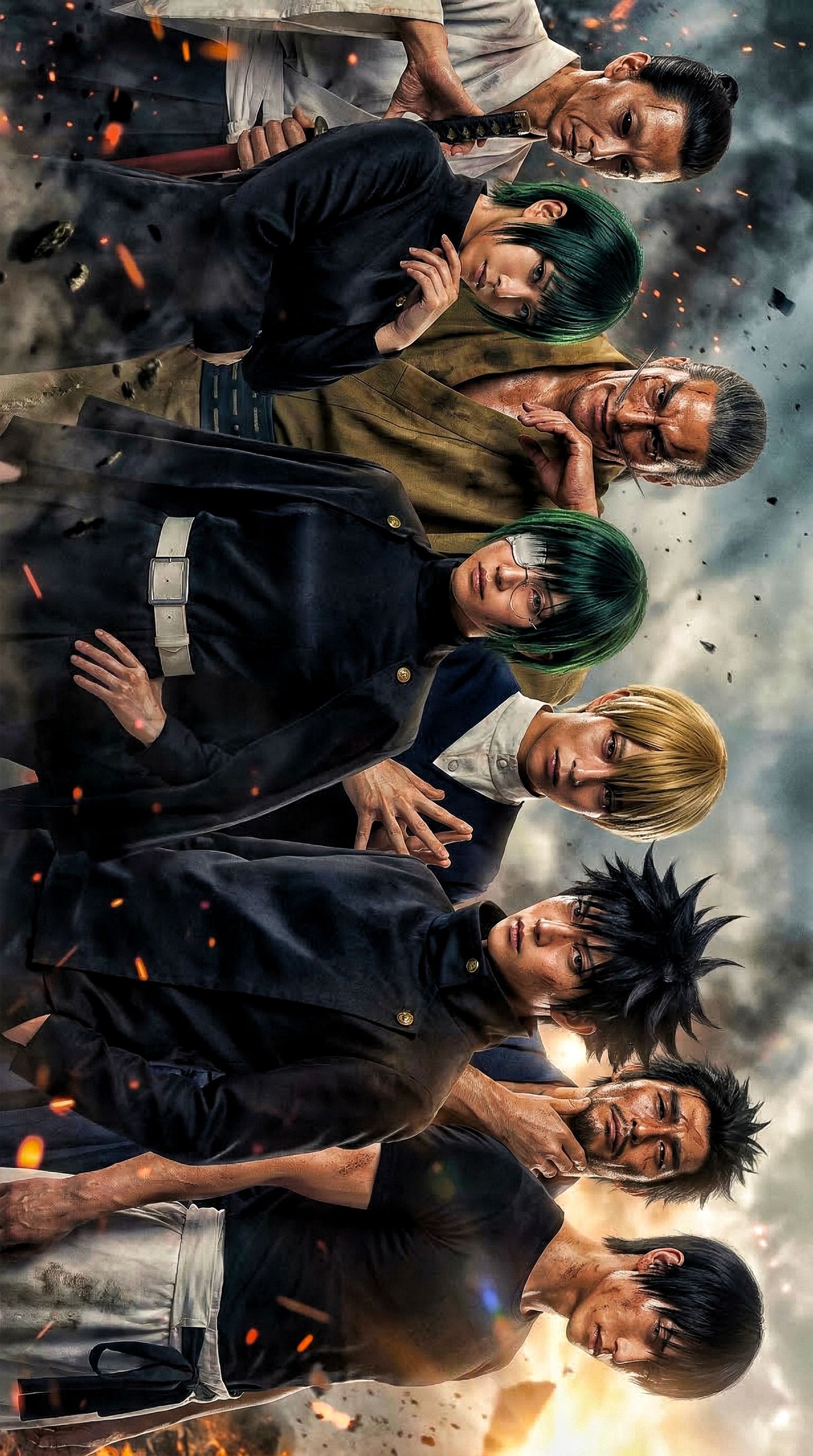
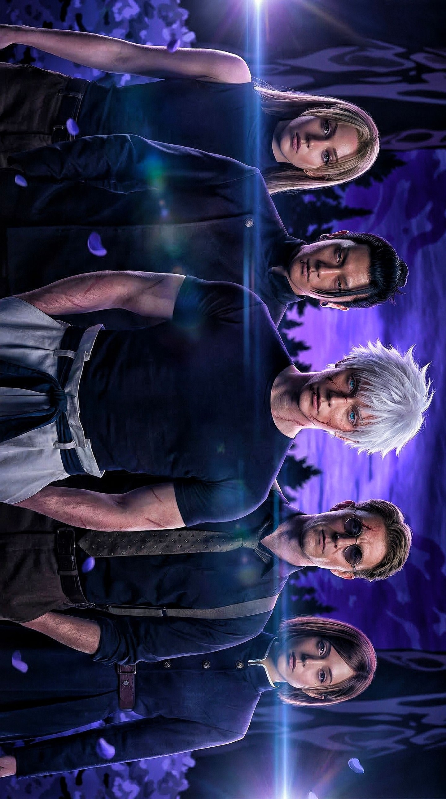
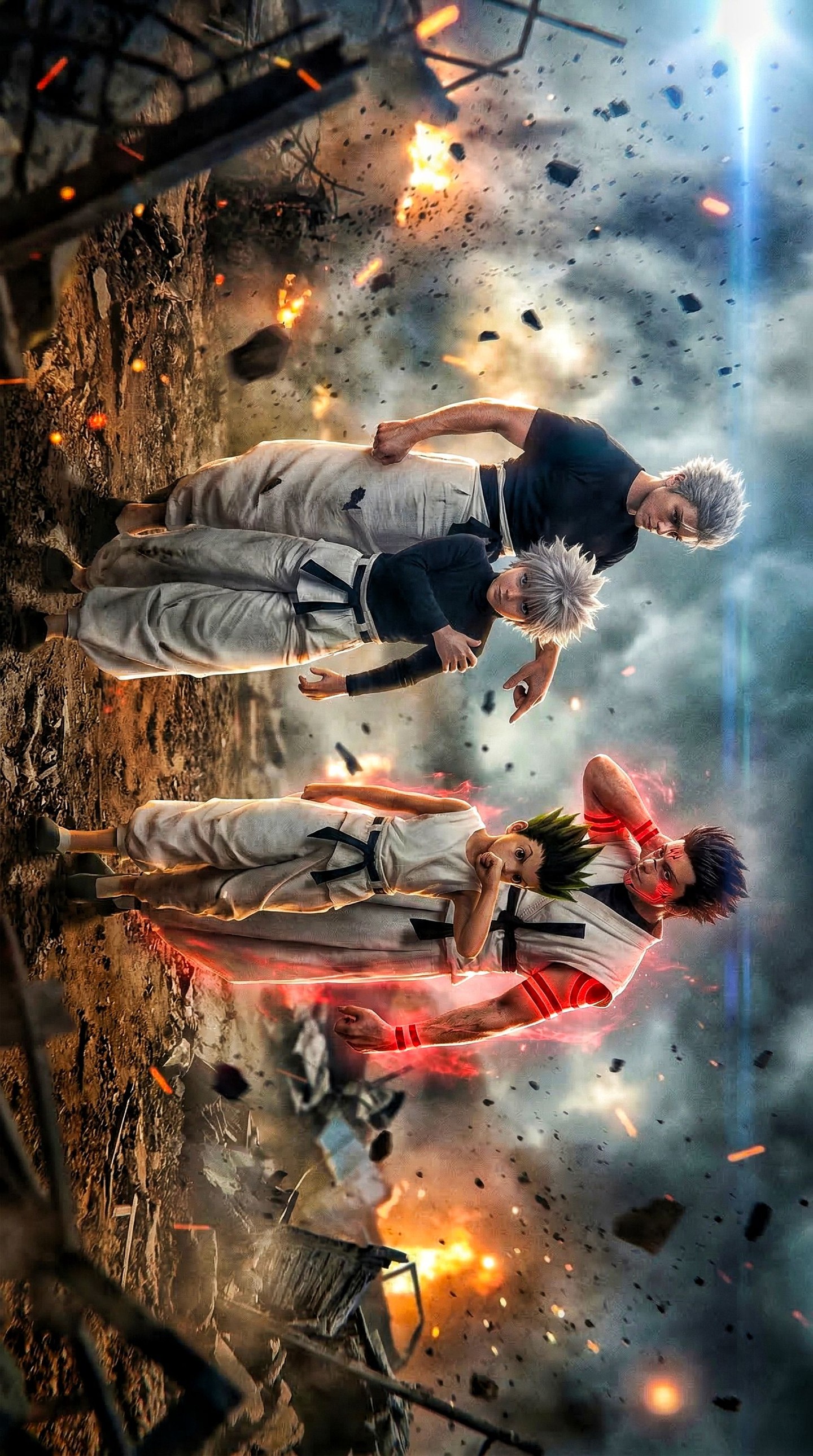
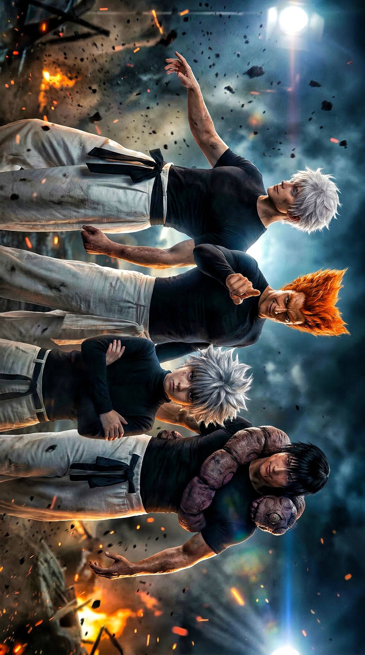
This image works because it understands that ensemble posters are not just collections of characters. They are visual systems built on hierarchy, rhythm, and controlled density. Here, seven stern anime-inspired fighters are arranged in a dramatic vertical stack, with younger uniformed characters holding the foreground while older, harder-looking figures build pressure behind them. The layout gives the image the authority of a franchise faction poster rather than a random multi-character collage. If you want to write stronger AI prompts for ensemble character art, this composition is a valuable model for how to organize many figures without losing clarity or intensity.
The first reason the poster succeeds is that it recognizes the importance of layered hierarchy. Not every member of the cast is fighting equally for attention. Some figures anchor the front, while others are pushed backward to become looming presences. This creates a natural reading order. The viewer understands immediately that the foreground characters matter first, while the others contribute atmosphere, rank, or faction identity. In prompt writing, this is a critical lesson. If you ask an image model for several characters without also describing their relationship to the frame, you often get flat distribution. A successful group poster needs positional logic.
The school-style uniforms in the foreground are especially effective because they give the lineup a clear base identity. Dark buttoned uniforms signal discipline, youth, training, and faction belonging. They also provide clean silhouette shapes that help the front characters read quickly. In many ensemble images, the problem is that everyone is styled too differently, which weakens the sense that the group belongs together. Here, the uniform language appears to act as a common visual anchor. In prompt design, shared costume grammar can be one of the easiest ways to create cohesion across multiple characters.
The older or battle-worn figures in the rear layers introduce a different kind of energy. Their presence expands the poster beyond a school cast image and turns it into something more dangerous and intergenerational. This shift in apparent age, experience, or severity gives the lineup narrative texture. It suggests a world with ranks, mentors, rivals, or veteran forces standing behind the younger front line. In poster-writing terms, this is a very useful strategy. An ensemble feels richer when the group contains internal variation, but that variation needs structure. Front youth versus rear experience is one of the clearest and most effective structures available.
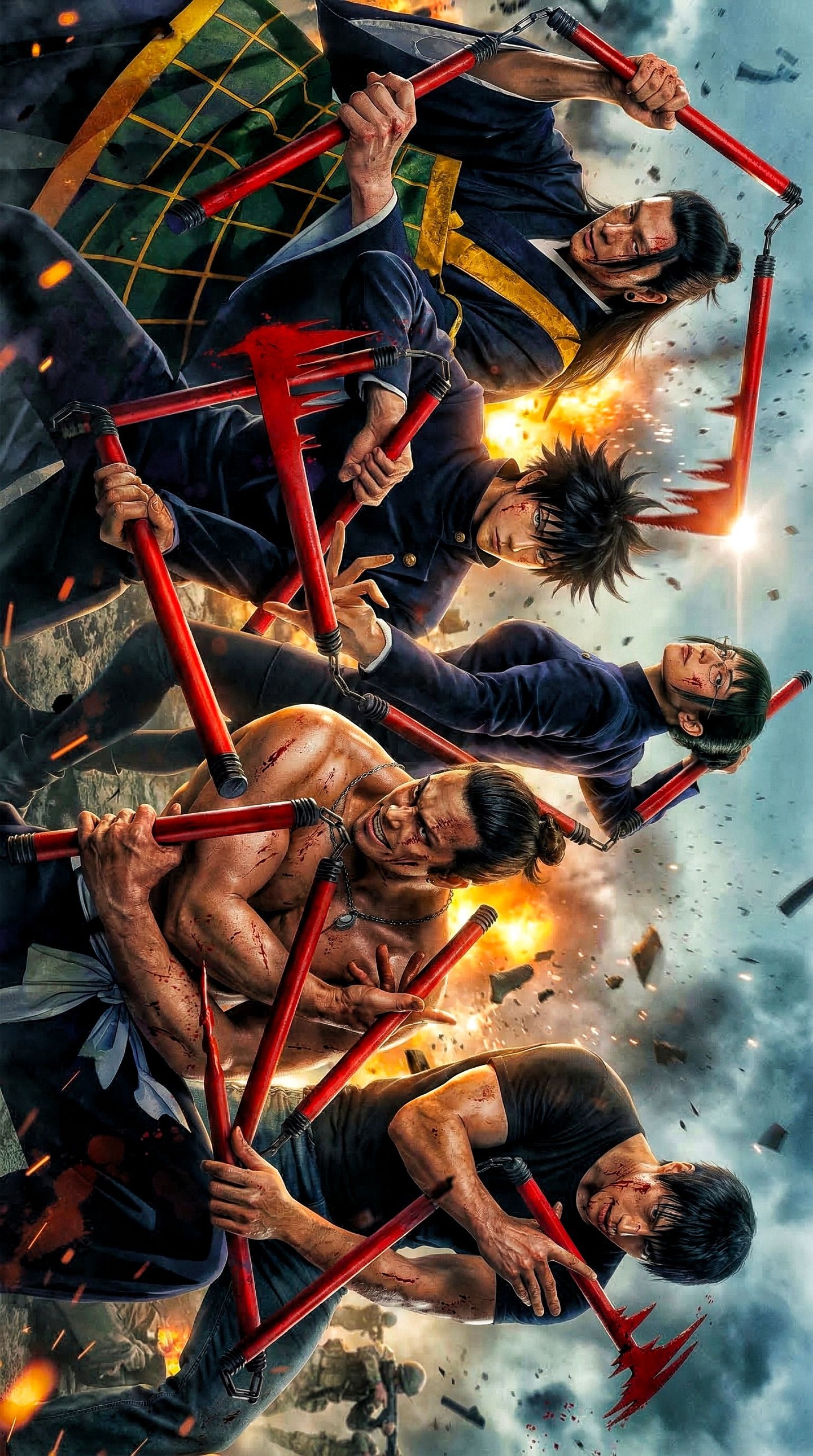
The vertical stacking is also a major reason the poster feels dramatic. Vertical compositions naturally imply ascent, hierarchy, and pressure. By stacking the cast instead of spreading them across a wide horizontal banner, the image turns the group into a wall of identity. That makes the faction feel dense and formidable. This is especially useful for anime-inspired rivalry or battle-lineup art, where intensity is often amplified by compressed space. In AI prompts, phrases like stacked ensemble portrait, vertical faction poster, layered team hierarchy, and compressed character lineup can help move the output toward this kind of controlled density.
Expression plays a strong role too. The fighters look stern, not cheerful or chaotic. That uniformity of seriousness is important because it unifies the emotional temperature of the image. If half the cast were smirking playfully and half were screaming in battle mode, the ensemble would feel tonally split. Here the stern expressions suggest shared resolve, shared danger, or shared ideology. In prompt design, emotional coherence matters just as much as costume coherence. If you want a cast poster to feel strong, it helps to align the expressions toward one central mood.
Color discipline likely contributes significantly to the image’s strength as well. Dark uniforms and restrained tones in the foreground help the cast read as a unit, while any accent colors are likely distributed strategically rather than randomly. This matters because ensemble posters can become messy very quickly when too many bright colors compete equally. Limiting the palette or grouping tones by rank and role often produces far more powerful results. In practical prompting, terms like moody ensemble palette, dark faction styling, restrained color hierarchy, or cool dramatic group tones can help preserve that cohesion.
Another key strength is the implied story. This does not feel like seven unrelated characters posed together for convenience. It feels like a faction, a school, a combat order, or a dangerous alliance. That is exactly what strong ensemble key art should do. The viewer should sense that each face belongs to a larger power structure. In prompt writing, this means thinking in terms of group logic, not just individual coolness. If every character is designed as a solo star, the lineup will often fail. Some figures need to support, some need to dominate, and the whole must imply shared worldbuilding.
If you wanted to build a prompt inspired by this image, start with the group identity: “a dramatic vertical ensemble of seven stern anime fighters.” Then define the hierarchy: “younger characters in dark school-style uniforms in the foreground, with older hardened figures stacked behind them.” After that establish the mood and format: “cinematic faction poster, compressed lineup, intense facial expressions, high-contrast dramatic composition.” Finally specify finish: “anime-inspired key art, clean hierarchy, polished promotional poster design.” That structure helps the model understand that the image is about rank, density, and faction presence rather than random character variety.
It is also helpful to think about what should be avoided. Too much spacing between characters would weaken the tension. Excessive props would clutter the hierarchy. Overly distinct lighting on each figure would break the sense of group belonging. This kind of poster depends on compression and coherence. The figures should feel like parts of one visual machine. In AI generation, that often means keeping the environment minimal or abstract enough that the cast remains the primary architecture of the frame.
The image also demonstrates the importance of face variety within structure. Even when the lineup is tightly controlled, each person should still feel like a distinct node inside the faction. Differences in age, hairstyle, gaze, and facial sharpness help accomplish that. But the poster succeeds because those differences remain organized within a larger system. This is exactly the balance worth aiming for in prompt design: individuality inside hierarchy. Too much similarity makes the cast blur together. Too much individuality destroys the faction feeling. This lineup appears to find the middle ground effectively.
There is strong room for variation while preserving the same principles. You could shift the uniforms toward military coats, ceremonial robes, or urban combatwear and still keep the front-versus-back hierarchy. You could move the palette colder, warmer, or more monochrome depending on the franchise tone. You could also frame the ensemble around one central leader, or allow the middle row to dominate if you want a different power structure. But the core should remain: a vertical buildup of rank, threat, and identity, all clearly readable at a glance.
For SEO and educational content, this image fits naturally into themes like anime ensemble poster prompts, faction lineup AI art, school fighter team composition, dramatic vertical cast design, and how to structure multi-character key art. It is especially useful as a teaching example because it shows that group images are not solved by merely adding more people. They are solved by deciding who leads, who supports, and how the eye should travel through the lineup. That is the design intelligence that turns a busy image into a memorable one.
Ultimately, what makes this poster effective is that it treats the group as architecture. The cast forms a visual tower of discipline, rivalry, and shared tension. The foreground uniforms, the rear-layer veterans, the stern faces, and the stacked composition all support the same idea. Nothing feels random. That is exactly the standard worth aiming for in AI-generated ensemble posters. If you want stronger results, think less about collecting characters and more about building hierarchy. This lineup proves that once hierarchy is clear, even a crowded faction image can feel sharp, cinematic, and fully intentional.