How cyborg.digitalart Created This Explosive White Hair Anime Action AI Portrait — and How to Recreate It
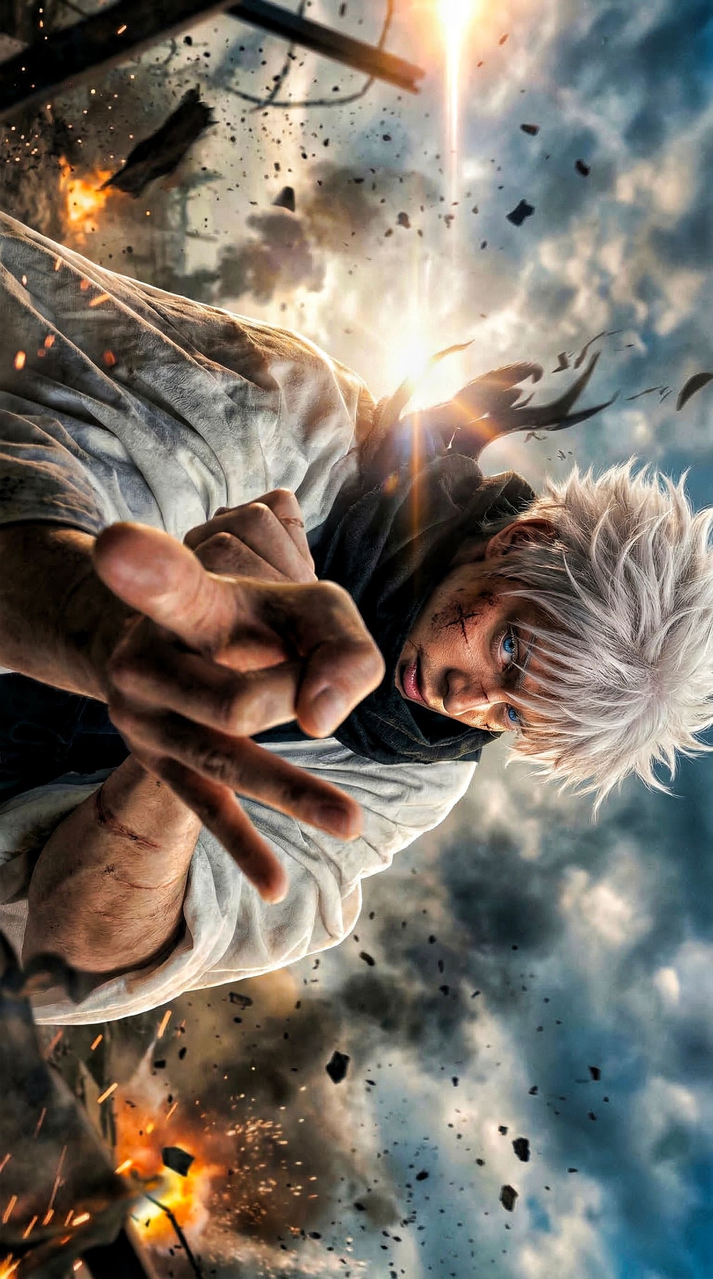
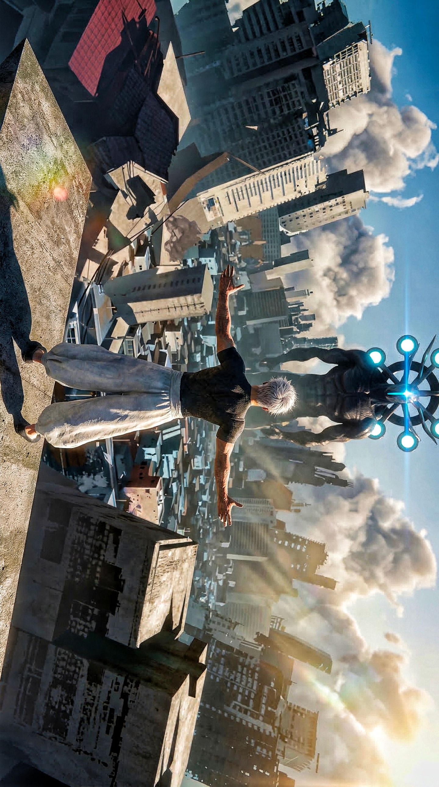
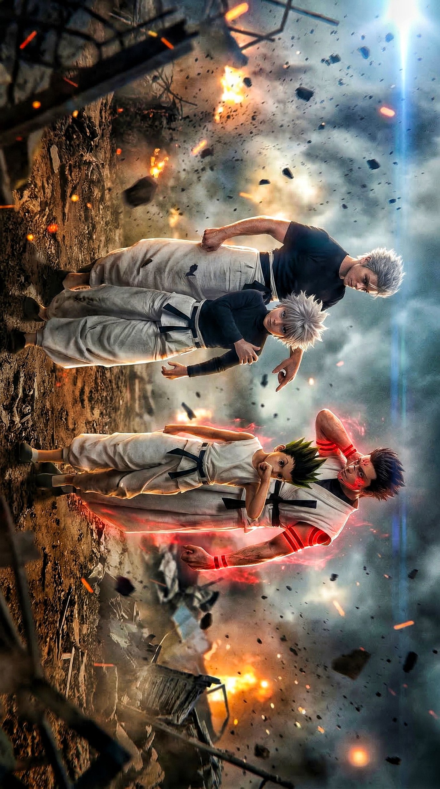
This artwork captures the exact moment when battle energy becomes visual architecture. A white-haired anime fighter launches forward with his arm and hand dominating the foreground, while his face, bright blue eyes, and damaged costume remain clearly readable behind the perspective distortion. The result is not just an action pose. It is a fully compressed impact frame that makes the audience feel physically close to the strike. The image creates pressure, momentum, and emotional urgency by using camera placement as its primary storytelling tool.
At first glance, the defining feature is the forward hand. It is thrust directly into the viewer’s space, creating an aggressive lens relationship that instantly establishes danger. In action illustration, this kind of foreshortened anatomy can either become the image’s greatest strength or its biggest technical failure. Here, it succeeds because the hand reads as large and forceful without turning into visual noise. The fingers, wrist, and motion path all support the idea of a committed attack rather than a generic reaching gesture.
Behind that foreground strike, the character identity is protected through a disciplined set of visual anchors. His white hair cuts sharply against the darker smoke-filled sky, while the blue eyes function as an emotional focal point that pulls the viewer from the aggressive hand back to the face. This matters because strong action art cannot survive on effects alone. If the character disappears into the chaos, the image becomes empty spectacle. In this case, expression, posture, and battle wear all remain legible enough to preserve personality.
The environment is equally important, even though it stays secondary to the fighter himself. Smoke, debris, sparks, and a vertical beam of explosive light behind the body create a battlefield atmosphere without competing with the central gesture. That bright column gives the composition a strong rear spine. It reinforces the direction of movement, makes the frame feel taller and more dramatic, and visually traps the fighter inside a moment of catastrophic force. Background design is doing structural work here, not decorative work.
Lighting deepens the cinematic effect. There is warm fire and explosion light at the edges of the frame, paired with cooler smoky daylight or storm light across the upper background. This warm-cool balance keeps the image dynamic. The face remains visible, the hand feels dimensional, and the entire frame avoids flattening into one muddy temperature. In battle illustration, color contrast is often the difference between a readable hero shot and a collapsed mass of effects. This image understands that clearly.
Why the Perspective Feels So Strong
Extreme perspective works when the artist chooses one dominant visual promise and commits fully to it. Here, that promise is impact through proximity. The hand is huge because the viewer is meant to feel the attack before they fully process the rest of the image. The body recedes diagonally, creating a visual tunnel from foreground force to facial emotion and then into the explosive atmosphere behind him. That layered depth turns a static illustration into something that feels physically unstable and alive.
Foreshortening is often overused in anime key art because it is associated with intensity, but many attempts fail because they distort anatomy without preserving clarity. This artwork avoids that trap. The hand is enlarged in a way that supports the motion path, the arm still feels connected to the torso, and the shoulder alignment suggests a believable strike trajectory. That makes the aggression feel intentional rather than gimmicky. The perspective is not there to impress the viewer technically. It is there to communicate force.
Another reason the image works is that the body angle is not neutral. The figure is slightly tilted and compressed, which adds instability and enhances the feeling that he is moving through violent space rather than posing on a flat plane. This matters in action prompt writing. Motion is rarely convincing when the torso, shoulders, and head remain too orderly. Controlled asymmetry is one of the simplest ways to create genuine pressure in an image.
| Perspective choice | Effect on the image |
|---|
| Oversized foreground hand | Creates danger, speed, and direct audience involvement. |
| Diagonal body recession | Builds depth and reinforces the strike direction. |
| Visible face behind gesture | Preserves character identity and emotional intensity. |
| Rear explosion column | Adds a vertical axis and cinematic background pressure. |
| Debris moving through space | Supports the momentum instead of leaving the frame static. |
When translating this into prompt logic, the lesson is straightforward: camera and gesture should come before special effects. A prompt that only says “epic anime warrior with explosions” is too vague to create a memorable frame. A better prompt establishes the body relationship first: “white-haired anime fighter lunging toward the lens, hand dominating the foreground, face intense and battle-worn, explosion beam behind him, debris in a smoke-filled sky.” Once those physical anchors exist, the rest of the scene can be built around them.
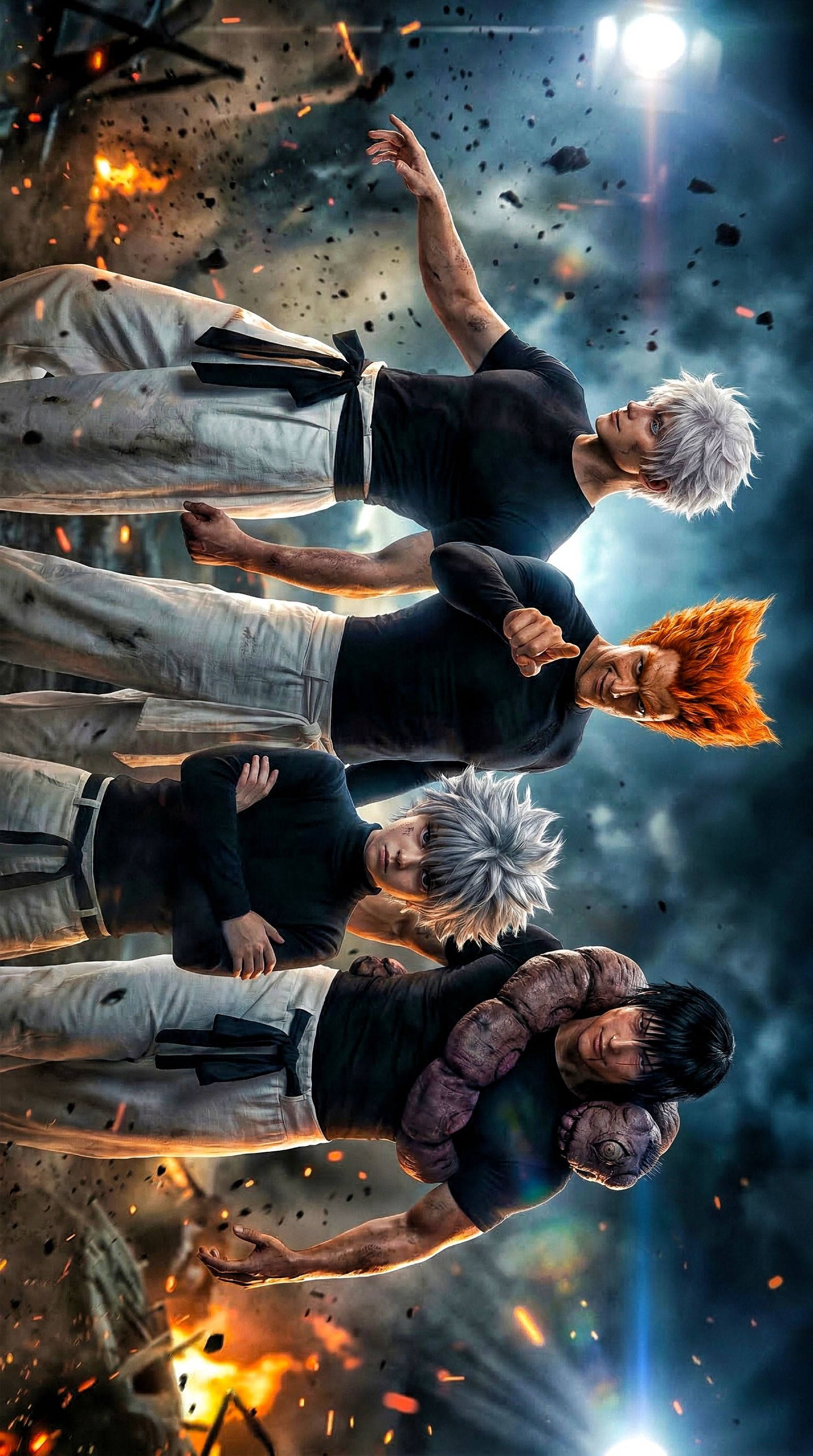
Character Readability Under Chaos
The most impressive achievement in this image is that the subject remains unmistakable even while the world around him is breaking apart. His hair color, eye color, and facial damage form a concise identity package. White hair gives high contrast against smoke. Blue eyes add a concentrated emotional accent. Scuffs and scratches on the face imply narrative history. Torn clothing communicates prior struggle. Together, these details make the character feel like someone inside an ongoing battle rather than an empty model for a pose experiment.
Readability under chaos is a technical discipline. If the effects are too bright, the face disappears. If the debris is too dense, the silhouette becomes unreadable. If the expression is too small, the viewer only remembers the hand. This composition balances those risks well. The hand is the entry point, but the face remains the emotional center. The viewer experiences the attack first and the character second, but both stay present in memory.
This is why the image feels like a poster-quality battle moment rather than an unfinished animation frame. Posters must communicate quickly. They need an iconic focal path that can be understood in one glance. Here, the path is clear: hand, face, explosion, debris field. Every major element serves that hierarchy. Nothing crucial competes unnecessarily with the subject.
| Identity marker | Role in readability |
|---|
| White hair | Separates the fighter from the darker smoke background. |
| Blue eyes | Create a sharp emotional focal point inside the chaos. |
| Scratches and dirt | Suggest battle history and increase dramatic credibility. |
| Torn clothing | Connects the character visually to the violence of the setting. |
| Focused expression | Prevents the scene from becoming empty spectacle. |
For anyone writing prompts for battle illustration, this is a useful reminder that identity cues should be compact and durable. Do not overload the prompt with ten costume details if the image’s real power comes from a few memorable traits. Hair, eyes, damage, and one dominant gesture can often do more work than complicated armor breakdowns or elaborate accessory lists.
Color, Atmosphere, and Controlled Violence
The palette in this artwork is a disciplined mix of heat and cold. Warm orange and gold tones appear in the lower explosion and spark regions, while the sky and smoke carry cooler grays and steel-blue values. That split keeps the image from collapsing into a single-temperature mass. Warmth suggests active destruction. Coolness preserves scale and air. When both are present, the battlefield feels cinematic instead of flatly fiery.
The debris field is especially effective because it behaves directionally. It does not appear to float for decoration. Instead, fragments and sparks echo the movement vector of the attack. That creates the impression that the fighter is not separate from the environment. His movement is affecting the world around him. Good action scenes often become believable when the environment appears to respond physically to the subject’s momentum.
Atmosphere also helps with temporal compression. This image feels like one decisive fraction of a second extracted from a larger battle. Smoke trails, sparks, and the rear energy beam all imply that something happened just before this frame and something destructive will happen just after it. That sense of immediate before-and-after is essential in strong action art. It turns a pose into an event.
Another subtle success is restraint. Despite the dramatic environment, the image avoids overcrowding itself with secondary enemies, unnecessary props, or overcomplicated architecture. This choice protects the strike. If too many extra elements were introduced, the impact would weaken. Minimal complexity around a strong central gesture usually creates more power than excessive worldbuilding inside a single frame.
How to Prompt This Scene More Effectively
When turning this kind of image into a reusable prompt pattern, the best method is to describe it in layers. Start with subject identity, then body action, then camera relationship, then lighting, then environmental support. That sequence mirrors how the image actually works. If you begin with “epic battlefield” or “explosive anime scene,” you risk generating a setting without a clear physical center. The character action has to come first.
A strong reusable prompt structure for this scene would describe the subject as a white-haired anime fighter with bright blue eyes, battle damage, and torn clothing, lunging toward the camera with one hand dominating the foreground through extreme foreshortening. Then it should introduce the smoke-filled battlefield sky, airborne debris, sparks, and a vertical column of explosive light behind him. Finally, it should specify cinematic warm-cool lighting, crisp subject detail, and a poster-grade action composition.
Negative prompting matters here too. This type of image fails easily if the hand becomes malformed, if the face becomes unreadable, if the debris is random, or if motion blur overwhelms detail. The safest approach is to explicitly reject blurry anatomy, extra fingers, static composition, muddy lighting, cluttered secondary characters, low-detail smoke, and cheerful or casual expressions. The scene needs commitment, sharpness, and violent focus.
| Prompt component | Recommendation |
|---|
| Subject | White-haired anime fighter with blue eyes, battle damage, torn light clothing. |
| Main action | Lunging directly toward the camera with one hand thrust into the foreground. |
| Camera | Extreme low-angle foreshortened perspective with diagonal body recession. |
| Environment | Smoke-filled battlefield sky, debris, sparks, and explosion beam behind the figure. |
| Lighting | Cinematic warm firelight against cooler smoke and sky tones. |
| Negative controls | No muddy anatomy, no unreadable face, no weak pose, no random clutter. |
If the goal is to iterate variations, the best elements to preserve are the hand, facial readability, and the explosion beam. Those three elements are the frame’s backbone. Background texture, costume wear, debris density, and color emphasis can vary, but if you lose the foreground hand or the face, the image stops feeling like the same core idea.
Why This Image Feels Like Premium Battle Key Art
Premium battle art is usually not defined by how many effects it contains. It is defined by whether all the effects support one decisive emotional and physical idea. In this image, that idea is direct confrontation through motion and perspective. The hand tells you the strike is happening now. The face tells you the fighter is under pressure but not broken. The background tells you the world is collapsing around him. All three layers align cleanly.
The image also understands scale. The explosion behind the subject is large enough to feel consequential, but not so large that it swallows the character. The debris field is active enough to imply danger, but not so dense that it destroys the silhouette. This kind of scale control is what separates polished action composition from overbuilt spectacle.
Emotionally, the frame succeeds because it combines aggression with strain. The character does not look decorative or cool for its own sake. He looks committed, damaged, and still advancing. That is why the image feels dramatic rather than superficial. Good action art usually contains some evidence of cost, and this one does. The scratched face and torn clothing matter because they give the attack context.
For artists, prompt writers, and visual directors, this image is a clear model of how to stage an attack-centric composition that still preserves character identity. The lesson is not simply “use more explosions” or “add more debris.” The lesson is to give the audience one dominant physical event, protect the face, build the environment around that gesture, and let light reinforce the hierarchy. When those pieces align, even a single frame can feel like the climax of an entire story arc.
Final Takeaway
This explosive white-hair action portrait succeeds because it treats perspective as narrative, not just as decoration. The oversized hand establishes danger. The face carries emotional consequence. The environment reinforces impact without overwhelming the subject. Warm and cool lighting build cinematic atmosphere, while scratches, torn fabric, sparks, smoke, and the rear energy column make the moment feel earned. It is a highly teachable example of how anime battle imagery can be sharp, dramatic, and readable all at once.
If you want to recreate this level of impact in future prompts, begin with a physical action that owns the frame, choose a camera angle that makes that action unavoidable, and then organize every secondary effect around the movement path. That principle is what gives this image its force, clarity, and poster-level presence.