How cyborg.digitalart Made This Split Panel Anime Fight Poster AI Art -- and How to Recreate It
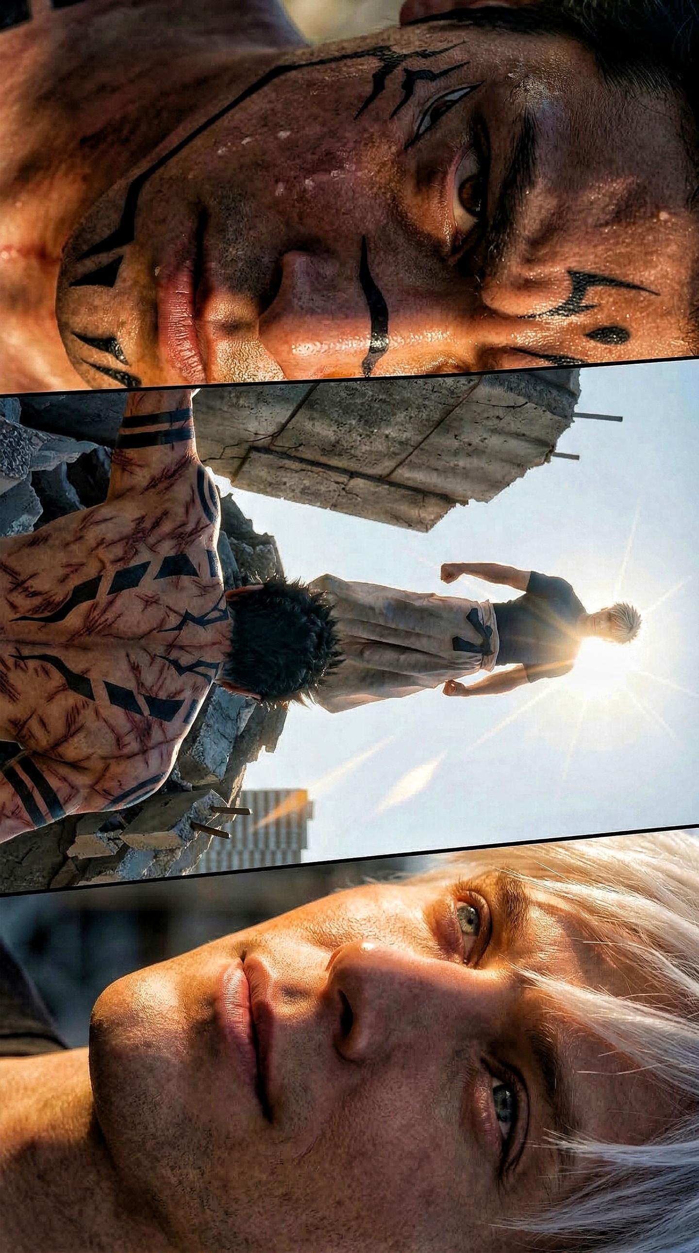
Most action posters try to solve too many visual problems with one frame. They want intensity, mythology, character contrast, worldbuilding, and spectacle all at the same time, and the result is often crowded. This image takes a more disciplined route. Instead of forcing every idea into one shot, it splits the confrontation into three purposeful panels. That decision is the foundation of the poster’s strength.
The upper panel gives us emotional heat. The middle panel gives us physical stakes. The lower panel gives us psychological distance. Together, they form a reading sequence that feels less like a still image and more like a compressed scene from a high-budget action story. By the time the viewer reaches the bottom panel, the rivalry already feels established, even though no explicit narrative has been shown.
This is why the poster feels cinematic rather than merely illustrative. It understands rhythm. The viewer is not presented with a single frozen event. Instead, the image guides attention from fury to confrontation to composure. That sequencing is especially effective for duel-based visuals, where the emotional contrast between opponents matters as much as the physical clash.
The image also benefits from clear contrast in character design. One fighter is marked, muscular, wounded, and visibly heated. The other is pale, calm, and controlled. Those oppositions are familiar, but they work here because the poster gives each fighter visual territory instead of flattening them into the same emotional register.
The Top Panel Establishes Raw Human Pressure
The top panel is doing the essential work of emotional ignition. It presents the dark-haired fighter in an extreme close-up, with sweat, dirt, facial markings, and a narrowed, determined stare. That is not just “character detail.” It is a pressure chamber. The frame is tight, the face is damaged, and the expression is already carrying the memory of violence before the duel is even fully shown.
Close-ups like this are powerful because they compress the viewer into the subject’s internal state. We are not asked to admire his design from a distance. We are asked to feel the cost of the fight through skin texture, marks, and focus. This gives the poster emotional credibility. The duel feels dangerous because one side already looks like it has paid a price.
The markings are especially useful because they increase memorability without relying on costume complexity. They cut across the forehead, cheeks, and neck in a way that turns the face itself into a signature design element. Strong rivalry posters often need this kind of instantly recognizable marker. It helps one fighter stay emotionally loud even when the composition later widens.
For visual storytelling, the lesson is simple: if you want your action poster to feel personal, start with the face of consequence. Damage, tension, and eye focus are often more effective than generic shouting or exaggerated battle effects.
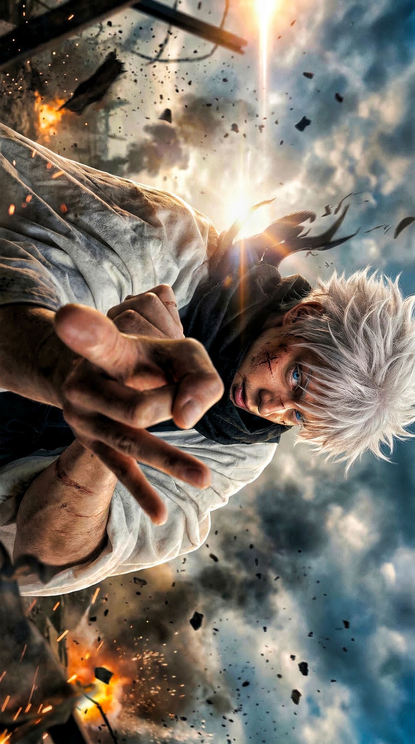
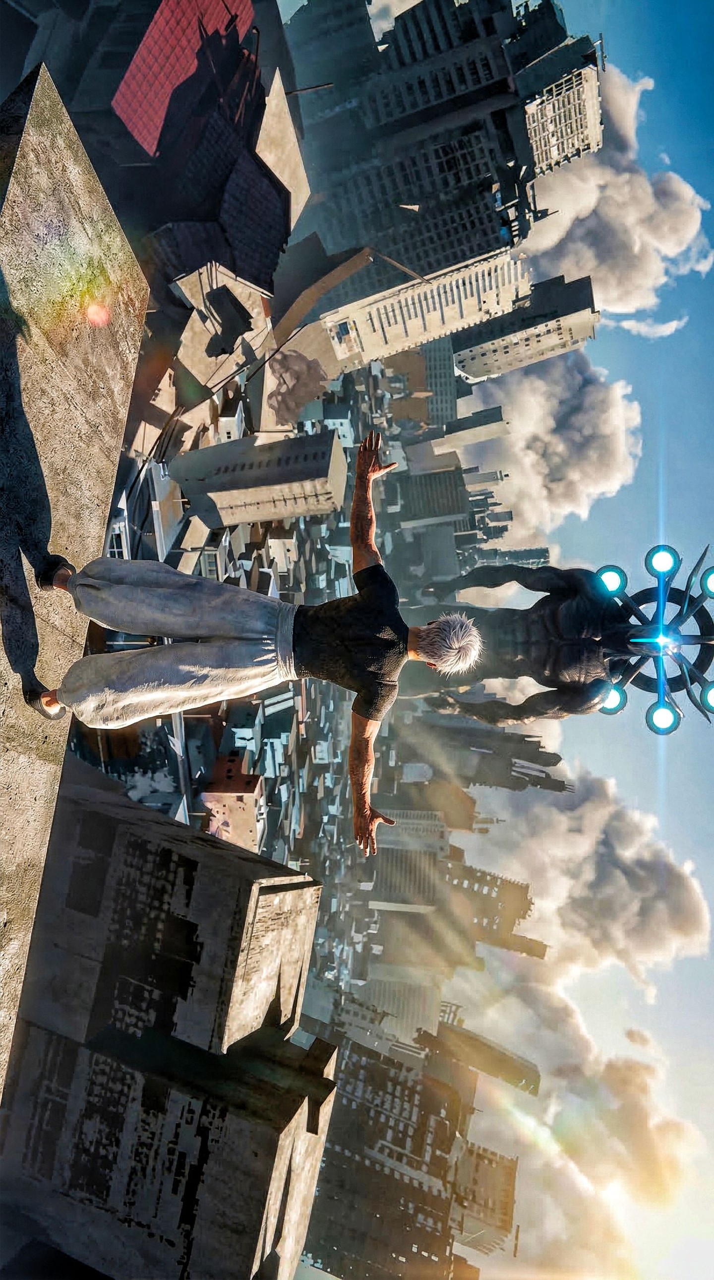
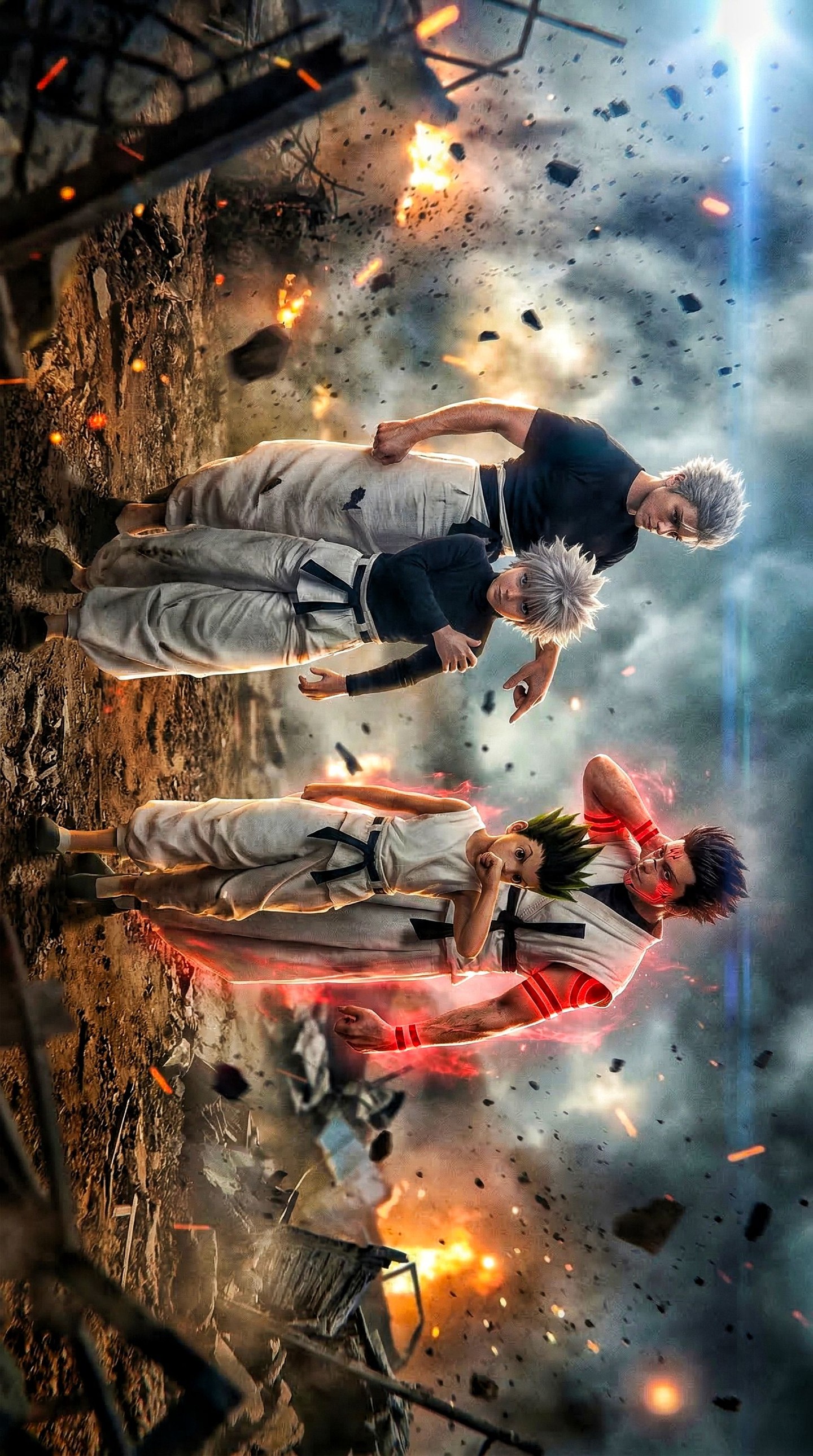
The Middle Panel Creates Scale and Narrative Stakes
The center panel is the structural spine of the poster. It pulls the camera back, reveals the ruined rooftop environment, and places both opponents into the same physical space. This is where the image stops being portraiture and becomes confrontation. The wounded fighter is seen from behind, while the white-haired rival stands ahead on broken concrete, elevated by backlight and distance.
That framing is extremely effective because it makes the viewer take the wounded fighter’s position. We are not neutral observers floating above the scene. We are placed just behind him, looking toward the opponent and the sun flare beyond. That perspective adds narrative alignment. Even without explicit story context, we understand where the emotional pressure is coming from.
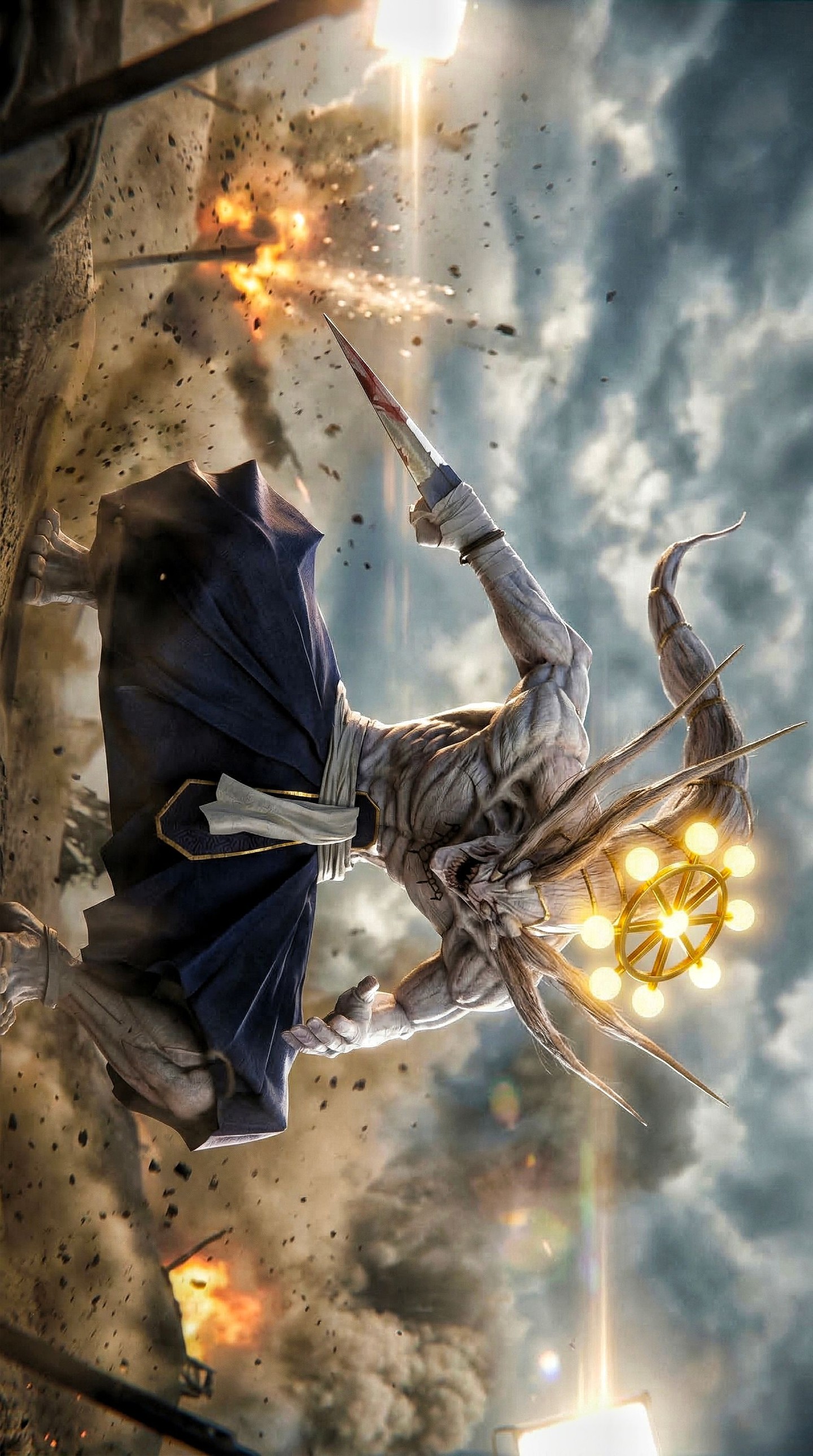
The ruined urban battleground also matters more than it first appears. Broken slabs, fractured surfaces, and harsh daylight all help the duel feel grounded in consequence. This is not a fantasy void. It is a place where something has already collapsed. The damage in the setting mirrors the damage in the protagonist’s body, which creates compositional coherence.
The backlit rival is especially important. Standing in the sun, slim and still, he appears almost untouchable. This makes the middle panel function like a challenge image. The viewer sees distance, disadvantage, and tension at once. It is one of the strongest ways to sell a duel without showing the actual strike.
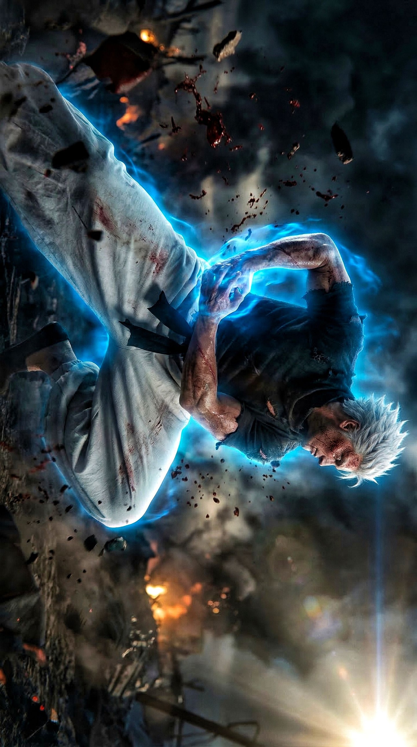
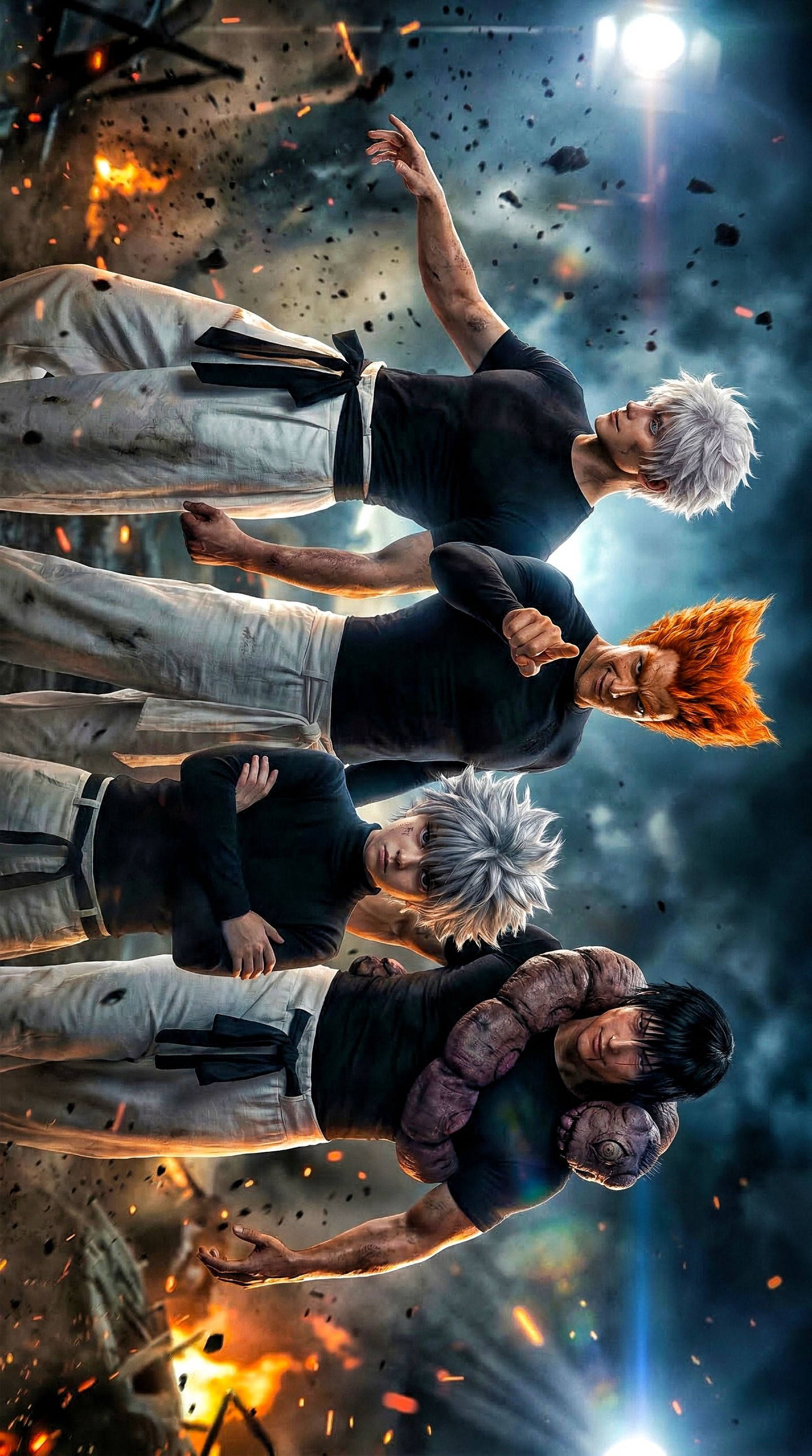
The Bottom Panel Wins Through Restraint
Many action posters would end with a second screaming face, another damage close-up, or some overwhelming energy effect. This one does something smarter. It ends with calm. The white-haired fighter’s face is shown in a close-up that is composed, clean, and almost serene. That emotional reversal is what completes the rivalry.
Calm opponents are often more threatening than visibly aggressive ones. The bottom panel uses that principle perfectly. Where the upper face is rough, strained, and marked, the lower face is smooth, cool, and untouched. That contrast is not just aesthetic. It creates a hierarchy of emotional control. One fighter is burning. The other is contained.
The pale eyes and silver hair intensify this effect. The design feels distant and refined rather than physically brutal. In rivalry imagery, that kind of contrast helps define narrative roles quickly. The marked fighter reads as force and endurance. The pale fighter reads as precision and detachment.
Ending the poster this way also improves overall rhythm. The eye begins in tension, expands into spatial conflict, and then narrows again into composed danger. That arc is one reason the whole piece feels like a trailer rather than a still.
| Panel | Main Purpose | Emotional Effect |
|---|
| Top close-up | Establish the injured fighter’s inner pressure | Creates urgency, pain, and determination |
| Middle confrontation | Place both fighters in the ruined battlefield | Defines distance, scale, and duel stakes |
| Bottom close-up | Introduce the rival’s composure and control | Creates contrast and completes the emotional arc |
Why the Ruined Rooftop Setting Matters
The environment is not highly detailed, but it is exactly detailed enough. Broken concrete, fractured architecture, and a bright sky give the fight a believable stage without overwhelming the figures. This is important because duel posters should support the rivalry, not bury it inside worldbuilding.
The rooftop or collapsed urban zone also gives the poster a useful symbolic quality. It suggests a world already under pressure. The confrontation does not happen in an empty arena. It happens after damage, collapse, and strain. That makes the rivalry feel consequential rather than performative.
Daylight is another strong choice. A darker setting might have made the scene moodier, but the bright sun and hard illumination make everything feel more exposed. There is no hiding in the scene. The wounds, the distance, and the opponent are all visible. That visual honesty supports the duel’s seriousness.
When building similar images, it is often better to choose one clear damaged environment than a complicated fantasy battlefield. Simplicity helps rivalry read faster, and fast readability is part of what makes poster art effective.
Why This Poster Feels Premium Instead of Overloaded
Premium action art usually knows what to leave out. This poster does not depend on glowing power swirls, giant explosions, or excessive text overlays to create excitement. It trusts composition, contrast, and sequencing. That restraint is what gives it authority.
The panel splits are also carefully judged. They are angled enough to feel dynamic but not so aggressive that they become distracting. The viewer always understands where each image segment begins and ends. In design terms, that is a mark of confidence. Dynamic layout should increase clarity, not reduce it.
Another premium quality is that the two fighters are never confused with one another. Their hair, skin tone, emotional expression, body posture, and placement all reinforce distinction. That is essential in rivalry design. If the viewer has to work too hard to decode who matters, the image loses force.
Finally, the poster understands pacing. It does not reveal everything. It suggests a duel, a world, a hierarchy, and a possible outcome without trying to show the full fight. Good posters create anticipation rather than exhaustion.
How to Recreate This Kind of Three-Panel Duel Poster
If you want to build a similar image, begin with emotional roles for each panel. Do not split the composition arbitrarily. Decide what each segment must do. One panel should establish emotional pressure, one should establish spatial stakes, and one should define contrast or dominance. Once those roles are clear, the layout becomes meaningful.
Then define the two characters by visual philosophy rather than just wardrobe. One can be rough, marked, and physically burdened. The other can be pale, still, and composed. That contrast will often matter more than the complexity of costume design. Rivalry works best when each side represents a different kind of power.
Choose a setting that supports aftermath. Ruined concrete, empty urban edges, exposed rooftop structures, or fractured industrial zones all work because they imply consequence without demanding extensive exposition. The environment should sharpen the duel, not compete with it.
Finally, keep the rendering language clean. Sharp line control, cinematic close-ups, controlled glare, and disciplined panel framing are all better than overloaded effects. The poster should feel directed, not chaotic.
- Assign each panel one clear emotional function before designing the layout.
- Use contrast in temperament as strongly as contrast in appearance.
- Keep the environment damaged but readable so the duel remains primary.
- Use backlight and distance to make one fighter feel unreachable or dominant.
- End with restraint if you want the rivalry to feel psychologically sharp.
Final Takeaway
This poster works because it understands rivalry as sequence. The top panel gives us pain and fury. The center panel gives us distance and danger. The bottom panel gives us calm superiority. Each section does a specific job, and together they create a duel that feels bigger than the poster itself.
That is why the image feels cinematic. It is not just about who these fighters are. It is about how their emotional energies collide. For anyone building anime-inspired action posters, this is the lesson to keep: a strong duel image is not made from noise. It is made from contrast, pacing, and the discipline to let each frame carry one part of the story.