How vikaschauhan Made This Anime Squad Battle Lineup AI Art - and How to Recreate It
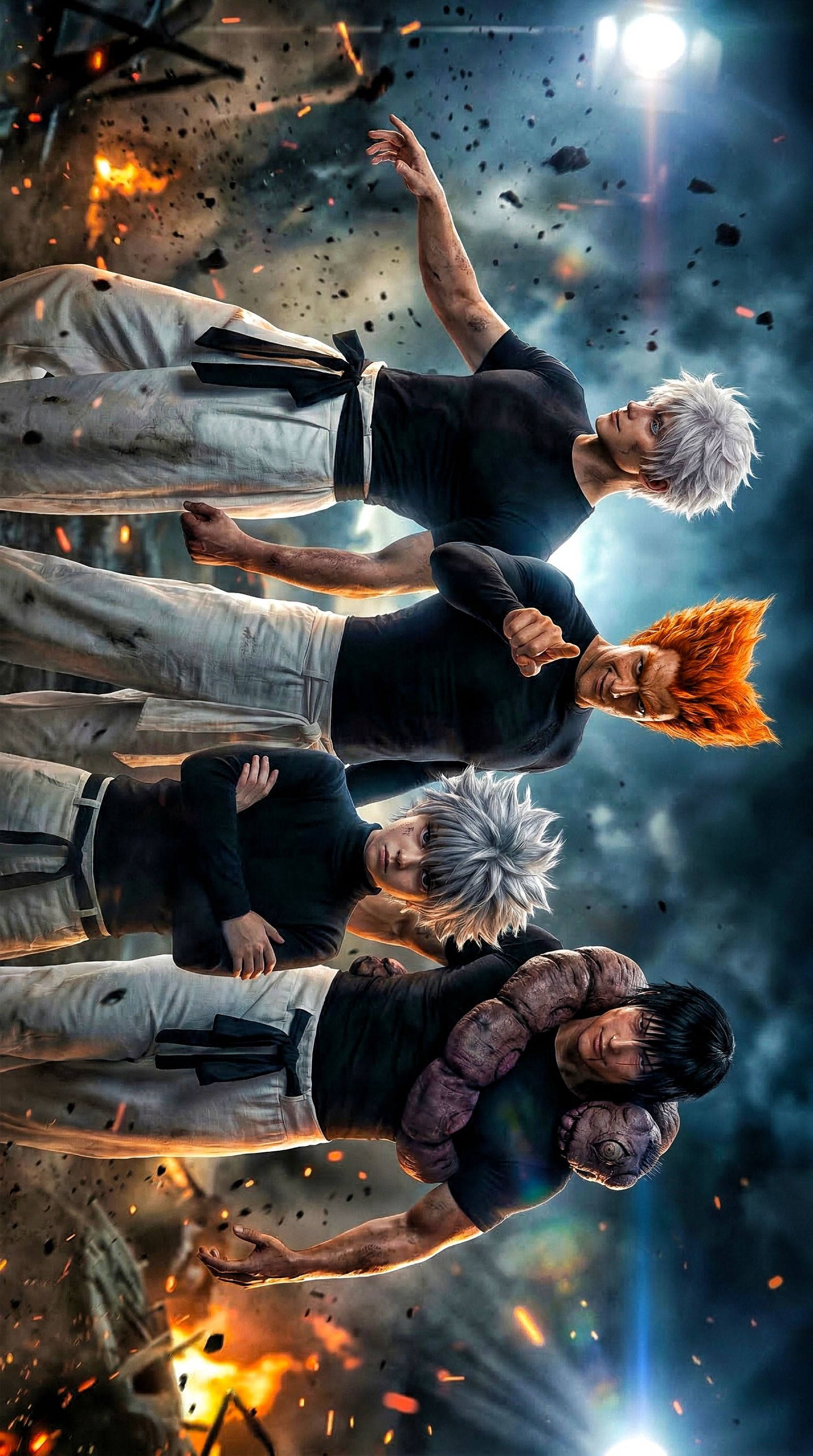
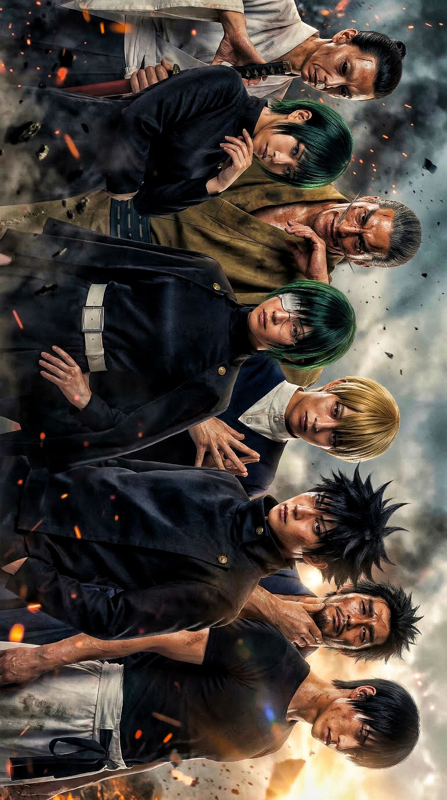
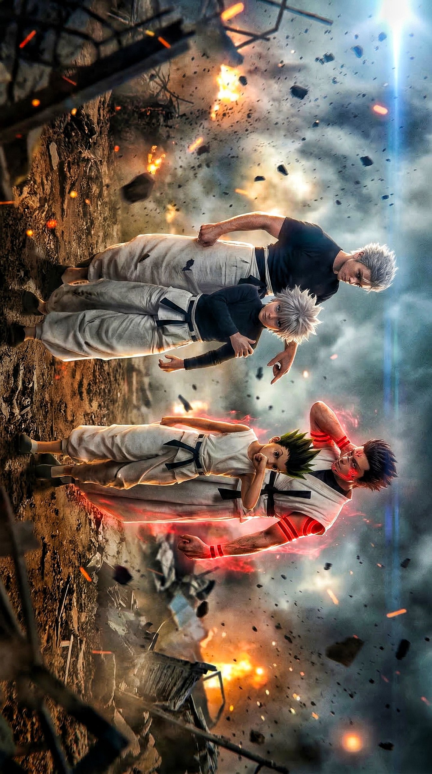
This image works because it combines team readability with battlefield intensity. Each character is easy to distinguish, but none of them breaks the group rhythm. That balance is what makes the poster feel like a serious lineup rather than a cluttered collection of designs.
Visual breakdown
| Element | What it contributes |
|---|
| Four-character row | Creates immediate team identity and clean poster readability. |
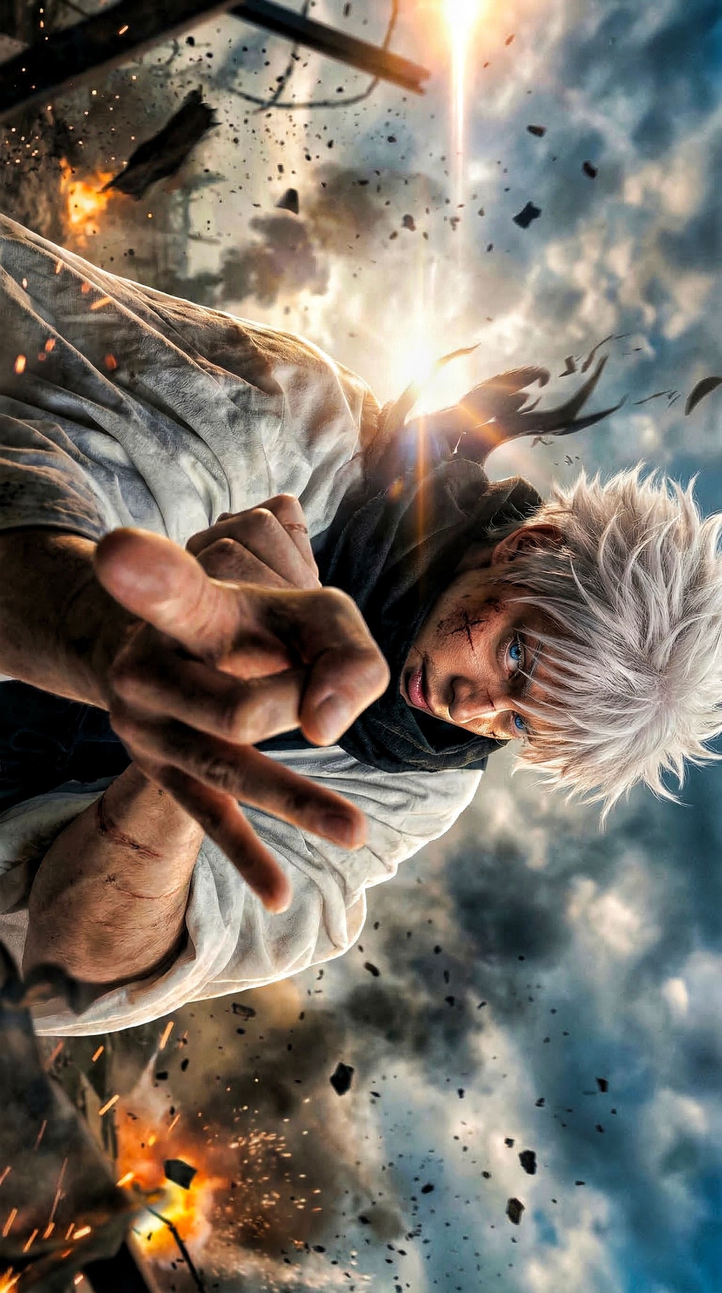
| Distinct hair silhouettes | Make each character memorable even at a glance. |
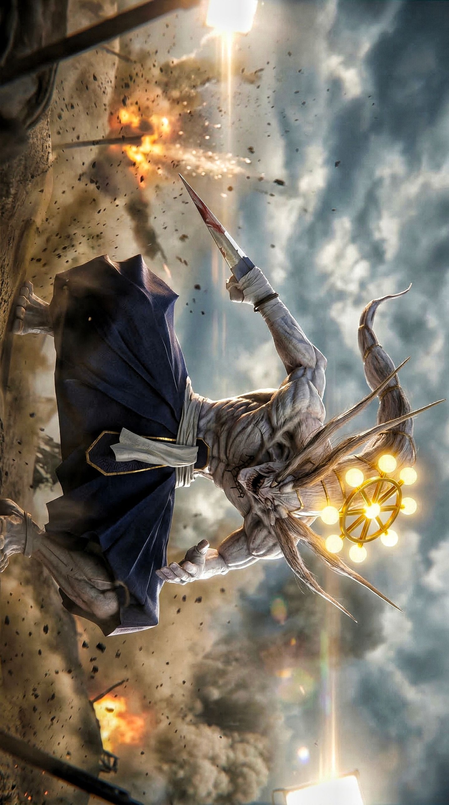
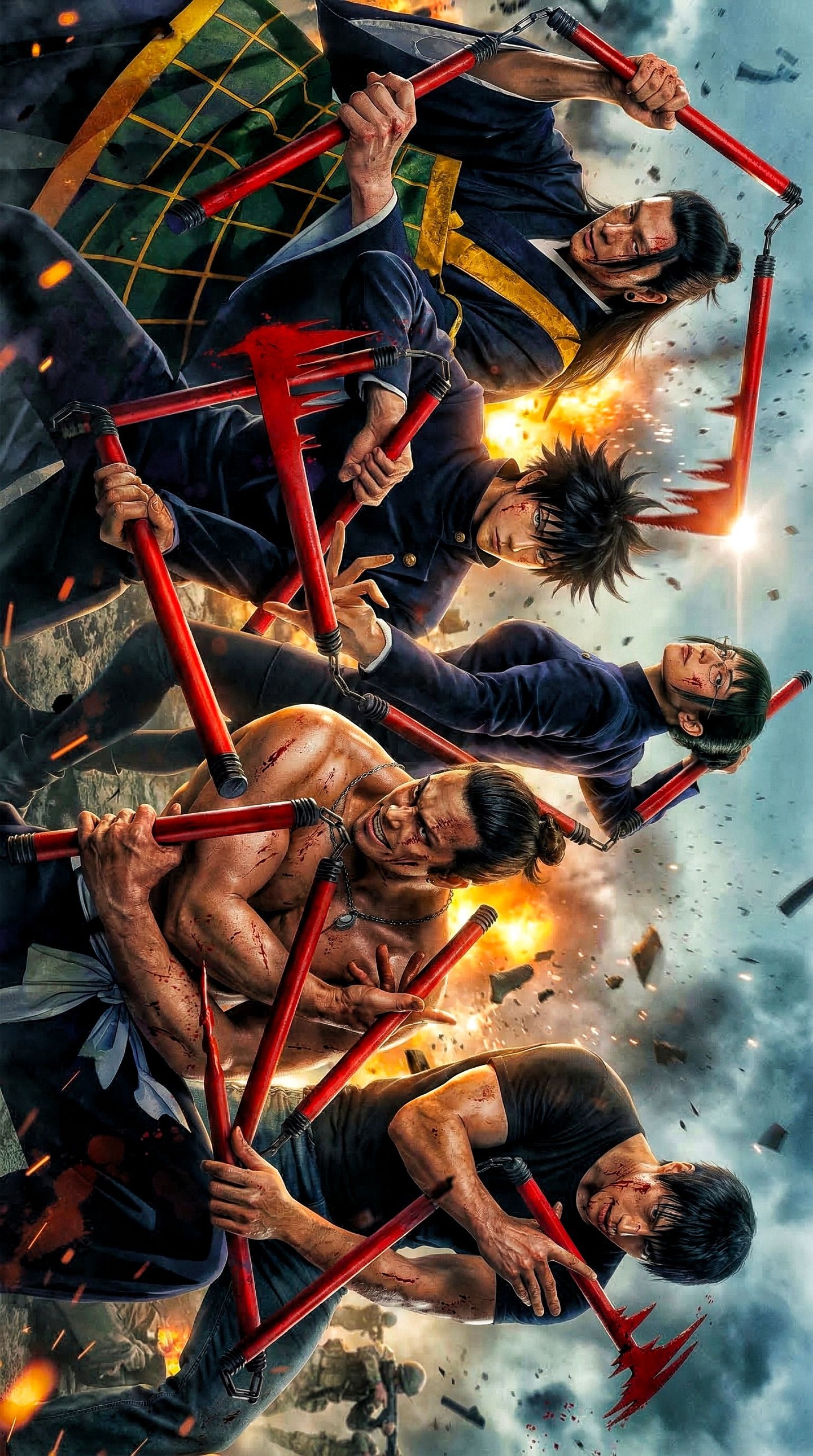
| Curse-like shoulder growth | Adds body-horror tension and breaks visual uniformity in a useful way. |
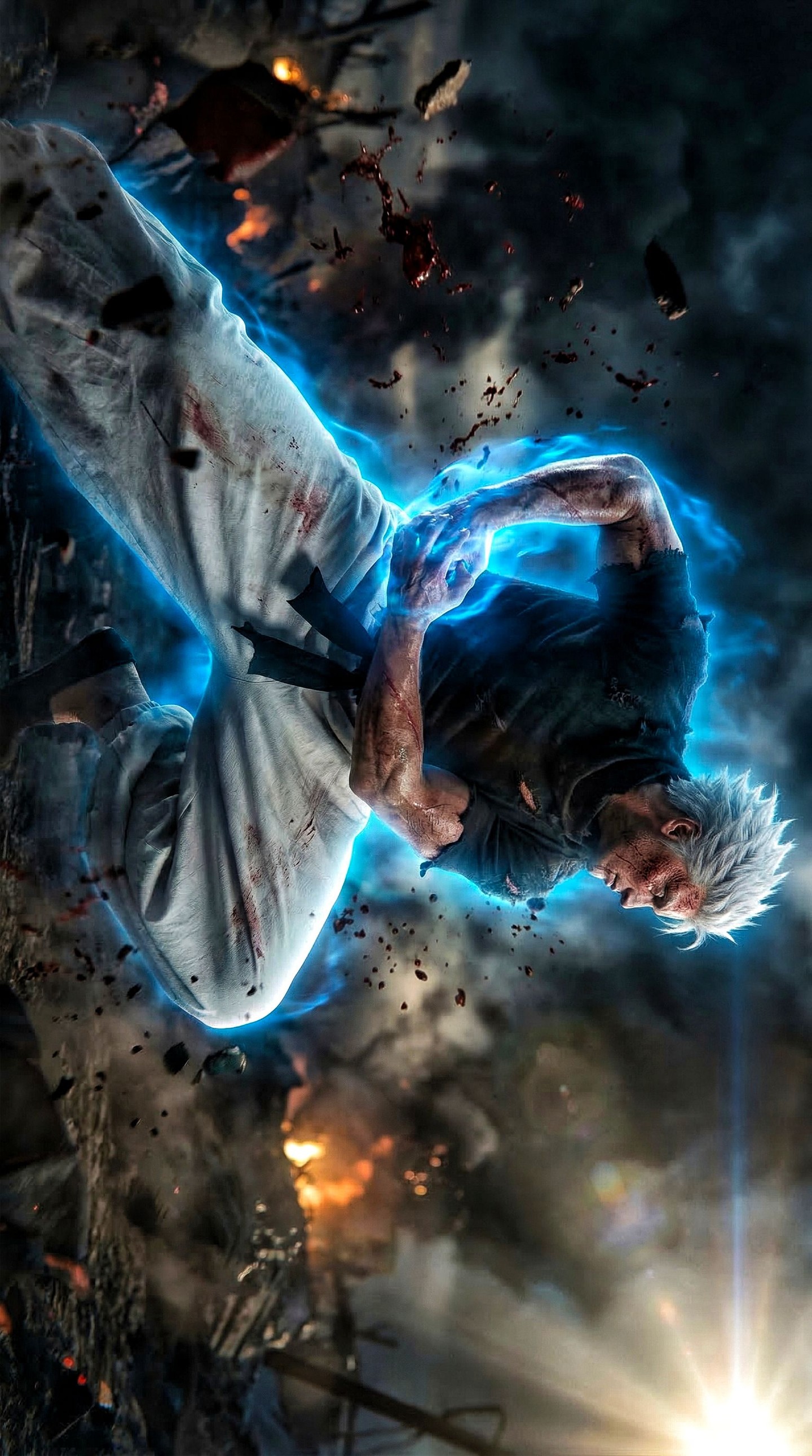
| Fire and sparks | Inject urgency and motion into an otherwise static pose setup. |
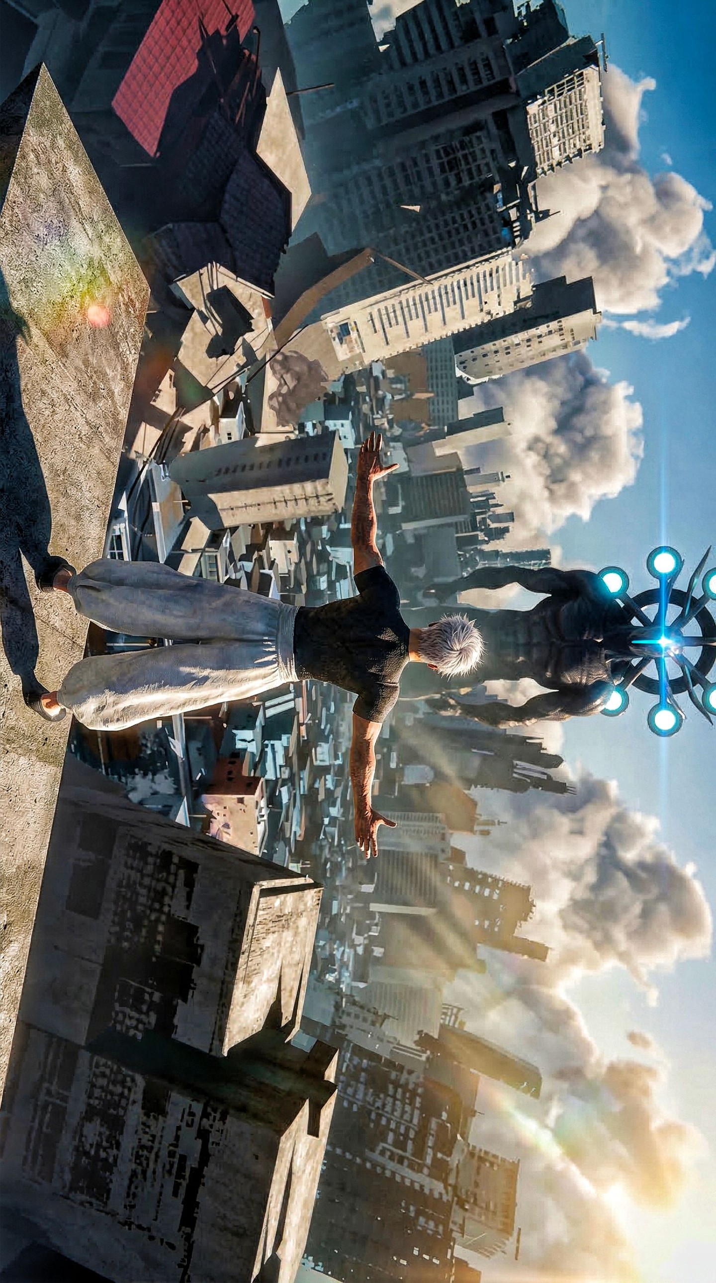
| Low-angle framing | Gives the lineup scale and authority. |
What the image is really doing
The strongest choice here is controlled uniformity. The outfits are coordinated enough to make the group feel connected, but the faces, hair, and body variations keep each member distinct. That is a classic key-art strategy because it supports both collective power and individual recognition.
The battlefield setting also helps by adding stakes without distracting from the characters. Explosions, debris, and smoke tell the viewer this is a climax, but the frame never stops being about the lineup. That is exactly the right balance for character-first promotional art.
Why the lighting and palette work
| Visual choice | Effect |
|---|
| Cool sky backlight | Separates the characters from the background and adds scale. |
| Orange fire accents | Introduce energy and emotional heat. |
| Dark shirts | Unify the team visually and support silhouette clarity. |
| Pale pants | Keep the lower bodies readable against the battlefield glow. |
The palette works because it stays disciplined. There are enough accent colors to feel explosive, but not so many that the team loses cohesion. That is why the poster remains easy to process.
Best-fit uses and transfer paths
- Reference for anime team posters that need strong silhouette separation.
- Useful for AI prompt work involving battle lineups, coordinated outfits, and apocalyptic VFX backgrounds.
- Good inspiration for wallpapers, key art, and character ensemble cover images.
- Strong benchmark for making multiple characters feel unified without becoming visually repetitive.
How to adapt the idea without weakening it
If you want to reuse this structure, keep one outfit system and one environmental threat level. That gives the lineup cohesion. You can swap characters, powers, or color accents, but the team still needs clear silhouette differentiation and one shared world condition like fire, storm, or ruin.
A reliable variation path is to preserve the same low-angle lineup while changing the faction theme. Hero team, villain squad, or cursed alliance can all work, as long as each member has one instantly readable shape cue.