JJK
HD Wallpaper link in bio Wallpaper link in my bio 👆🏻
.
.
.
.
.
Created with nano banana pro on @pixverse_official
Follow @cyborg.digitalart
for more ai artworks
Which one is your Favourite?
Comment down your Favourite one 👇
❌❌ Do not repost ❌❌
#aiart #anime #manga #cyborgdigitalart #jujutsukaisen
How cyborg.digitalart Created This Five Character Anime Ensemble Poster AI Art — and How to Recreate It
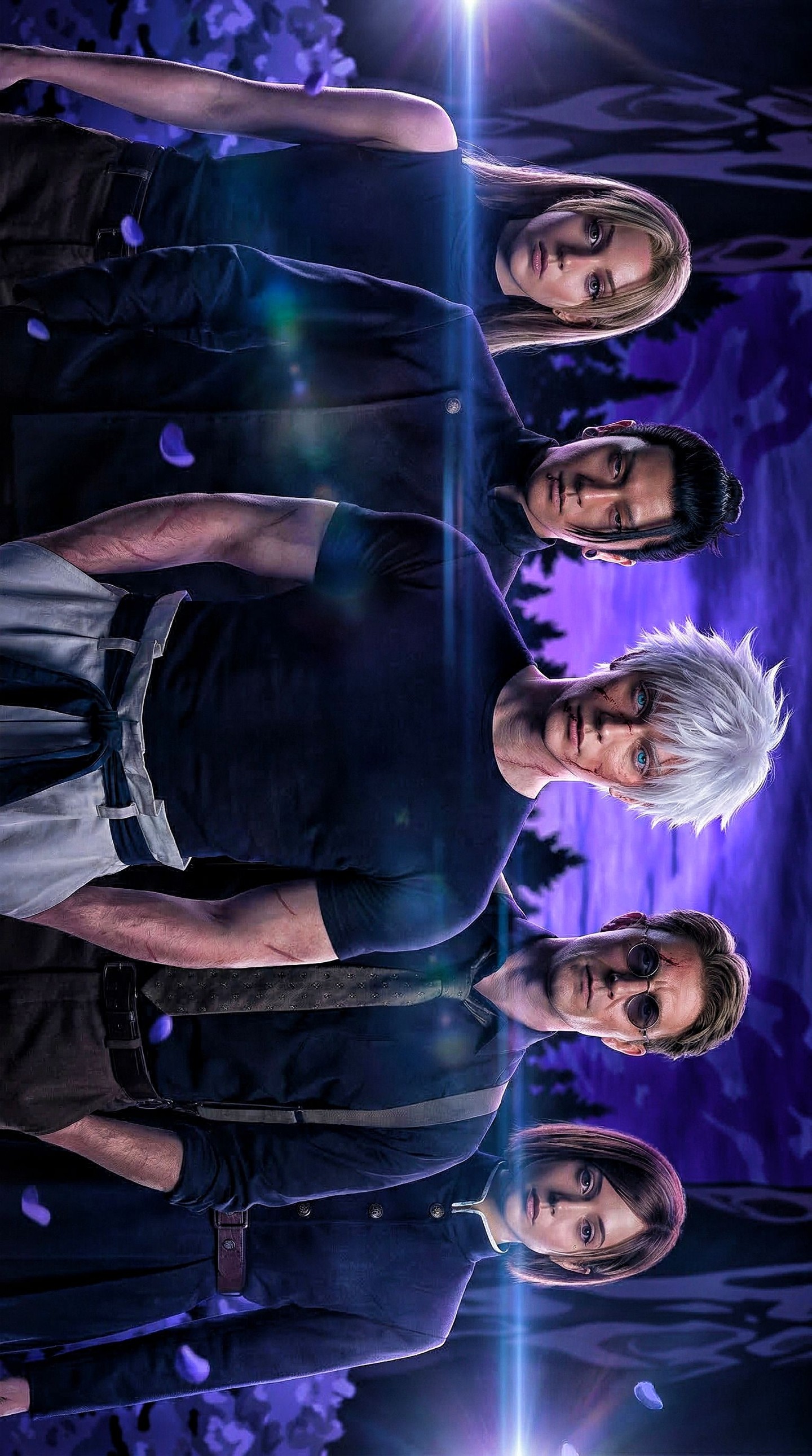
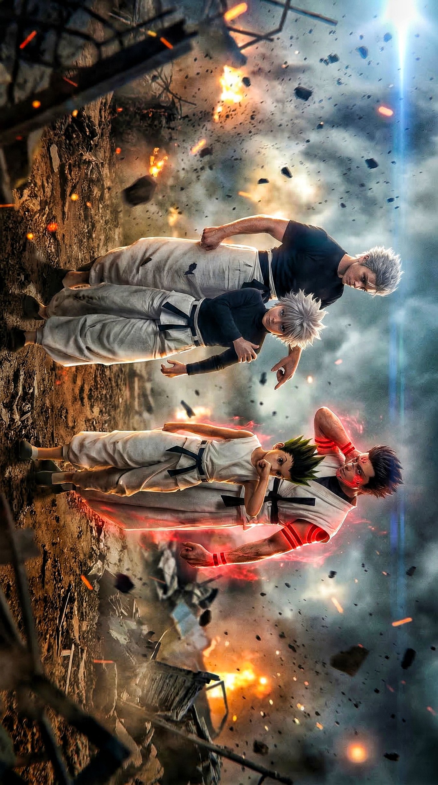
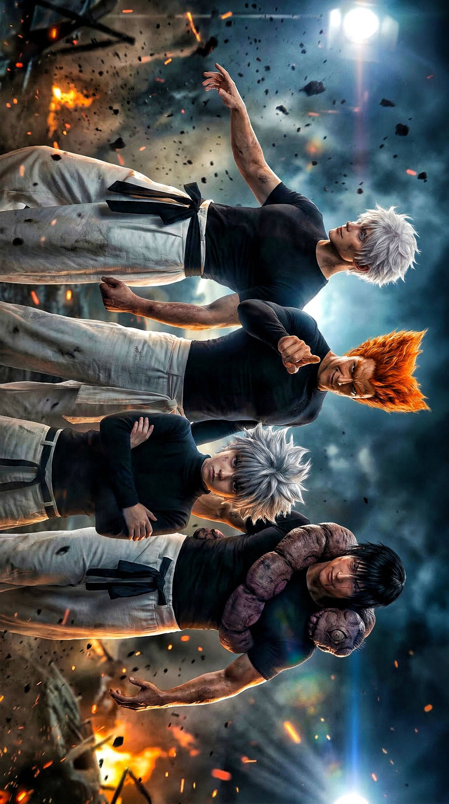
This image works because it understands ensemble hierarchy. Even before you know who these characters are, your eye knows where to land, how to travel, and what kind of tone to expect. The white-haired central figure acts like the gravitational core, while the surrounding characters build tension and texture around him. That kind of visual ordering is one of the oldest poster tricks in the book, but it still works because the brain loves a clear center of power.
The second reason it lands is mood compression. Purple twilight, cool flares, dark clothing, drifting petals, serious expressions: every visual element is voting for the same genre. That alignment matters more than complexity. The poster is not trying to tell you everything about the story. It is trying to lock one emotional channel fast: supernatural threat, cool-headed confidence, and team chemistry under pressure.
Why this style gets attention quickly
The first hook is the central contrast. White hair against a dark wardrobe and purple background gives the middle character instant icon status. That is a reliable strategy in cast imagery. If the hero or main energy source reads in one second, the rest of the lineup can work as supporting intrigue rather than visual competition.
The second hook is the lens flare and top-light treatment. These are not just decorative effects. They turn the lineup into an event. The flare cuts across the cast like a visual drum hit, and the top light makes the group feel chosen, summoned, or cinematic. For viewers, that kind of lighting language immediately signals “poster,” not “still frame,” which raises perceived importance.
Signal
Evidence (from this image)
Mechanism
Replication Action
Central hero lock
The white-haired blue-eyed male is the brightest and most visually distinct figure in the middle
One dominant center lets the viewer decode the lineup instantly
Give the central character one high-contrast trait that no one else shares
Genre-coherent palette
Purple sky, cool blue flare, dark clothing, pale face highlights
Color unity makes the cast feel like they belong to the same world
Choose one dominant mood palette and make every element reinforce it
Poster-scale lighting
A top starburst and horizontal lens flare run across the cast
Stylized lighting separates the image from ordinary character art and adds importance
Use one theatrical light effect that runs across the whole ensemble
Balanced outer anchors
Two women and two darker-toned supporting men frame the center figure
Outer balance keeps the lineup readable and gives the center more authority
Treat the cast like a shape system, not a random collection of faces
Best use cases for this visual language
This image style is strongest for cast posters, crossover concepts, fan-made adaptation art, role-introduction slides, game squad visuals, and announcement graphics where ensemble identity matters more than environmental storytelling. It works especially well when you need viewers to believe in a team or faction instantly.
Fan-cast or adaptation posters: strong fit because the composition already sells “who matters” and “what tone this is”; keep one dominant central figure.
Game or anime squad reveals: strong fit because the lineup can communicate class, attitude, and worldbuilding quickly.
Character-pack promotion: strong fit because one image can present multiple roles without becoming chaotic.
Franchise mood posters: strong fit because genre compression is one of the main strengths of ensemble design.
It is less ideal for intimate single-character studies, comedy promos, or documentary realism. This language is theatrical by design.
Three transfer recipes
Keep: five-person lineup, central hero contrast, horizontal flare. Change: genre from supernatural to sci-fi, dystopian, or fantasy. Slot template (EN): “five-character hero lineup poster with one central visual anchor, cinematic top light, and a unified mood palette”.
Keep: dark wardrobe and twilight color system. Change: signature trait of the lead from white hair to red coat, glowing eyes, or metallic armor. Slot template (EN): “ensemble character poster where one unique visual trait establishes the lead instantly”.
Keep: serious expressions and atmospheric particles. Change: setting from forest edge to ruined city, moonlit rooftop, or temple courtyard. Slot template (EN): “vertical team poster with a dramatic sky, subtle particles, and one strong shared genre mood”.
The aesthetic read
The strongest aesthetic move here is compositional discipline. All five characters feel distinct, but none of them are allowed to break the vertical seriousness of the frame. Their silhouettes are narrow, their clothing is dark, and their expressions stay restrained. That restraint keeps the central white-haired figure from getting lost. Ensemble posters often fail when everyone screams for attention at once. This one succeeds because attention is rationed well.
The purple backdrop is another key choice. Purple is often used badly in fan art because it can become cheap or generic fast. Here it works because it is supported by deep blacks, cool skin highlights, and minimal warm interference. The result feels nocturnal and supernatural instead of merely colorful.
The lens flare helps the image feel expensive. It creates a bridge across the cast, making the lineup feel like one unit rather than five cutouts arranged side by side. That is a small but powerful poster lesson: one shared effect can unify a cast better than adding more costume detail ever could.
Observed
Why it matters for recreation
The central figure has the highest contrast hair and eye color
Contrast concentration is what makes ensemble hierarchy readable
Dark outfits keep most of the visual field calm
Restraint in wardrobe gives more power to the few highlighted elements
Lens flare runs horizontally across the group
A shared lighting effect visually fuses separate characters into one team image
Background is atmospheric but simple
Minimal environment prevents the poster from competing with the cast
Each outer character has a distinct face or accessory cue
Small identity markers create memorability without breaking group balance
Prompt technique breakdown
If you want to build this kind of poster, think in hierarchy first and detail second. The lineup has to read before the costumes do.
Prompt chunk
What it controls
Swap ideas (EN, 2–3 options)
five-character heroic lineup with one central lead
Cast count and hierarchy
“ensemble team poster with a dominant center figure”; “five-person cast lineup”; “hero squad standing shoulder-to-shoulder”
silver-white-haired lead with icy blue eyes
Primary focal distinction
“white-haired protagonist”; “pale-haired central hero”; “glowing-eyed center anchor”
deep violet twilight sky with dark silhouettes
World mood and genre compression
“purple night sky backdrop”; “supernatural dusk atmosphere”; “twilight fantasy skyline”
horizontal lens flare and bright top spotlight
Poster-scale theatricality and unity
“blue flare across the lineup”; “cinematic chest-level light streak”; “top starburst light source”
dark fitted clothing and serious expressions
Tone discipline and silhouette simplicity
“understated dark wardrobe”; “serious supernatural team mood”; “restrained action-anime styling”
Execution playbook
Lock three things first: the exact five-character count, the central high-contrast lead, and the horizontal flare. Those are the poster’s three anchors. If one breaks, the image loses its cast-poster clarity fast.
Then use the one-change rule. Shift one or two variables per pass.
Run 1: lock the lineup spacing, the white-haired central lead, and the purple twilight backdrop.
Run 2: keep the lineup fixed and refine lighting: stronger top light, cleaner flare, sharper cool rim highlights.
Run 3: keep lighting fixed and improve identity cues on the outer characters: sunglasses, beard, hairstyle, collar detail, and pose distinctions.
Run 4: preserve the same ensemble grammar and test one controlled variation such as swapping the background world or changing the central hero’s signature visual trait.
Fast takeaway
If you want an ensemble poster to feel powerful, stop trying to make every character equally loud. Build one clear center, then let everyone else support that signal.