How vikaschauhan Made This Anime Three Hero Battle Poster AI Art - and How to Recreate It
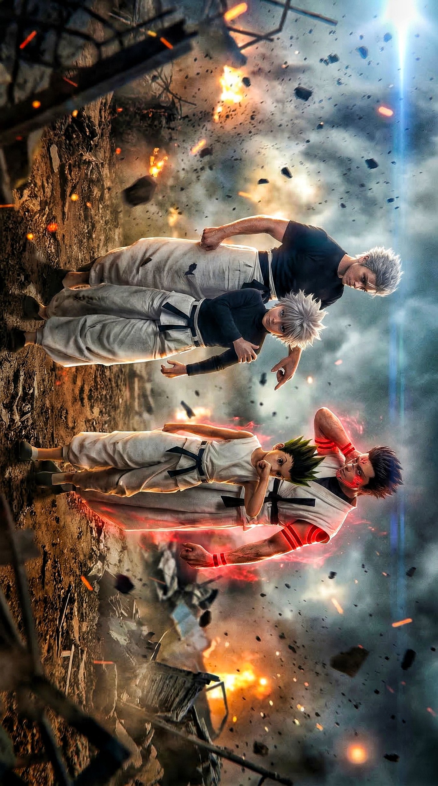
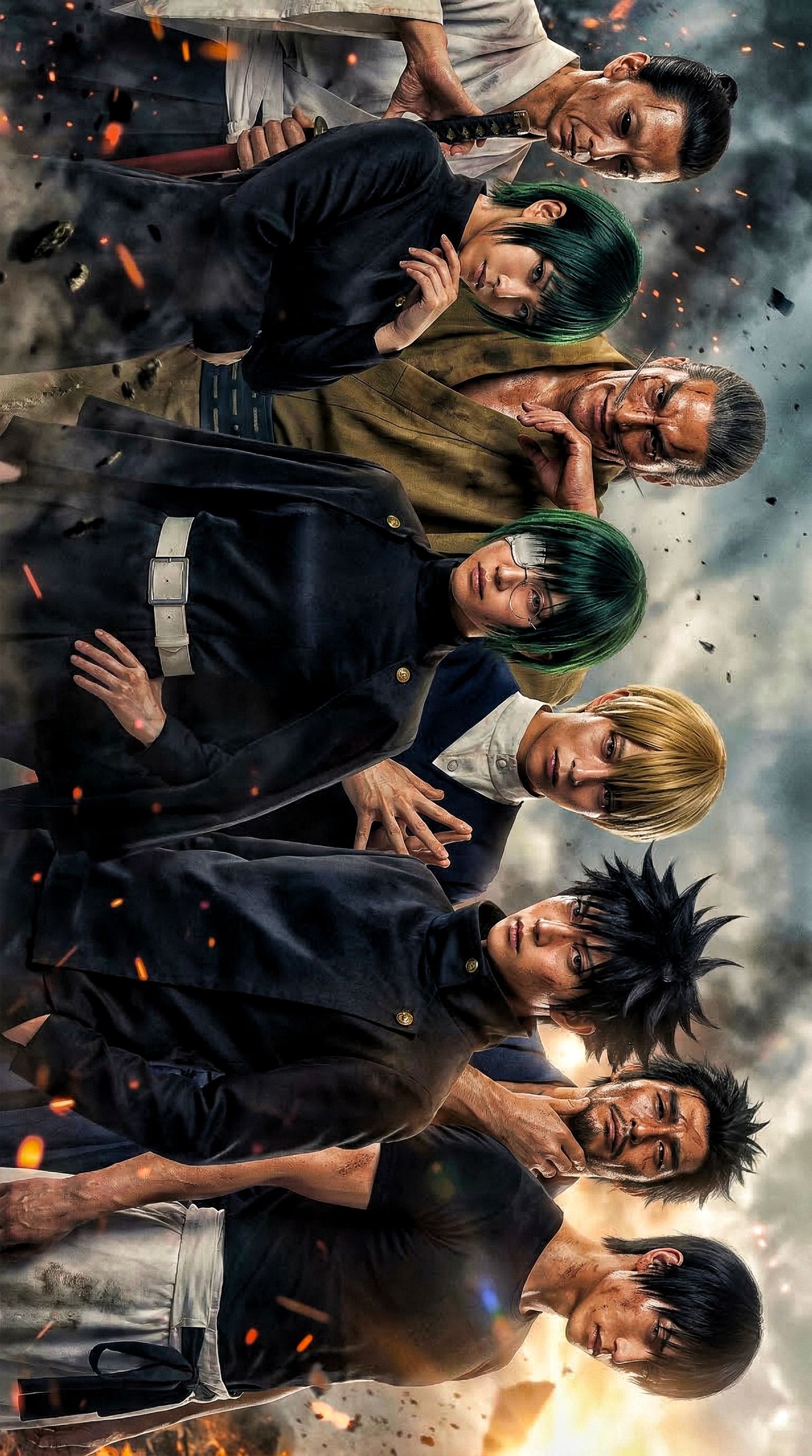
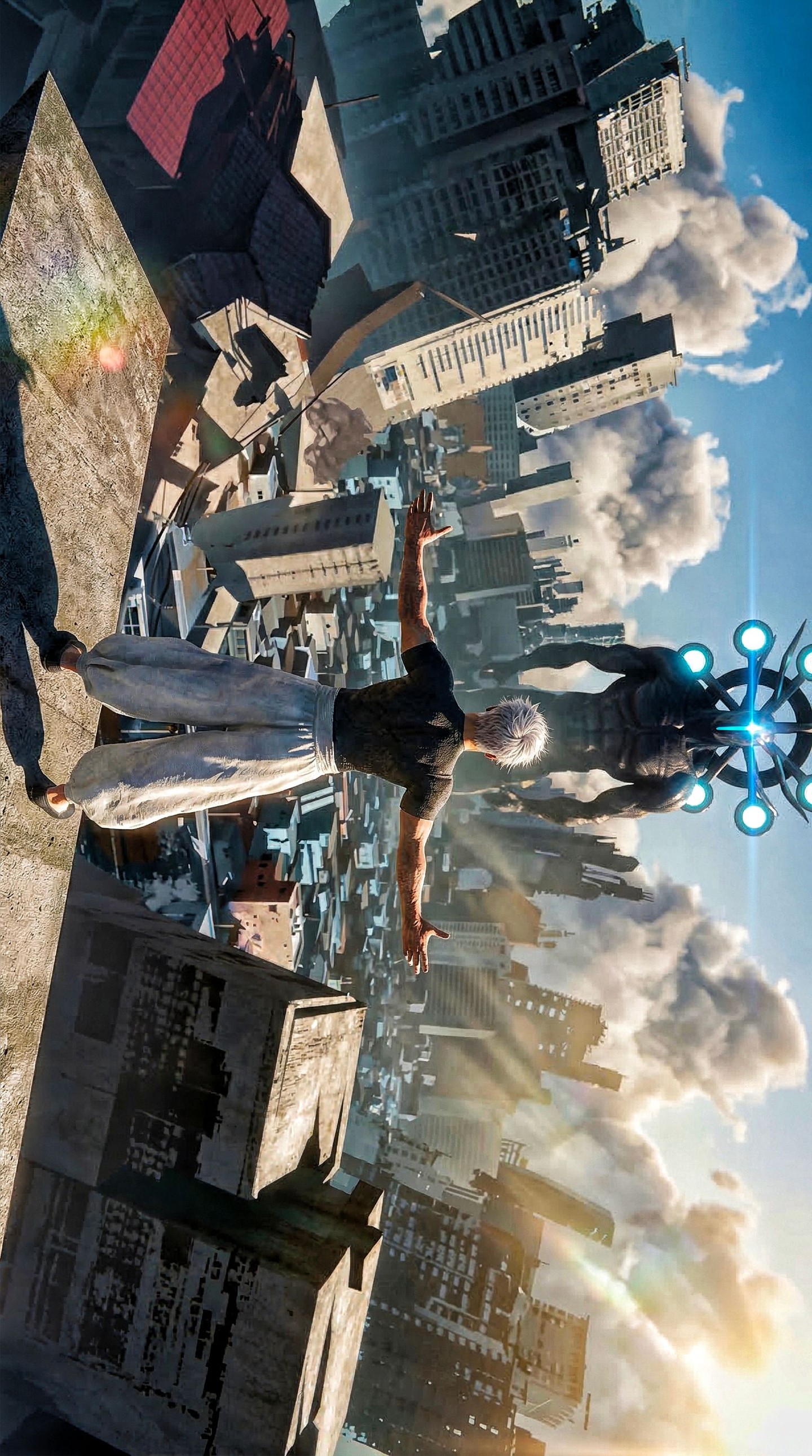
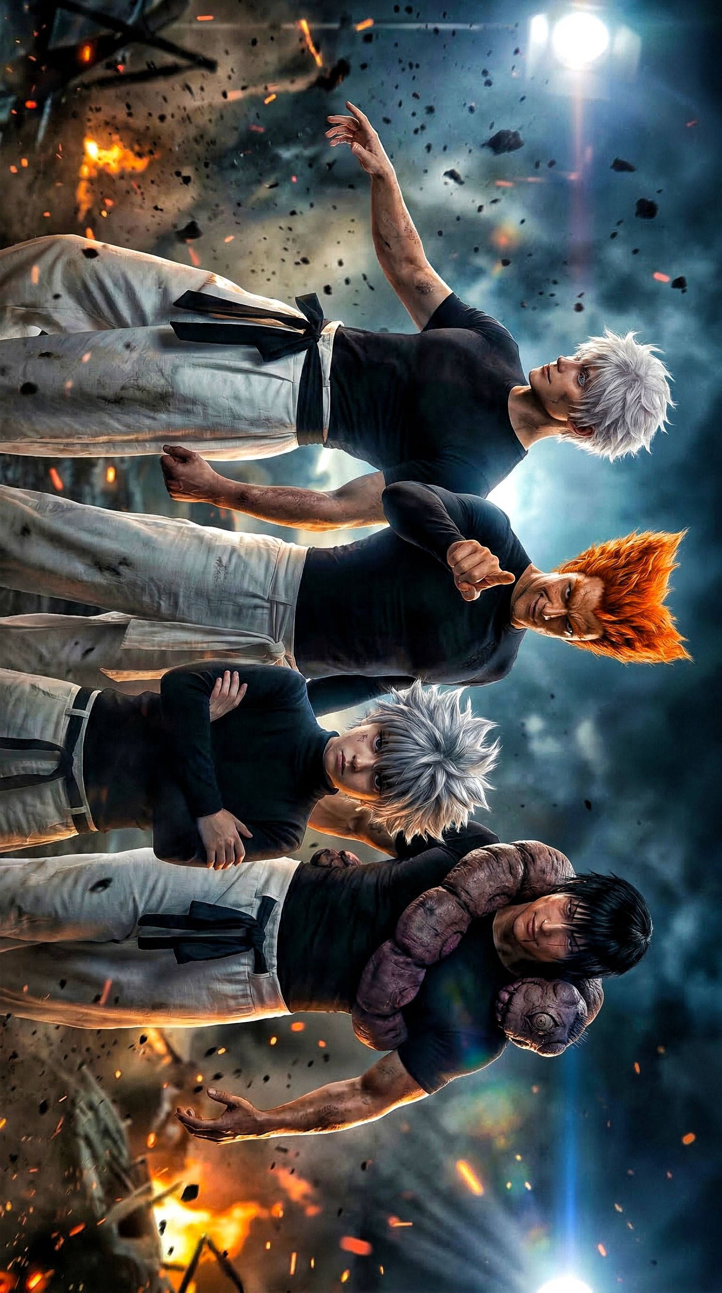
Some action images rely on choreography. This one relies on pressure. The moment you look at it, the frame tells you that the world is already damaged, the stakes are already high, and the figures inside it are carrying different emotional weights. That is why the image works as poster art instead of just group illustration. The battlefield is not background decoration. It is part of the power system of the image. Smoke, explosions, drifting rubble, and that cold flare in the sky all help the characters feel larger than life.
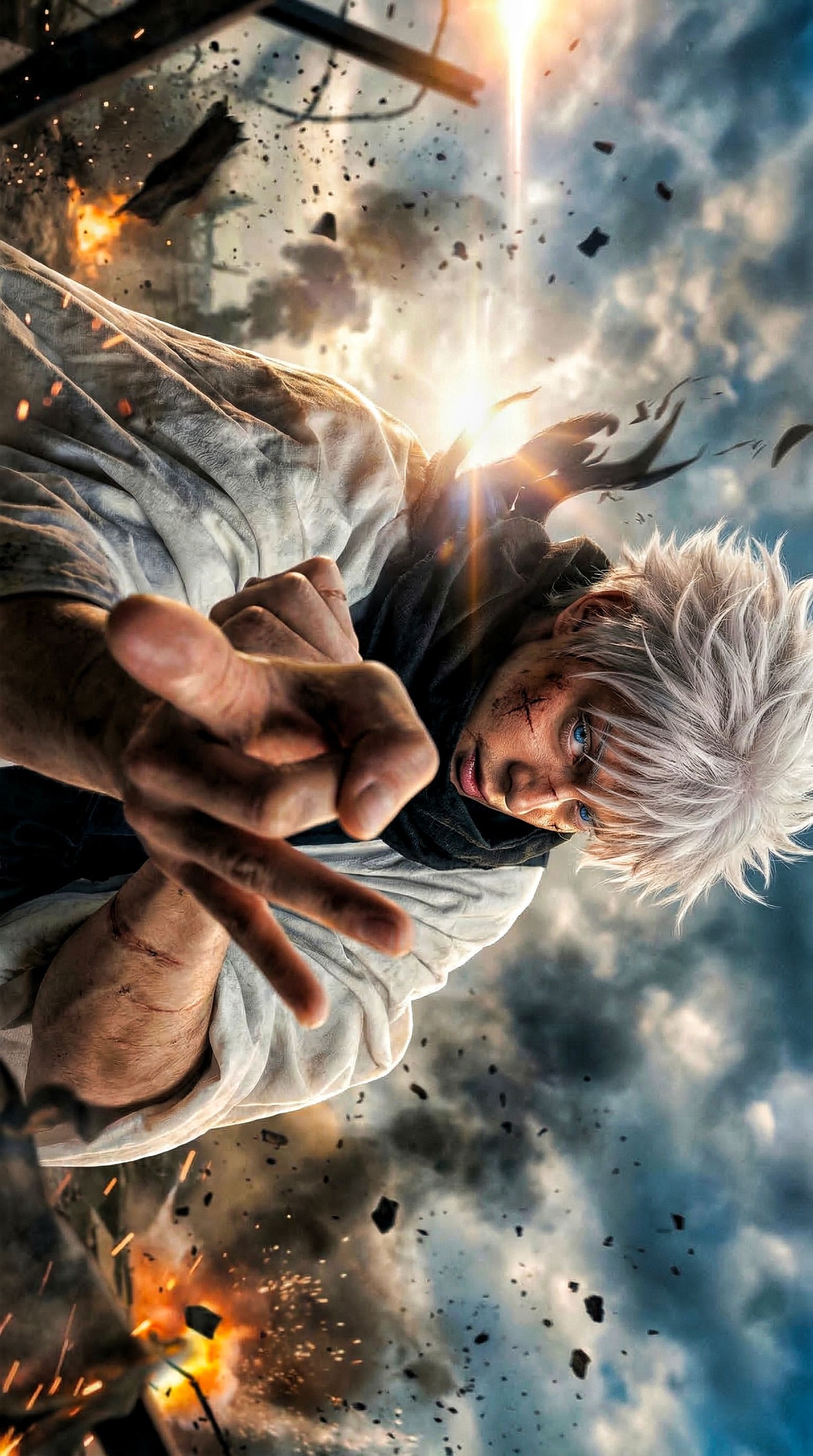
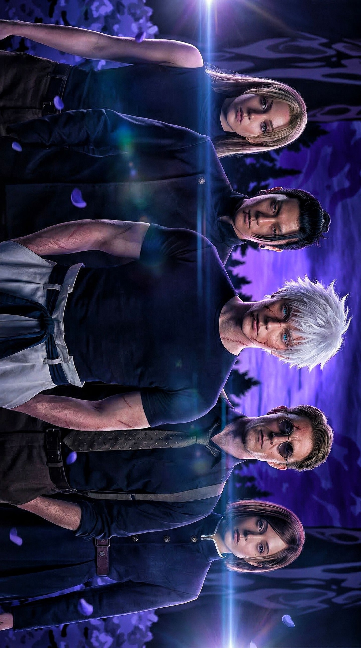
The second reason it lands well is the hierarchy inside the group. The dark-haired fighter in front gives the viewer an immediate anchor. The red-glowing figure behind him raises the threat level. The silver-haired pair at the other side add emotional complexity, because they soften the image just enough to stop it from becoming generic combat noise. For creators, this is a useful lesson in ensemble design. A group image gets stronger when each figure carries a different kind of narrative energy instead of all characters trying to look equally dominant.
| Signal | Evidence (from this image) | Mechanism | Replication Action |
|---|
| Explosive atmosphere | Smoke, fireballs, embers, and flying debris fill the scene | The environment makes the stakes feel high before the viewer studies any pose | Build the danger level into the background, not only into the characters |
| Power hierarchy | The red-aura figure towers behind while the central fighter anchors the front | Different energy levels create immediate relational drama | Assign each character a distinct visual role instead of mirroring the same stance |
| Emotional contrast | The silver-haired adult and the smaller youth add a vulnerable note inside the chaos | Contrast prevents the image from feeling like empty aggression | Add one softer relational cue inside a combat-driven composition |
| Orientation disruption | The whole poster is rotated, making the group feel unstable and cinematic | Unusual framing increases tension and memorability | Use controlled orientation shifts when you want a poster to feel dangerous or off-balance |
What makes the image especially effective is the way it balances spectacle with readability. There are many particle effects, but the composition still gives the viewer a clean path. You notice the central fighter first, then the glowing red figure, then the silver-haired duo, and only after that do you absorb the explosions and wreckage. That order matters. Action art fails when everything screams at once. This frame avoids that by giving each area of the image a job.
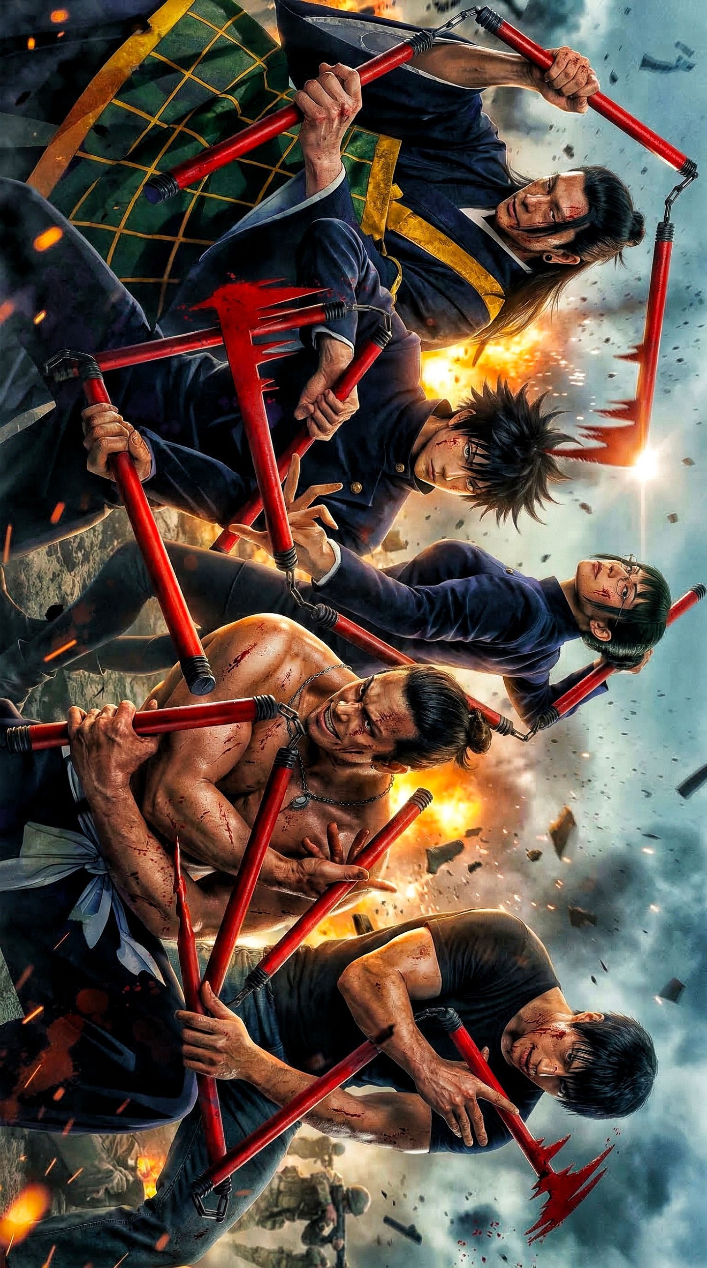
I also like the fact that the battlefield feels dirty rather than generic. The ground is torn up, the air is full of fragments, and the frame edges are invaded by broken structures. Those choices help the image feel like a moment inside a collapsing world, not a character render pasted over stock smoke. For creators trying to improve anime battle posters, this is one of the most useful takeaways: environmental damage needs shape, not just particles.
Where This Visual Strategy Works Best
- Final-showdown key visuals: the image already carries endgame stakes and works well for climactic character lineups.
- Shonen ensemble posters: if you need several figures to coexist while still preserving hierarchy, this structure is strong.
- Trailer-thumbnail style artwork: the explosions and silhouette grouping create a quick, dramatic read even at small sizes.
- Event promos for fandom edits: the blockbuster mood makes it effective for countdown posts, themed drops, or recap graphics.
This structure is less ideal for intimate emotional scenes, romance-driven fandom art, or purely tactical combat diagrams. It is also not ideal if the creator wants clean design minimalism. The image depends on controlled chaos. Remove too much debris and it loses urgency. Add too much more and it becomes unreadable. That balance is the whole craft.
Three Transfer Recipes
- Keep: low-angle warzone, group hierarchy, heavy particle atmosphere. Change: franchise cues, aura color, damaged terrain type. Template: {team lineup} in {ruined battleground} with {energy accent} and {sky condition}
- Keep: front anchor plus rear threat figure. Change: supporting duo relationship, costume system, debris language. Template: {lead fighter} with {rear power figure} and {support pair} amid {destruction type}
- Keep: dramatic orientation, explosion lighting, smoky depth. Change: weather, architecture ruins, glow color logic. Template: {characters} under {catastrophic atmosphere} with {lighting contrast} in {rotated poster setup}
Aesthetic Read: Why the Image Feels Cinematic
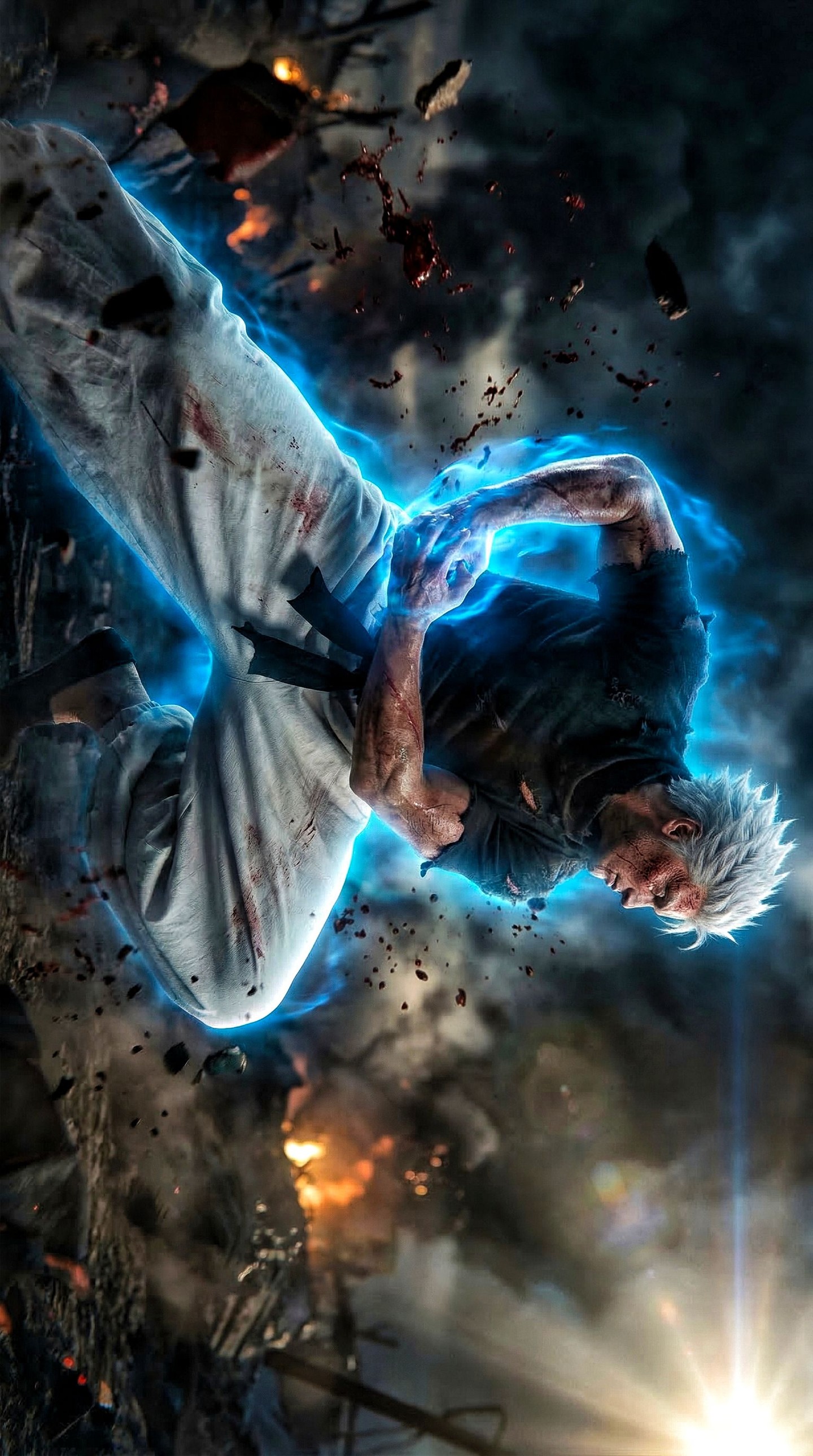
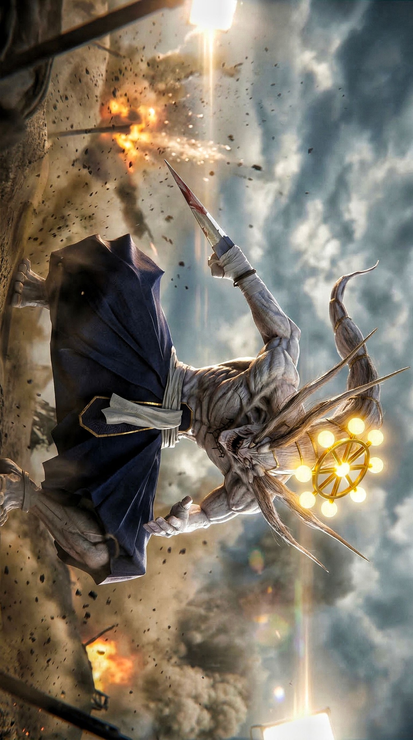
The first strength is directional chaos. Debris is not randomly sprinkled; it moves in a way that supports the sensation of impact. The second is light contrast. Warm blasts and a cool storm sky create tension without muddying the palette. The third is cluster design. The characters are close enough to feel like one unit, but different enough to suggest conflict, responsibility, and power imbalance. The fourth is the use of red energy. That crimson glow does not just make one figure look cool. It shifts the emotional temperature of the whole right side of the frame. The fifth is the rotated presentation. By refusing a normal upright reading, the image creates instability, which is exactly what a battle poster should do.
| Observed | Why it matters | How to recreate |
|---|
| Rotated poster orientation | Makes the composition feel less safe and more kinetic | Experiment with controlled frame rotation instead of always defaulting to upright hero shots |
| Warm fire against cool cloud haze | Keeps the environment dramatic without collapsing into one-tone orange | Split the atmosphere into one warm destruction zone and one cool sky zone |
| Front anchor plus rear threat silhouette | Creates instant relational hierarchy | Decide who leads the eye first and who raises tension second |
| Visible damage at frame edges | Improves immersion and makes the warzone feel real | Let broken structures intrude into the sides of the frame |
| Smaller vulnerable figure inside the group | Adds emotional variety and story depth | Include one character whose posture softens the all-out aggression |
Prompt Technique Breakdown
| Prompt chunk | What it controls | Swap ideas (EN, 2-3 options) |
|---|
| three-fighter anime battle lineup with one smaller silver-haired youth | Character grouping and emotional structure | hero squad cluster, protector-and-youth pairing, ensemble war pose |
| ruined battlefield with explosions, smoke, rubble, and flying debris | Environmental stakes and world damage | apocalyptic warzone, shattered industrial ground, collapsing combat zone |
| red supernatural aura on the tall rear figure | Threat level and power hierarchy | crimson cursed glow, hostile energy wrap, demonic red edge light |
| cool storm haze with blue flare and warm blast light | Color drama and cinematic lighting | steel-blue sky with ember bursts, cold haze plus firelight, cinematic blast contrast |
| rotated vertical poster framing from a low angle | Memorability and visual tension | sideways key visual, tilted war-poster setup, unstable heroic composition |
The most practical way to build a piece like this is to think in layers. Layer one is group hierarchy. Layer two is battlefield damage. Layer three is power-color accents. Layer four is orientation. If your output feels generic, one of those layers is underdeveloped. Fix the weak layer instead of adding more random sparks.
Remix Steps for Better Convergence
Baseline lock the group arrangement, the environmental damage level, and the warm-cool lighting split first. Those decisions hold the whole poster together. After that, change only one or two variables per run. In run one, stabilize the character cluster and body scale. In run two, tune the red aura and the front fighter silhouette. In run three, strengthen smoke density and explosion placement. In run four, adjust rotation and edge wreckage until the image feels tense but still readable. That sequence keeps the poster from collapsing into random effects noise.
If you want to adapt this image logic for your own work, ask what kind of tension the group should communicate before the viewer knows the lore. Here, the answer is clear: power, danger, protection, and collapse. Because those themes are built into both the characters and the environment, the poster feels complete rather than decorative.