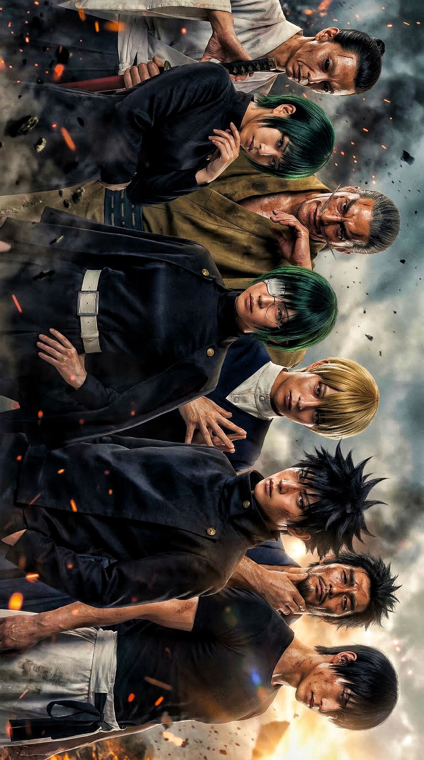
How vikaschauhan Made This Anime Team Battle Poster AI Art - and How to Recreate It
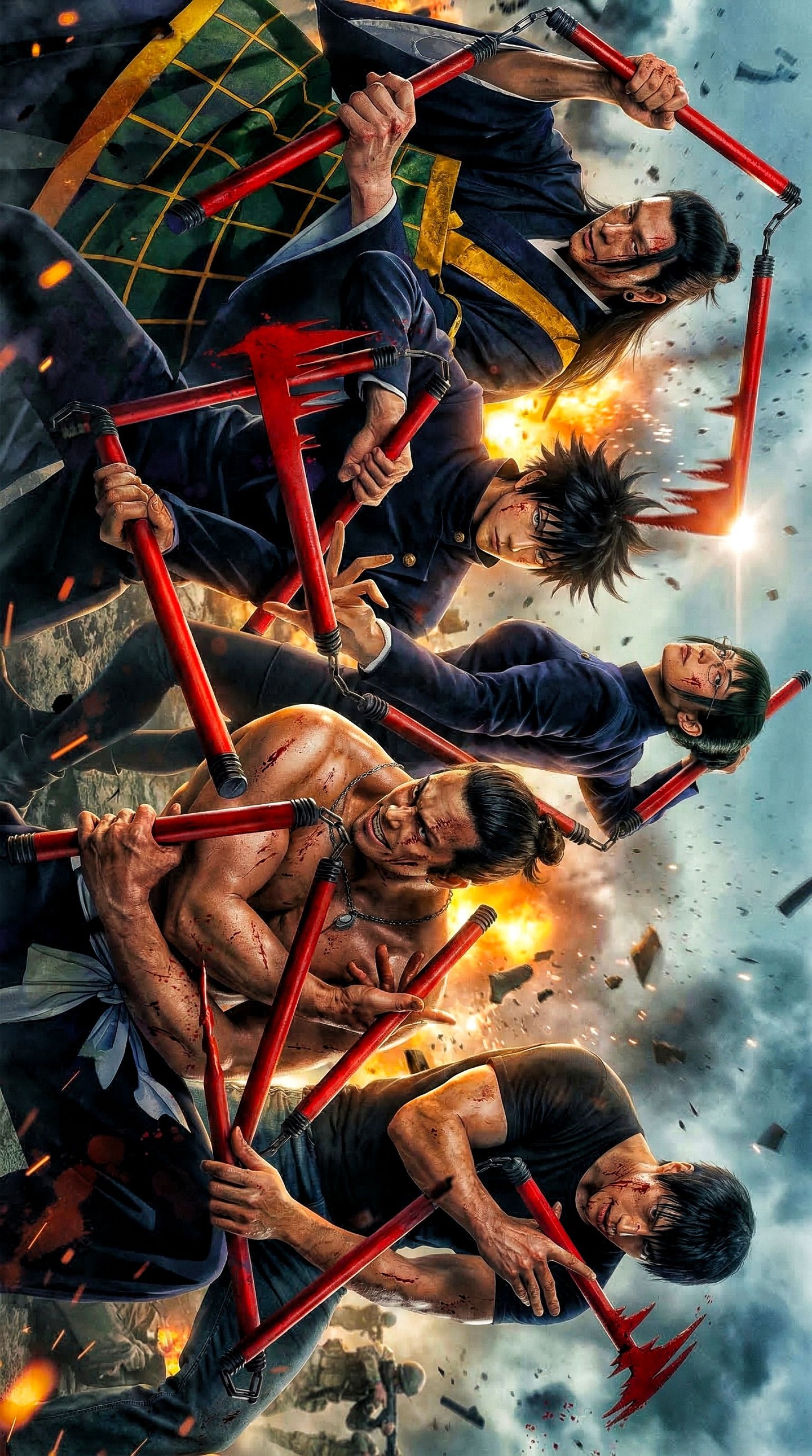
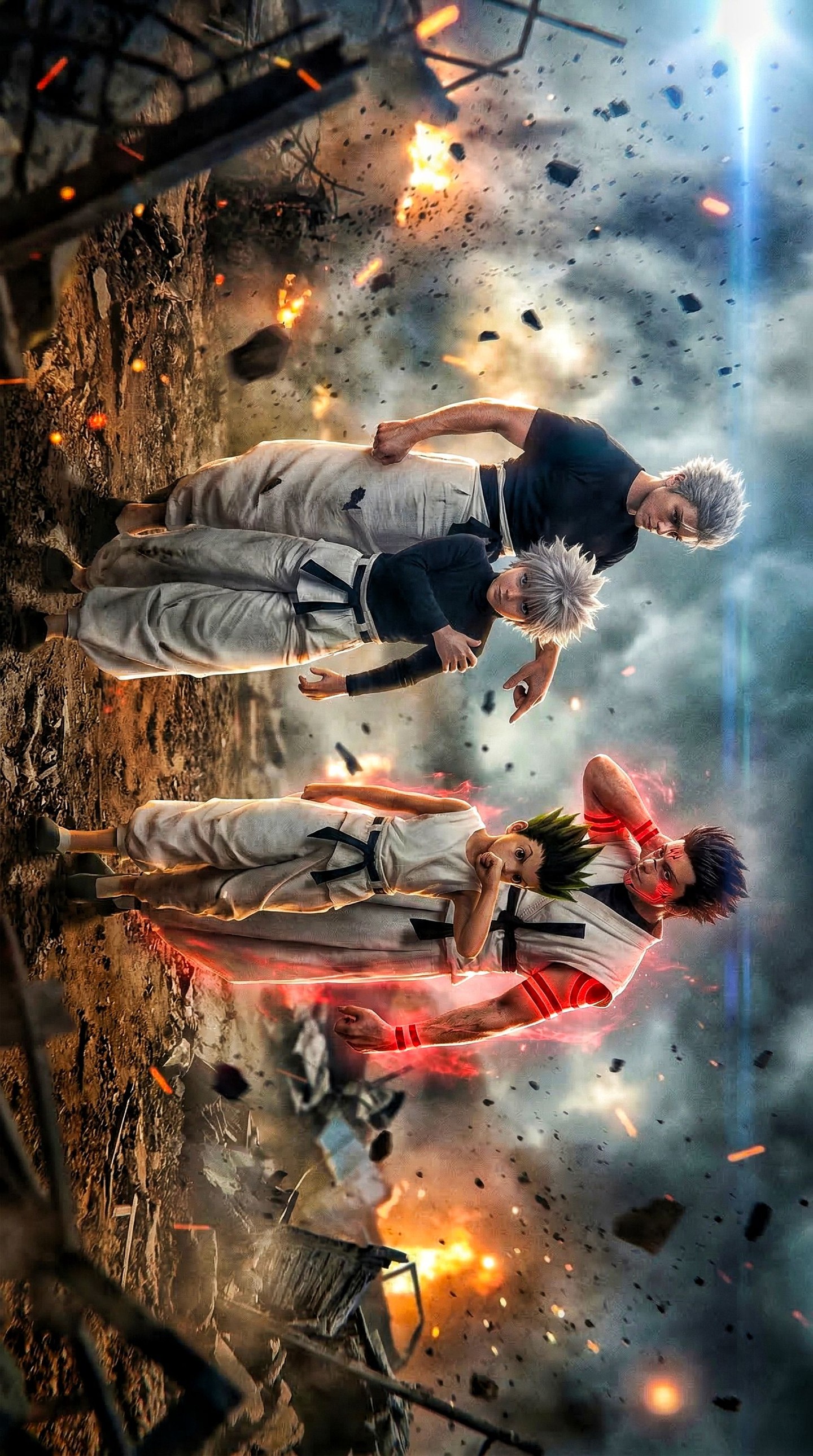
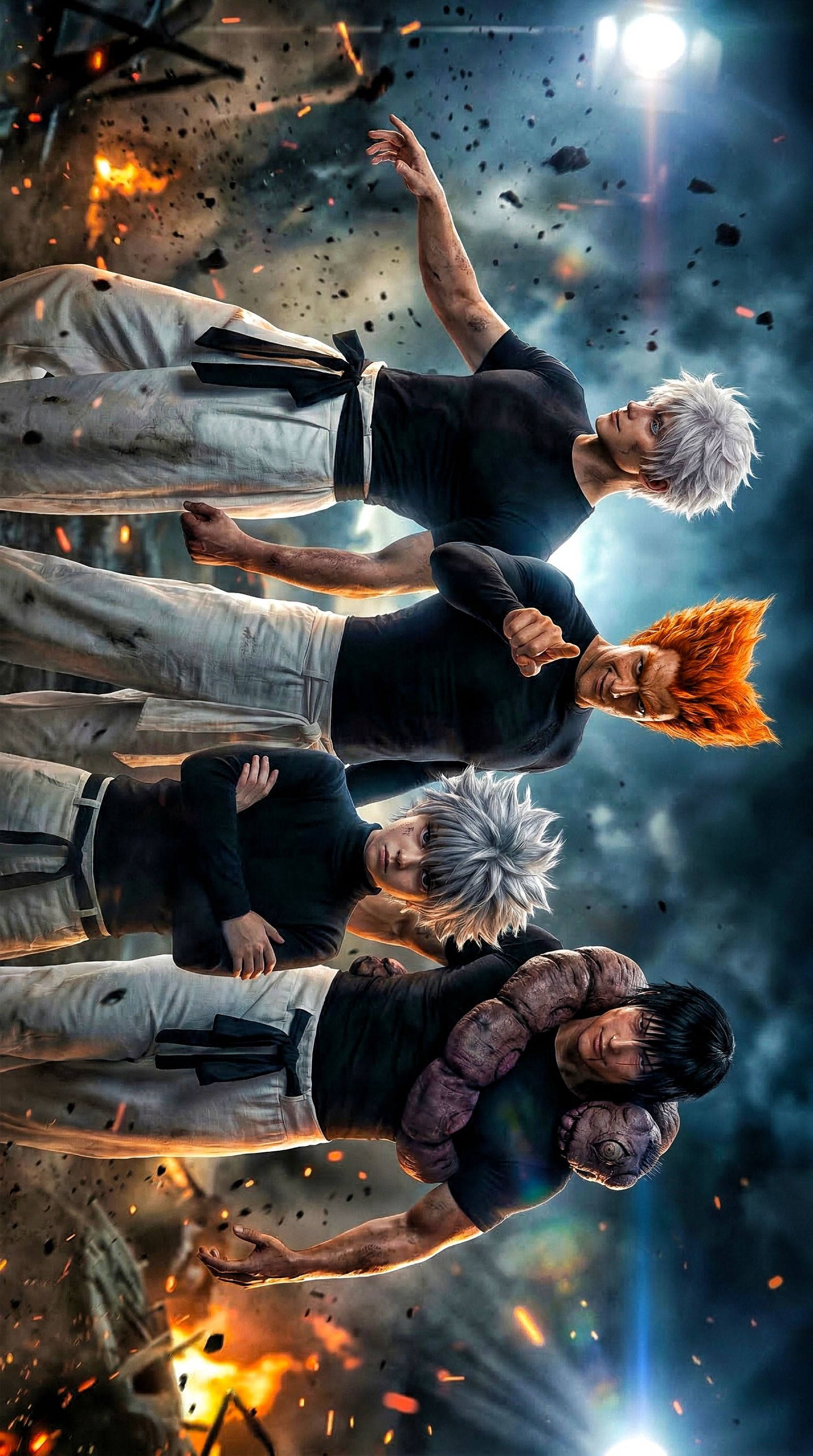
This image succeeds because it understands how ensemble action posters create impact. Instead of treating five characters as separate portraits placed side by side, the composition fuses them into a single combat mass. Bodies, weapons, faces, and bursts of fire all participate in one shared directional flow. That is the difference between a crowded poster and an effective one. In a weak ensemble image, each figure fights for attention separately. In a strong ensemble image, every character contributes to a single rhythmic composition. This poster clearly aims for that second result, and the prompt language supports it well.
The defining device is the repeated use of vivid red polearms and hooked staff weapons. Those red weapons are not only props. They are the visual framework of the poster. They cut across the image as diagonals, connect foreground to midground, and create a repeating color accent that unifies the fighters. In ensemble action art, repeated object language often does more work than repeated costume design. Here, the weapons create group identity. Even before viewers parse individual faces, they understand that the poster belongs to one coordinated, high-stakes battle world built around these striking crimson forms.
The image also benefits from choosing intensity over spaciousness. The close crop, stacked arrangement, and overlapping silhouettes make the confrontation feel immediate. There is no wasted space and no false calm. Everything in the frame points toward collision. That compression is a smart decision for a season-finale style poster because it turns the image into a pressure chamber. The audience does not observe the battle from afar. They are dropped directly into the visual noise of a decisive moment, but the noise remains organized by shape and lighting.
Why the Ensemble Composition Feels Cohesive
Handling five characters in one vertical frame is difficult because the risk of muddiness rises quickly. Too much separation and the image becomes static. Too much overlap and the figures become unreadable. This prompt aims for the balance point by describing a tightly packed arrangement with distinct silhouettes. That instruction is important. Ensemble posters only work when overlap increases tension without destroying identity. The viewer needs to feel density and still recognize that each fighter has a different pose, expression, and role in the scene.
The stacked composition helps because it turns the poster into a vertical progression of force. Eyes move upward and downward through bodies and weapons rather than left and right across disconnected zones. That makes the image feel more like one unified key visual. Vertical stacking is especially effective for anime-style posters because it lets the artist exaggerate diagonals, create layered depth, and maintain face visibility even when several characters occupy the same frame. The result feels choreographed instead of merely crowded.
Another strength is the decision to let weapons and limbs overlap aggressively. Overlap is one of the fastest ways to create depth in illustrated action art, but it only works when edges remain legible. That is why the prompt repeatedly emphasizes crisp red weapons, separated silhouettes, and controlled atmospheric effects. It understands that action density without edge control collapses into blur. In other words, this is not chaos for its own sake. It is structured chaos designed for poster readability.
The Role of Red Weapons in the Visual Hierarchy
The red weapons are the most important hierarchy tool in the composition. Red instantly separates itself from the blue-gray battlefield environment and the darker costume values. Because the weapons are long, directional objects, they do more than add color. They carve the frame. They guide the eye across faces, through combat poses, and toward the different layers of the ensemble. That makes them ideal for a battle poster, where movement and orientation need to be communicated in a single frozen image.
Color repetition also helps unify the team. Even if each fighter has a different outfit, expression, or pose, the repeating crimson weapon language makes them feel like participants in the same visual system. That is a useful lesson for ensemble prompting in general. Shared motifs often create stronger cohesion than shared clothing. A group can feel related because they repeat a shape, object, effect, or accent color. In this case, the red polearms give the image an instantly recognizable signature.
The choice of red is especially effective because it bridges both danger and design. Red suggests heat, aggression, bloodless violence, and high stakes, but it also works as a graphic accent in poster art. Against the cooler storm-sky tones, it becomes even more forceful. That contrast makes the image easier to read at small size. If the weapons had been metallic gray or muted brown, the poster would lose much of its aggressive rhythm.
Why the Battlefield Background Supports Rather Than Distracts
The environment is deliberately chaotic, but it remains secondary. Firebursts, airborne debris, smoke, and storm clouds all tell us that the battle is large and dangerous, yet none of those effects are allowed to replace the fighters as the main event. That is exactly the right decision. In action key art, the environment should amplify the emotional state of the combat without stealing the role of the characters. The battlefield here functions as pressure, not as subject.
The stormy blue-gray sky is especially useful because it creates a cool, receding field behind the warmer foreground effects. That makes sparks and firelight more legible and gives the red weapons stronger separation. Cool backgrounds are often the best choice for aggressive warm-accent posters because they let heat register immediately. The image feels explosive not because every pixel is bright, but because the warm zones are placed against a broad cool field.
Smoke is another useful device when handled correctly. It softens the depth transitions between characters and environment, while also implying scale and impact. But the key is restraint. If the smoke were too thick, it would blur silhouettes and reduce readability. The prompt smartly frames smoke as supporting atmosphere rather than dominant effect. This is exactly how atmospheric effects should be described in high-density posters: present enough to create energy, controlled enough to preserve structure.
Lighting as a Force Multiplier
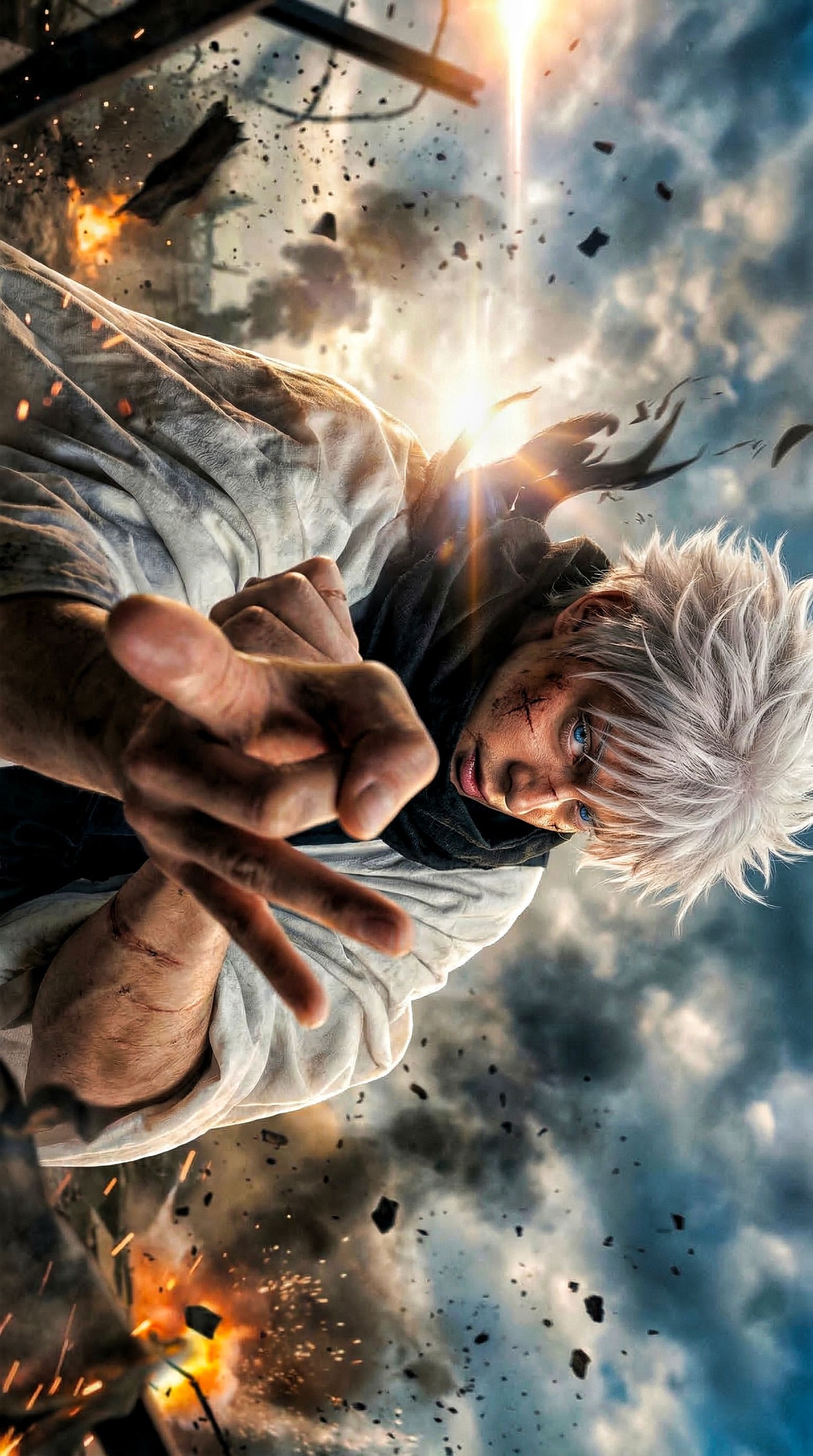
The lighting in this poster works because it creates contrast in more than one direction. Warm firelight comes from behind and between the figures, while cool daylight pressure remains in the sky. That dual-lighting structure makes the frame feel cinematic. It produces rim separation, weapon highlights, facial intensity, and enough value contrast to hold a crowded ensemble together. In action art, lighting often becomes the hidden architecture of the poster. It tells viewers where to look, what is closer, and what carries emotional heat.
Warm backlighting is particularly effective because it adds drama without flattening the character faces. If all the light were frontal, the poster could become readable but less dimensional. If all the light were backlit, the faces might disappear. Combining edge heat with enough frontal clarity solves both problems. It gives the poster spectacle while preserving expression. That is vital in ensemble art because each fighter must feel alive, not just present.
The sparks are also intelligently described. They are not meant to become large fireworks. They function as high-frequency energy notes scattered across the scene. Small bright accents like these help unify action posters by making the frame feel electrically active. They reinforce the idea that the image captures a peak moment. But again, because the prompt keeps them secondary, they add motion language without turning the poster into effect clutter.
How This Poster Creates Character Differentiation
One of the most difficult parts of a five-character battle poster is making sure each person feels distinct. The prompt handles that by emphasizing fierce expressions, battle-worn clothing, distinct poses, and readable silhouettes. That is the correct strategy. Individual differentiation in ensemble key art does not come from describing every costume stitch. It comes from making sure each figure claims a slightly different attitude, angle, or gesture. Distinction emerges through posture and energy.
Expressions are especially important here. In dense battle art, facial expressions often do more to create identity than costume details. A clenched jaw, narrowed eyes, or battle-focused gaze can help a character stand apart even in an overlapping crop. The prompt repeatedly supports this by asking for intensity rather than neutrality. That is essential because ensemble posters lose power when the characters appear emotionally disconnected from the conflict.
The semi-realistic musculature and painterly action style also contribute to differentiation. They allow physical tension to read across shoulders, arms, necks, and weapon grips. That means even partial figure crops can still feel specific. When a poster is this compressed, broad physical acting becomes a useful design language. It helps each fighter feel committed to the moment rather than passively arranged for the viewer.
Why This Image Feels Like Finale Key Visual Material
The prompt explicitly evokes season-finale key art, and that framing is accurate. Finale posters usually rely on concentration: more characters, more stakes, more heat, and more directional force than earlier promotional images. This composition captures that mentality well. The fighters are packed together, the air is full of fragments and sparks, the weapons cross aggressively, and the sky looks unstable. Everything suggests escalation. That is what gives the poster its narrative weight even if the viewer knows nothing about the story behind it.
Another reason it feels like finale imagery is that there is no comic relief in the composition. Every element is turned toward urgency. The poses, expressions, lighting, and environment all align with confrontation. That level of tonal discipline matters. Posters become stronger when every choice agrees on mood. Here, the mood is collision and endurance. Nothing in the frame contradicts that.
The painterly polish also supports the premium feel. It makes the scene feel designed for promotion, not like a random frame from animation. Key visuals work best when they compress story into iconography. This image does that by turning motion, fire, and weapon rhythm into a unified visual brand for the confrontation.
Prompt Writing Lessons You Can Apply Elsewhere
The first big lesson is to choose one repeatable motif for an ensemble image. In this case, it is the red weapons. If you are prompting group battle art, ask what recurring element can unify the cast. It might be a weapon type, a color accent, a shared magical effect, or a repeated shape. Without that repetition, group images often feel like unrelated characters forced into one frame.
The second lesson is to specify density with control. Saying “crowded” is not enough. You need language about layered hierarchy, separated silhouettes, crisp edges, and supporting atmosphere. These instructions tell the model how to keep complexity readable. Dense imagery only works when hierarchy survives compression.
The third lesson is to let the environment serve the fighters rather than compete with them. The battlefield here amplifies mood and lighting, but it does not demand equal attention. That is the right relationship. In promotional battle art, characters are usually the memory anchor. The environment should make them more dramatic, not less visible.
The fourth lesson is to think in diagonals. Diagonal staging almost always makes battle posters feel more alive than flat horizontal arrangements. It creates directional pressure, supports overlap, and gives weapon arcs more energy. This poster is built on that principle from top to bottom.
How to Evolve This Concept in Future Variations
If you wanted additional versions, the safest route would be to preserve the red-weapon system and the storm-fire palette while changing one structural variable at a time. You could widen the crop, isolate one fighter slightly more in the foreground, or intensify the background storm while keeping the cast arrangement consistent. Each of those changes would refresh the image without weakening its identity.
You could also experiment with the hierarchy of faces. One version might push a single leader closer to the viewer while keeping the other four layered behind. Another could lean harder into full ensemble symmetry. As long as the red weapon rhythm remains clear and the lighting preserves separation, the poster would retain its core logic.
A third option would be to shift the environment while preserving the group structure. A ruined gate, a cliffside fortress, or a broken temple sky could all work if the cool background and warm fire accents stay balanced. The key is not the exact setting. The key is the same relationship between combat figures, atmospheric pressure, and weapon-led composition.
Final Takeaway
This image works because it understands that strong ensemble battle art is not about showing more things. It is about organizing many intense elements around a few repeatable visual principles. Here, those principles are diagonal staging, red weapon repetition, controlled atmospheric chaos, and cinematic warm-cool lighting contrast. Because those principles are clear, the poster feels explosive without becoming unreadable.
If you want to build better anime battle posters, this image offers a reliable template: unify the cast through a repeated visual motif, compress the composition around a directional flow, use the background as pressure rather than clutter, and let lighting hold the hierarchy together. Done well, that approach produces exactly what this poster achieves: a dense, high-stakes, season-finale-style key visual that feels both chaotic and completely designed.