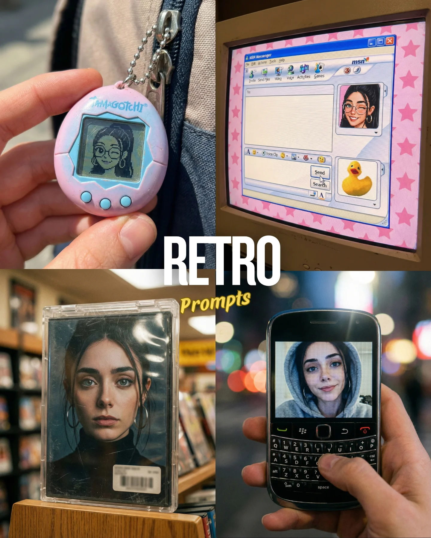


Retro Prompts 🕹️ 💡Idea from: @ai_vitaminc_ Te suena algo de esto?? 👀 Ahora lo llaman "Retro" El tiempo vuela pero los recuerdos se quedan... 🥹 Comenta "ARIA" y te paso los prompts 💌
Retro Prompts 🕹️ 💡Idea from: @ai_vitaminc_ Te suena algo de esto?? 👀 Ahora lo llaman "Retro" El tiempo vuela pero los recuerdos se quedan... 🥹 Comenta "ARIA" y te paso los prompts 💌
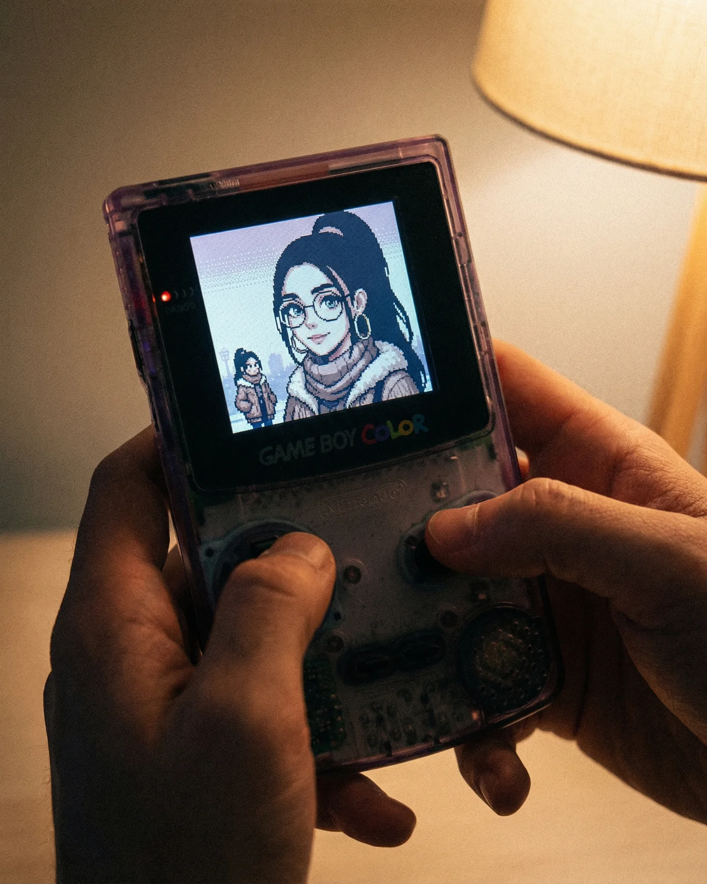
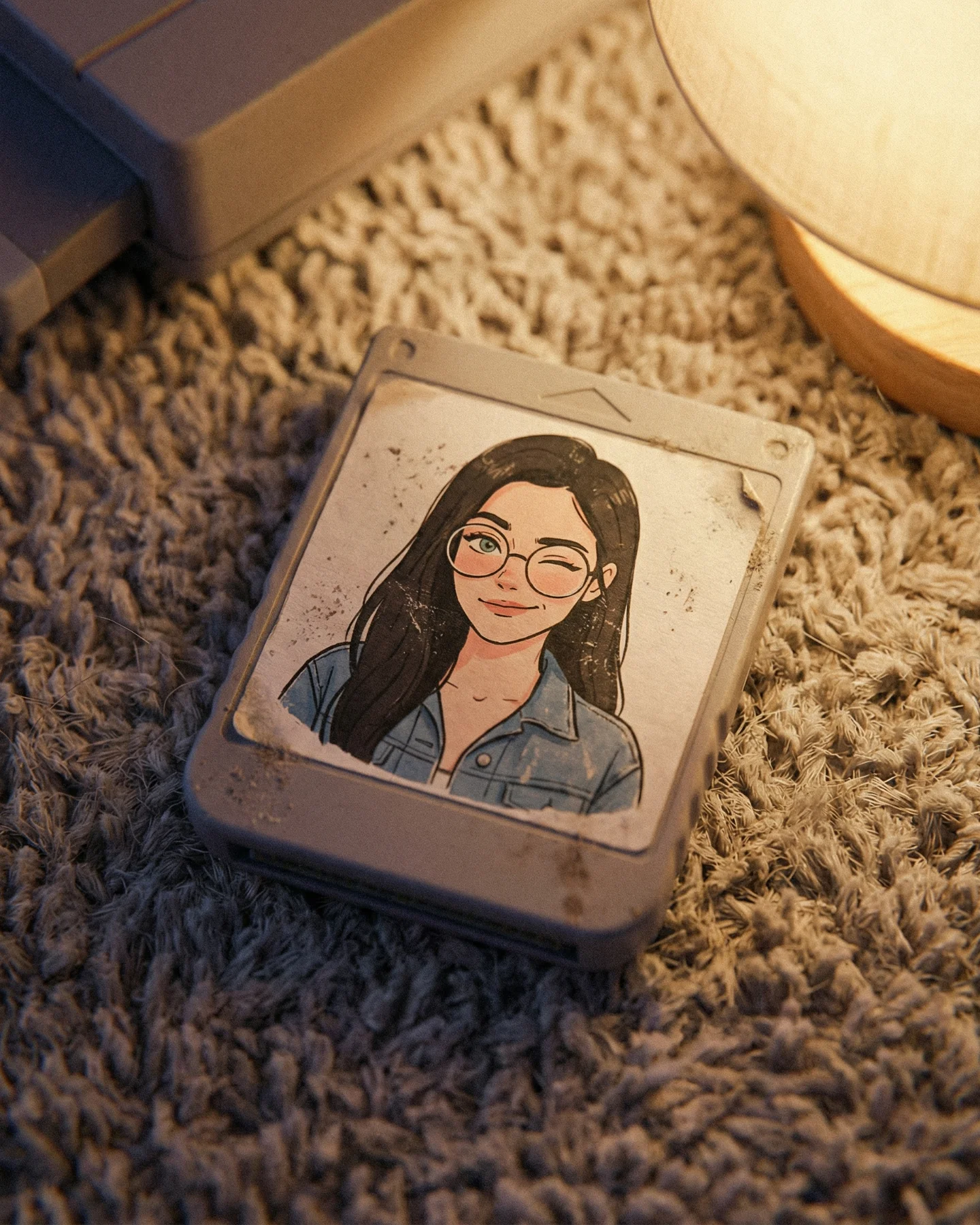
This image works because it does not only reference nostalgia. It stages nostalgia in a tactile way. The hands, the warm lamp, the translucent shell, and the tiny glowing screen all tell the viewer this is not just retro as an abstract style. It is retro as an object you can almost feel.
That difference matters for creators. A lot of “retro” content online stops at filters, fonts, or color grading. This frame goes deeper by making the physical ritual part of the image. Holding the console becomes as important as the art on the screen, and that is what makes the post feel emotionally anchored instead of purely aesthetic.
The viral hook is recognition plus tenderness. People who grew up with old handhelds recognize the console shape immediately, while people who did not still understand the intimacy of the scene. The image is easy to decode, but it carries emotional residue because the device is not photographed like a museum object. It is being used.
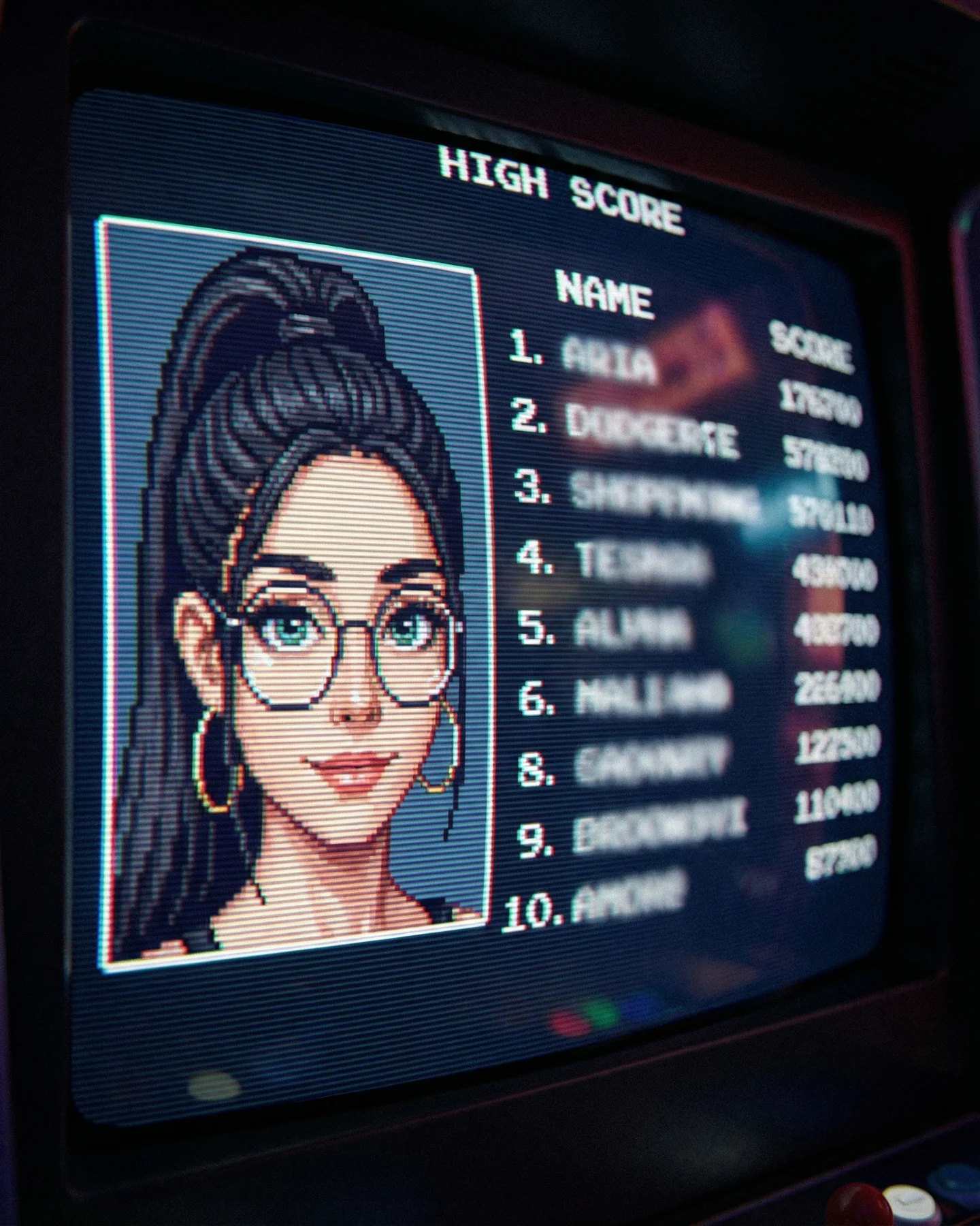
The second strength is the mix of two time layers. The real-world photo is warm, soft, and present. The screen image is pixelated, simplified, and memory-coded. That contrast creates a pleasant friction. Viewers are looking at a modern image of an older media experience, which is exactly the kind of layered nostalgia that performs well in retro-themed creator content.
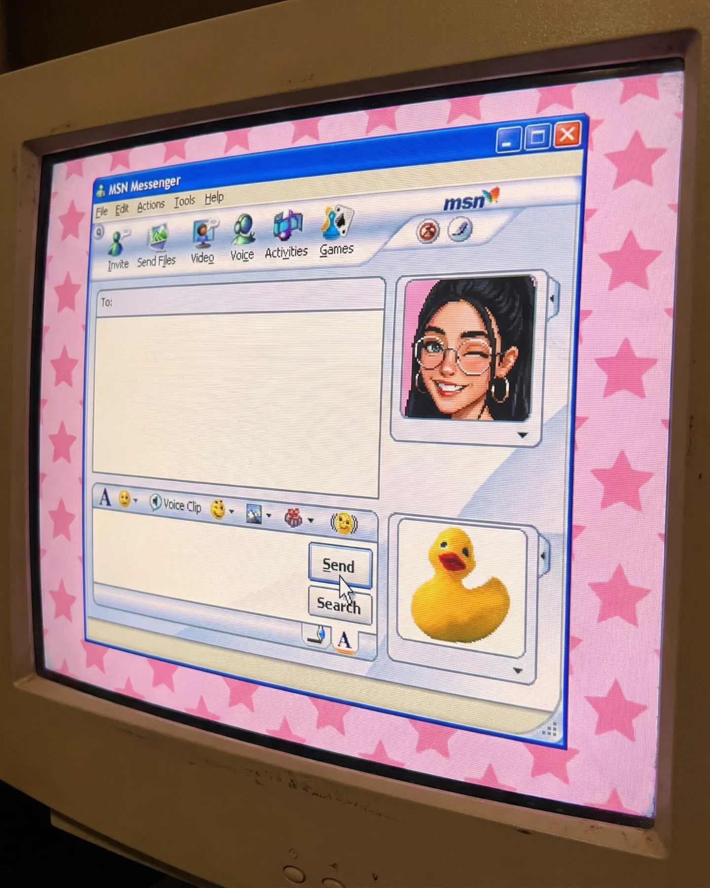
| Signal | Evidence (from this image) | Mechanism | Replication Action |
|---|---|---|---|
| Instant retro recognition | The Game Boy Color-style silhouette and text are readable at a glance | Fast recognition lowers scroll friction and triggers memory | Use one unmistakable retro object and keep its shape visible |
| Tactile intimacy | Both hands are actively holding and using the console | Touch makes the scene feel personal, not archival | Show the object in use rather than isolated on a flat background |
| Warm memory coding | The lamp light is soft and amber rather than cool and technical | Warm practical light pushes the image toward comfort and recollection | Favor lamp light or other household warmth over RGB or studio gloss |
| Character bridge | The screen portrait mirrors the creator’s visual identity in pixel form | Retro style becomes personal rather than generic | Translate one recognizable personal feature into pixel art |
This style is ideal for retro-memory posts, creator identity remixes, and AI image pages built around “what if I existed in another era of media.” It works because the object is doing narrative labor. The console is not just decoration. It is the portal that frames the creator’s self-image in a different language.
The image is strong because it balances object clarity with emotional softness. The console is centered and readable, but the scene never feels like a sterile product shot. The warm light and the hands soften the technology. That is exactly why the nostalgia lands. The device is remembered as a companion, not as an artifact.
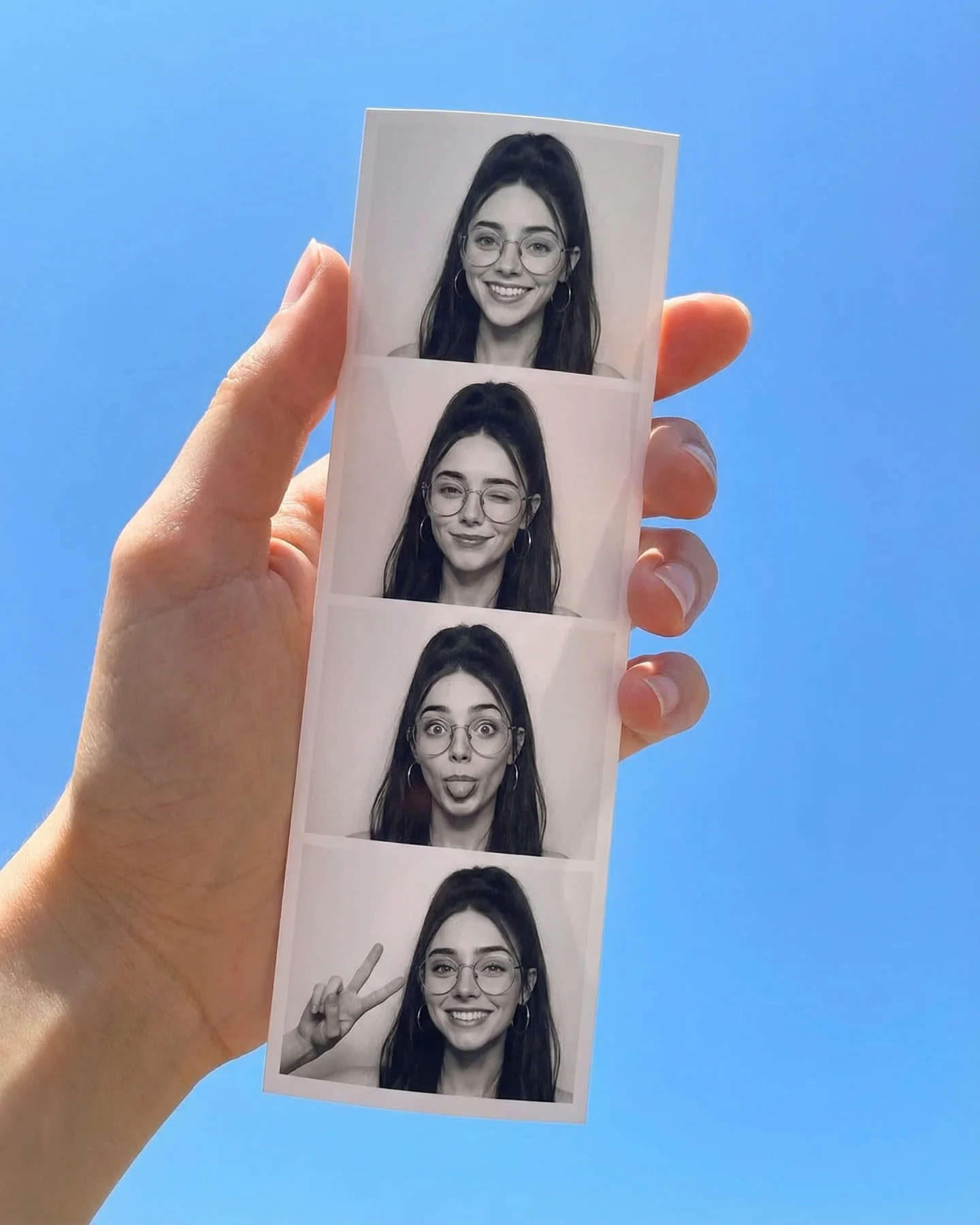
The screen treatment is also smart. It does not show a random game scene. It shows a pixel portrait that feels tied to the creator’s own visual identity. That choice turns the post from a broad retro mood board into a creator-specific memory fantasy. For SEO content, that is valuable because it creates more useful language around use case, style transfer, and remix logic.
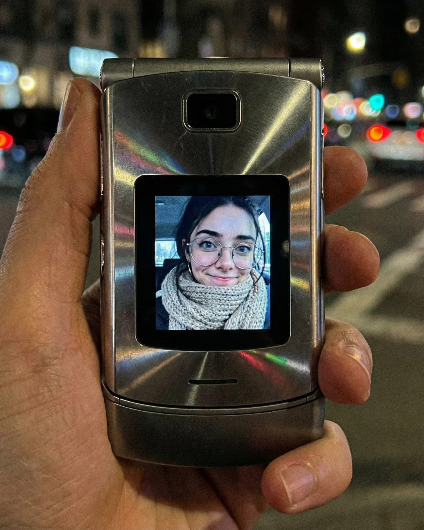
| Observed | Why it matters | How to recreate it |
|---|---|---|
| Transparent purple handheld shell | Signals a very specific retro era and collector memory | Pick one iconic shell color or edition rather than generic gray hardware |
| Warm lamp entering the frame | Creates household intimacy and memory warmth | Use one practical lamp as a visible mood source, not just invisible ambient light |
| Screen portrait plus tiny sprite | Turns retro style into a character concept rather than random nostalgia | Include both a face and a small full-body version when possible |
| Hands actively using the device | Keeps the scene embodied and believable | Show thumbs and grip pressure instead of floating or display-only staging |
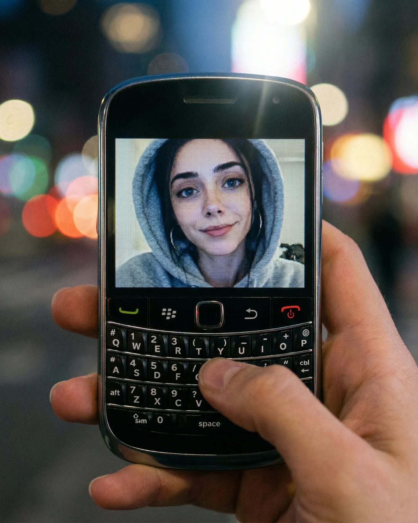
If you prompt this as “retro Game Boy photo,” the result usually becomes either a flat product catalog or a messy neon gamer setup. The image only works when the lamp, the hands, the translucent shell, and the creator-specific pixel portrait are locked together.
| Prompt chunk | What it controls | Swap ideas (EN) |
|---|---|---|
| transparent purple Game Boy Color-style handheld in two hands | Main object identity and tactile framing | clear blue handheld, retro flip phone, portable cassette player |
| pixel-art portrait of a girl with glasses and ponytail on screen | Personalized retro screen content | pixel boy portrait, tiny RPG avatar, monochrome menu portrait |
| warm lamp light, cozy indoor room | Emotional tone and nostalgia coding | bedside nightstand glow, living-room tungsten light, rainy-window evening mood |
| close vertical lifestyle product shot with shallow depth of field | Platform readability and intimacy | wider tabletop scene, tighter macro on buttons, over-the-shoulder play view |
| visible GAME BOY COLOR text and red power LED | Era specificity and authenticity | cartridge label detail, worn shell scratches, stickered battery door |
Lock these three things first: the handheld shape, the warm lamp, and the pixel portrait identity. Those are the anchors. After that, adjust shell color, screen art style, or room mood. If you start by changing too many style details first, the image stops reading as intimate nostalgia and becomes generic “retro aesthetic” content.
The fastest convergence path is practical. First get the handheld and hands right. Then add the lamp and warm wall. Then refine the screen portrait. Finally add small authenticity details like the power light, shell transparency, and button wear. That order keeps the scene emotionally grounded before you polish it.
Iteration 1: handheld close-up in two hands, no extra styling
Iteration 2: keep framing, add warm lamp and cozy wall background
Iteration 3: keep mood, add a personalized pixel portrait and small sprite on screen
Iteration 4: keep all anchors, refine shell transparency, branding text, and red power LED