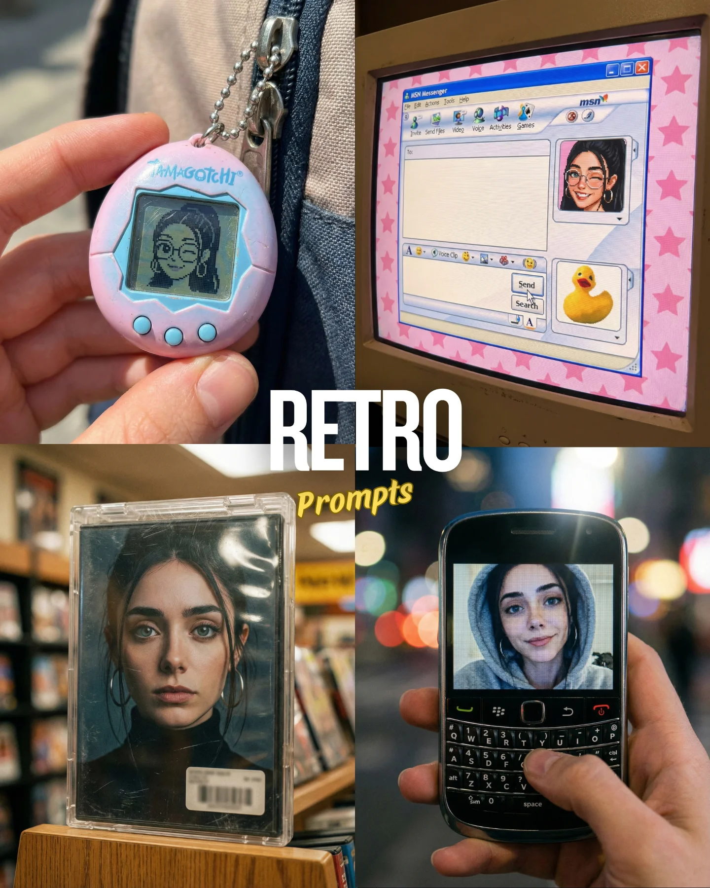


Retro Prompts 🕹️ 💡Idea from: @ai_vitaminc_ Te suena algo de esto?? 👀 Ahora lo llaman "Retro" El tiempo vuela pero los recuerdos se quedan... 🥹 Comenta "ARIA" y te paso los prompts 💌
Retro Prompts 🕹️ 💡Idea from: @ai_vitaminc_ Te suena algo de esto?? 👀 Ahora lo llaman "Retro" El tiempo vuela pero los recuerdos se quedan... 🥹 Comenta "ARIA" y te paso los prompts 💌
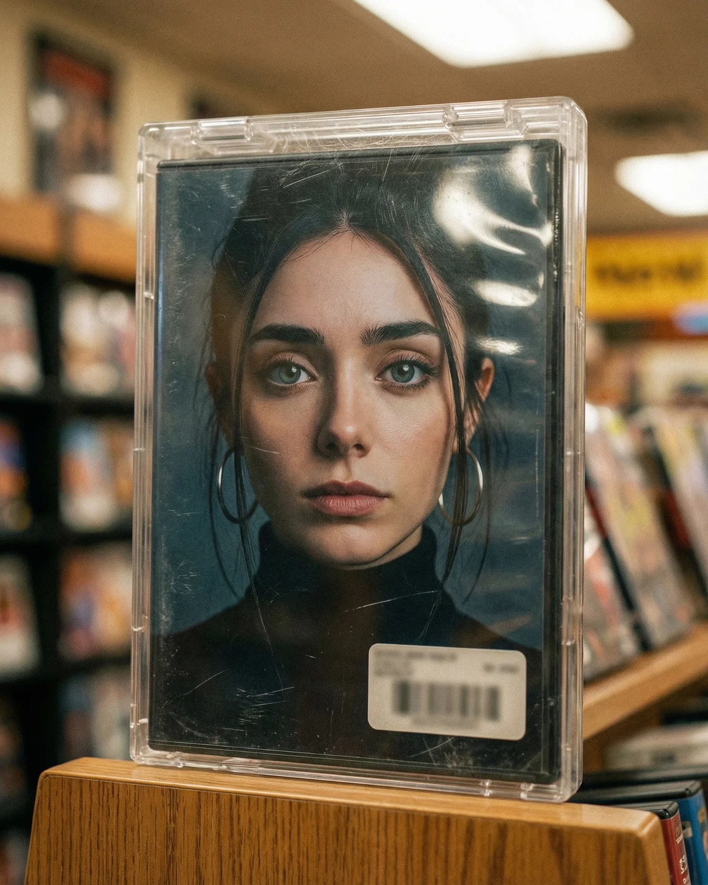
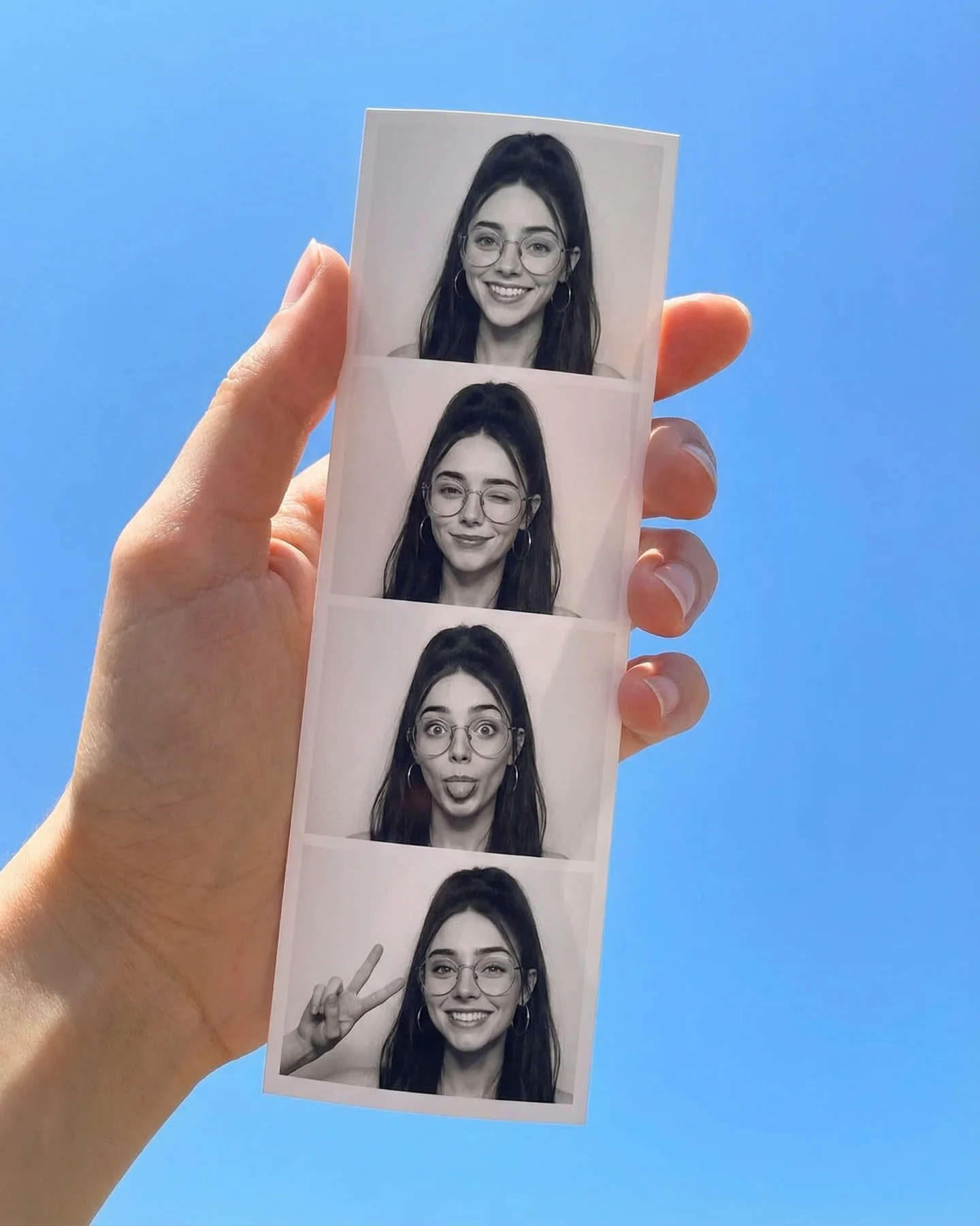
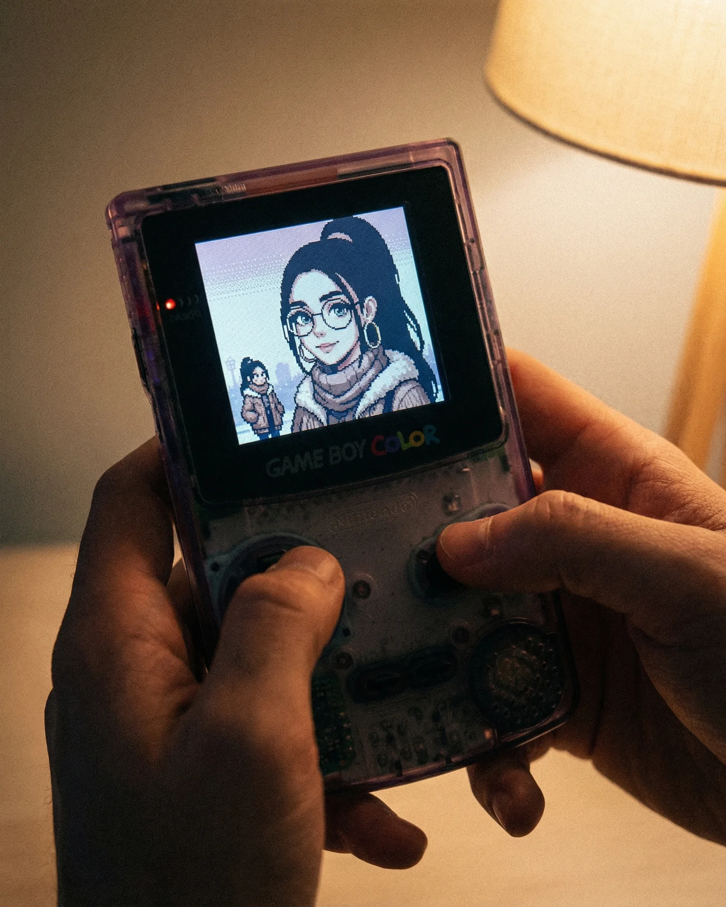
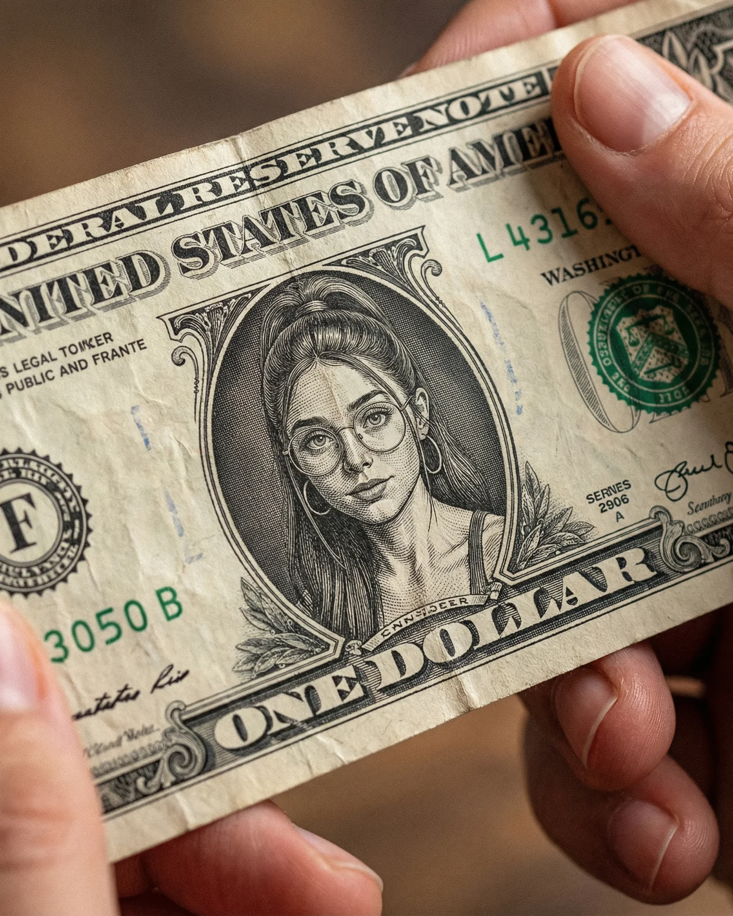
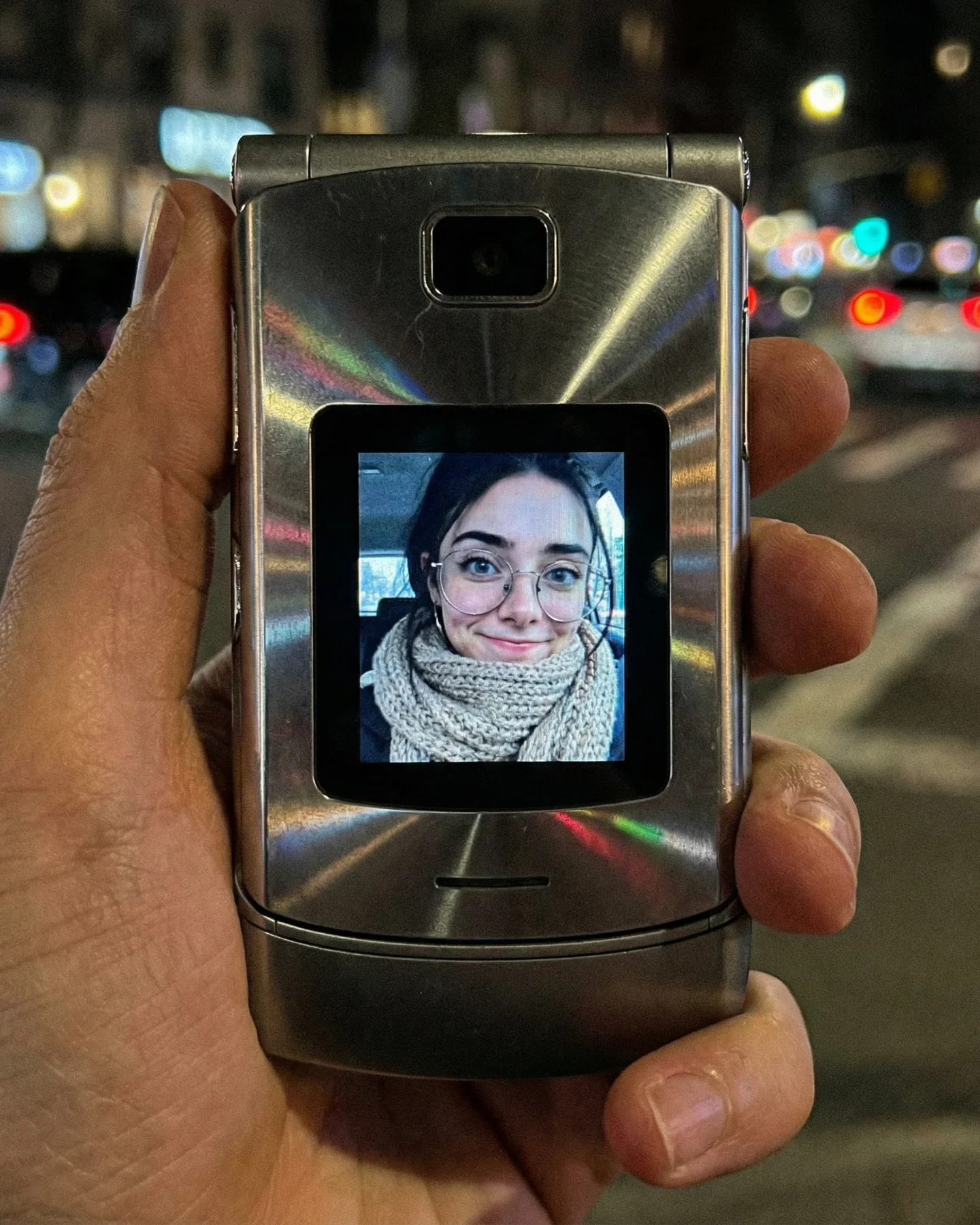
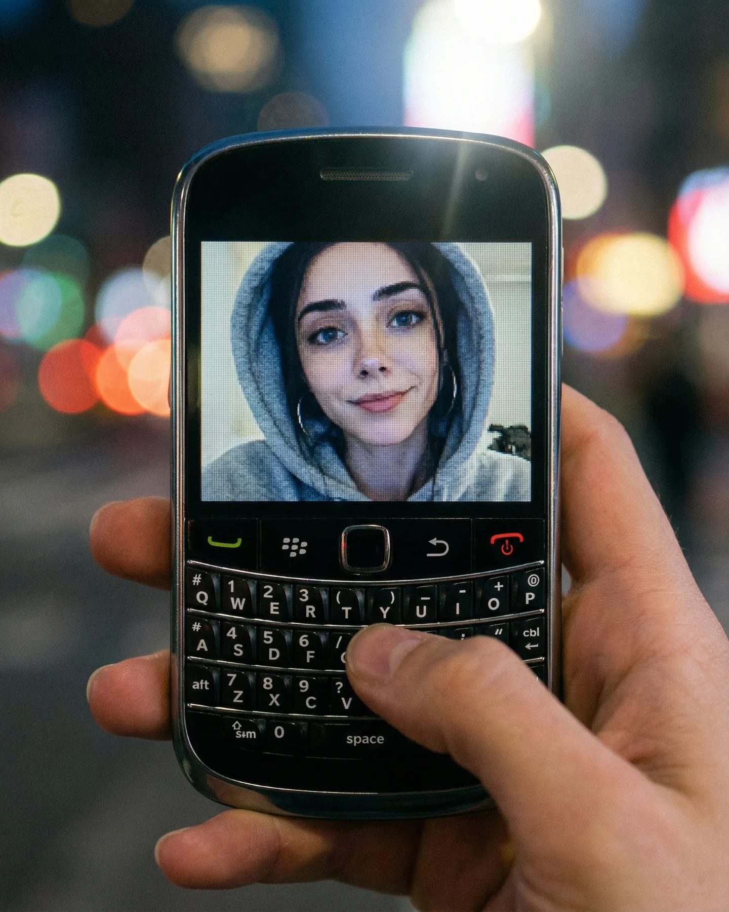
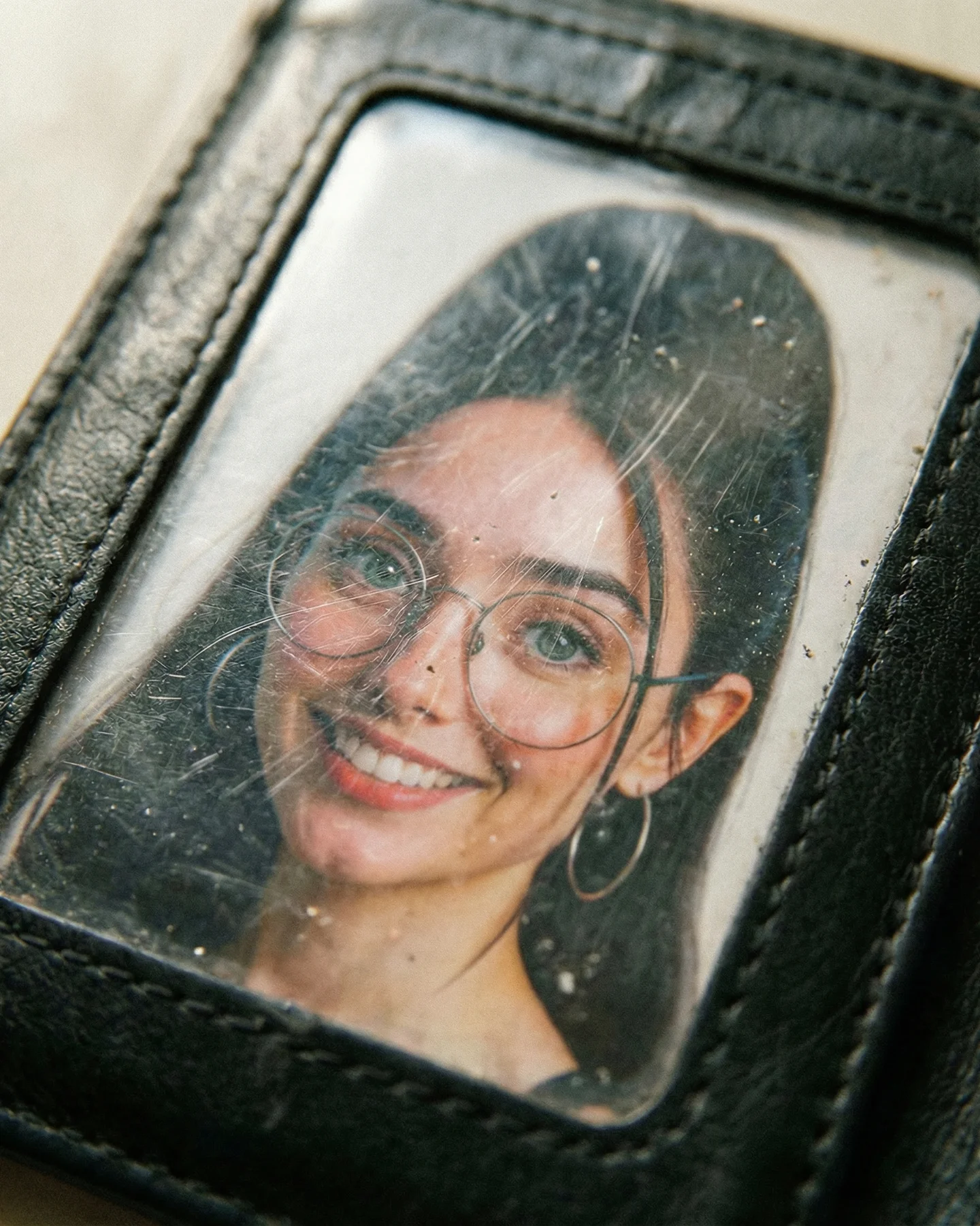
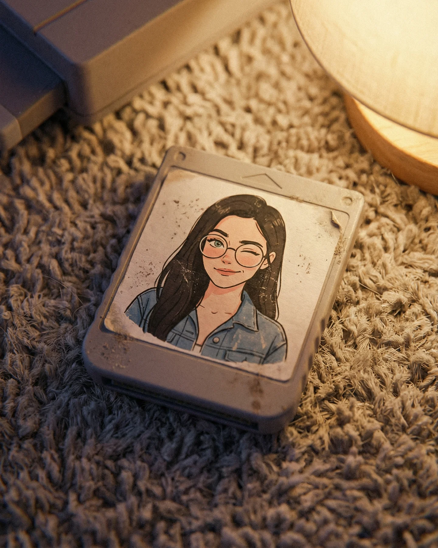
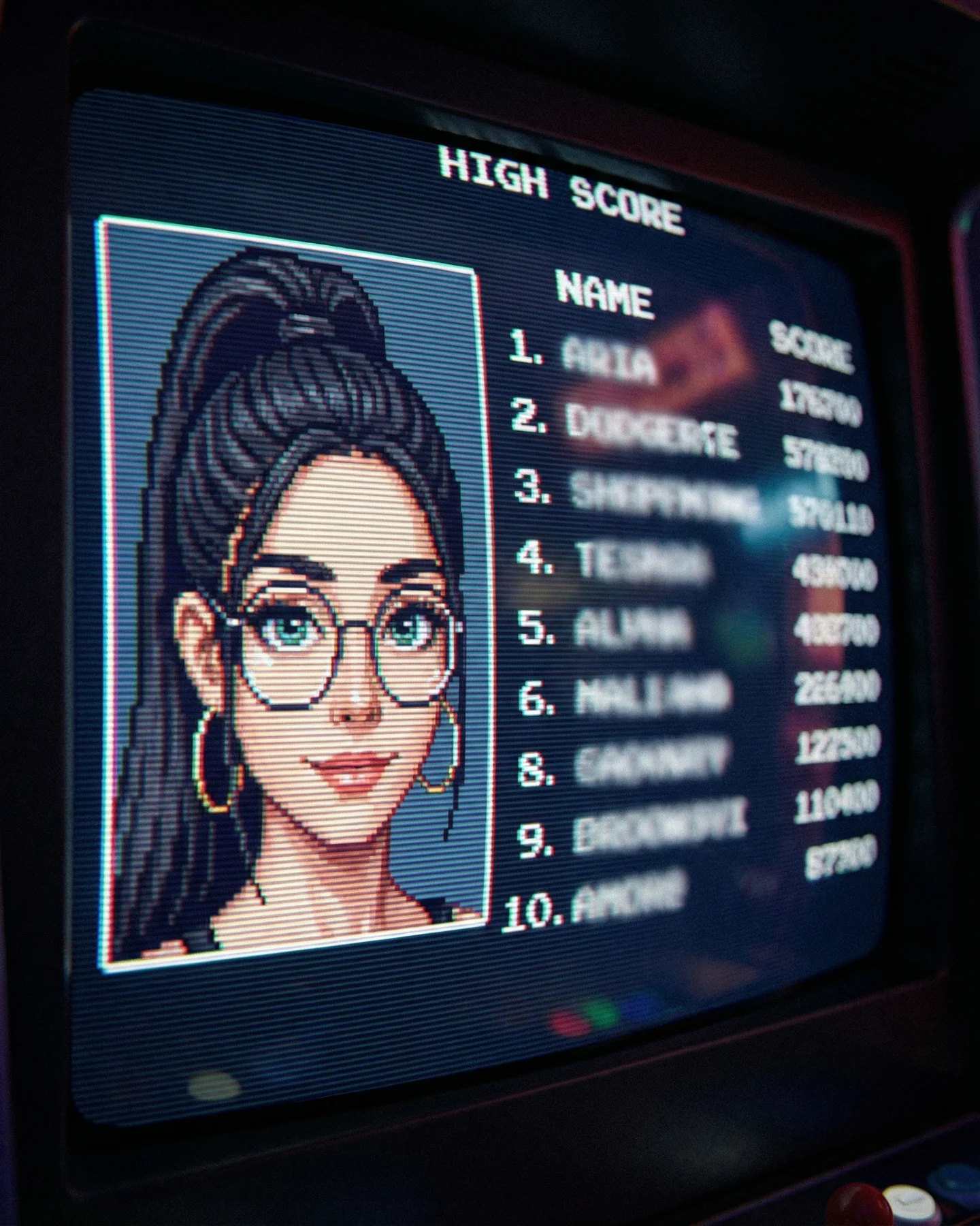
Most retro AI content stops at surface references. It adds grain, a faded color grade, maybe an old TV, and expects the audience to feel something. This image goes deeper because it anchors nostalgia inside a very specific object: a transparent rental-store video case with a portrait cover sealed behind scratched plastic. That makes the memory feel tactile, not decorative.
The post context explains why it likely performed so well. The creator frames the series as “Retro Prompts,” and the caption directly invites viewers to recognize something from their own past. This is an important distinction. The image is not only aesthetically retro. It is emotionally structured around recall. That combination of object precision and audience memory is exactly what tends to drive comments.
The first strength is object specificity. A generic retro portrait might earn a quick like, but a portrait packaged inside a scratched VHS-style case inside a rental-store aisle gives the viewer more to process. It creates a little delay, and that delay is useful. People stop because they are decoding both the object and the feeling attached to it.
The second strength is the serious portrait inside the packaging. The face is quiet and direct, which creates emotional contrast against the commercial wrapper around it. Instead of a loud parody, the image feels intimate and a bit melancholy. That tone is much more powerful than kitschy nostalgia when the goal is deeper engagement.
The third reason is environment credibility. The blurred store shelves, fluorescent ceiling panels, and wooden shelf edge all help the concept feel found rather than fabricated. That is important for retro content. The audience has to believe the scene before they reward the memory it is trying to trigger.
| Signal | Evidence (from this image) | Mechanism | Replication Action |
|---|---|---|---|
| Tactile nostalgia | Scratched plastic case, barcode sticker, and shelf placement make the object feel handled and real | Physical specificity triggers memory more effectively than abstract retro styling | Prompt the wear, labels, and packaging details, not just the era |
| Quiet emotional tone | The portrait expression is serious and still rather than playful | Melancholy increases dwell time and comment quality in memory-driven posts | Use restrained facial expression when the concept depends on nostalgia rather than humor |
| Believable environment | Blurred rental shelves and overhead store lights support the analog premise | Contextual realism makes the image feel remembered instead of staged | Include 2 to 4 store cues around the hero object and keep them softly out of focus |
| Comment-ready caption fit | The caption asks viewers if the scene feels familiar and offers prompts by DM | Recognition plus incentive turns memory into interaction | Pair nostalgia visuals with a direct recall question or prompt giveaway CTA |
This approach works best for nostalgia-themed prompt packs, analog-media moodboards, creator storytelling posts, and social content aimed at memory-based engagement. It is especially effective when the image is meant to feel like an artifact rather than a character render.
This style is less ideal for fast entertainment memes, product-detail ads, or bright commercial campaigns. Its strength is quiet recall. If you make it too loud, it loses the thing that makes it feel emotionally trustworthy.
Three transfer recipes are especially useful. Keep the artifact logic, the worn plastic or paper surface, and the blurred analog environment. Change the container. A cassette version can use a cracked jewel case with handwritten track notes. A yearbook version can move the portrait into a glossy school annual page with pen signatures. A magazine version can place the face behind a worn glossy cover in a convenience-store rack. Slot template: {portrait subject} printed inside {retro container} with {wear details} in {analog retail or memory setting}.
The strongest aesthetic decision is using the case itself as the frame. The portrait is not floating in nostalgia. It is trapped behind it. That creates emotional distance and makes the image feel more reflective than decorative.
Another smart choice is the balance between blur and detail. The shop environment is soft enough to stay secondary, but specific enough that the viewer reads shelves, lighting, and retail architecture. That is exactly the level of environmental information retro object photography needs.
The scratches on the plastic are also critical. Without them, the image would feel like a mockup. With them, it feels touched, borrowed, returned, and remembered. That is doing a huge amount of narrative work with very little visual space.
| Observed | Why it matters | How to recreate it |
|---|---|---|
| Portrait sealed behind worn clear plastic | Creates an artifact feeling rather than a standard framed image | Use visible shell edges, glare, and fine surface scratches |
| Barcode sticker in the lower corner | Adds commercial realism and reinforces rental-store memory | Include one small label or price marker in a believable position |
| Warm wooden shelf foreground | Anchors the object in a physical retail space | Place the container on one simple shelf edge rather than floating it in empty space |
| Fluorescent ceiling shapes above | Subtly defines the store environment without distraction | Use soft overhead light panels as blurred geometric cues |
| Muted serious portrait inside the packaging | Prevents the image from becoming a parody | Keep facial styling restrained and color grading slightly subdued |
To recreate this well, separate the prompt into artifact container, printed portrait, environment, surface wear, and lighting blocks. Retro images often fail because creators only describe era mood and forget the object mechanics that actually sell the time period.
| Prompt chunk | What it controls | Swap ideas (EN, 2-3 options) |
|---|---|---|
| Container block | Defines the core memory object | VHS case, cassette jewel box, plastic clamshell rental box |
| Portrait block | Controls the emotional tone inside the object | serious studio portrait, soft school photo, moody headshot |
| Wear details | Makes the object feel used rather than fabricated | scratches, sticker residue, smudges, shelf dust |
| Retail environment | Builds believable nostalgia around the object | video rental aisle, thrift shelf, record-store wall |
| Lighting family | Sets whether the scene feels authentic or staged | fluorescent overhead, warm store ambient, faded daylight spill |
| Label system | Adds low-key realism without clutter | barcode sticker, rental code, hand-written shelf tag |
Baseline lock first: keep the clear plastic case, keep the rental-store shelf environment, and keep the subdued portrait tone. Those three variables create almost all of the image's value. After that, change only one or two controls per run.
The key lesson is that strong nostalgia content does not just imitate the past. It recreates the objects that carried the past. This image understands that, and that is why it feels more emotionally credible than a generic retro filter ever could.