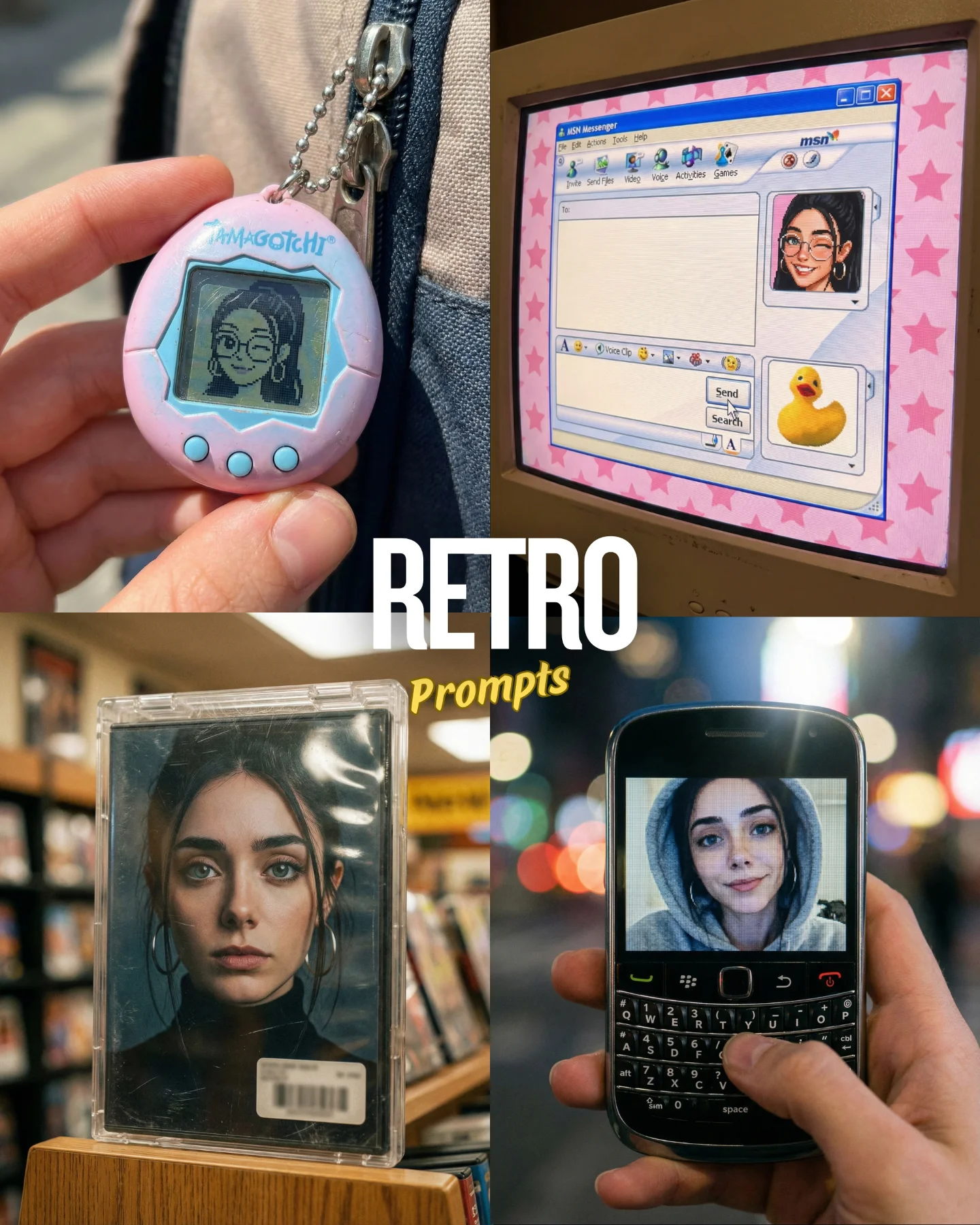
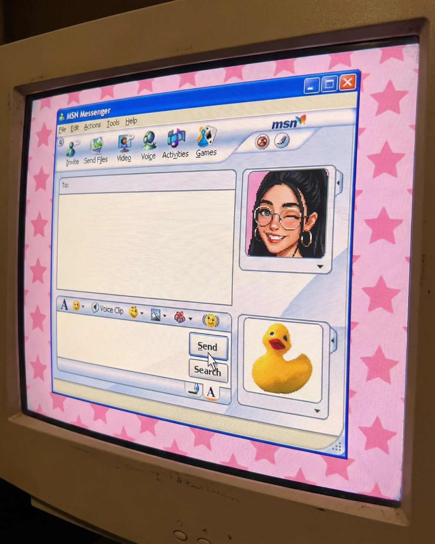
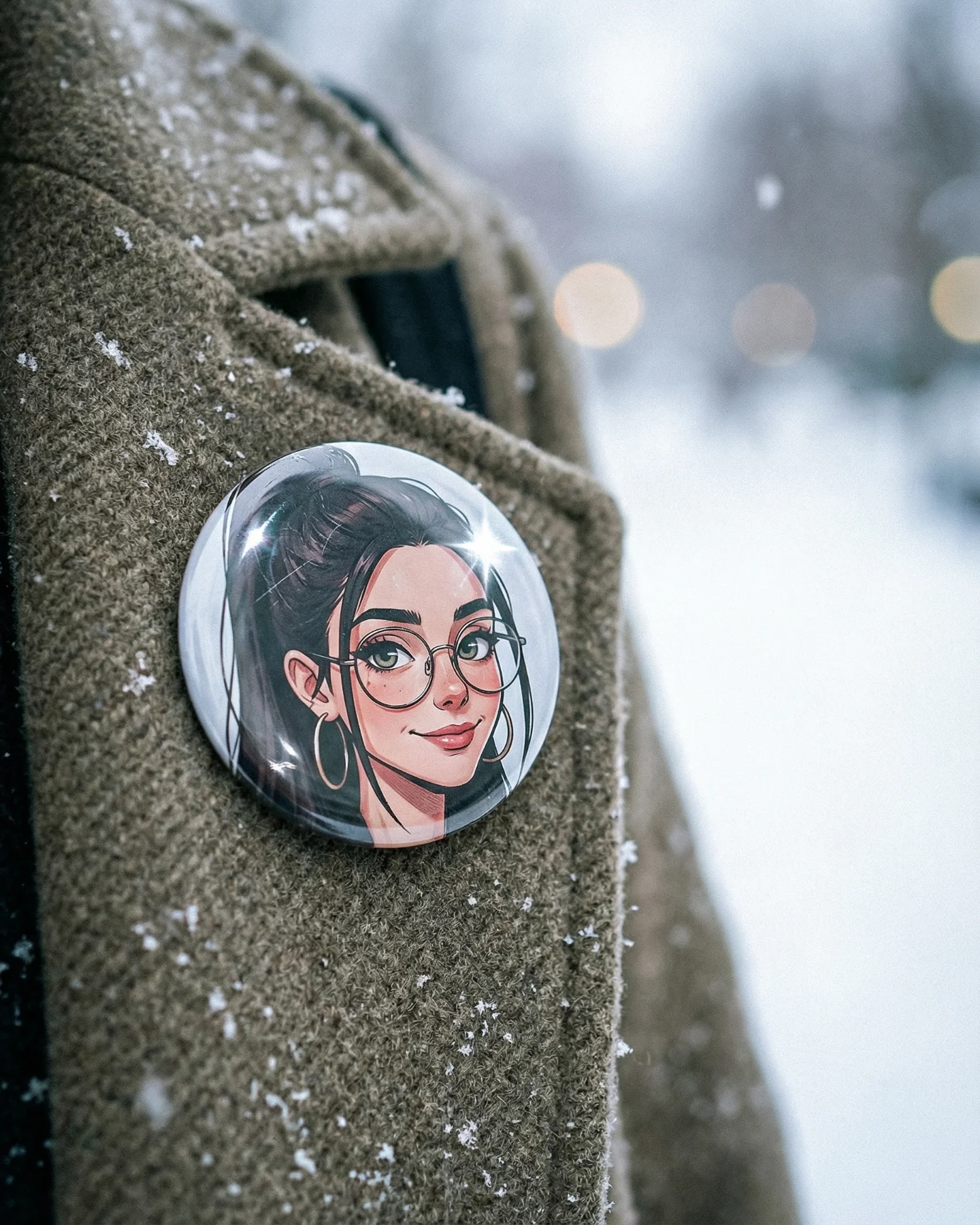
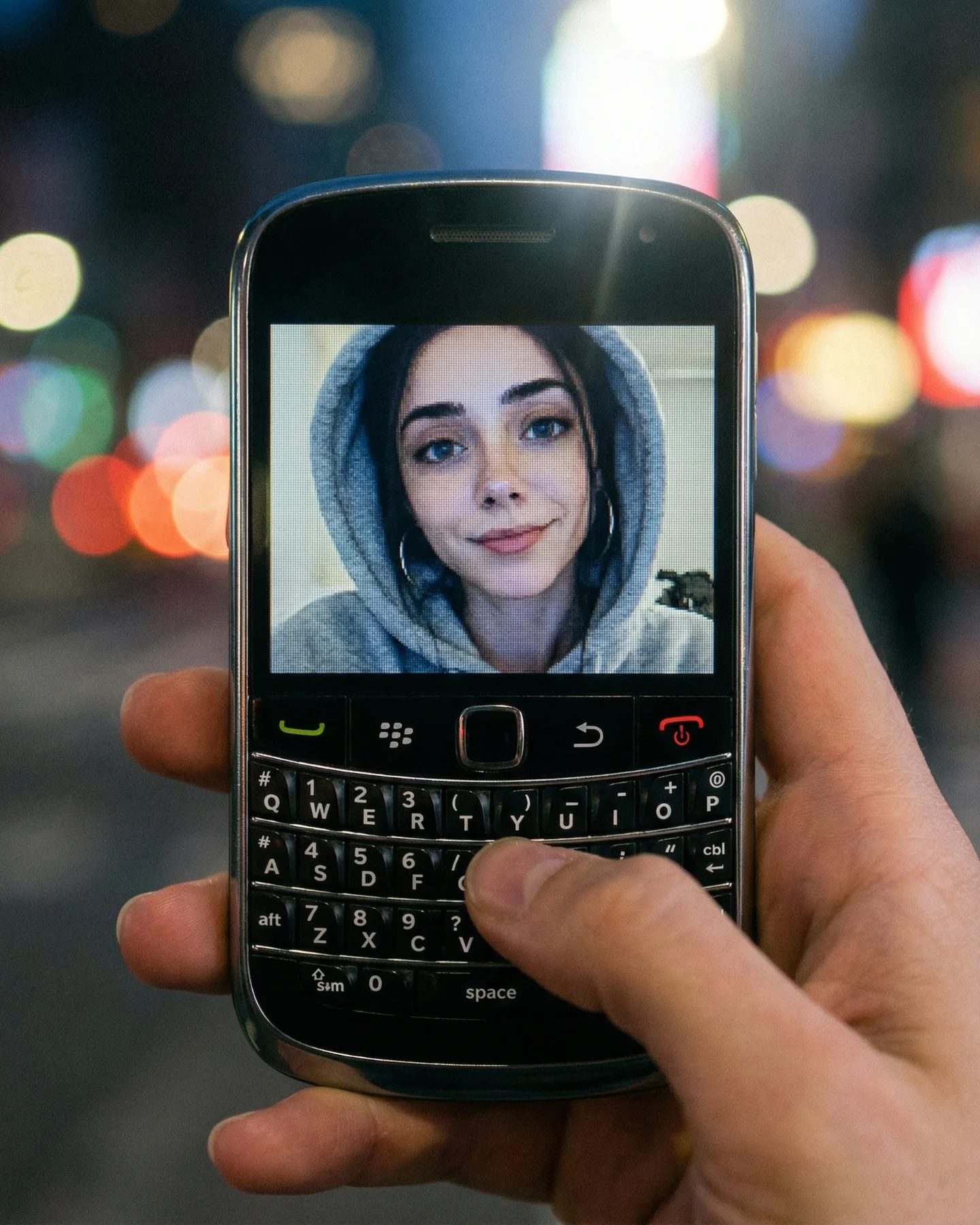
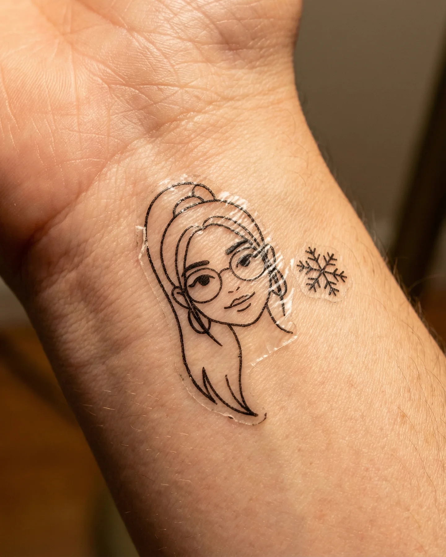

Retro Prompts 🕹️ 💡Idea from: @ai_vitaminc_ Te suena algo de esto?? 👀 Ahora lo llaman "Retro" El tiempo vuela pero los recuerdos se quedan... 🥹 Comenta "ARIA" y te paso los prompts 💌
Retro Prompts 🕹️ 💡Idea from: @ai_vitaminc_ Te suena algo de esto?? 👀 Ahora lo llaman "Retro" El tiempo vuela pero los recuerdos se quedan... 🥹 Comenta "ARIA" y te paso los prompts 💌
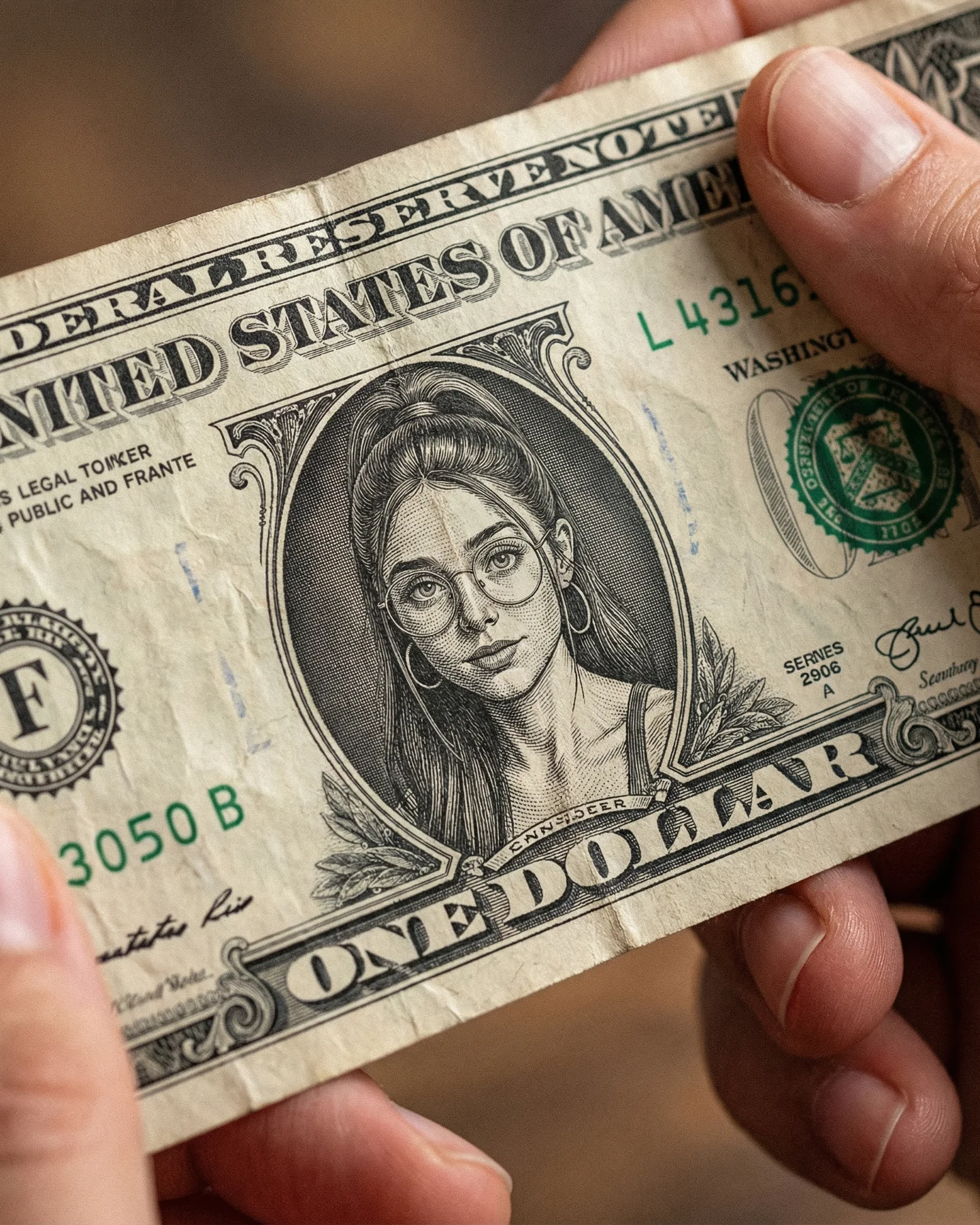
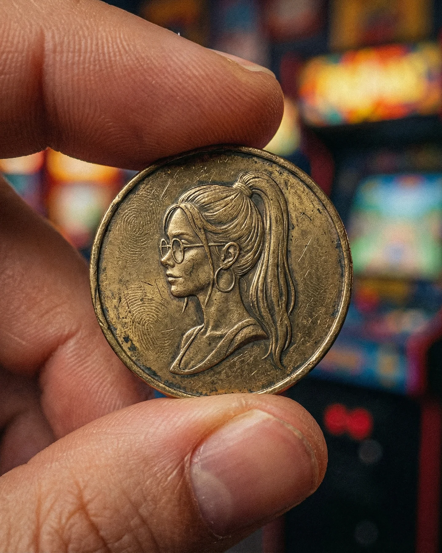
This image works because it hijacks one of the most familiar visual objects in the world and makes a tiny but emotionally charged swap. The dollar bill is instantly recognizable, so the viewer does not need time to decode the format. The surprise comes from the portrait. Instead of the expected historical face, there is a modern girl with glasses, hoop earrings, and a ponytail rendered in engraved money style. That tension between the familiar and the altered is exactly what makes the image sticky.
The second reason it performs is that the effect feels tactile rather than purely digital. The wrinkles in the paper, the way the fingers hold the note, and the shallow focus all make the edit feel like a photographed object. That is much stronger than a flat Photoshop joke. When retro edits feel physical, they carry more nostalgia and more credibility at the same time.
The best visual trick content does not ask the viewer to solve a complicated puzzle. It lets recognition happen first and surprise happen second. This image follows that sequence perfectly. The eye reads “money” immediately, then notices that the engraved portrait is wrong, then leans in to inspect the details. That tiny inspection loop is powerful for social dwell time.
The macro framing helps too. By cropping tightly around the bill and fingers, the image removes distraction and turns a simple concept into an object study. That makes the swap feel more deliberate. It is not just a meme. It looks like an artifact someone could hold.
| Signal | Evidence (from this image) | Mechanism | Replication Action |
|---|---|---|---|
| Instant familiarity | The object is clearly a U.S. one-dollar bill. | Fast recognition lowers friction and lets surprise land immediately. | Use an everyday iconic object as the base before introducing the visual twist. |
| Micro-surprise | The center portrait is replaced by a modern creator face in engraved style. | Small deviations inside familiar systems are more memorable than total redesigns. | Change one core element while preserving the overall object grammar. |
| Tactile realism | The paper is wrinkled and held naturally by fingers. | Physical cues make the concept feel real rather than composited. | Add handling marks, creases, and believable finger contact to anchor the illusion. |
| Nostalgic craft feel | The portrait matches vintage line-engraving conventions. | Retro rendering gives the image more personality than a modern flat print. | Translate the face into etched currency-style linework instead of clean photo replacement. |
This format is strongest for retro prompt pages, nostalgia-driven edits, identity remixes, and object-transformation content. It also adapts well to stamps, magazine covers, ID cards, postage labels, arcade posters, cassette art, and newspaper clippings. The transferable pattern is simple: start with a culturally stable artifact, then insert a modern identity into its visual language without breaking the object’s structure.
It is less effective for luxury-money flex content, financial branding, or highly abstract art direction. The image does not win because of wealth symbolism alone. It wins because it makes a familiar civic design feel personal and strange.
{familiar printed artifact} with {creator identity} rendered in its original graphic language{hands holding vintage-style object} featuring {custom retro portrait} in a close-up product shot{recognizable object} preserved in structure but personalized through {single high-impact design swap}The image feels satisfying because almost everything stays within one muted visual family: off-white paper, green ink, dark engraved lines, warm skin, and soft brown blur behind. That limited palette keeps the trick from feeling noisy. It gives the viewer space to appreciate the concept instead of fighting through clutter.
The diagonal hold also matters more than it seems. A straight-on flat scan would feel like design work. The slight angle and hand tension make it feel like a discovered object. That shift from “graphic” to “held thing” is what upgrades the image from novelty to shareable visual artifact.
| Observed | Why it matters for recreation |
|---|---|
| Female engraved portrait integrated into the bill center | This is the one-change twist that powers the entire image. |
| Two realistic hands holding the note | The image gains scale, realism, and physical credibility. |
| Visible wrinkles and paper wear | Texture prevents the edit from feeling sterile or digitally flat. |
| Macro crop with shallow background blur | The object becomes intimate and inspection-friendly. |
| Muted retro palette of green ink, cream paper, and warm skin | The image stays cohesive despite the novelty concept. |
To recreate this well, lock the object grammar first. If the note does not feel structurally like a dollar bill, the portrait swap loses force. Start with the bill, borders, text zones, seal area, and paper wear. Then specify that the female face is rendered in engraved banknote style. The realism depends on integration, not on simply drawing a face on money.
| Prompt chunk | What it controls | Swap ideas (EN, 2-3 options) |
|---|---|---|
| worn U.S. one-dollar bill held in two hands | The base object and tactile framing | handled banknote; vintage paper money close-up; real held currency shot |
| female portrait integrated into the central engraved medallion | The main surprise mechanism | custom currency portrait; creator face in banknote line art; engraved identity swap |
| round glasses, high ponytail, hoop earrings in etched style | The specific face identity markers | retro portrait details; creator signature cues; engraved modern face |
| paper wrinkles, slight creases, off-white aged tone | The tactile realism | handled note texture; worn paper authenticity; subtle use marks |
| soft warm macro lighting with shallow depth of field | The photographic mood and focus behavior | close-up product shot; gentle background blur; tactile object lighting |
| no extra props, no stacks, no graphic overlays | Prevents the concept from getting diluted | single-object focus; clean novelty artifact; restrained composition |
Baseline lock the bill layout, portrait integration, and hand placement first. Those three elements make the illusion credible. After that, refine paper wear and then tune the portrait likeness. Leave any typography cleanup until the end, because the broad structure matters more than perfect microtext.
Use the one-change rule strictly. If the portrait still looks pasted on, do not touch the background yet. If the bill stops reading as real currency, fix the object grammar before adjusting likeness. This image wins on integration, not complexity.