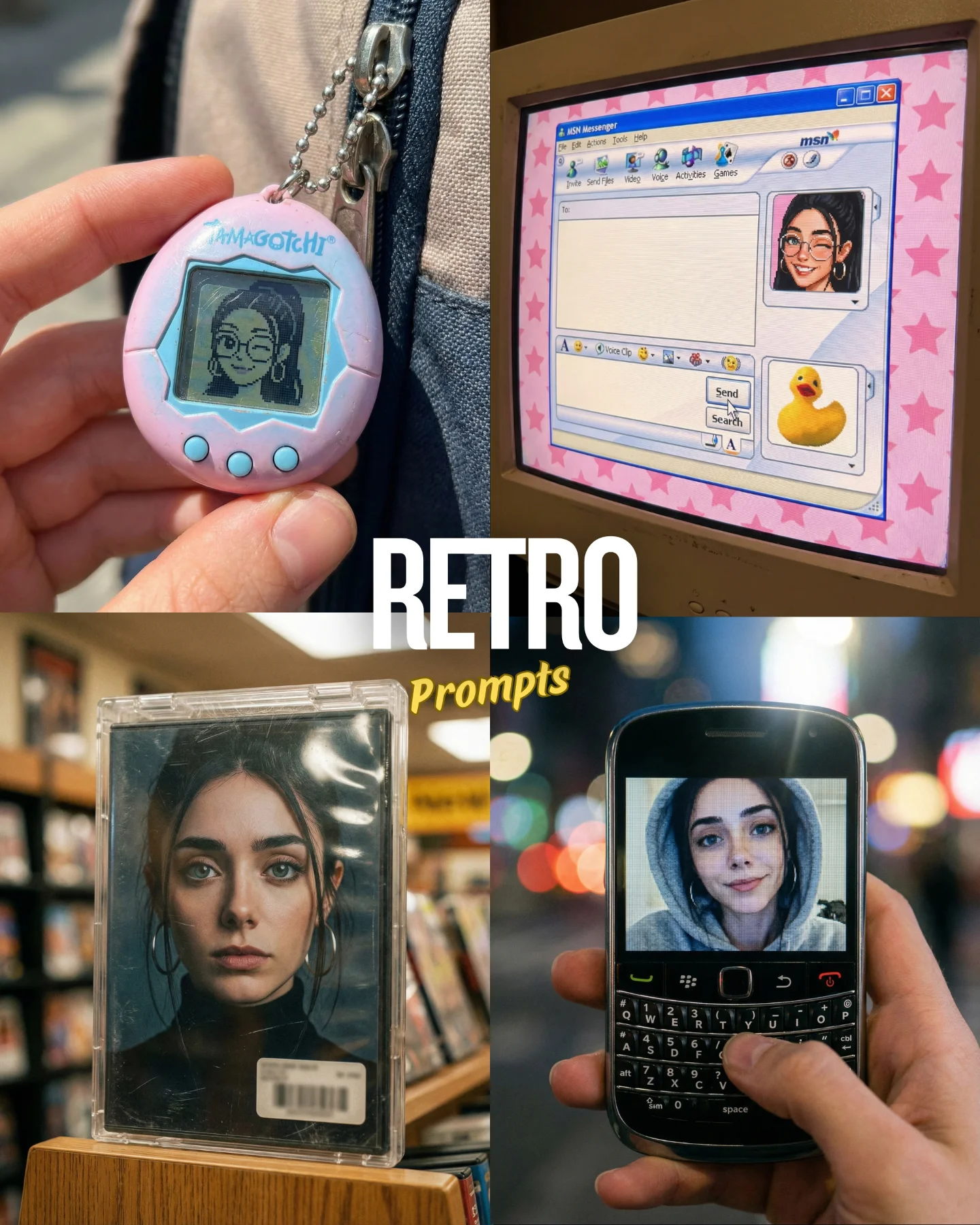
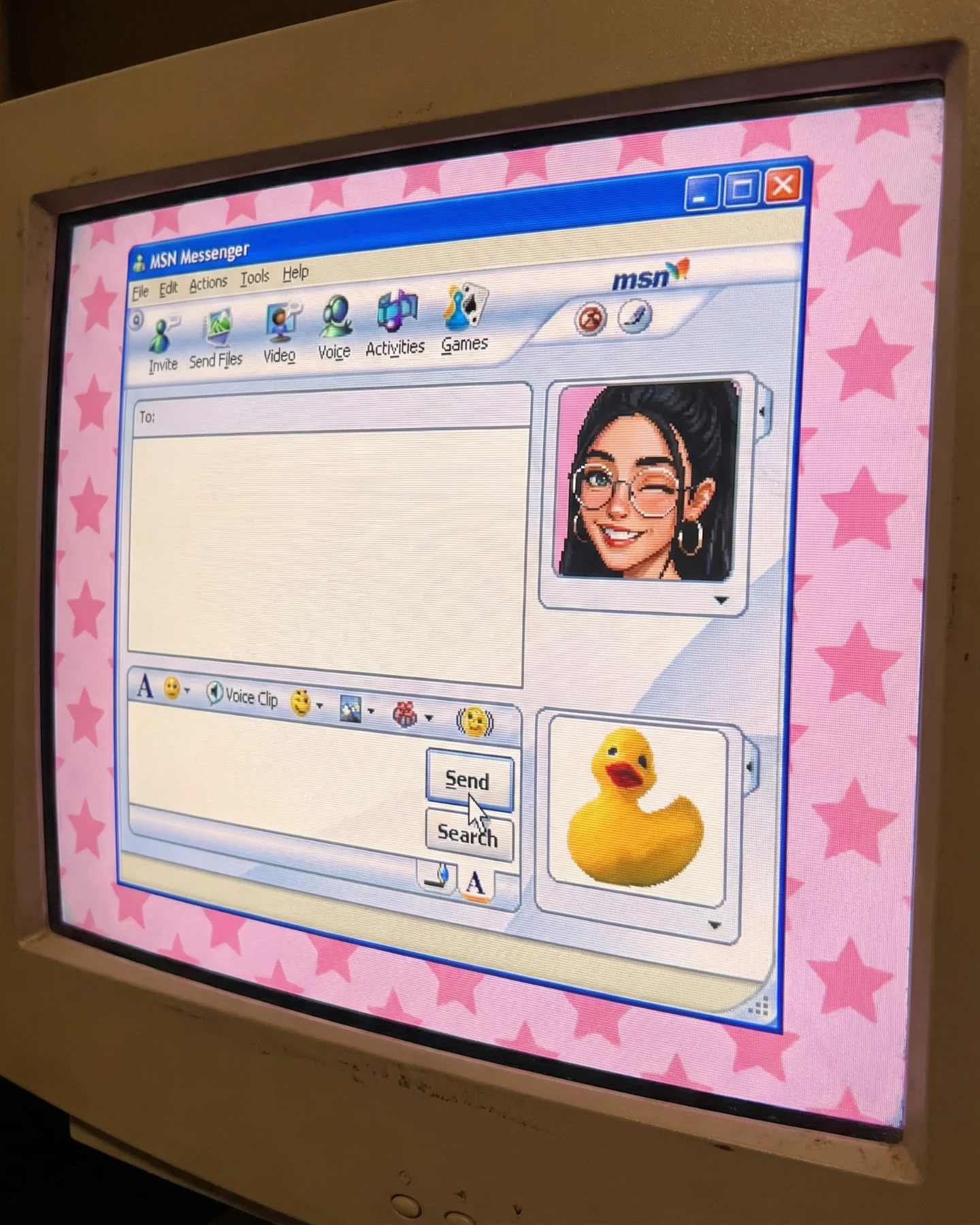
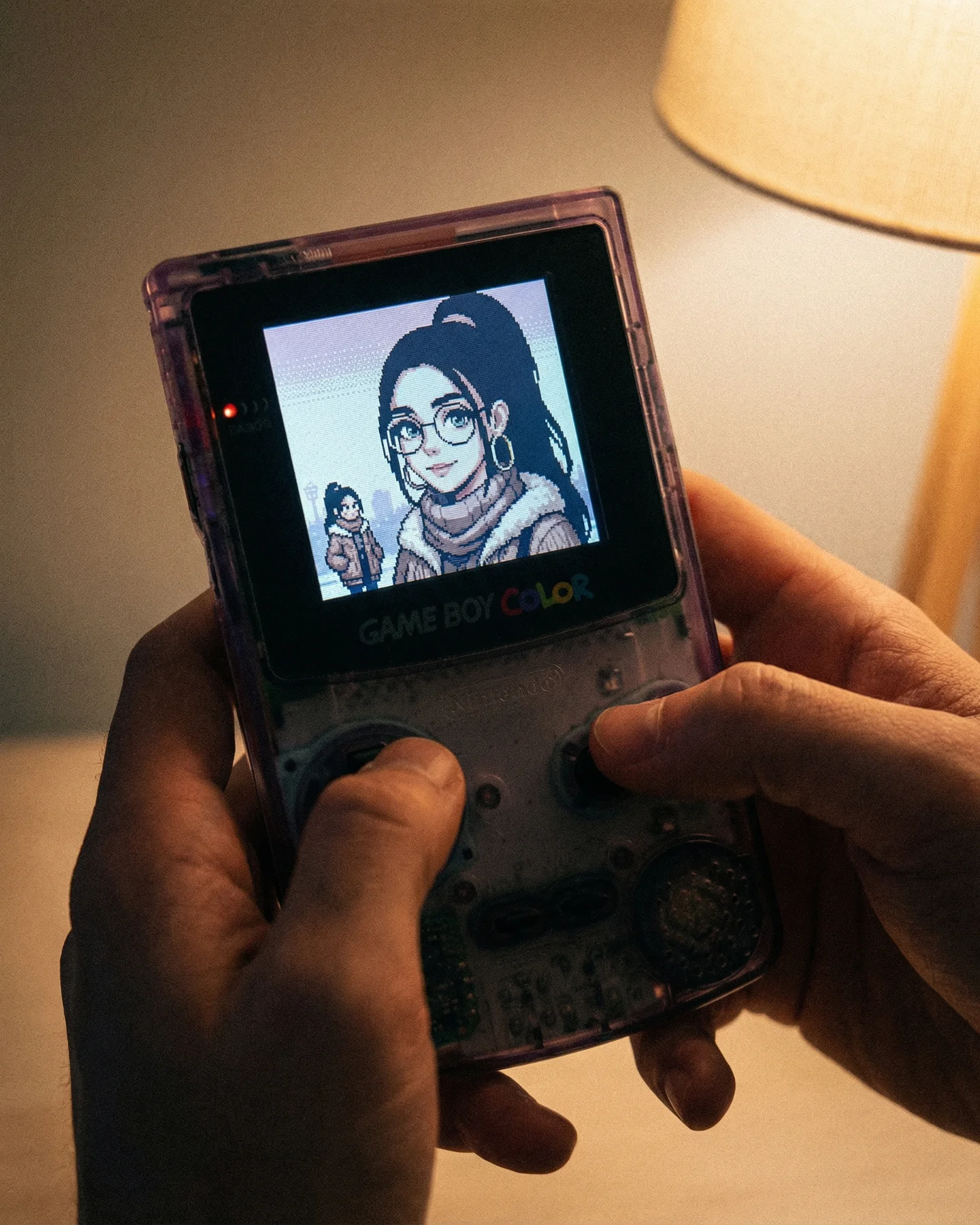
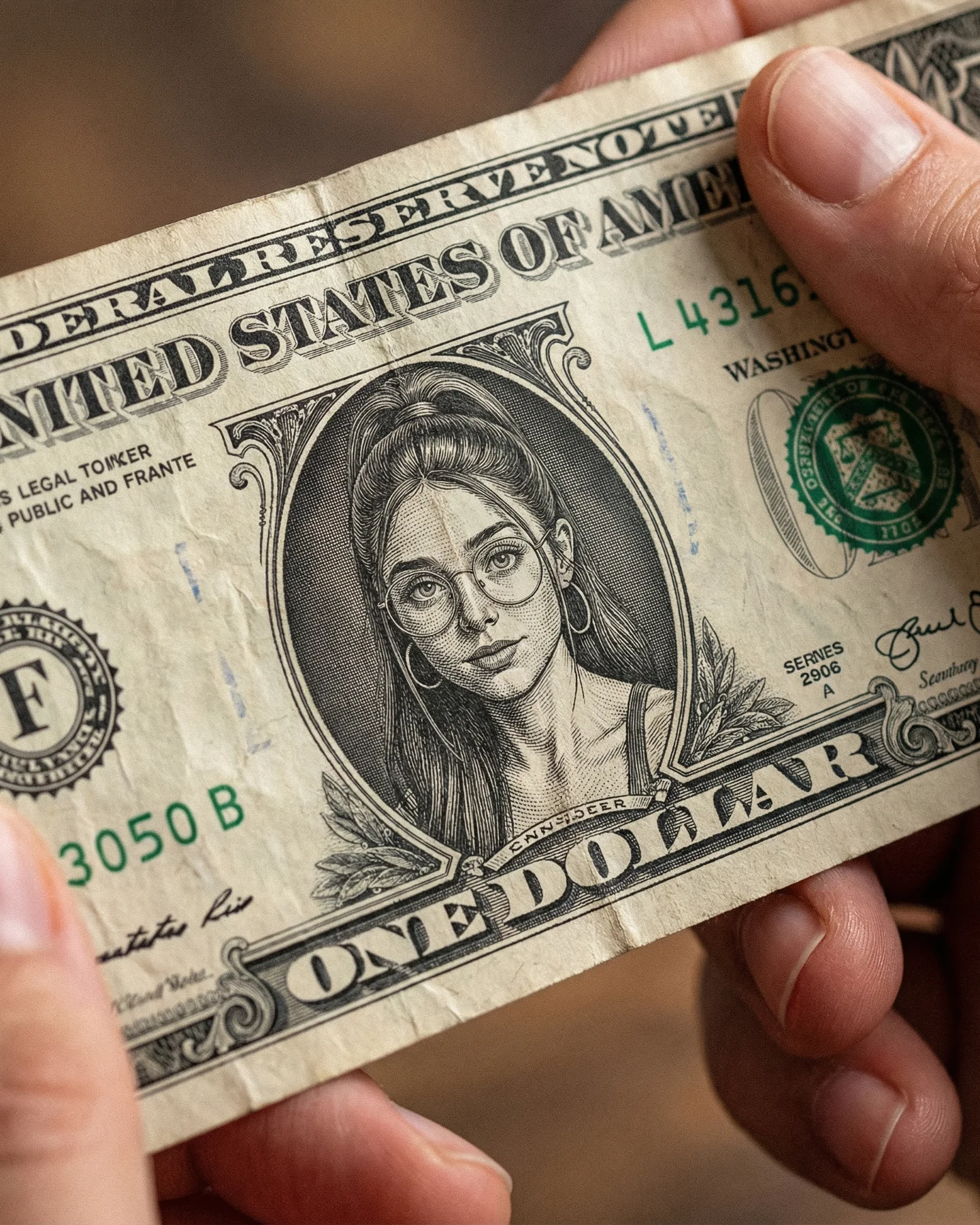
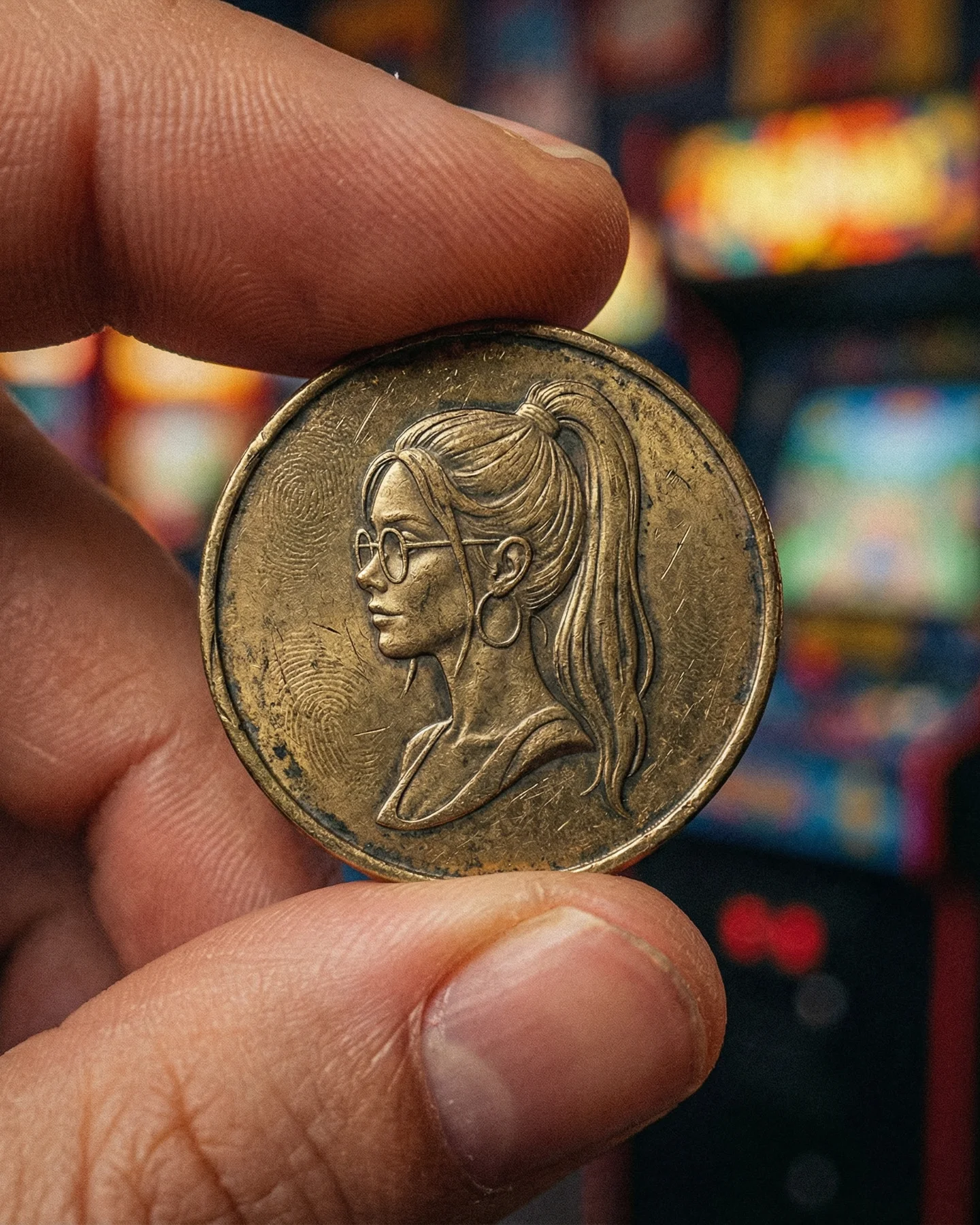
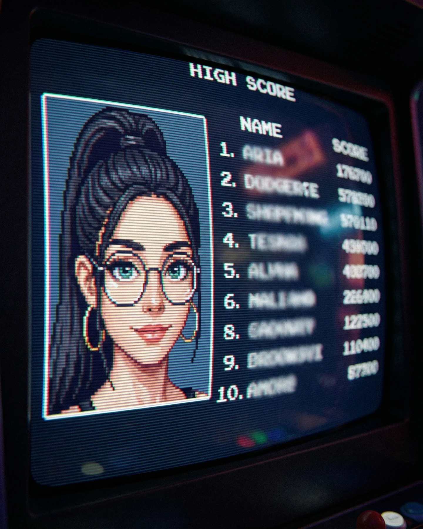
Retro Prompts 🕹️ 💡Idea from: @ai_vitaminc_ Te suena algo de esto?? 👀 Ahora lo llaman "Retro" El tiempo vuela pero los recuerdos se quedan... 🥹 Comenta "ARIA" y te paso los prompts 💌
Retro Prompts 🕹️ 💡Idea from: @ai_vitaminc_ Te suena algo de esto?? 👀 Ahora lo llaman "Retro" El tiempo vuela pero los recuerdos se quedan... 🥹 Comenta "ARIA" y te paso los prompts 💌
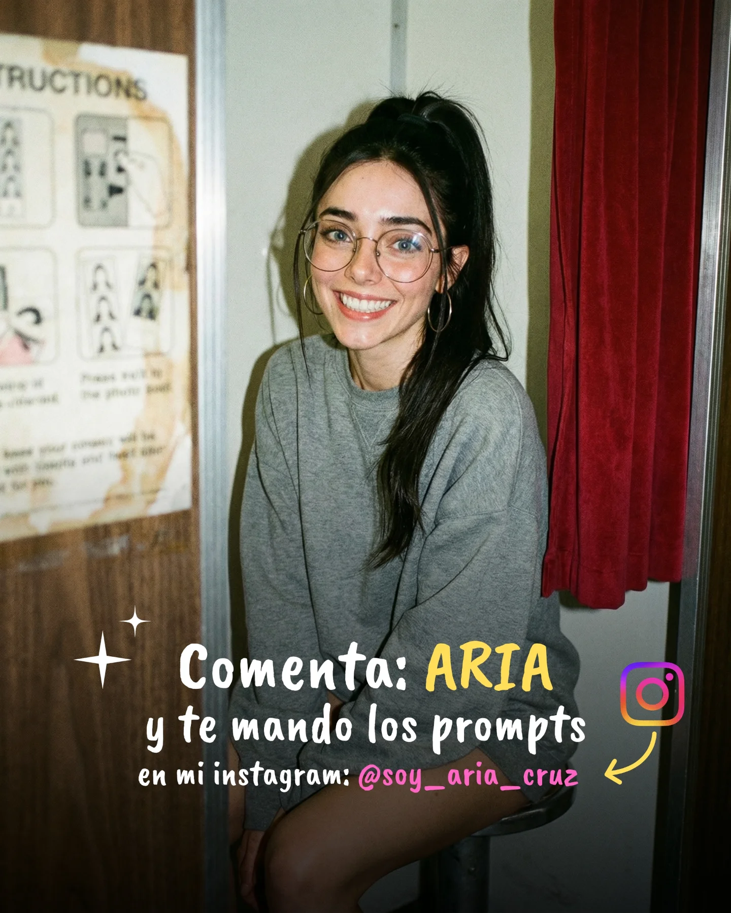
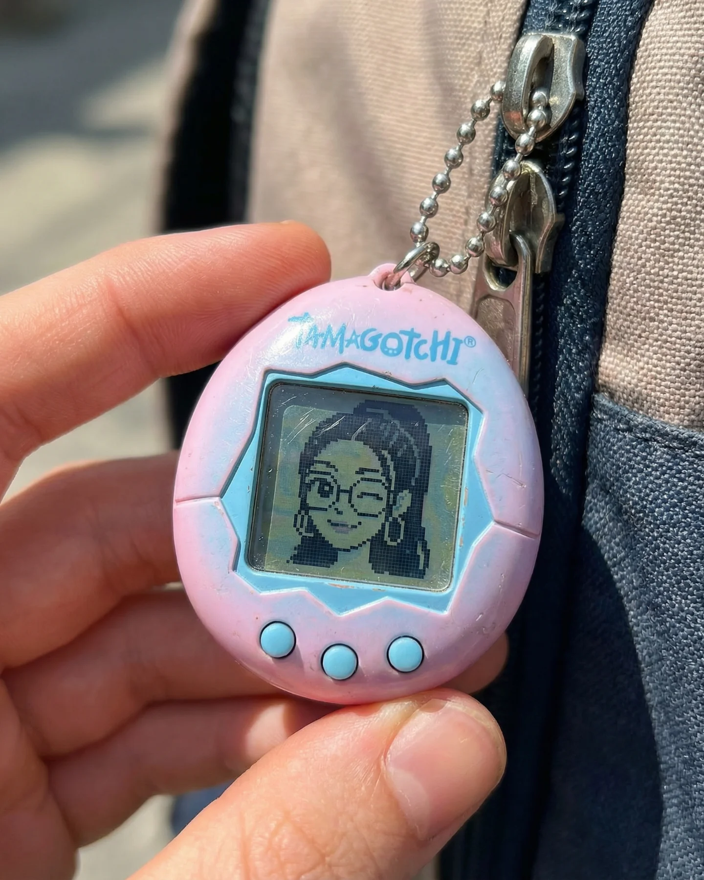
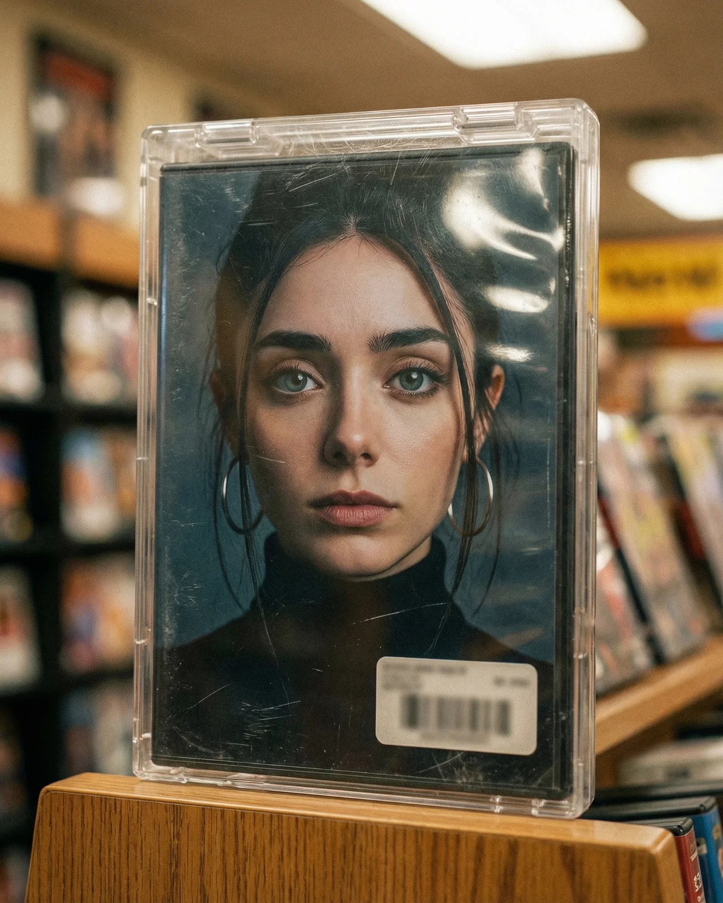
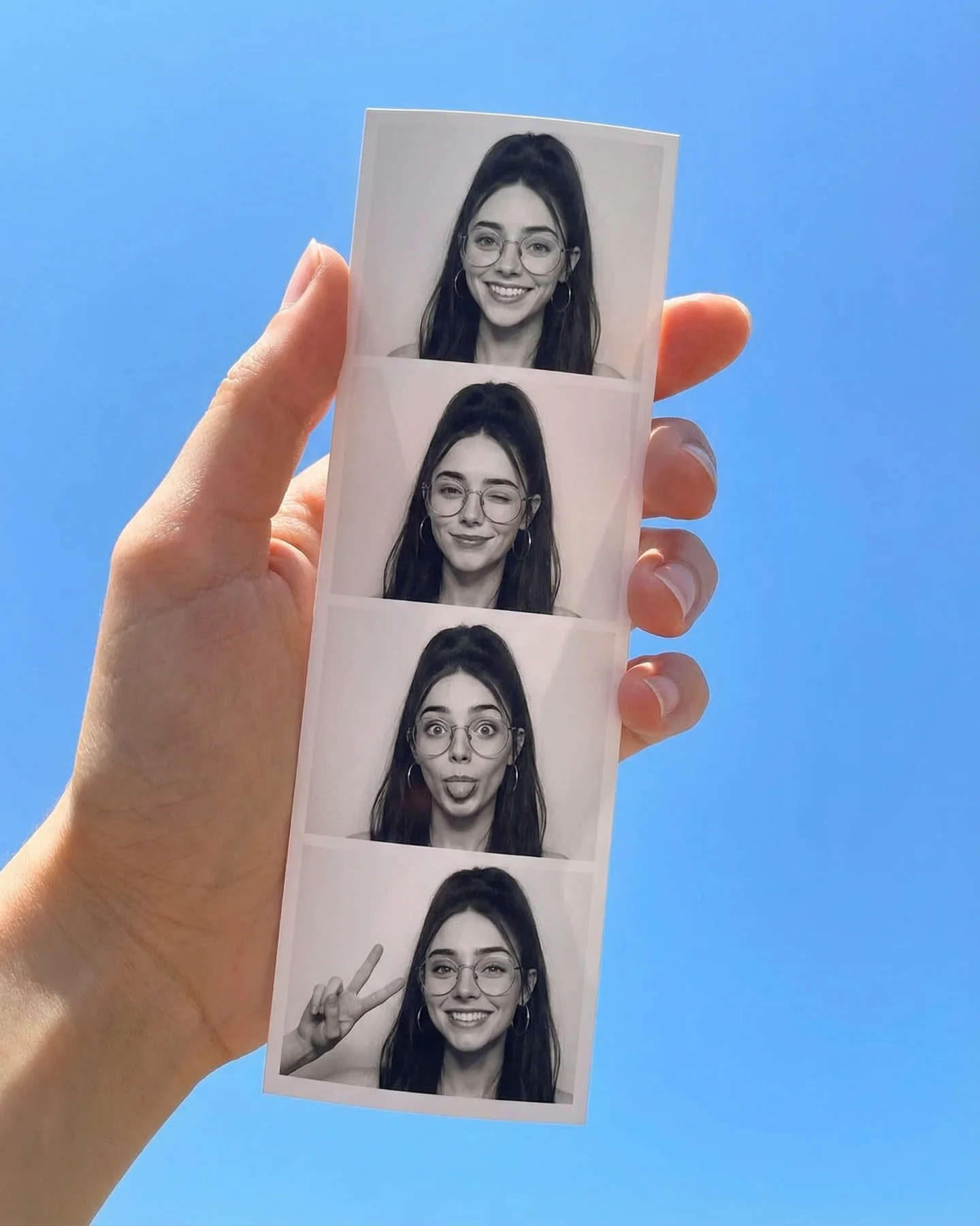
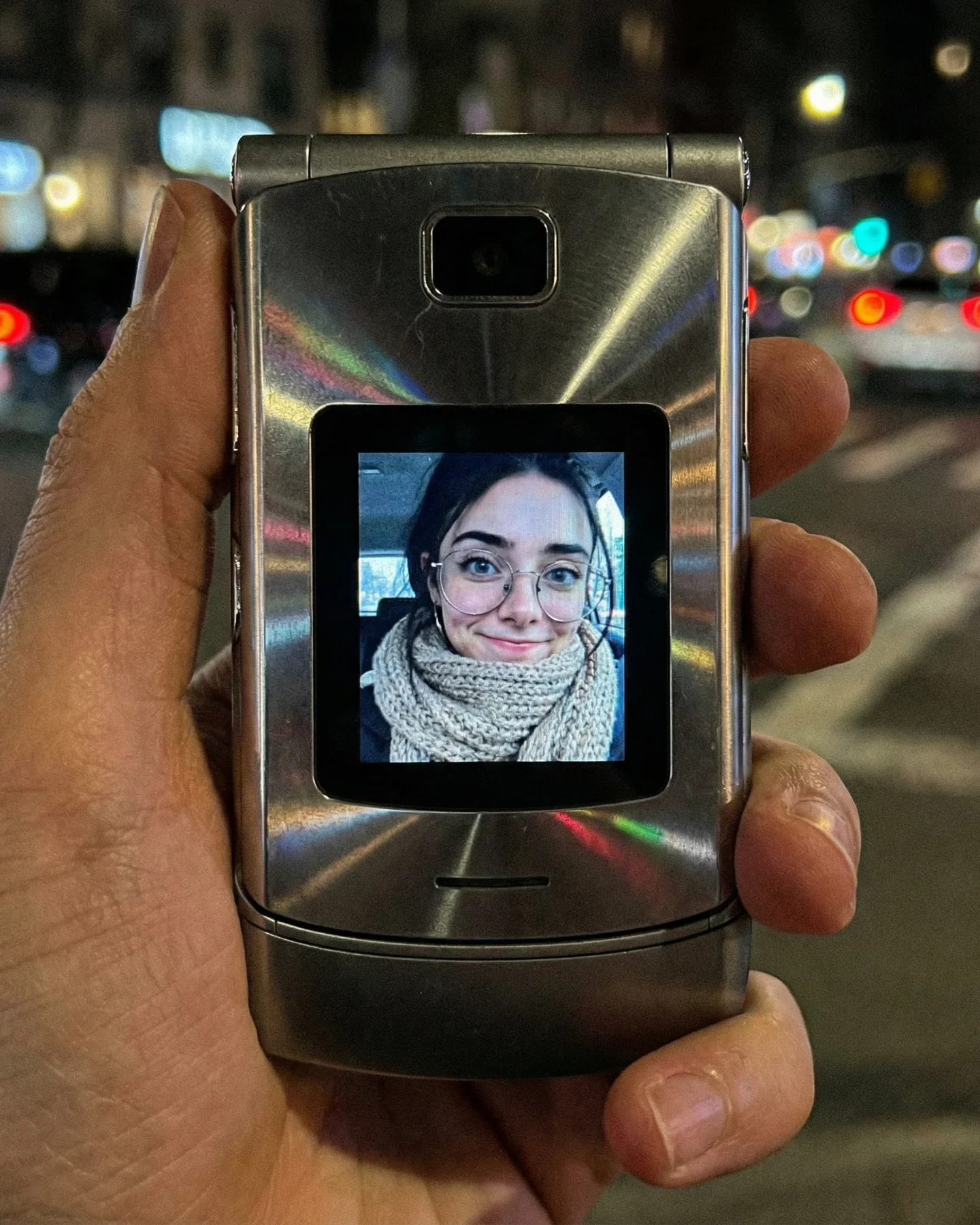
This image works because it turns a very ordinary portrait into an object of memory. A smiling face in a booth is not just a portrait. It comes with built-in associations: waiting for the strip to print, cramped curtains, bad flash, imperfect posture, and the feeling that the photo is more personal because the setup is small and a little awkward. That emotional baggage is exactly what gives the image its retro power.
The second reason it performs is that the imperfections are the point. The booth is narrow, the flash is flat, the wall poster is slightly ugly, and the curtain is heavy. None of these are polished design moves in a conventional sense. But together they create authenticity. Retro aesthetics are stronger when they feel accidentally specific rather than beautifully generalized.
The image uses the booth as a context machine. The subject is warm and attractive, but the environment does the deeper emotional work. Viewers recognize the booth immediately and supply their own memories. That is useful for SEO-driven imagery too. An image that activates collective memory has more staying power than one that relies only on face value.
The direct flash is also essential. A softer, more cinematic light would make the picture prettier, but it would weaken the time-travel effect. Here the flash says “machine-made snapshot” instead of “carefully art-directed portrait.” That distinction matters. The more the image feels like a discovered moment, the more nostalgic it becomes.
| Signal | Evidence (from this image) | Mechanism | Replication Action |
|---|---|---|---|
| Instant nostalgia trigger | The cramped booth, curtain, and instruction poster are immediately recognizable. | Specific old-media environments carry memory better than generic vintage styling. | Use a recognizable analog context instead of only color-grading a normal portrait. |
| Charming imperfection | The flash is flat and the space feels awkwardly small. | Imperfections make the image feel authentic and emotionally sticky. | Keep the lighting a little harsh and the composition a little tight. |
| Approachable warmth | The smile feels easy and unforced. | Human softness balances the roughness of the booth setup. | Use a naturally friendly expression rather than a fashion pose. |
| Environment-led identity | The booth details are as memorable as the subject’s face. | Object context transforms a portrait into a scene with story residue. | Let background details carry equal emotional value to the person. |
This setup is ideal for nostalgia prompt pages, retro snapshot aesthetics, analog-memory content, and personality-led images where the goal is intimacy rather than polish. It also transfers well to arcade corners, mall kiosks, bus-station booths, diner photo strips, ticket counters, and other semi-public little spaces where personal memory meets cheap machinery.
It is less effective for luxury vintage, highly stylized editorials, or cinematic melancholy. The strength here is humble specificity. It should feel like a real booth someone used, not like a designer’s mood board.
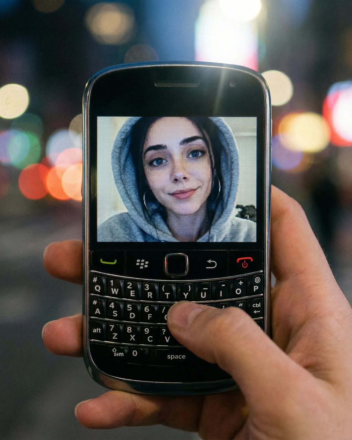
{creator portrait} inside {retro booth environment} with {harsh analog flash} and {worn details}{warm candid face} framed by {narrow nostalgic machine space} that feels {used / slightly worn / familiar}{ordinary comfortable styling} captured in {recognizable retro setting} where imperfection is part of the charmThe image feels strong because its materials are slightly ugly in the right way. Wood paneling, wrinkled curtain, faded instructions, flat flash. These are not inherently beautiful elements, but together they produce emotional credibility. This is a useful principle in retro work. Precision nostalgia often comes from the right kind of cheapness.
The oversized gray sweatshirt is also smart. It removes any sense that the subject is over-dressed for the setting, which helps the image feel spontaneous. Clothing that is too styled would make the booth feel like a prop instead of a real place.
| Observed | Why it matters for recreation |
|---|---|
| Direct flash across the face and booth walls | The flash is one of the strongest era and medium signals in the entire image. |
| Worn instruction poster on the left | Small booth-specific details make the nostalgia feel authentic rather than generic. |
| Deep red curtain on the right | The curtain instantly codes the space as a photo booth or enclosed kiosk. |
| Oversized gray sweatshirt and easy smile | The subject feels real, casual, and socially relatable. |
| Tight close framing inside a narrow space | The image gains intimacy and booth realism at the same time. |
To recreate this image well, start with the booth. If you only ask for “retro portrait of a girl in glasses,” the image will become vague and decorative. The booth is the anchor. Then add the flash, the sweatshirt, and the instruction poster. Nostalgia here is not a filter. It is a machine-space.
| Prompt chunk | What it controls | Swap ideas (EN, 2-3 options) |
|---|---|---|
| young woman sitting inside a vintage photo booth | The core environment and intimacy | retro booth portrait; enclosed kiosk snapshot; analog photo-strip setting |
| round glasses, high ponytail, hoop earrings, warm smile | The face identity and emotional tone | friendly nostalgic portrait; approachable booth subject; creator-specific portrait cues |
| oversized gray sweatshirt | The casual realism | ordinary cozy styling; low-glam wardrobe; everyday snapshot clothing |
| wood panel wall with worn instruction sheet and deep red curtain | The booth specificity | machine details; old-kiosk framing; recognizable booth architecture |
| direct on-camera flash | The analog snapshot behavior | booth flash look; harsh frontal lighting; flat nostalgic exposure |
| no overlay text, no glam studio polish | Keeps the image humble and believable | imperfect charm; real booth mood; non-editorial nostalgia |
Baseline lock the booth walls, red curtain, and flash first. Those are the structure. Then fix the face and the sweatshirt. Only after that should you refine poster wear, skin texture, or the exact crop.
Keep the one-change rule strict. If the booth stops reading as a booth, fix that before touching the face. If the flash becomes too polished, flatten it before working on texture. This image wins because it preserves the specific awkwardness of the setting.