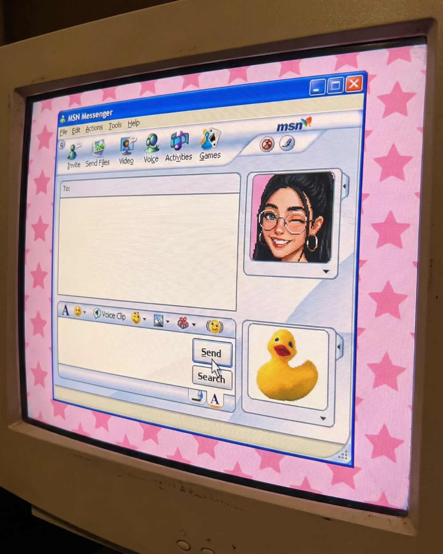
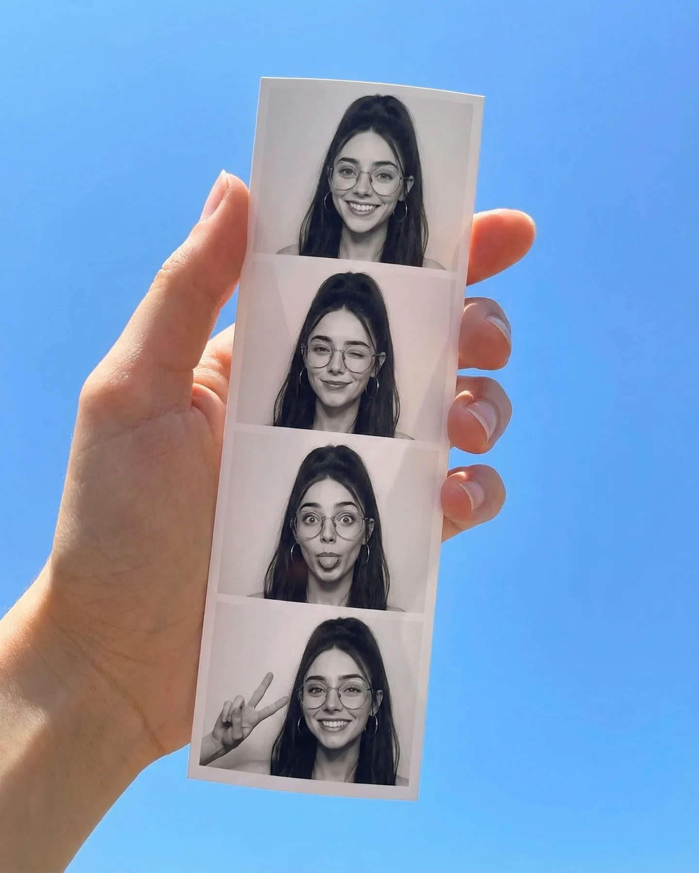
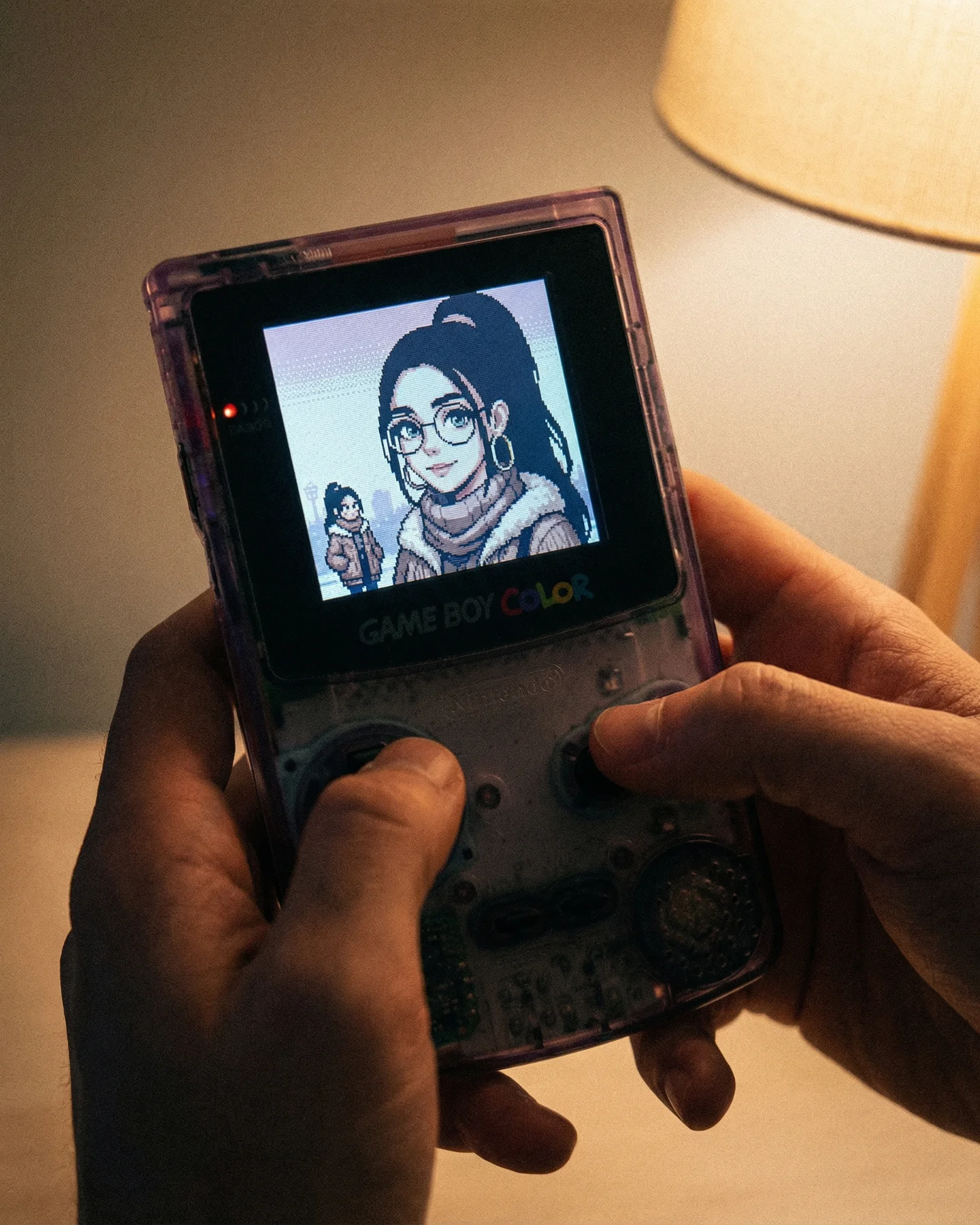
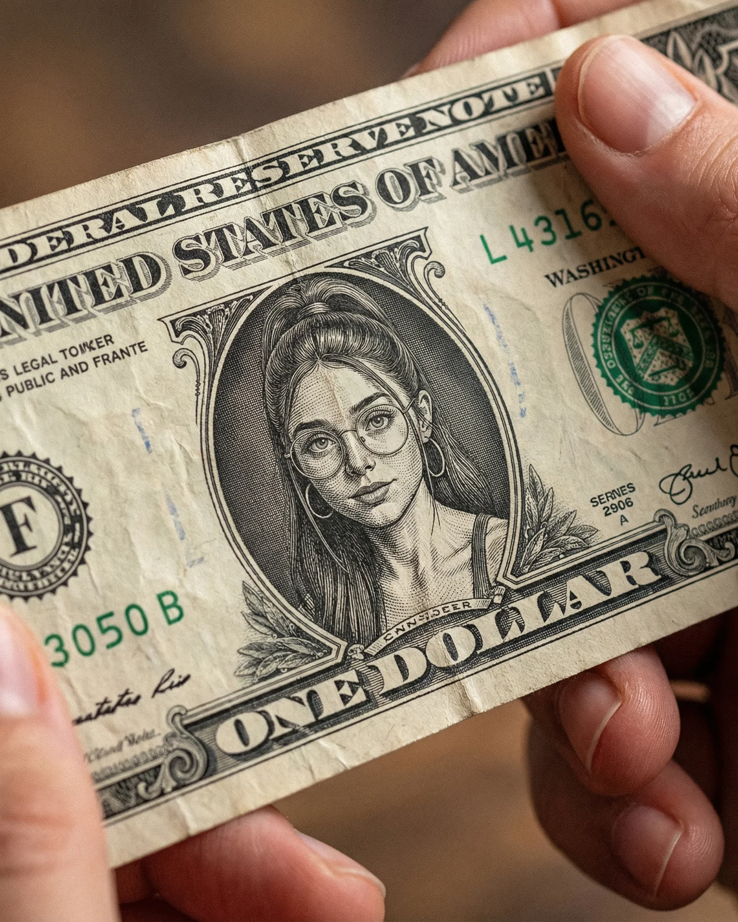
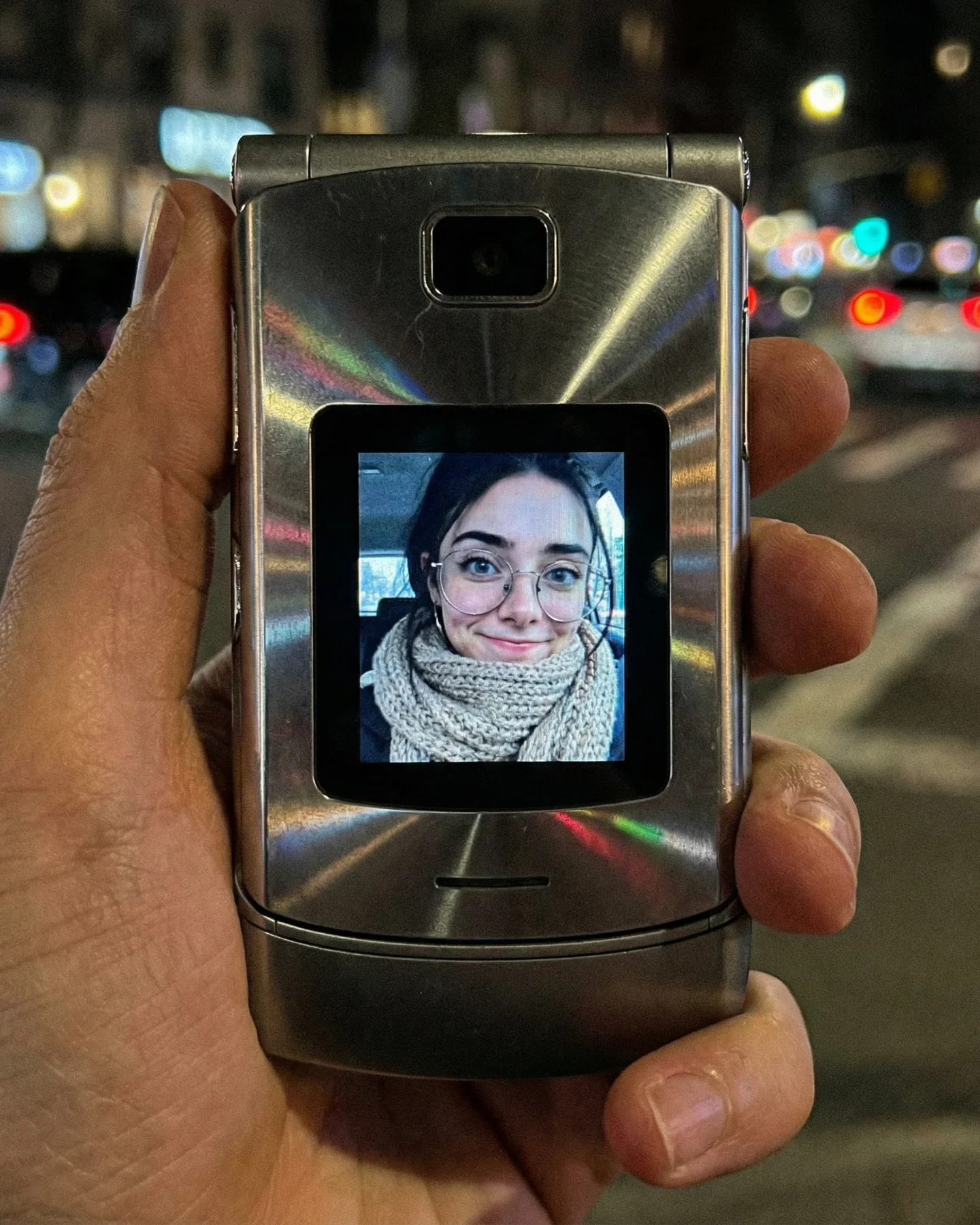
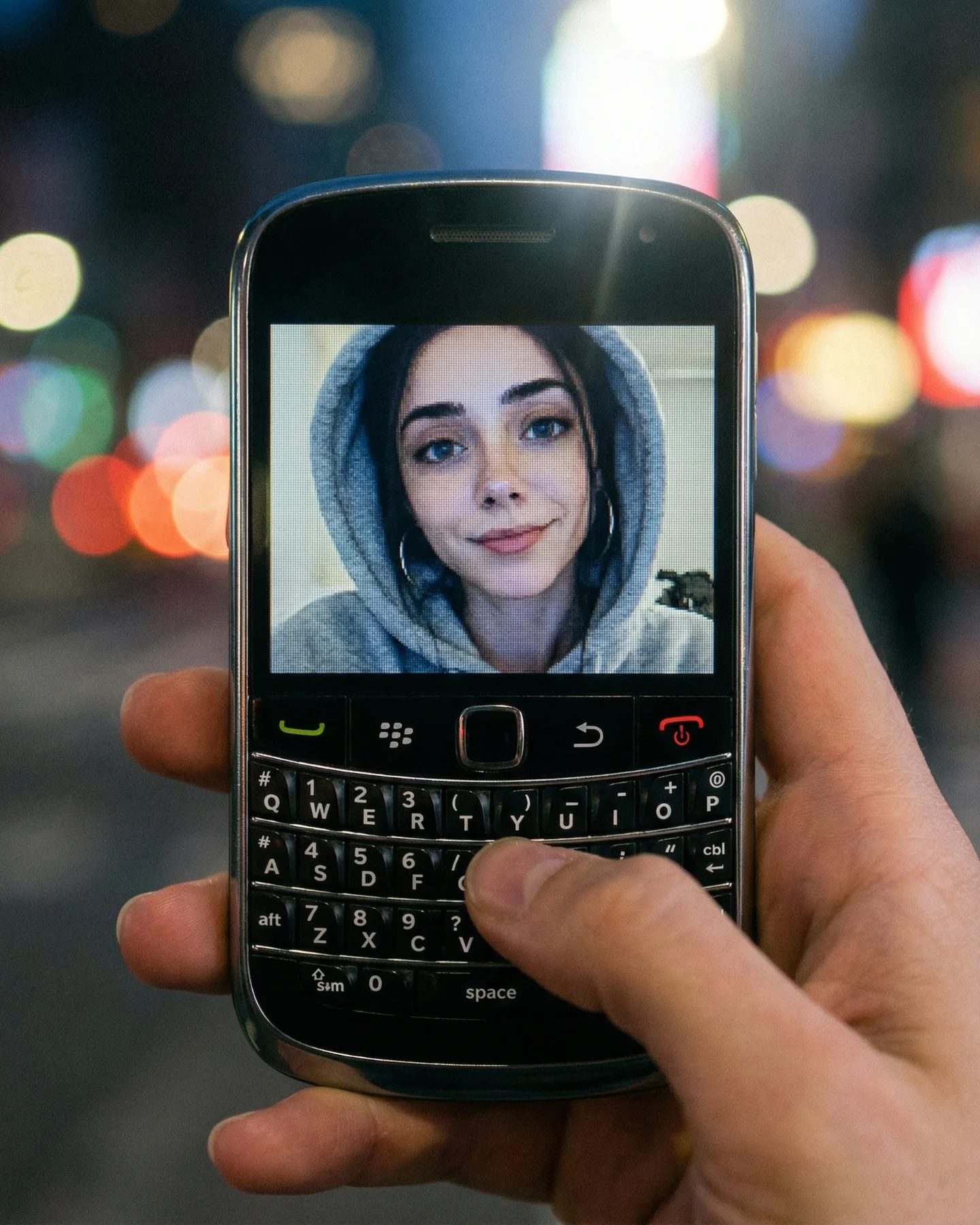
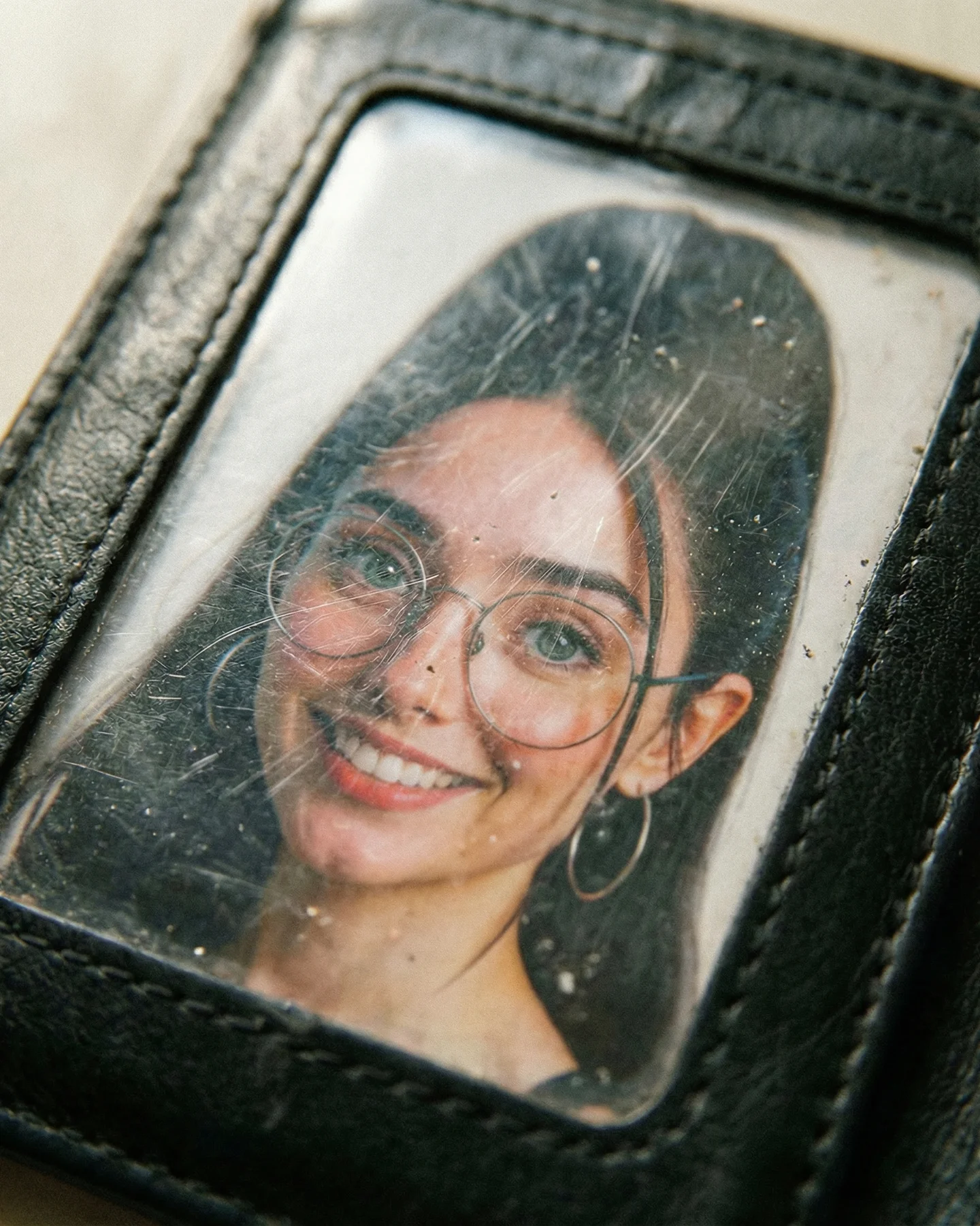
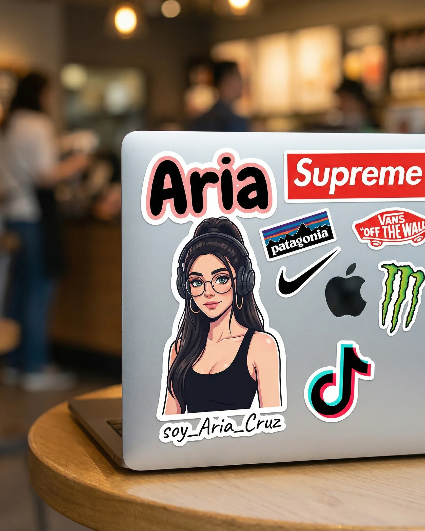
Retro Prompts 🕹️ 💡Idea from: @ai_vitaminc_ Te suena algo de esto?? 👀 Ahora lo llaman "Retro" El tiempo vuela pero los recuerdos se quedan... 🥹 Comenta "ARIA" y te paso los prompts 💌
Retro Prompts 🕹️ 💡Idea from: @ai_vitaminc_ Te suena algo de esto?? 👀 Ahora lo llaman "Retro" El tiempo vuela pero los recuerdos se quedan... 🥹 Comenta "ARIA" y te paso los prompts 💌
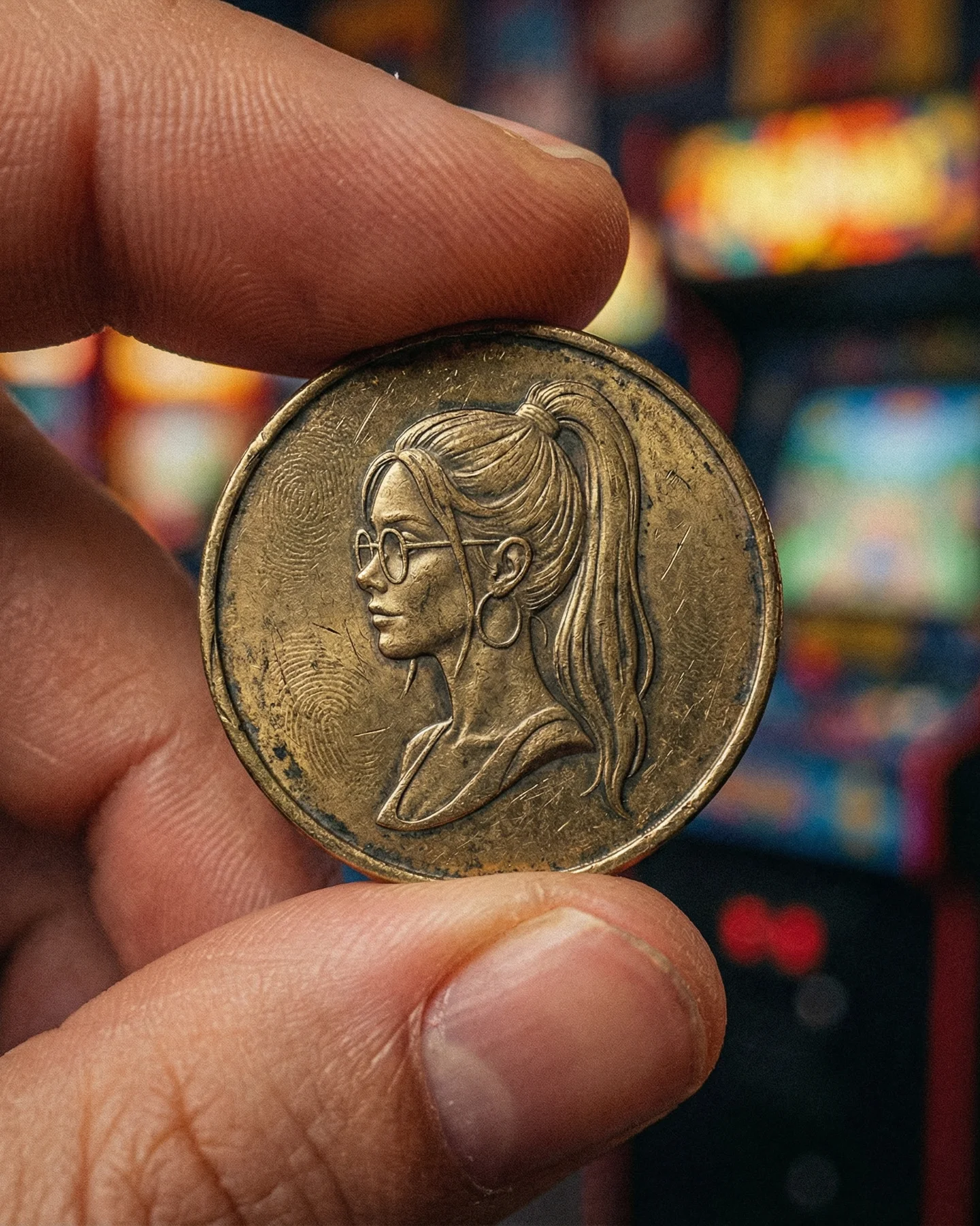
This image works because it takes nostalgia and compresses it into one symbolic object. Instead of showing the whole arcade clearly, it lets a single token carry the emotional weight. That is a strong creator move. Small objects often outperform wider scenes when they are chosen well, because they force the viewer to lean in.
The token is doing more than representing old games. It acts like a personal relic. The engraved side profile turns it from a generic arcade coin into a custom memory artifact. That shift is important. Good retro content is rarely about the era alone. It is about attaching the era to a specific identity.
The first hook is curiosity. People understand coins instantly, but this coin is strange in a useful way. It looks familiar enough to read as arcade money, yet specific enough to feel custom and collectible. That combination creates a pause because the viewer wants to resolve what they are looking at.
The second mechanism is scale contrast. The background suggests a loud, colorful arcade world, but the frame centers a very small, worn object held delicately in fingers. That contrast turns noise into intimacy. Instead of being overwhelmed by retro clutter, the audience gets one tactile portal into the entire aesthetic.
| Signal | Evidence (from this image) | Mechanism | Replication Action |
|---|---|---|---|
| Symbolic object focus | The arcade world is reduced to one handheld token | One sharp symbol is easier to remember than a full noisy environment | Choose one object that can stand in for the whole theme |
| Personalized nostalgia | The token engraving mirrors the creator’s identity cues | Retro aesthetics become personal instead of generic | Translate one or two recognizable personal features into the retro object itself |
| Tactile realism | Scratches, tarnish, and finger texture are clearly visible | Imperfection makes the object feel storied and real | Keep wear, edge darkening, and micro-scratches instead of over-cleaning surfaces |
| Color-memory backdrop | The arcade machines glow behind the coin as soft saturated blur | Background color supplies context without competing with the object | Let the environment remain suggestive, not fully descriptive |
This style is strongest for nostalgic collectible worlds, creator memorabilia concepts, and AI pages built around “my identity reimagined as an artifact.” It works because the object becomes a bridge between fandom, memory, and self-branding.
The image is effective because it makes the object feel touched by time. The scratches are not noise. They are the main storytelling device. Without them, the coin would read as a design exercise. With them, it reads like a found thing, something kept, used, and carried.
The background treatment is equally important. The arcade cabinets are colorful, but they stay unresolved. That is exactly right. The viewer does not need to identify any machine; they only need to feel the space. This is a good lesson for creators making nostalgia content: suggest the memory field, then put all the detail budget into the object that holds the memory.
| Observed | Why it matters | How to recreate it |
|---|---|---|
| Macro token with engraved side profile | Turns a simple coin into a character object | Use one readable engraved portrait rather than tiny unreadable iconography |
| Finger pinch framing | Adds scale, tactility, and human presence | Always include a real grip or touch point when the object is small |
| Heavy background blur with arcade colors | Provides context without visual competition | Keep environment color-rich but detail-poor |
| Worn metal surface | Makes the nostalgia believable | Favor age, patina, and edge wear over mint-condition surfaces |
If you prompt this too broadly, the model tends to turn it into a clean commemorative coin or a fantasy medal. The image only works when you lock the arcade context, the finger scale, and the used metal texture together.
| Prompt chunk | What it controls | Swap ideas (EN) |
|---|---|---|
| worn brass arcade token held between two fingers | Main object and scale relationship | used cartridge, scratched cassette, old transit token |
| engraved profile portrait with glasses and ponytail | Personal identity embedded into the object | engraved profile with bangs, embossed avatar, etched silhouette |
| retro arcade blurred into colorful bokeh | Context without clutter | CRT store glow, pinball hall blur, neon diner blur |
| warm directional light revealing scratches and relief | Texture and age realism | side lamp gleam, golden practical light, softer diffuse antique lighting |
| macro close-up, shallow depth of field | Intimacy and visual priority | wider hand shot, extreme macro relief detail, object on tabletop |
Lock these three things first: the worn brass token, the engraved portrait identity, and the blurred arcade background. Those are the anchors. After that, you can vary the shell colors of the machines, the amount of wear, or the grip angle. If you change the object identity too early, the whole concept loosens into generic retro decor.
A good sequence is simple. First establish the token and fingers. Then refine the portrait engraving. Then add the arcade bokeh. Finally tune the wear pattern and warm highlight direction. That order keeps the image grounded in touch before environment styling takes over.
Iteration 1: macro arcade token held between fingers
Iteration 2: keep the token, refine the engraved portrait and facial identity cues
Iteration 3: keep the portrait, add colorful blurred arcade cabinets in the background
Iteration 4: keep all anchors, deepen scratches, tarnish, and warm metal highlight detail