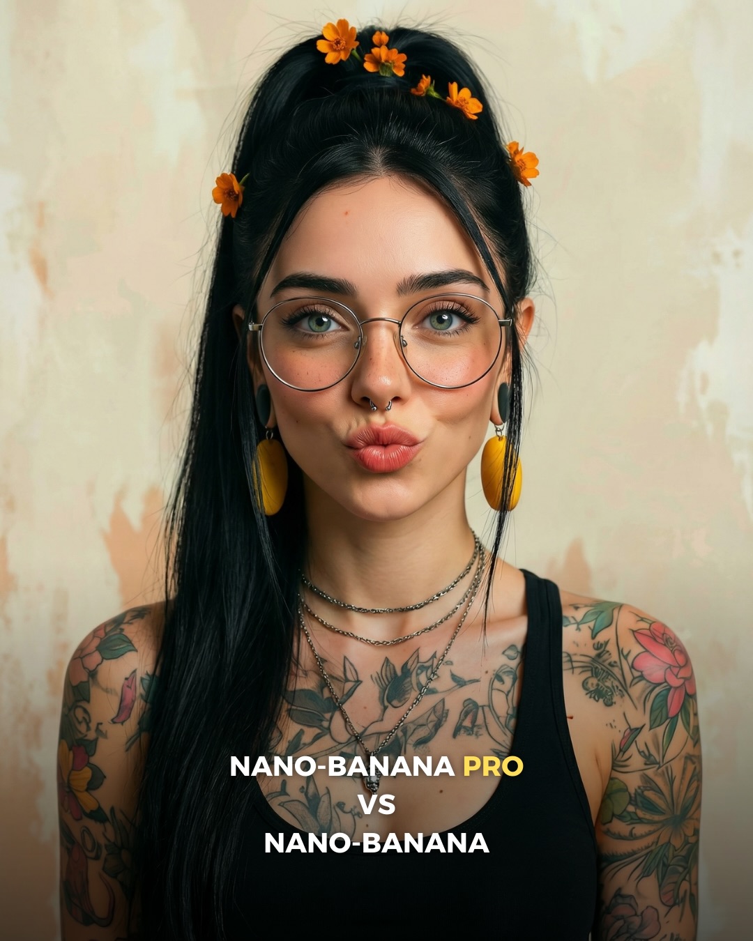
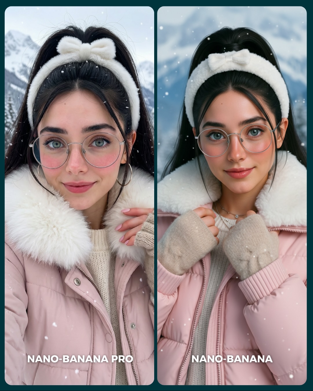
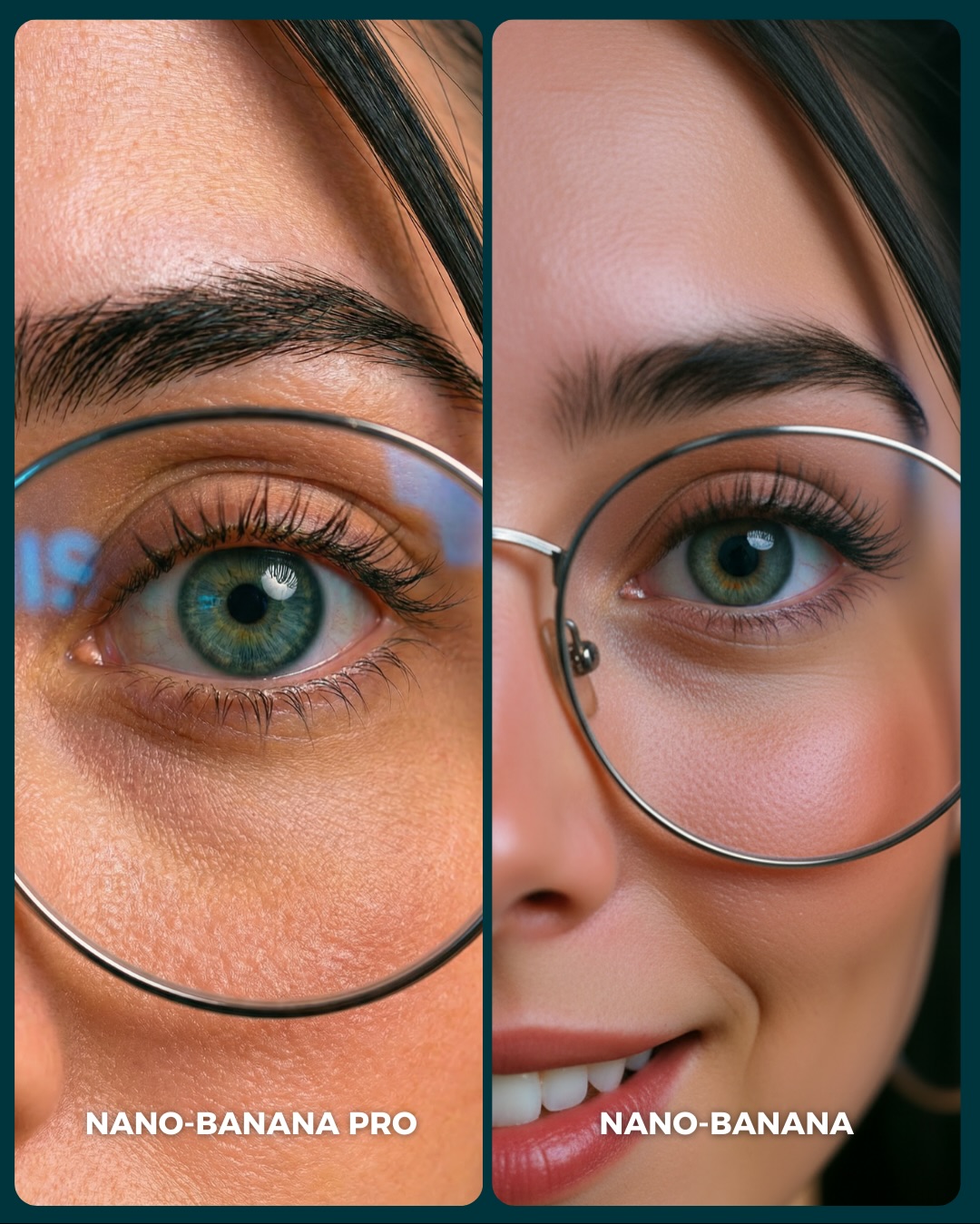
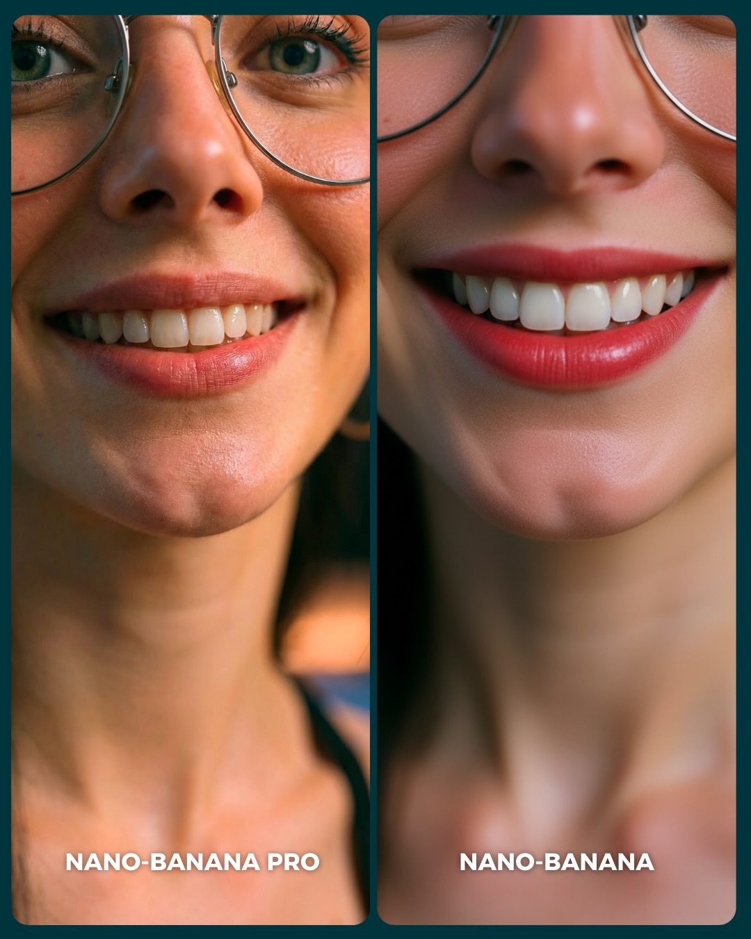
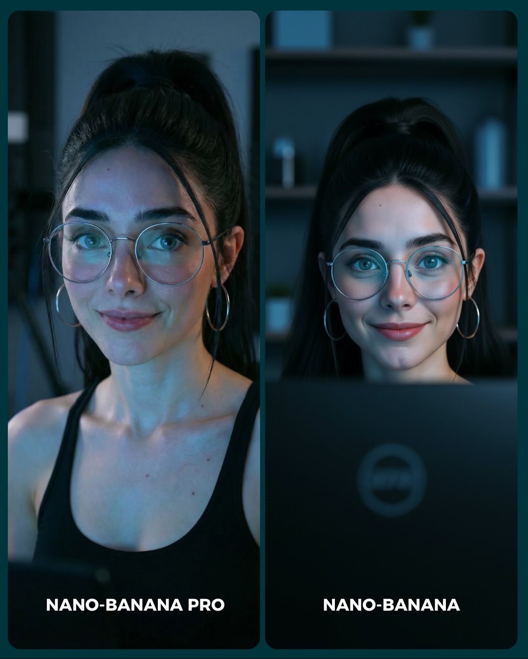
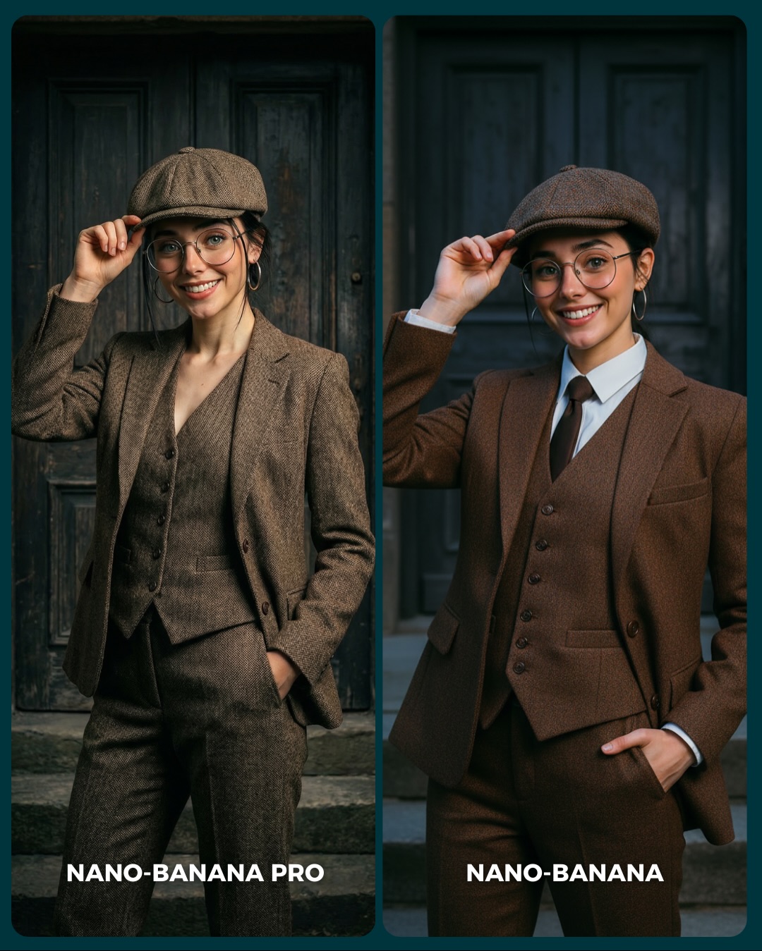
🥹Nano-Banana PRO VS. Nano-Banana
Hoy toca poner a prueba el nuevo generador de Google 🙊 Es tan bueno que tienes que verlo para creerlo…
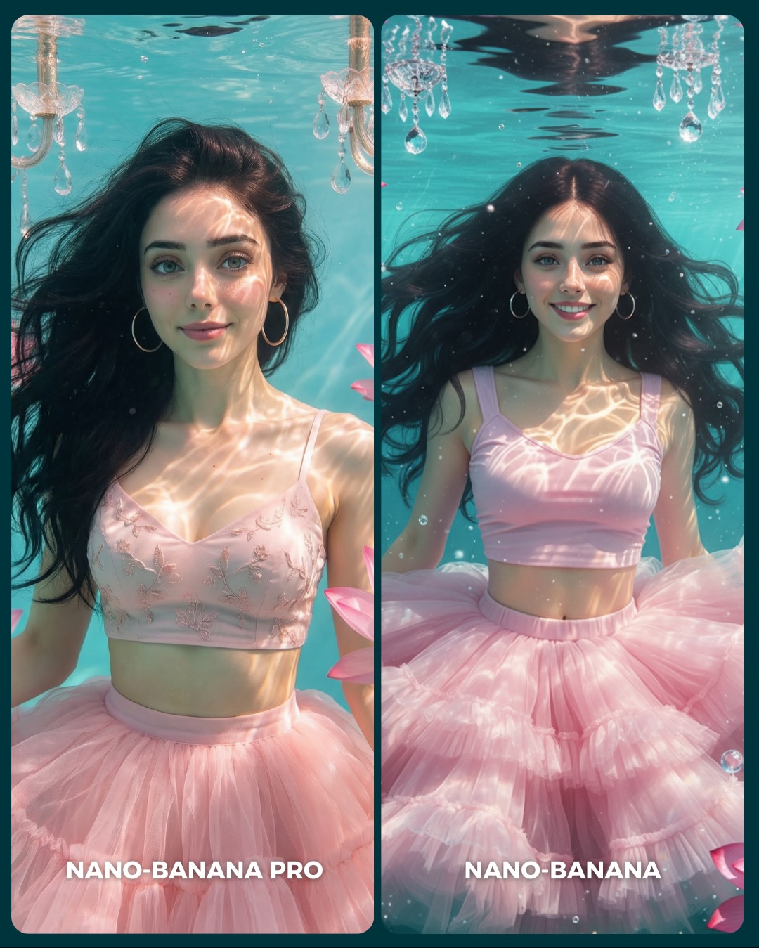
Aquí os dejo unas imágenes para que podáis comparar el Gran salto de calidad de algo que ya era muy bueno a algo insuperable 💕
Y dime… con cuál de los 2 te quedas?? 👀
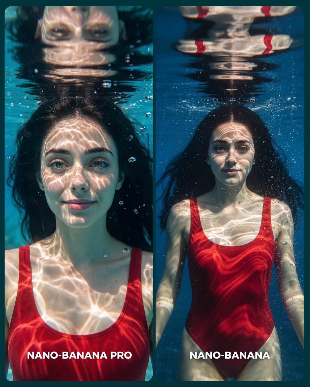
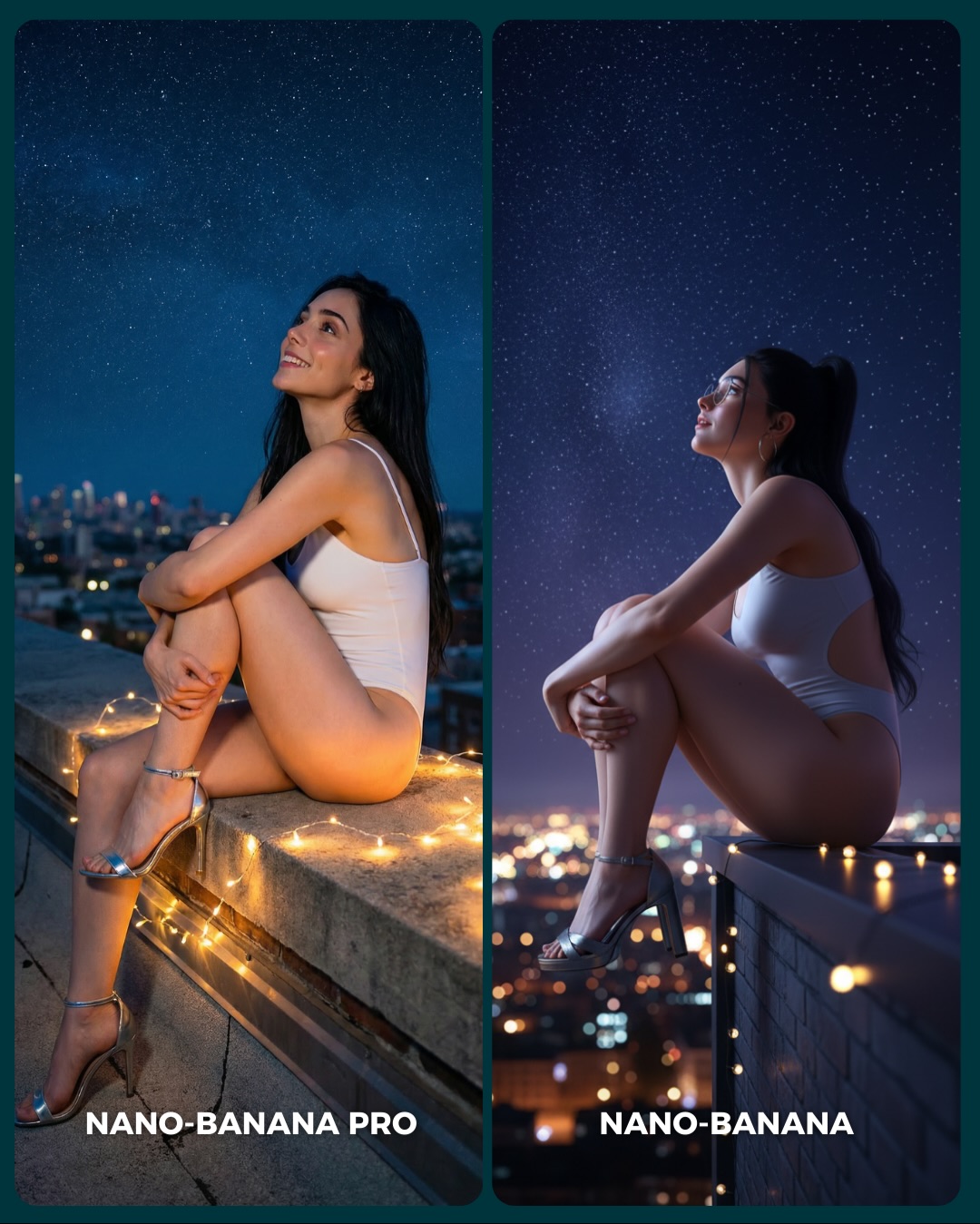
Why soy_aria_cruz's Nano-Banana Pro vs Nano-Banana Underwater Red Swimsuit Comparison Went Viral — and the Formula Behind It
Underwater portraits are useful for model comparisons because they are much harder than they first appear. Water has to behave correctly. Light has to refract correctly. Hair has to float in a believable way. Reflections at the surface have to read as water, not as accidental distortion. This image succeeds because it packages all of those technical demands inside a composition that is still calm and beautiful. The viewer is comparing models, but they are also enjoying a strong image.
That balance is the real strength here. The scene is technically challenging, yet emotionally simple. One subject, one swimsuit, clean pool water, and a tightly controlled diptych layout. The simplicity keeps the audience from getting lost, while the underwater conditions give them many subtle checkpoints to judge. That is why comparison posts like this can generate more useful discussion than more chaotic test images.
Why The Image Has Strong Scroll Power
The first hook is the water surface reflection. It creates an immediate visual puzzle that is easy to understand but still interesting to inspect. The second hook is the red swimsuit against the blue pool, which gives the image instant color contrast without making it noisy. Then the diptych structure turns the whole thing into a choice-based interaction. Viewers are not just looking. They are deciding.
Another reason this image works is that the subject remains readable even in a technically difficult environment. The face is clear, the eyes are open, and the body is not hidden by murk or dramatic motion. That readability is critical. If the viewer cannot identify the subject quickly, they will not stay long enough to compare rendering quality.
Signal
Evidence (from this image)
Mechanism
Replication Action
Technical difficulty with simple framing
Underwater refraction, hair float, caustics, and reflection are all present in a minimal two-panel layout
Hard rendering conditions increase comparison value while clean framing keeps the audience engaged
Use one technically demanding environment but reduce everything else to a stable, comparable setup
Strong color separation
The red swimsuit stands out sharply against the blue pool water
High-contrast color pairing improves feed visibility and makes the subject easy to track
Pick one bold wardrobe color against a single dominant environment color
Reflection checkpoint
The left panel includes a readable face reflection at the water surface
Reflections are an easy quality test because errors are immediately noticeable
Include one reflection-sensitive element when you want viewers to evaluate realism quickly
Diptych consistency
The same subject and same outfit appear in both panels with only mild composition change
Stable ingredients let viewers focus on model behavior rather than prompt drift
Lock subject identity and wardrobe across both panels; only change framing distance or subtle expression
How The Aesthetic Stays Elegant
The image avoids one common mistake in underwater AI art: overdramatization. There are no wild bubbles, no fantasy glow, no extreme body twisting. Instead, the subject floats calmly, and the light does the work. The caustic patterns give the image enough movement and complexity to feel alive. That restraint is what makes it elegant.
The second smart choice is the difference between the two panels. They are not identical duplicates, but they are close enough to compare cleanly. The left panel uses intimacy and reflection. The right panel opens the frame slightly and lets the swimsuit and torso read more clearly. That is a useful tactic for creators. Change one dimension of the image, not five.
Observed
Why it matters for recreation
Bright caustic light across the face and chest
Creates believable underwater realism and adds visual richness without clutter
Red swimsuit as the only bold color accent
Helps the subject stay dominant inside a monochromatic blue environment
Readable water-surface reflection at the top
Provides a high-signal realism test that viewers instantly notice
Loose floating hair with clear facial visibility
Maintains beauty-portrait clarity while preserving underwater authenticity
Two-panel structure with subtle crop difference
Makes the comparison engaging without introducing distracting prompt drift
Best Uses, Weak Uses, And Transfers
Best for public generator comparisons because underwater scenes expose weaknesses in rendering fast.
Best for summer or swimwear prompt tutorials where texture, lighting, and water behavior all matter.
Best for creator education around consistency, because small differences are easy to spot in a stable diptych.
Best for comment-driven posts asking viewers to choose a preferred result.
This format is less ideal for narrative storytelling, crowded environments, or product detail shots. Its strength lies in controlled beauty comparison, not story progression.
Transfer Recipes
Keep: same-subject diptych, reflection checkpoint, bold wardrobe color. Change: swap pool water for bathtub editorial, rain-glass portrait, or shallow shoreline image. Slot template: "{water environment} comparison portrait, same subject, vivid wardrobe accent, surface reflection detail"
Keep: serene floating pose and caustic lighting. Change: shift wardrobe from red swimsuit to black one-piece, pale slip dress, or athletic swim top. Slot template: "{subject} underwater portrait diptych, {wardrobe}, bright refracted light, calm upward gaze"
Keep: minimal background and high realism checkpoints. Change: turn the format into skincare, beauty, or cinematic pool-scene tests. Slot template: "{beauty concept} underwater comparison, clear face, subtle panel variation, clean blue environment"
Prompt Technique Breakdown
Prompt chunk
What it controls
Swap ideas (EN, 2-3 options)
Water environment
Defines clarity, color mood, and reflection behavior
clean blue swimming pool; pale turquoise hotel pool; deep cobalt indoor pool
Reflection rule
Adds a visible realism checkpoint near the surface
Sets the visual richness of the water without adding props
strong sunlight caustics; softer pool shimmer; geometric surface reflections
Panel delta
Keeps the comparison engaging without breaking consistency
tight close-up vs wider torso shot; smile vs neutral face; stronger reflection vs cleaner body read
Execution Playbook For Remixing It
Start by locking three things: the same subject identity across both panels, the red swimsuit against blue water, and the water-surface reflection line at the top. Those are the structural pillars of the image. If they drift, the diptych stops being a fair comparison.
Then run the build in this order:
First stabilize the subject and swimsuit so both panels clearly belong to the same scene.
Next tune the water clarity, hair float, and reflection behavior.
Then refine the caustic light patterns so they enhance realism without covering the face too aggressively.
Finally adjust the crop difference between the two panels.
This sequence is important because underwater prompt failures usually happen at the environment physics stage. If the water does not behave correctly, everything else feels fake.