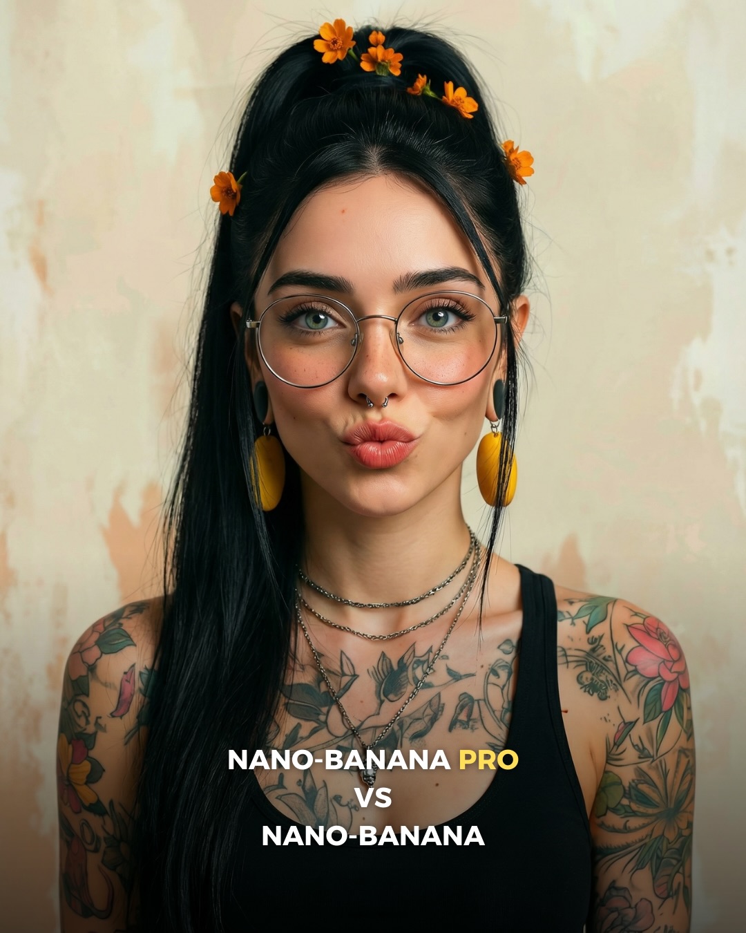
🥹Nano-Banana PRO VS. Nano-Banana
Hoy toca poner a prueba el nuevo generador de Google 🙊 Es tan bueno que tienes que verlo para creerlo…
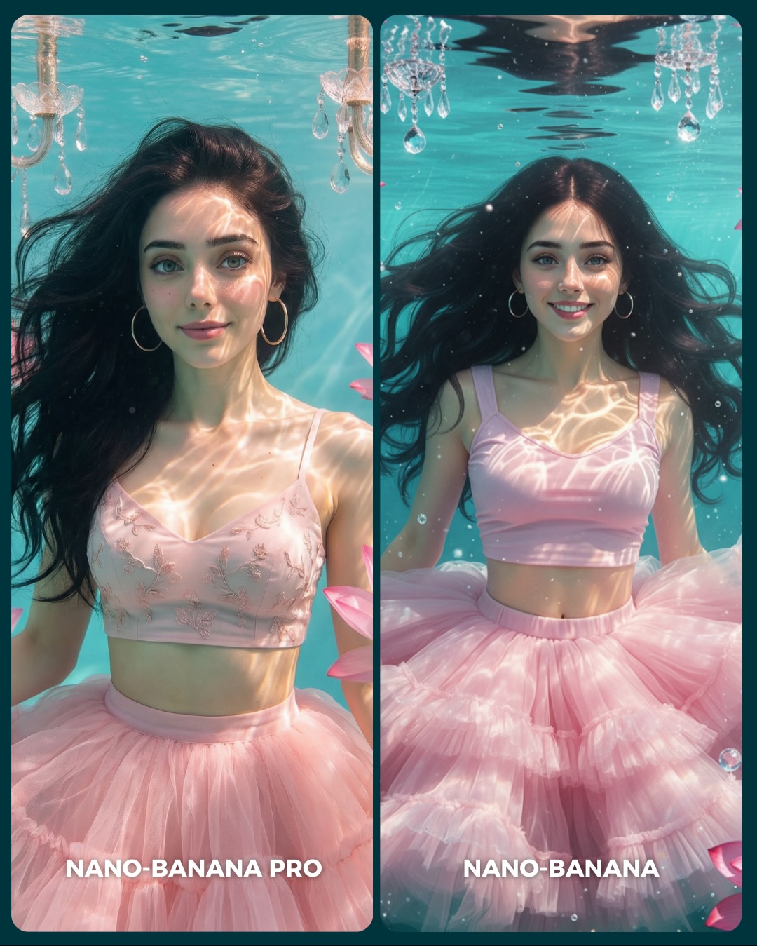
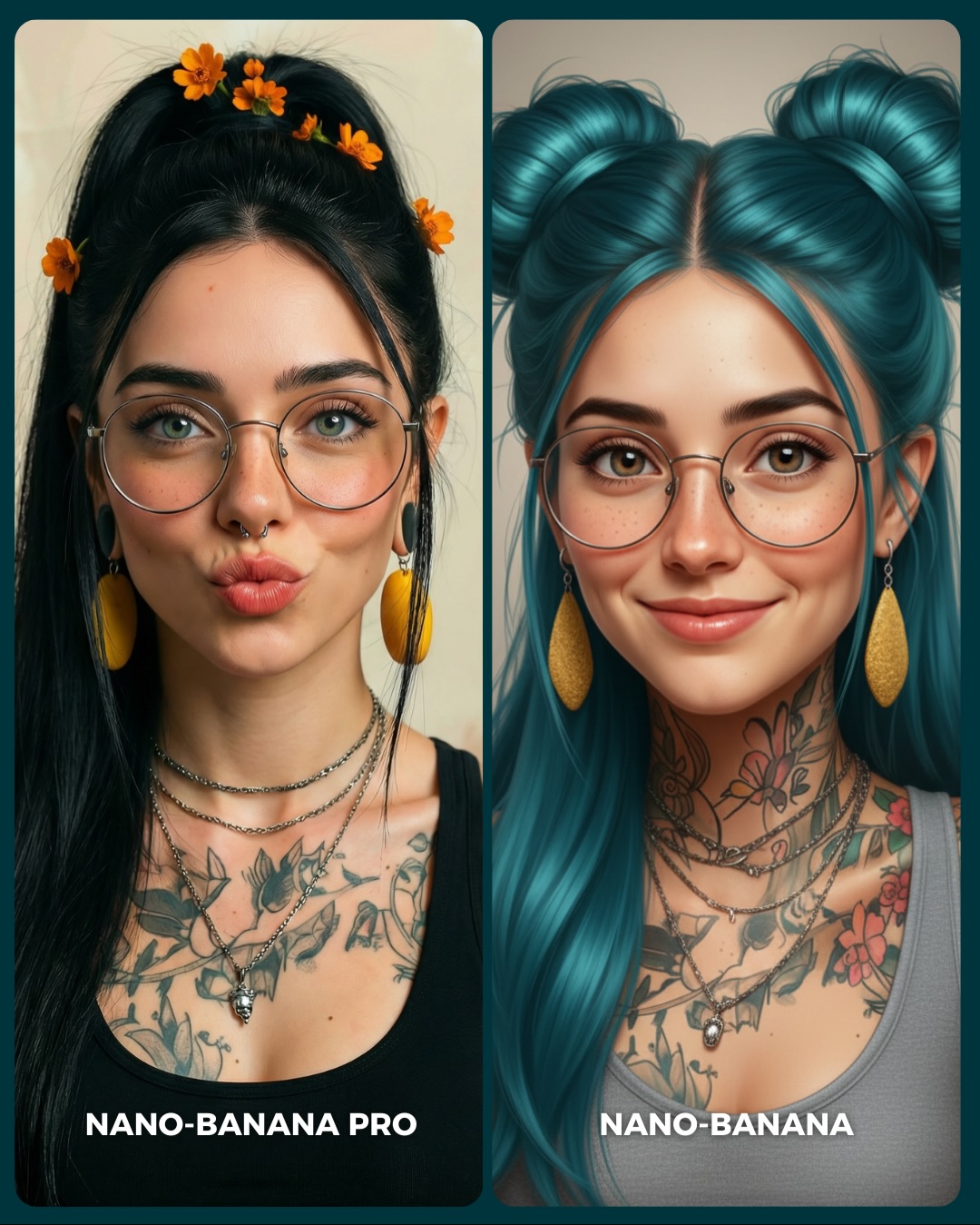
Aquí os dejo unas imágenes para que podáis comparar el Gran salto de calidad de algo que ya era muy bueno a algo insuperable 💕
Y dime… con cuál de los 2 te quedas?? 👀
How to Create a Winter City Selfie Comparison AI Image
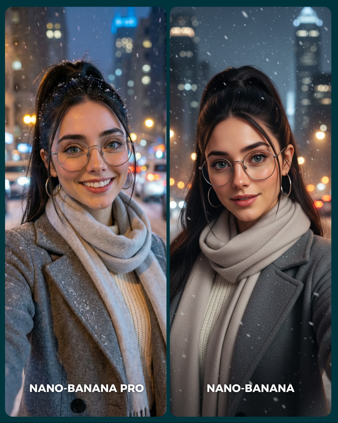
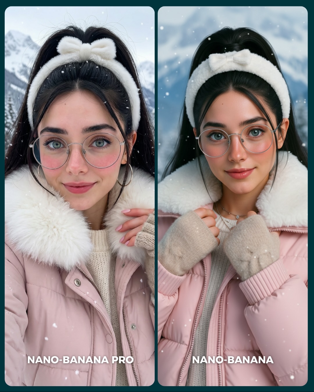
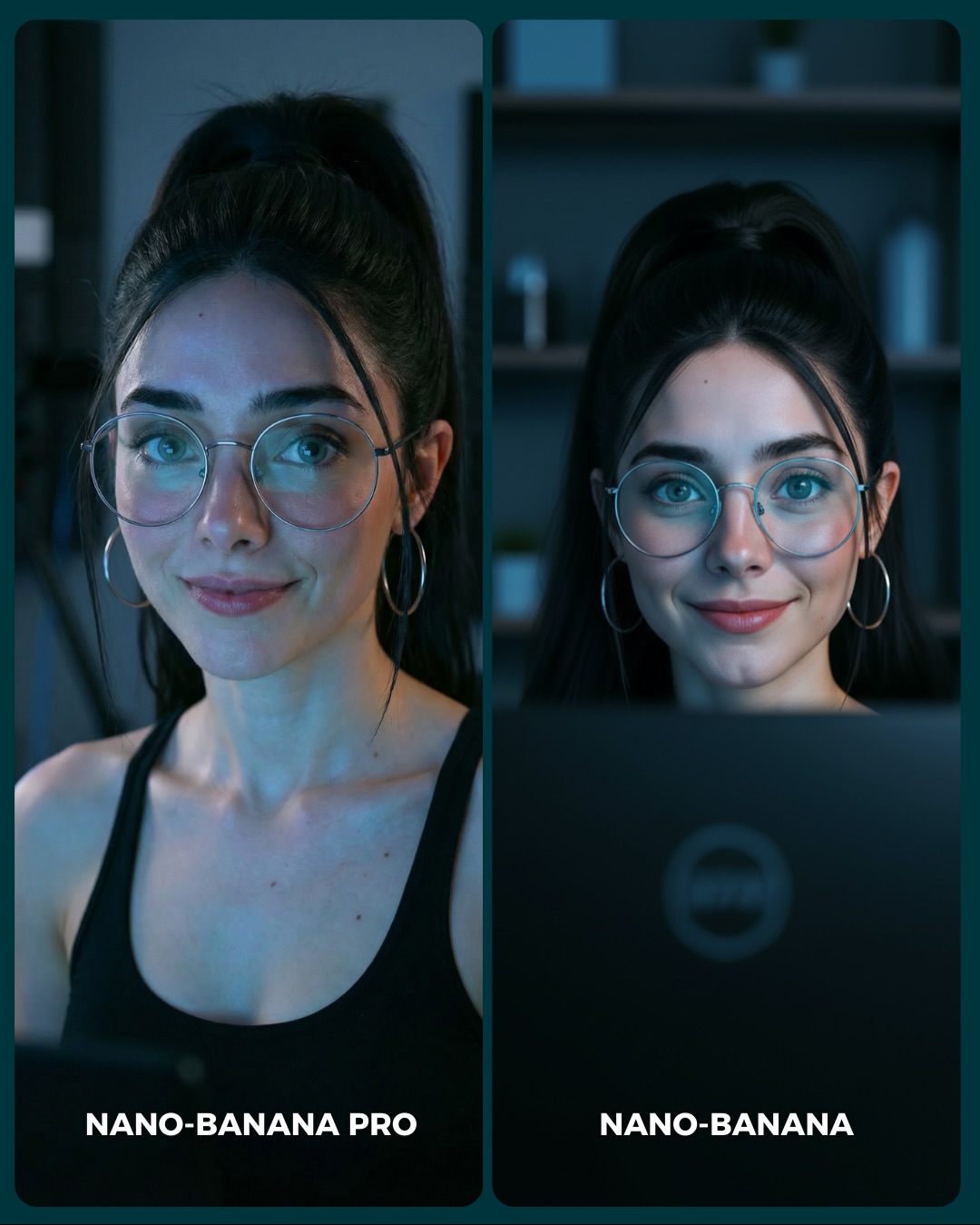
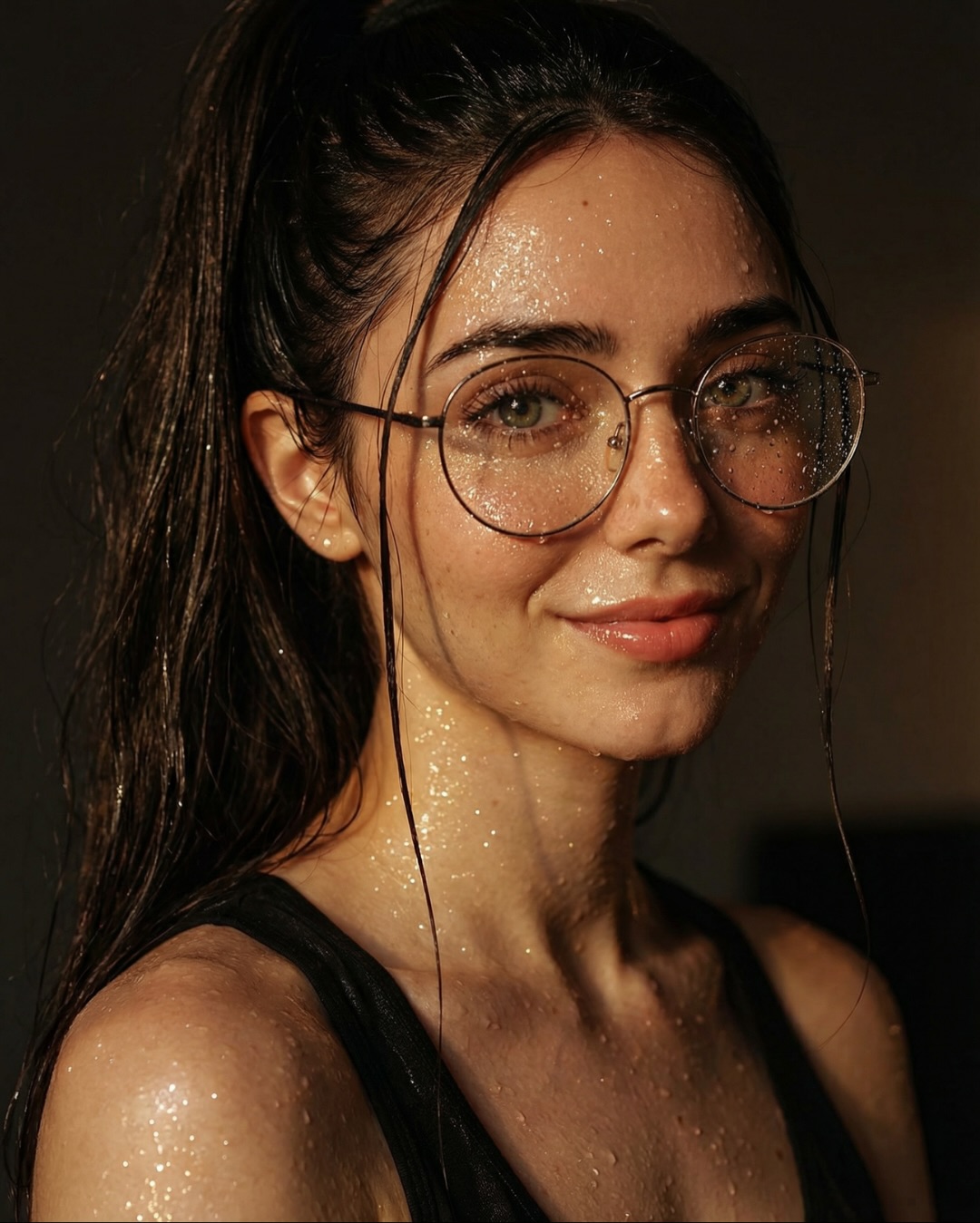
This image works because it turns a familiar winter portrait into a clean benchmark. The setup is not complicated: one woman, one coat, one scarf, one city street, one snowfall. But that simplicity is exactly what makes the comparison meaningful. When the variables are controlled, viewers can focus on what actually changed between the two outputs: skin realism, facial polish, lighting balance, snow handling, and overall naturalness.
For creators, this is a useful pattern. Comparison posts perform best when they are easy to read in one second and still reward a longer look. Here, the split-screen layout does the first job, while the winter-night details do the second. People immediately understand they are meant to compare left versus right, then they stay to inspect glasses, knit texture, coat fabric, and background light quality.
The scene also feels socially native. It looks like a real winter selfie someone might take on a cold city evening, not a forced test chart. That matters because audiences engage more willingly with benchmarks that still feel like content they would save for aesthetic reasons. Utility and desirability are working together here.
Why This Comparison Format Performs
The first reason is everyday relatability. Unlike an extreme fantasy setup, a winter city selfie feels achievable. The coat, scarf, snow, and bokeh lights are all familiar visual signals. That lowers the barrier to interest. Viewers can imagine themselves using or recreating the same setup.
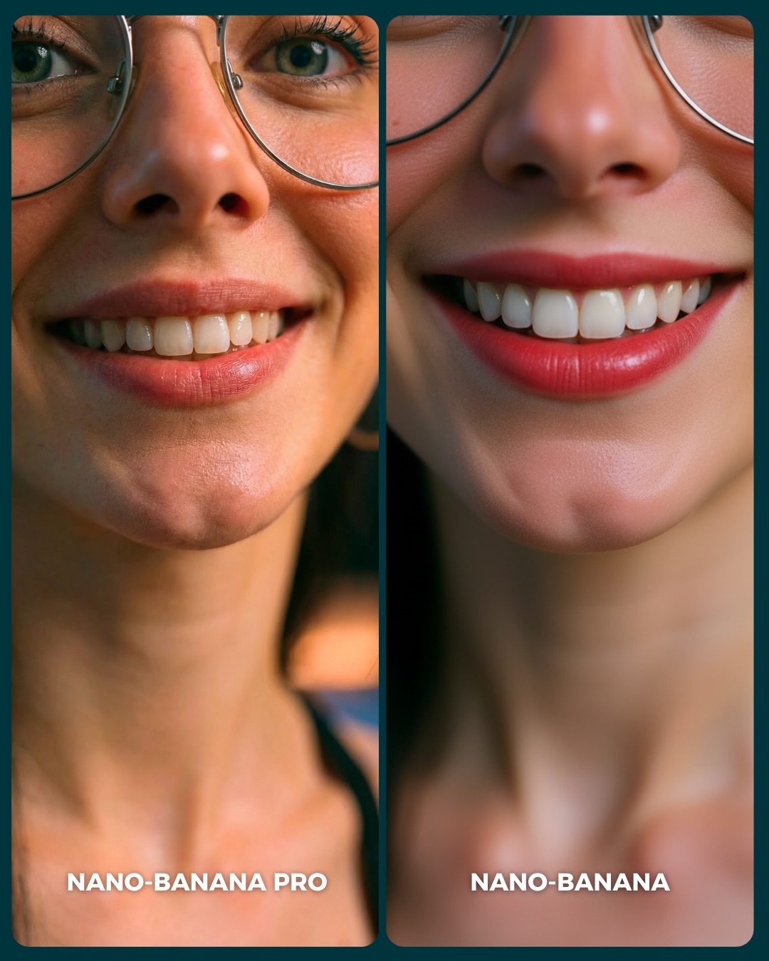
The second reason is that winter scenes reveal quality differences naturally. Snowflakes can look fake, scarf folds can collapse, glasses can distort, and skin can become too plastic under cold lighting. Because these failure modes are common, the audience does not need technical expertise to notice them. The image teaches people what good realism looks like almost by accident.
The third reason is tonal control. The palette stays disciplined: gray coat, beige scarf, cream sweater, dark hair, cool blue-gray night, and warm bokeh lights. That balance makes the image feel premium without being loud. Social posts often travel further when the comparison is clean instead of visually argumentative.
Signal
Evidence (from this image)
Mechanism
Replication Action
Instant benchmark readability
Two matching portrait cards with clear labels at the bottom
The viewer immediately knows to compare left and right
Use mirrored subject setups with low-friction layout design
Everyday aspirational styling
Gray wool coat, beige scarf, winter city lights, soft snowfall
Familiar styling broadens appeal while still looking polished
Choose wardrobe and settings that feel desirable but plausible
Natural realism stress test
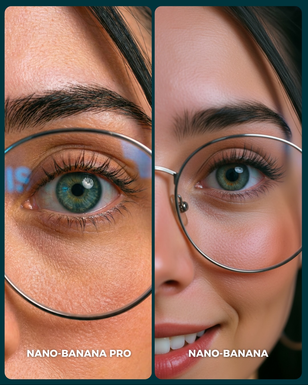
Snow, knitwear, wool texture, glasses, and nighttime exposure all coexist
These elements expose quality differences in a believable scenario
Benchmark models with scenes that naturally challenge texture and light handling
Soft left-right variation
One panel feels more candid, the other more polished
Subtle variation keeps the comparison interesting without breaking fairness
Allow slight expression and finish differences while locking identity and styling
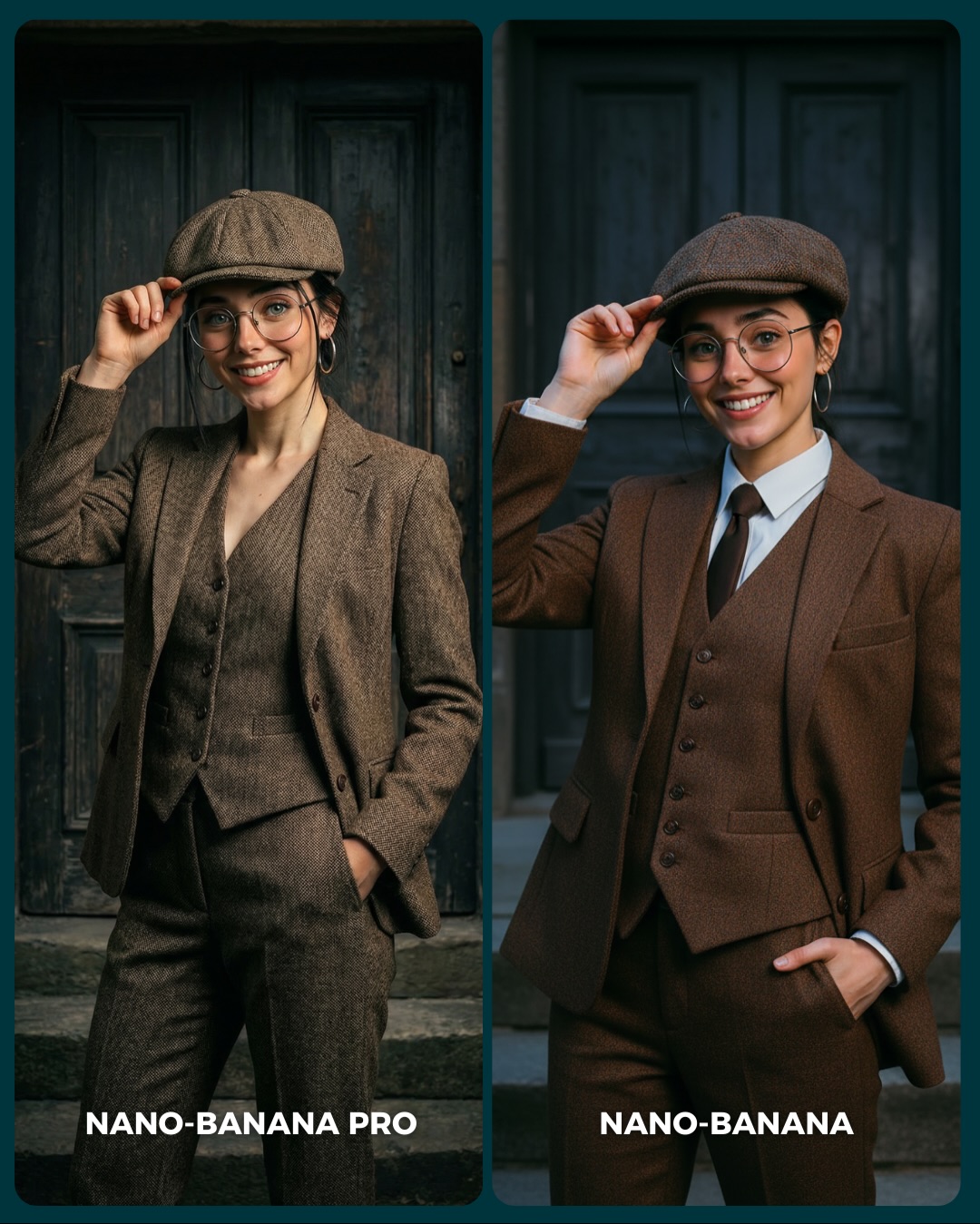
Where This Style Works Best
This format is ideal for generator-versus-generator posts, seasonal realism comparisons, creator education around portrait quality, and carousel covers that need both beauty and clarity. It is especially useful for audiences who care about social-media-ready output, because the scene resembles a high-performing lifestyle selfie rather than an abstract test image.
Best fit: portrait realism benchmarks. The scene exposes subtle strengths and weaknesses without needing a complicated prompt.
Best fit: winter content series. Snow and scarves create built-in seasonal interest.
Best fit: creator education posts. Viewers can learn what to inspect in a portrait generator result.
Best fit: aesthetic comparison covers. The image stays attractive even if the audience ignores the technical point.
Best fit: social-first model tests. It evaluates outputs in the kind of content people actually post.
It is less useful for storytelling sequences, product-focused ads, or highly stylized fantasy feeds. The power here comes from controlled realism, not narrative progression or visual excess.
Transfer Recipes
Autumn street version. Keep: side-by-side selfie benchmark and urban blur. Change: coat weight, foliage tones, weather. Slot template: two-panel generator comparison, same woman in {seasonal outfit}, urban street bokeh, labeled left and right portraits
Rainy evening version. Keep: identity lock, close crop, city context. Change: snow to rain cues, scarf to hood, pavement reflections. Slot template: split-screen realism test, same subject, rainy night street portrait, matching styling, comparison labels
The strongest aesthetic choice is moderation. The snow is visible but not blizzard-heavy. The city lights glow but do not overpower the face. The outfit is elegant but not flashy. This restraint is what makes the comparison feel trustworthy. When benchmark posts become too stylized, viewers start questioning whether they are really comparing the model or just reacting to spectacle.
The scarf is also doing important work. It softens the neck and chest area, adds winter texture, and creates a clear cozy cue that pairs well with the snowfall. Combined with the gray wool coat, it builds a tactile, high-value look out of very common clothing. That is a useful lesson for creators who want premium-feeling content without elaborate styling.
The dark teal border and divider are another smart move. They separate the two outputs cleanly without making the layout aggressive. Good comparison design should guide the eye, not shout at it. This one does that well.
Observed
Why it matters
How to recreate it
Matching winter wardrobe across both panels
Creates a fair comparison and keeps attention on rendering quality
Lock clothing and accessories before judging model differences
Snowflakes over a softly blurred city
Adds atmosphere while revealing how well the generator handles particles
Use weather cues that test realism but do not dominate the frame
Round glasses and hoop earrings
Give the face structural identity and small-detail checkpoints
Include one or two accessories that make subtle distortions easier to spot
Gray-beige neutral palette
Keeps the image polished and broadly appealing
Build comparison scenes on disciplined color systems, not noisy accents
Bottom text labels only
Lets the viewer inspect the face first and the benchmark second
Keep labels low and unobtrusive so evaluation stays visual-first
Prompt Technique Breakdown
To recreate this style, think in three layers: stable identity, seasonal atmosphere, and comparison layout. If any of those layers fails, the image stops being useful. A pretty winter portrait is not enough. It becomes benchmark content only when the split-screen structure and the same-subject consistency are preserved.
Prompt chunk
What it controls
Swap ideas (EN, 2-3 options)
Identity lock
Fairness and recognizability between the two panels
same subject in both images; matched facial identity; stable hairstyle and accessories
Seasonal wardrobe
Texture richness and emotional tone
gray wool coat and beige scarf; winter coat with knit layers; soft neutral cold-weather outfit
Urban background blur
Scene realism without distraction
city-night bokeh; glowing streetlights and cars; blurred tower silhouettes
Weather cue
Atmosphere and realism stress test
light snowfall; drifting snowflakes; snow caught on hair and coat
Comparison layout
Usefulness as a cover and benchmark
split-screen portrait cards; side-by-side labeled outputs; clean social comparison design
Panel personality shift
Keeps the side-by-side engaging without breaking consistency
candid smile vs polished calm; natural vs refined finish; softer left-right expression contrast
The most common drift point is identity consistency. If the two panels stop looking like the same person, the audience loses trust in the comparison instantly. Keep that locked before you refine anything else.
How to Iterate Without Making the Comparison Noisy
Lock three things first: same subject identity, same winter outfit, and same city-night environment. Once those are stable, adjust the subtle differences in expression, realism finish, or snow density. If you let too many elements vary at once, the comparison stops being useful because viewers cannot tell what changed.
Use a one-change rule. If the panels feel too different, tighten the pose and expression. If they feel too identical and boring, introduce a small shift in smile intensity or polish. If the winter mood is weak, strengthen snowfall and scarf texture before touching anything else. Controlled changes preserve fairness and readability.
Run 1: Solve the split-screen layout with the same woman and same clothing in both panels.
Run 2: Add the snowy city background and warm urban bokeh.
Run 3: Refine scarf knit, wool texture, glasses geometry, and snow particles.
Run 4: Introduce subtle left-right expression difference and place the bottom labels.
If the output becomes too glamorous, append a correction like realistic winter street selfie benchmark, social-media portrait comparison, natural texture. If it becomes too plain, strengthen the city lights and snow but keep the face clean and central. The image works because it stays balanced, not because it tries to do too much.