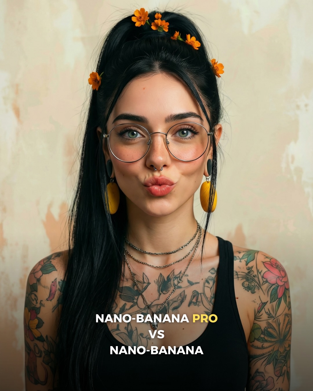
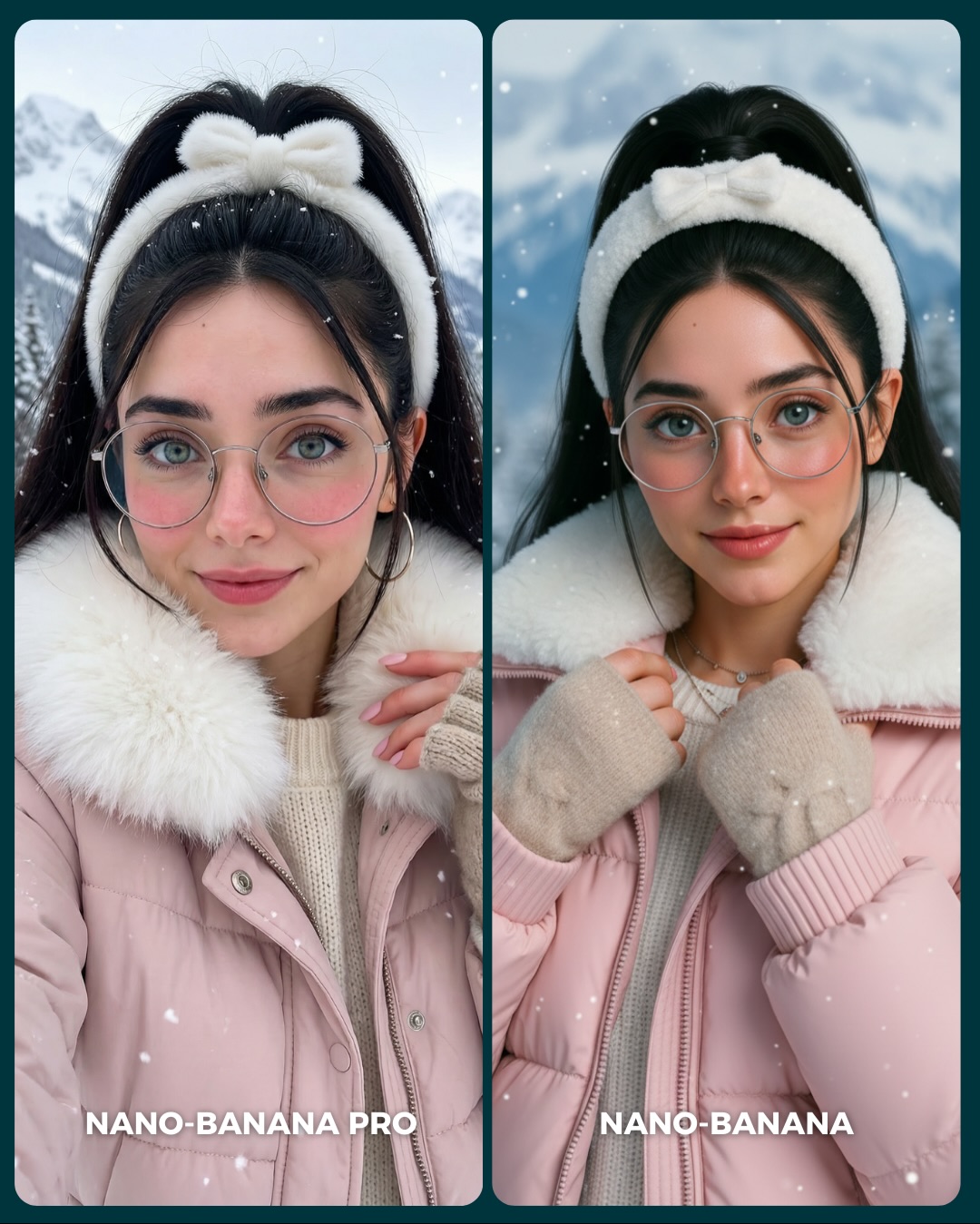
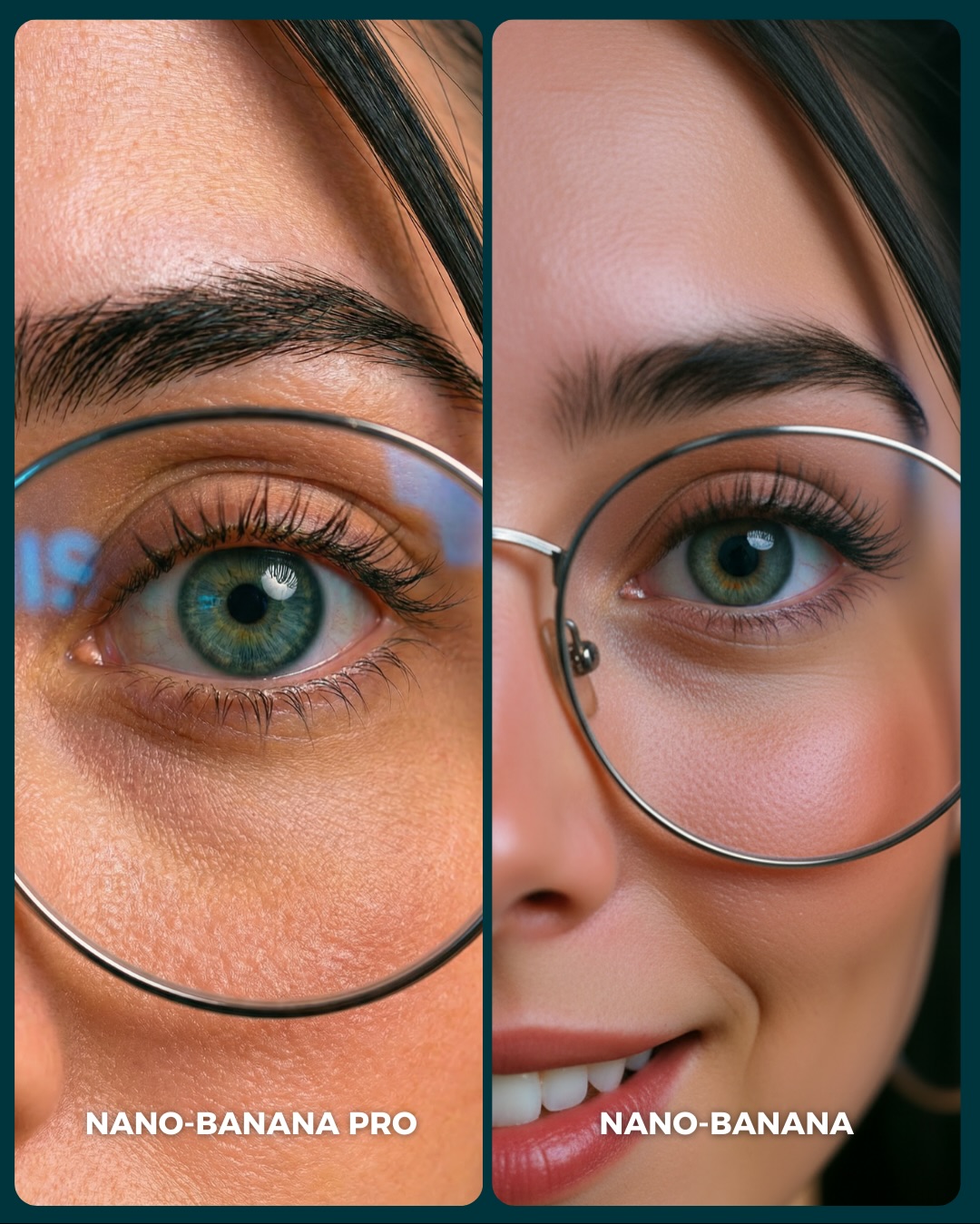
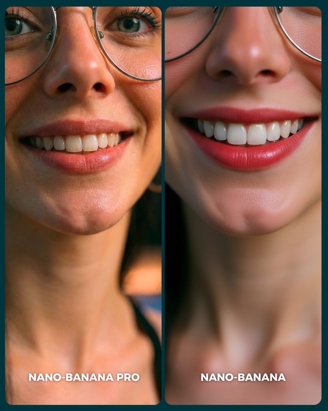
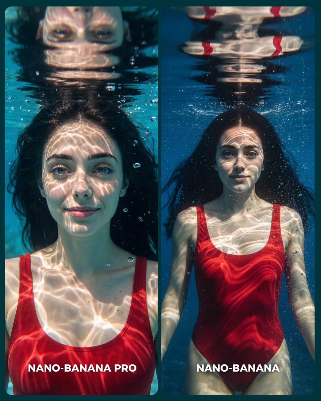
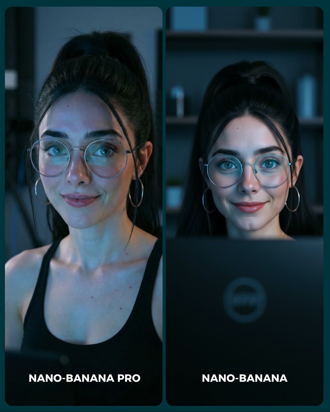
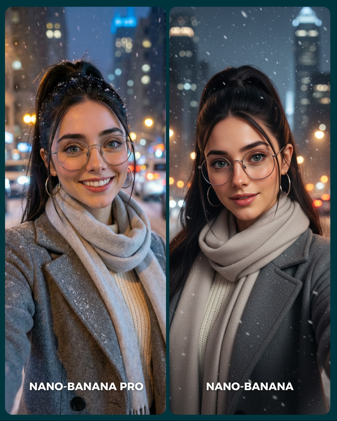
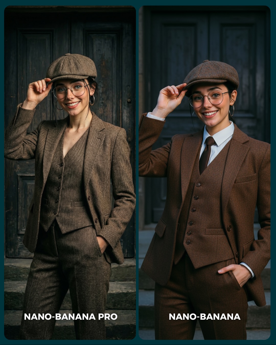
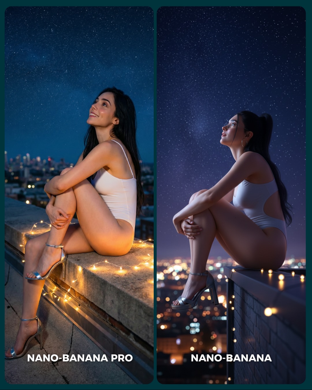
🥹Nano-Banana PRO VS. Nano-Banana
Hoy toca poner a prueba el nuevo generador de Google 🙊 Es tan bueno que tienes que verlo para creerlo…
Aquí os dejo unas imágenes para que podáis comparar el Gran salto de calidad de algo que ya era muy bueno a algo insuperable 💕
Y dime… con cuál de los 2 te quedas?? 👀
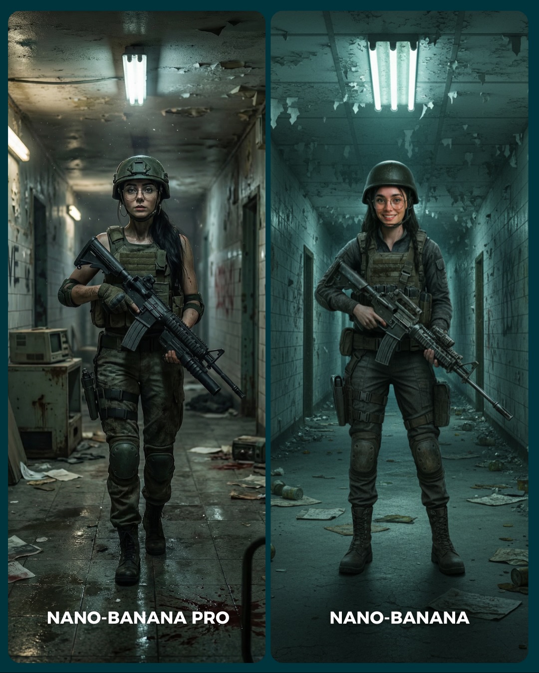
How to Create a Female Soldier Hallway Comparison AI Image
This image is a good example of comparison content that does more than simply ask which model looks sharper. It sets up a complete atmosphere first. The abandoned corridor, fluorescent ceiling lights, tactical outfit, and rifle all create a high-pressure cinematic space before the viewer starts judging. That matters because audiences engage more with comparisons that already feel like real scenes rather than sterile benchmarks.
The diptych also reveals something useful about image evaluation: realism is not only about face quality. It is about clothing structure, weapon handling, corridor texture, lighting behavior, and body stance. That is why tactical imagery is effective for model comparisons. It contains many realism checkpoints at once. If a model gets the scene wrong, people notice quickly.
Why The Image Stops The Scroll
The first hook is environment pressure. The hallway feels decayed, narrow, and tense, which gives the subject a built-in story even without a caption. The second hook is the side-by-side tension between moods. One panel feels darker and more cinematic, the other cleaner and more straightforward. That creates instant contrast while keeping the core ingredients stable.
There is also a practical reason this format performs well: the silhouette is easy to read. Helmet, vest, rifle, boots, corridor lines. Even at small size, the image remains legible. That makes it especially effective in social feeds, where complex scenes often fail because the viewer cannot parse them quickly enough.
Signal
Evidence (from this image)
Mechanism
Replication Action
Environment-led tension
The corridor is narrow, damaged, fluorescent-lit, and full of debris
A strong location gives the comparison emotional context before the viewer inspects technical quality
Choose one setting with instant narrative pressure instead of relying only on wardrobe
High realism checkpoint density
Helmet fit, glasses, rifle, vest, boots, debris, and overhead lights all need to render convincingly
More checkpoints create richer viewer judgment and stronger comment potential
Use scenes that test props, clothing structure, lighting, and pose at the same time
Stable subject identity
The same woman and same tactical build appear in both panels
Consistency helps viewers compare model behavior rather than random prompt drift
Lock identity and gear first; vary only the presentation or model backend
Readable full-body composition
The subject is framed head-to-boots in a clean corridor perspective
Full-body readability makes clothing, posture, and prop handling easy to evaluate
Use simple one-point perspective when your scene includes full outfits and large props
How The Aesthetic Stays Coherent
The image keeps itself under control by limiting the palette to cold concrete tones, dark olive gear, and black equipment. That discipline makes the scene feel serious. If brighter colors were introduced, the comparison would lose its grounded military mood. The fluorescent lights also do important work. They create a clear top-down rhythm that repeats in both panels and strengthens the corridor symmetry.
The second smart choice is that the two panels are not trying to show two different stories. They are showing two readings of the same idea. The left leans cinematic and grim, while the right leans cleaner and more neutral. That is exactly the kind of variation you want in a public model comparison. Enough difference to provoke judgment, not enough difference to confuse it.
Observed
Why it matters for recreation
Overhead fluorescent tubes dominate the ceiling
Give the corridor a cold institutional mood and a strong repeated lighting pattern
Subject framed full-body with corridor perspective behind
Keeps both outfit construction and environment depth readable at once
Dark olive tactical gear against pale damaged walls
Creates strong silhouette separation without using loud color
Rifle carried across the torso rather than actively fired
Makes the image tense and grounded without needing explosive action
Left panel moodier than right panel
Provides clear comparison energy while preserving the same core prompt concept
Best Uses, Weak Uses, And Transfers
Best for generator comparison content where you want multiple realism tests inside one scene.
Best for action-game or tactical prompt libraries because the visual language is widely recognizable and easy to adapt.
Best for creator education around mood control, since small lighting changes noticeably alter the scene.
Best for carousel posts that invite audiences to choose which rendering feels more cinematic or more believable.
This format is less ideal for brand-safe lifestyle imagery, romance content, or scenes where softness matters more than tension. Its strength is controlled severity.
Transfer Recipes
Keep: corridor perspective, full-body framing, tactical silhouette. Change: swap military styling for security guard, cyberpunk detective, or disaster-response worker. Slot template: "{character type} in a damaged corridor, full-body portrait, overhead cool lights, prop carried across body"
Keep: stable A/B layout and environment tension. Change: replace rifle with flashlight, medical kit, or riot shield. Slot template: "{subject} comparison diptych, same hallway, same outfit family, different prop emphasis"
Keep: cold palette and institutional decay. Change: move from military realism to horror survivor, sci-fi bunker tech, or espionage training scene. Slot template: "{genre} corridor portrait, worn walls, fluorescent overhead light, grounded full-body stance"
Keeps the action tone grounded without overcomplicating the frame
rifle held across torso; flashlight in hand; shield hanging at side
Panel delta
Creates meaningful comparison between versions
darker cinematic walk vs brighter static stance; wet floor vs dry floor; stern face vs faint smile
Costume realism
Makes the image believable rather than cosplay-generic
olive tactical vest; black training harness; worn combat trousers with knee pads
Execution Playbook For Remixing It
Lock three things first: the same female identity across both panels, the corridor perspective, and the tactical gear silhouette. Those are the structural constants that make the comparison usable.
Then iterate in this order:
Get the full-body stance and weapon handling stable first.
Refine the corridor decay and overhead lighting so the environment supports the subject.
Tune outfit realism next, especially vest fit, pant structure, and boots.
Change mood last through shadow depth, floor reflections, and facial expression.
This workflow matters because tactical images fall apart fast when props or clothing drift. Mood should be the final adjustment, not the first.