Why soy_aria_cruz's Nano-Banana Pro vs Nano-Banana Tattoo Portrait Benchmark Went Viral — and the Formula Behind It
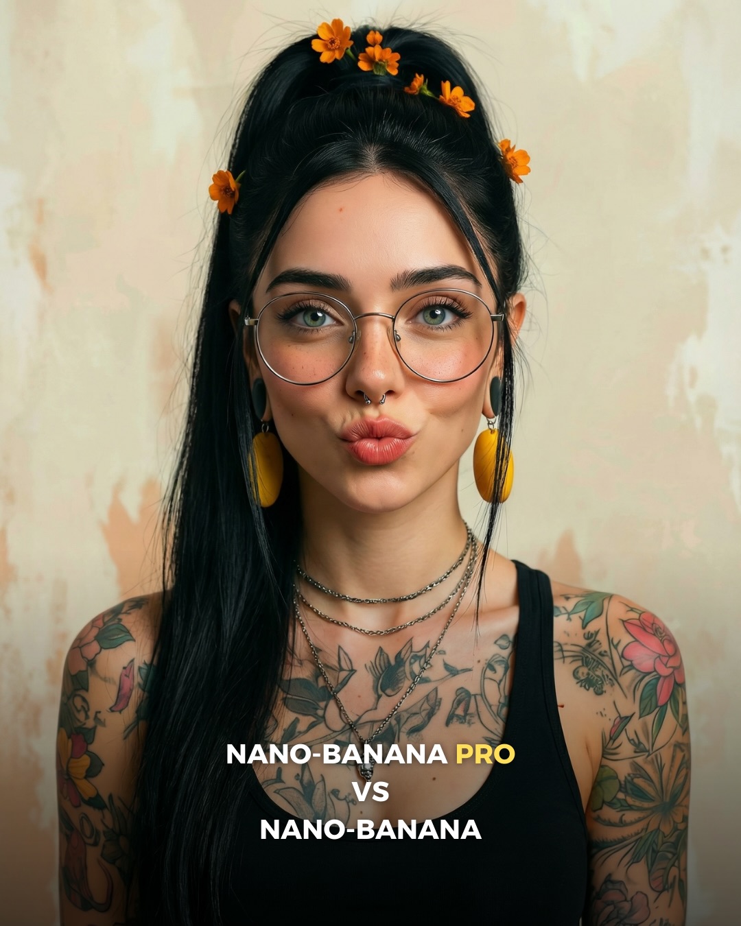
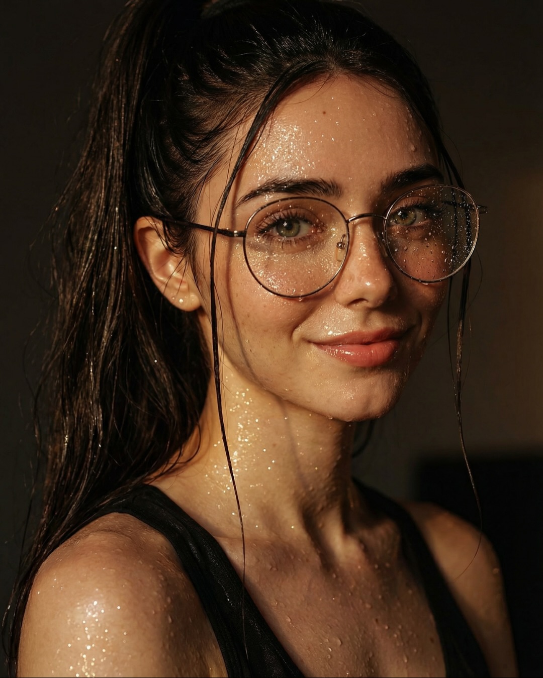
This image is interesting because it proves that comparison content does not always need two panels. Instead of showing two outputs directly next to each other, it uses one strong hero portrait and lets the text framing carry the benchmark message. That can work very well on social when the goal is not detailed forensic comparison, but fast attention and brand positioning.
For creators, this is a useful distinction. Side-by-side comparisons are better for technical judgment. Single-image benchmark posters are better for making the audience curious enough to click, comment, or look for the rest of the carousel. In other words, this format behaves more like a hook than a lab test.
Why the portrait itself is a good benchmark choice
The styling gives the model plenty of chances to fail. You have glasses, a septum ring, layered necklaces, flowers in the hair, yellow statement earrings, and dense colorful tattoos. That is a high-information portrait. If a model can keep all of those details coherent while still producing a flattering face, the result feels impressive very quickly.
The centered composition is also smart. Because the pose is simple and symmetrical, the audience can focus on rendering quality rather than camera drama. That makes the portrait feel strong as a benchmark poster. The complexity lives in the micro-details, not in the composition itself.
| Signal | Evidence (from this image) | Mechanism | Replication Action |
|---|
| High-detail subject design | Tattoos, flowers, jewelry, glasses, and facial accessories all coexist cleanly | Viewers read the image as a quality stress test even without a split-screen | Use portraits with many small identity markers when you want one image to imply capability |
| Strong thumbnail readability | The subject is centered against a plain background with bold bottom text | The message remains legible at feed speed | Keep the composition simple when the detail challenge already lives in the styling |
| Hook-first comparison framing | The overlay text announces the benchmark directly inside the image | The post invites curiosity even before the audience sees the full comparison sequence | Use single-image comparison posters as entry points for larger carousel or thread narratives |
Where this format fits best
This structure is ideal for carousel cover slides, teaser posts, AI benchmark openers, and creator accounts that want to package comparison content in a more branded way. It is especially useful when one image already contains enough high-detail information to imply quality differences, even before the viewer sees alternatives.
It is less useful if your audience expects precise side-by-side evidence in the first frame. In that case, a split layout is more transparent. This poster format is strongest when the first goal is grabbing attention and setting the benchmark premise.
- Best fit: carousel cover images for tool comparisons. Why fit: the single hero portrait creates a cleaner hook than a busy dual panel. What to change: keep the text promise bold and the subject styling rich.
- Best fit: AI prompt educators. Why fit: one portrait can demonstrate accessory consistency and tattoo fidelity well. What to change: explain which details should be inspected in follow-up slides.
- Best fit: creator-brand benchmark posts. Why fit: the format feels more branded and poster-like. What to change: standardize typography and subject framing across a series.
- Not ideal: direct technical showdown posts. Reason: viewers cannot compare outputs in the same frame.
- Not ideal: minimalist personal-brand feeds. Reason: the tattoos, jewelry, and bold text make the visual identity intentionally dense.
Transfer recipes
- Keep: one centered portrait with many identity details and bold benchmark text. Change: tattoos to freckles, braids, piercings, or patterned makeup. Slot template: "{single-subject benchmark poster} featuring {dense styling markers} and {comparison label}"
- Keep: plain background and symmetrical pose. Change: wardrobe complexity and color accents. Slot template: "{clean beauty portrait} used as a teaser poster for {model comparison}"
- Keep: hook-first text treatment and one detail-rich face. Change: portrait archetype from edgy tattoo aesthetic to glam, mature, or masculine styling. Slot template: "{benchmark cover portrait} with {identity-rich styling} and {tool-vs-tool headline}"
What the image gets right aesthetically
The portrait succeeds because the complexity is concentrated in the subject rather than the environment. That is exactly what you want in a benchmark cover. The tattoos and accessories create density, but the beige background gives them room to breathe. Nothing in the setting competes with the face.
The color choices are efficient too. Orange flowers and yellow earrings create accent points that break up the black hair and black top. Those small warm notes help the portrait feel lively, while also acting as good rendering tests. They are simple visual decisions, but they make the benchmark stronger.
| Observed | Why it matters for recreation |
|---|
| Centered front-facing portrait with simple backdrop | Keeps the benchmark clear and instantly readable |
| Dense detail set on the subject only | Tests rendering quality without environmental distraction |
| Orange flowers and yellow earrings as accent colors | Add visual rhythm and stress-test color handling |
| Floral tattoos across both shoulders and arms | Challenge line fidelity, skin blending, and detail consistency |
| Bottom text framing the benchmark | Turns the image into a promotional comparison poster, not just a beauty portrait |
Prompt chunks worth locking first
If you want to build this kind of image, start with the subject-detail stack and the poster framing. Do not begin with “beautiful tattooed woman portrait” alone. The benchmark value comes from the precise combination of many small details plus the explicit comparison headline.
| Prompt chunk | What it controls | Swap ideas (EN, 2–3 options) |
|---|
| centered front-facing beauty benchmark portrait | Poster clarity and readability | straight-on bust portrait, clean head-and-shoulders poster, symmetrical studio beauty shot |
| round glasses, septum ring, layered chains, yellow earrings | Accessory complexity and identity fidelity | nose stud and bangles, layered pearl set, silver hoops and ear cuffs |
| orange flowers in high ponytail | Color accents and hairstyle signature | small daisies, ribbon clips, gemstone pins |
| colorful floral tattoos on shoulders and arms | Fine-detail rendering challenge | blackwork tattoos, sleeve illustration tattoos, delicate line-art florals |
| plain beige textured wall | Background restraint | soft gray backdrop, cream studio wall, light plaster surface |
| bottom headline text announcing the comparison | Hook-first benchmark packaging | MODEL X VS MODEL Y, PRO VS BASE, UPGRADE TEST |
An iteration path that keeps the poster effective
Lock these three things first: the centered composition, the high-detail accessory-and-tattoo stack, and the benchmark headline at the bottom. Those are the real anchors. After that, refine skin texture, tattoo crispness, and text hierarchy one pass at a time.
- Run 1: stabilize face identity, glasses, earrings, and the centered pose.
- Run 2: improve tattoo clarity and the flower placement in the ponytail.
- Run 3: refine jewelry detail, septum-ring visibility, and the warm accent colors.
- Run 4: remix the portrait archetype while preserving the same single-image benchmark-poster structure.
If the output feels like a normal portrait, strengthen the headline framing. If it feels too promotional and not impressive enough visually, increase the density of subject detail. The strongest version balances both.