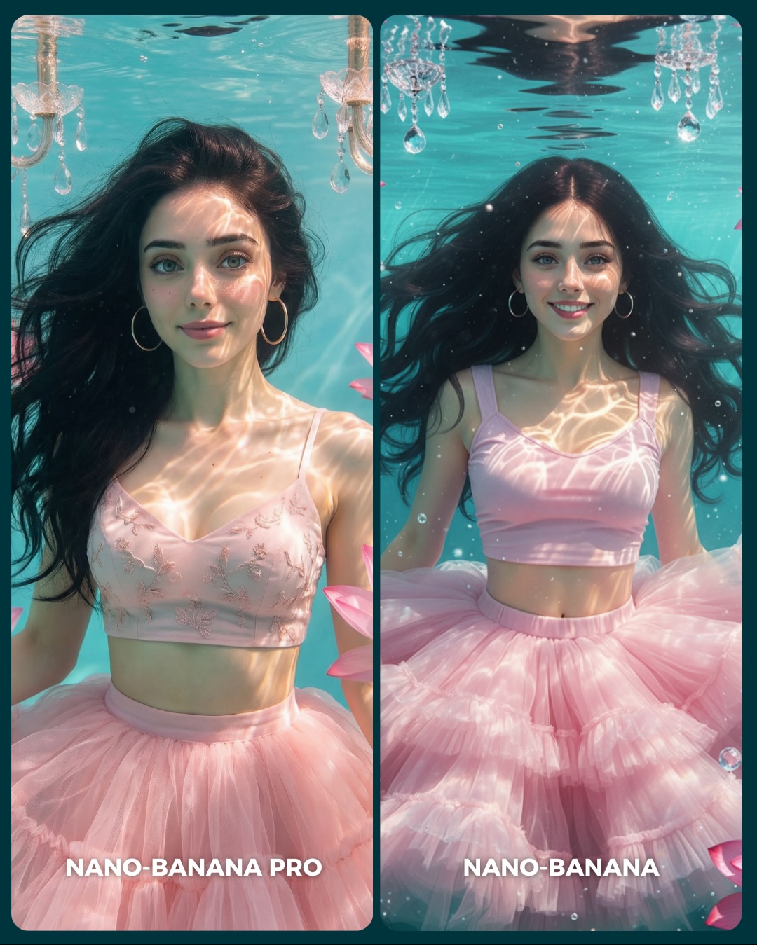
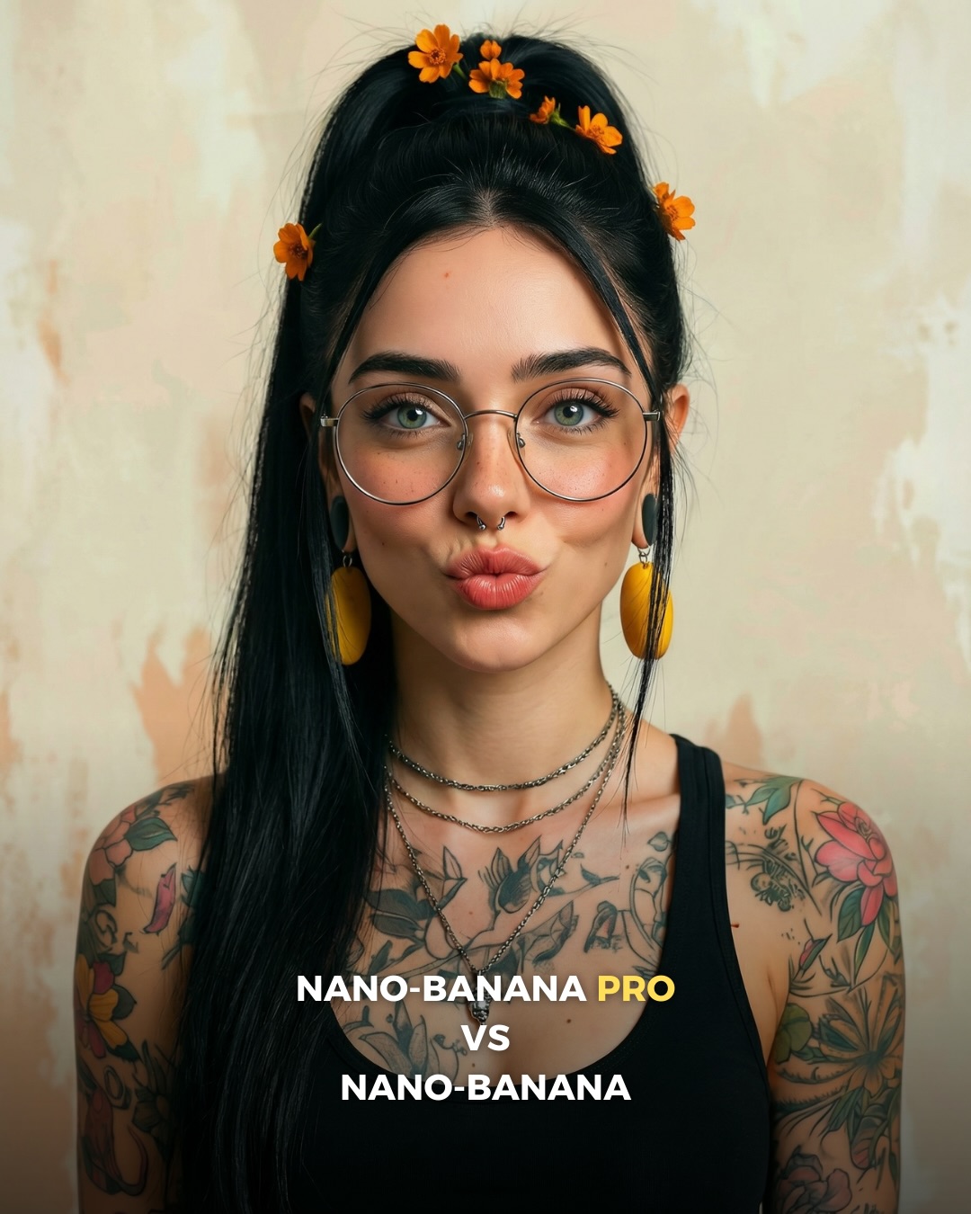
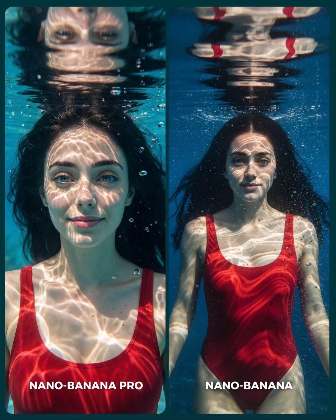
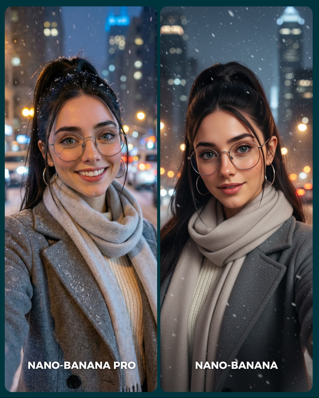
How to Create an Underwater Pink Dress Comparison AI Image
This image works because it takes a comparison format and gives it dream value. Instead of benchmarking two generators with a dry studio test, it uses an underwater fantasy-lifestyle setup full of textures that are hard to fake: floating hair, light caustics, translucent tulle, chandelier crystals, and facial realism under water distortion. That makes the image emotionally attractive and technically revealing at the same time.
For creators, this is a strong lesson in how to present comparison content without making it feel sterile. The side-by-side layout invites analysis, but the soft pink palette and luminous aqua water keep the post aspirational. People do not feel like they are reading a lab report. They feel like they are stepping into a dreamy visual test.
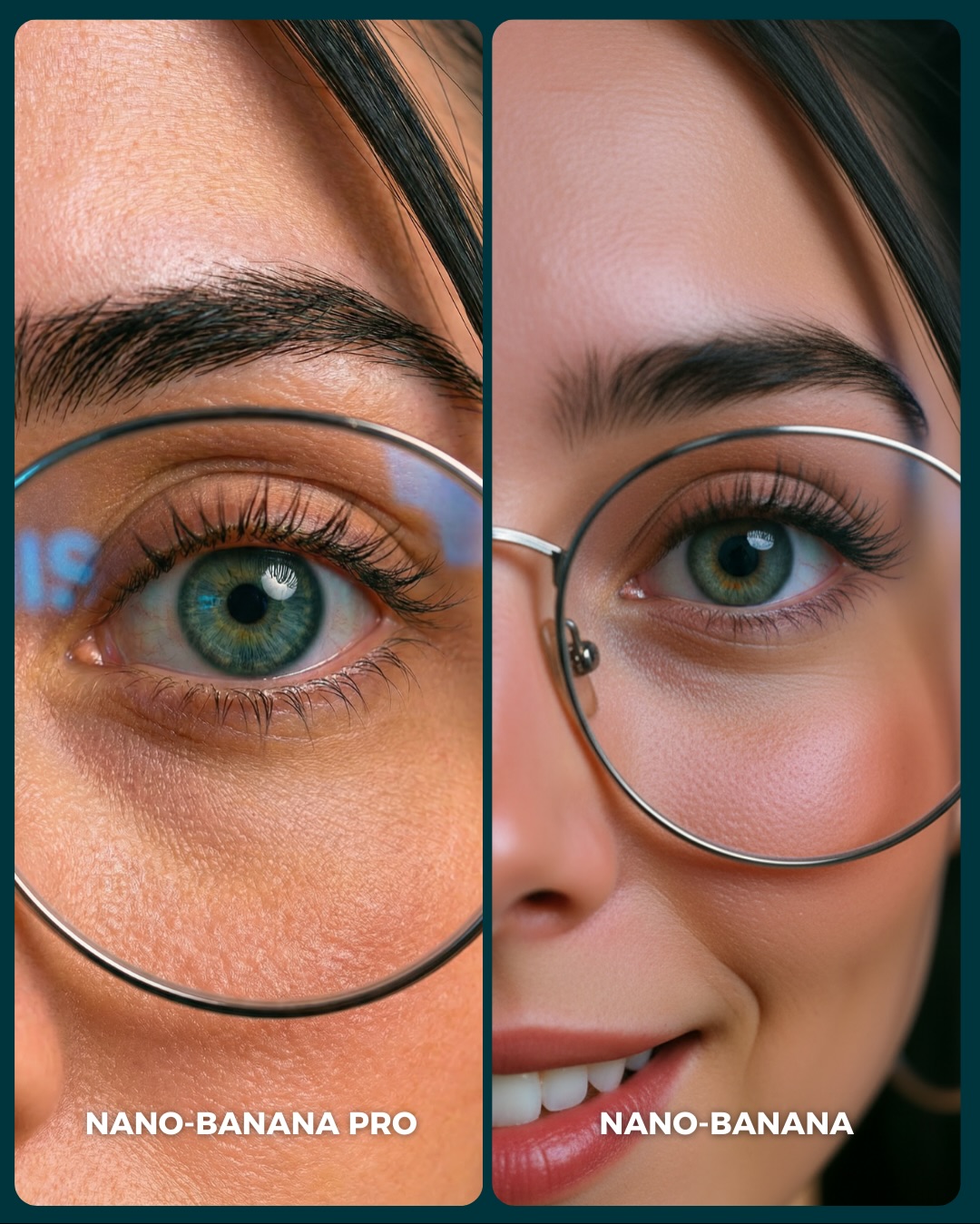
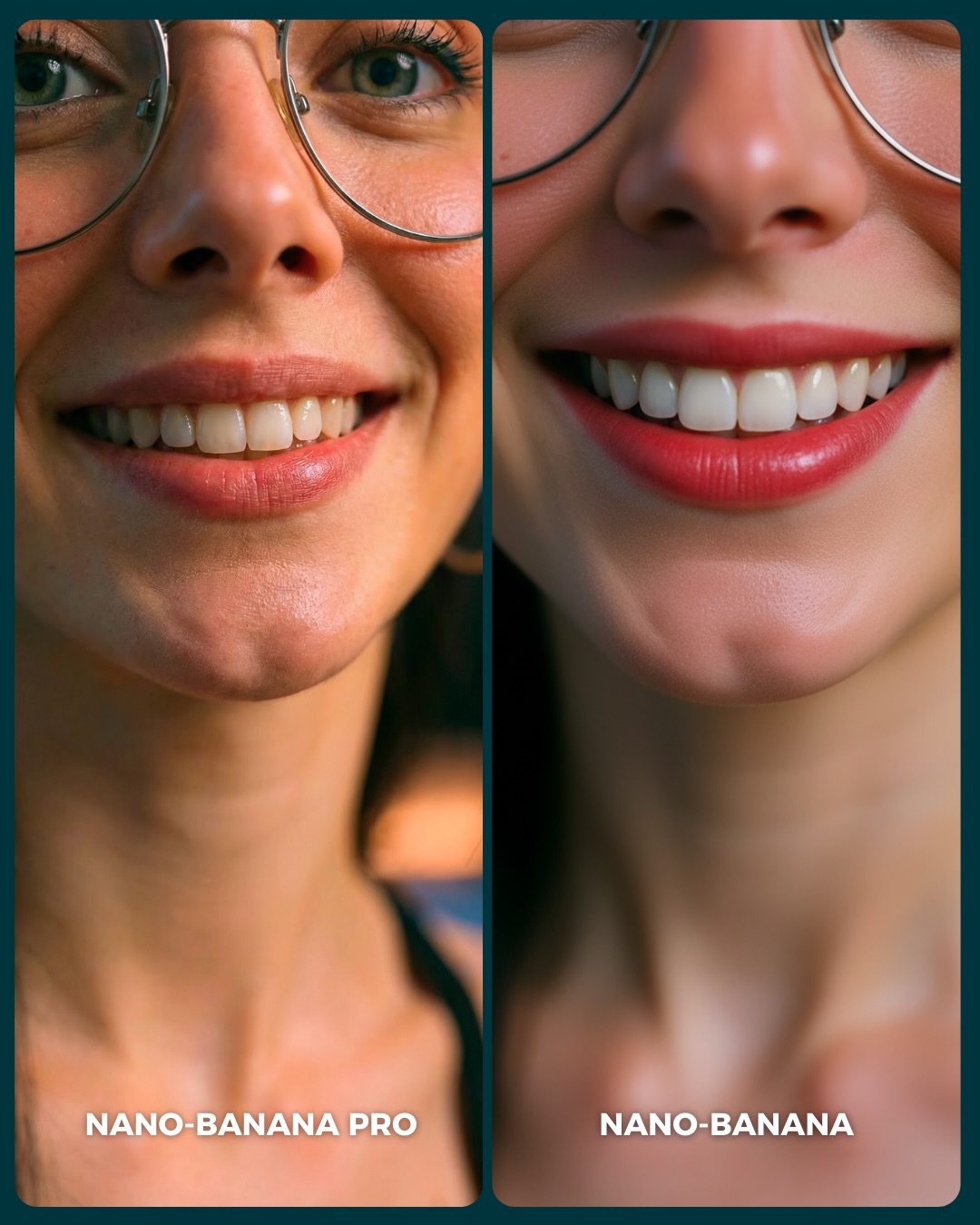
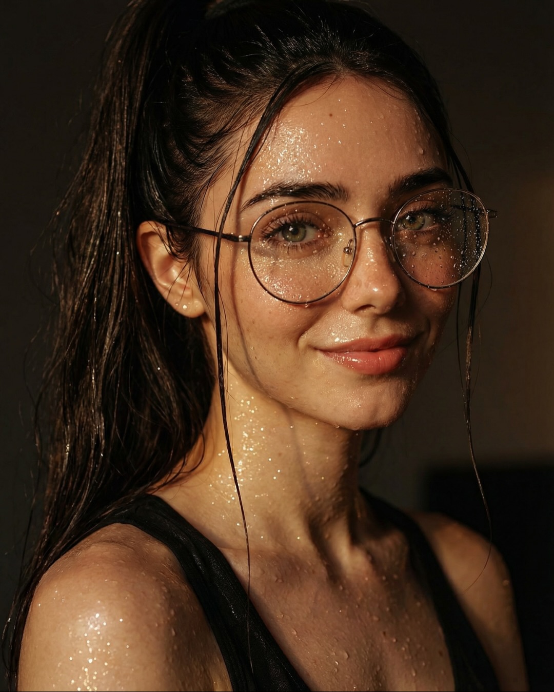
The concept is also smart because underwater scenes expose common generation weaknesses quickly. Hair often clumps unnaturally, fabric loses believable buoyancy, water lighting becomes fake, and faces can flatten or distort. That means viewers do not need expert knowledge to evaluate the images. The scene itself makes quality differences easier to notice.
Why This Comparison Holds Attention
The first reason is texture complexity. There are several difficult material systems operating at once: skin under water, free-floating hair, transparent or semi-transparent tulle, chandelier crystals, tiny bubbles, and refracted light patterns. Social images keep attention longer when the eye has multiple believable surfaces to inspect.
The second reason is emotional softness. The pastel pink outfit and the calm facial expressions prevent the technical comparison from feeling cold. This matters because comparison content can easily become too analytical. Here, the viewer gets both romance and evaluation. That combination is very shareable.
The third reason is that the layout is immediately understandable. Two nearly matching underwater portraits, clearly labeled, create a built-in invitation to compare. The audience knows exactly what to do without relying on the caption. Good benchmark posts remove ambiguity from the first glance.
| Signal | Evidence (from this image) | Mechanism | Replication Action |
|---|
| Dreamy benchmarking | Side-by-side generator labels are paired with a visually luxurious underwater setup | Technical content becomes more engaging when wrapped in an aspirational scene | Use comparison layouts inside emotionally attractive environments, not plain test shots |
| Hard-to-fake materials | Floating hair, tulle, water caustics, crystals, and bubbles all appear together | Difficult surfaces help viewers judge quality more confidently | Pick scenes that naturally expose rendering weaknesses without looking forced |
| Color-coherent softness | Aqua water and pastel pink styling keep the frame gentle and inviting | A soft palette broadens appeal beyond technical audiences | Choose one cool base color and one warm accent color, then stay disciplined |
| Clear interaction model | Two matching portraits encourage left-versus-right evaluation | Built-in comparison increases dwell time and comment potential | Keep subject, styling, and crop consistent enough that differences are easy to inspect |
Where This Style Transfers Best
This format is especially good for generator comparisons, realism-versus-beautification tests, fantasy-lifestyle benchmark posts, underwater prompt showcases, and carousel covers that need both beauty and utility. It is ideal when you want the audience to compare subtle quality differences without losing emotional interest.
- Best fit: generator benchmark covers. The split layout is instantly legible and useful.
- Best fit: fantasy-lifestyle prompt showcases. Underwater scenes feel magical without needing full fantasy creatures.
- Best fit: material realism tests. Tulle, hair, skin, and water lighting all challenge the model in natural ways.
- Best fit: beauty-adjacent feeds. The palette and styling keep technical posts visually aligned with soft aesthetic content.
- Best fit: carousel-first social content. A side-by-side dream scene is strong enough to stop the scroll before the swipe.
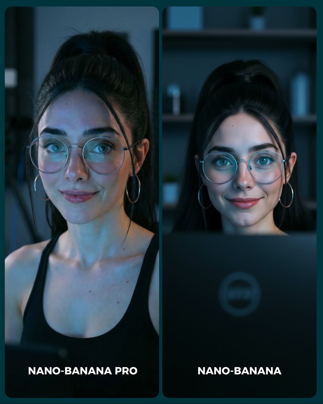
It is less useful for rugged realism, street content, or heavily narrative posts. The power here comes from controlled beauty and direct comparison, not from story progression or documentary energy.
Transfer Recipes
- Flower bath comparison. Keep: matching dual-panel layout and soft palette. Change: environment from underwater to surface-floating bath scene. Slot template:
two-panel generator comparison, same woman, {soft palette}, difficult texture scene, labeled left and right outputs - Rain-glass comparison. Keep: material challenge and dreamy tone. Change: water system from underwater to droplets on glass and wet hair. Slot template:
split-screen realism test, same subject, {weather texture}, comparison labels, elegant social cover - Snow-tulle comparison. Keep: airy fabric and pastel styling. Change: water caustics to snow glow and cold light. Slot template:
side-by-side portrait benchmark, same woman in soft tulle styling, {seasonal environment}, generator labels below
The Aesthetic Read
The strongest aesthetic choice is the balance between structure and fluidity. The split-screen frame is strict, but everything inside the panels is drifting: hair, fabric, bubbles, reflections. That tension makes the composition feel both controlled and alive. For creators, it is a useful reminder that benchmark content does not need to look rigid.
The chandelier elements are another clever touch. They give the scene a sense of decorative luxury without overpowering it. More importantly, they help the viewer understand that this is not just a swimmer in a pool. It is a stylized underwater fantasy environment with deliberate visual design.
The pink tulle does critical work too. Without it, the image would be a generic underwater portrait. The skirt blooms outward in the water and creates volume, softness, and motion. That single wardrobe choice is what turns the scene from “portrait under water” into “ethereal comparison cover.”
| Observed | Why it matters | How to recreate it |
|---|
| Two near-matching underwater portraits | Creates a fair and easy-to-read benchmark | Keep the subject identity and wardrobe stable across both sides |
| Pastel pink tulle skirt underwater | Adds softness, movement, and material drama | Use a lightweight, volumetric fabric that reacts visibly to the environment |
| Waterline and chandelier crystals near the top | Defines the scene as stylized rather than generic pool imagery | Add one decorative environmental cue that clarifies the fantasy |
| Caustic reflections across the face and chest | Supplies the core underwater realism signal | Prompt for shimmering refracted light patterns on skin and fabric |
| White text labels at the bottom of each panel | Makes the comparison explicit without crowding the face | Put identifiers in the lower area so visual inspection remains primary |
Prompt Technique Breakdown
To recreate this image successfully, you need to control four systems: identity consistency, underwater realism, fabric behavior, and comparison layout. If any one of those systems fails, the entire post weakens. A beautiful underwater portrait alone is not enough. The image only becomes useful social content when the side-by-side benchmark logic remains intact.
| Prompt chunk | What it controls | Swap ideas (EN, 2-3 options) |
|---|
| Identity lock | Fairness and recognizability between panels | same woman in both panels; stable facial identity; matched subject styling |
| Underwater realism | Whether the scene feels plausible or synthetic | clear turquoise water; visible waterline; realistic bubbles and refraction |
| Fabric bloom | Motion and dream quality | floating tulle skirt; layered chiffon volume; airy pink dress underwater |
| Decorative cue | Scene identity beyond a generic pool portrait | submerged chandelier crystals; elegant hanging ornaments; luxury underwater detail |
| Comparison layout | Usefulness as a benchmark cover | split-screen portrait cards; side-by-side labeled outputs; clean benchmark design |
| Panel variation | Helps the comparison feel alive rather than duplicated | calm expression on left; brighter smile on right; subtle quality difference between outputs |
The most likely drift point is the underwater physics. Hair and fabric often behave wrong in generated images. That is why the prompt should explicitly call for floating strands, buoyant tulle, and clean caustic reflections rather than assuming the model will infer them.
How to Iterate Without Breaking the Benchmark
Lock three things first: the split-screen layout, the same-subject identity, and the underwater lighting. Once those are stable, refine the tulle shape, chandelier details, or the subtle difference in expression between panels. If you start changing styling too early, the comparison becomes less trustworthy.
Use a one-change rule. If the water looks fake, fix only the caustics and buoyancy. If the scene loses dream value, strengthen the chandelier and pastel palette. If the two sides feel too different, tighten identity and crop consistency. Small changes preserve fairness while still letting you create a visually rich comparison.
- Run 1: Solve the dual-panel layout with the same woman and same outfit.
- Run 2: Add clean underwater realism: waterline, caustics, and floating hair.
- Run 3: Refine the pink tulle bloom and chandelier crystal accents.
- Run 4: Tune the left-right personality difference and add the lower generator labels.
If the output becomes too mermaid-like, append a correction such as photoreal underwater portrait benchmark, no fantasy creature elements, elegant comparison cover. If it becomes too technical and dry, soften the palette and increase the tulle motion. The image works because it lets beauty and benchmarking reinforce each other.