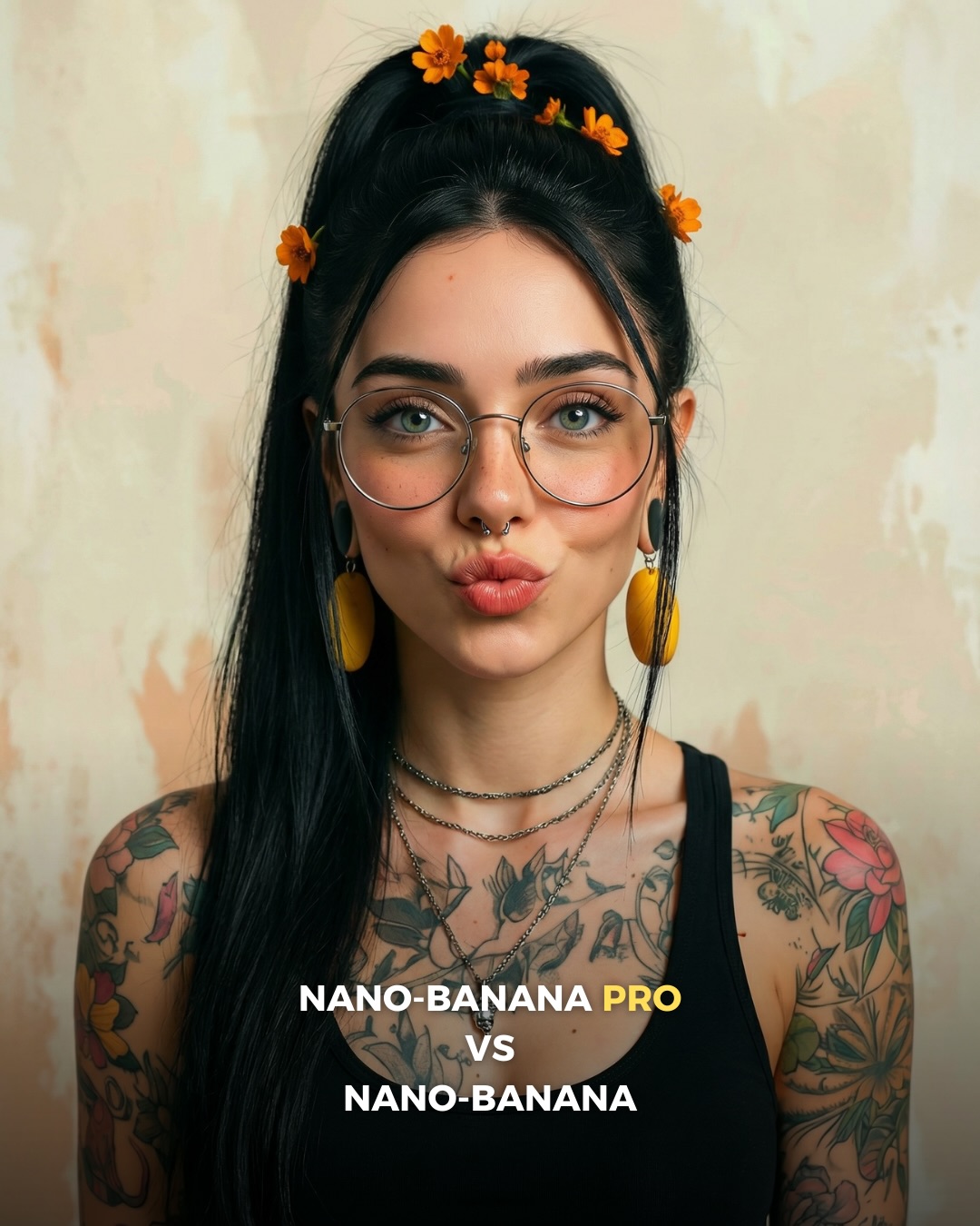
Why soy_aria_cruz's Nano-Banana Pro vs Nano-Banana Realism vs Stylized Comparison Went Viral — and the Formula Behind It
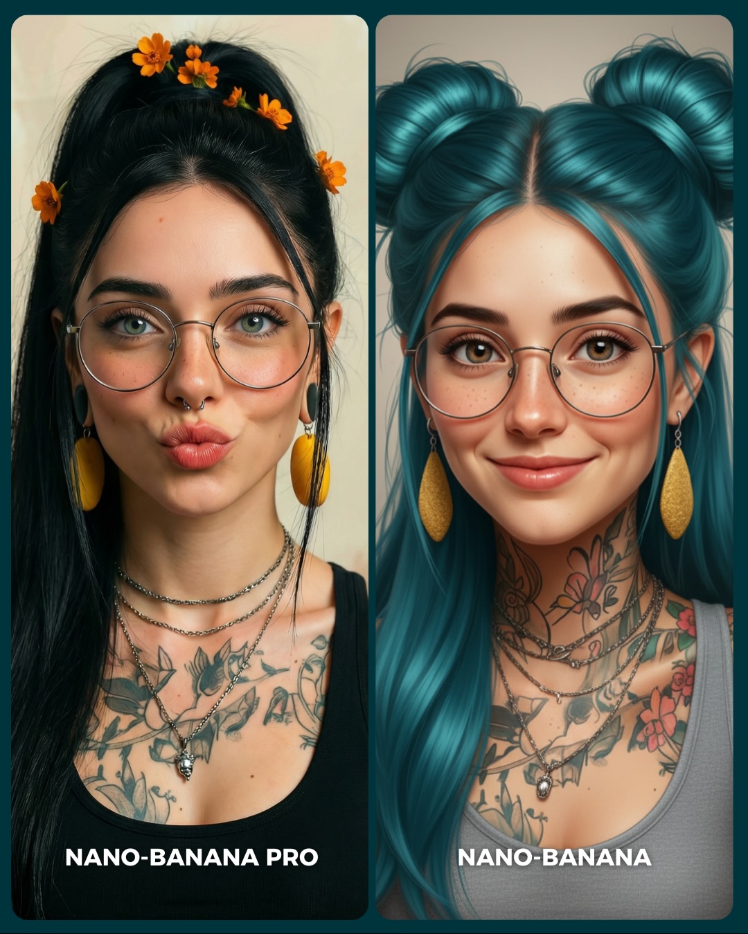
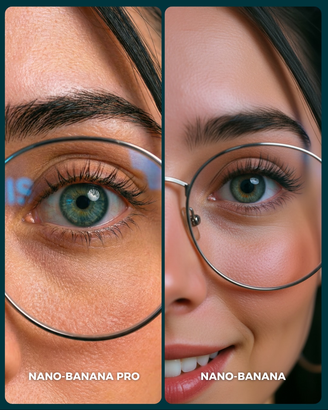
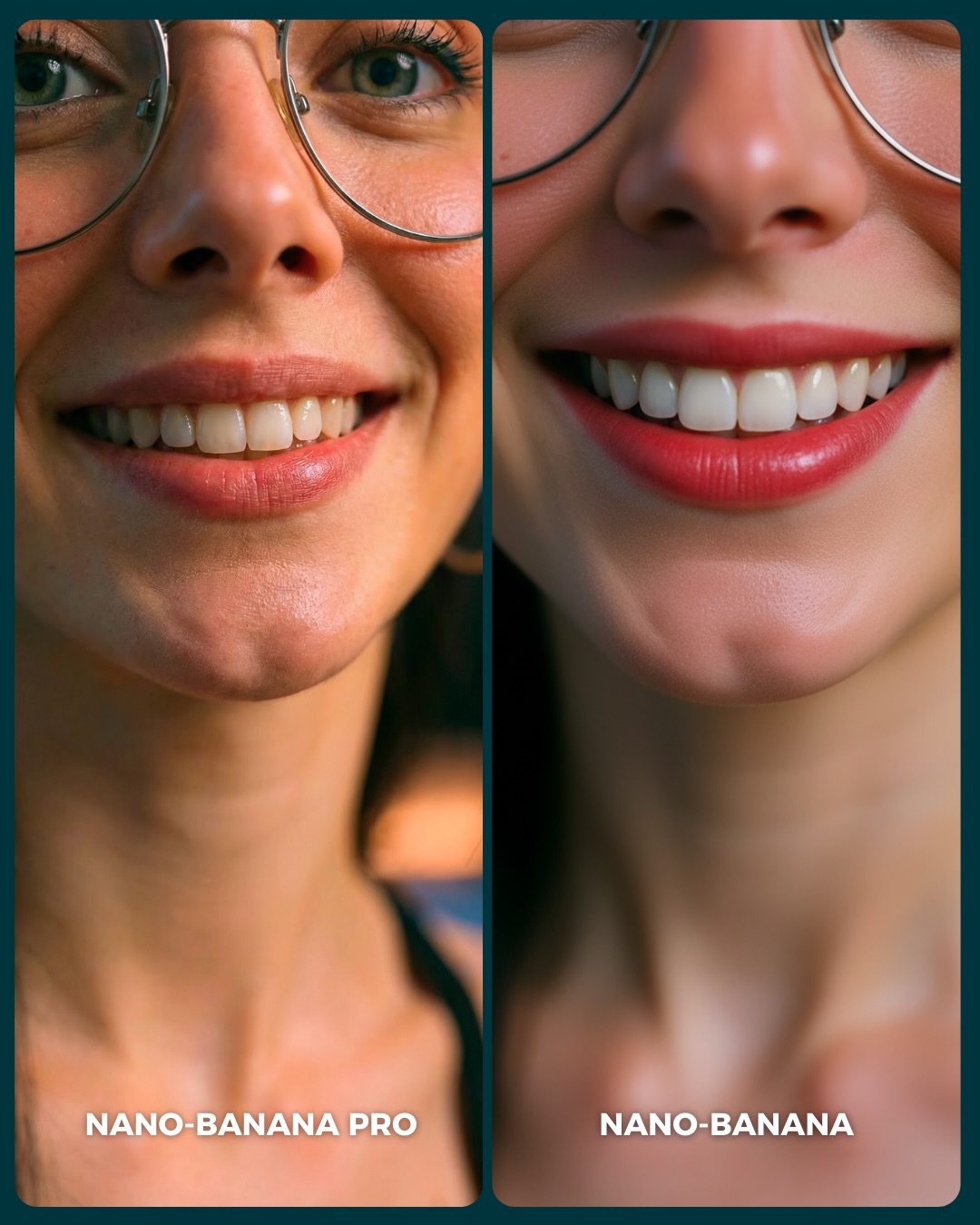
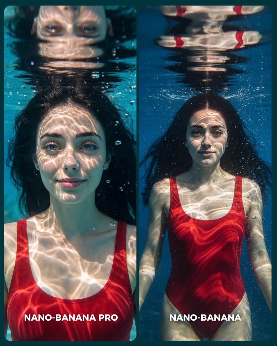
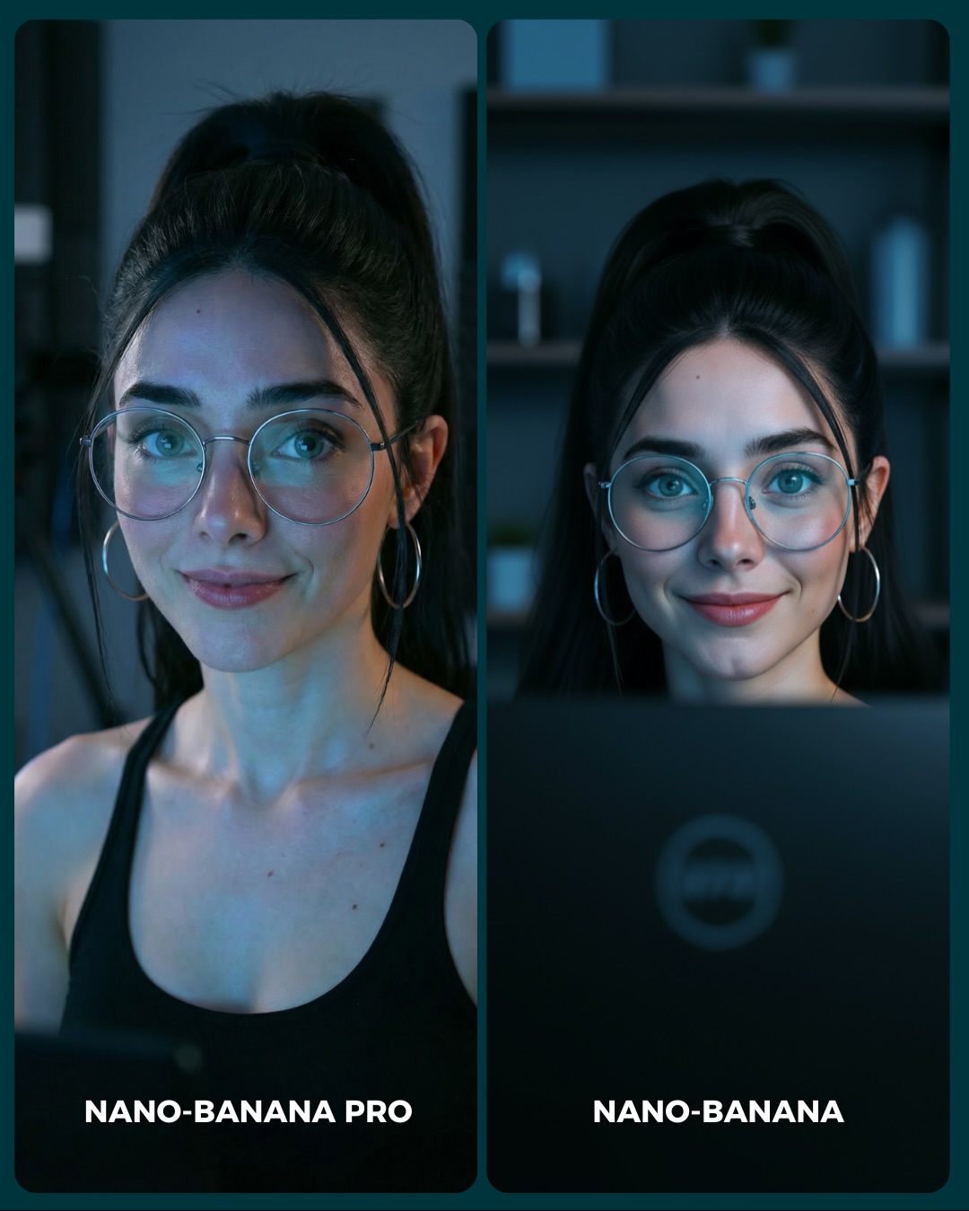
This comparison works because it is not only testing image quality. It is testing identity retention under style drift. Both sides clearly represent the same core persona, but one output stays much closer to photographic realism while the other shifts into a smoother, more stylized beauty language. That is a more interesting comparison than a simple “which one is sharper?” question.
For creators, this matters because many model comparisons fail to separate realism from prettification. A lot of tools can make a face look polished. The harder question is whether they preserve the same person while doing it. This image puts that exact tension in front of the audience.
Why the comparison reads quickly
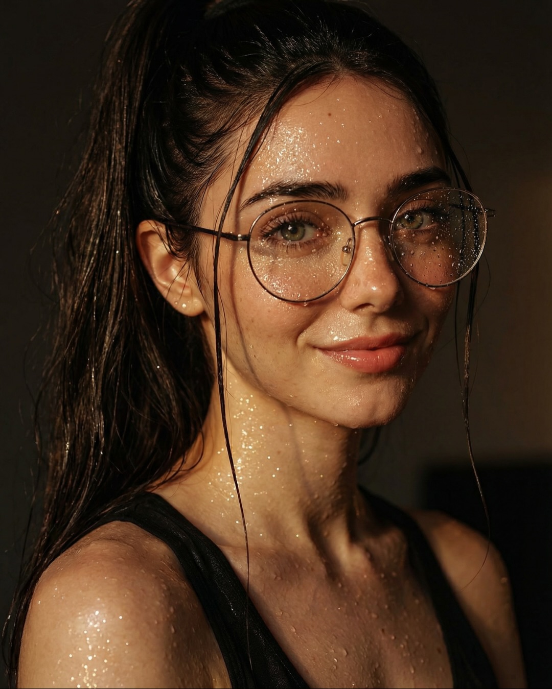
The strongest mechanism here is identity anchoring. Both sides preserve glasses, earrings, tattoos, necklaces, and the same general face structure. Because those anchors stay visible, the viewer can focus on how the style shifts rather than wondering whether the prompt changed completely. That makes the comparison feel fair.
The second strength is that the scene itself is very controlled. No complicated background, no extra props, no dynamic pose changes. This is important. When you want the audience to judge realism versus stylization, the cleanest path is to remove everything else that might distract from the face.
| Signal | Evidence (from this image) | Mechanism | Replication Action |
|---|
| Identity retention test | Both sides keep the same accessories, tattoos, and facial framework | Viewers can evaluate whether the model holds onto the same person under different rendering styles | Lock high-signal identity markers before comparing realism quality |
| Obvious style split | Left side stays grounded and realistic, right side becomes smoother and more stylized | The audience instantly understands what kind of difference is being measured | Choose comparisons where the style gap is visible but the character stays recognizable |
| Minimal frame noise | Neutral background and chest-up crop keep attention on the face and tattoos | Comparison becomes easier to read at feed speed | Remove scene complexity when testing portrait consistency |
Where this format fits best
This structure is ideal for creators comparing realism-focused versus beautification-focused models, prompt educators teaching identity locking, and carousel posts that want to spark debate over “better” versus “more accurate.” It is also useful when you want to show that one model may be more flattering while another is more faithful.
It is less effective for users who only care about visual prettiness. If the audience is not interested in identity fidelity, they may simply pick whichever side looks more glamorous. That is not wrong, but it means the educational value depends on how well you frame the conversation.
- Best fit: portrait-model benchmark posts. Why fit: the image cleanly isolates identity consistency as the main variable. What to change: vary hair complexity or accessory count while keeping the structure fixed.
- Best fit: prompt educators. Why fit: the image demonstrates how anchors survive or drift between models. What to change: explicitly point out which details stayed and which details shifted.
- Best fit: creator discussion posts. Why fit: the audience can argue over realism versus beautification in a meaningful way. What to change: ask the audience which value matters more for their use case.
- Not ideal: cinematic narrative pages. Reason: the composition is too controlled and studio-like.
- Not ideal: purely technical lab comparisons. Reason: the stylization layer introduces taste into the judgment, not only raw fidelity.
Transfer recipes
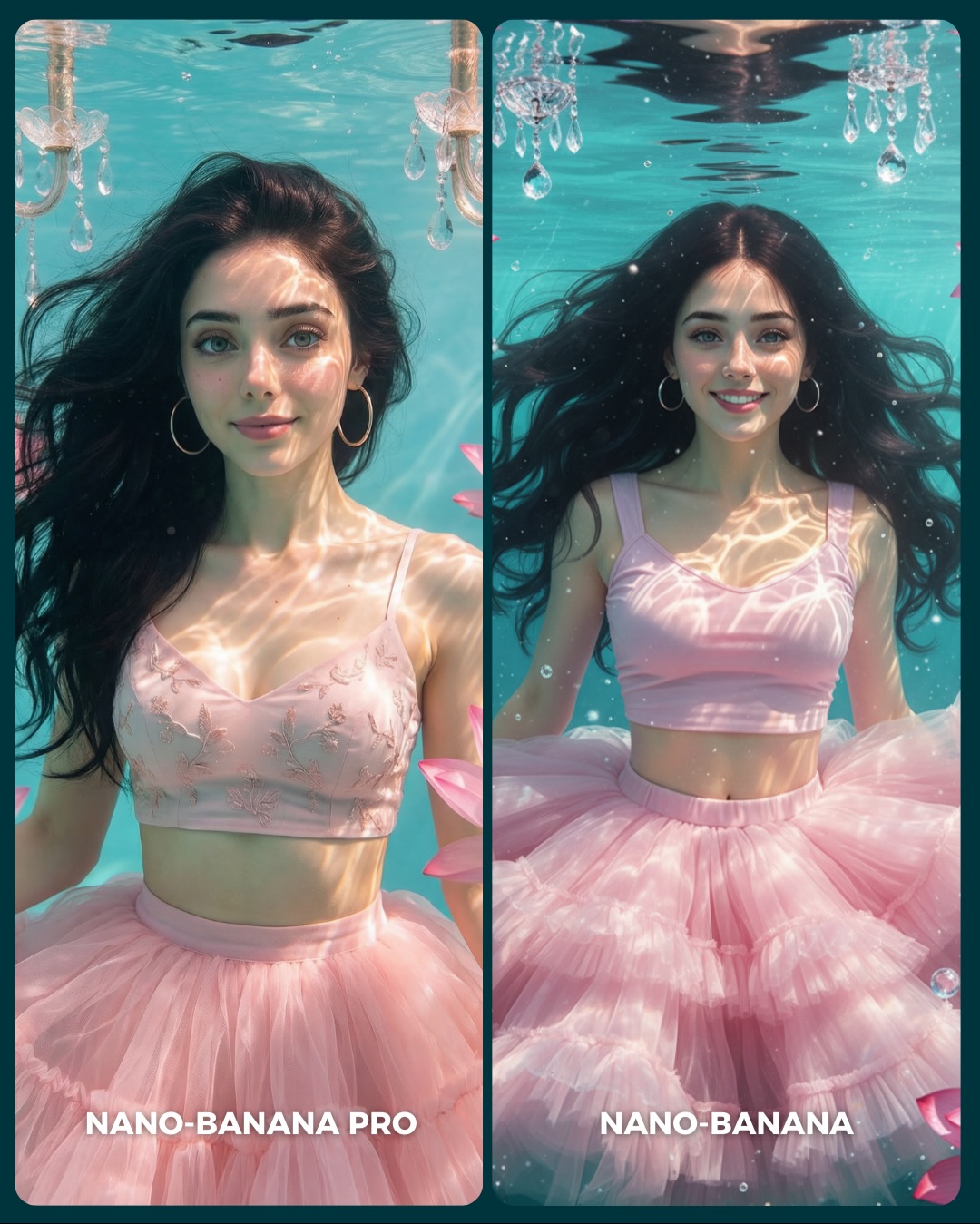
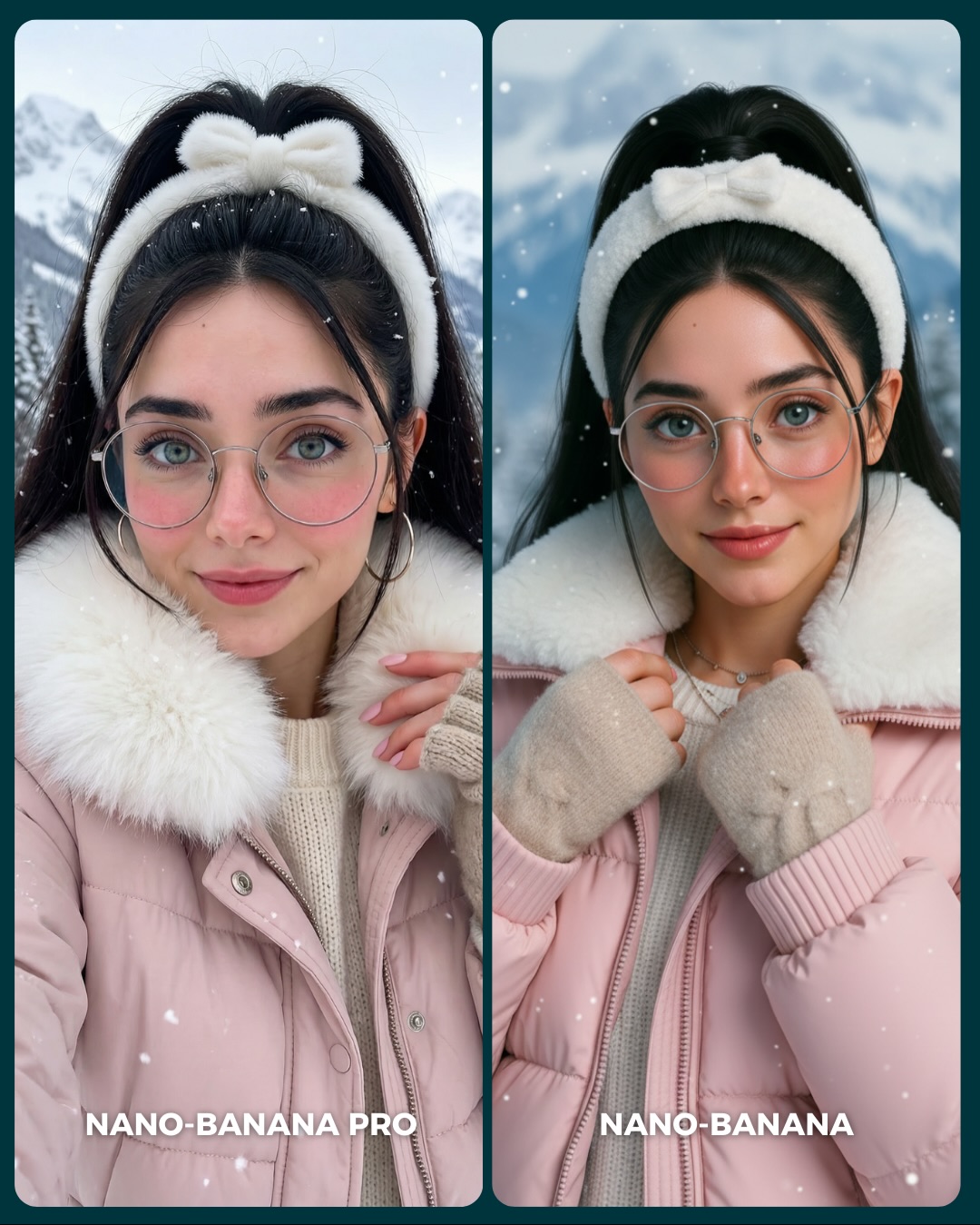
- Keep: same portrait crop, same accessories, and clear style split. Change: realism versus anime-softening, realism versus beauty-filter, or realism versus painterly stylization. Slot template: "{same subject} compared across {realism style A} and {stylization style B}"
- Keep: chest-up benchmark framing and identity markers. Change: tattoos to freckles, piercings, braids, or patterned makeup. Slot template: "{identity-rich portrait} showing {model A} against {model B}"
- Keep: neutral background and label-driven comparison. Change: the age, gender presentation, or fashion aesthetic while preserving the same test logic. Slot template: "{single-person comparison poster} testing {identity consistency variable}"
What the image gets right aesthetically
The image succeeds because the differences are interesting but not chaotic. The left side feels grounded with black hair and small flower accents. The right side introduces bright blue hair buns and a smoother finish, but the shared glasses, earrings, and tattoos keep the comparison coherent. That balance is what makes the image readable instead of random.
The warm neutral background also does exactly what it should do: almost nothing. It gives the portraits a clean stage without competing for attention. In a comparison like this, silence in the background is valuable. It lets the subject carry all the information.
| Observed | Why it matters for recreation |
|---|
| Same portrait structure across both sides | Makes the comparison feel intentional and fair |
| Shared tattoos, jewelry, and glasses | Anchor identity across different rendering styles |
| Black hair with flowers on one side, turquoise twin buns on the other | Make the realism-versus-stylization split instantly visible |
| Minimal warm background | Keeps the eye on the portrait details |
| Clean bottom labels | Explain the comparison in-feed without requiring the caption |
Prompt chunks worth locking first
If you want to recreate this type of comparison, start with the identity anchors before the style split. Without strong anchors, the result becomes two unrelated portraits instead of one meaningful test.
| Prompt chunk | What it controls | Swap ideas (EN, 2–3 options) |
|---|
| two equal portrait comparison panels | Benchmark structure and readability | dual-column identity test, split portrait benchmark, side-by-side character comparison |
| same woman with glasses, yellow earrings, layered necklaces, tattoos | Identity retention anchors | same man with beard and rings, same beauty face with freckles, same character with piercings and braids |
| left panel photorealistic, right panel beautified and stylized | Comparison premise | realistic vs anime-soft, realistic vs painterly, realistic vs airbrushed beauty mode |
| neutral portrait backdrop | Noise reduction | soft beige seamless, muted gray wall, light cream studio background |
| front-facing chest-up crop | Fairness of facial comparison | head-and-shoulders crop, straight-on beauty crop, matched bust portrait |
| clear model labels at the bottom | Feed comprehension | PRO vs BASE, MODEL A vs MODEL B, ACCURATE vs BEAUTIFIED |
An iteration path that keeps the comparison meaningful
Lock these three things first: the same identity markers, the same crop, and the clear realism-versus-stylization split. Those are the non-negotiables. After that, refine hair styling, skin detail, and label clarity in small controlled steps.
- Run 1: stabilize shared identity features such as glasses, earrings, tattoos, and necklaces.
- Run 2: refine the left panel toward realistic texture and the right panel toward smoother stylization.
- Run 3: improve hair treatments so the difference is visible without breaking identity continuity.
- Run 4: remix the style gap while preserving the same identity-retention benchmark logic.
If the comparison feels random, the anchors are too weak. If it feels dull, the style split is too subtle. The strongest version keeps both identity and difference clearly visible.