How soy_aria_cruz Built This Desktop Portrait Comparison AI
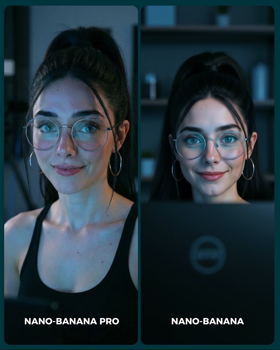
The strongest thing about this card is how ordinary the scene is. It is not a beach, a nightclub, or an expensive studio setup. It is a desk-facing portrait in cool indoor light. That makes the comparison more useful, because most creators need models to perform well in normal scenes, not only in highly curated ones. Everyday environments are often where subtle rendering weaknesses become more obvious.
The image also keeps the test controlled. Same woman, same glasses, same black top, same cool palette, same close crop. That restraint makes the viewer focus on what actually changed: facial finish, skin transitions, eye clarity, and the overall “confidence” of the portrait. This is a good example of how comparison content becomes stronger when the prompt is disciplined.
The laptop edge at the bottom is another smart detail. It gives the portrait a context anchor without taking attention away from the face. That small piece of desk realism helps the whole image feel lived-in and believable. For comparison posts, these tiny cues are often what keep the frame from becoming a sterile side-by-side beauty test.
Why this card is easy to compare
| Signal |
Evidence (from this image) |
Mechanism |
Replication Action |
| High control |
Same subject identity, same styling, same cool interior setup in both panels |
Pushes the viewer to judge rendering rather than scene concept |
Lock all major variables except the model when building comparison cards |
| Everyday realism test |
Desk-edge foreground, cool room light, minimal background objects |
Reveals how models handle common user scenarios, not only aspirational ones |
Use office, bedroom, desk, or home-life scenes for practical model benchmarking |
| Micro-detail anchors |
Glasses, earrings, hairline, skin around the eyes, black tank top neckline |
Give the viewer fixed points for judging subtle quality differences |
Choose portraits with clear, repeatable detail markers across both panels |
| Clear label hierarchy |
`NANO-BANANA PRO` vs `NANO-BANANA` at the bottom |
Makes comments and voting easy without needing extra explanation |
Keep labels simple, bold, and tied directly to panel position |
Where this format fits best
- Model benchmark posts: Best when the goal is to compare engines under realistic conditions rather than stylized showcase scenes.
- Portrait-quality testing: Strong because close-up desk portraits expose small rendering decisions quickly.
- Prompt education content: Useful for teaching that “same prompt” does not equal “same visual taste” across models.
- Comment-driven preference tests: Good when you want the audience to discuss which finish feels more trustworthy or appealing.
This structure is less ideal for dramatic transformations or highly decorative cover cards. It depends on subtlety. If the audience cannot notice nuance, the post will feel flat. But for creators who care about realism, this kind of comparison is highly informative.
Three transfer recipes
- Keep: same face + same crop + same room light. Change: model only. Slot template: “{same desk portrait prompt} rendered by {model A} vs {model B}”.
- Keep: everyday setup + minimal background + stable accessories. Change: expression angle and micro-finish. Slot template: “{ordinary indoor portrait} used as a {realism benchmark card}”.
- Keep: split-screen and bottom labels. Change: wardrobe color, room type, screen foreground. Slot template: “{controlled portrait A/B} in a {practical user scenario}”.
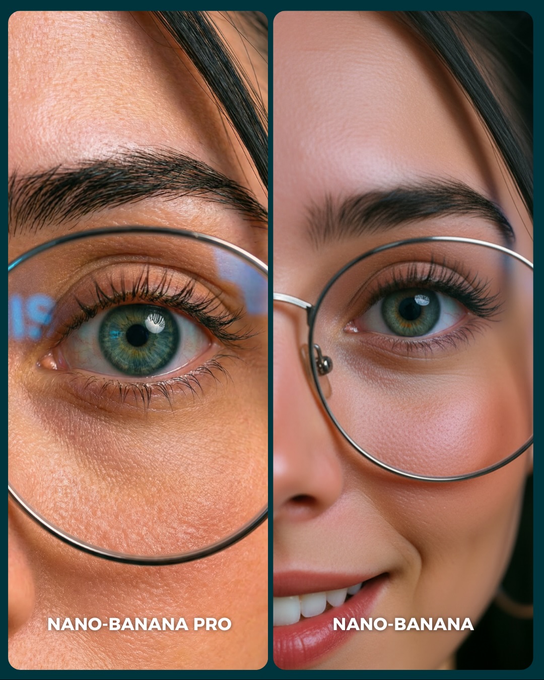
What the image is actually measuring
The scene is really testing how each model handles quiet realism. There is no dramatic costume or location to hide behind. That means the models must get skin softness, lens feel, eye symmetry, and glasses behavior right. Those are small things, but they strongly shape whether an AI portrait feels convincing.
The desk context adds another useful layer because it introduces a familiar screen-lit environment. Many generators can do glamorous portraits under ideal light. Fewer feel truly confident when asked to render “normal but polished” interior portraits. That is why this test is more practical than it first appears.
The slight difference in pose angle between the two panels also matters. It shows that even within a tightly controlled setup, models can drift in character interpretation and image confidence. That kind of drift is exactly what many creators want to understand before choosing a tool.
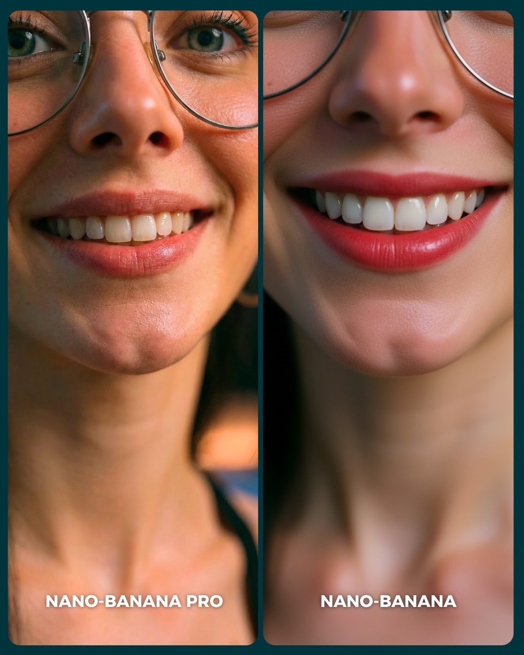
| Observed |
Why it matters |
| Cool monitor-like lighting across both faces |
Tests realistic indoor portrait rendering under practical light |
| Glasses and earrings preserved in both panels |
Offer stable detail anchors for comparing precision |
| Visible laptop edge in the lower frame |
Adds everyday context and keeps the portrait grounded |
| Minimal blurred room background |
Removes distraction and keeps focus on facial finish |
| Close crop with subtle expression changes |
Expose the models’ small aesthetic decisions clearly |
Prompt technique breakdown
To recreate this kind of card well, you need to suppress drift aggressively. The goal is not to create two exciting portraits. The goal is to create one scenario that reveals two different rendering tendencies.
| Prompt chunk |
What it controls |
Swap ideas (EN, 2–3 options) |
| “same woman in both panels with identical accessories and black top” |
Fairness and identity continuity |
“same identity lock”, “preserve face and accessories”, “no subject drift across panels” |
| “cool indoor desk portrait with laptop edge visible” |
Practical scenario and everyday realism context |
“monitor-lit office portrait”, “home workstation portrait”, “desk-side beauty comparison” |
| “two side-by-side vertical panels with bottom model labels” |
A/B comparison readability |
“benchmark card layout”, “split portrait test”, “social comparison frame” |
| “left slightly softer, right slightly cleaner and more direct” |
Subtle rendering contrast |
“moodier vs clearer”, “natural vs polished”, “soft realism vs crisp realism” |
| “minimal room blur behind the subject” |
Visual focus and reduced environmental noise |
“soft shelves in background”, “blurred home office”, “subtle room context only” |
How I would iterate this image
Baseline lock first: identity, cool desk light, and label placement. Those are the three anchors. Once they are stable, refine the slight finish difference between panels and the amount of room detail behind them.
- Run 1: lock the same woman, same glasses, same hair, same black top in both panels.
- Run 2: establish the cool indoor desk environment with a visible laptop edge and soft background.
- Run 3: add the split-screen structure and bottom labels with no extra clutter.
- Run 4: tune the rendering character so one panel feels slightly softer and the other slightly cleaner.
Use the one-change rule. If the faces do not feel like the same person, fix that before touching the lighting. If the faces match but the comparison is too vague, then separate the rendering taste slightly. Trust in this format comes from control first and difference second.